Tag: masculine
Girga Font
Triumphant, vigorous and strong. These were the keywords for the design of Girga, named after an Egyptian city in the Sohag Governorate. The power and strength of the Egyptian letterforms were balance with a few sans serif forms so the
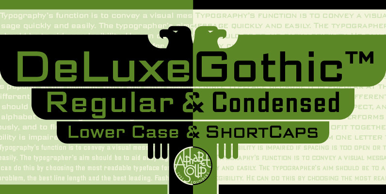
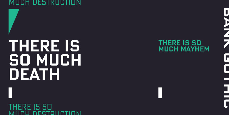
DeLuxe Gothic Font
Michael Doret was always very aware of the fact that Morris Fuller Benton’s classic Bank Gothic, a longtime favorite of his, didn’t contain any lowercase characters. So he set out to remedy that by designing his all new DeLuxe Gothic,
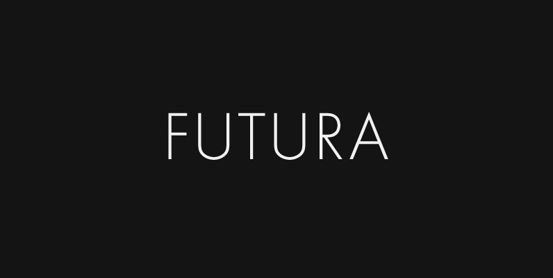
Futura Font
Futura. The very name brings to mind jet-age splendor of the highest order, and indeed the text on the commemorative plaque left behind on the Moon by the Apollo 11 astronauts in July, 1969 is set in Futura. There is
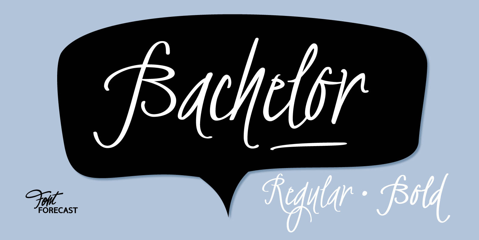
Bachelor Font
Bachelor Script is the preliminary design for Graduate Script. You can clearly see the resemblance between the two, but while Bachelor is frisky and authentic, Graduate is more polished and staged. Graduate Ornaments was originally designed to complement Graduate Script,
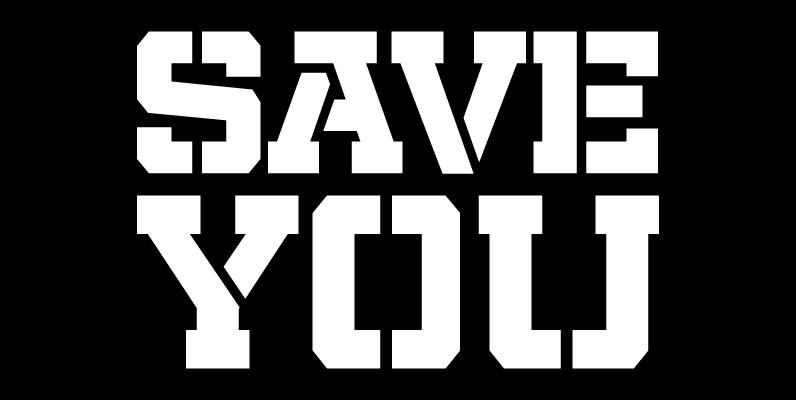
Militia Font
Militia is the face of well-orchestrated military coups, tanks and gun barrels, maps and covert plans, camouflage and war paint. It has no irony, patience, or give-and-take politic. It is strong, successful, swift and significantly in your face. Militia comes
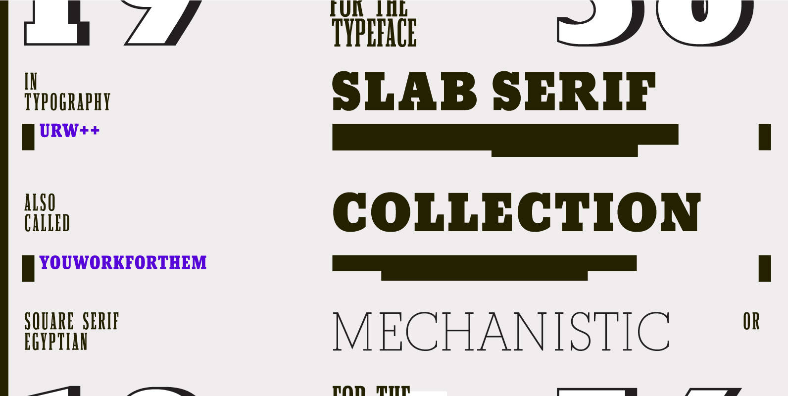
URW Slab Serif Collection Font
The URW++ Slab Serif Collection contains all of the muscle and masculinity of URW++’s finest Slabs, lined up in their boots and spurs, ready to take on all comers. These OpenType killers include various options like stylistic alternates, and make
Aculida Font
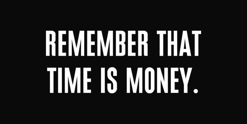
Aculida is a strong, condensed, and headline sans-serif font designed by Claudia Kipp in 2004, published and released by URW. Published by URW Type Foundry GmbHDownload Aculida
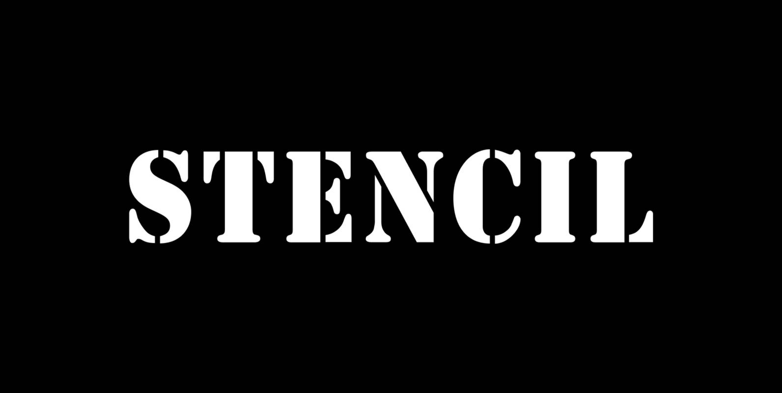
User Stencil Font
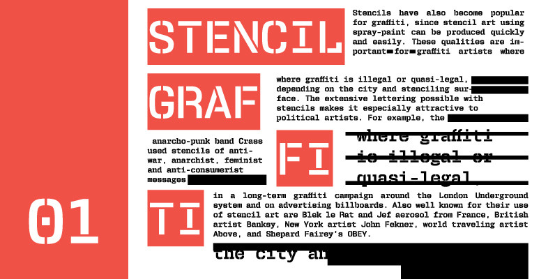
User is a monospaced type family with 30 styles, from Hairline to Bold, divided in Regular, Upright and Stencil, with five weights (Hairline, ExtraLight, Light, Medium and Bold) all with Cameo versions. Complexity and versatility are the keywords for this

Robotik Font
This slab serif Egyptian typeface follows the trend for simple, mechanically constructed typefaces and is an ideal choice for communicating a feeling of precision and strength. Robotik is equally effective when set with normal or wide letter and word spacing.
Gaslon Font
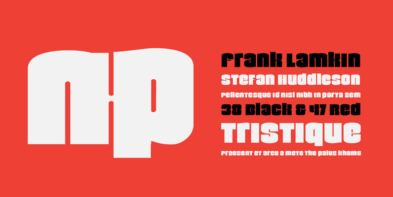
Gaslon is a slight reinterpretation and major expansion of a 1973 film type called Corvina Black, originally designed for VGC by A. Bihari. While the original typeface was popular in its own right, there were some things in it that

Normalise Din Font
Normalise Din is a font design released for the Mecanorma Type Collection. Copyright 2004 Trip Productions BV. Published by MecanormaDownload Normalise Din
P22 Hedonic Font
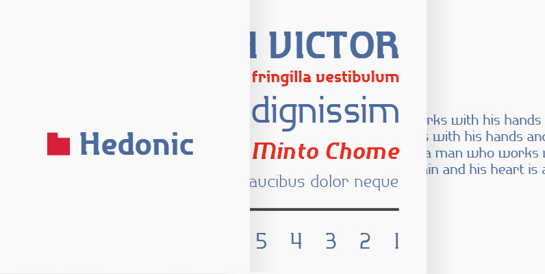
Hedonic has just a hint of a slab serif and even that is used so sparingly that it almost feels like a sans serif font. Its design does appear to be painfully simple, but there are many interesting features including
