Tag: mechanical
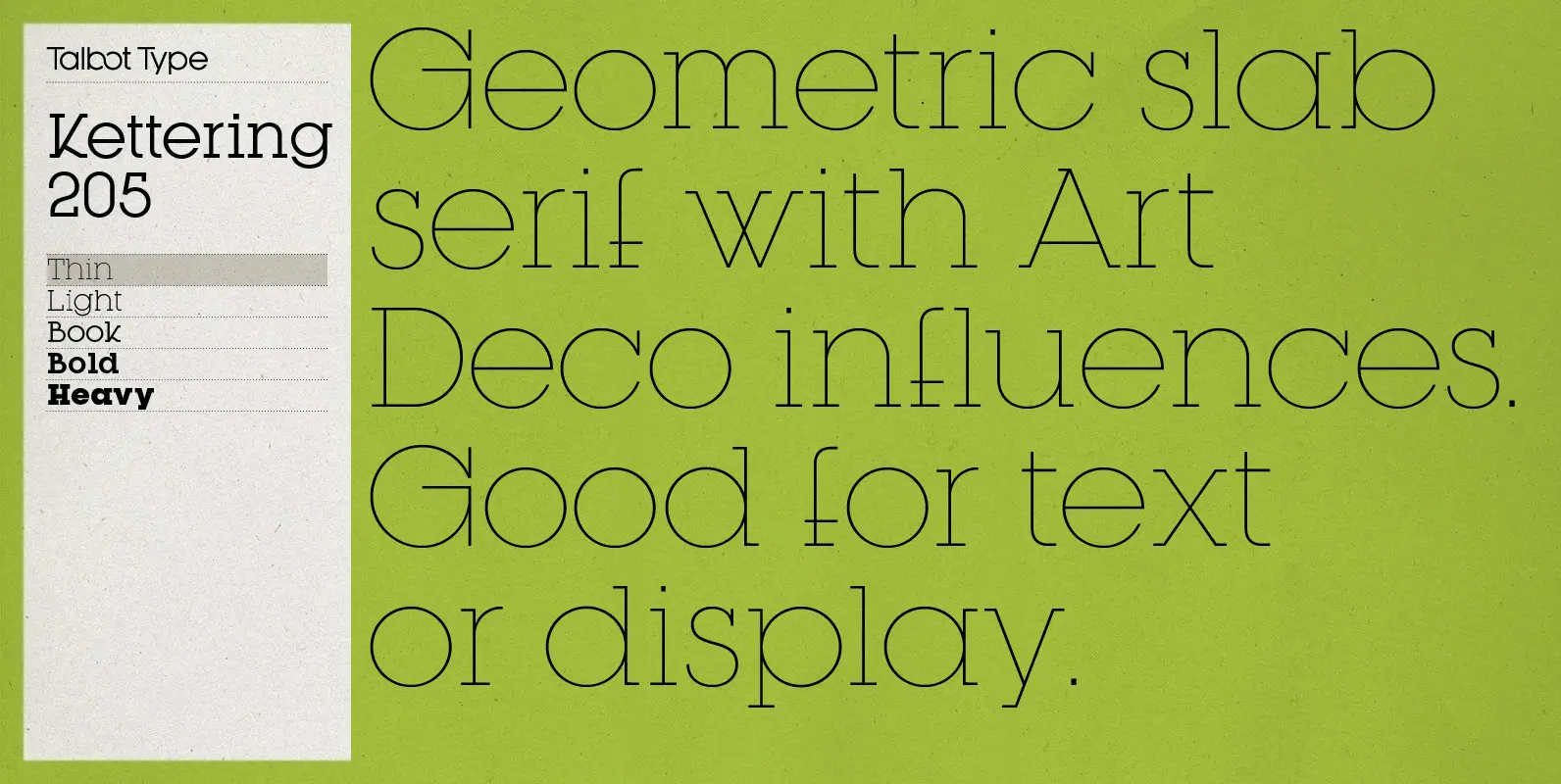
Kettering 205 Font
Kettering 205 is inspired by the classic, geometric slab-serifs such as Lubalin, but has shallower ascenders and descenders for a more compact look, and features art deco influenced, lowered crossbars and an oblique crossbar on the lower case e. It’s
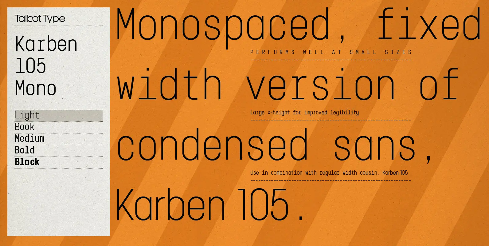
Karben 105 Mono Font
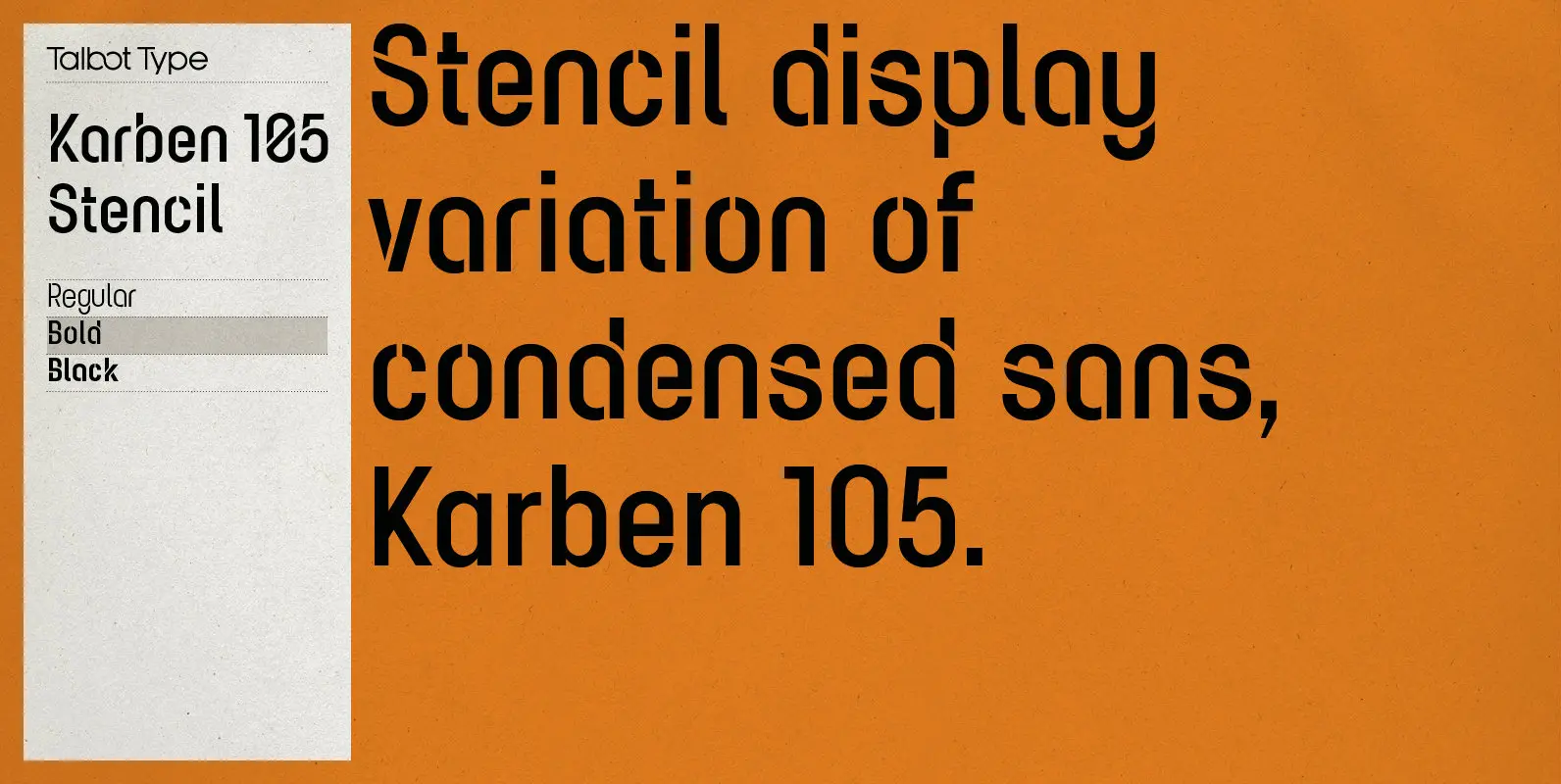
Karben 105 Mono is a monospaced variation of Karben 105. The clean and pure geometry of Karben 105 makes it highly suitable for adaptation to this monospaced variant. It has an even look and retains its legibility at very small
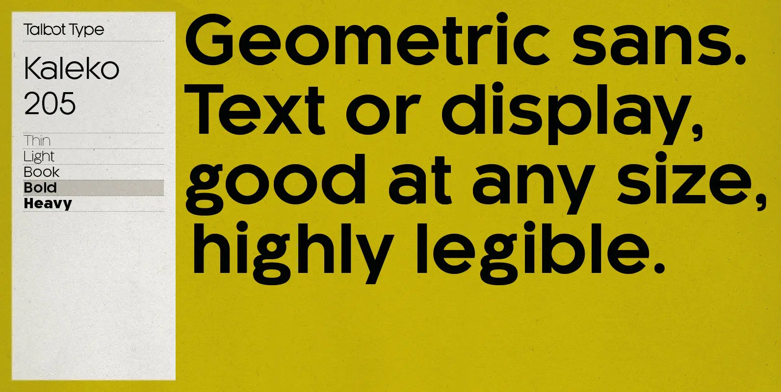
Kaleko 205 Font
Kaleko 205 is inspired by the classic, geometric sans-serifs such as Gill Sans, but has shallower ascenders and descenders for a more compact look. It’s a well-balanced, versatile, modern sans, highly legible as a text font and with a clean,
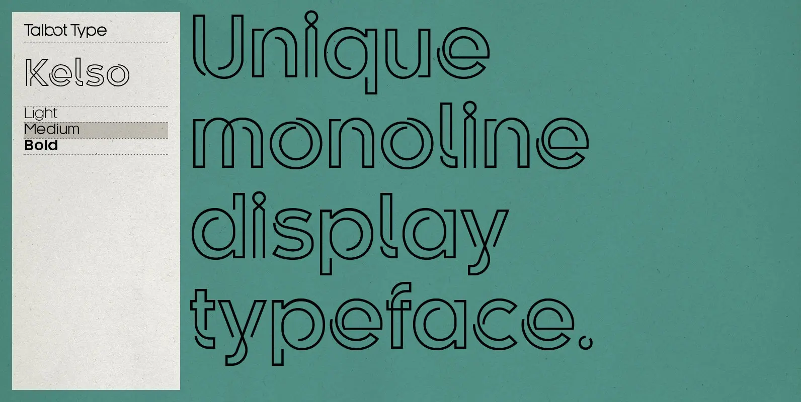
Kelso Font
Kelso is a highly original, outline display font. Each character is represented by a single continuous line to create a fluid and rhythmic look. This technique seems somehow to bring out the individual characteristics of each letter, resulting in a
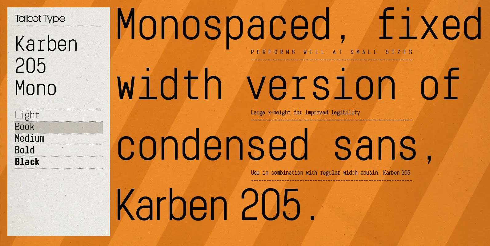
Karben 205 Mono Font
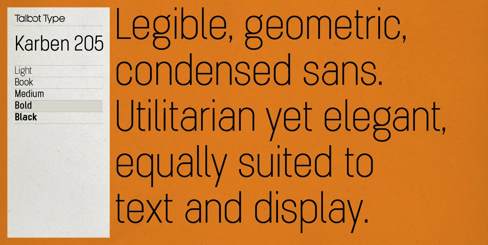
Karben 205 Mono is a monospaced variation of Karben 205. The clean and pure geometry of Karben 105 makes it highly suitable for adaptation to this monospaced variant. It has an even look and retains its legibility at very small
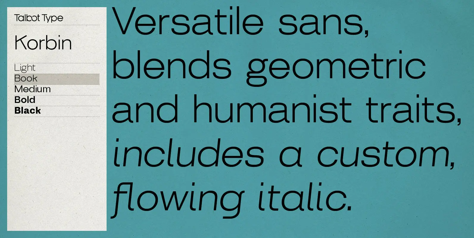
Korbin Font
Inspired by the sans-serifs of the late 19th and early 20th century, Korbin is a legible and versatile text and display face available in five weights. It mixes geometric and humanist traits to achieve a modern, clean, friendly appearance. The
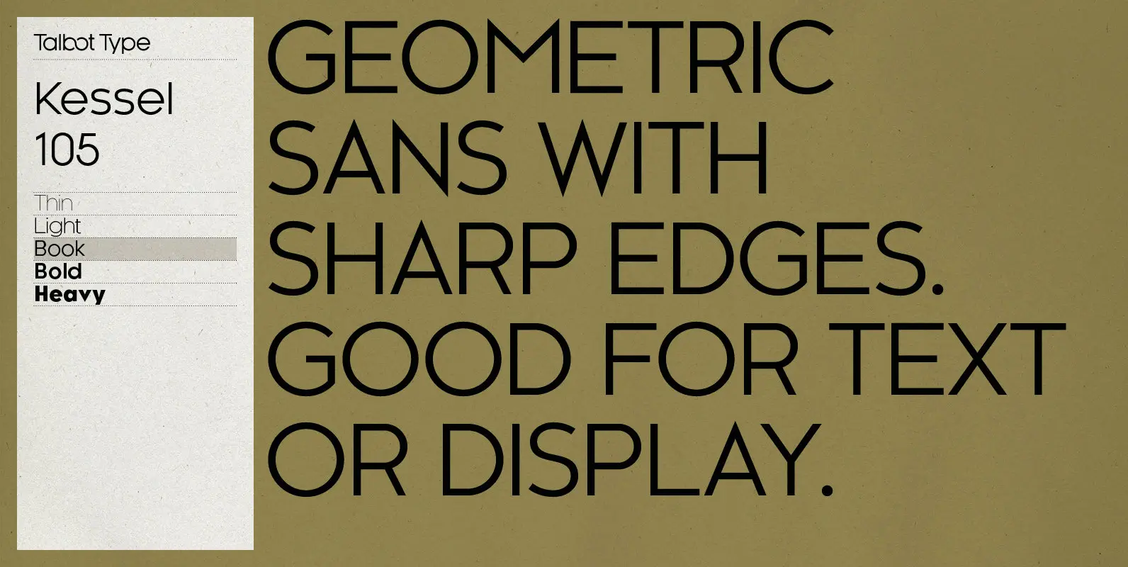
Kessel 105 Font
Kessel 105 is inspired by the classic, geometric sans-serifs such as Futura, but has shallower ascenders and descenders for a more compact look, and features an art deco influence with sharp points at the apex of many characters. It’s a
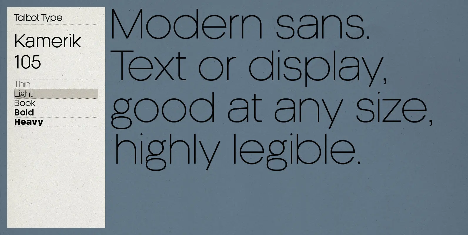
Kamerik 205 Font
Kamerik 205 is inspired by the classic, geometric sans-serifs such as Futura and Avant Garde, but has shallower ascenders and descenders for a more compact look, and features a traditional double-storey lower case a and g. It’s a versatile, modern
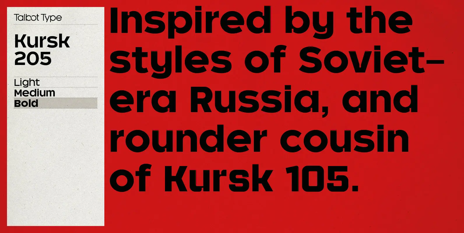
Kursk 205 Font
A text and display font with square proportions, inspired by the type styles of soviet-era Russia. Very shallow ascenders and descenders and a large relative x-height, exaggerate the compact and geometric look. Related to Kursk 105, its squarer-edged cousin. Published
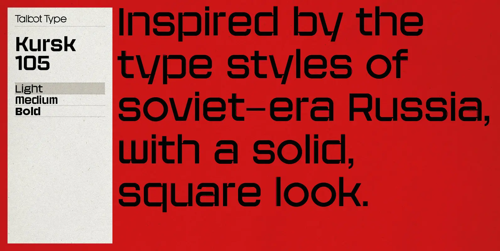
Kursk 105 Font
A text and display font with square proportions, inspired by the type styles of soviet-era Russia. Very shallow ascenders and descenders and a large relative x-height, exaggerate the square look. Related to Kursk 205, its slightly rounder cousin. Published by
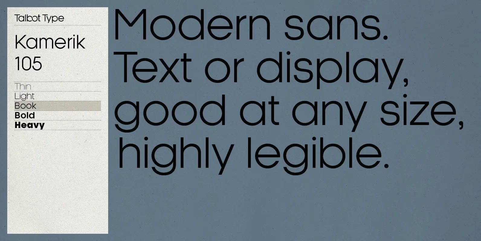
Kamerik 105 Font
Kamerik 105 is inspired by the classic, geometric sans-serifs such as Futura and Avant Garde, but has shallower ascenders and descenders for a more compact look. It’s a versatile, modern sans, highly legible as a text font and with a
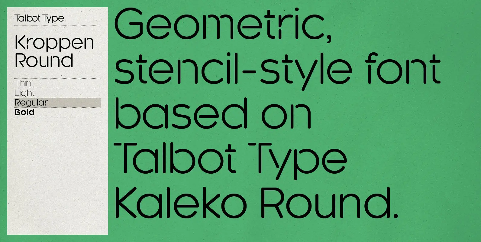
Kroppen Round Font
Kroppen Round is a geometric, stencil-style font based on Talbot Type Kaleko Round, and is available in four weights. Kroppen is not strictly a stencil font given that several characters, notably the O, are not stencilled. The design has more
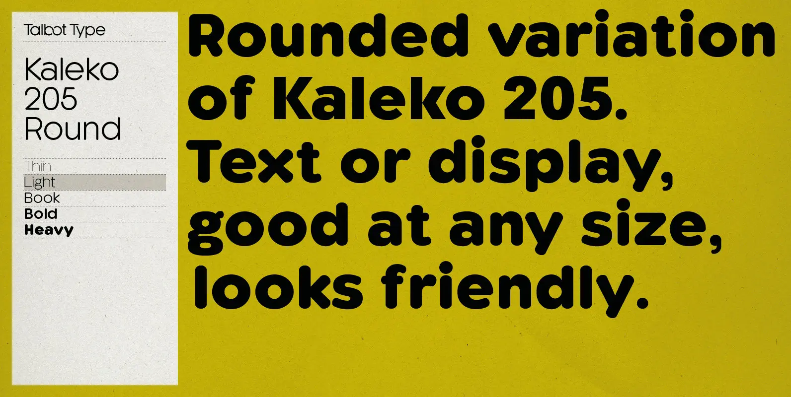
Kaleko 205 Round Font
Kaleko 205 Round is a rounded variation of Talbot Type font Kaleko 205. It’s a well-balanced, versatile, modern sans, highly legible as a text font and with a clean, elegant look as a display font at larger sizes. The rounded
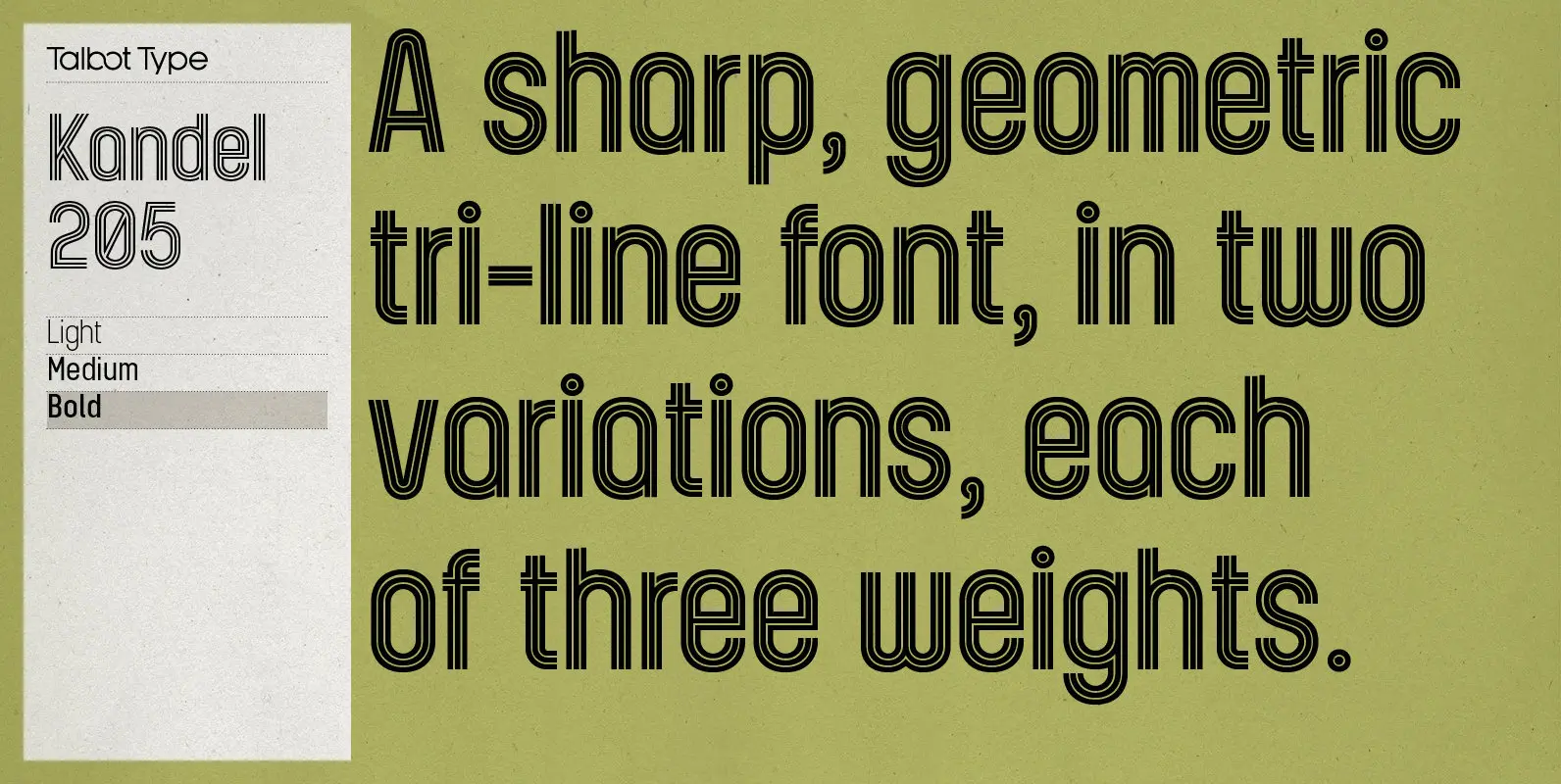
Kandel 205 Font
Kandel 205 is a geometric, tri-line, display and headline font available in a family of three weights. Its bold, graphic styling gives it great stand-out qualities and a highly individual look. It’s particularly well suited to bringing energy to designs,
