Tag: mechanical
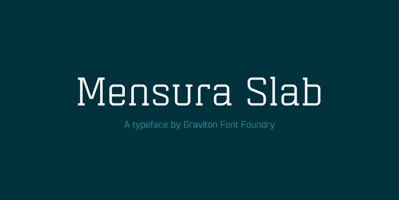
Mensura Slab Font
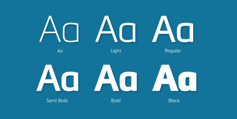
Mensura Slab font family has been designed for Graviton Font Foundry by Pablo Balcells in 2013. It is a modular, geometric typeface with subtle rounded angles that provides a soft, pleasant appearance. It has been conceived to be primarily a
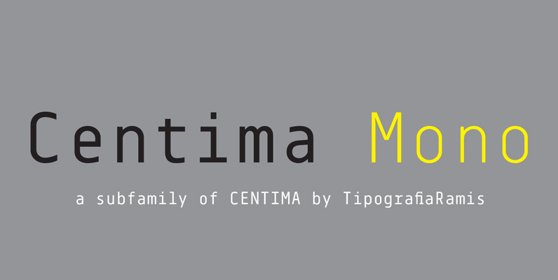
Centima Mono Font
Centima Mono is a subfamily addition to Centima type family. Centima Mono is a condensed geometric monospaced san serif, built in six styles. The typeface is intended for use in display sizes, but also is quite legible in text and
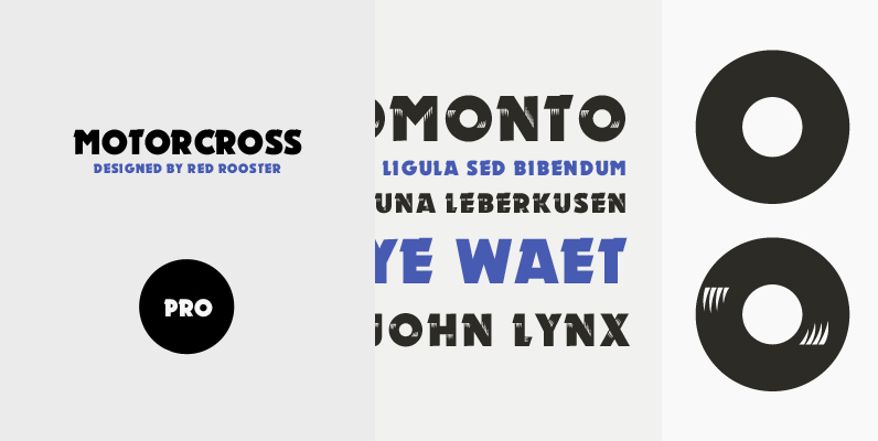
Motorcross Pro Font
Revival of the Ludwig & Mayer type design from 1930. Motorcross Pro includes over 800 glyphs and supports 131 languages. Published by Red RoosterDownload Motorcross Pro
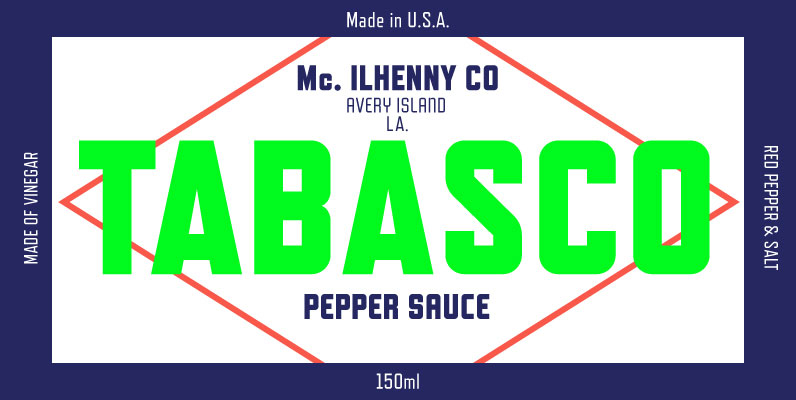
Refrigerator Deluxe Font
Refrigerator Deluxe (2008) was inspired by generic block-style lettering typical of the mid-20th century. It follows the typical American model that can be seen in old lettering manuals, although I designed it purely from memory. I originally released it in
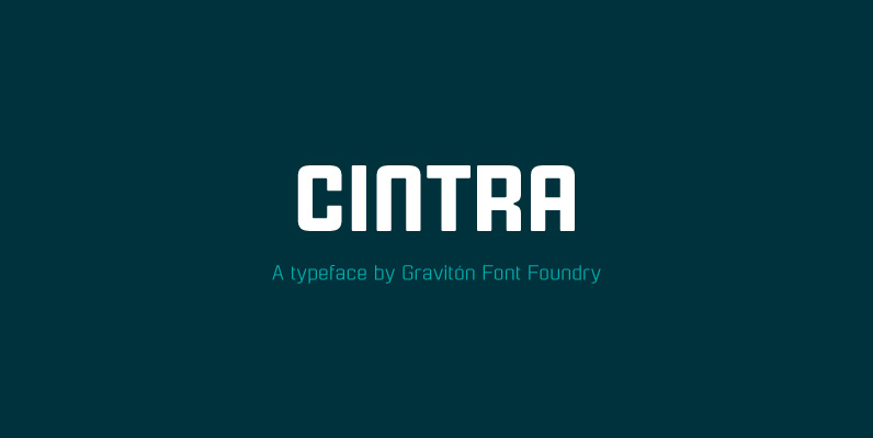
Cintra Font
Cintra font family has been designed for Graviton Font Foundry by Pablo Balcells in 2014. It is a sans serif, bold, geometric typeface with subtle rounded angles, which provides a soft, pleasent appearence. Cintra consists of 4 styles. Published by
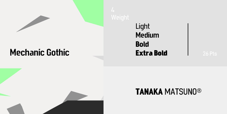
Mechanic Gothic Font
Designed by Darren Scott. Based on character shapes with origins rooted in the work of 19th Century American wood type makers, DST Mechanic Gothic draws influence from the poster types found in the impactful advertising during the Industrial revolution. It

Aquarius Font
Designed by Steve Jackaman, Aquarius is based on the popular 1968 VGC typeface drawings. Published by Red RoosterDownload Aquarius
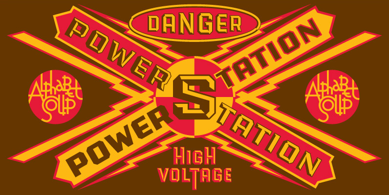
PowerStation Font
Originally conceived as part of a unique display design created for Hershey’s Times Square flagship store, the PowerStation family is the perfect choice when looking for a font that speaks of strength, solidity and character. It comes in two faceted

Trapper Round Family Font
Trapper is so named because it exploits a typographic design mechanism known as ink traps purely for graphic effect. Ink traps are a device used by type designers to create significantly higher legibility under adverse printing conditions, especially when the
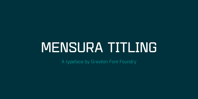
Mensura Titling Font
Mensura Titling font family is the display version of Mensura font family, it has been designed for Graviton Font Foundry by Pablo Balcells in 2013. Mensura Titling consists of 12 styles including italics. The styles included in the font have
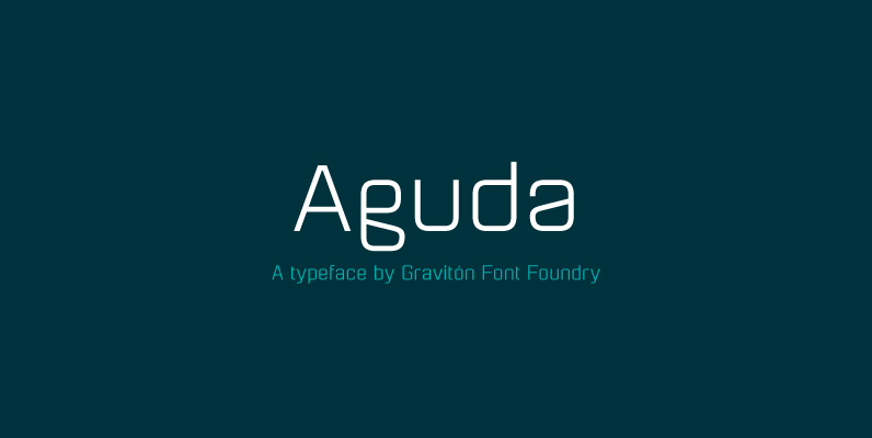
Aguda Font
Aguda font family has been designed for Graviton Font Foundry by Pablo Balcells in 2014. It is a modular, geometric typeface which has been conceived to be primarily a display typeface, but given its clarity it can also be used
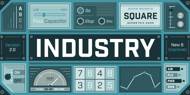
Industry Font
Forged from geometric and technical styles, Industry stands sturdy and strong. The sans serif family includes seven weights with corresponding italics. The typeface is meant to be a workhorse that can span from a refined vintage feel to an industrial

Ginza Narrow Font
Here’s what I said about the original Ginza: Sometimes you get an idea stuck in your head and the only way to get rid of that demon is to put something down on paper. A year later the doodles became
