Tag: medium
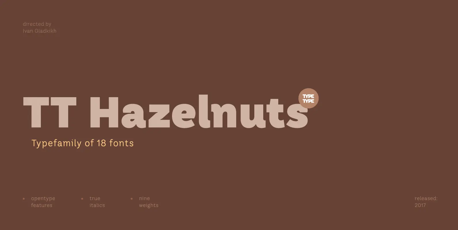
TT Hazelnuts Font
TT Hazelnuts is a display sans-serif font family containing a set of elegant and delicate decorative elements. Initially the family was designed for highly specialized areas, but we’ve decided to extend the number of typefaces and to make the family
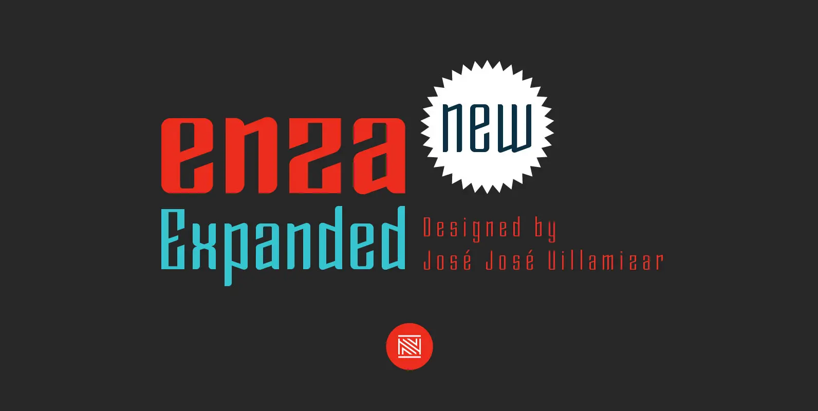
Enza Expanded Font
“Enza Expanded” is the new display typeface of the family Enza designed by José José Villamizar for Neo Type Foundry. Its design stems from the typographic exploration for conducting an identity aimed at entrepreneurs of the Millennial Generation. This typeface
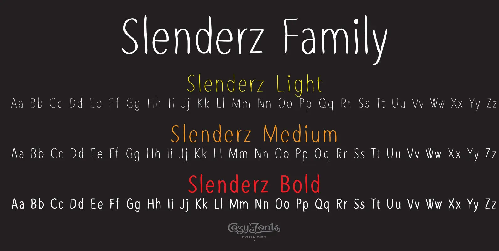
Slenderz Font
Slenderz Family is a hand crafted font family designed by Tom Nikosey, an American Graphic Designer specializing in Typographic Design and Illustration. Slenderz is available in Light, Medium & Bold weights CozyFonts Foundry is Tom's intro into the world of
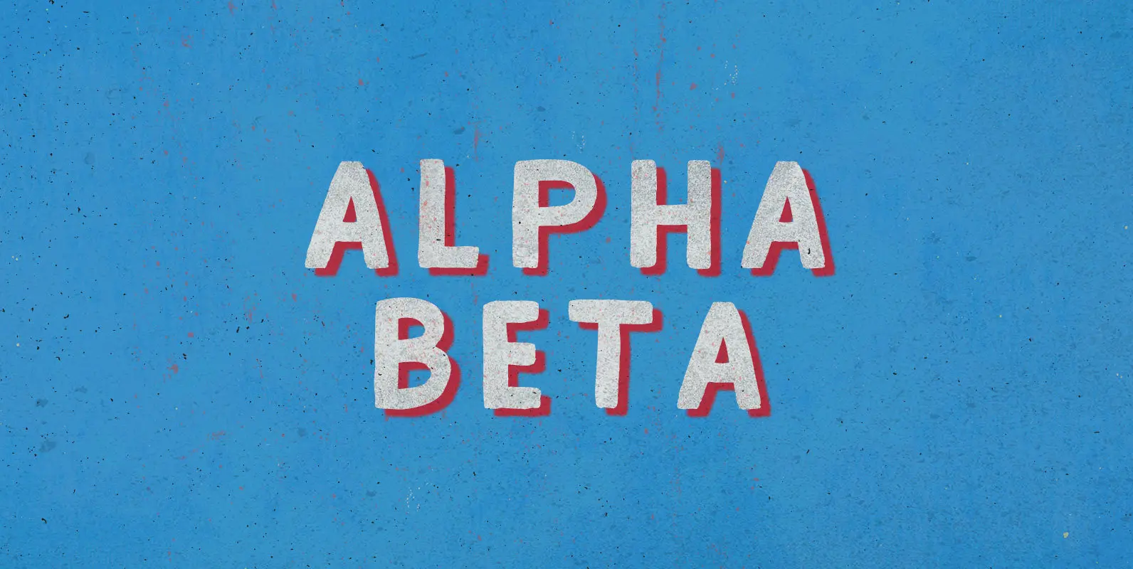
Alpha Beta Font
Steady in its place, ambitious in its outlook: Enter the journeyman of pack leaders. The Alpha Beta comes from behind to run ahead, before falling back; fighting and losing, fighting again, always to win. Published by BLKBKDownload Alpha Beta
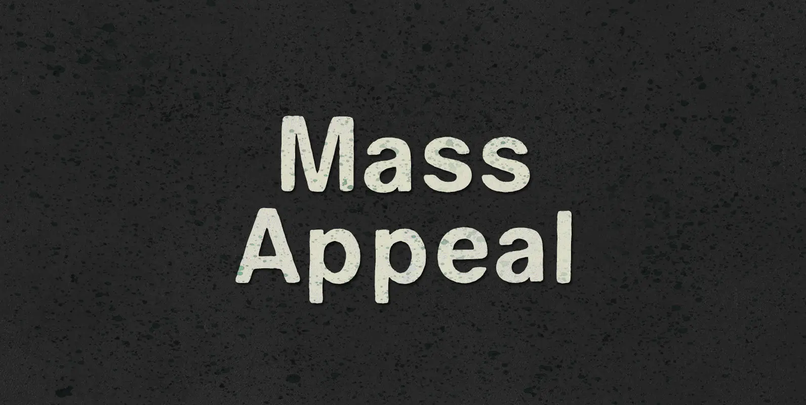
Mass Appeal Font
Down but standing tall under the weight of having it all. Above the clouds, or holding it down on the ground, the solution to and absolution of all problems with gravity: a pillar of planetary Mass Appeal. Published by BLKBKDownload
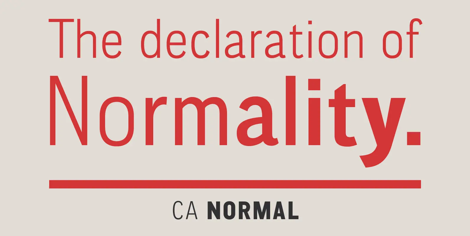
CA Normal Font
CA Normal is a typeface aiming for beauty without ostensible effects, merely relying on clarity and well balanced proportions. It merges influences from European grotesques and American gothics, breeding an experimental mongrel. The underlying concept stays in the background, giving
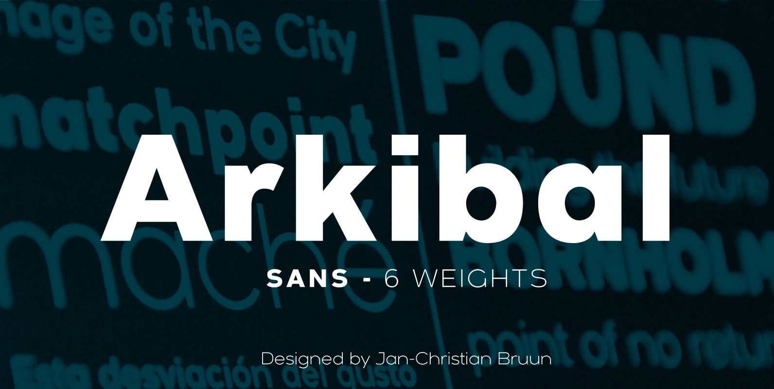
Arkibal Sans Font
The inspiration comes from some old documents and store signs from my great-grandfather’s old gold list factory from 1838. He delivered hits for many artists of that time, and various museums in Copenhagen. I priority increases to make a mixture
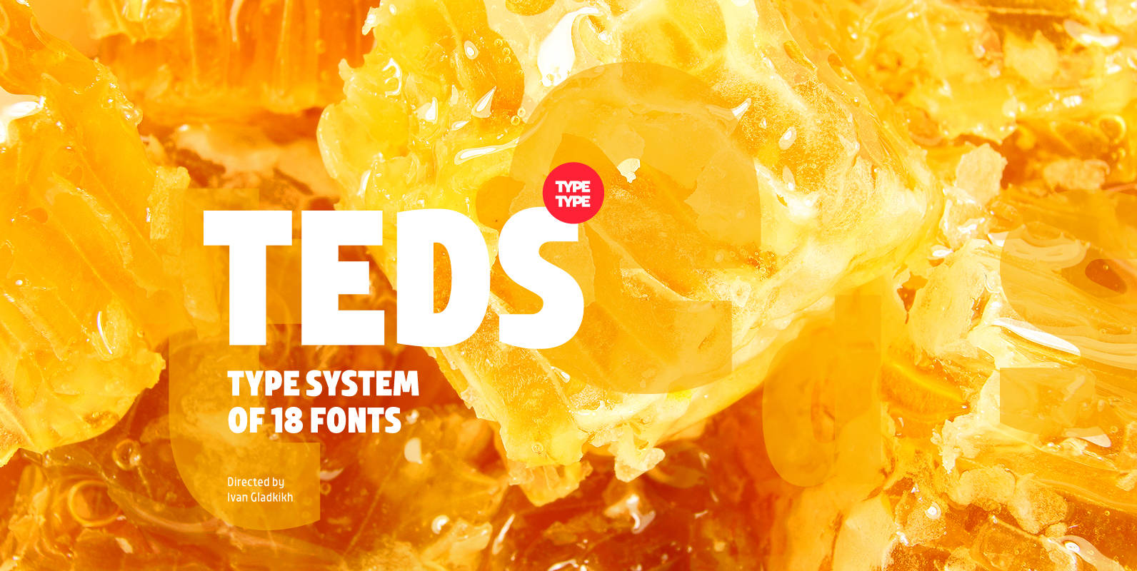
TT Teds Font
Teds is a geometric non-serif with narrow proportions created for universal application in any types of text. Relatively tall lowercase characters, open forms of semicircular characters, and low contrast between vertical and horizontal lines make this font type easy to
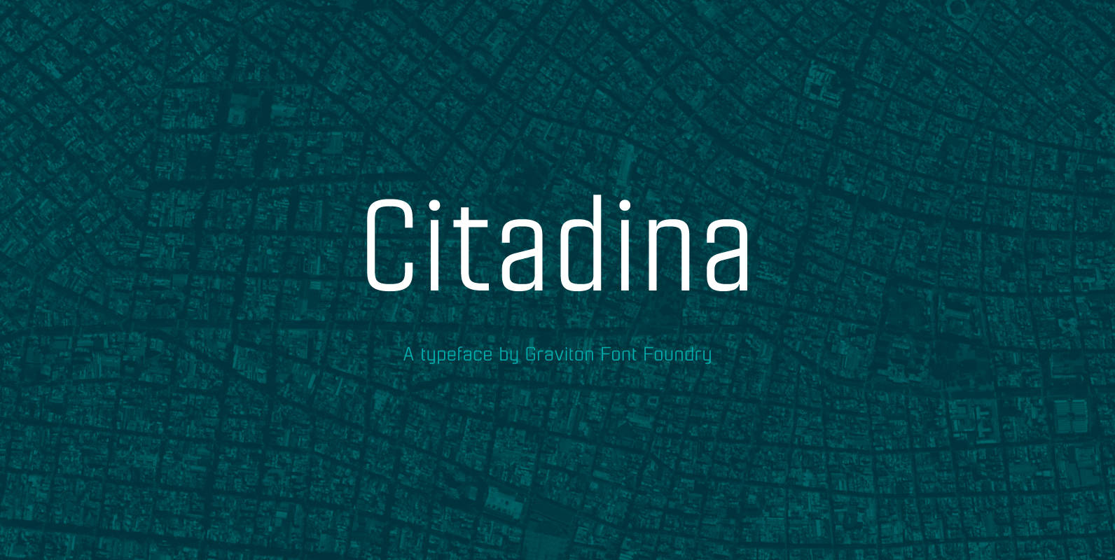
Citadina Font
Citadina font family has been designed for Graviton Font Foundry by Pablo Balcells in 2016. It is a sans serif typeface with a geometrical, mechanic, neutral appearance and a slightly condensed design which makes it particularly effective for space economizing.
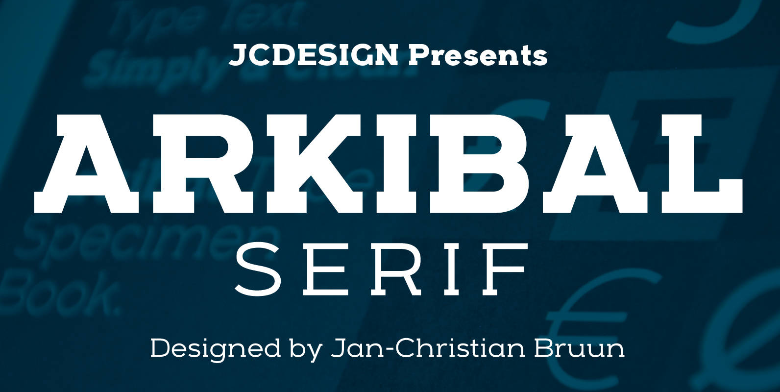
Arkibal Serif Font
The inspiration comes from some old documents and store signs from my great-grandfather’s old gold list factory from 1838. He delivered hits for many artists of that time, and various museums in Copenhagen. I priority increases to make a mixture
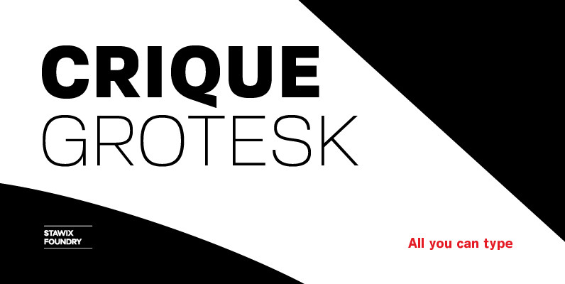
Crique Grotesk Font
The Crique Grotesk This contemporary typeface is inspired from Neo-humanist and Geomatric industrial tone presented the late 2000s typeface. The font family is also composed of the normal width and display width in order to support the different applications on the delicate
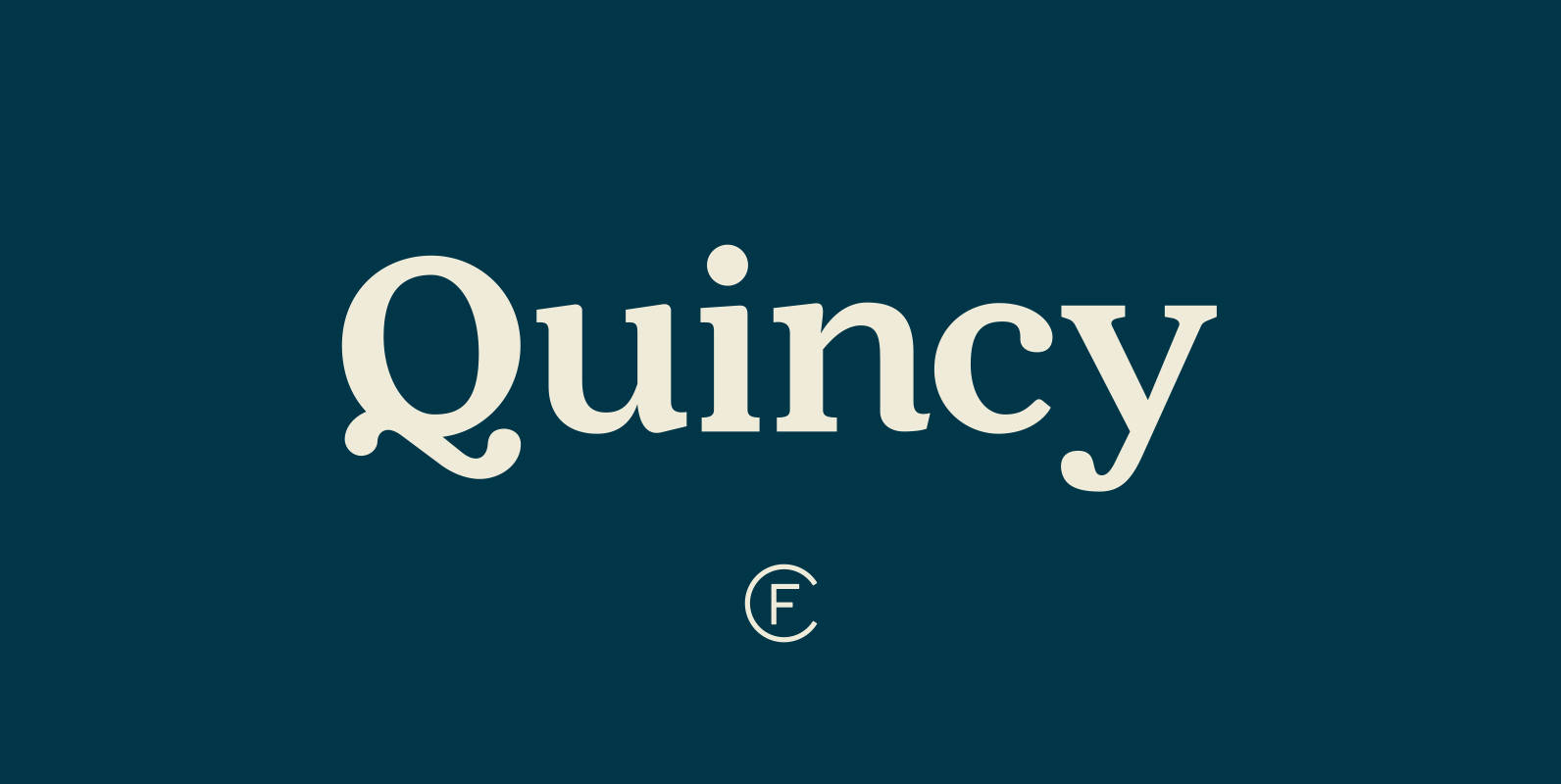
Quincy CF Font
The warm letterforms and medium contrast of Quincy© CF give any text a smooth, flowing motion. Small variations and human touches add charm, with Quincy’s boldest weights especially strong as large and medium display type. New in version 4.1: Quincy
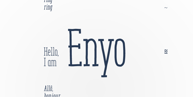
Enyo Serif Font
Enyo is a decorative, display, serif handwritten font. This font will provide an informal look to your work! It can be used for small ammount of text, and specially for display usage because of its glyph quality. Enyo offers OpenType
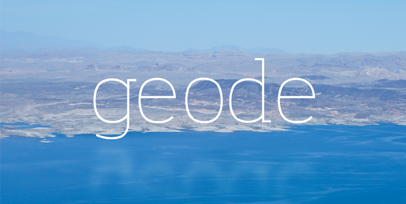
Geode Font
Geode is an open, approachable slab serif with wide apertures, gentle leading curves, and small touches that make it easy to love. Just like a geode, this typeface is round on the outside, but highly structured on the inside, providing
