Tag: Mid Century

Trankco Font
Do you have a passion for textured and hand-drawn aesthetics that can inject nostalgia into your design projects? Are you seeking to elevate your designs with a font that embodies the soul of vintage authenticity yet delivers a modern acuity?
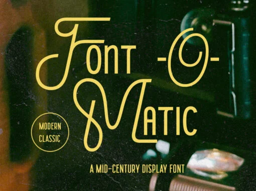
Font o Matic Font
Embrace the echoes of design history while shaping your digital creations of today with Font-o-Matic, a game-changing retro-inspired display font that has taken the digital design world by storm. Perfectly bridging the past with the present, this innovative tool offers

YWFT Openspek Font
In the realm of digital design, typographic choices carry communicatory power, often subtly setting the tone of a project. One font sets itself apart seamlessly blending humanist elements with calculable geometry: the YWFT Openspek Font. Cherished by graphic and digital
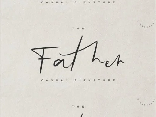
Father Font
When one considers the myriad fonts available in the digital typography market, a few crawl up the ladder of the extraordinary, crashing through the ceiling of mediocrity, and claim unique space in the field of digital design, and among these
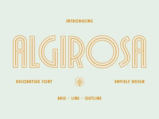
ED Algirosa Font
In the sphere of graphic and digital design, the marriage of classic aesthetics with a modern sensibility can be a game-changer. An exemplar of this union is demonstrated in the ED Algirosa font, a digital product created with an eye
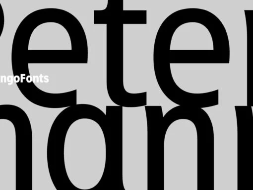
Petermann Font
In the realm of graphic design and digital aesthetics, the importance of typeface cannot be overstated. A particular standout in this arena is the Petermann font, a modern sans serif that effortlessly blends functional form with eloquent expression. A New
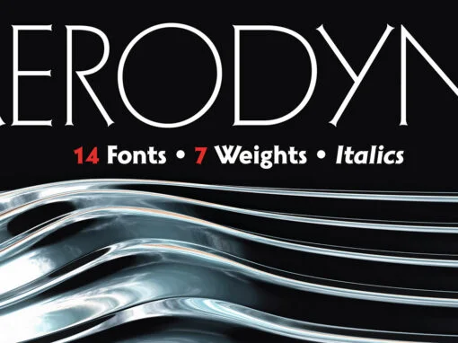
Aerodyne Font
Aerodyne is a highly versatile font family with seven weights and italics. While both modern and sleek in its line quality and flow, the fundamentals of this font set takes many of its design cues from more antiquated typestyles of
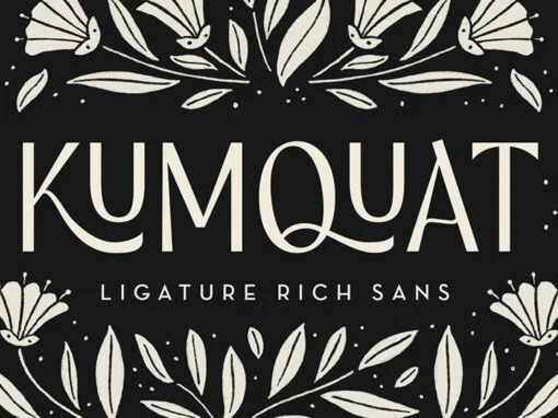
Kumquat Font
Kumquat is an elegant, ligature rich sans display font. It has a modern and sophisticated feel while still being fun and approachable! Kumquat is inspired by hand lettering and symmetrical floral art – incorporating many letters that fit together while
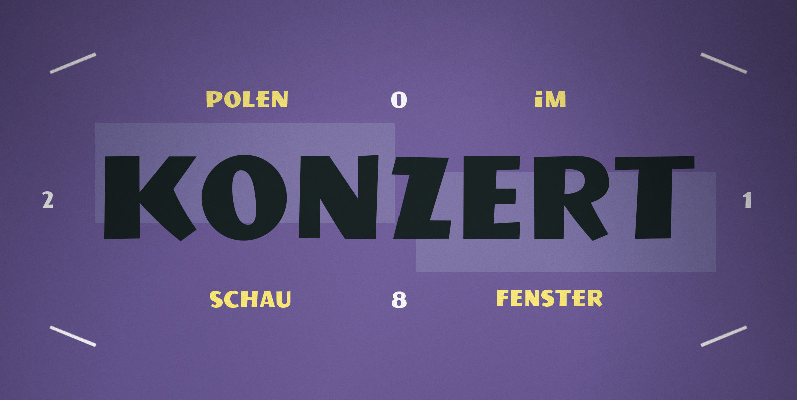
PiS Konzert Font
PiS Konzert is a bulky quirky all caps headline sans, inspired by letters found on a hand drawn polish poster from the 1960s. Its slightly shaky mid-century style makes it perfect for concert posters, movie intros or any other applications

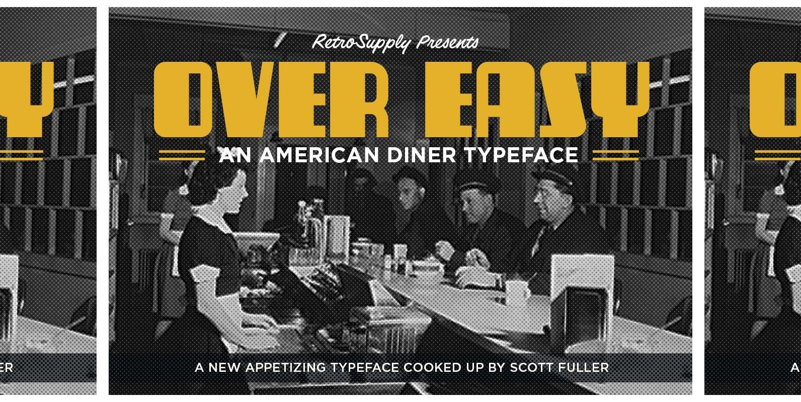
Over Easy Font
A FONT INSPIRED BY THE STORY OF THE AMERICAN DINER Diners… They’re as American as jazz and baseball. Inspired by streamlined trains, diners first appeared in the northeast United States. They were pre-fabricated and ready to go out of the
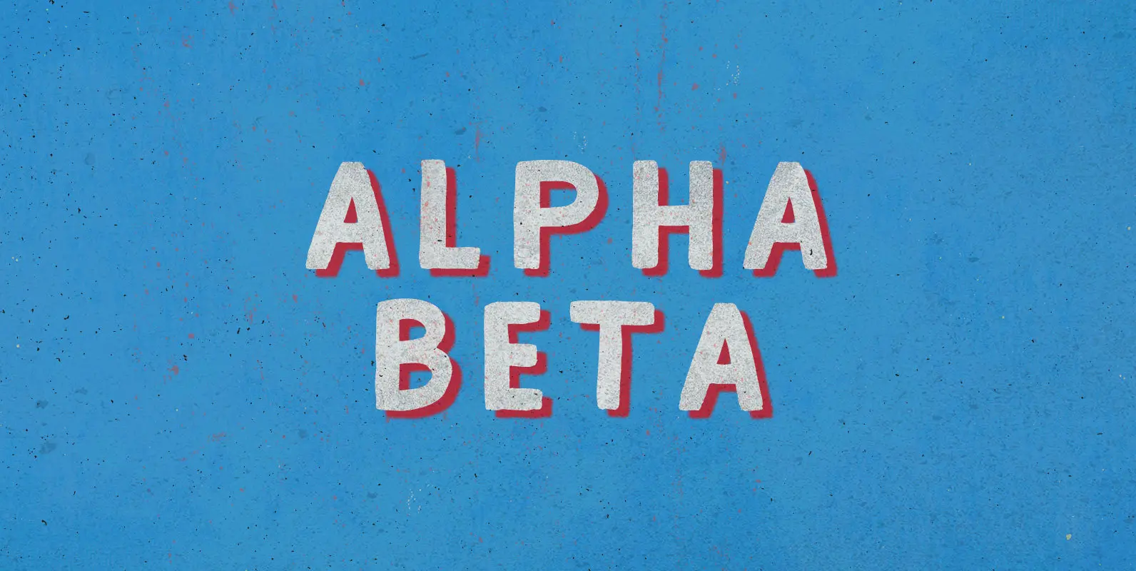
Alpha Beta Font
Steady in its place, ambitious in its outlook: Enter the journeyman of pack leaders. The Alpha Beta comes from behind to run ahead, before falling back; fighting and losing, fighting again, always to win. Published by BLKBKDownload Alpha Beta
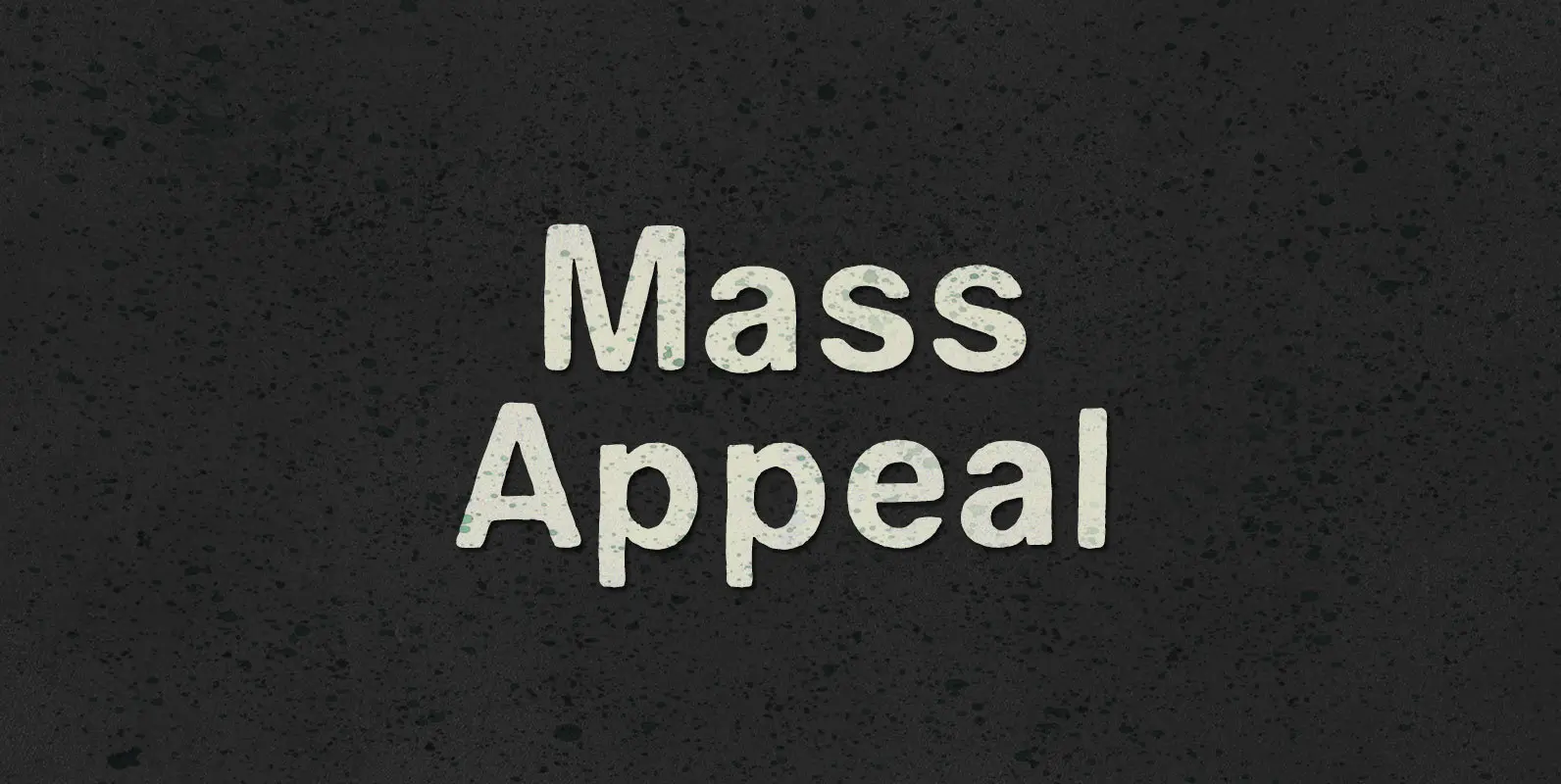
Mass Appeal Font
Down but standing tall under the weight of having it all. Above the clouds, or holding it down on the ground, the solution to and absolution of all problems with gravity: a pillar of planetary Mass Appeal. Published by BLKBKDownload
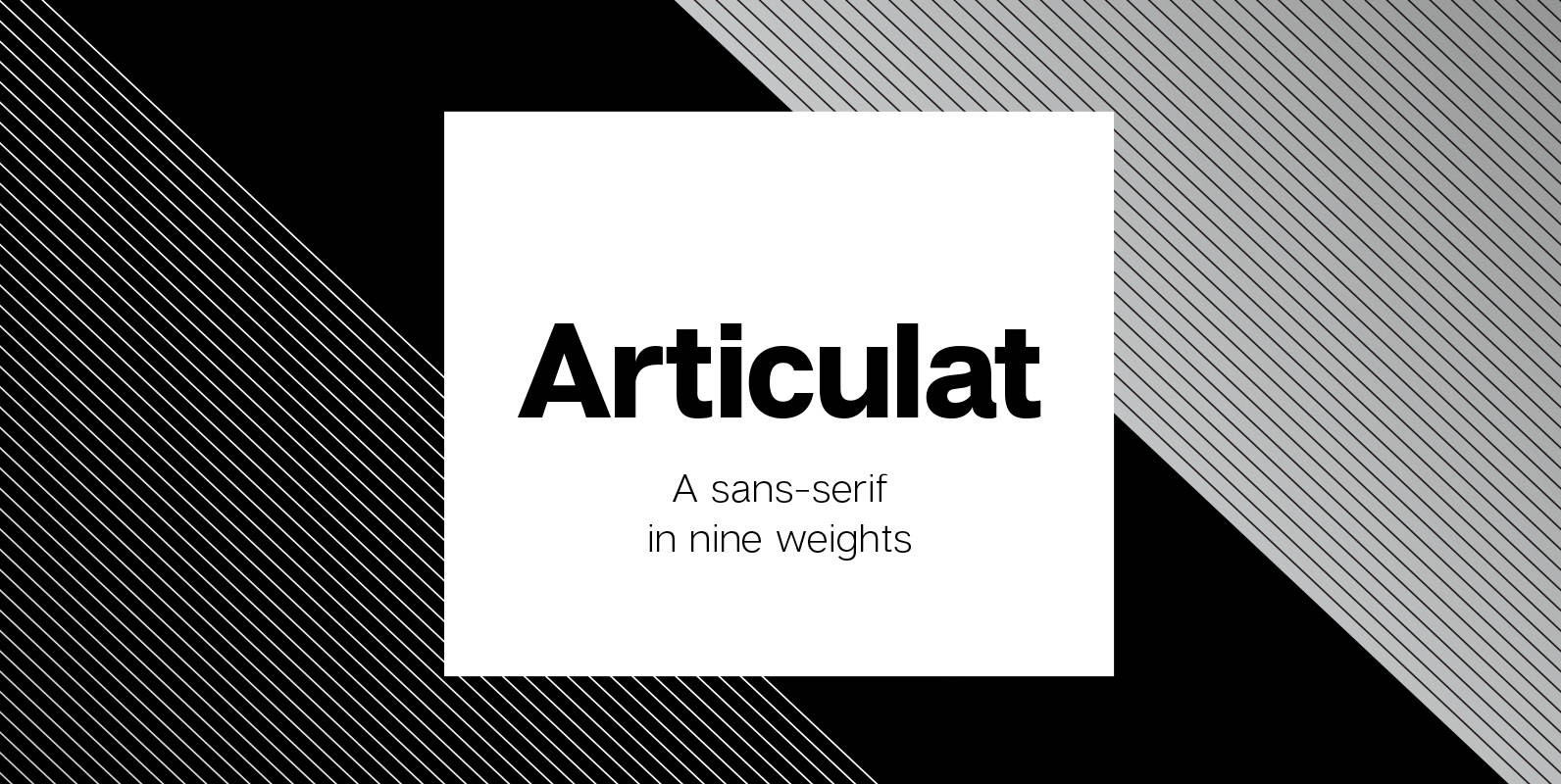
Articulat CF Font
Articulat© CF is a new take on the timeless Swiss typography style. Strong, sharp and well-spoken, Articulat was built to be versatile, charismatic and legible. Always in style, use it for a hit of mid-century beauty – reimagined for the

Remi-Rand Font
Based on the old Remington Rand typewriter logo from the the 1940’s, Remi-Rand is an approachable humanistic typeface suited for a wide array of applications. It’s packed with expressive alternates, a beautifully crafted numeral set and ligatures. Published by Mike
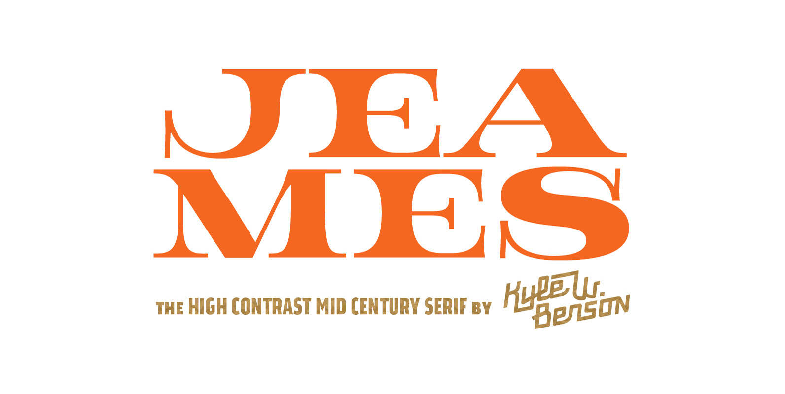
Jeames Font
Jeames brings familiarity to the often detached feeling extended serif genre. The curved, heavy, joints let the letters bounce along while the proportions and contrast keep your eyes grounded. This mid century inspired family of three weights is intended for
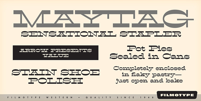
Filmotype Western Font
Inspired by French Antique reverse-stress types of the 1880s, Filmotype Western was released in 1955 to expand its Flat Serif category. Popular in broadsides, circus posters and advertisements at the turn of the 19th century, Filmotype Western will add old
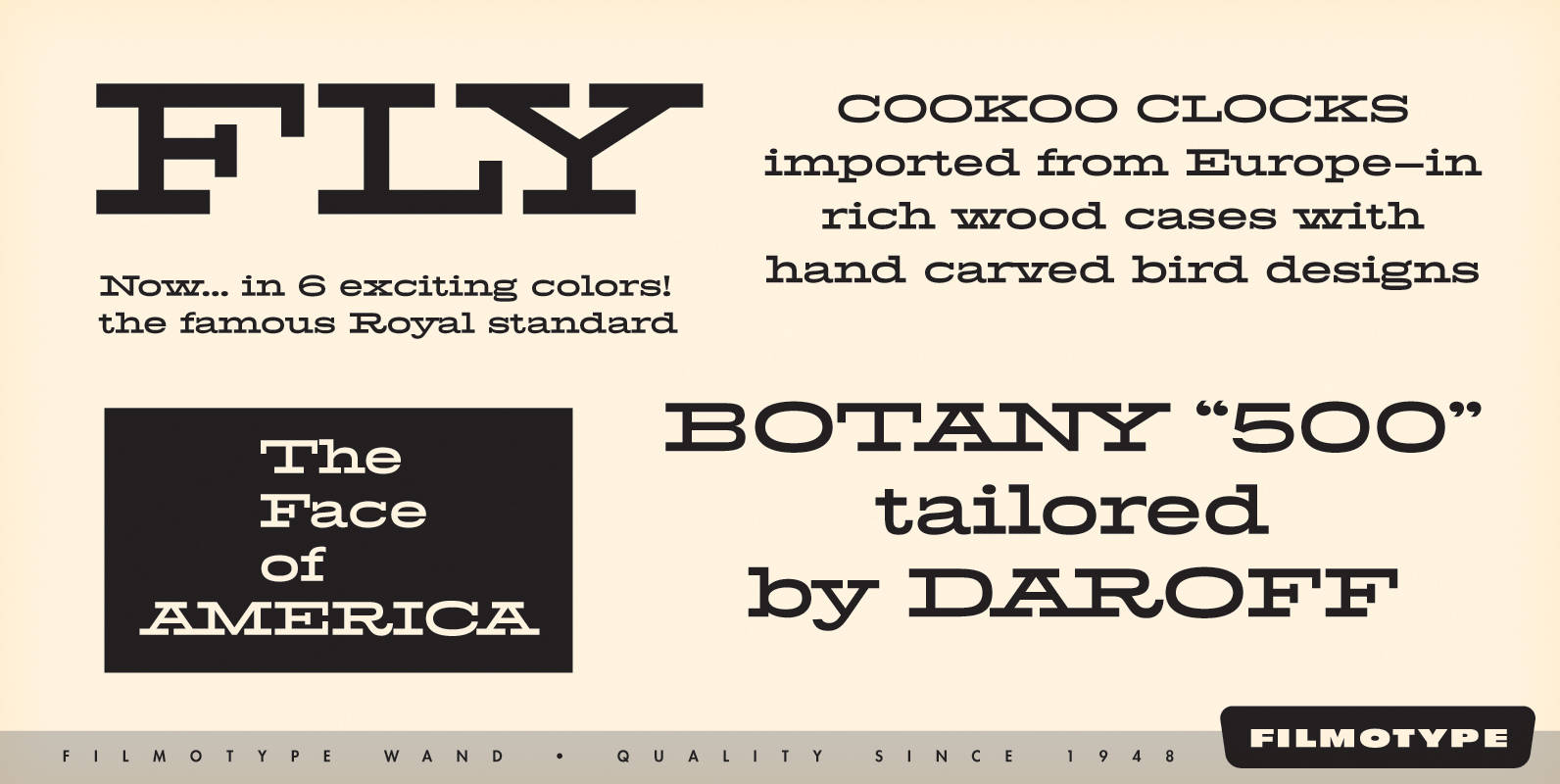
Filmotype Wand Font
Filmotype Wand was introduced in 1955 as part of the Flat Serif category. Inspired by smart slab serifs including Hellenic Wide popular in American television westerns and in heavy use in corporate letterhead and store packaging, Filmotype Wand takes a