Tag: mono-linear
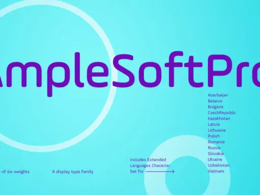
AmpleSoftPro Font
AmpleSoft Pro is an extended version of AmpleSoft type family. AmpleSoft Pro Includes Extended Languages Character Set for the following: Azerbaijan, Belarus, Bulgaria, Czech Republic, Kazakhstan, Latvia, Lithuania, Polish, Romania, Russia, Slovakia, Ukraine, Uzbekistan, Vietnam. AmpleSoft Pro is a display
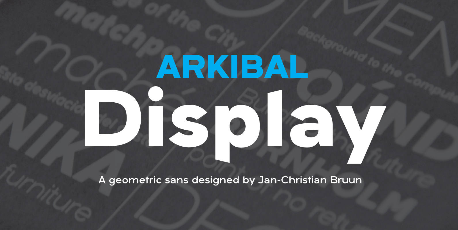
Arkibal Display Font
Display version is a little different from Sans family, where “a” is the center of the whole font. And letters “l, b, d, p, q and t” is the moved slight angle. The idea was to make two versions with
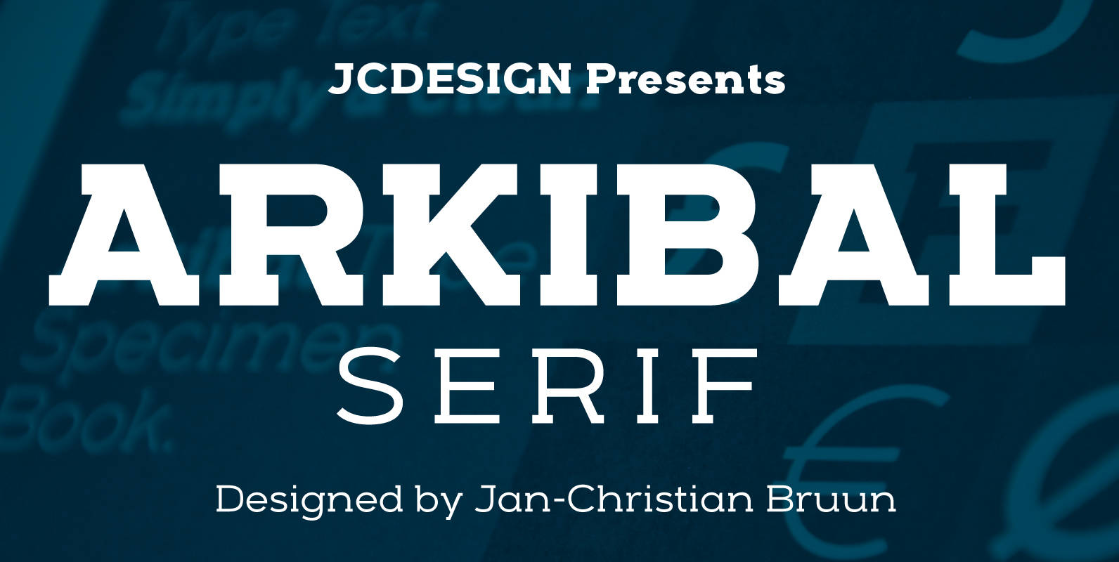
Arkibal Serif Font
The inspiration comes from some old documents and store signs from my great-grandfather’s old gold list factory from 1838. He delivered hits for many artists of that time, and various museums in Copenhagen. I priority increases to make a mixture
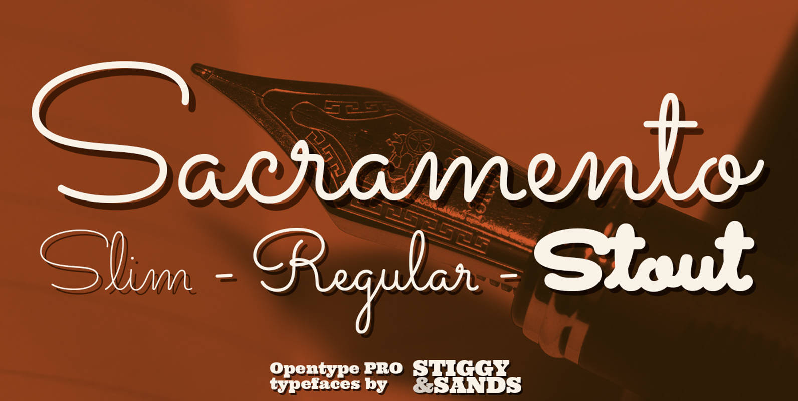
Sacramento Pro Font
The Sacramento Pro family of typefaces was inspired by a monoline, semi-connected script from hand-lettering artist brochure work of the 1950’s and 1960’s. With its sophisticated upright stance, it stands on a thin line between formal and casual lettering styles,
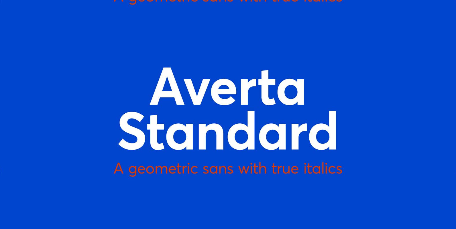
Averta Standard Font
Averta Standard is the basic version of Averta. Bringing together features from early European grotesques and American gothics, Kostas Bartokas’ (Greek: ‘αβέρτα’ – to act or speak openly, bluntly or without moderation, without hiding) Averta is a geometric sans serif
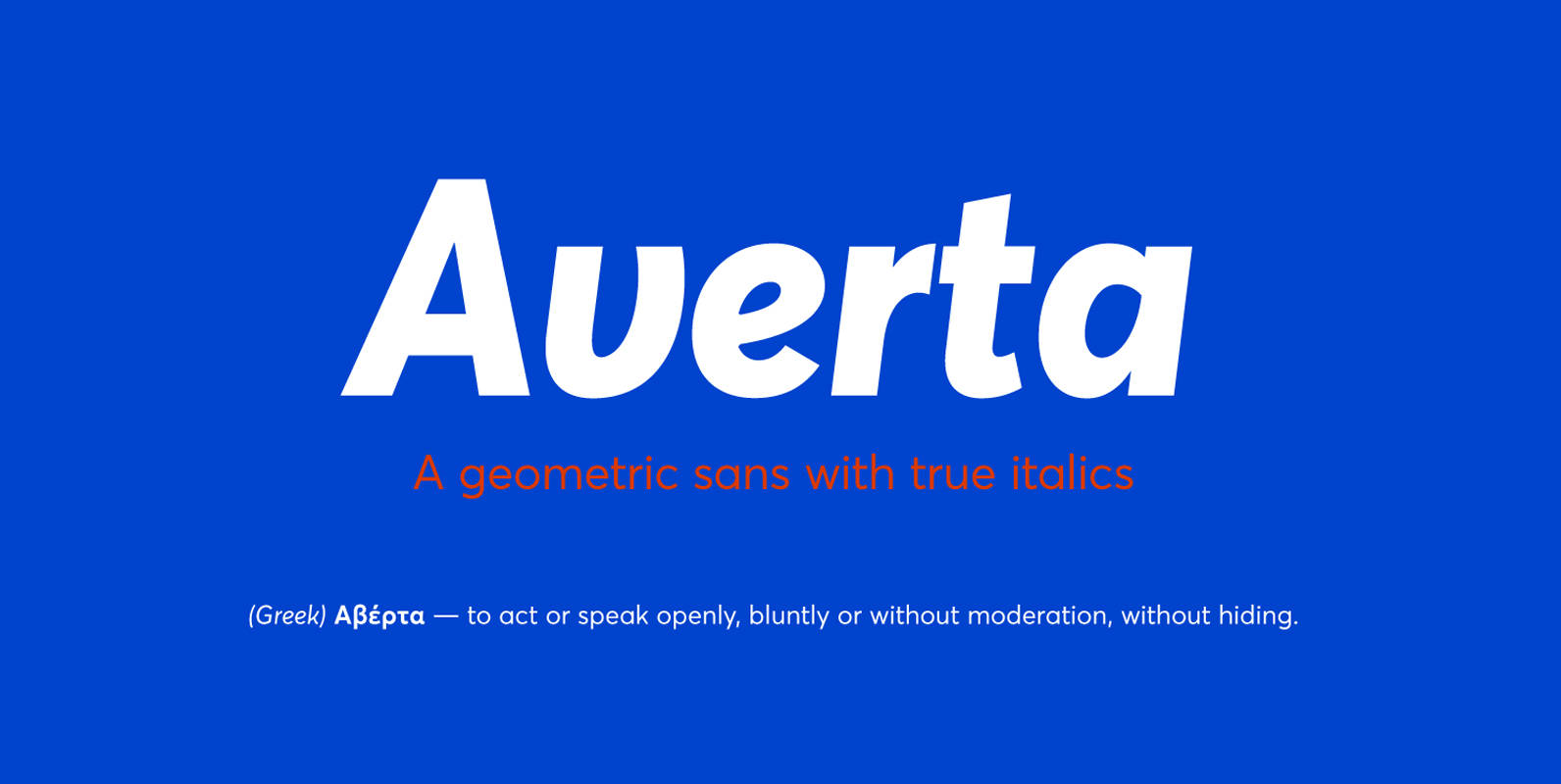
Averta Font
Bringing together features from early European grotesques and American gothics, Kostas Bartokas’ Averta (Greek: ‘αβέρτα’ – to act or speak openly, bluntly or without moderation, without hiding) is a new geometric sans serif family with a simplistic, yet appealing, personality.