Tag: monumental
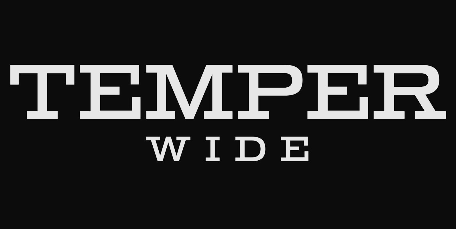
Temper Wide Font
Temper Wide was designed in 2018 by type designer Jeschke in Berlin. The font consists of many cuts from light to bold and is formally based on its predecessor, Sequel 100. A characteristic feature of the Temper Wide is the
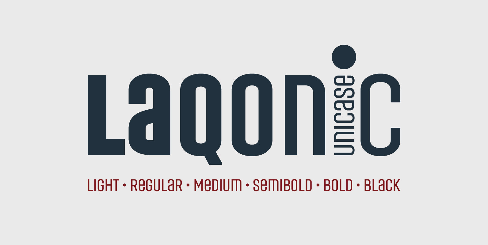
Laqonic 4F Font
Laqonic 4F is a geometric modular grotesque with a technological character, perfectly suited for signage, logos and loud headlines. Published by Sergiy TkachenkoDownload Laqonic 4F
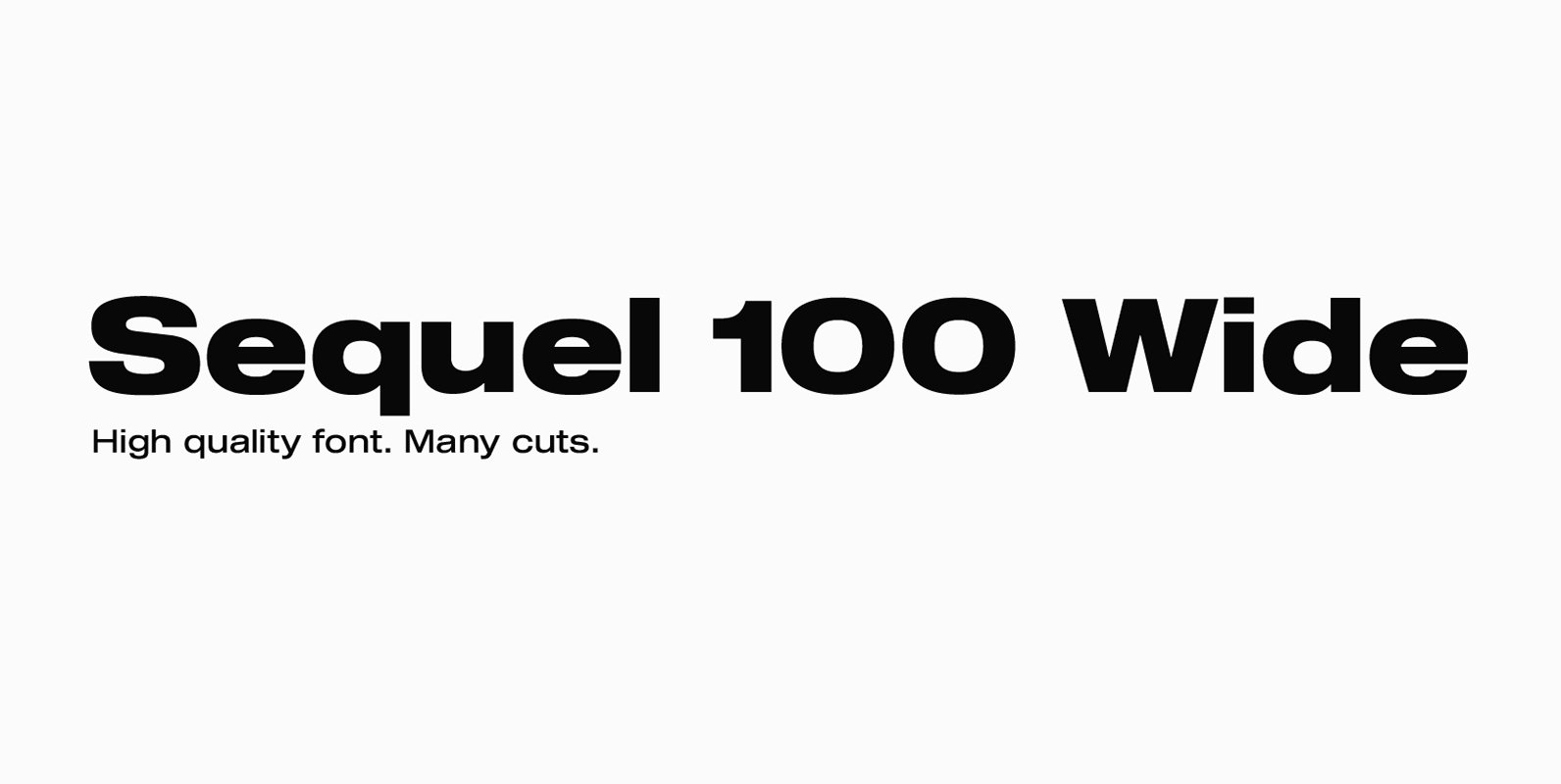
Sequel 100 Wide Font
Sequel 100 Wide was designed in 2018 by type designer Jeschke in Berlin. It is based on the sans-serif typefaces of the early 19th century. A characteristic feature of the Sequel 100 is the almost equal thickness of the vertical
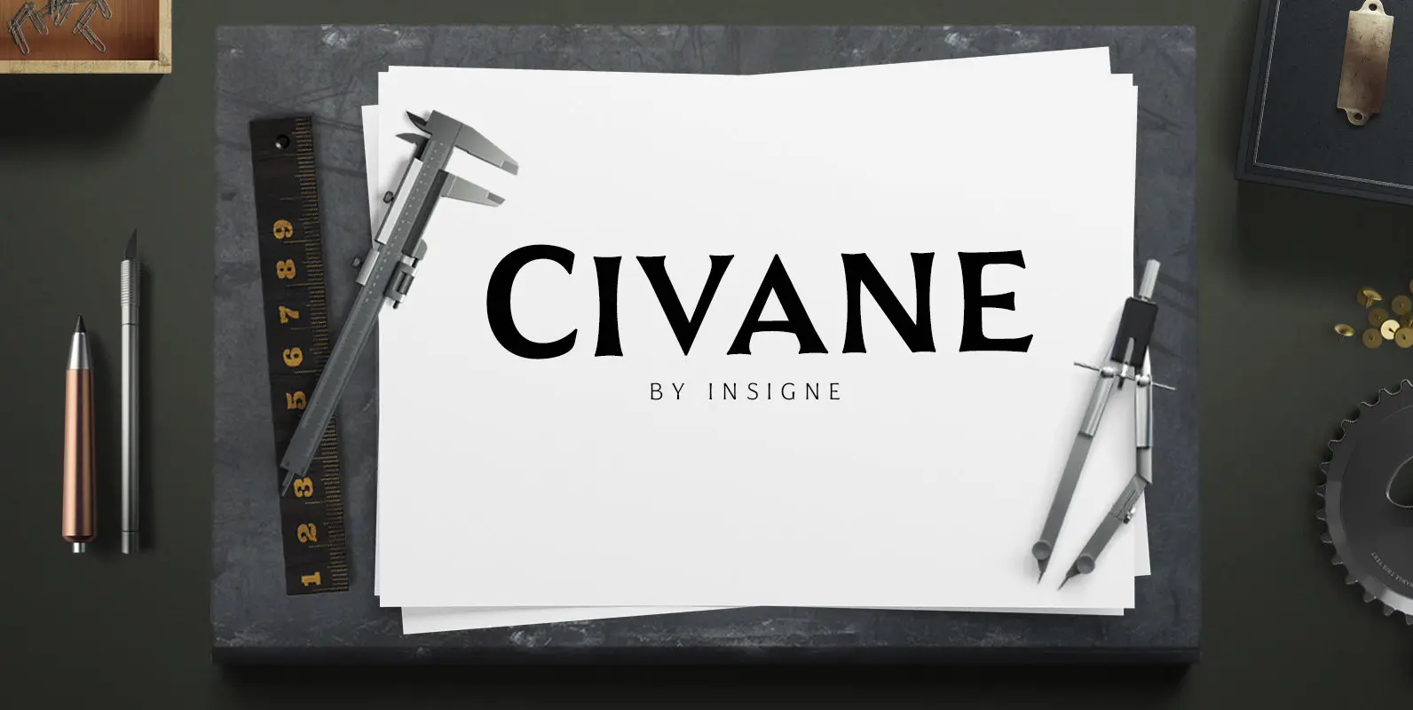
Civane Font
High atop the mountain of fonts, a new structure has been raised–one solid and strong against the challenges of time. Civane is a victorious conqueror among fonts, standing above the clutter and the mundane. Its firm structure joins effortlessly with
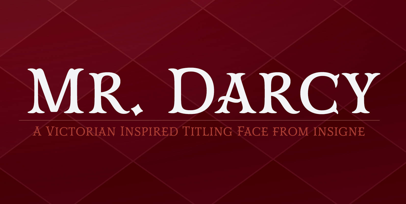
Mr Darcy Font
The elegant and very graceful Mr. Darcy is sufficiently compete with its additional characters–to be stated more precisely, over 136 defining alternates. These optional features are carefully displayed within the supplied brochure. The employ of the Mr. Darcy family moreover
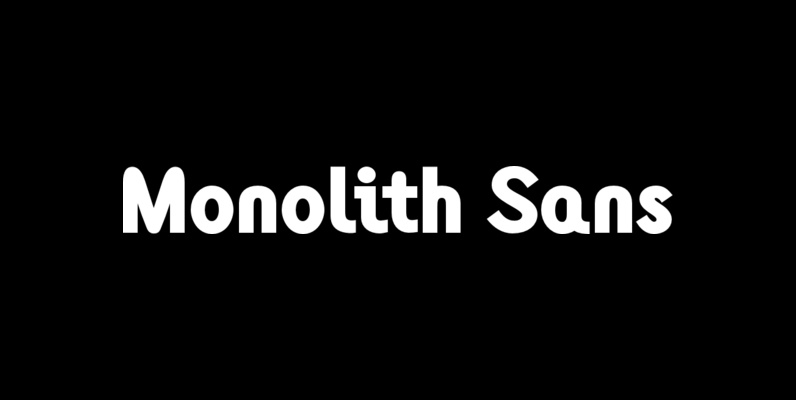
Monolith Sans Font
Designed by Tony Mayers in 2004, Monolith Sans is a unique and modern sans-serif type design. Published by ABCTypesDownload Monolith Sans
Monolith Roman Font
Designed by Tony Mayers in 2004, Monolith Roman is a unique and modern serif type design. Published by ABCTypesDownload Monolith Roman
Generation Uncial Font
Generation Gothic, has already proved to be very popular with leading magazines including Later, Computer Arts, Ultimate Golf and Spark Magazine. This collection introduces complementary Generation Headlines which seek attention and create impact; Generation Uncial (which isn’t just for mystics
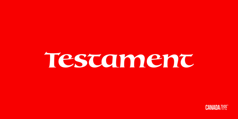
Testament Font
From the standpoint of calligraphy, a font family of capitals and uncials makes perfect sense. The Roman square capitals, the quadrata, are matched by round capitals of older Greek origin; the word “uncus” means hook-shaped like a beak or talon.
Generation Gothic Font
Generation Gothic, has already proved to be very popular with leading magazines including Later, Computer Arts, Ultimate Golf and Spark Magazine. This collection introduces complementary Generation Headlines which seek attention and create impact; Generation Uncial (which isn’t just for mystics
Generation Headline Font
Generation Gothic, has already proved to be very popular with leading magazines including Later, Computer Arts, Ultimate Golf and Spark Magazine. This collection introduces complementary Generation Headlines which seek attention and create impact; Generation Uncial (which isn’t just for mystics