Tag: multilingual
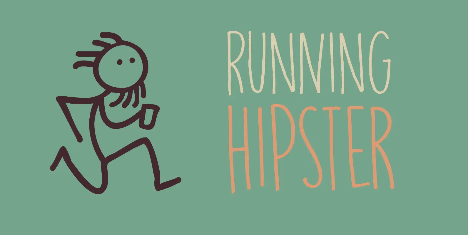
Running Hipster Font
Running Hipster is a tall, thin and all caps font with a funny name. The upper and lower case letters differ and can be mixed. You don’t necessarily have to use it to market your free range sheep woollen jumpers
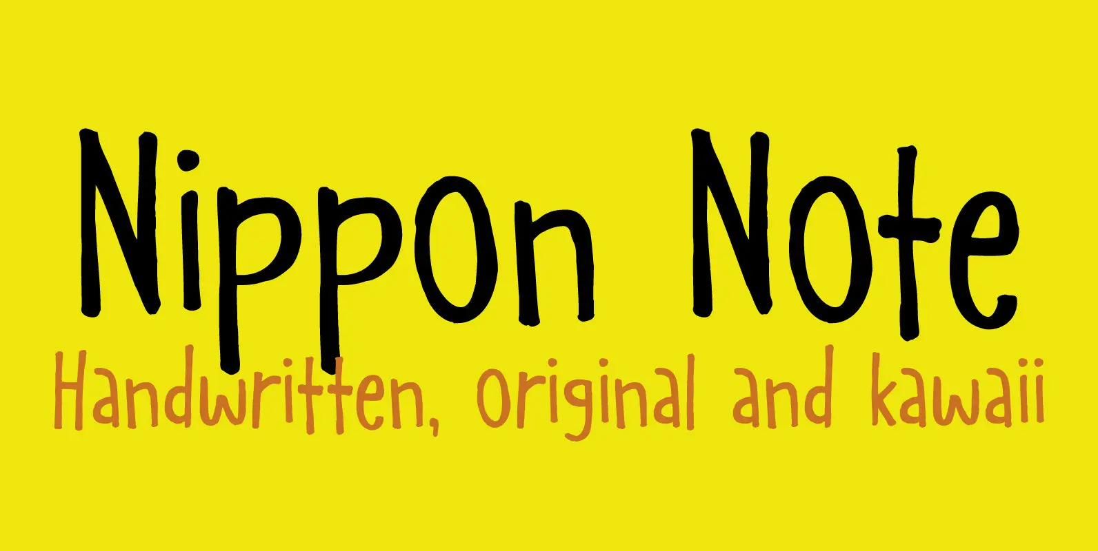
Nippon Note Font
I just returned from a short holiday in Japan. I stayed in hostels and small guesthouses and noticed a peculiar thing they all had in common: they love little notes, telling you where to go, what to do, how to
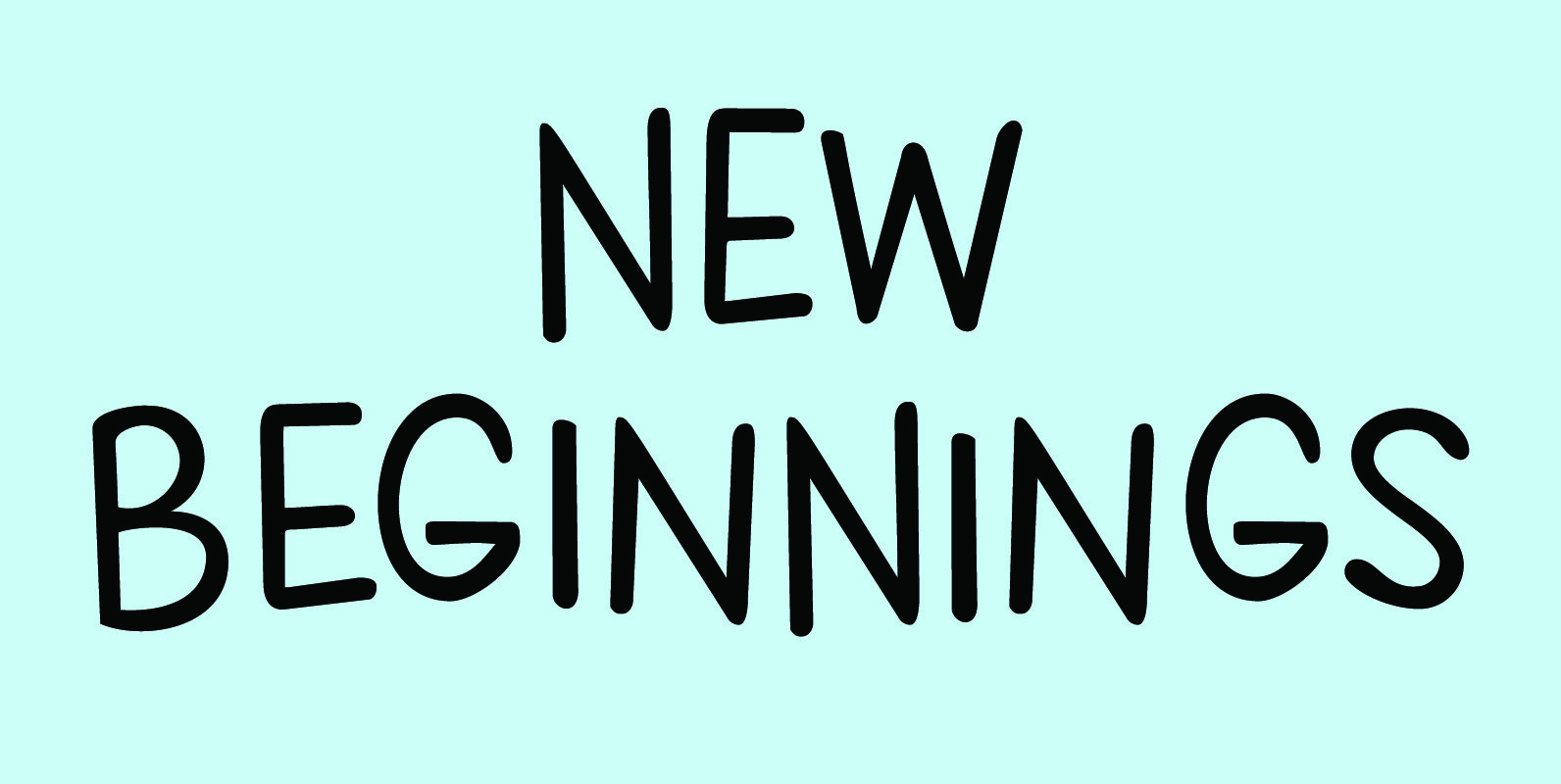
New Beginnings Font
A new year has begun, new resolutions have been made. Fresh ideas are popping up and a new life is about to begin. All in all, I figured New Beginnings was the perfect name for my first font in 2016.
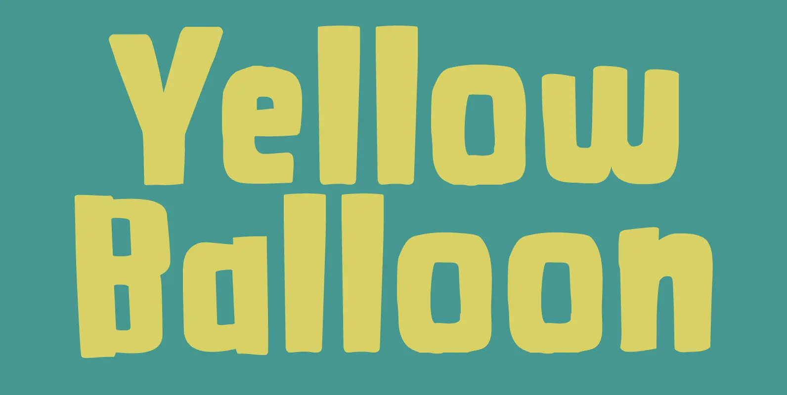
Yellow Balloon Font
Yellow Balloon is a typeface named after my two year old son’s favorite book: The Yellow Balloon by Dutch author/illustrator Charlotte Dematons. Every night before he goes to sleep, he wants to read the book and manages to find the
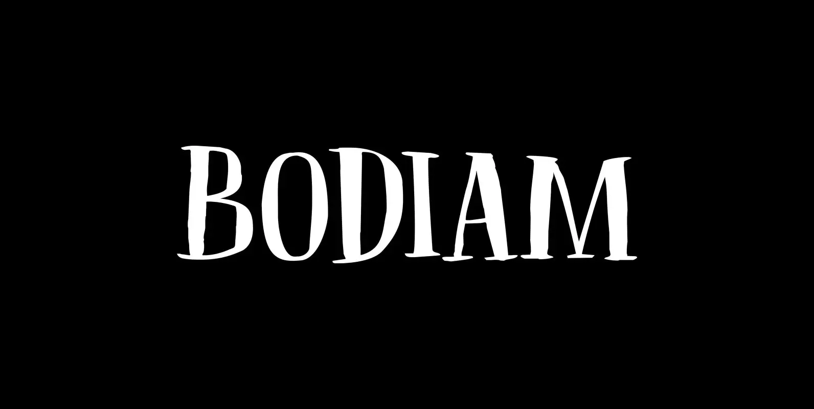
Bodiam Font
Two years ago I went on a camping holiday in England with my wife and (then two) small children. The first stop was a nature campsite near the village of Bodiam in East Sussex. My son wanted to see a
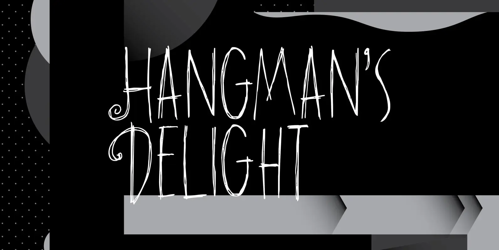
Hangman's Delight Font
Hangman’s Delight is a scratchy, all caps font. The upper case letters come with swirls and curls, but the lower case letters are unadorned. A bit of an unusual font, I admit, but it would look nice on book covers
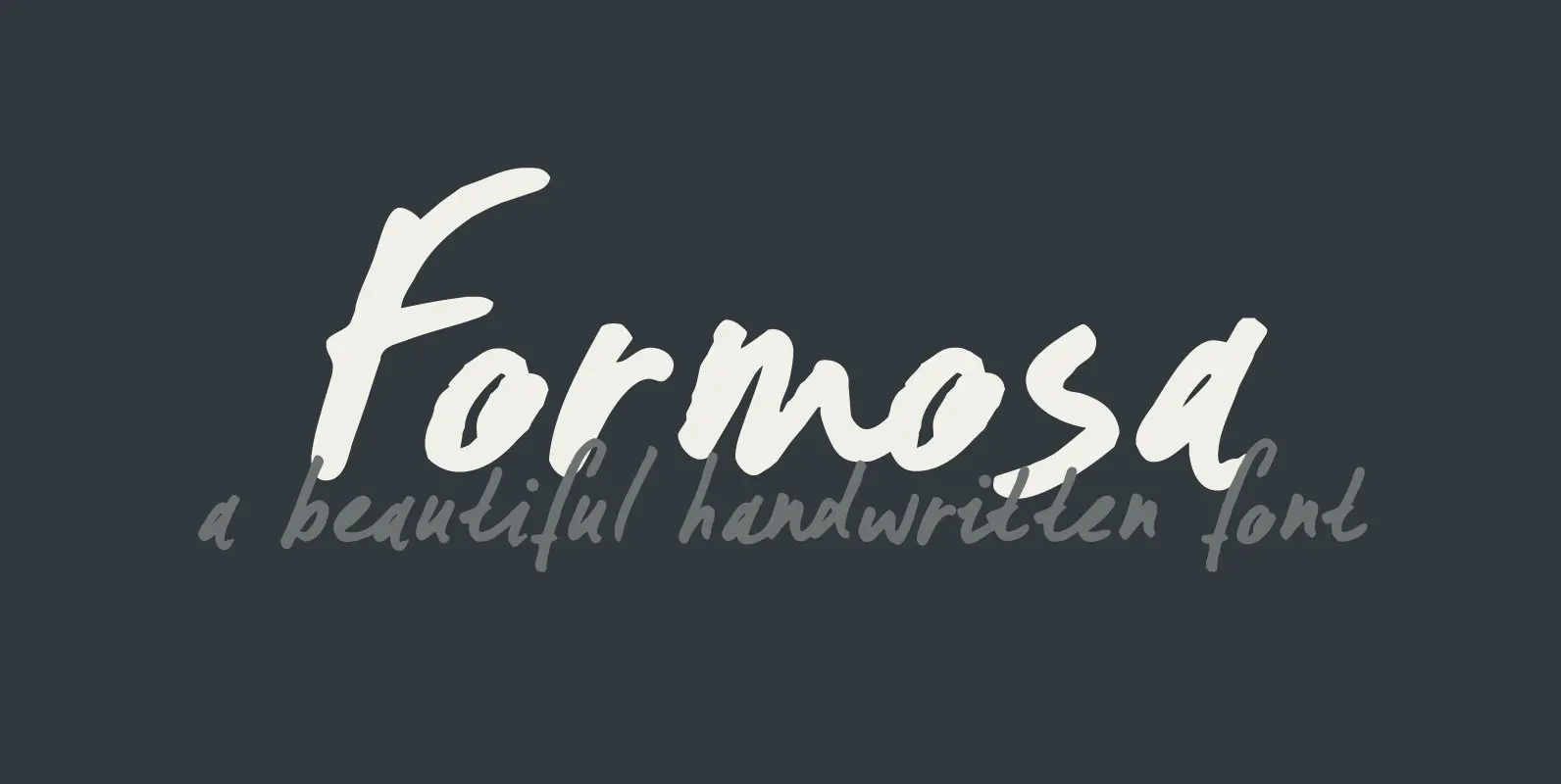
Formosa Font
Formosa is the old, colonial name for Taiwan. Formosa means beautiful in Portuguese and I think this handwritten typeface has a certain beauty itself. It comes in three styles, all of which make extensive use of ligatures, to give the
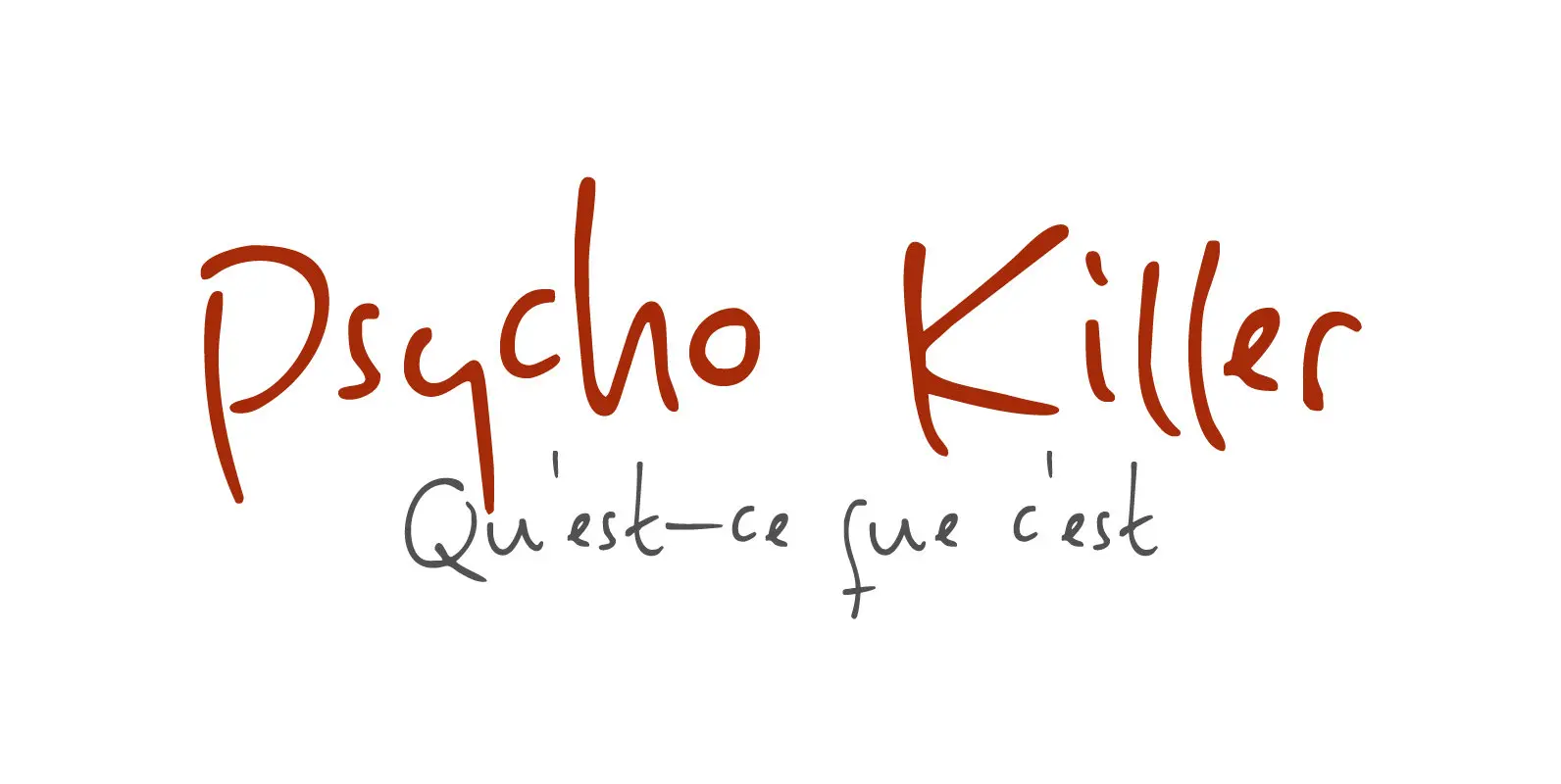
Psycho Killer Font
Psycho Killer is a song by the Talking Heads. It is also one of my favorite songs, so I figured I’d name a font after it. Psycho Killer is a script font; it contains some messy glyphs and gives the
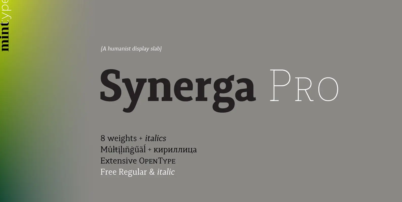
Synerga Pro Font
Synerga Pro is a contemporary slab-serif typeface with humanist features. In smaller text sizes it exposes the characteristics of its slab built, but as the size grows, lots of fine features become visible: rounded terminals, dynamic horizontal serifs, non-vertical endings
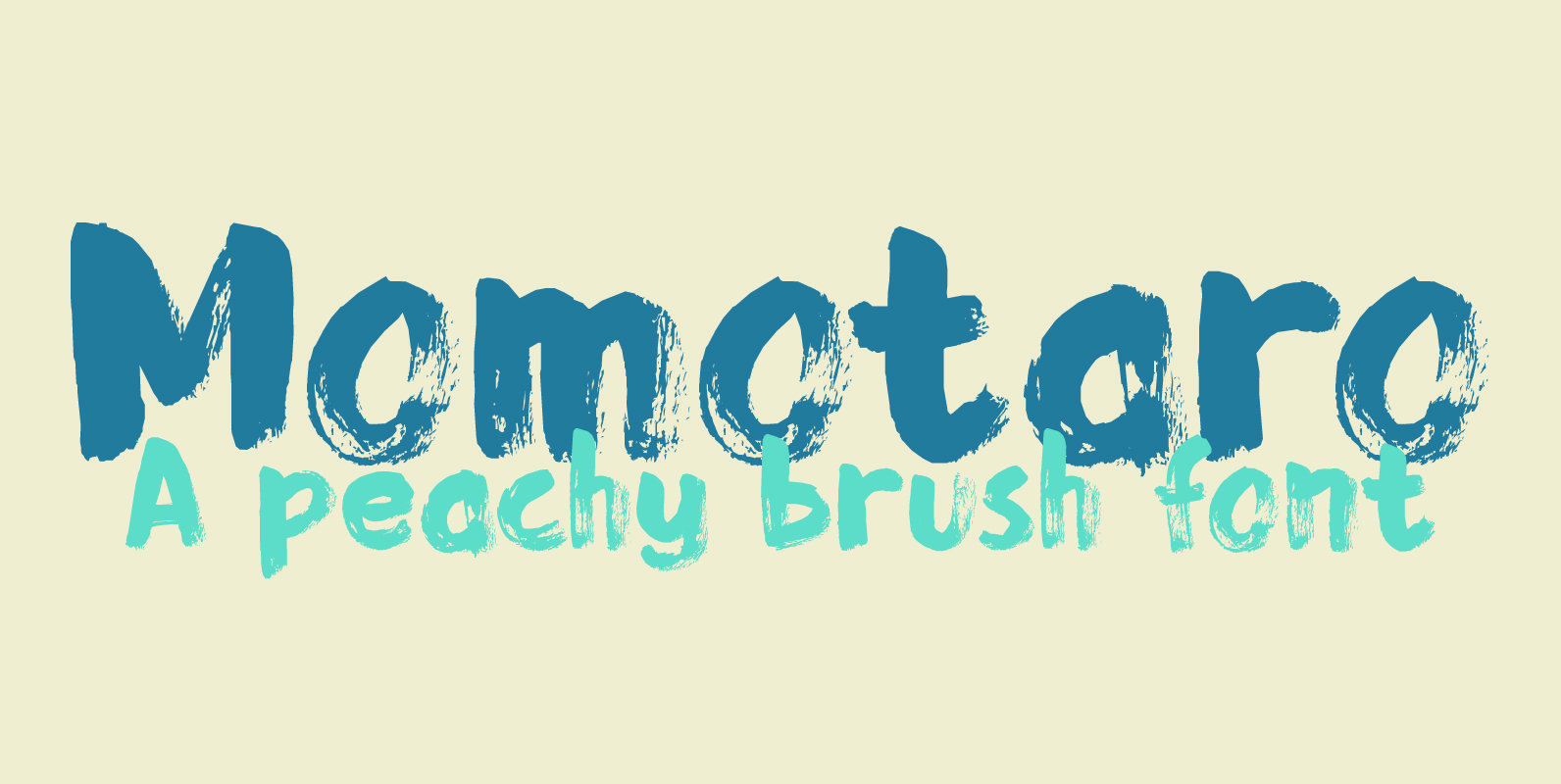
Momotaro Font
Momotarō is a Japanese legend about a boy who came to earth inside a giant peach. He was found by a childless woman and grew up to be a hero. I’m in a Japanese mood – mainly because lately I
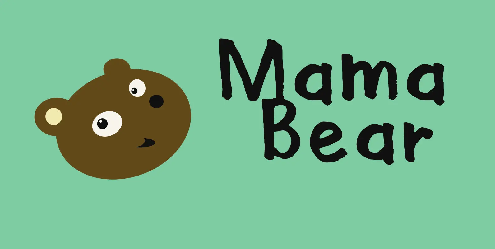
Mama Bear Font
Mama Bear is a playful, neat, children’s book typeface. It is cute and happy, very legible and comes with extensive language support, including the ‘schwa’ glyph found in a handful of languages. Mama Bear was inspired by my 16 month
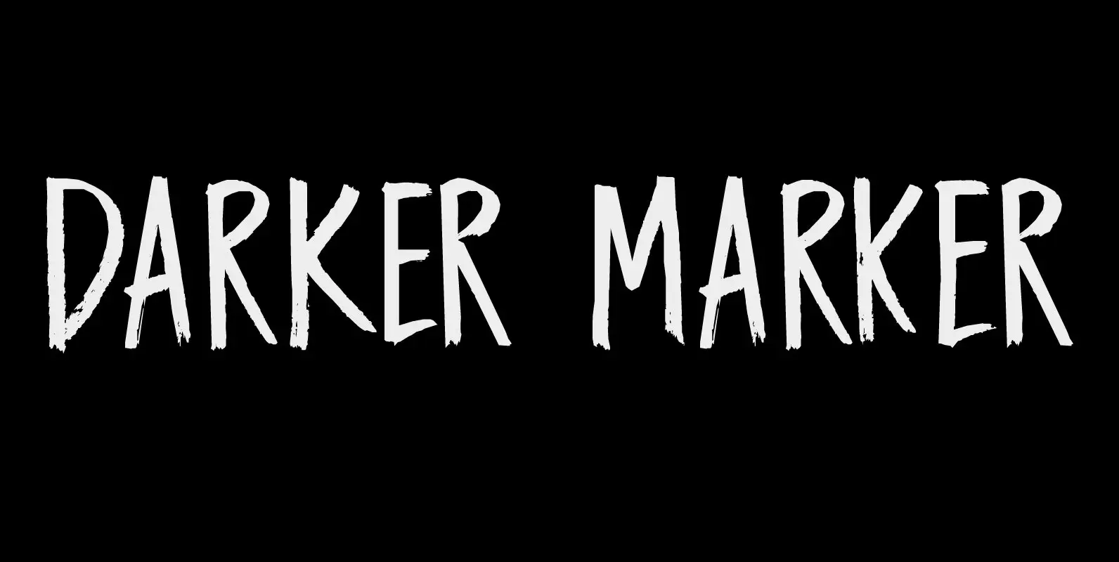
Darker Marker Font
Darker Marker is just what the name suggests: I found a very big fat marker in a local stationary store, bought it, came home and went to work on this font. Darker Marker is a very clear, very easy to
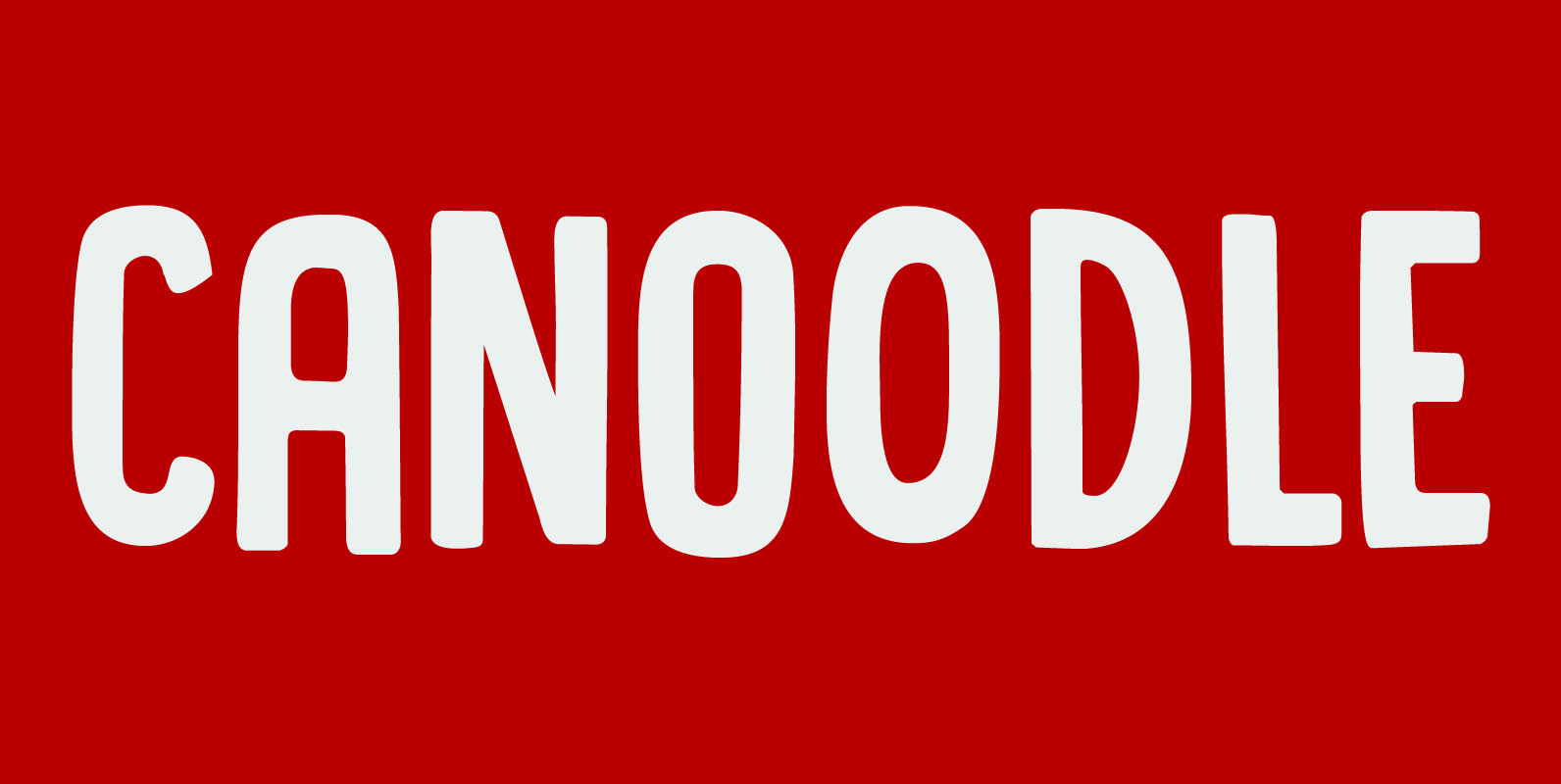
Canoodle Font
To canoodle means to hug and kiss passionately. I leave the rest to your imagination. Canoodle is also a very adorable font – some would even go as far as calling it kissable. It is an all caps typeface, but
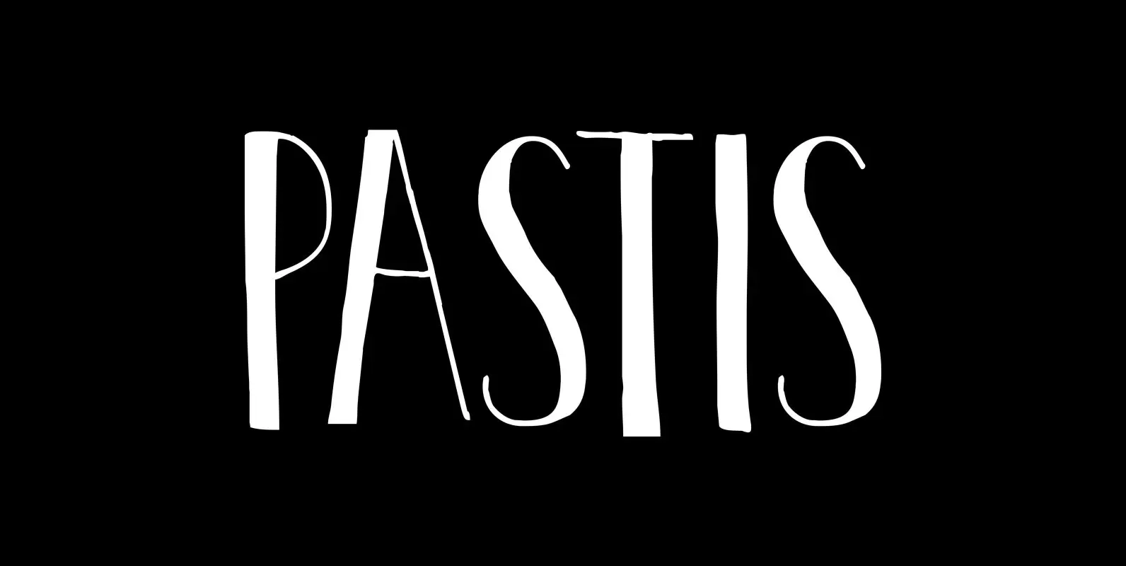
Pastis Font
Pastis is an anise-flavored drink from France – and a lovely font as well. Pastis is an all caps typeface with a different set of glyphs for upper and lower case. Use it for books, posters, ads and product packaging.
