Tag: narrow
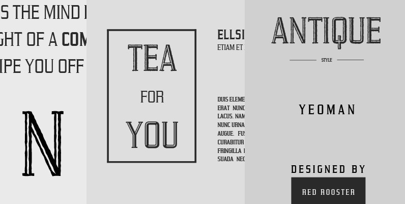
Yeoman Gothic Font
Designed by Steve Jackaman, Yeoman Gothic is a unique serif font based on an early wood type design. Yeoman Gothic is an original creation released for the Red Rooster Collection. Published by Red RoosterDownload Yeoman Gothic
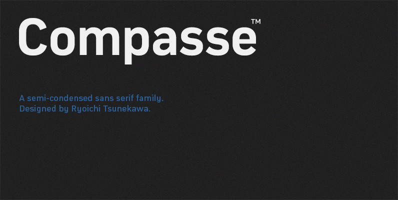
Compasse Font
Compasse is a semi-condensed sans-serif family designed by Ryoichi Tsunekawa and the whole family consists of 12 style: six weights from Thin to ExtraBold and their matching Italics. The range of styles provides flexibility for title, headline and body text.
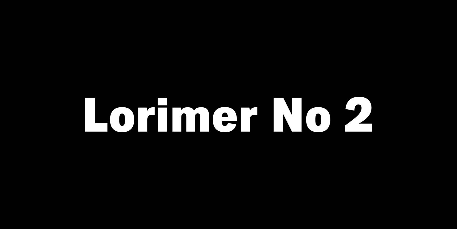
Lorimer No 2 Font
Lorimer No 2 is a sans family designed for display settings. Narrow letters, tight spacing, and a low x-height make Lorimer No. 2 better suited to display settings than fonts adjusted to work in text settings. Packaging, identities, and headlines

Tempest Font
Tempest is a small-x-height serif font for headline use. Tempest will bring a thin, sharp and classic approach to your layout, and at the same time keep an elegant and fashionable flow to the project. Published by Suomi Type FoundryDownload
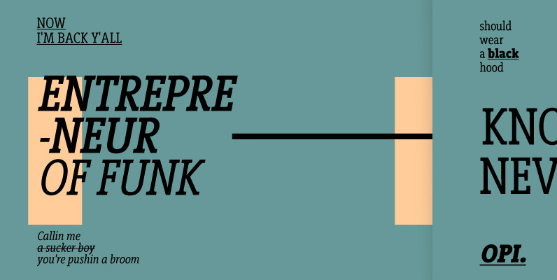
Vigor DT Condensed Font
Vigor DT Condensed is a serif font design, published by DTP Types Limited. Published by DTP Types LimitedDownload Vigor DT Condensed

Centima Font
Centima – a geometric sans serif typeface family, built in six styles. The typeface is intended for use in display sizes, but also is quite legible in text and is well suited for editorial and brand design. Centima is released
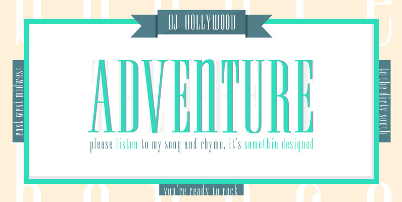
Spire Extra Light Font
Originally designed by Sol Hess for the Lanston Monotype Foundry in 1938 as a fat face, this extra light revival was designed by Ann Pomeroy in the early 90s. Spire is extra condensed with a very retro look. Published by
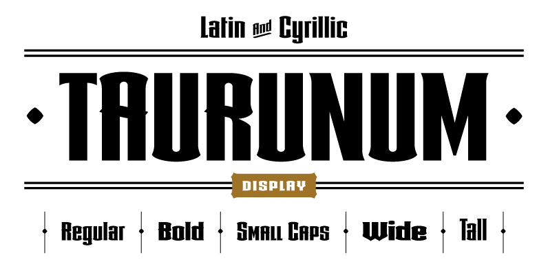
Taurunum Font
Taurunum is made with intention to be used for display design (logos, posters, etc.), and combining the weights should give best results. Published by Kostic Type FoundryDownload Taurunum
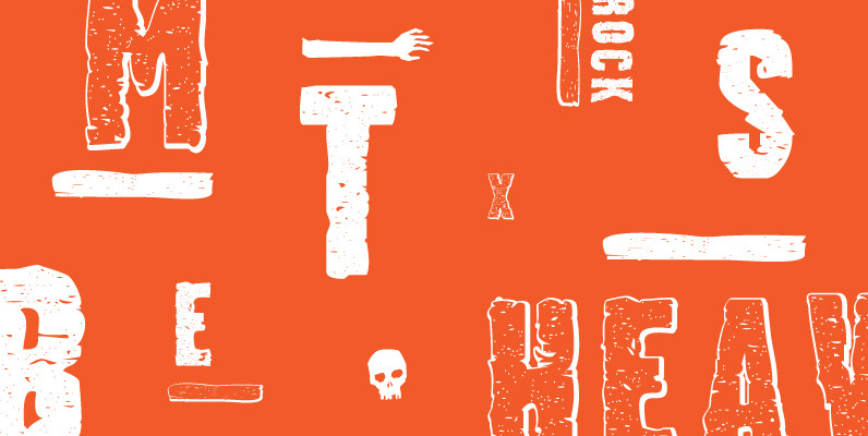
Stalker Font
Stalker is one of those necessary fonts in a designer’s toolbox: Grungy sans serif caps that are most useful for entertainment project chores. Originally made in the summer of 2003 for set and prop design of an Alliance film, Stalker
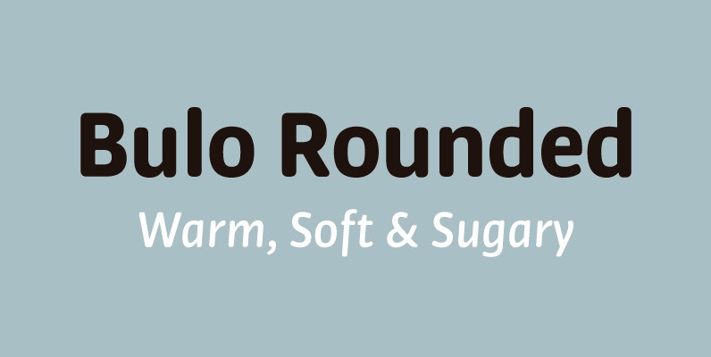
Bulo Rounded Font
Bulo Rounded is a real Rounded: not only the beginning and the end of the strokes are rounded, but also the counters and the intersections of the glyphs. The result is a smooth effect that brings a warm feeling, and
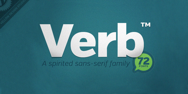
Verb Complete Series Font
Verb from Yellow Design Studio is a 72-font sans-serif superfamily that’s confident, friendly and energetic. At text sizes it’s highly legible, while at larger sizes it reveals lively shapes and personality. It has four subfamilies including Regular, Condensed, Extra Condensed,
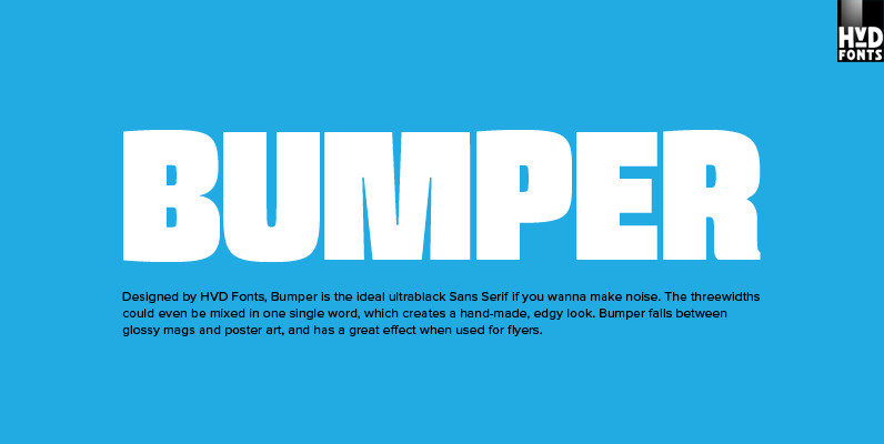
Bumper Font
Bumper is the ideal ultrablack Sans Serif if you wanna make noise. The three widths could even be mixed in one single word, which creates a hand-made, edgy look. Bumper falls between glossy mags and poster art, and has a
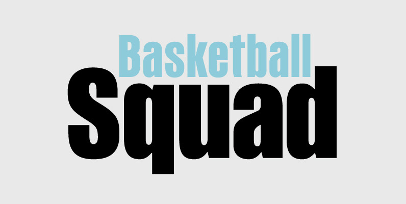
PF Fusion Sans Pro Font
Fusion Sans is an amalgamation of traditional early nineteenth-century sans-serif letters. Despite its monotone structure it retains certain features common to roman. For instance lowercase ‘a’ and the two-storey ‘g’ are normal roman characters, while most letters are designed with
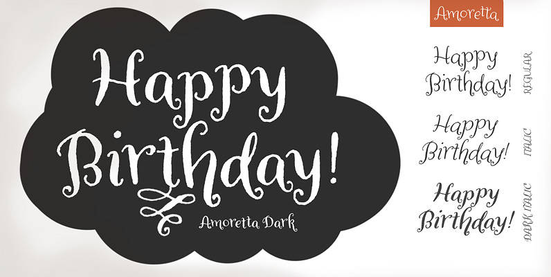
Amoretta Font
Amoretta = Little Love. Our sweet Amoretta is optimistic & bright. A charming balance of youth and sophistication, Amoretta is full of opportunity for print (Identity projects, stationery, book design, packaging design) or online applications (eBooks, games, websites). Easy to
