Tag: narrow
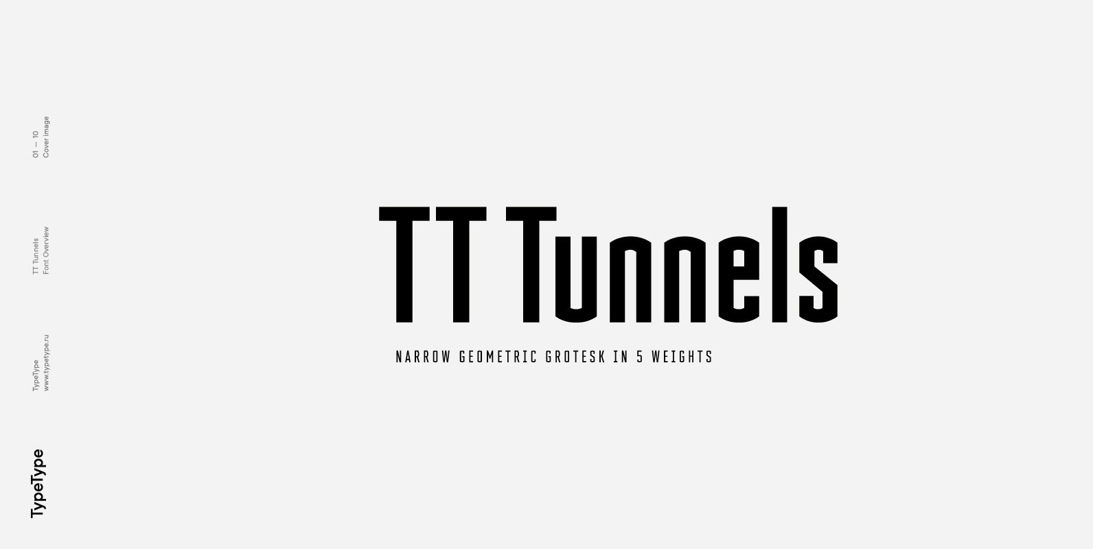
TT Tunnels Font
TT Tunnels is a glyptal modular font family with narrow proportions and a large number of pronounced visual compensators. In the basic version of the typeface, all glyphs have simple chopped shapes, created according to the usual geometric principles. In
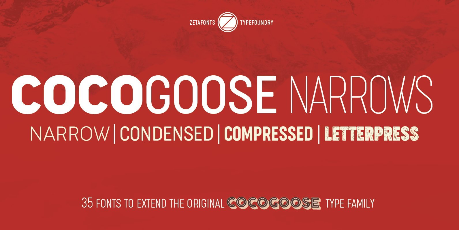
Cocogoose Narrows Font
Cocogoose is a geometric sans serif typeface designed with straight, monolinear lines and circular or square shapes. Its strong, modernist look has been softened by rounded corners and slight visual corrections that make Cocogoose not only perfect for logos and
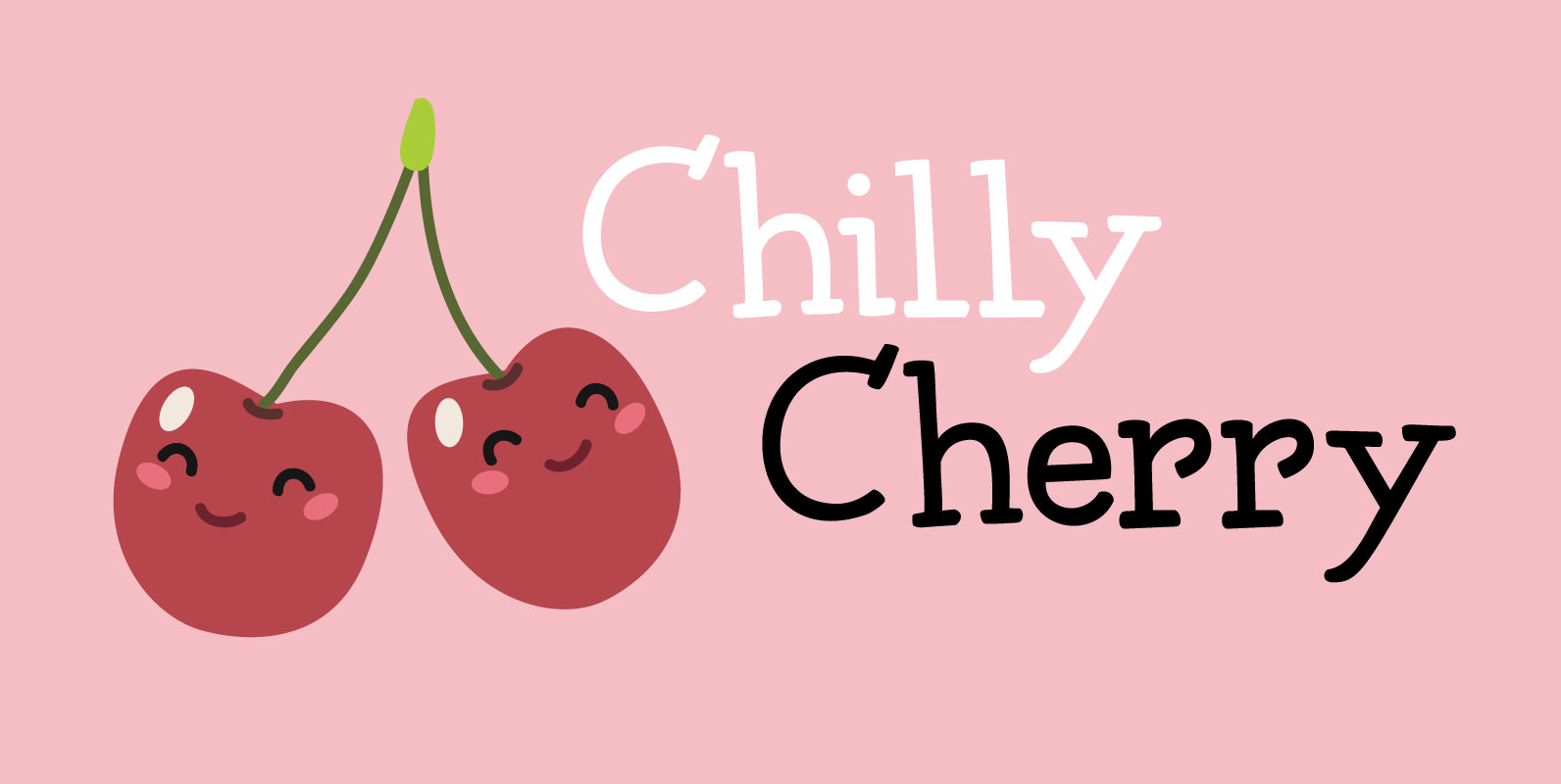
Chilly Cherry Font
It’s cherry season, so I bought 2 kilos of cherries at the local cherry farm. The cherries I bought had been in a cooling cell, so they were quite cold. As I was eating them, the name for this new
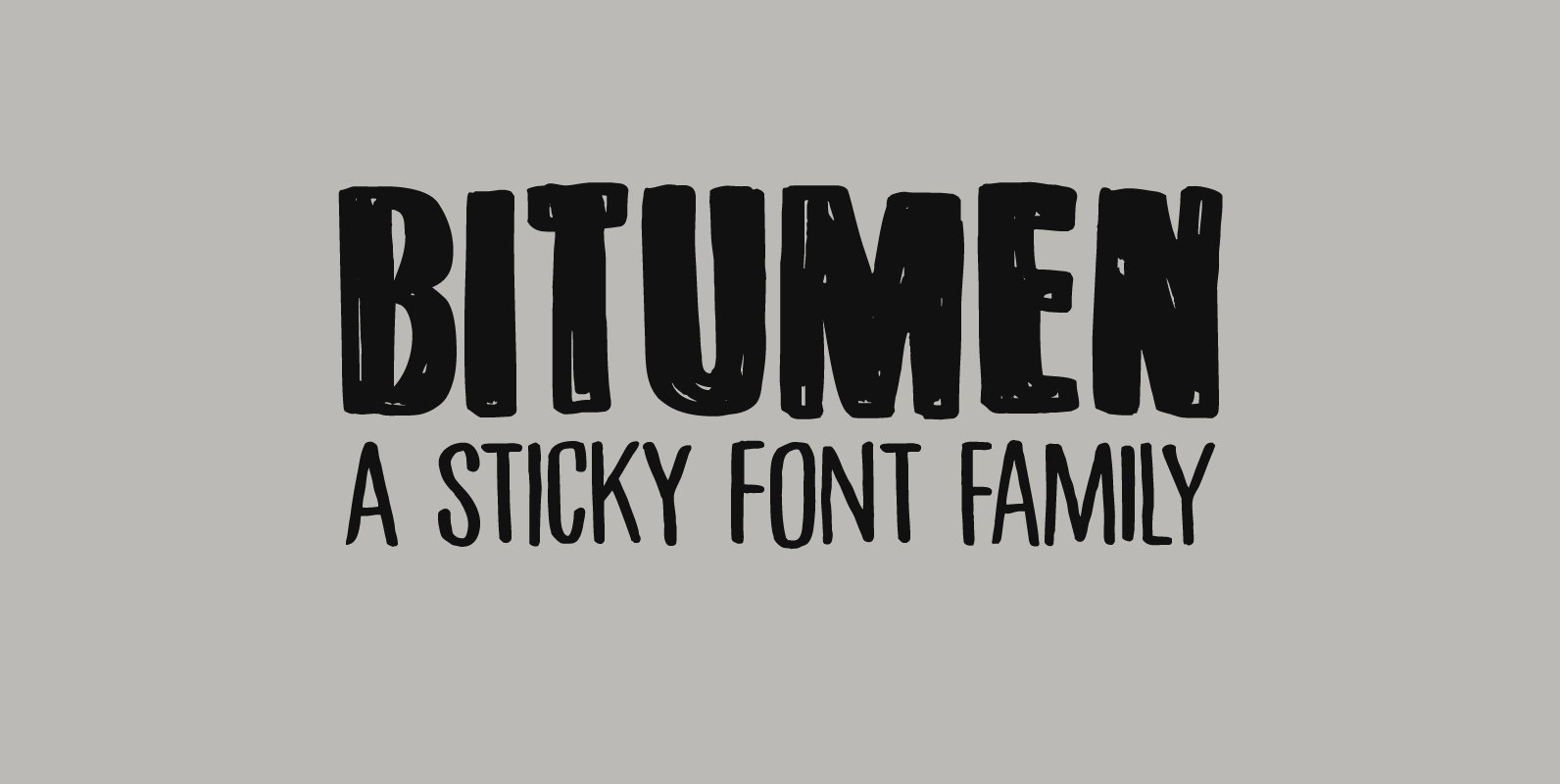
Bitumen Font
Bitumen is a sticky, black, and highly viscous liquid form of petroleum. When I created this font, it reminded me a bit of asphalt, hence the name. Bitumen is a handmade font based on Schmallfette Grotesk by Walter Haettenschweiler and
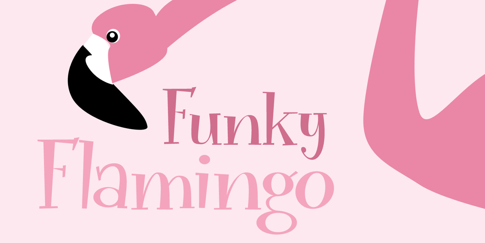
Funky Flamingo Font
I really can’t tell you why I called this font Funky Flamingo. Normally I name fonts after something I see or do, but I don’t have a special thing for flamingoes, nor do I keep them in my backyard. Funky
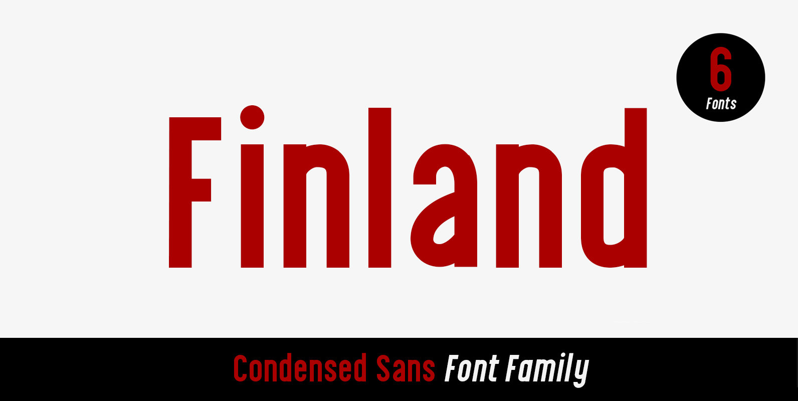
Finland Font
Finland was inspired by European type specimen books, especially Finland type standard. Delivering some glorious vibes of the solid values from the pioneers and keeping one eye on todays demands and technology, Finland is made for high professional use. Finland
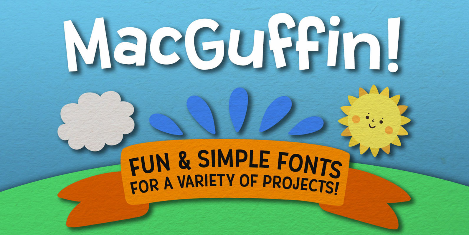
MacGuffin Font
Simple, clean, and fun — MacGuffin is like if Dr. Seuss and a highway sign got put in a blender and came out in font form. The letters are all crisp, sharp, and smooth; perfect for any crafting project, logo,
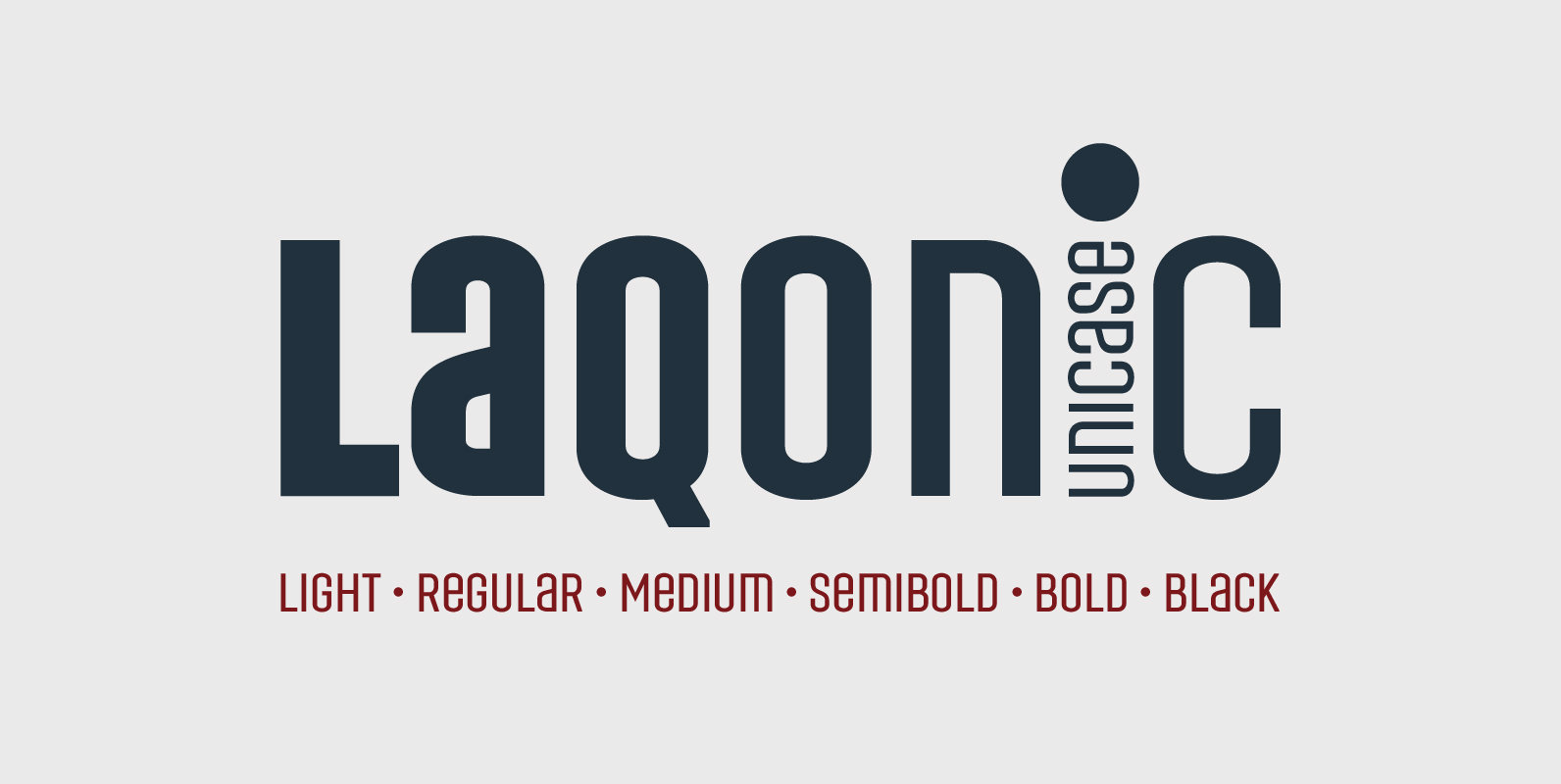
Laqonic 4F Font
Laqonic 4F is a geometric modular grotesque with a technological character, perfectly suited for signage, logos and loud headlines. Published by Sergiy TkachenkoDownload Laqonic 4F
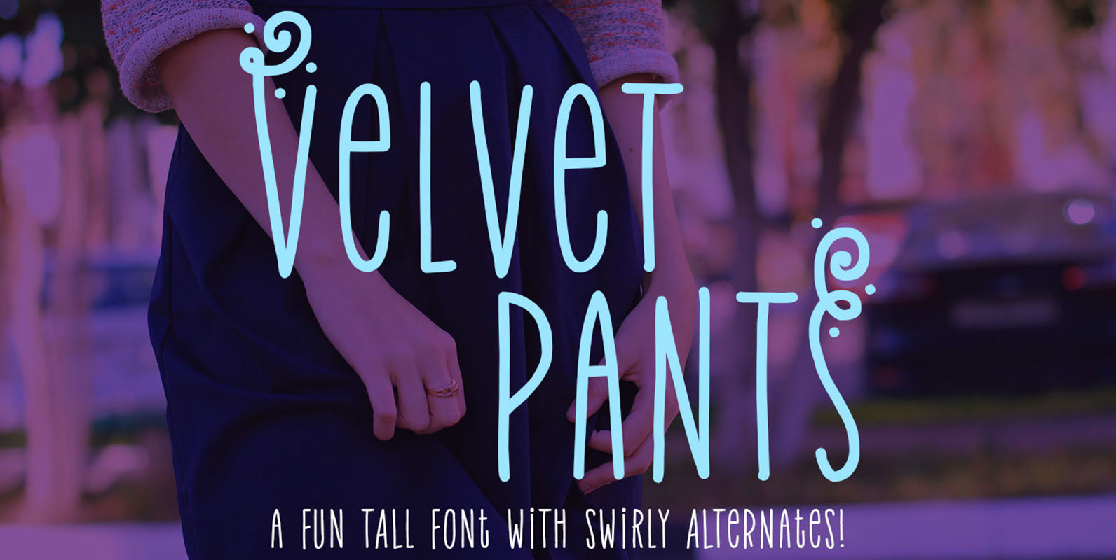
Velvet Pants Font
all. Narrow. Spaced wide. Sounds like a pair of fashionable trousers to me! Named after a song by the band Propellerheads, this font is fun for crafts, print, branding, and more! Not only are there standard letters, but the font
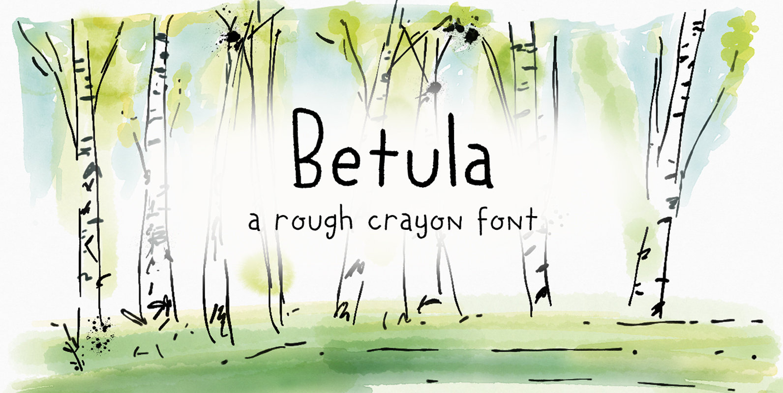
Betula Font
Betula is the scientific name for Birch – I probably don’t have to explain that birches are my favourite trees! They always look like the ghosts of the forest with their papery white bark and dark blotches. Betula is a
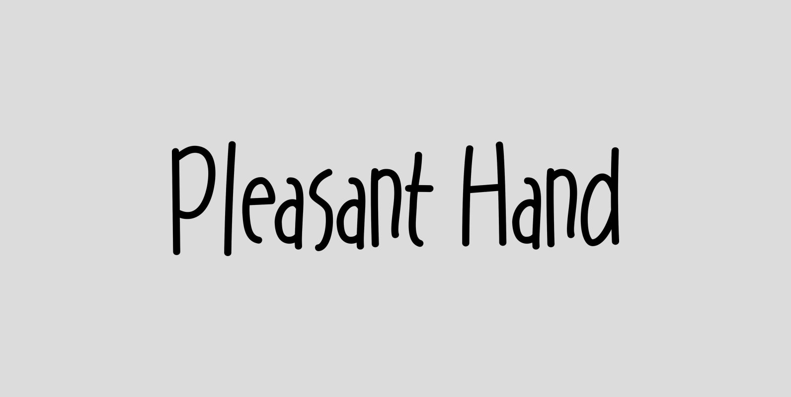
Pleasant Hand Font
The Pleasant Hand family, Light, Medium and Bold is designed as condensed hand-lettered fonts. The family is casual and informal and is ideal for use in conveying these qualities. Published by Gerald GalloDownload Pleasant Hand
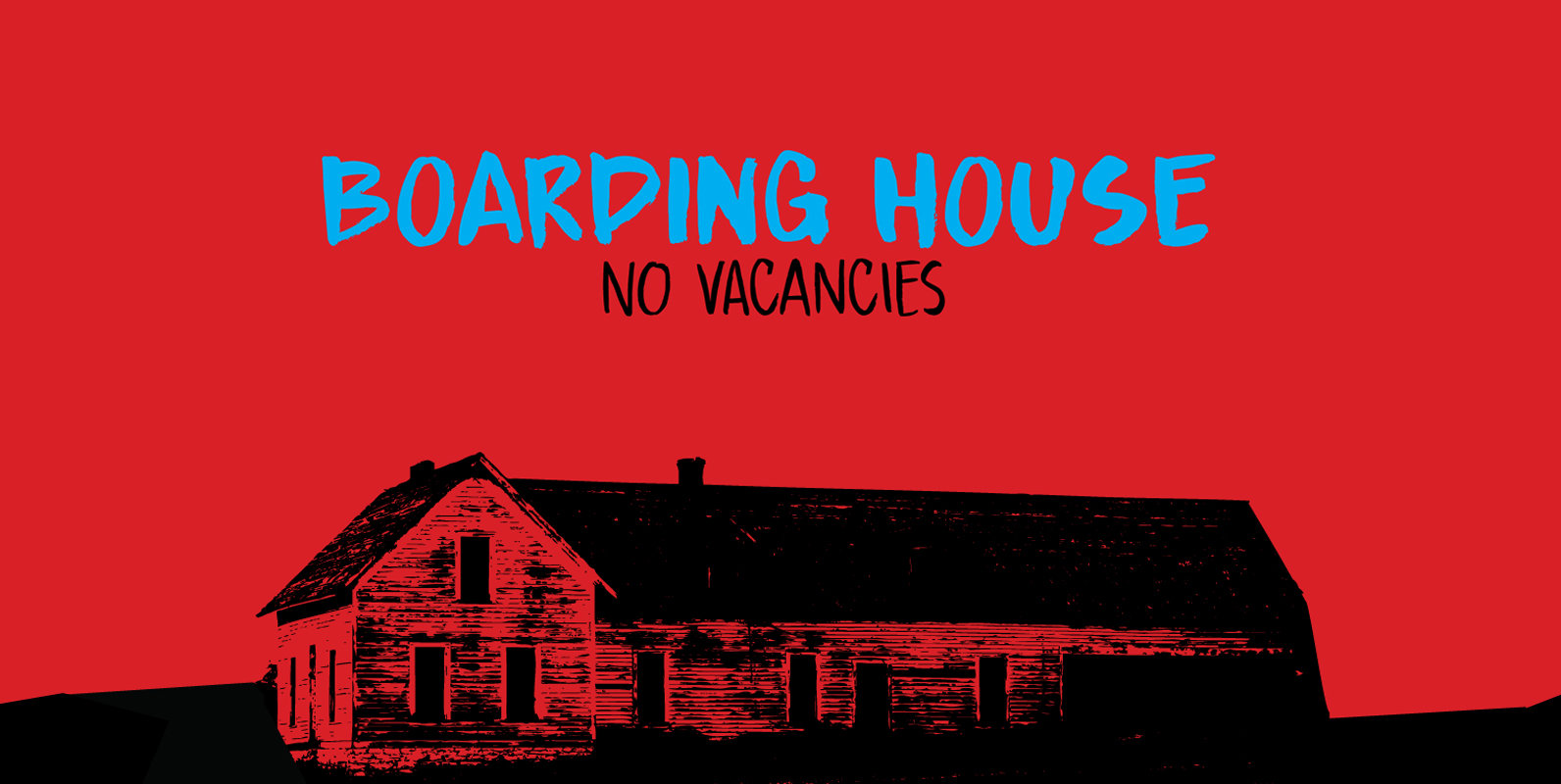
Boarding House Font
I have never stayed at a boarding house myself, but I’ve heard some horror stories. When I have finished painting the three fonts (using Chinese ink and a small brush), I didn’t have to think long for a name. Boarding

Vin Slab Pro Font
Vin (translated from Ukrainian as “he”) is a superfamily consisting of three distinctly masculine typefaces with pronounced vertical stems and rounded corners. All three typefaces feature very large x-height for even more expression and assertiveness. Vin Slab Pro is a
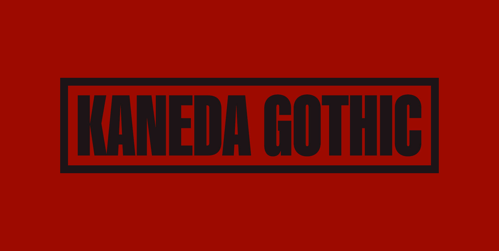
Kaneda Gothic Font
Kaneda Gothic is a whole new basic gothic. Philosophically, Kaneda Gothic is the one of the niche answers in the interspace between these antinomies. Image of near-future and giant metropolis in 80s, 90s vs our real life in the 2010s,20s.
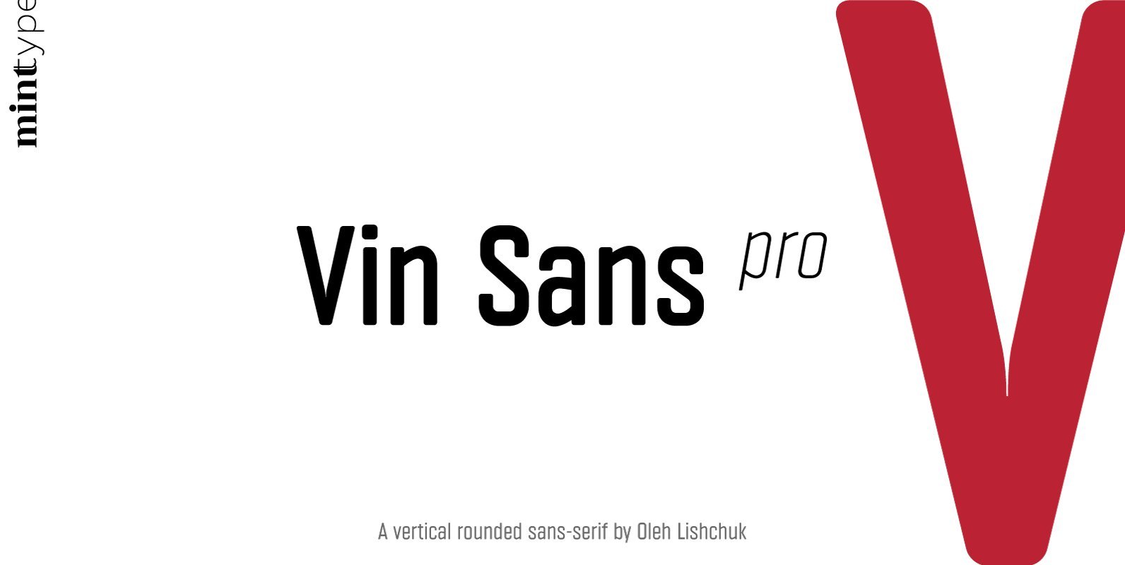
Vin Sans Pro Font
Vin (translated from Ukrainian as “he”) is a superfamily consisting of three distinctly masculine typefaces with pronounced vertical stems and rounded corners. All three typefaces feature very large x-height for even more expression and assertiveness. Vin Sans Pro is a
