Tag: narrow

Tusker Grotesk Font
Tusker Grotesk is a headline typeface designed for robust and high-impact use. The initial inspiration for Tusker came from postwar typefaces like Haettenschweiler, Impact and Helvetica Inserat which use very high x-heights. Other influences in the condensed end of the Tusker family are
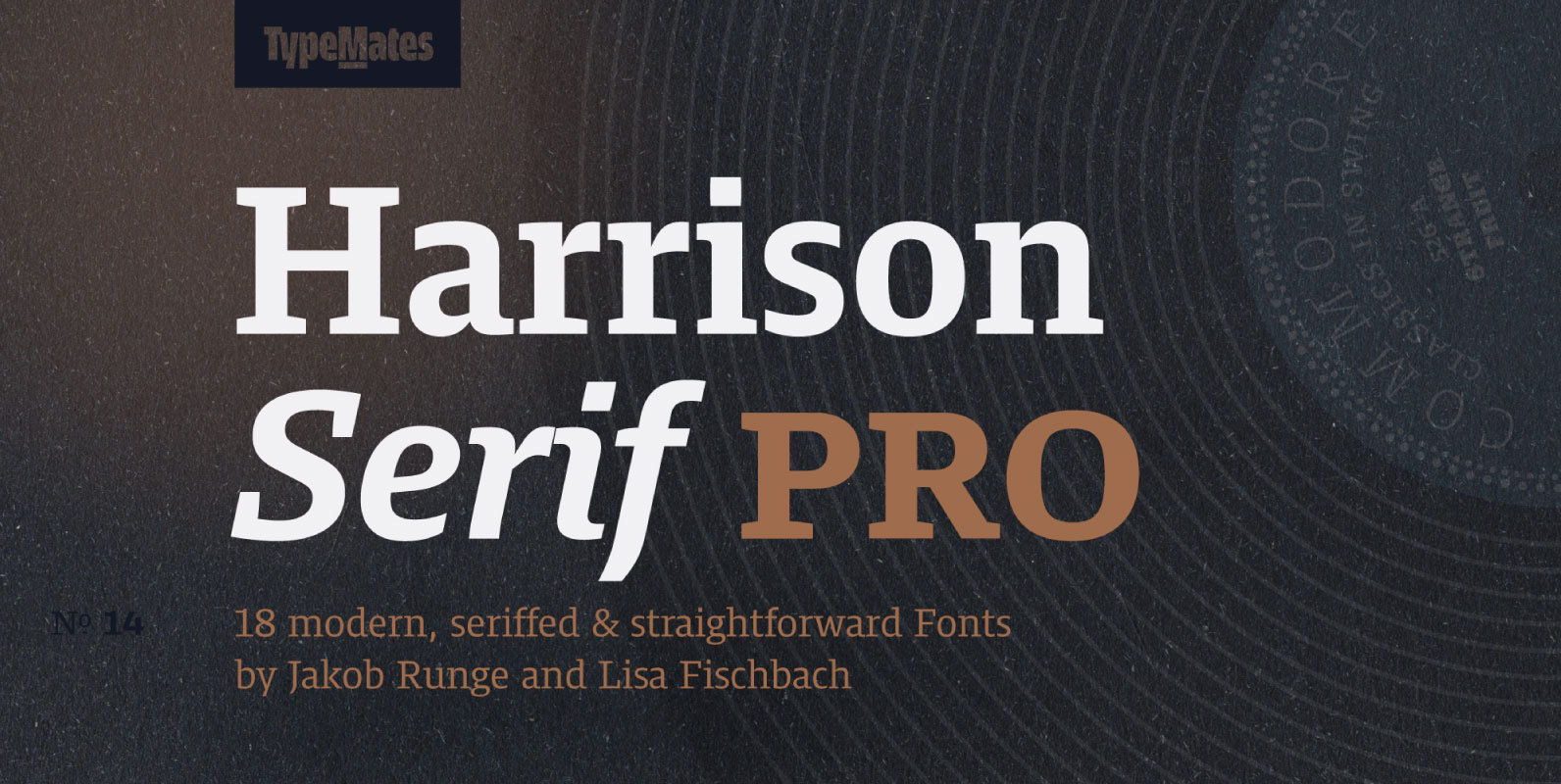
Harrison Serif Pro Font
Harrison Serif Pro is a sturdy yet contrasted slab serif that combines a rational and efficient approach with a warm voice. A typeface of nuances, the slightly carved and occasionally extended serifs evoke the friendly side of Harrison Serif and
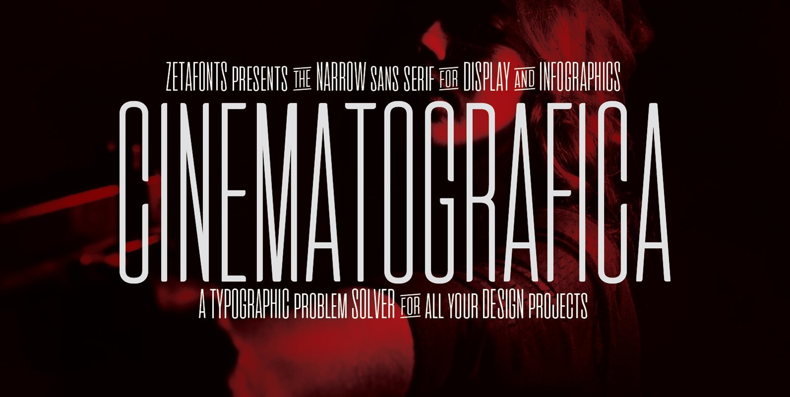
Cinematografica Font
Cinematografica is an Ultra Condensed Small Caps typeface created by Francesco Canovaro, developing his previous Aliens & Cows Typeface and used in the advertising campaign for Lucca Comics 2017 Festival. The family features seven weights from thin to heavy with
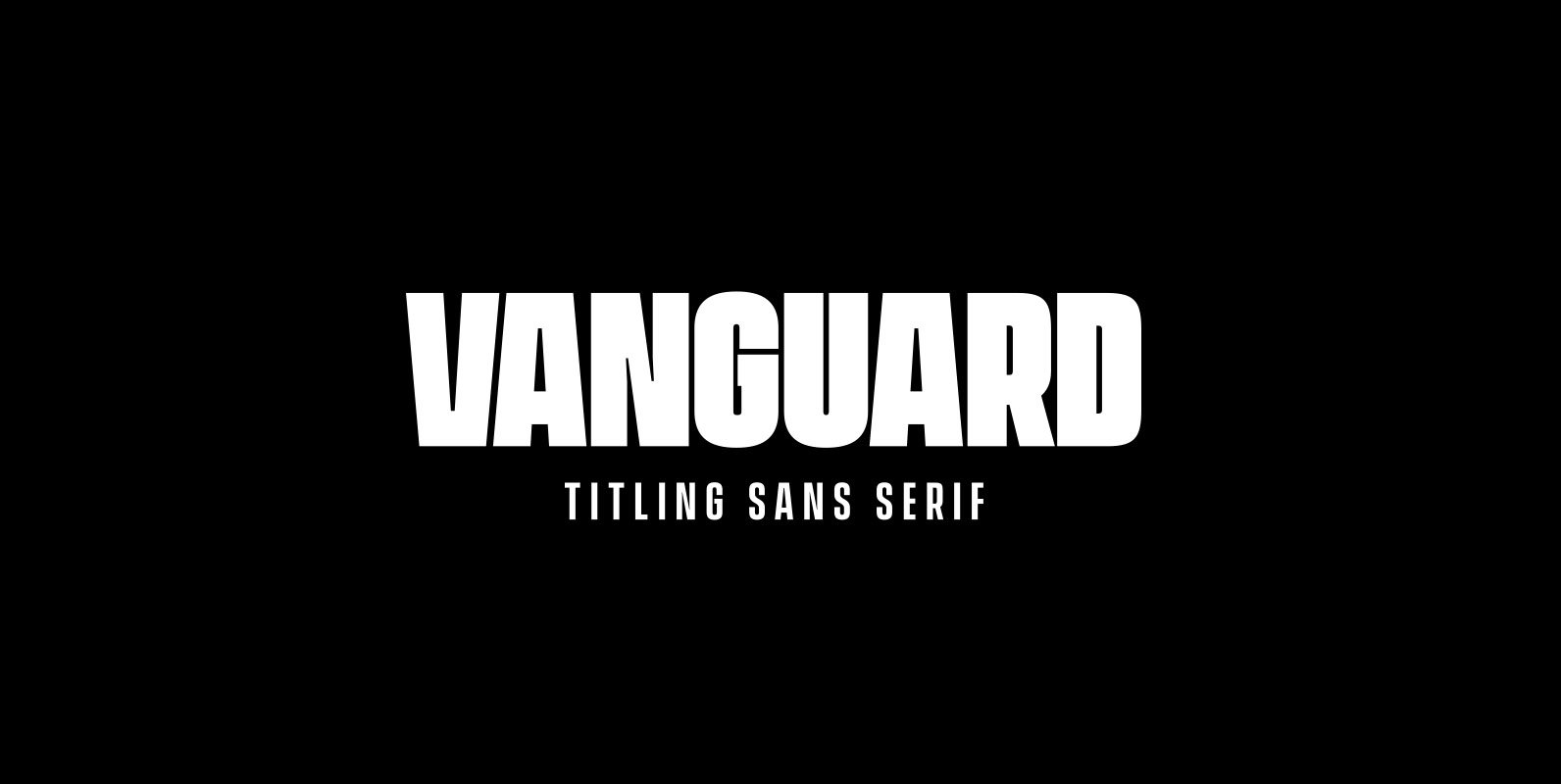
Vanguard CF Font
VANGUARD CF is a powerful and elegant display typeface, constructed to maximize horizontal space. Built from sketches originally drawn in 2012, Vanguard’s eight weights span an elegant Thin to an arresting Heavy, with accompanying obliques. As with its sibling Integral
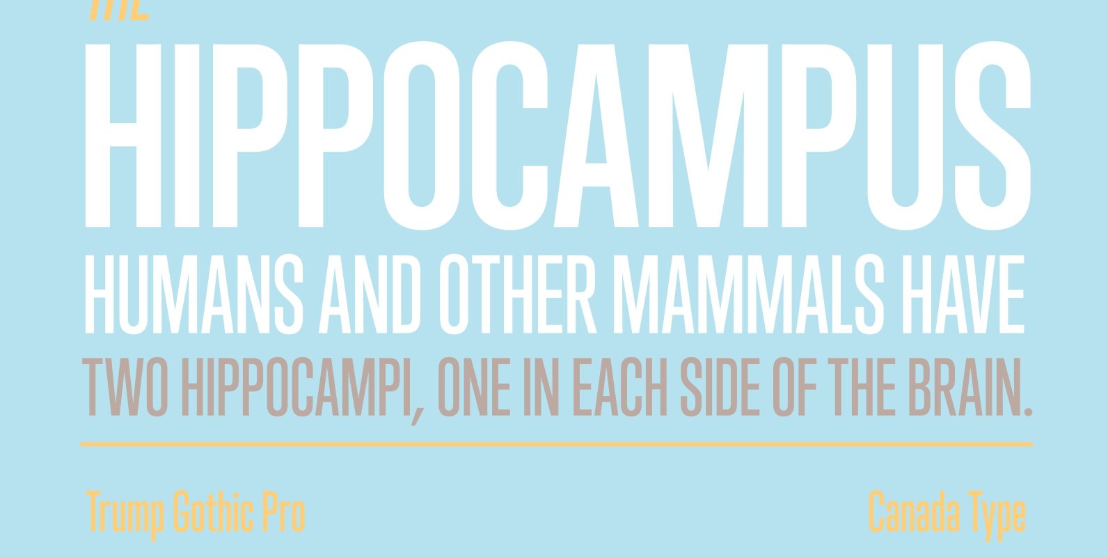
Trump Gothic Pro Font
Trump Gothic is a reconception of ideas from Georg Trump's seminal 1955 Signum typeface and its later reworking (Kamene) by Czech designer Stanislav Marso. Originally cobbled together for a variety of film projects in the late 1990s and early 2000s,
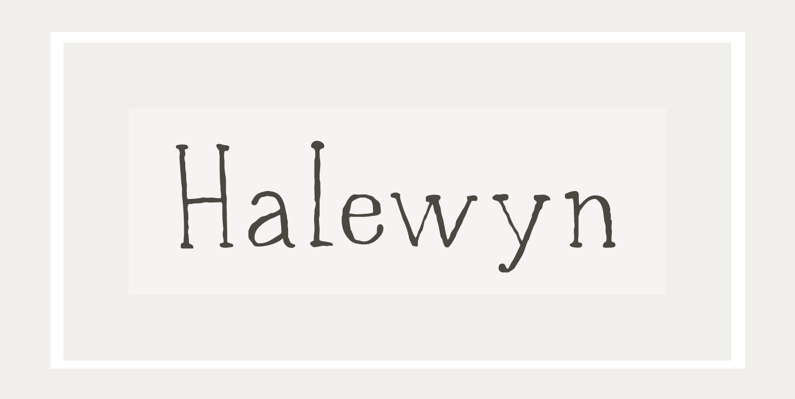
Halewyn Font
Heer Halewijn (The Song of Lord Halewijn) is a 13th century Dutch folk tale which survives in folk ballad. The story tells of a man called Halewijn, who lives in the woods and who lures pretty women with his songs
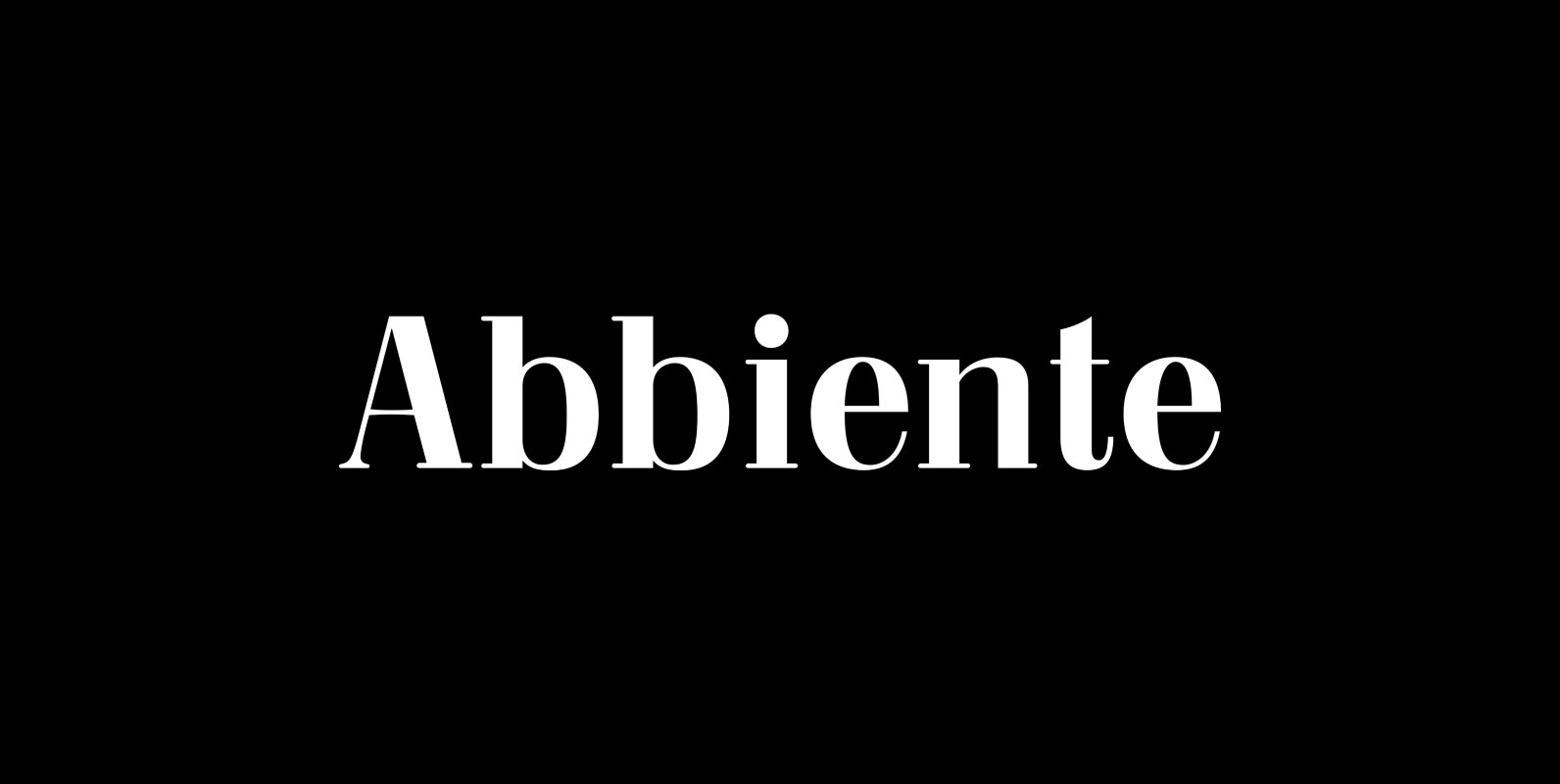
Abbiente Font
Abbiente is a neoclassical Didot style font. Published by FontMesa LLCDownload Abbiente
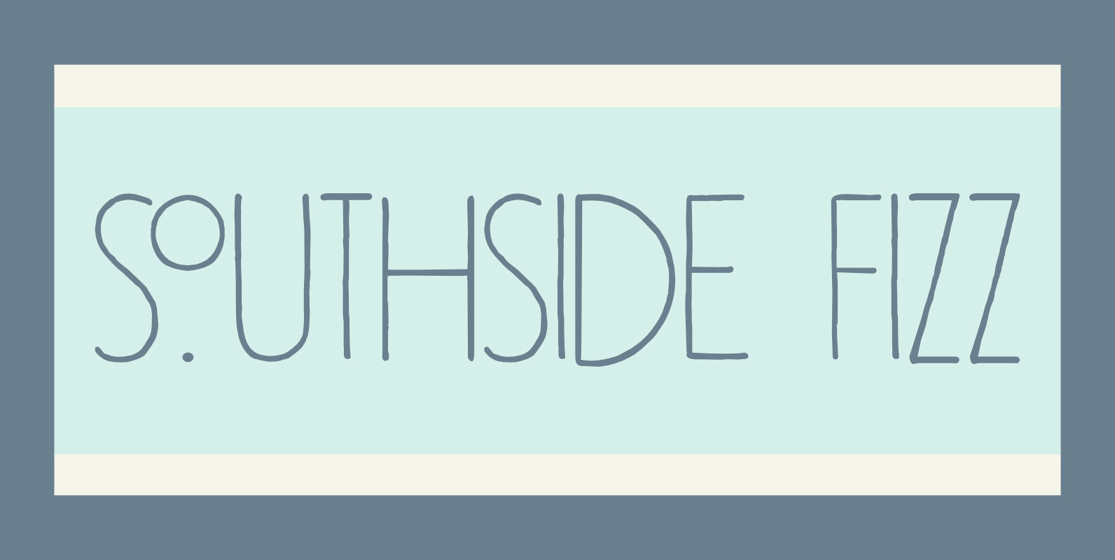
Southside Fizz Font
Southside Fizz is a cocktail (made with gin, lime, mint and soda). Southside Fizz font was based on a single word in a 1930’s advertisement and my Palembang font. I did not have that many glyphs to work with, so
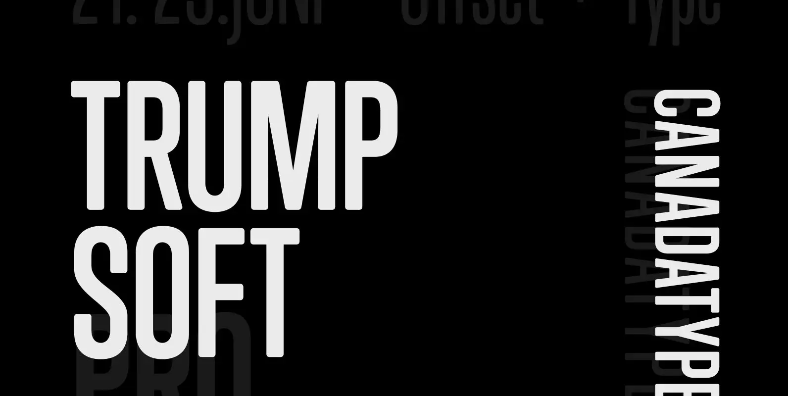
Trump Soft Pro Font
Trump Soft Pro is the softer, round-cornered version of Trump Gothic Pro, the popular condensed gothic seen on films, magazines, book covers and fashion brands all over the globe. Trump Soft offers a friendlier grade of the same economic functionality,
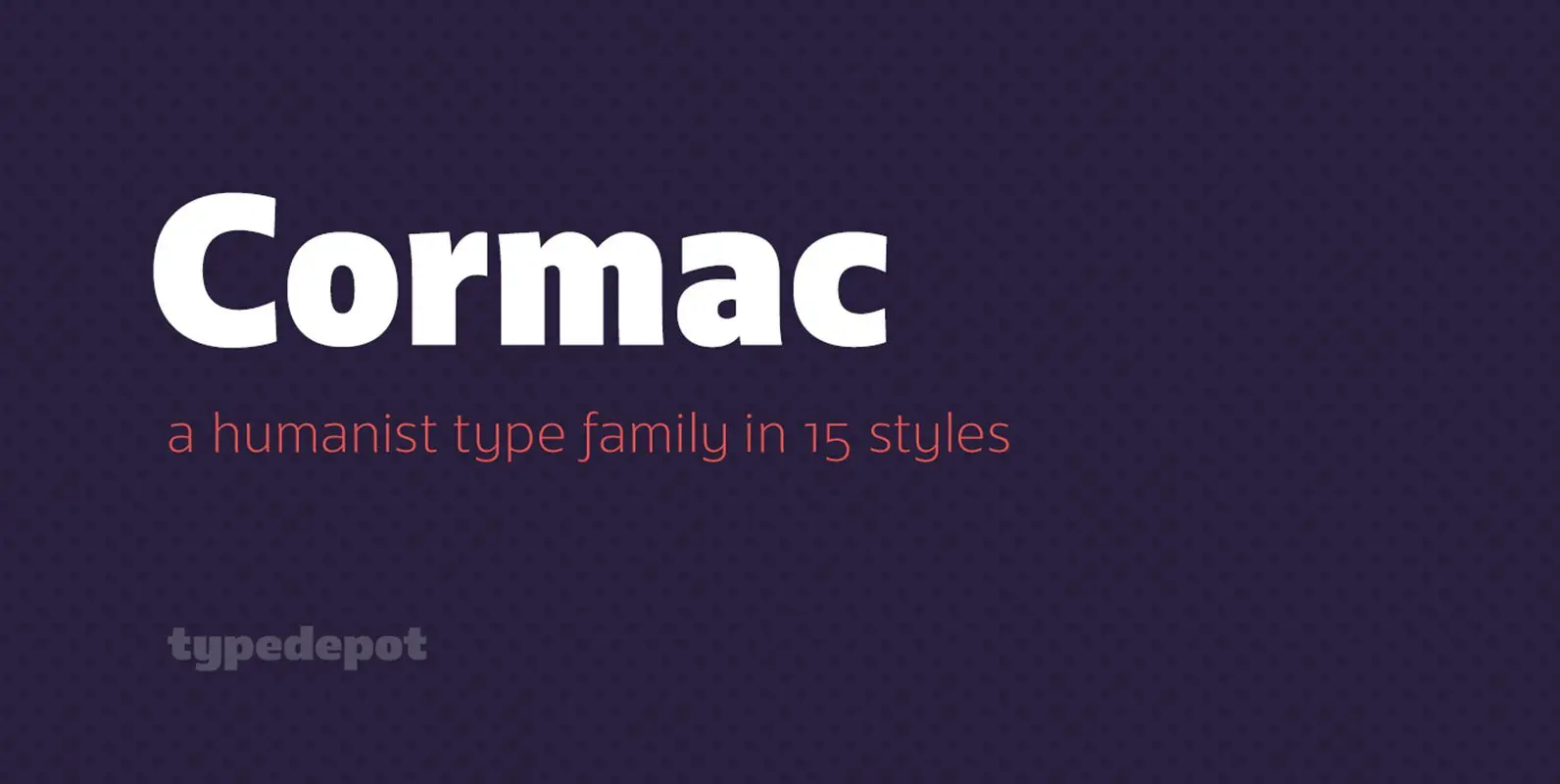
Cormac Font
Cormac is a humanist typeface characterized with it’s large x-height and slightly flared stems. The word that best describes our ideas in the beginning of the project is “simple” – the idea behind it was to strip the letter forms
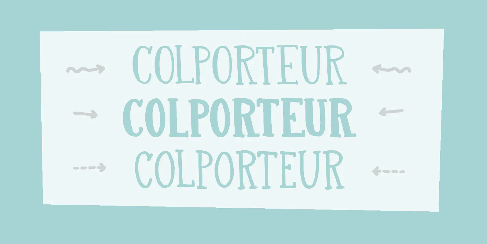
Colporteur Font
A Colporteur is a peddler of books, newspapers, and similar literature. When I was young, we often got visits from colporteurs – mostly they wanted to sell us a very expensive encyclopaedia. I haven’t seen them for a while –
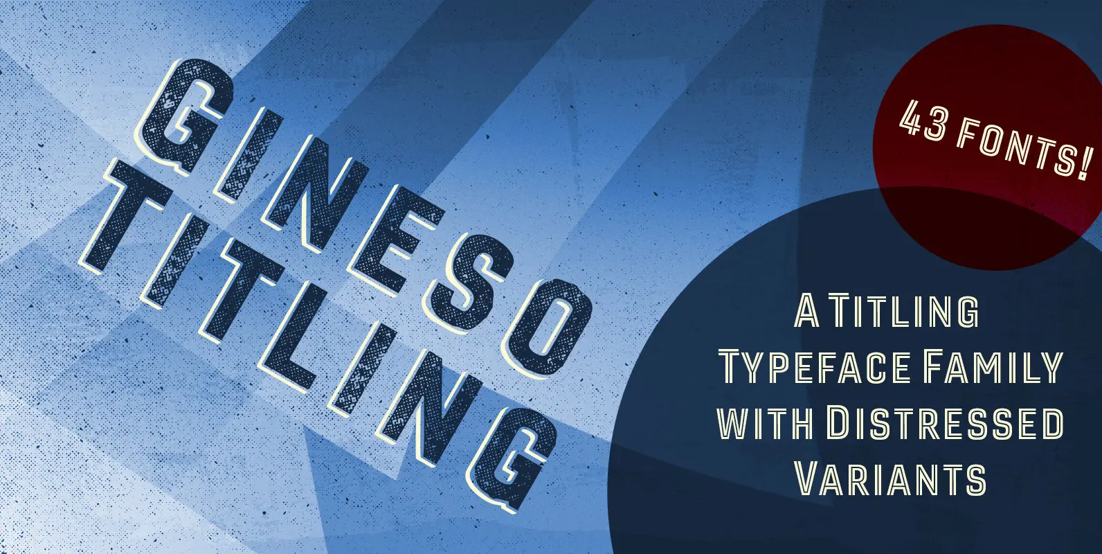
Gineso Titling Font
Before the Great War, there were great posters. Posters of elegance and grandeur. Posters calling people to the pleasures of sunny southern France and to the perfections of northern Italy’s dolce vita. Le Havre, based on a poster by AM
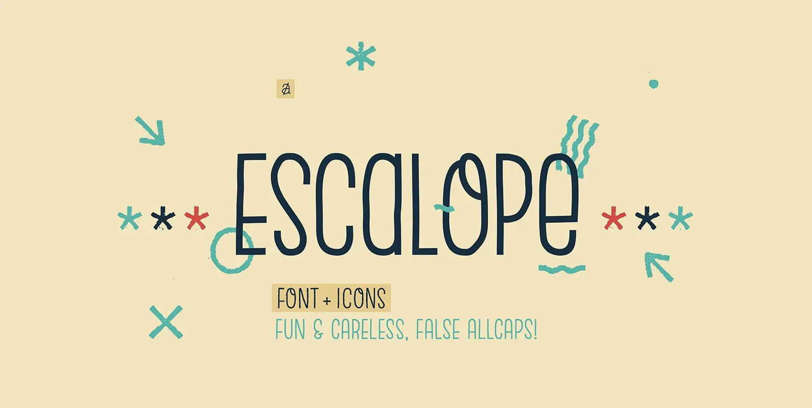
Escalope Font
Escalope is a hand-drawn layered font with a crazy & unique personality: the low midline, the false-All Caps style, all the fun & playful Stylistic Sets will give your projects a new and fresh look! There are many Open-Type features
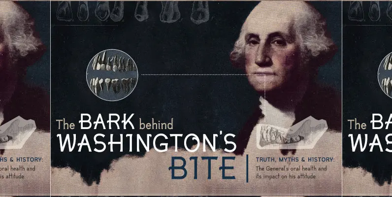
Pinion Display Font
Pinion Display is a modern decorative typeface that features an assembly line approach to the character design. Each glyph is constructed from a library of parts. The result is an ornamental typeface with modern simplicity and a bit of historic
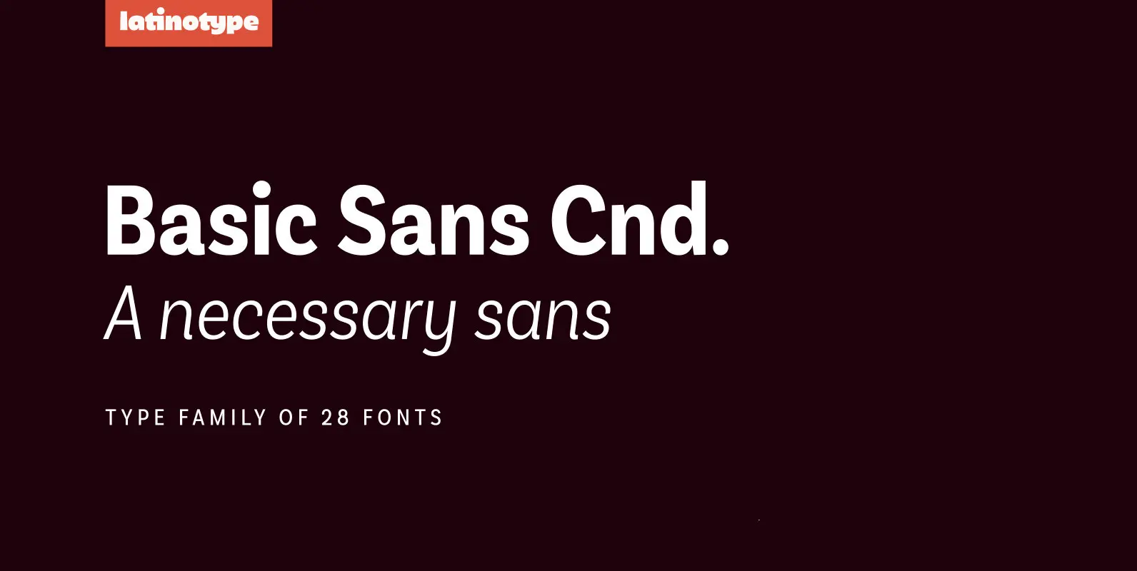
Basic Sans Cnd Font
Basic Sans Cnd: A new sans. Designed by Daniel Hernández Basic Sans Cnd is a narrower version of Basic Sans. It is a family of Grotesque features with a functional, neutral and seeming clean style that looks to keep a
