Tag: narrow
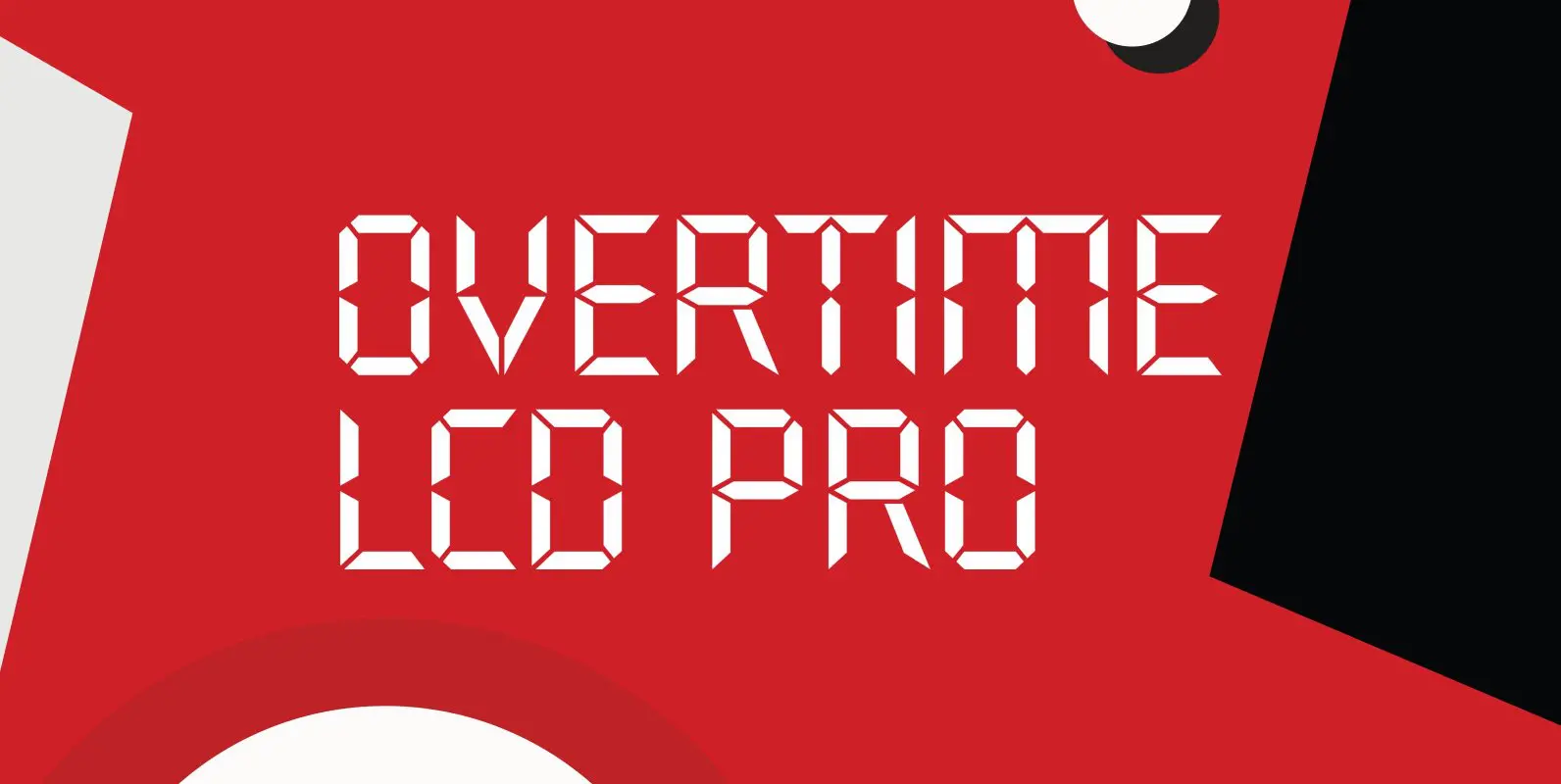
Overtime LCD Pro Font
Designed by Steve Jackaman & Ashley Muir. Our collection was missing a small piece of the jigsaw puzzle until now; a quartz digital LCD font! Overtime LCD contains all the high-end features expected in a quality OpenType Pro font. Published
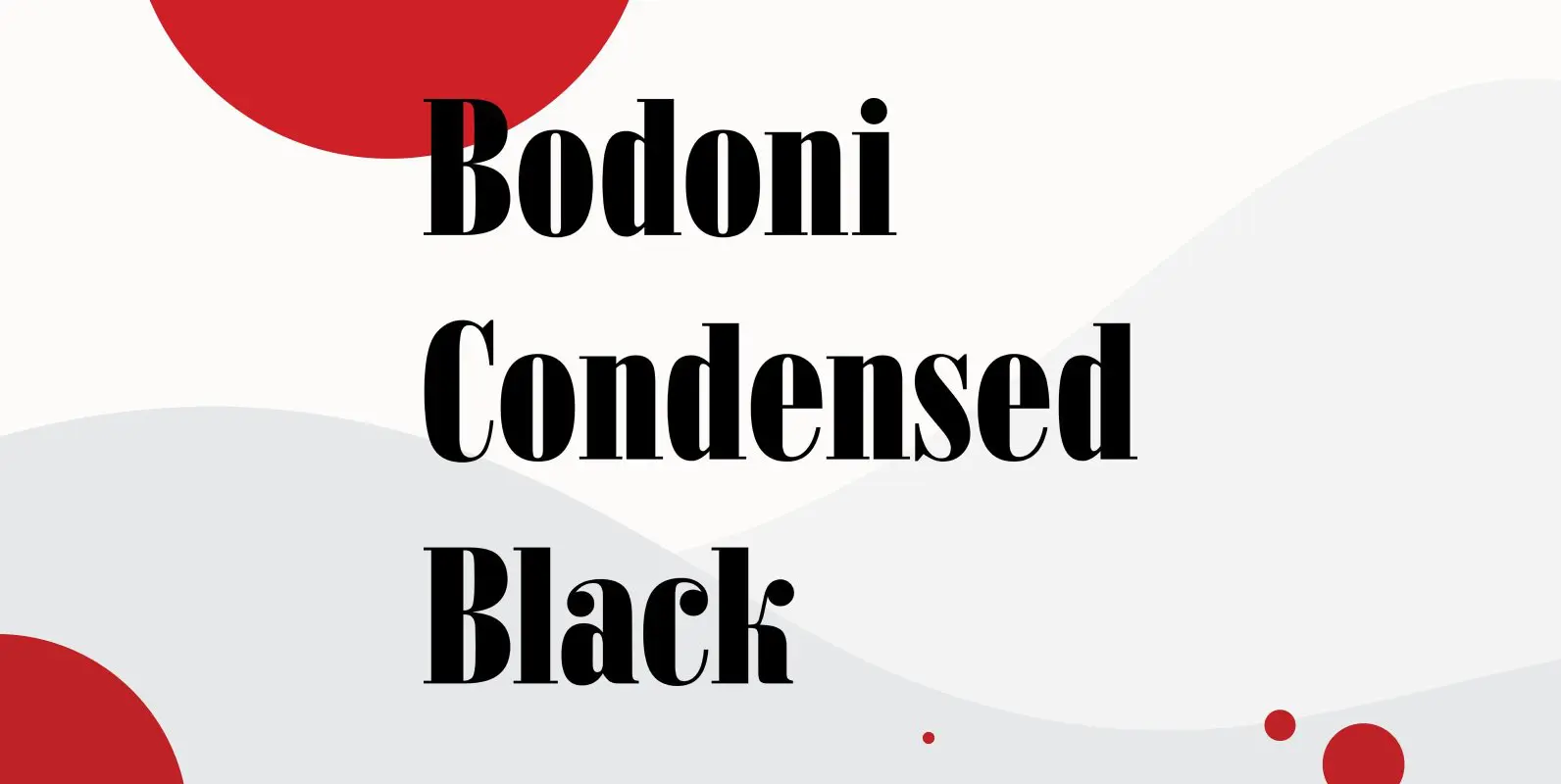
Bodoni Condensed Black Font
Bodoni Condensed Black was designed by R.H. Middleton for Ludlow, circa 1930. Digitally engineered by Steve Jackaman. Published by Red RoosterDownload Bodoni Condensed Black
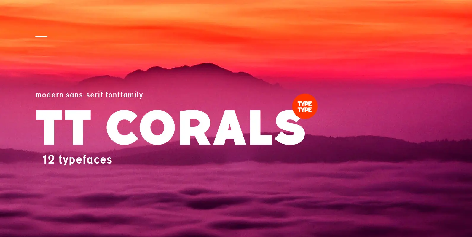
TT Corals Font
TT Corals is a modern humanistic sans-serif which has many typical traits of the beginning of the 20th century. For an increased functionality of the font family we’ve created 6 typefaces of various weights: Thin, Light, Regular, Bold, Extrabold, Black.
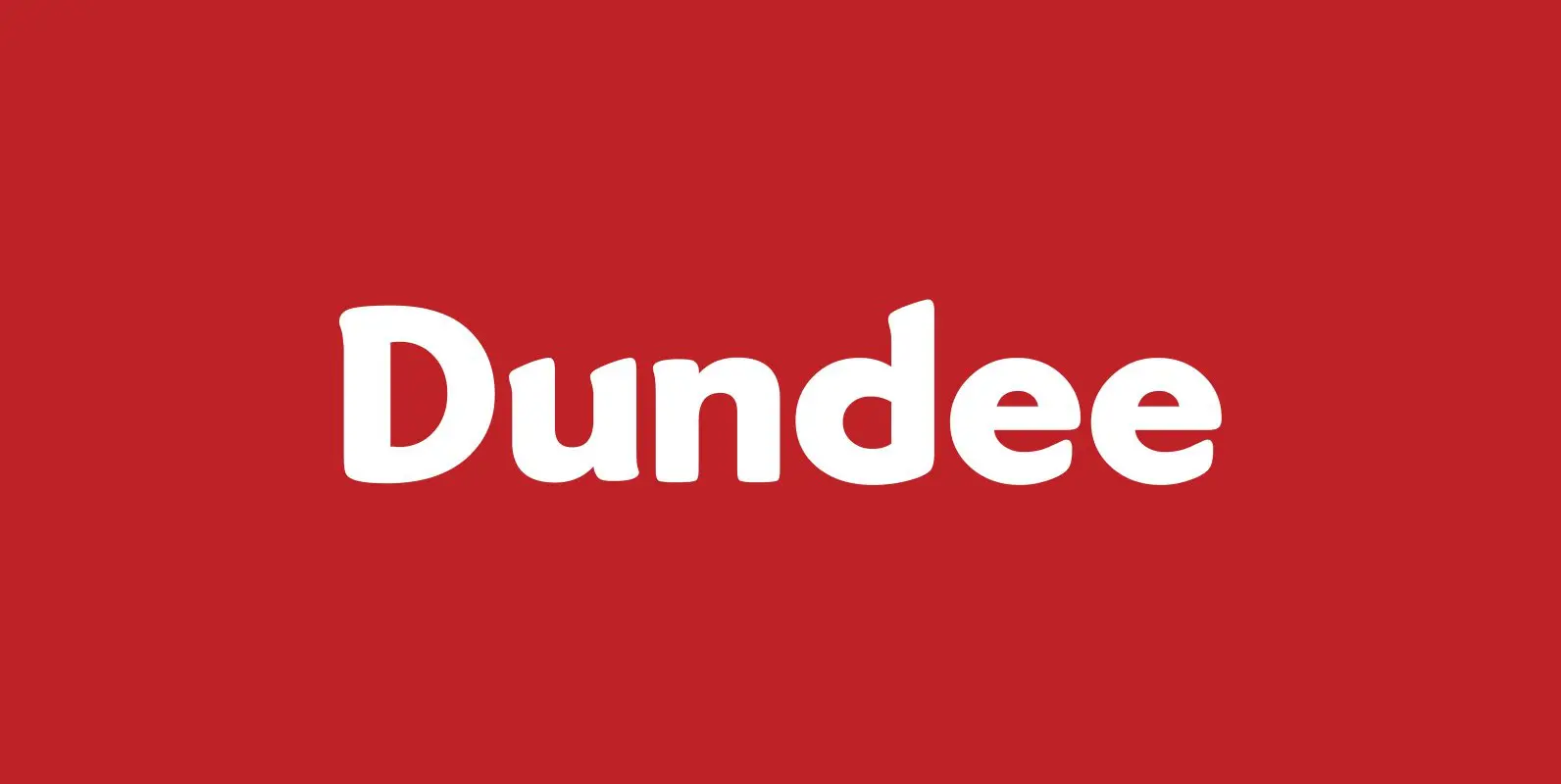
Dundee Font
Designed by A. Pat Hickson, Dundee is a new design inspired by the various mastheads used in children’s comic books in England, published by D.C. Thompson of Dundee, Scotland. Published by Red RoosterDownload Dundee

TT Supermolot Condensed Font
TT Supermolot Condensed is the narrow version of the TT Supermolot font family. Thanks to its open forms, TT Supermolot Condensed fits perfectly into any contemporary technological design and navigation systems. We've already seen this fontfamily in the sports theme
Leighton Font
Designed by Paul Hickson, Leighton is a clean serif based on Lectura, a design by Dick Dooijes of the Amsterdam Foundry (1966). Published by Red RoosterDownload Leighton
Fraktura Font
“Fraktura” and “Fraktura Plus” is a set of classical Fraktur (Blackletter) in a modern interpretation. The two fonts differ in the amount of embellishments and can and should be mixed. I only sell the pair, but for a fair price.
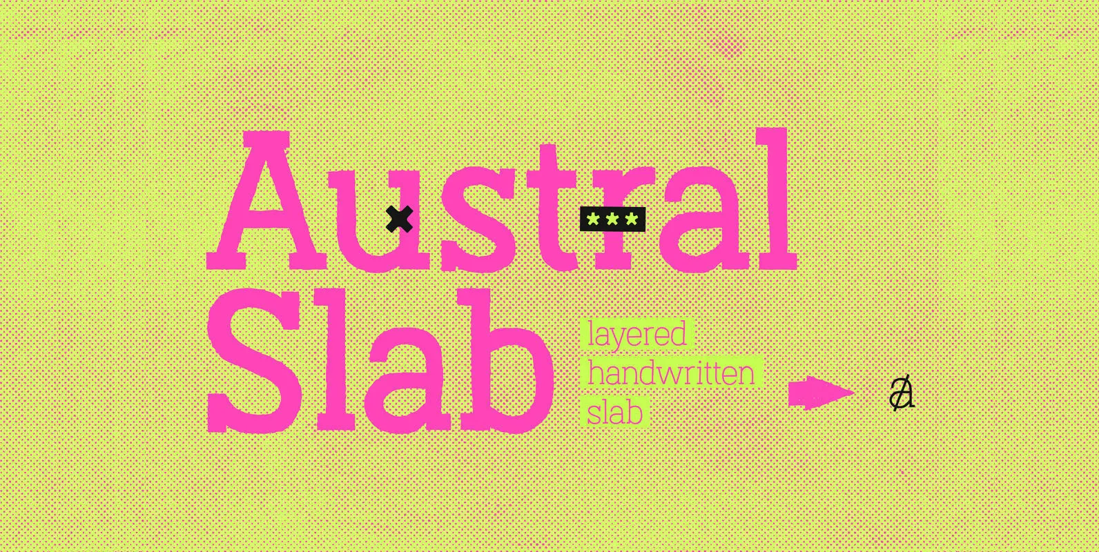
Austral Slab Font
Austral Slab is a hand-drawn layered font designed by Antipixel, with unique textures & styles that combine giving your work a distinctive impression. This font comes in three weights, Regular, Light & Thin, with irregular outlines and uneven/crooked strokes, giving
Adorn Collection Font
What can be more lovely than a wedding, an intimate invitation, a gift from the heart? One whose presentation uses the warm and welcoming family of typefaces, Adorn. With a modern and sometimes quirky twist on the staid, almost corporate
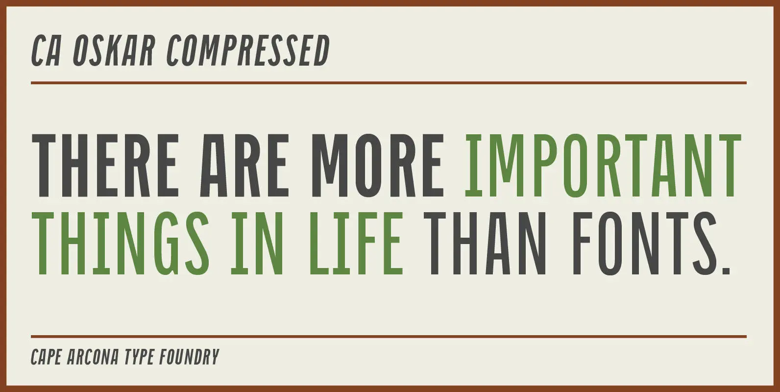
CA Oskar Compressed Font
CA Oskar came into being as a custom typeface for the international Traumzeit music festival. As a substantial part of the new corporate identity, it had to be characteristic, but also flexible in use. Starting with the design of compressed
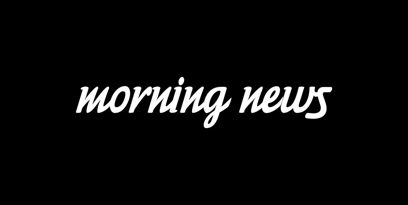
Morning News Font
“Morning News” is the sister font of “Evening News” which I designed some years ago for use with my local newspaper “Abendzeitung”. “Morning News” is an adaption, a little bit rounder, which gives the font a much softer touch. The
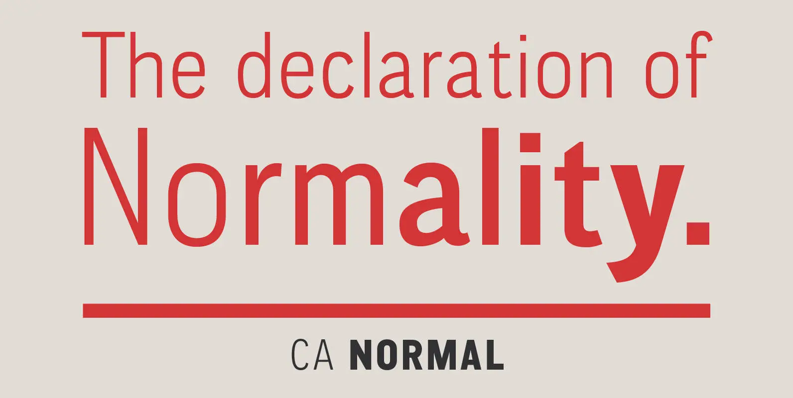
CA Normal Font
CA Normal is a typeface aiming for beauty without ostensible effects, merely relying on clarity and well balanced proportions. It merges influences from European grotesques and American gothics, breeding an experimental mongrel. The underlying concept stays in the background, giving
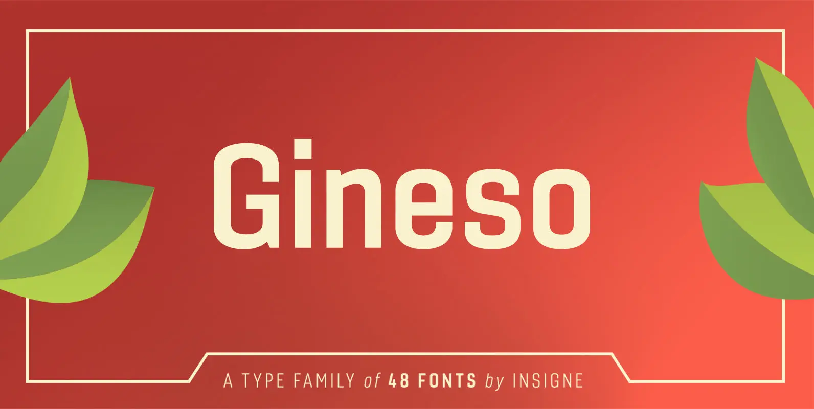
Gineso Font
Michaelangelo. da Vinci. Bellini. Rafael. Masters of Italian art whose names have dwarfed those of many other great Italian artists. Yet relics from these other artists remain, though often unnoticed because of their practical nature. These unknowns are the Italian
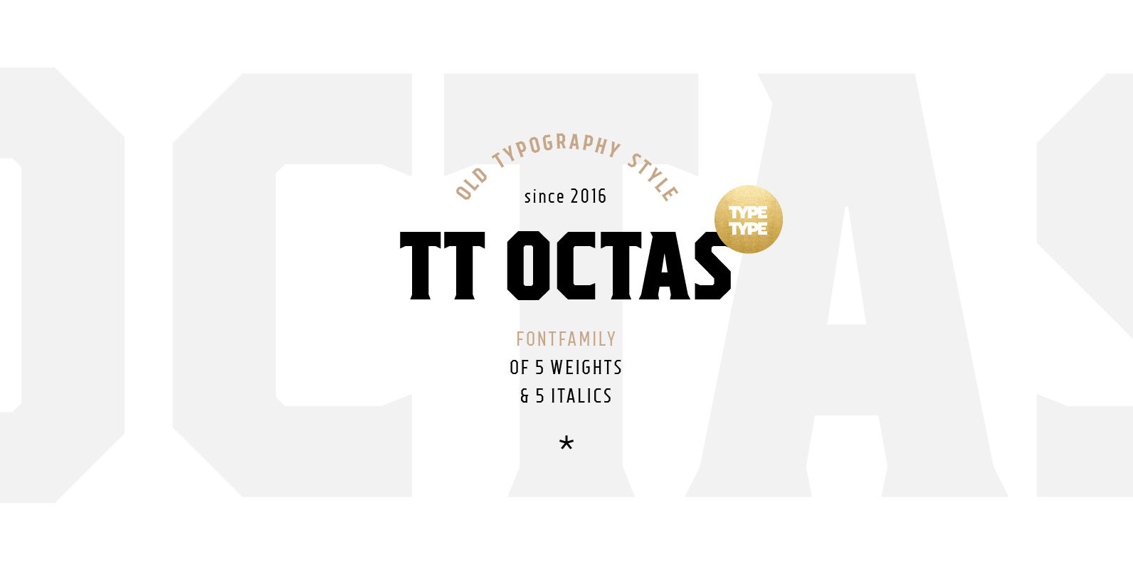
TT Octas Font
TT Octas is a narrowly proportioned font family built upon the principle of octagonal forms: all circles in this font family are actually octagons. Thanks to small serifs, TT Octas has a saturated and vintage character to it. Simple depiction
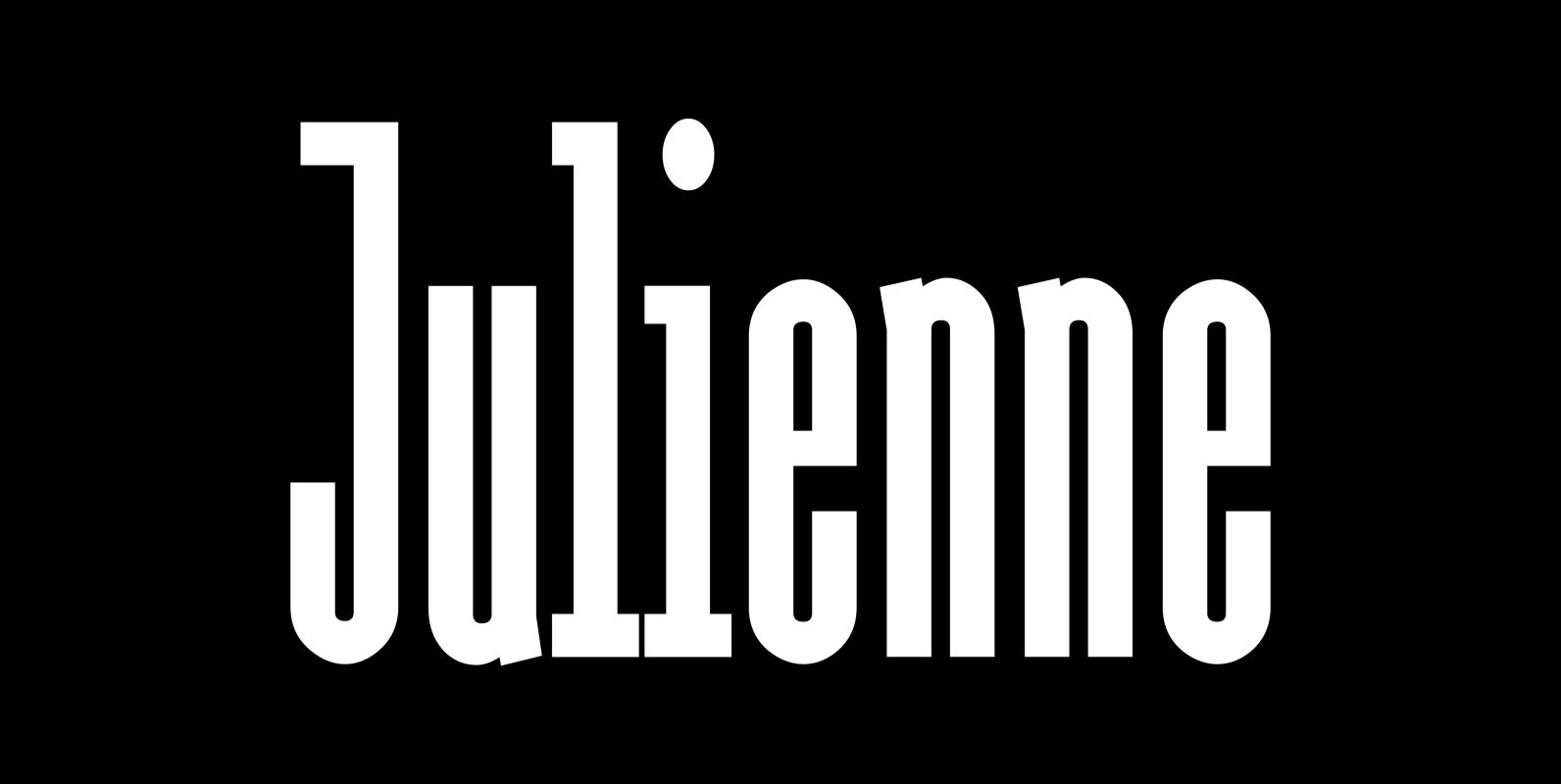
Julienne Font
Cooks call thinly cut – like matchsticks – vegetables »Julienne«. I found that was a fitting name for this very narrow typeface. Julienne Slim is the extreme cut of the two. Personally I do not use narrow typefaces very often,
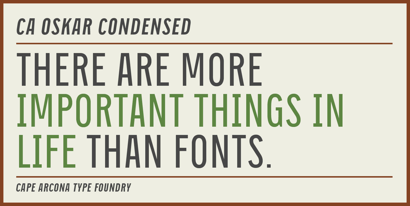
CA Oskar Condensed Font
CA Oskar came into being as a custom typeface for the international Traumzeit music festival. As a substantial part of the new corporate identity, it had to be characteristic, but also flexible in use. Starting with the design of compressed
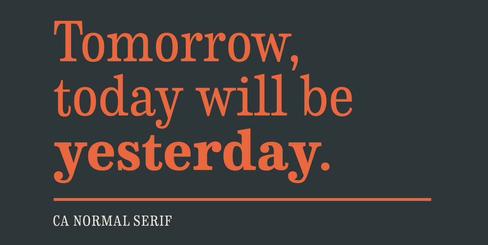
CA Normal Serif Font
CA Normal Serif is the perfect companion to its grotesque brother CA Normal. But it is not just a serifed equivalent. It has a character of its own while preserving the principal proportions and the idea of quirkiness. It was
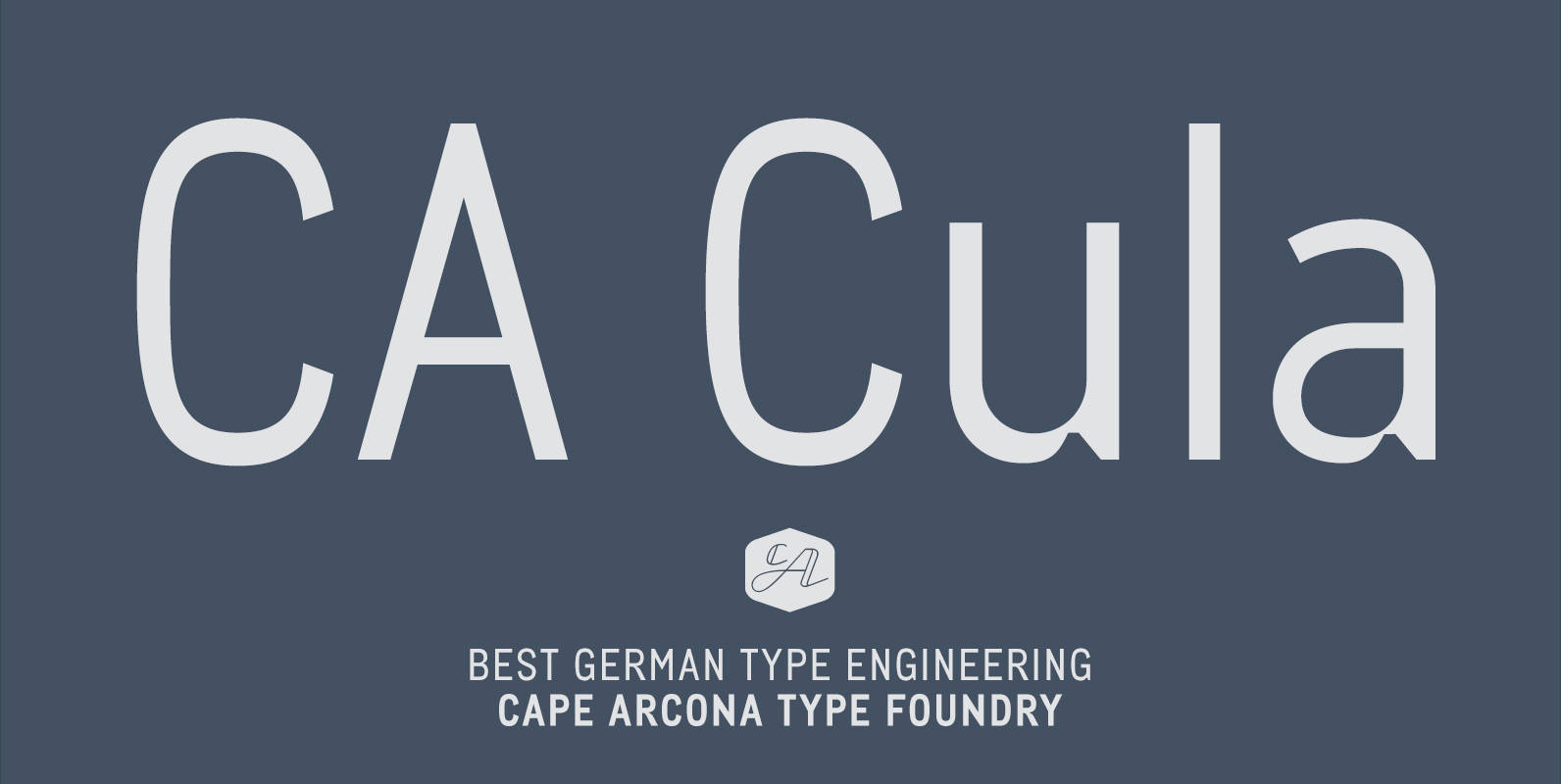
CA Cula Font
CA Cula is standing in the tradition of cool tempered sans serif typefaces like DIN. But at a closer look it reveals a tendency towards rounder reading-friendly forms. The denaturalized ink traps give CA Cula a very special and individual