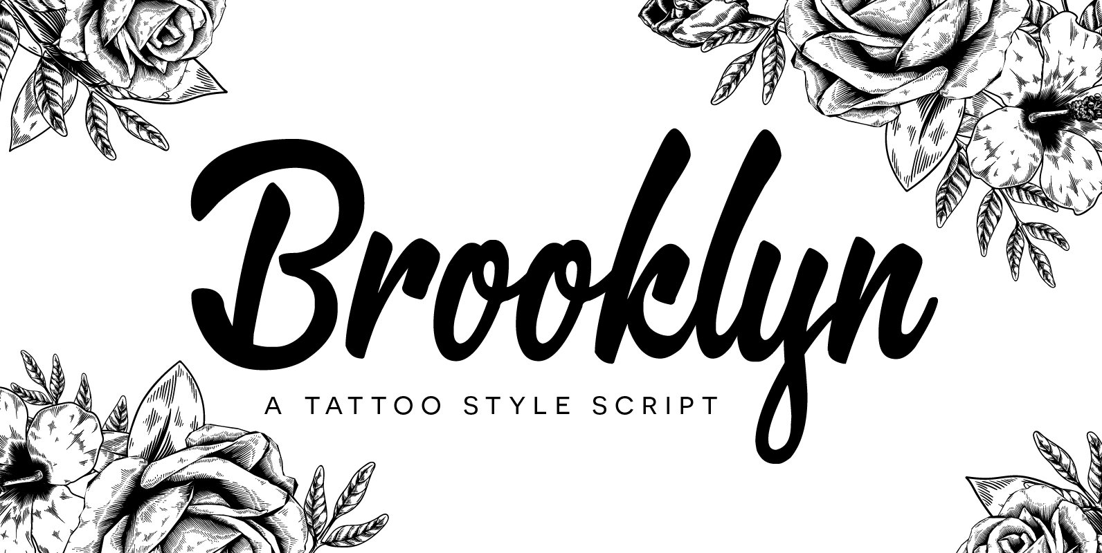
Tag: New York
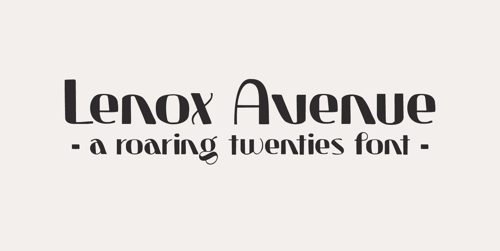
Lenox Avenue Font
I came across an old book called ‘Studio Handbook Letter And Design For Artists And Advertisers’ by Samuel Welo. Samuel Welo was an American advertising calligrapher, typographer and lettering artist, who was most active during the roaring twenties. Lenox Avenue
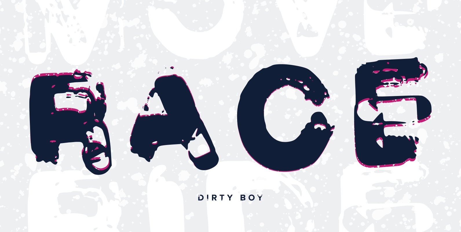
Dirty Boy Font
For all you graffiti home boyz. Brush style script with a dirty urban look. For those looking for a rough brush style ting. This font was created by Benjamin A Melville and features a full upper and lower case alphabet
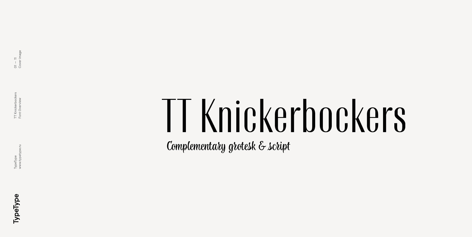
TT Knickerbockers Font
TT Knickerbockers is a contrasting pair of fonts that continues our project series dedicated to different cities. The new project is dedicated to New York with its multiculturalism, historicity, creativity, energy, and to its inhabitants. TT Knickerbockers Grotesk symbolizes the
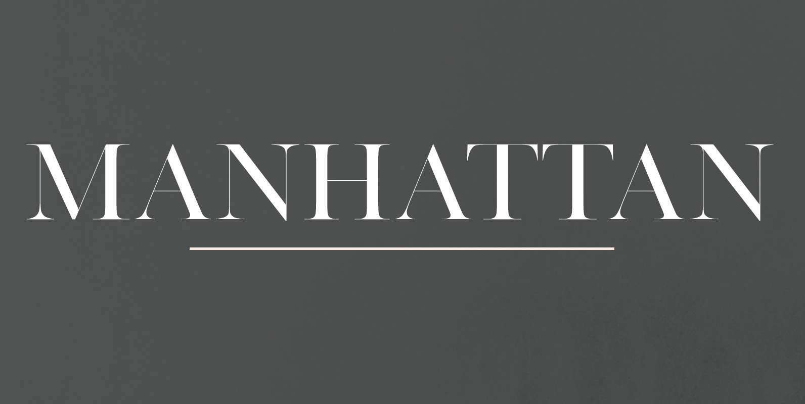
Manhattan Font
This minimalistic and classy all-caps serif typeface features sleek lines and thin serifs. Perfect for gorgeous logos & titles, Manhattan will pair beautifully with many fonts and work well with whatever project you’re working on. Published by Jen WagnerDownload Manhattan
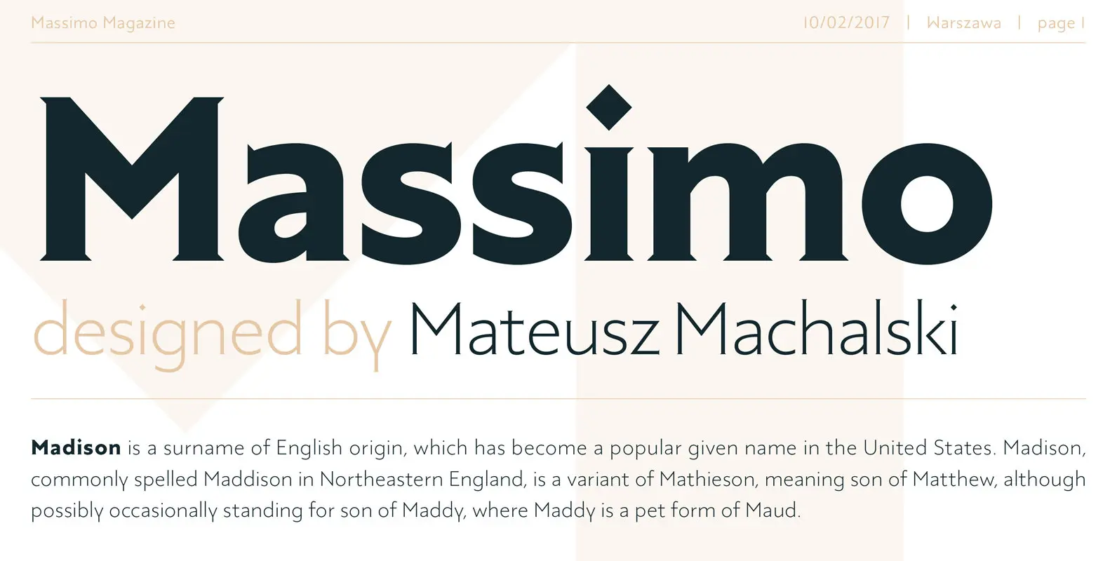
Massimo Font
Massimo is a semi-serif geometric type family inspired by the visual culture of New York City – architecture, fashion, design and typography. Published by Mateusz Machalski Download Massimo
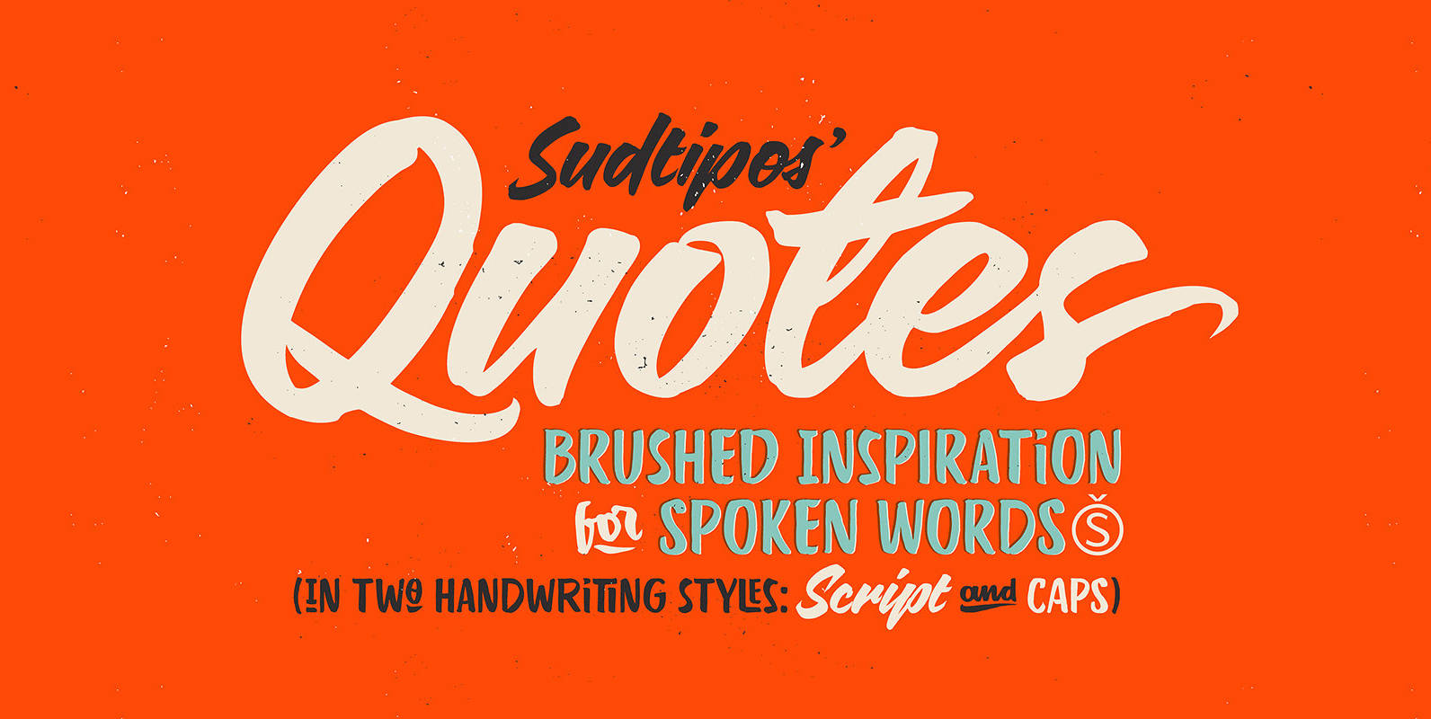
Quotes Font
“Quotes” is the second typeface calligraphed by Yani Arabena, designed along with Guille Vizzari and Ale Paul, for Sudtipos. Being thrilled by the use of the pointed brush, spontaneous messages, gesture and freshness to represent inspirational phrases and quotes written
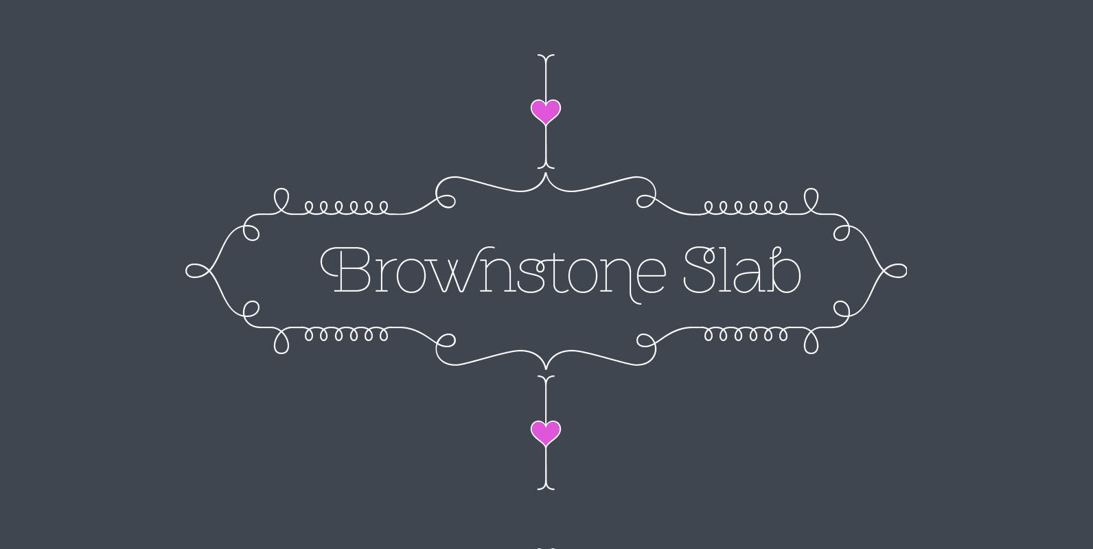
Brownstone Slab Font
Alejandro Paul’s Brownstone Slab is based on his own popular, award-winning, Brownstone Sans typeface. Like the original Sans, Brownstone Slab is a 21st-century design, influenced by the Victorian decorative motifs of the ironwork and carved decorations of New York City
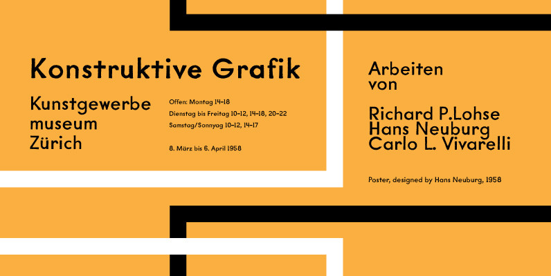
YWFT Mullino Font
Slightly distressed but possessing of serious underlying power, YWFT Mullino can be used as a display typeface or as a text face. This font brings huge diversity, beginning with the fact that there are two styles (Book and Medium) and
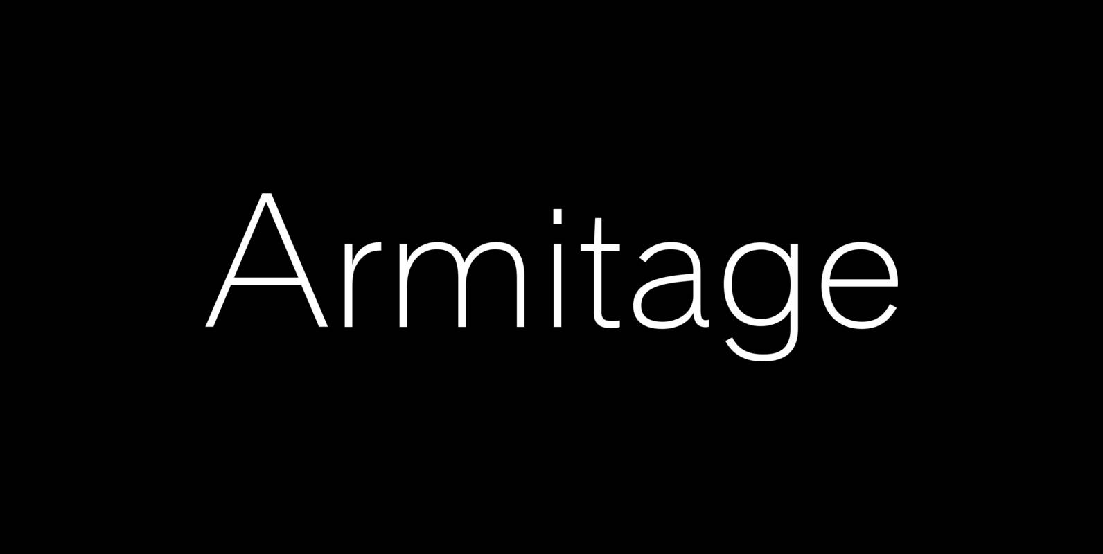
Armitaged Font
Sturdy and humane, Armitage renders type with vintage American warmth. Even with a subtle sparkle, Armitage stays humble to let words work. Rather than build on recent trends, Armitage starts over, derived from designs of the late nineteenth century. Designer
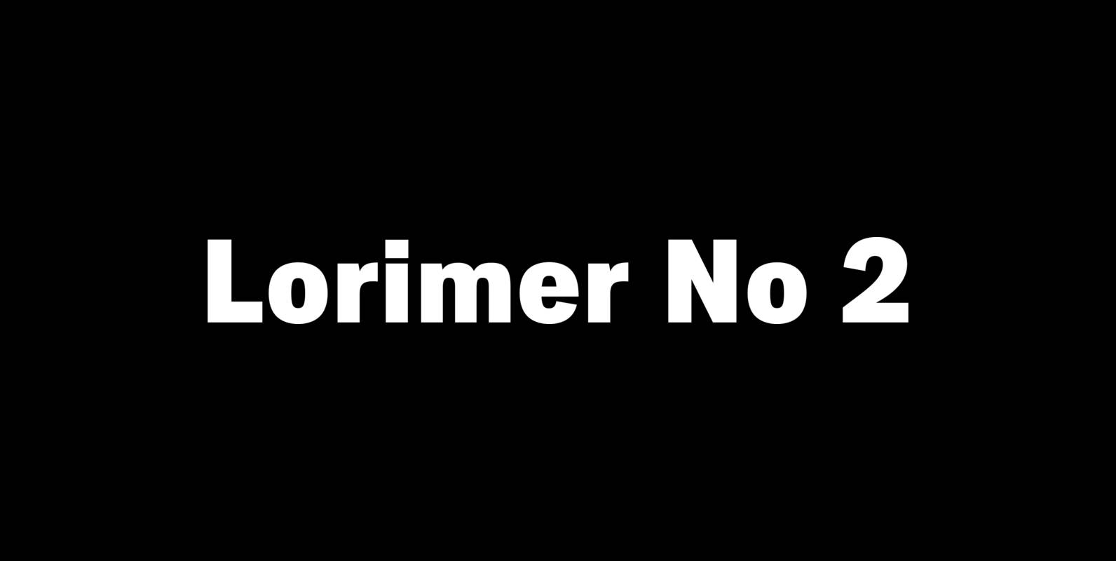
Lorimer No 2 Font
Lorimer No 2 is a sans family designed for display settings. Narrow letters, tight spacing, and a low x-height make Lorimer No. 2 better suited to display settings than fonts adjusted to work in text settings. Packaging, identities, and headlines
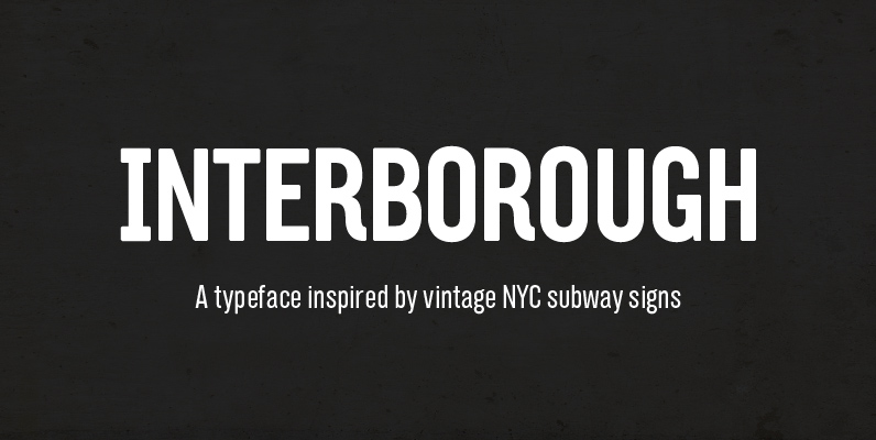
Interborough Font
Interborough collects the inconsistent characteristics of those signs and combines with a personal touch to create a new, unique design itself. The sans-serif typeface explores the American, compact modular style and try to balance the solid, geometric form with subtle
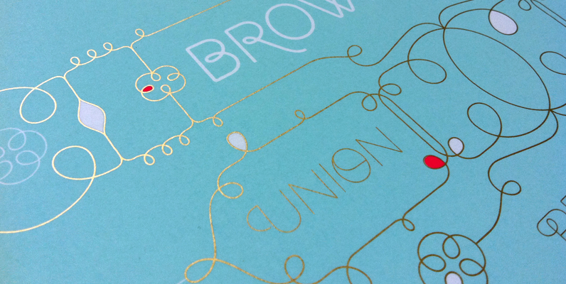
Brownstone Sans Font
One design sparks another. As Alejandro Paul experimented with the strokes and curves of the monoline script Business Penmanship, he discovered interesting new forms and shapes that didn’t fit the Spencerian theme of that typeface. These forms simmered in Ale’s
