Tag: news

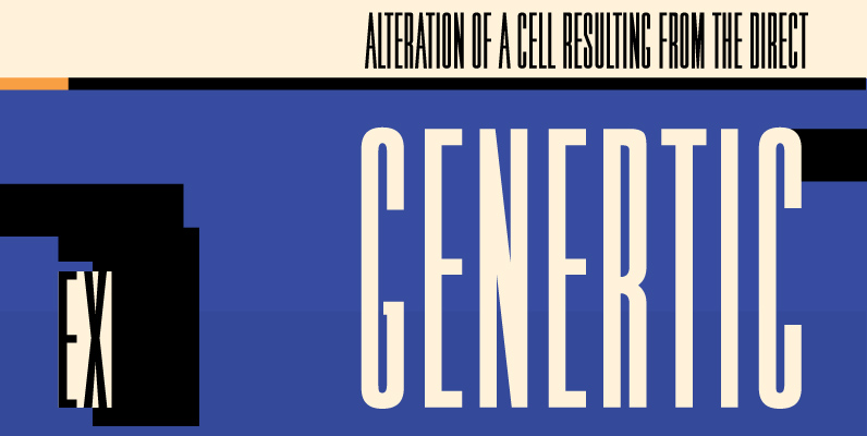
Kropotkin Font
Kroptokin was created just by observing. At the time I was looking at a lettering book. A certain typeface caught my eye. The typeface was introduced by Helvetica, but it didn’t come off as anything like the Helvetica I knew.
Aaux Next Wide Pack B Font
When the original Aaux was introduced in 2002, I intended to go back and expand the family to offer more versatility. Years went by before I was willing to pick it up again and invest the proper time into building
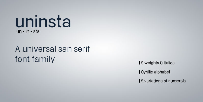
Uninsta Font
Uninsta is a neutral sans serif font family intended for use across a variety of modern applications in both digital and print media. Geometric letter forms are combined with subtle humanist touches to create a legible, low contrast typeface with

Aaux Next Family Font
When the original Aaux was introduced in 2002, I intended to go back and expand the family to offer more versatility. Years went by before I was willing to pick it up again and invest the proper time into building
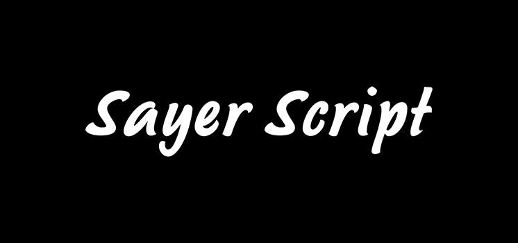
Sayer Script Font
Sayer Script is a font design released for the Mecanorma Type Collection. Copyright 2004 Trip Productions BV. Published by MecanormaDownload Sayer Script
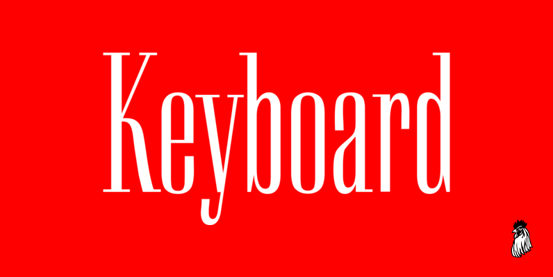
Keyboard Font
Keyboard was designed by Paul Hickson. This elegant serif release is based on the original design, circa 1951. Copyright International TypeFounders, Inc. Published by Red RoosterDownload Keyboard
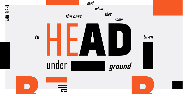
Directors Gothic 220 Font
Handcrafted by Lettering Inc as part of its core library of typefaces in the 1930s, Directors Gothic was dramatically expanded throughout the lifetime of the company and remains a timeless classic. Inspired by the Art Deco movement popular at the
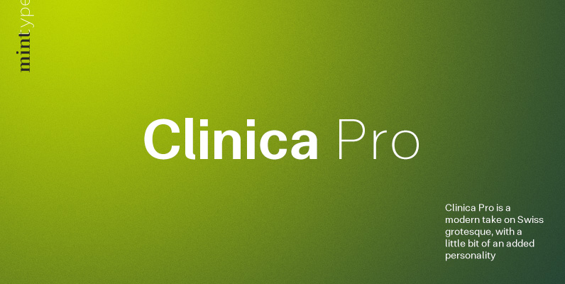
Clinica Pro Font
Clinica Pro is a modern take on Swiss grotesques, with a little bit of an added personality. It features 8 weights, italics, 6 sets of figures, small caps and a bunch of ligatures. Still relatively neutral, it lets a brand
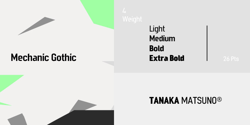
Mechanic Gothic Font
Designed by Darren Scott. Based on character shapes with origins rooted in the work of 19th Century American wood type makers, DST Mechanic Gothic draws influence from the poster types found in the impactful advertising during the Industrial revolution. It

Criterion Font
Designed by Phil Martin in 1982, Criterion is a serif font release by URW. Contains language support for West, East, Turkish, Baltic, and Romanian. Published by URW Type Foundry GmbHDownload Criterion

Aquarius Font
Designed by Steve Jackaman, Aquarius is based on the popular 1968 VGC typeface drawings. Published by Red RoosterDownload Aquarius
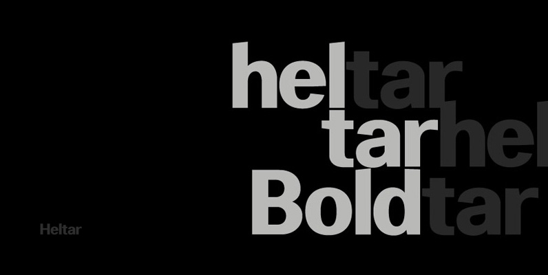
Heltar Font
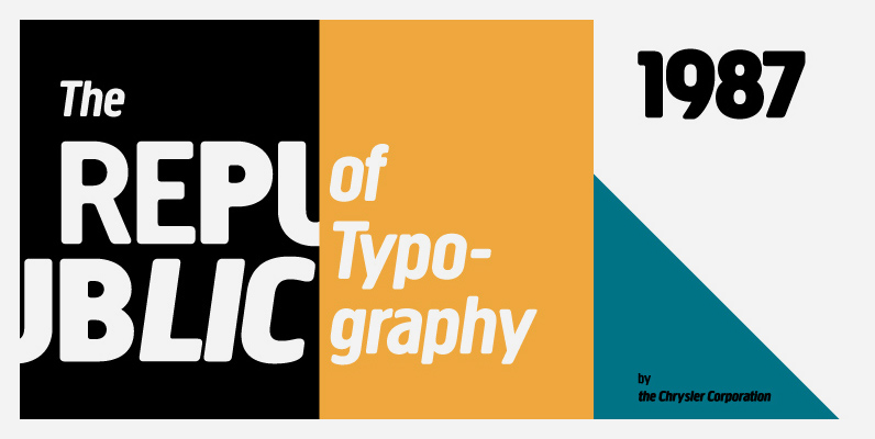
A modern neo-grotesque typeface. Having grown up in Sheffield and been completely immersed in the work of The Designers Republic I became very drawn to their treatment of Helvetica, especially the close tracking of the letter space. This visual investigation

Shintia Font
Shintia Script is a highly legible script font with a bold, classic vintage feel. It contains 215 glyphs as well as Opentype features such a stylistic alternates. A fantastic choice of font for posters, t-shirts, signage, logos, badges, and more.
