Tag: news
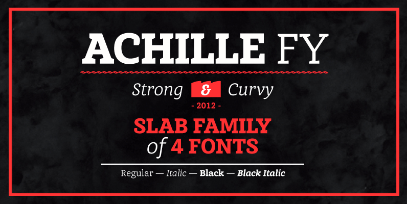
Achille FY Font
This Slab serif typeface is characterized by its curved & angular serifs which give it a special character. Not too rigid, no too round, its well balanced shapes make itself both legible in small size and powerful in big for
Aaux Next Wide Family Font
When the original Aaux was introduced in 2002, I intended to go back and expand the family to offer more versatility. Years went by before I was willing to pick it up again and invest the proper time into building
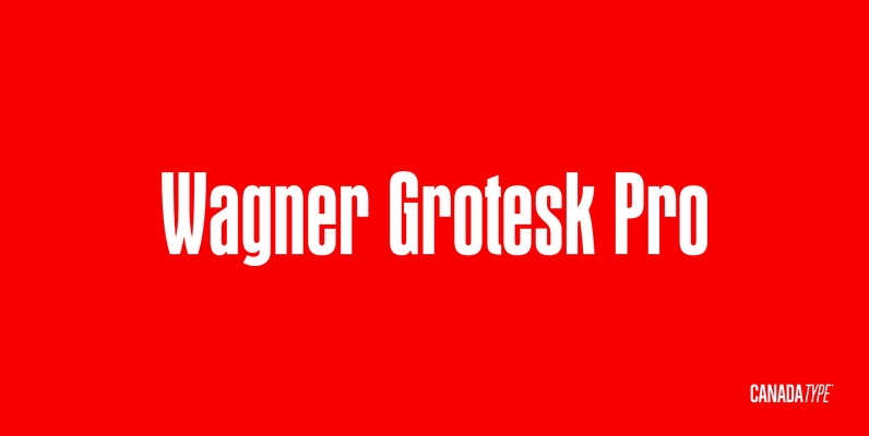
Wagner Grotesk Pro Font
This is the elaborate digital version of Edel Grotesque Bold Condensed (also known as Lessing, Reichgrotesk, and Wotan Bold Condensed) a 1914 typeface by Johannes Wagner, which was later adopted by pretty much every European type foundry, exported into the
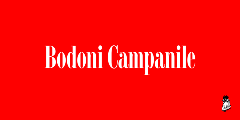
Bodoni Campanile Font
Bodoni Campanile was originally designed by R.H. Middleton for Ludlow, circa 1930. Digitally engineered by Steve Jackaman. Published by Red RoosterDownload Bodoni Campanile
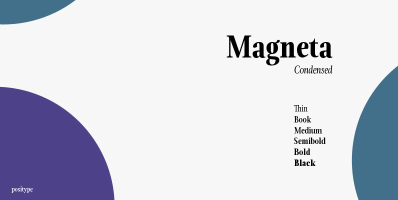
Magneta Condensed Font
To describe what inspired Magneta would be to add a little Dwiggins, throw in some Benton with a hint of Austin, wrap it up in a crisp, contemporary package and serve. The skeleton of the family is a Garalde (like
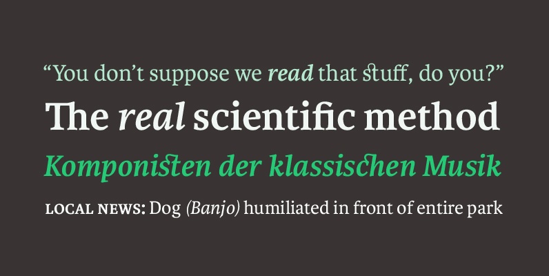
Karmina Font
Karmina is a text typeface developed mainly for pocket books and budget editions. It was built to withstand the worst printing conditions: low quality papers, high printing speed with web presses and variations in the ink level of the printing
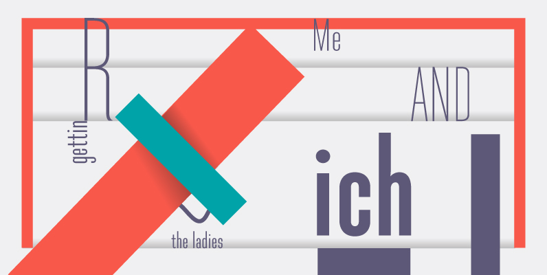
Directors Gothic 210 Font
Handcrafted by Lettering Inc as part of its core library of typefaces in the 1930s, Directors Gothic was dramatically expanded throughout the lifetime of the company and remains a timeless classic. Inspired by the Art Deco movement popular at the
Karmina Sans Font
Karmina Sans was conceived as a larger type family, six weights with matching italics, that could perform alongside it's serifed cousin, but that had its own features and personality. It shares the same technical excellence and has the same basic
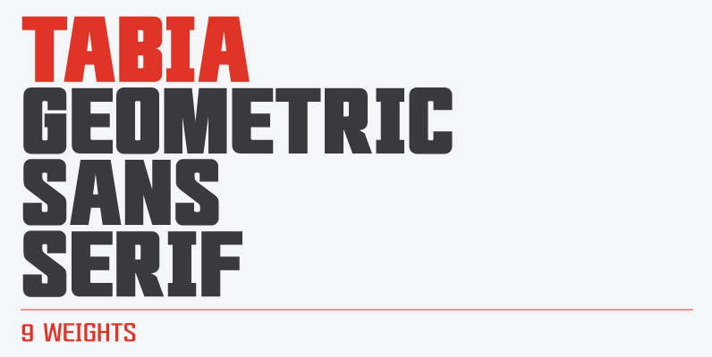
Tabia Font
Tabia is a geometric sans serif typeface, designed by Mariya V. Pigoulevskaya in 2013. The font was inspired by the work and principles of the iconic german industrial designer Dieter Rams, who is closely associated with the consumer product company
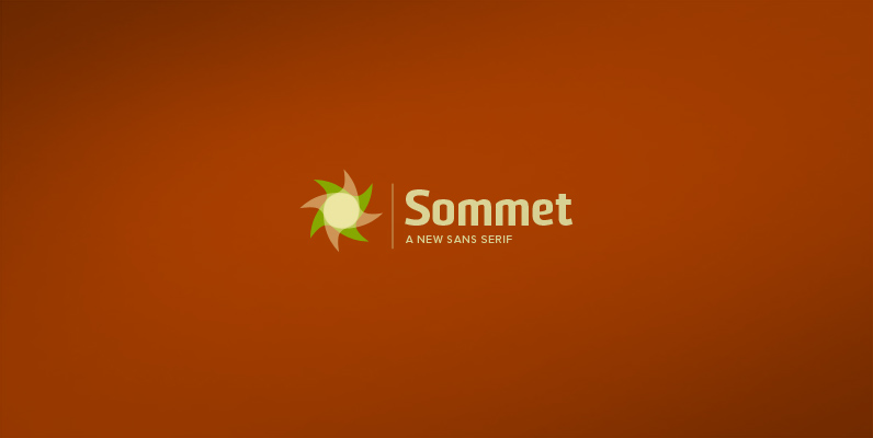
Sommet Font
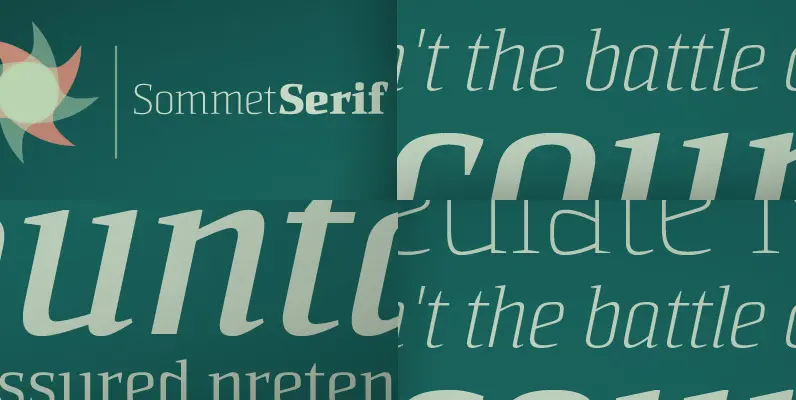
Sommet is a sans-serif with a high-tech web 2.0 feel. The typeface family is a powerful and sharp design that is highly legible onscreen even at small sizes. Sommet features a tall x-height, and its letterforms are compressed, perfect for

Trump Gothic Font
When it was published by the Weber foundry in 1955, Signum became an instant classic. Less than one year later, the Czech foundry Grafotechna released Stanislav Marso's Kamene, a reinterpretation of Signum. The differences between the two were quite subtle

Sorren Ex Font
Sorren Ex is a slightly less condensed, more robust version of Sorren. Its overall width has been increased to the point just before its rounded forms begin to flatten, retaining the aesthetic essence of the original without compromise.Sorren is a

Wagner Round Font
This is the rounded, softer version of Canada Type's popular Wagner Grotesk. Originally done in 2011 for a global publisher, this font has already seen plenty of magazine and book cover action, perhaps even more than the sharp condensed face
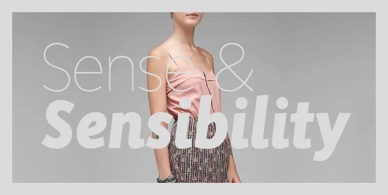
Sense and Sensibility Font
Over time, many of the functors of page layout have become formalized within the concept of typeface as morphic categories, categories being the semantic building blocks of perception at the level of both individual physiology and social production. First case,
