Tag: newspaper
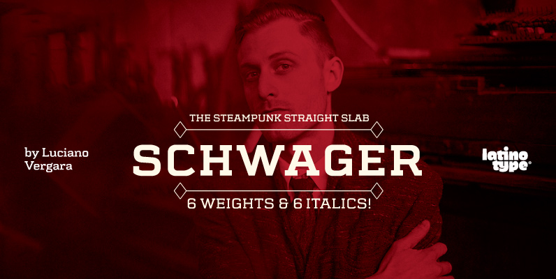
Schwager Font
Schwager is a steampunk slab serif typeface with an industrial accent in a contemporary tone. Its strong structure and male, makes it ideal for titles, headlines and brands of male lifestyle, technology and trend. This typeface contains alternate glyphs that
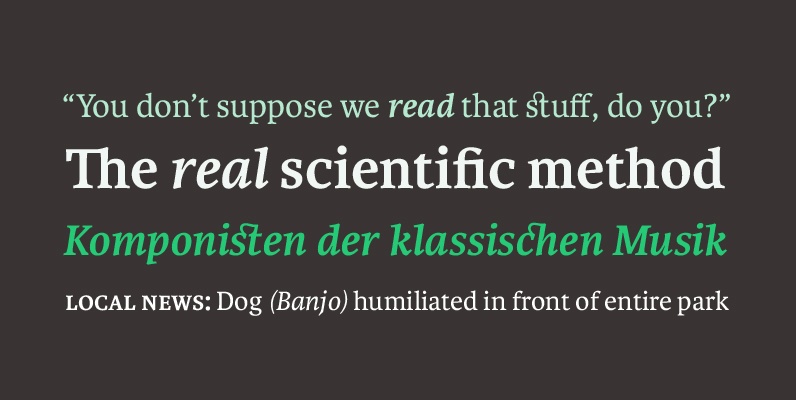
Karmina Font
Karmina is a text typeface developed mainly for pocket books and budget editions. It was built to withstand the worst printing conditions: low quality papers, high printing speed with web presses and variations in the ink level of the printing
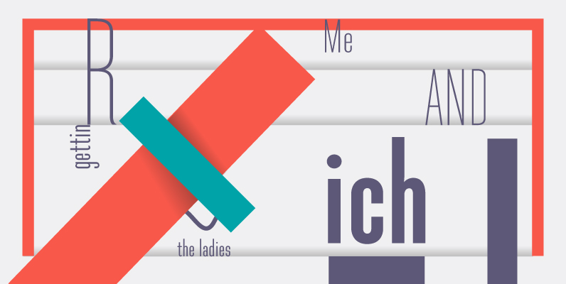
Directors Gothic 210 Font
Handcrafted by Lettering Inc as part of its core library of typefaces in the 1930s, Directors Gothic was dramatically expanded throughout the lifetime of the company and remains a timeless classic. Inspired by the Art Deco movement popular at the
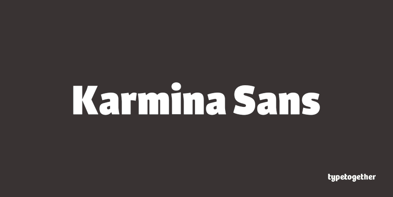
Karmina Sans Font
Karmina Sans was conceived as a larger type family, six weights with matching italics, that could perform alongside it's serifed cousin, but that had its own features and personality. It shares the same technical excellence and has the same basic
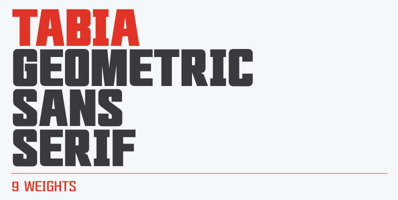
Tabia Font
Tabia is a geometric sans serif typeface, designed by Mariya V. Pigoulevskaya in 2013. The font was inspired by the work and principles of the iconic german industrial designer Dieter Rams, who is closely associated with the consumer product company

Trump Gothic Font
When it was published by the Weber foundry in 1955, Signum became an instant classic. Less than one year later, the Czech foundry Grafotechna released Stanislav Marso's Kamene, a reinterpretation of Signum. The differences between the two were quite subtle

News Gothic Font
This is URW’s digitization of the famous font News Gothic, the realist sans-serif typeface designed by Morris Fuller Benton, and released by the American Type Founders (ATF) in 1908. (News Gothic is similar in proportion and structure to Benton’s famous

Directors Gothic 230 Font
Handcrafted by Lettering Inc as part of its core library of typefaces in the 1930s, Directors Gothic was dramatically expanded throughout the lifetime of the company and remains a timeless classic. Inspired by the Art Deco movement popular at the

Michel Font
This typeface wasn’t designed for use as a body typeface. Rather, I designed it with the intention of it being used as a header at a large point size. It was originally the Firmin Didot typeface, but of course I

Directors Gothic 240 Font
Handcrafted by Lettering Inc as part of its core library of typefaces in the 1930s, Directors Gothic was dramatically expanded throughout the lifetime of the company and remains a timeless classic. Inspired by the Art Deco movement popular at the

PF Adamant Pro Font
The Adamant family is a serif typeface that comes in six weights, from Light to ExtraBold, each with italic and small caps versions. Every font includes ligatures, lining and oldstyle figures in proportional and tabular widths, fractions, alternate characters, and
