Tag: organic
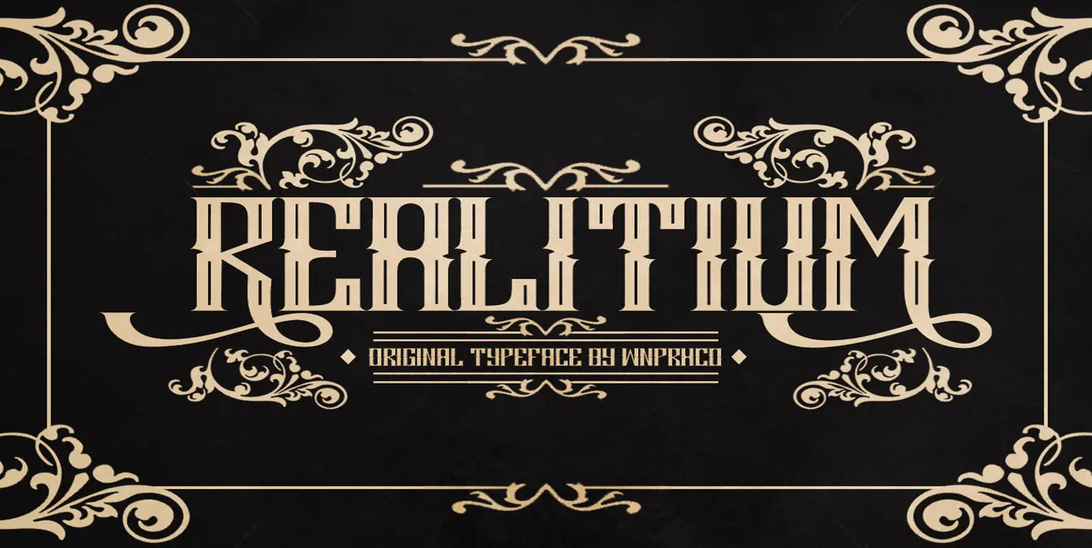
Realitium Font
Realitium is a vintage style blackletter font by WNPRH Collective. Published by WNPRH Collective Download Realitium
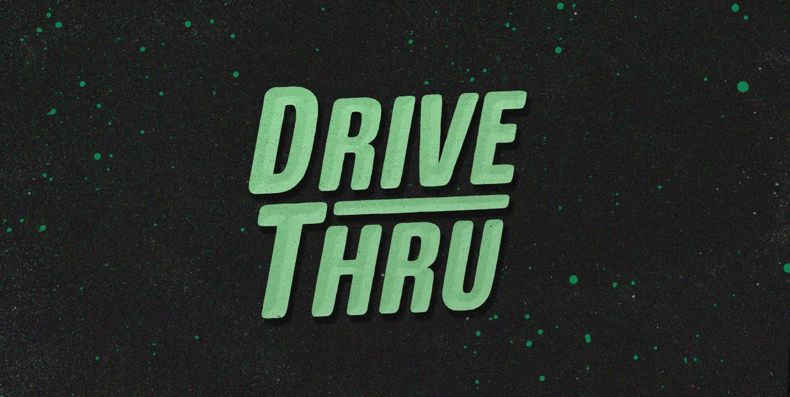
Drive Thru Font
Duncan loves the Drive Thru. He’d drive thru, and thru, and thru, whipping his insatiable appetite into a frenzy. But the glory days came to an end when cheeseburger grease slicked his steering wheel so smooth he couldn’t turn in
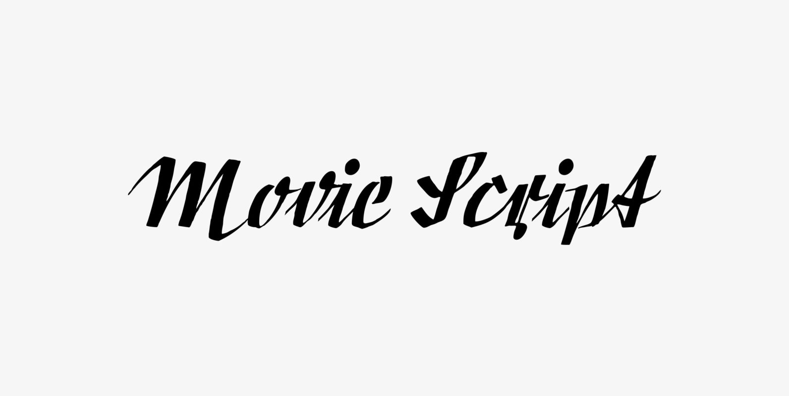
Movie Script Font
“Movie Script” is the script that was used in German movie-brochures. Those were small four page leaflets with a lot of sepia-colored pictures about the movie one was about to see. Today those things are collectors items. The script was
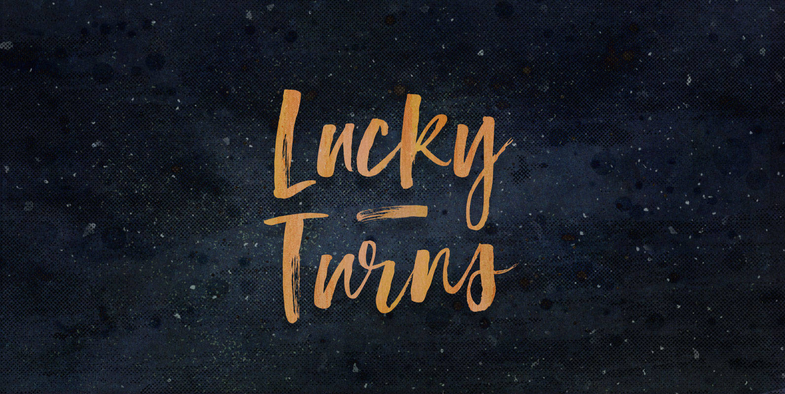
Lucky Turns Font
You have reached your destination. Whether you knew where you were going or not, all that matters is that you made it. Whether the best, or a blind pathfinder, either is only a few Lucky Turns away from making it.
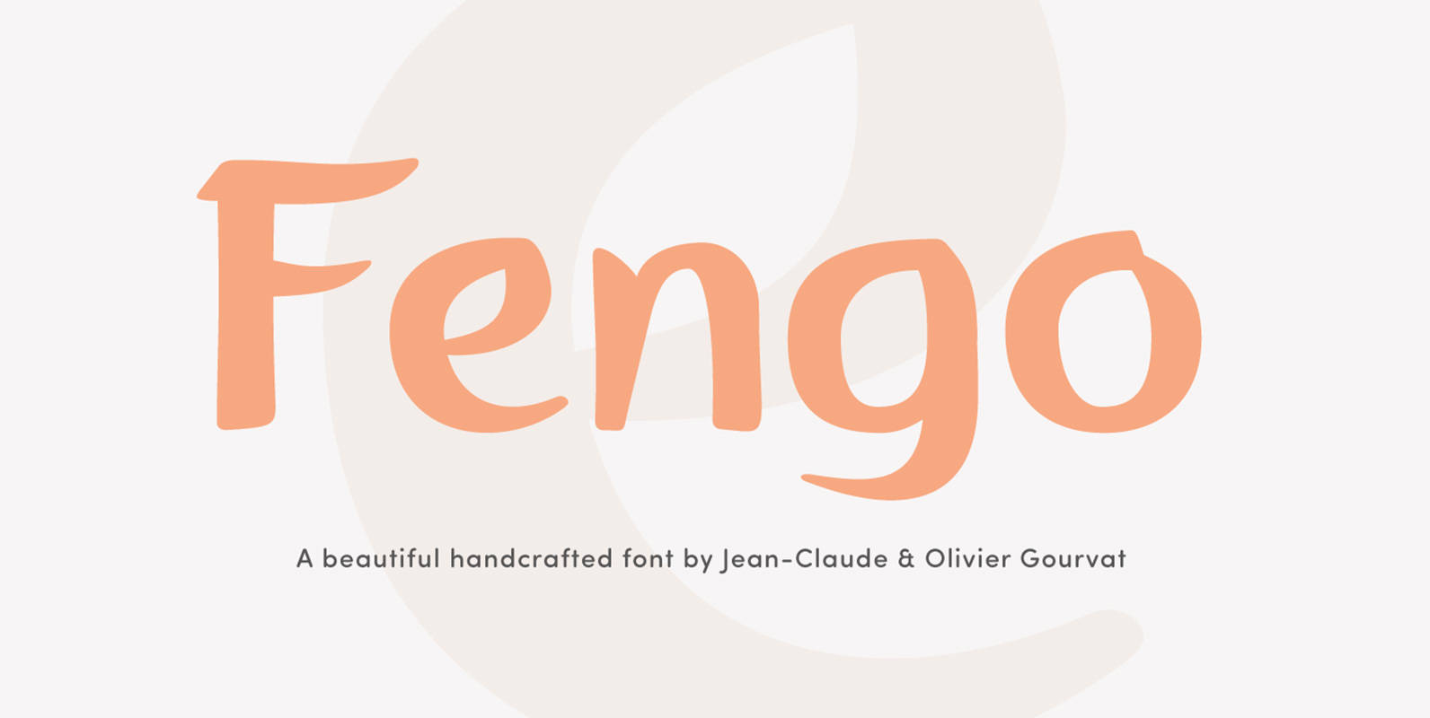
Fengo Font
Fengo is a beautiful handlettering font inspired by Sino-Japanese and traditional Chinese hieroglyphic characters. As a result the font looks authentic and very friendly. It contains a wide range of features such as initials, finals, swashes, arrows, circled numerals. Fengo
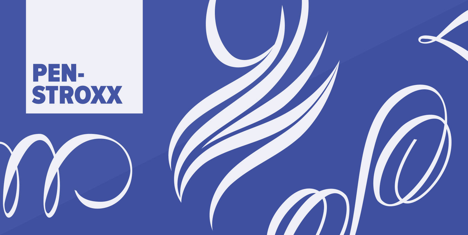
Penstroxx Font
“Penstroxx” is a collection of 5 fonts that are based on the powerful, expressive “Traits de plume” (pen strokes) designed in Paris around 1930 by Alfred Latour. I designed a lot of extra pen strokes to make this a full
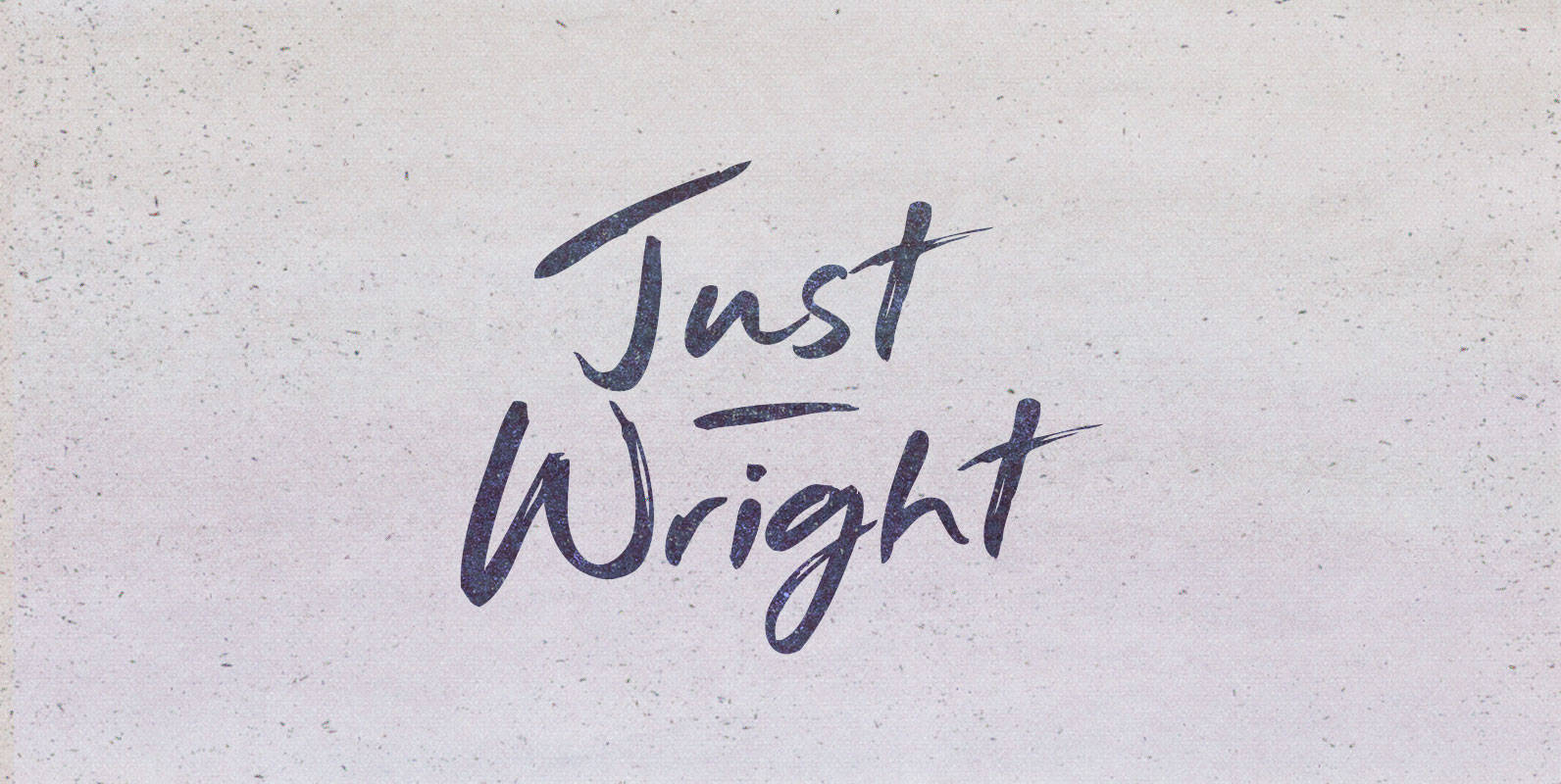
Just Wright Font
They had come for justice. It had been on order for centuries and they carried the bill their ancestors bestowed upon them. They came as a nation seeking her grand fleet, long under the nurturing of a great ship wright.
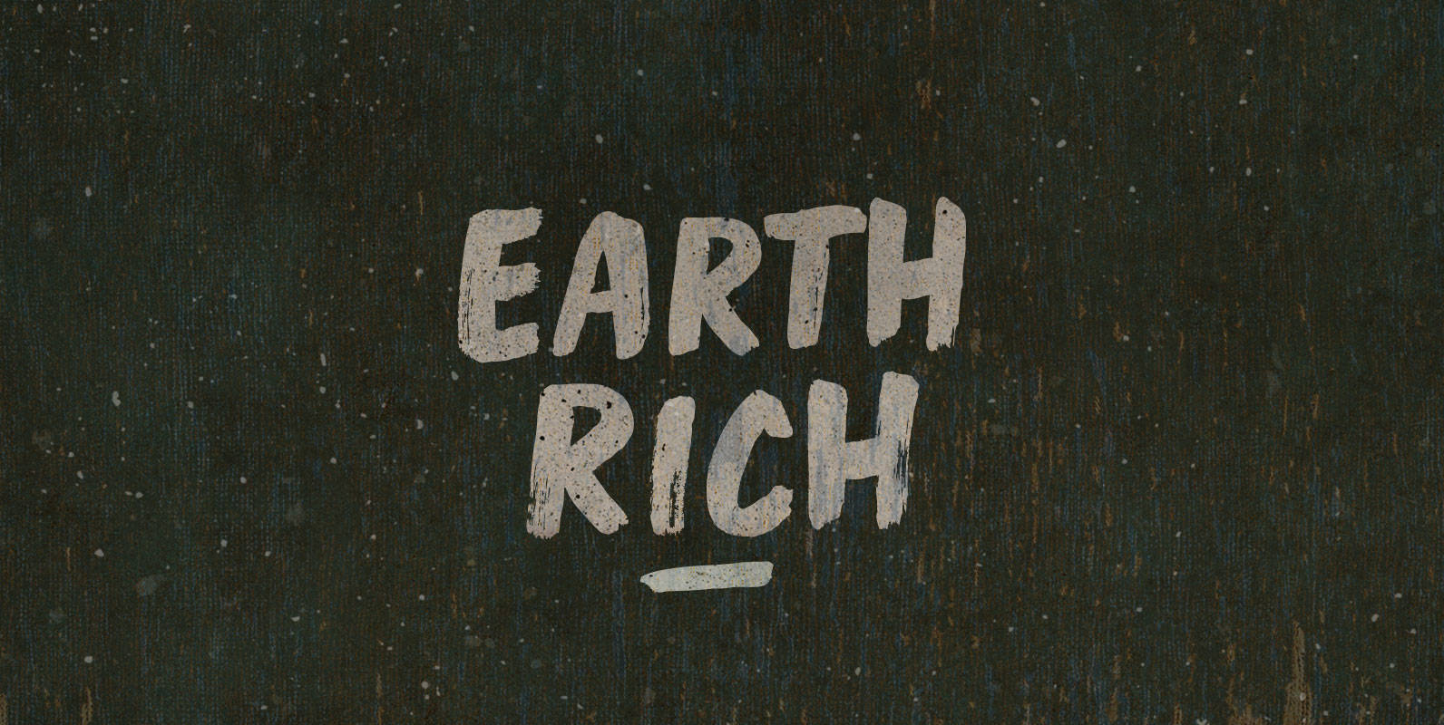
Earth Rich Font
Breathe air, drink water, spit fire, move your feet across an Earth Rich in elements. Open vistas, open dampers, open minds, but close the drapes. All in all it’s always something made when morsels aggregate. Published by BLKBKDownload Earth Rich
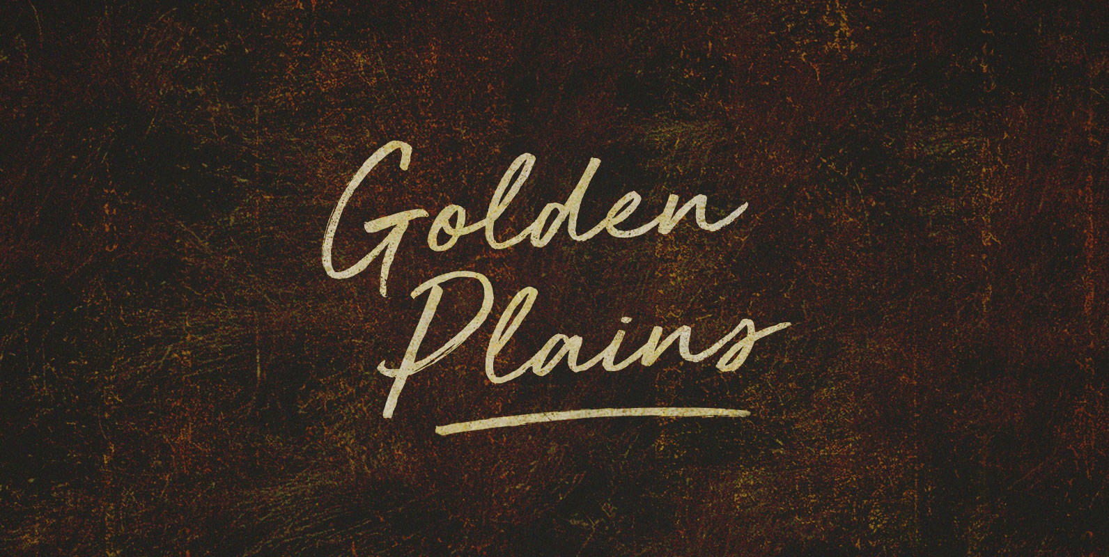
Golden Plains Font
Great shaggy heads and powerful shoulders, herded up against the hundredth meridian or breaking away into the sunset. Give me a home on that Golden Plain, and make my address a redress. For we will roam. Published by BLKBKDownload Golden
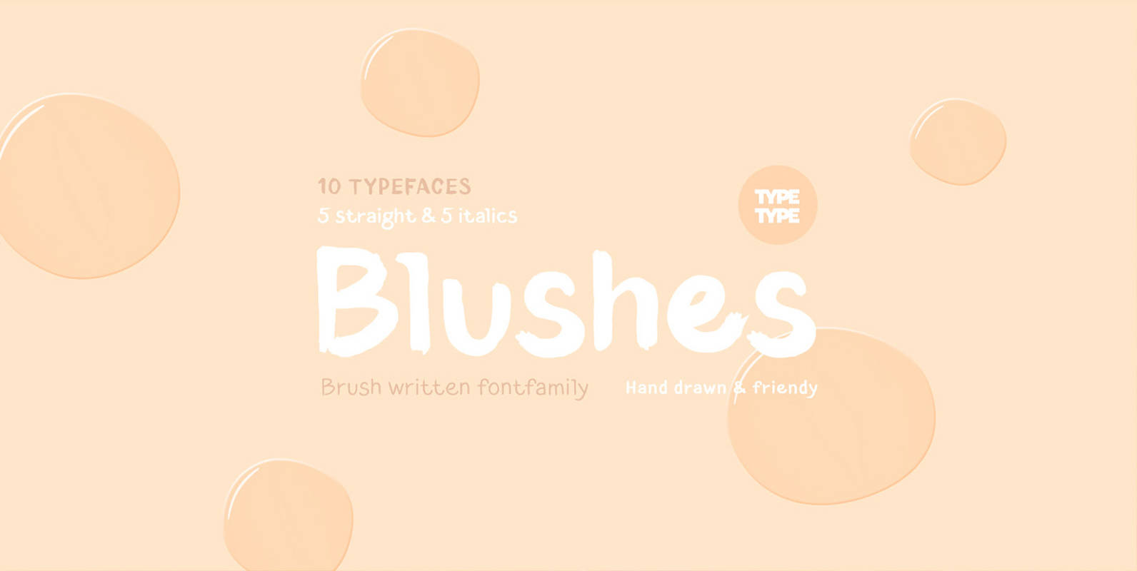
TT Blushes Font
Glitter, flashing cameras and fame – now you know how to deal with this stuff! Freshness and brightness is what defines the Blushes fontfamily, which is created for beauty and fashion industries. TT Blushes is a vibrant part of you
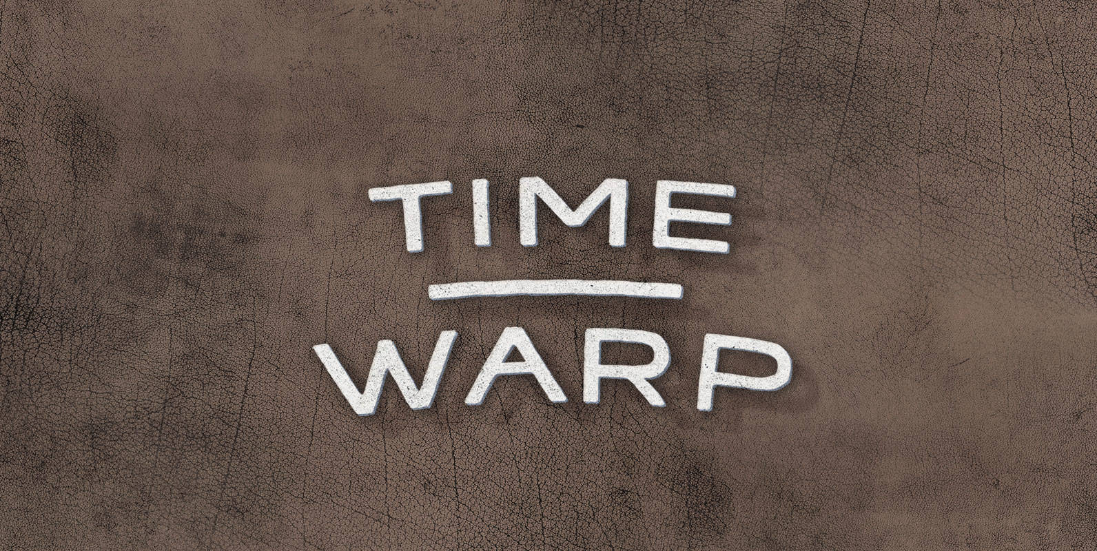
Time Warp Font
In the year 2004, Time Warp is a reality. It wasn’t, but a mysterious temporal distortion connected 2004 directly to 1994. Time warpers flooded through the rift, bringing heinous time-crime with them. Only a squad of tough as nails minute
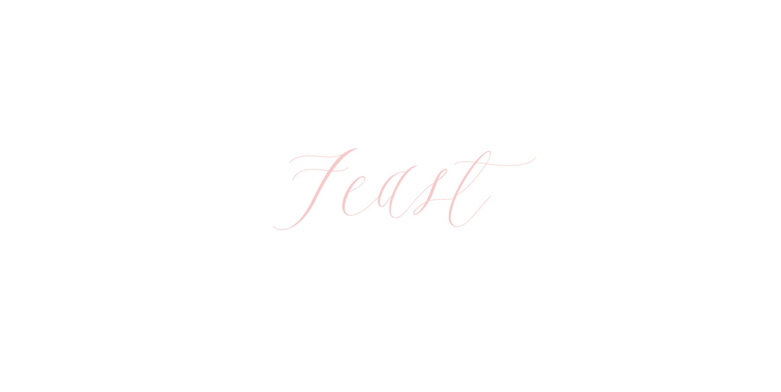
Feast Font
Feast is a calligraphy style font designed by Alissa Mazzenga. Her hand-sculpted letterforms emanate a powerful, yet delicate presence. Their magic resides in the ethereal movement of fluid wisps of ink, forming soft arched lines and design that stands alone.
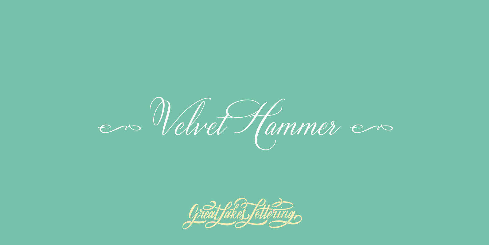
Velvet Hammer Font
The Velvet Hammer is a true hand calligraphy font that offers the viewer a sense of strong elegance. This font can be used for all things such as cards, posters, signage, wedding invitations, catalogs, book covers and so much more!
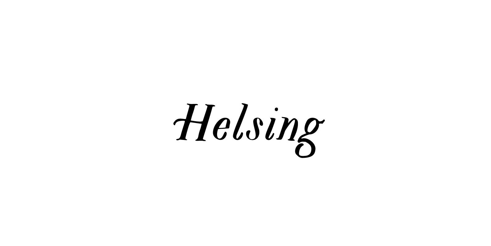
Helsing Font
Helsing is a serif style font inspired by Bram Stoker’s 1897 Dracula as well as Edward Gorey’s rendition of the story. Helsing is characterized by his slighting skewed baseline, subtle texture, thick and thin contrasts, and decorative legs. Made as

Timeless Appeal & Characteristic Versatility: The Handmade Fonts of Laura Worthington Font
A large and rare undertaking, Charcuterie is a family of ten distinct yet related typefaces, many of which have their own font families, and three decorative/ornamental typefaces.While most of the Charcuterie typefaces are outfitted with a standard character set, Charcuterie

Franklin Gothic Hand Light Font
Franklin Gothic Hand Light is part of a series of hand-drawn fonts from way back in time – before computers changed the way we worked. When I was in advertising – before computers – a very time consuming part of
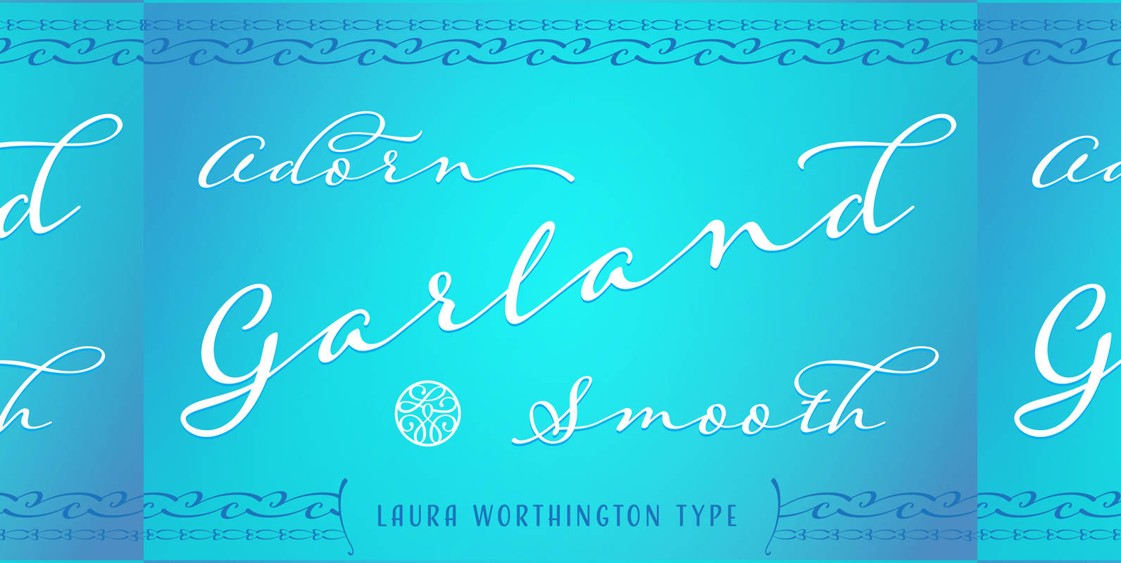
Adorn Garland Smooth Font
Adorn Garland is a script face that runs along a different, and somewhat “vintage” direction. Rather than deriving its strength from a heavy skeleton or structure, it uses its sense of contrast, its light touch upon the page, and its
