Tag: organic
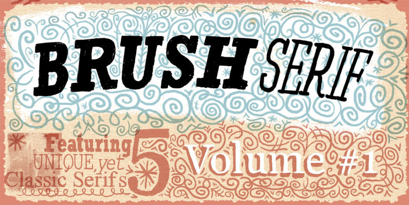
Brush Serif Font
All completely hand painted – including all the rough imperfections that come with that. I have used these a lot in my own projects, they are formal yet creative, versatile and fun. Published by Ed J BrownDownload Brush Serif

Mairy Font
Mairy is organic sans-serif font that contains 9 weights. Published by TypesketchbookDownload Mairy
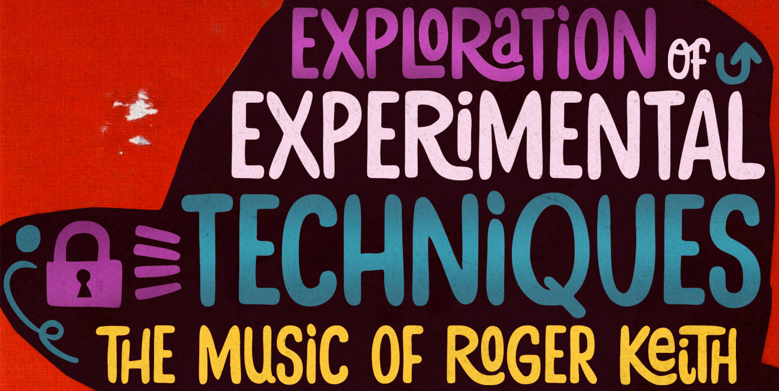
Stick-A-Round Font
Stick-A-Round started as an attempt to domesticate the wild Daft Brush font. During the process, though, it begun taking its own shape and personality, with friendly rounded terminals, dynamic interlock pairs and lots of alternates. There are at least 4
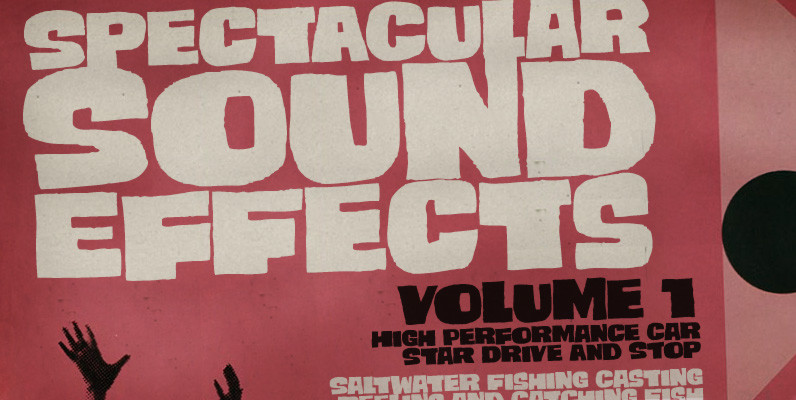
Smashing Font
Smashing is a stout typeface, with a twist. It’s a massive all-caps font with bouncing glyphs, positively bold yet quite good-humoured. Its upper and lower case slots stores different lettershapes, providing handy options to choose from. When working with OpenType
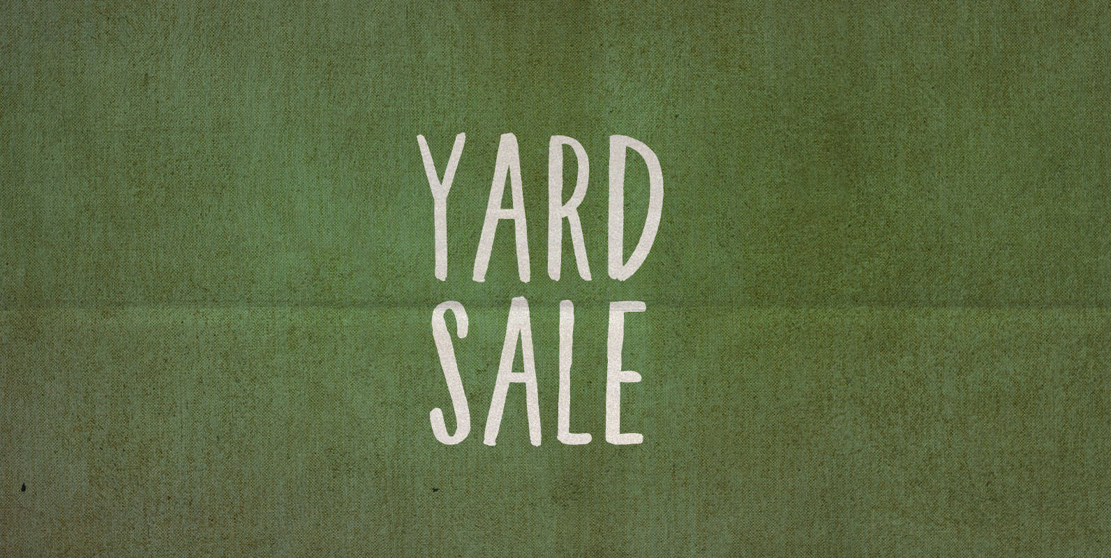
Yard Sale Font
Last year I put out my old yard sale sign and the city told me it was violating a bylaw for being too ugly of a sign in a public place. Not this year! This year I used BLKBK’s ‘Yard
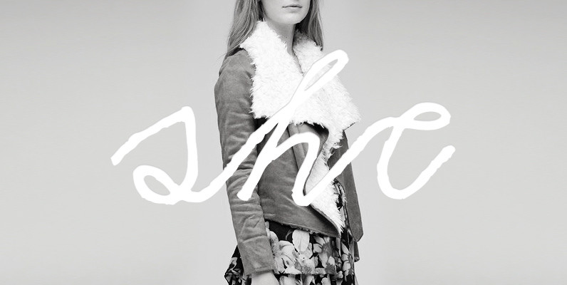
YWFT Chateau Font
Home-spun & hand-done, the coarsely calligraphic YWFT Chateau is an endearingly uneven complete script face with unerring links and lots of character. YWFT Chateau was converted to opentype format in 2010. Published by YWFT Maddy NyeDownload YWFT Chateau

Felt Noisy Font
Counting four variations for each letter and two for the numbers, Felt Noisy delivers a cool organic feel with a strong and spontaneous attitude. The typeface was drawn with a bad felt tip pen? and resulted in two rather nice
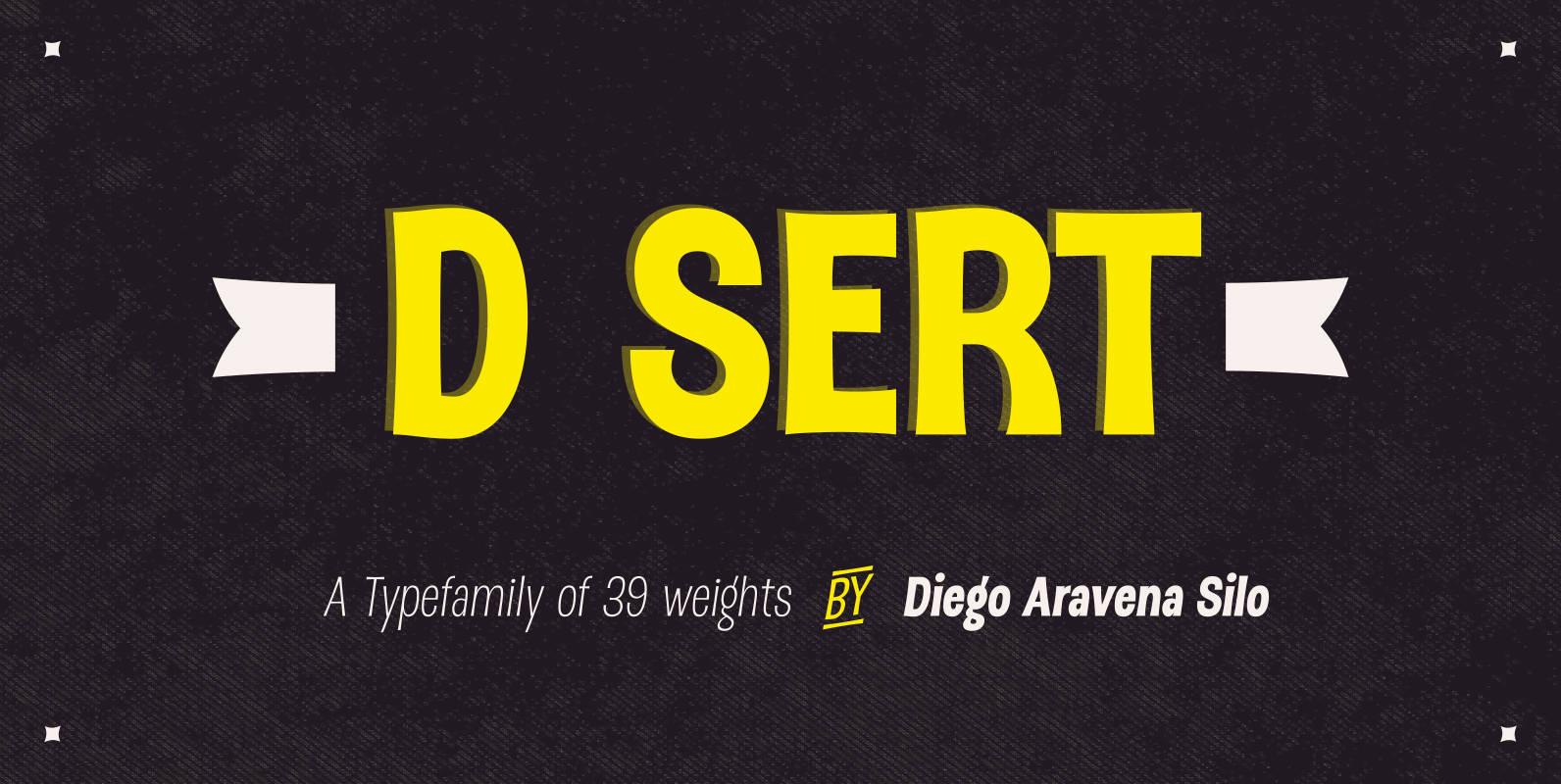
DSert Font
D Sert—based on the Pirata typeface—is inspired by 70s Chilean constructivist design and the political propaganda posters artwork of La Unidad Popular (Chilean political coalition). D Sert is the result of the combination of the Chilean graphic art revival with
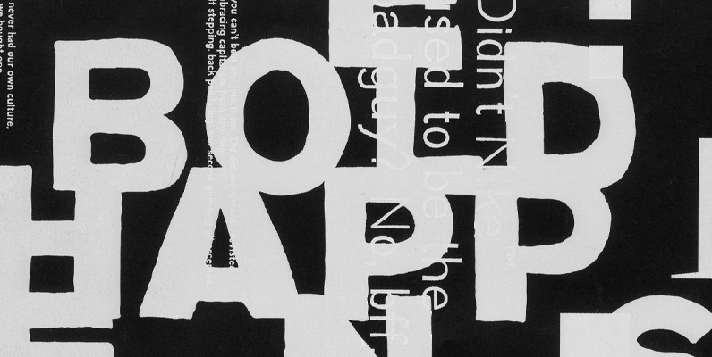
YWFT Absent Grotesque Font
In these over-Photoshopped times, a little imperfection can make your work stand out and excel. YWFT Absent Grotesque was created to be an imperfect typeface, exploring ideas found in Univers and Helvetica without the serious attitude and over-marketing. It was
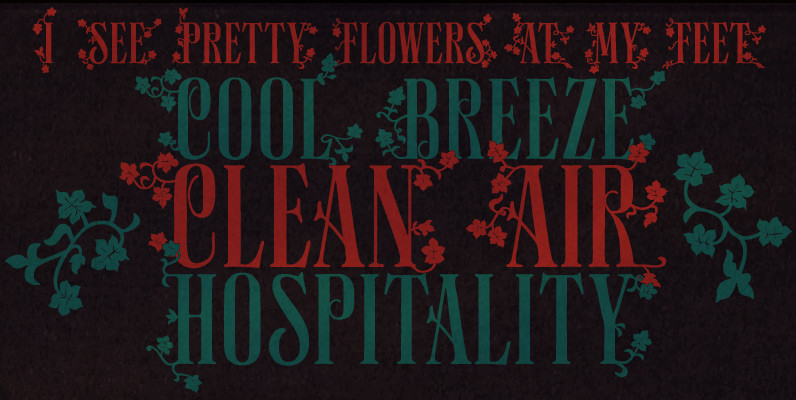
Polyspring Font
Polyspring is a handcrafted serif display font, with a refreshing flowery flair. It was hand-drawn based on Italia Condensed, a typeface from Keystone Foundry from circa 1906. Loaded with stylish ornaments and flourishing alternates for all its letters and numbers,
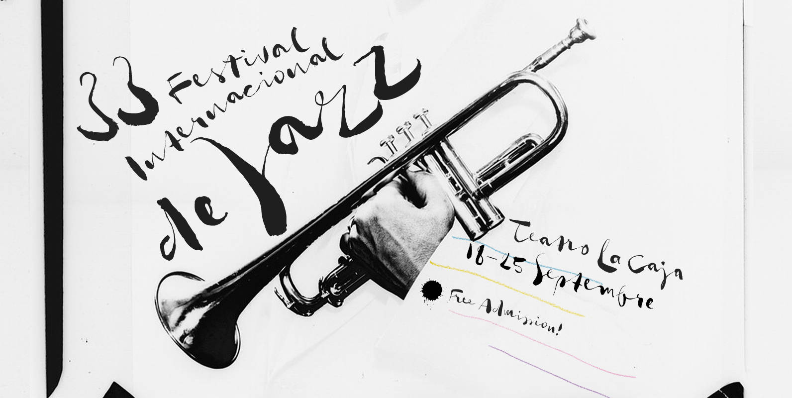
Gloss Drop Font
An enviable choice for magazine headers, book covers or record covers. Works also well as a companion to hand-drawn or painted illustrations. Like in real handwriting, some, but not all, letters connect within a word. Automatic Positional OpenType features handle
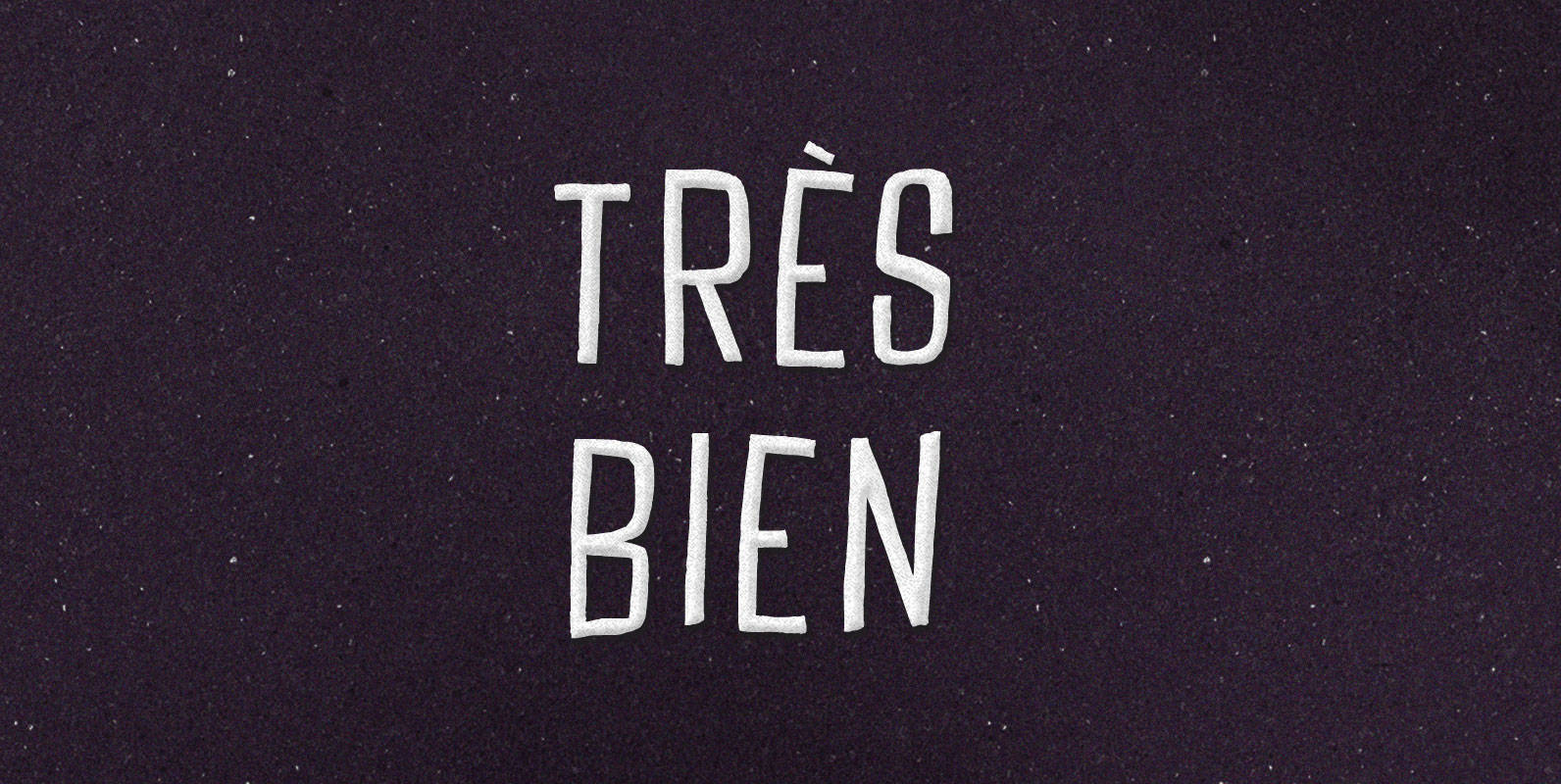
Tres Bien Font
We may say that a thing is good when on its own account it ought to exist, and bad when on its own account it ought not to exist. If it seems to be in our power to cause a
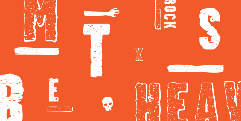
Stalker Font
Stalker is one of those necessary fonts in a designer’s toolbox: Grungy sans serif caps that are most useful for entertainment project chores. Originally made in the summer of 2003 for set and prop design of an Alliance film, Stalker
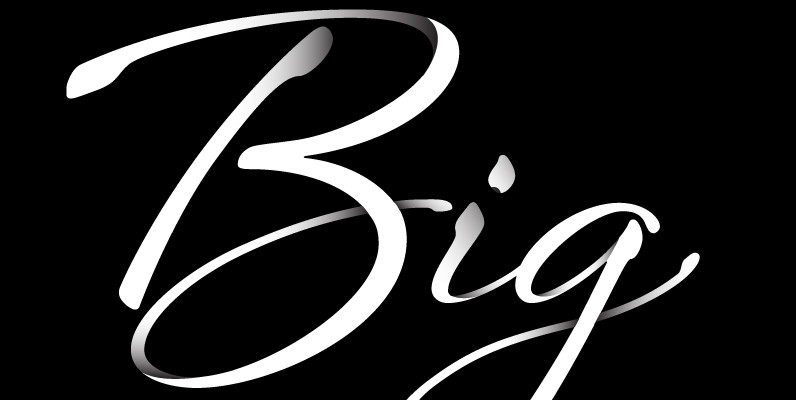
Sheila Font
Sheila strikes the perfect balance between casual handwriting and careful calligraphy, making it both approachable and aspirational. Put Sheila’s airy, breezy letterforms to use in friendly or feminine settings like inspirational quotes and fashion layouts. Contextual alternates and ligatures lend

