Tag: ornate
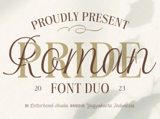
Roman Pride Font
Introducing Roman Pride, a fresh and stylish font duo that features an elegant serif font and a charming script font. The combination of the two fonts creates a perfect harmony that is both classic and modern. Whether you’re working on
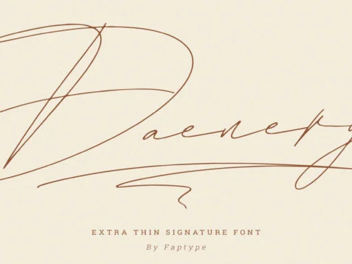
Daenerys Font
Daenerys is a thin, elegant signature font that is perfect for a wide range of design projects. It has a delicate, calligraphic style with smooth, flowing lines that give it a sense of grace and beauty. The letters have a
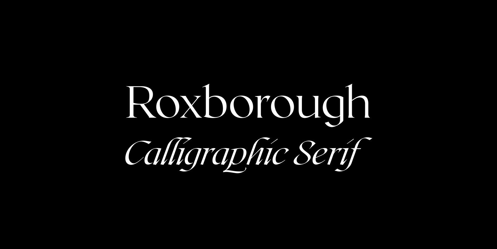
Roxborough CF Font
Roxborough is a dramatic serif, influenced by calligraphy and hand lettering. Rich, open construction – built around a distinctive single-storey “a” – pairs nicely with the stylized, expressive italics. Both traditional and chic, Roxborough transforms text into art; it adapts
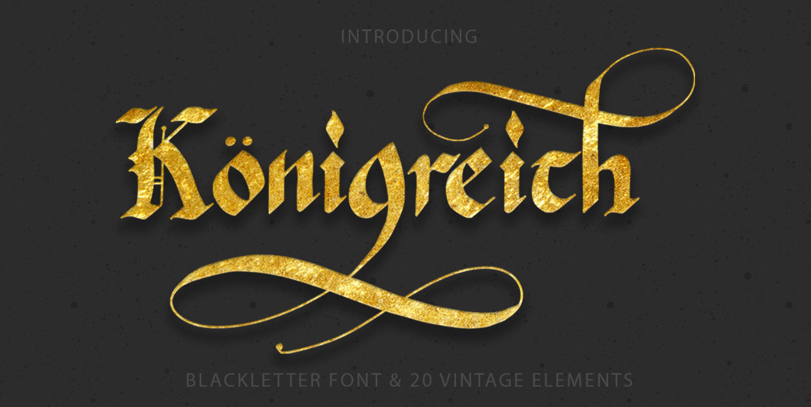
Konigreich Font
Konigreich is the perfect tool to create amazing designs, like vintage cards, modern t-shirts, retro posters, unusual mugs, luxury branding materials, and any other projects you are working on. Konigreich is a beautiful blackletter font with lots of OTF. 4
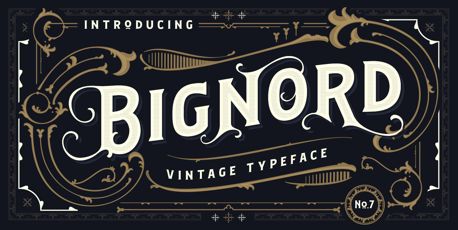
Bignord – Vintage Typeface Font
Bignord – Vintage Typeface is a decorative font design published by Adam Fathony Published by Adam FathonyDownload Bignord – Vintage Typeface
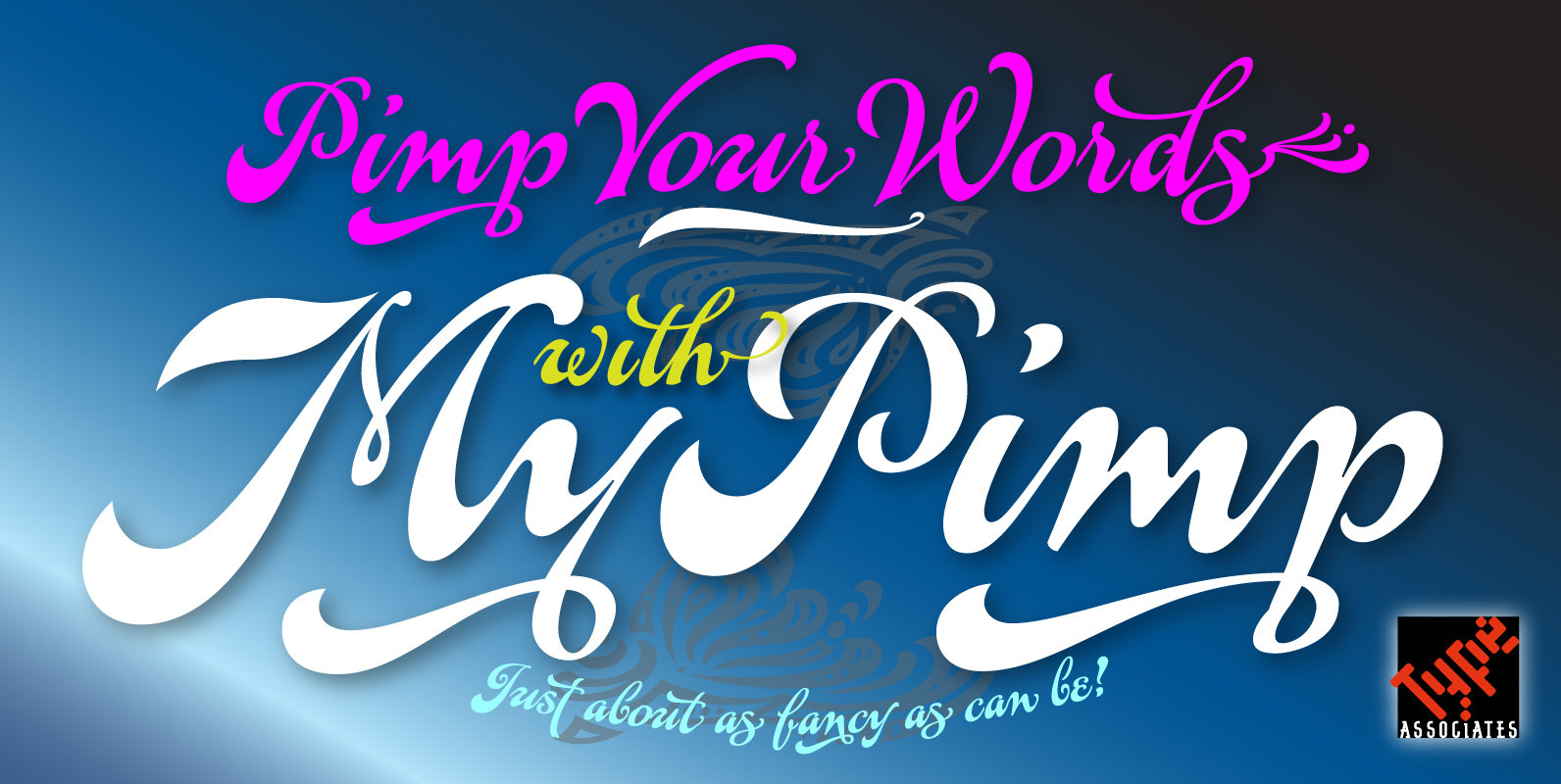
MyPimp Font
The concept of a bold connected script with a hand-lettered feel has been on my bucket-list for decades. I imagined a pretentious, ornate, swashy look, a variety of word-end embellishments, heaps of ligatures and underscores. It took a weekend workshop
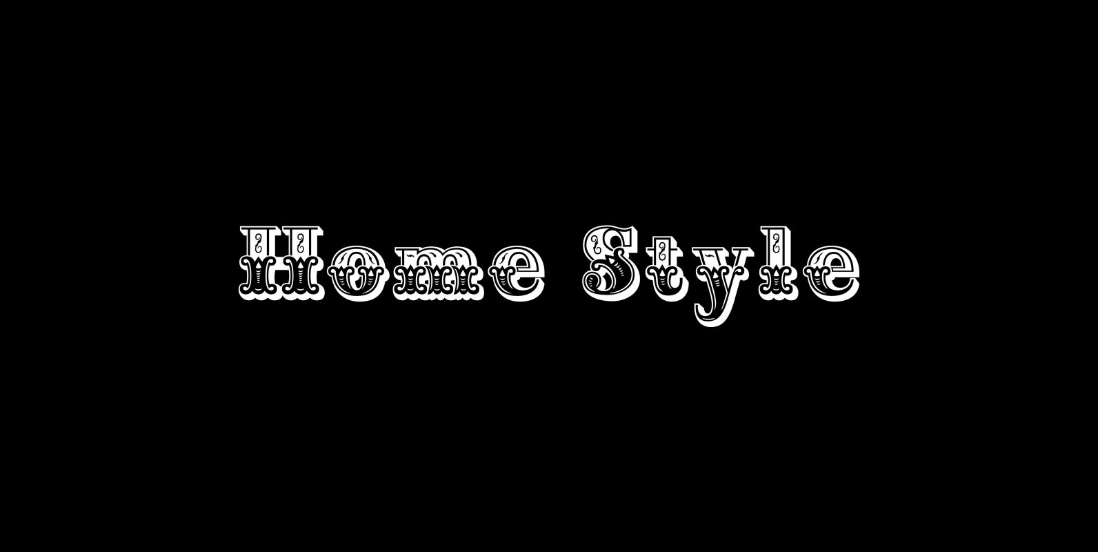
Home Style Font
Home Style is a revival of a very old font previously thought to have been designed by Joseph Gillé in or around the year 1820, however recent evidence from France suggests that an artist by the name of Silvestre from
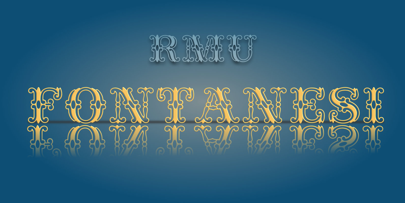
RMU Fontanesi Font
This abundantly ornate former Nebiolo font was freshly designed and carefully extended for multilingual use. Published by RMU TypedesignDownload RMU Fontanesi

Maison Luxe Font
Maison Luxe is a revival of a very old font designed in France in or around the year 1820. You may have seen this font in the past under the names of Circus, Roma, Madame and Gillé Classic. As of
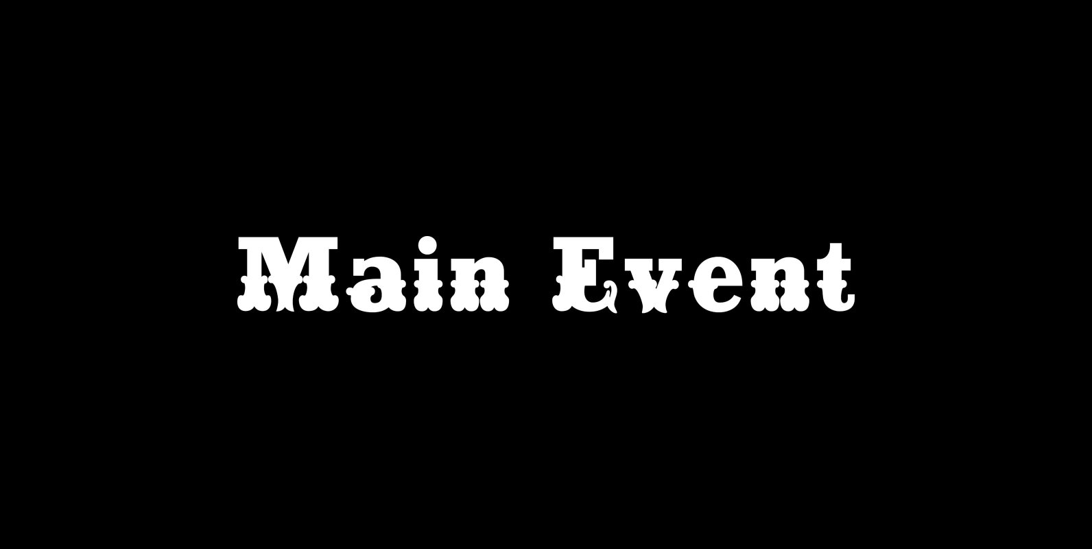
Main Event Font
Main Event is a revival of a very old Italian font that you may have seen in the past under the original name of Tuscan Ornate or Bracelet. Dating back to 1860 or earlier it has never been known to
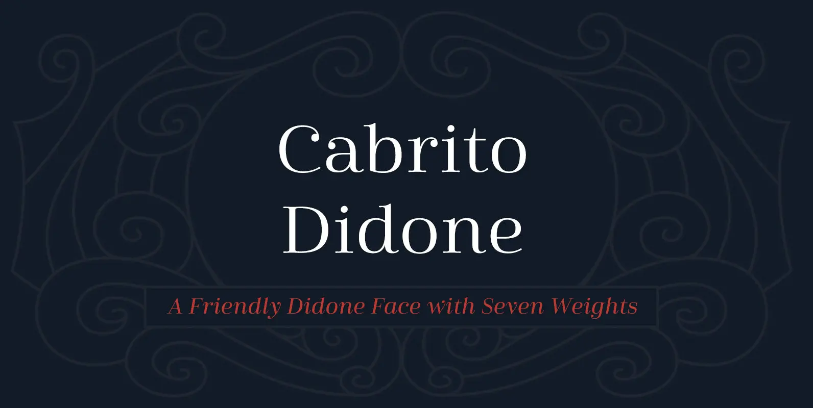
Cabrito Didone Font
A graceful kid if ever you’ve seen one, Cabrito Didone joins the Cabrito family of fonts–a family designed to provide young infants with clear recognition of letter forms. The original letters were released as part of the children’s book about
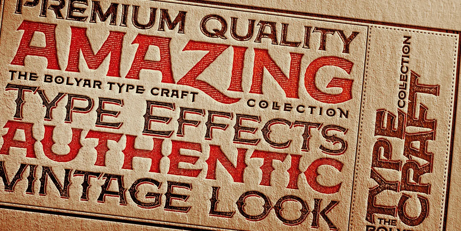
Bolyar TypeCraft Pro Font
A super font family mastered to an unparalleled level of precision, Bolyar TypeCraft is a collection multiple textured styles that represent historical printing techniques. A proud member of our successful Bolyar lineage this unique type family provides unlimited options for
