Tag: packaging
Mi Negra Font
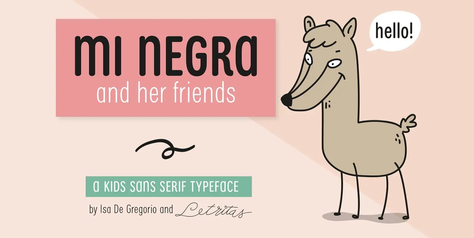
Mi Negra is a funny and hilarious typography designed especially for children, thought and created by Isabel de Gregorio. It could be described as an original combination between a semi-handwright and semi sans-serif font. Thanks to its structure and nice
Whale Song Font
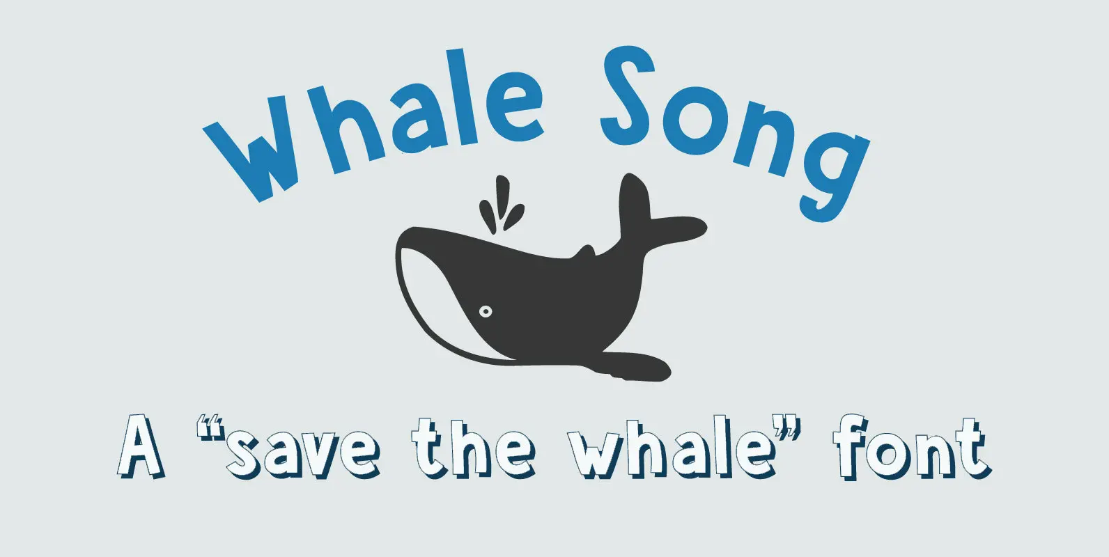
I grew up with the ‘Save The Whales’ slogan: I remember watching the news and seeing little Greenpeace dinghies taking on huge Japanese whalers, and activists clinging on for dear life. I haven’t heard that slogan for a while: maybe
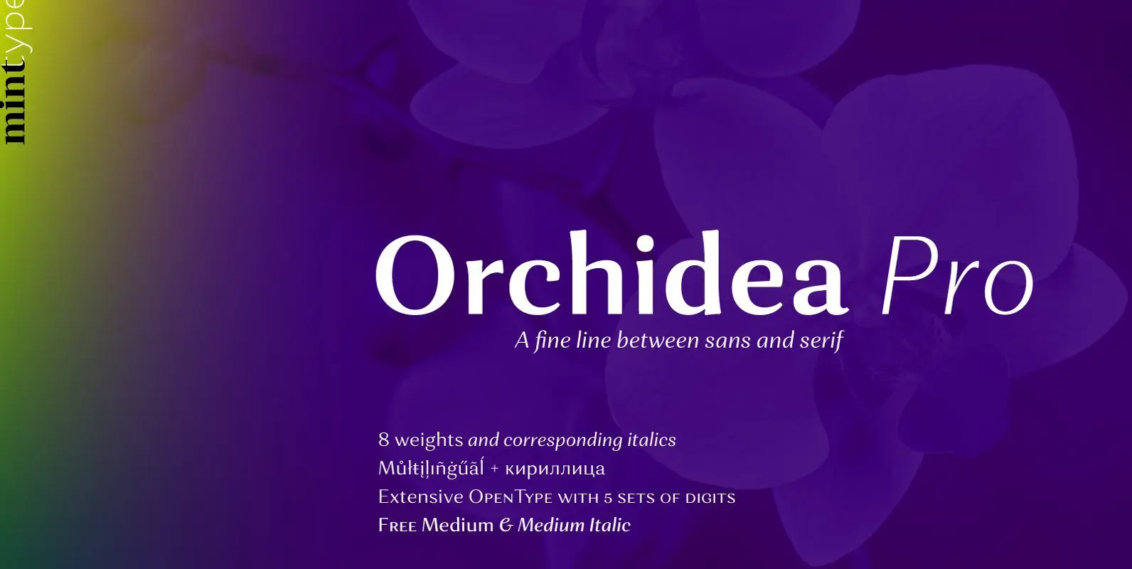
Orchidea Pro Font
Orchidea Pro is a typeface balancing on the verge of sans and serif. Called a stressed sans or a serifless serif, it does not feature any serifs, but resembles a serif typeface by build, and features unilateral nibs that speed

Trenda Font
Designed by Daniel Hernández and Paula Nazal. Corrections and review by Alfonso García and Rodrigo Fuenzalida. Trenda is a geometric sans-serif typeface based on the uppercase of Trend—a Latinotype font, released in 2013, that was very well received. This new
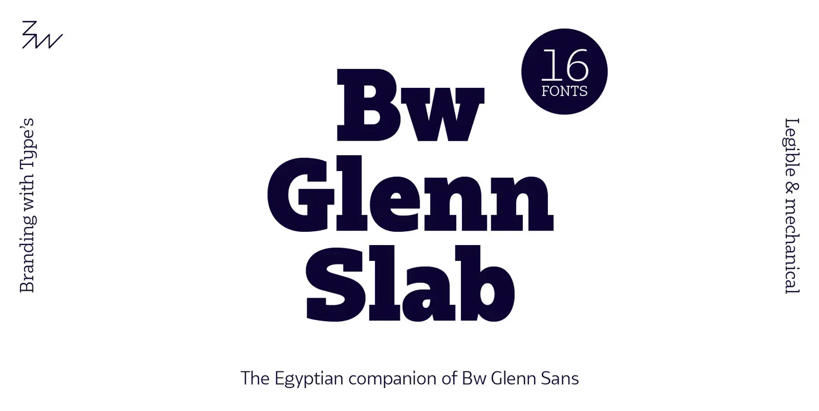
Bw Glenn Slab Font
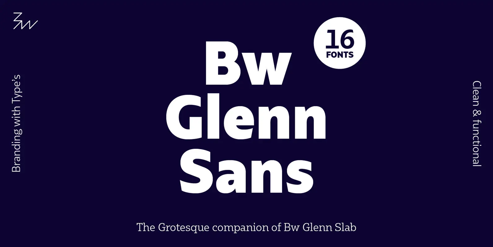
Bw Glenn Slab is a confident and robust font family with a sturdy feel offering no concessions for ambiguity. Its strict geometry and open shapes provide a very legible and clean texture, performing well on print and screens alike. It’s
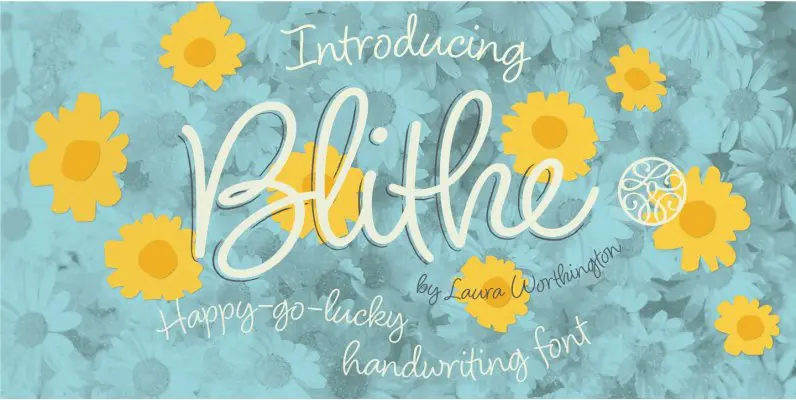
Blithe Font
Bouncy, effortless-looking handwriting can put us at ease or make us smile. Blithe captures the casual flair of a felt-tip pen with clean monoline strokes. Laura Worthington has retained the distinctive quirks of real handwriting – such as characters that
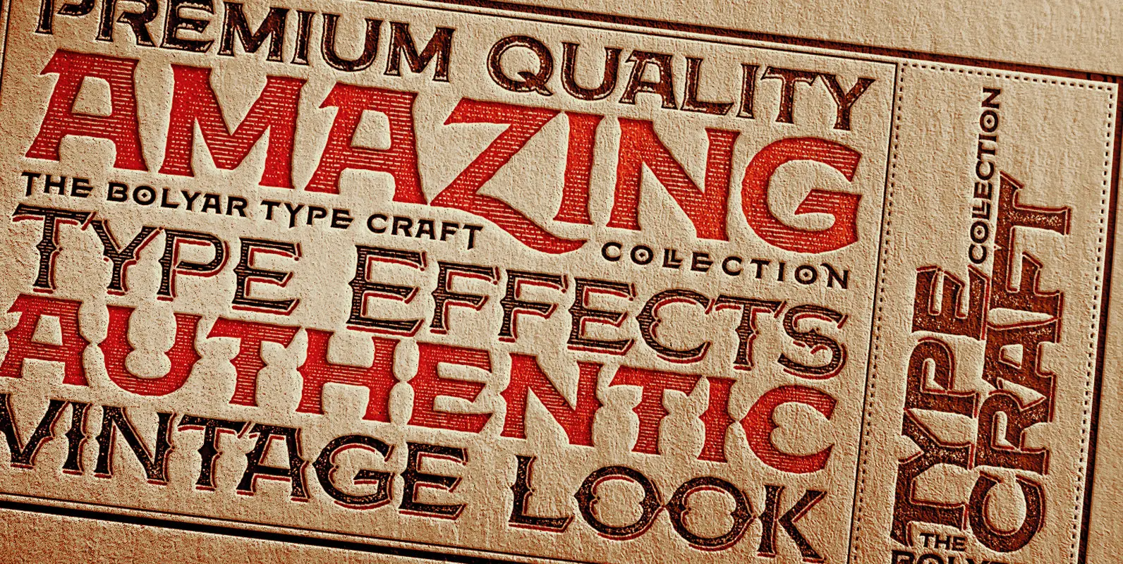
Bolyar TypeCraft Pro Font
A super font family mastered to an unparalleled level of precision, Bolyar TypeCraft is a collection multiple textured styles that represent historical printing techniques. A proud member of our successful Bolyar lineage this unique type family provides unlimited options for
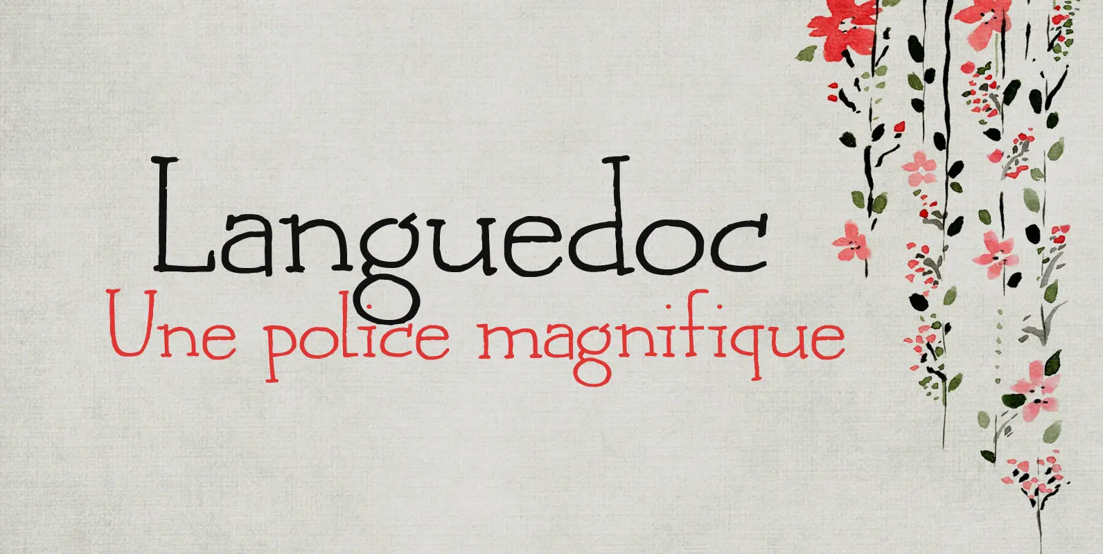
Languedoc Font
Languedoc is a former province of France. Most of its territory lies in what is now the Occitanie region. My family and I love camping there and I figured I’d name a font after it! Languedoc is a beautiful and
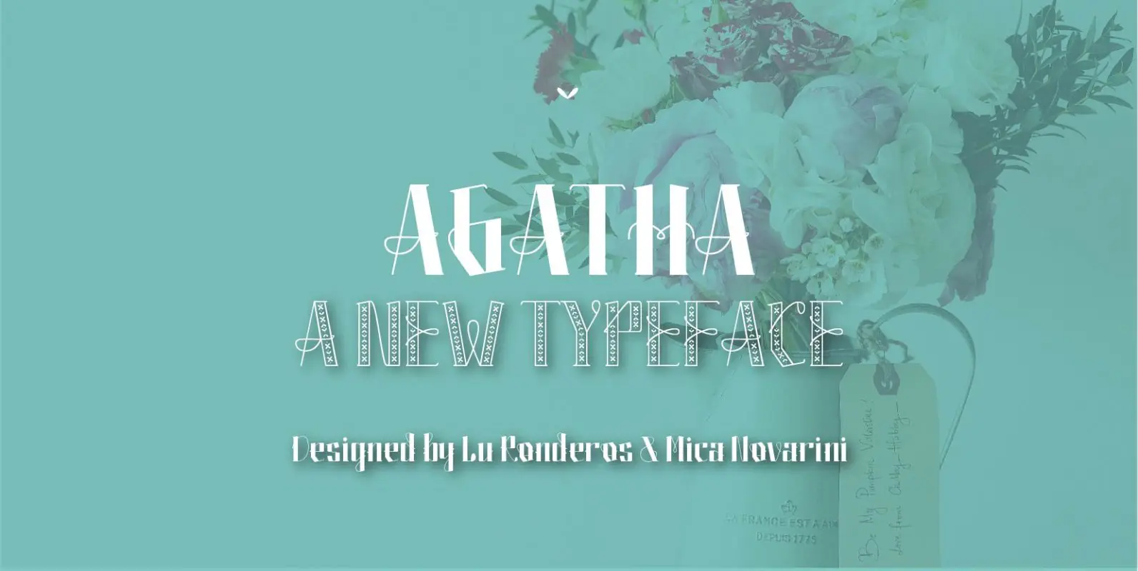
Agatha Font
Agatha is a new typeface for titles and short texts in big sizes. It can be use both in editorial publishing and brand design. From gothic geometric bases, the letters resemble the Nordic style in order to be more feminine,
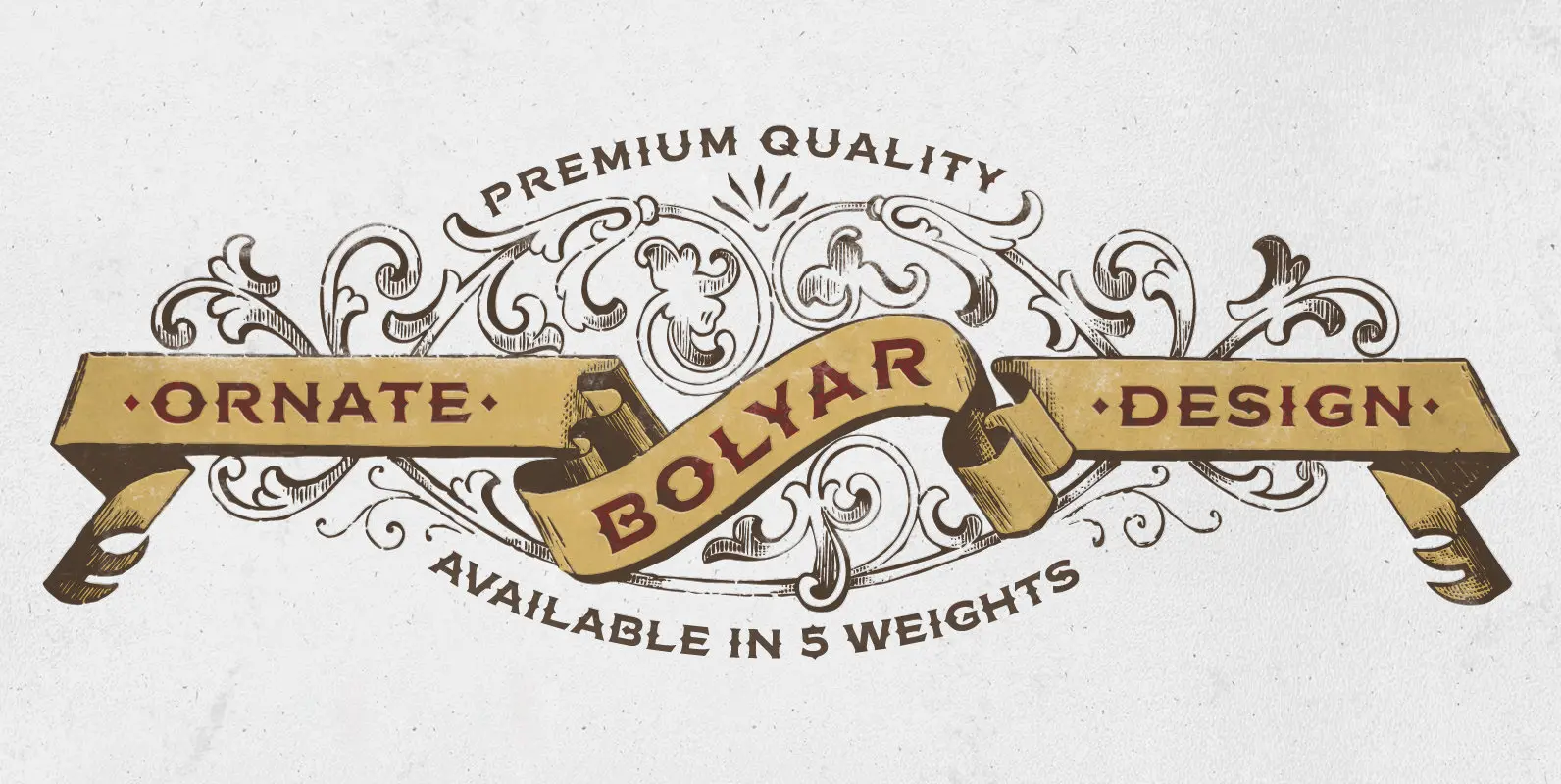
Bolyar Ornate Pro Font
Bolyar Pro Ornate is the latest member of our renowned Bolyar mega family and the perfect companion for our very successful FM Bolyar Pro. Developed to a new level of excellence this new improved ornate design is quite able to
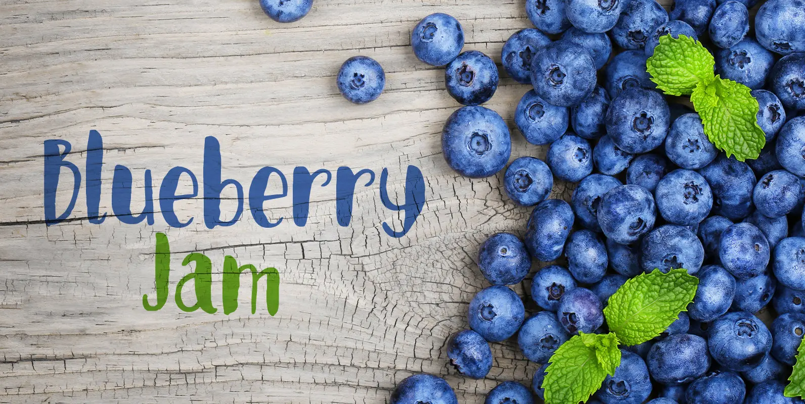
Blueberry Jam Font
I love blueberries. When my brother and I were young, we used to pick them in the forest by the bucket. Afterwards, we’d always look like victims of a serial killer, but it was all worth it, as nothing quite

Active Font
Active is an upright brush script with slanted and fill styles. Hand-drawn with brush and ink, it is confident while expressive and has a textured appearance. The slightly condensed proportions help it stand a little taller, and the slanted and
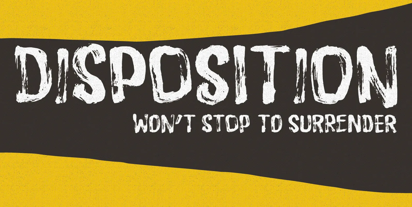
Disposition Font
You may not know it, but you’ve been looking for a font like DISPOSITION! Yeah, it’s a font…but it doesn’t act or look like one! Why?! Because there are 6 different versions of each letter! Yes, SIX different versions! Enough
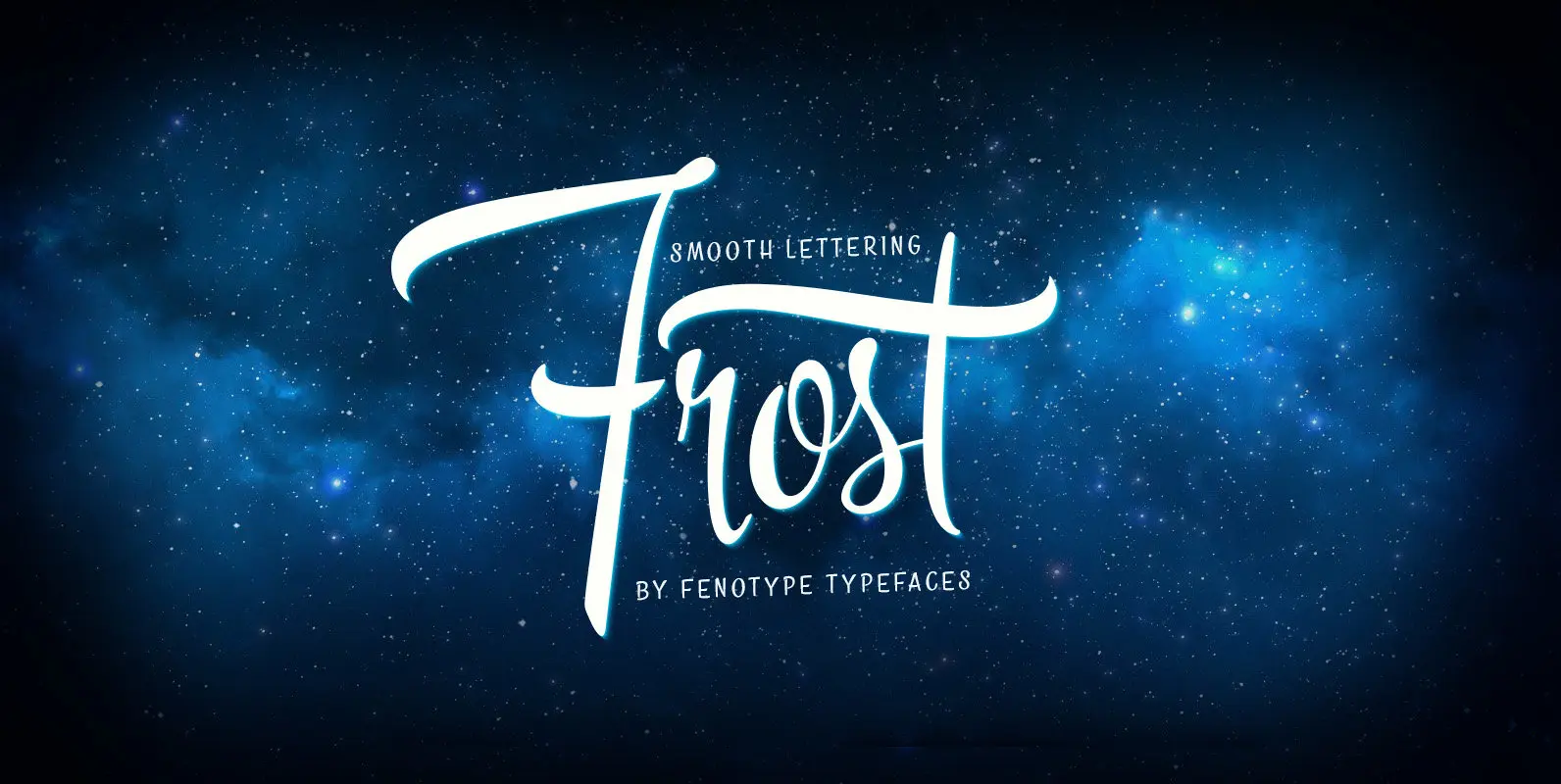
Frost Font
Firing Imaginations and lively connected script family of three weights, ornament and banner sets and separate caps and small caps designed to support the script. Frost is influenced by the hand lettering and sign painting of the 1950s and 1960s
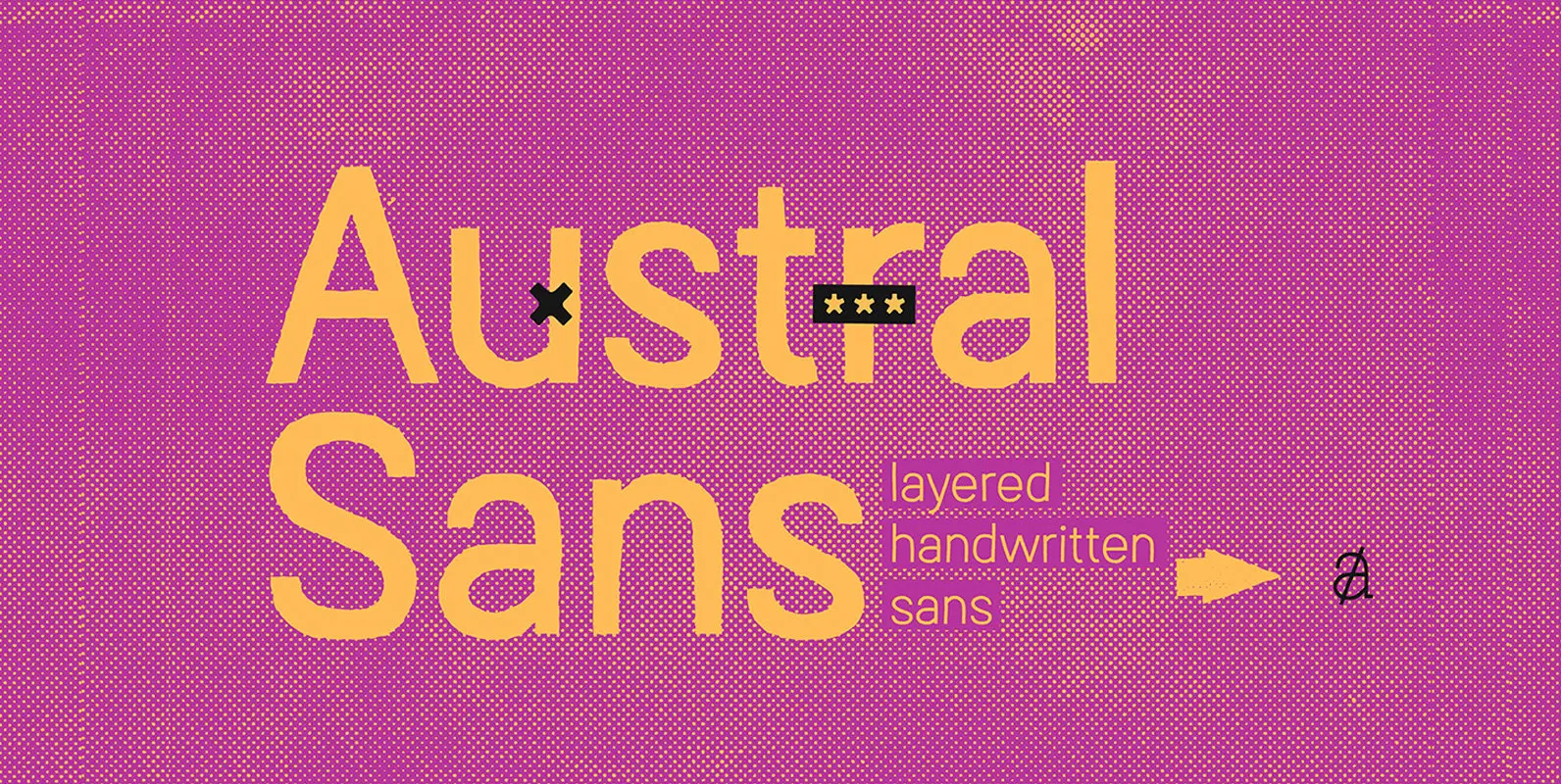
Austral Sans Font
Austral Sans is a hand-drawn layered font designed by Antipixel. Based in the Slab version, it is part of the Austral type family. This sans makes your work unique & noteworthy, because the possibilities of combinations of textures & styles
