Tag: packaging
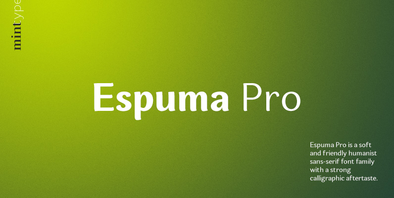
Espuma Pro Font
Espuma Pro is a soft and friendly humanist sans-serif font family with strong calligraphic aftertaste. Presented in 7 weights, with true italics each, it features the traditionally rich language support, small caps, 6 sets of figures and a bunch of

Delargo DT Pro Font
Delargo DT Pro is a sans-serif font design, published by DTP Types Limited. Published by DTP Types LimitedDownload Delargo DT Pro
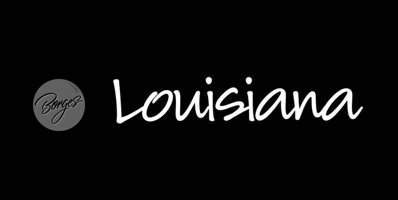
Louisiana Font
Louisiana originated from the lovely handwriting style of Melanie Snedeker Lettering Artist Charles Borges de Oliveira then refined the letter forms to produce this one of a kind handwriting script When you need a legible handwriting font, Louisiana is the

Delargo DT Rounded Font
Delargo DT Rounded is a sans-serif font design, published by DTP Types Limited. Published by DTP Types LimitedDownload Delargo DT Rounded
Macarena DT Font
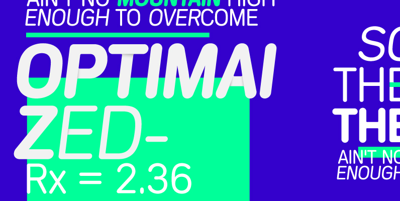
Macarena DT is a rounded sans-serif font design, published by DTP Types Limited. Published by DTP Types LimitedDownload Macarena DT
Carlingtown Font
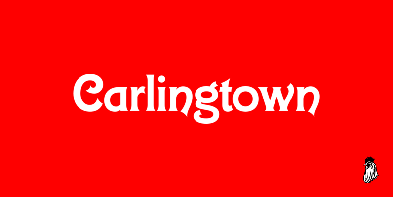
This old victorian typeface was originally called Constantia. Since that name was already in use, we decided on a the new name of Carlingtown. Digitally engineered by Steve Jackaman and Ashley Muir. Published by Red RoosterDownload Carlingtown

Goudy Old Style DT Font
Goudy Old Style DT is a serif font design, published by DTP Types Limited. Published by DTP Types LimitedDownload Goudy Old Style DT

Toppo Font
To design a font Toppo I was inspired by a You And Me Monthly published by National Magazines Publisher RSW Prasa that appeared from Mai 1960 till December 1973 in Poland. Family contains 6 different styles. Toppo family, every variety
Perron Font
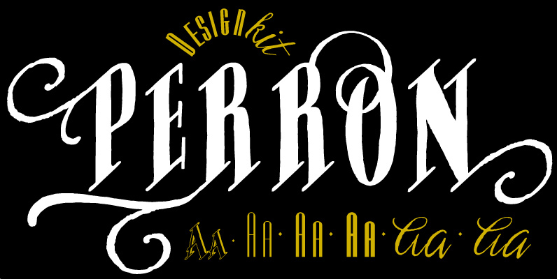
Meet the successor of our bestselling design kit ‘Chameleon’: Perron. The concept of designing multiple contrasting designs under the same name was first introduced by Fontforecast in TyfoonSans and TyfoonScript. Two font families that were designed to complement each other.
Malambo Font
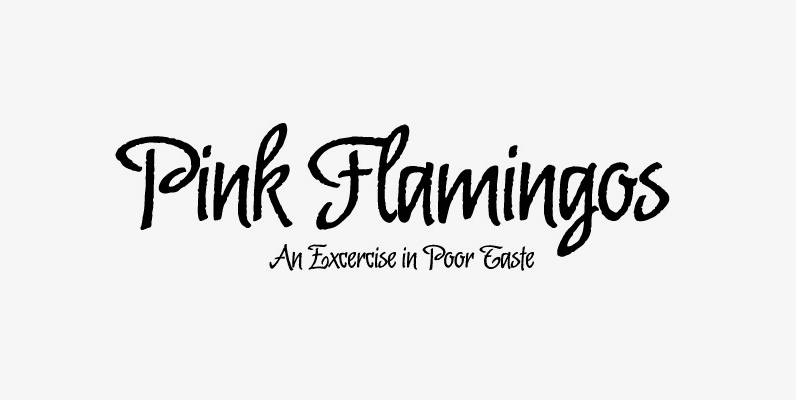
The master of the dancing brush, Angel Koziupa, and the node-obsessed perfectionist, Alejandro Paul, offer up another bucket of fun with Malambo. This time Koziupa allows his brush to jitter one whole millimeter, and Paul digitizes with two eyes instead

Ginza Narrow Font
Here’s what I said about the original Ginza: Sometimes you get an idea stuck in your head and the only way to get rid of that demon is to put something down on paper. A year later the doodles became
