Tag: packaging
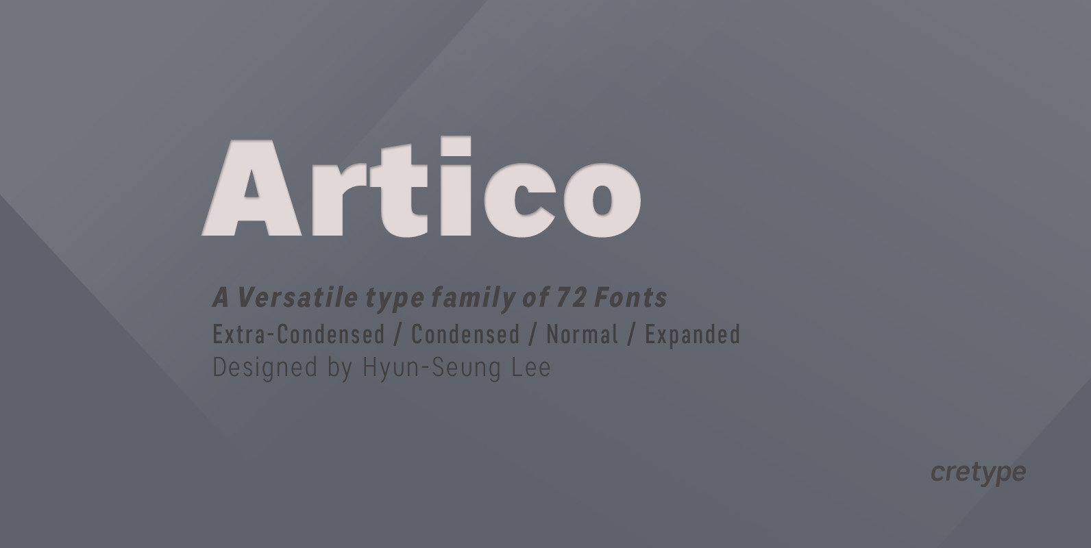
Artico Font
Artico Family is a modern sans-serif typeface that is clean, simple and highly readable. Letters in this type family are designed with genuine neo-grotesque and neutral shapes without any decorative distractions. The spaces between individual letter forms are precisely adjusted
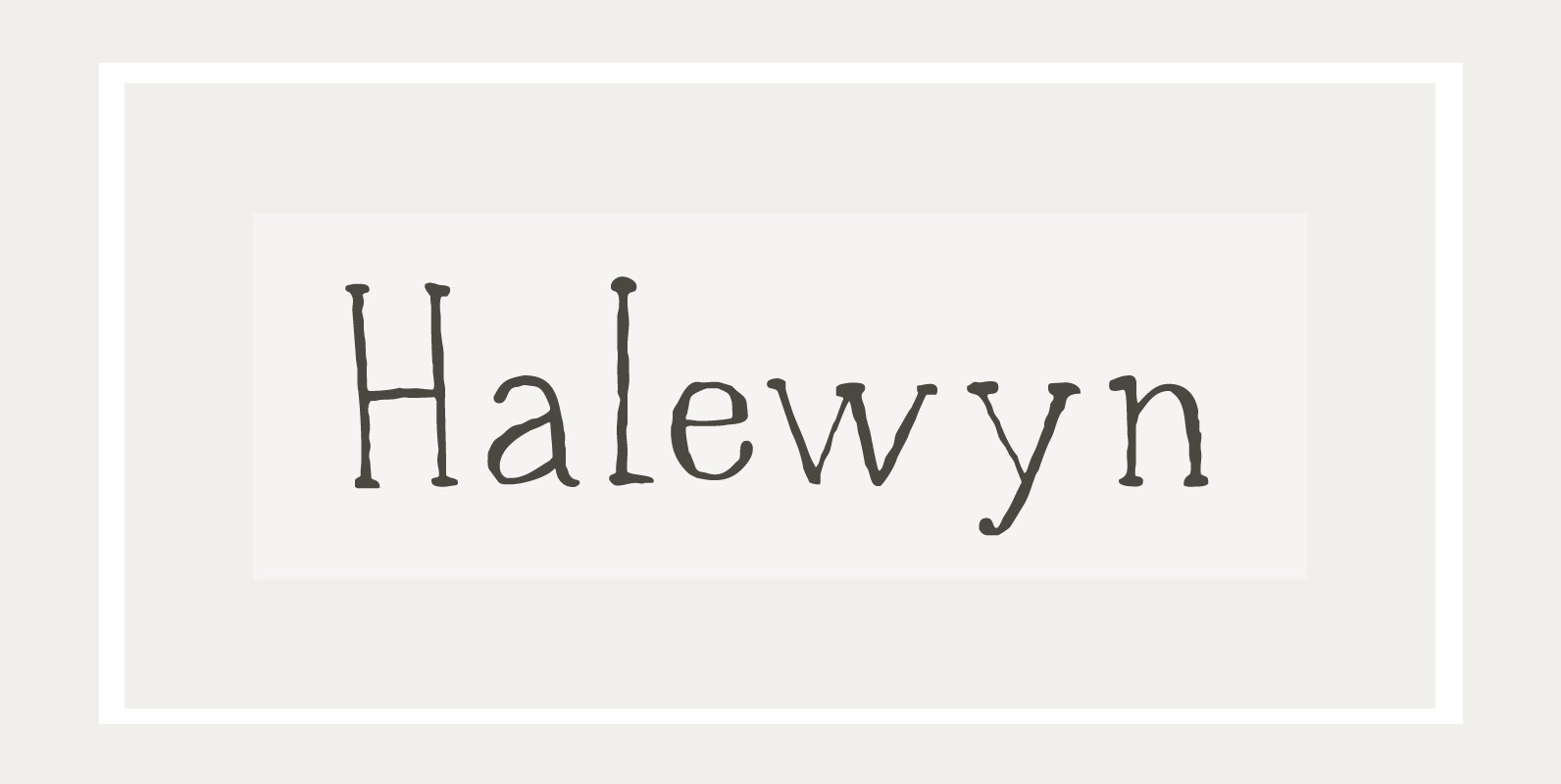
Halewyn Font
Heer Halewijn (The Song of Lord Halewijn) is a 13th century Dutch folk tale which survives in folk ballad. The story tells of a man called Halewijn, who lives in the woods and who lures pretty women with his songs
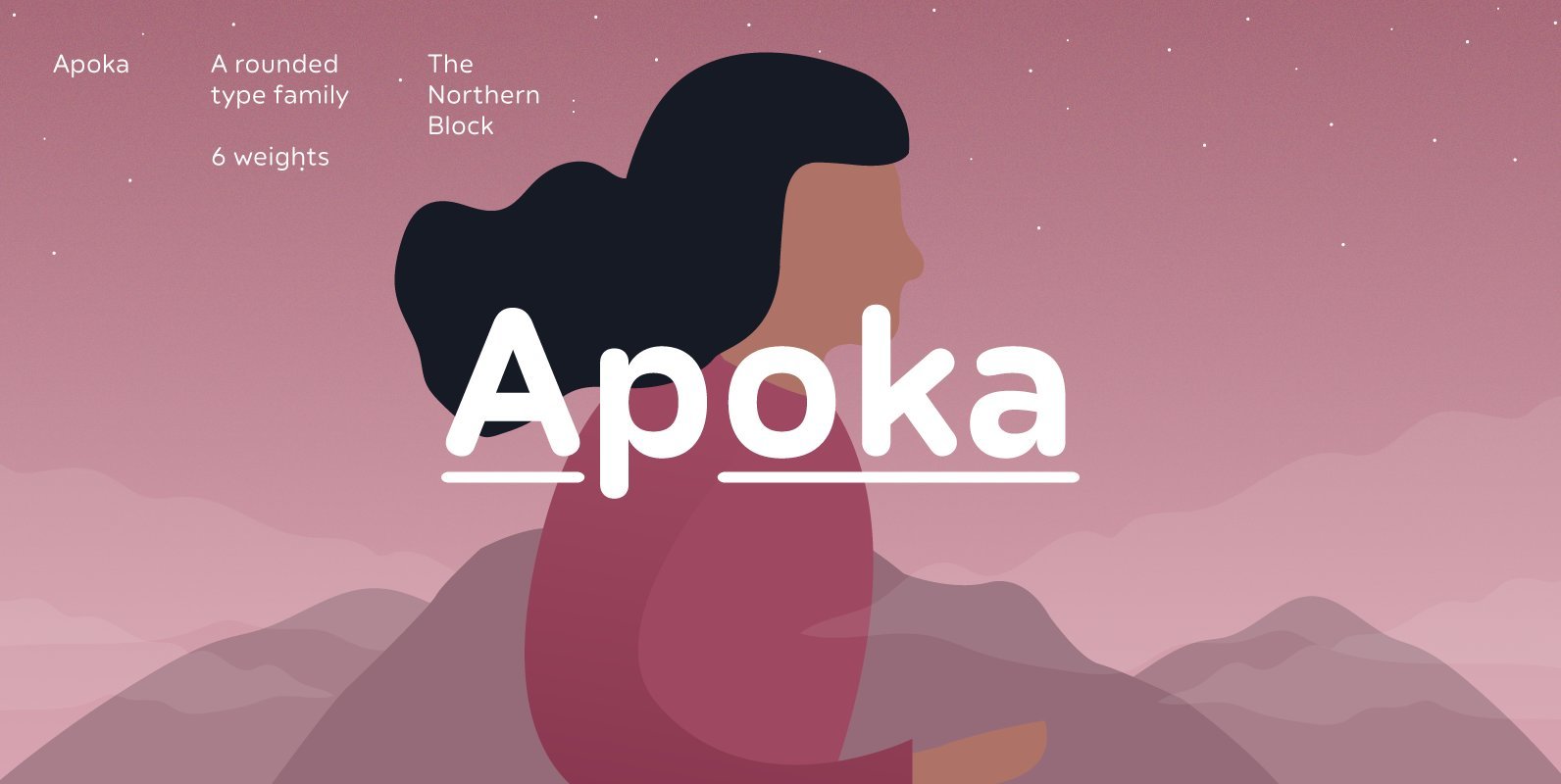
Apoka Font
Apoka is a sans-serif type family of 6 weights. The design features rounded terminals and a moderate contrast. Apoka's appeal is in understated simplicity and attention to detail. The type family is most suited for branding, signage, packaging, UI/UX and
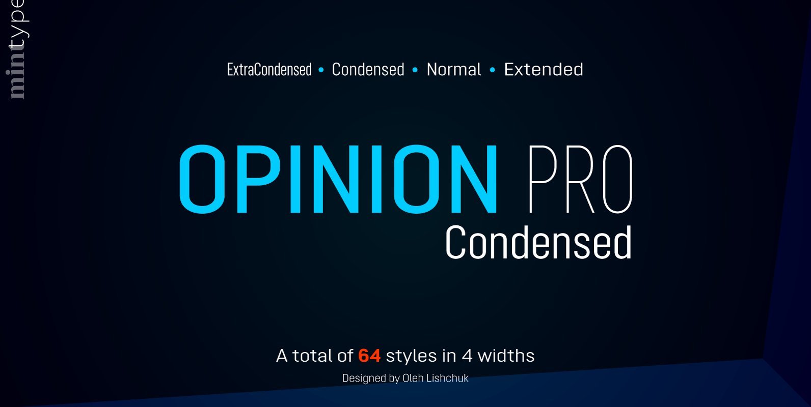
Opinion Pro Condensed Font
Opinion Pro is a geometric sans-serif typeface with extra-large x-height that comes in 64 styles. It is composed of 4 width variations, each in 8 weights with respective italics. Its rigid curves with pronounced vertical stems makes it useful as
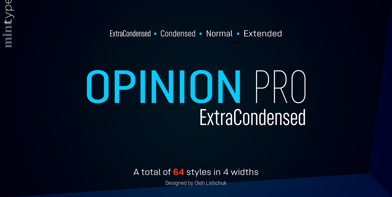
Opinion Pro ExtraCondensed Font
Opinion Pro is a geometric sans-serif typeface with extra-large x-height that comes in 64 styles. It is composed of 4 width variations, each in 8 weights with respective italics. Its rigid curves with pronounced vertical stems makes it useful as
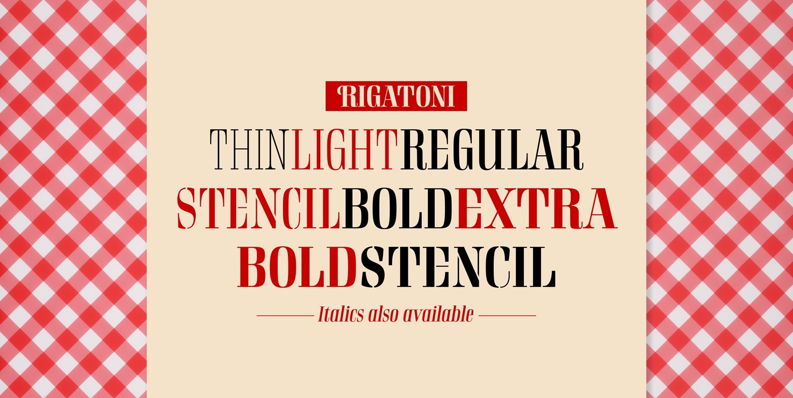
Rigatoni Font
Rigatoni is a didone display family with exceptional readability. Based on a German mid-century lettering specimen by Nerdinger, designer Alejandro Paul expanded the face into an extensive family, with 5 weights, italics, and a 2 weights stencil version. Its tall
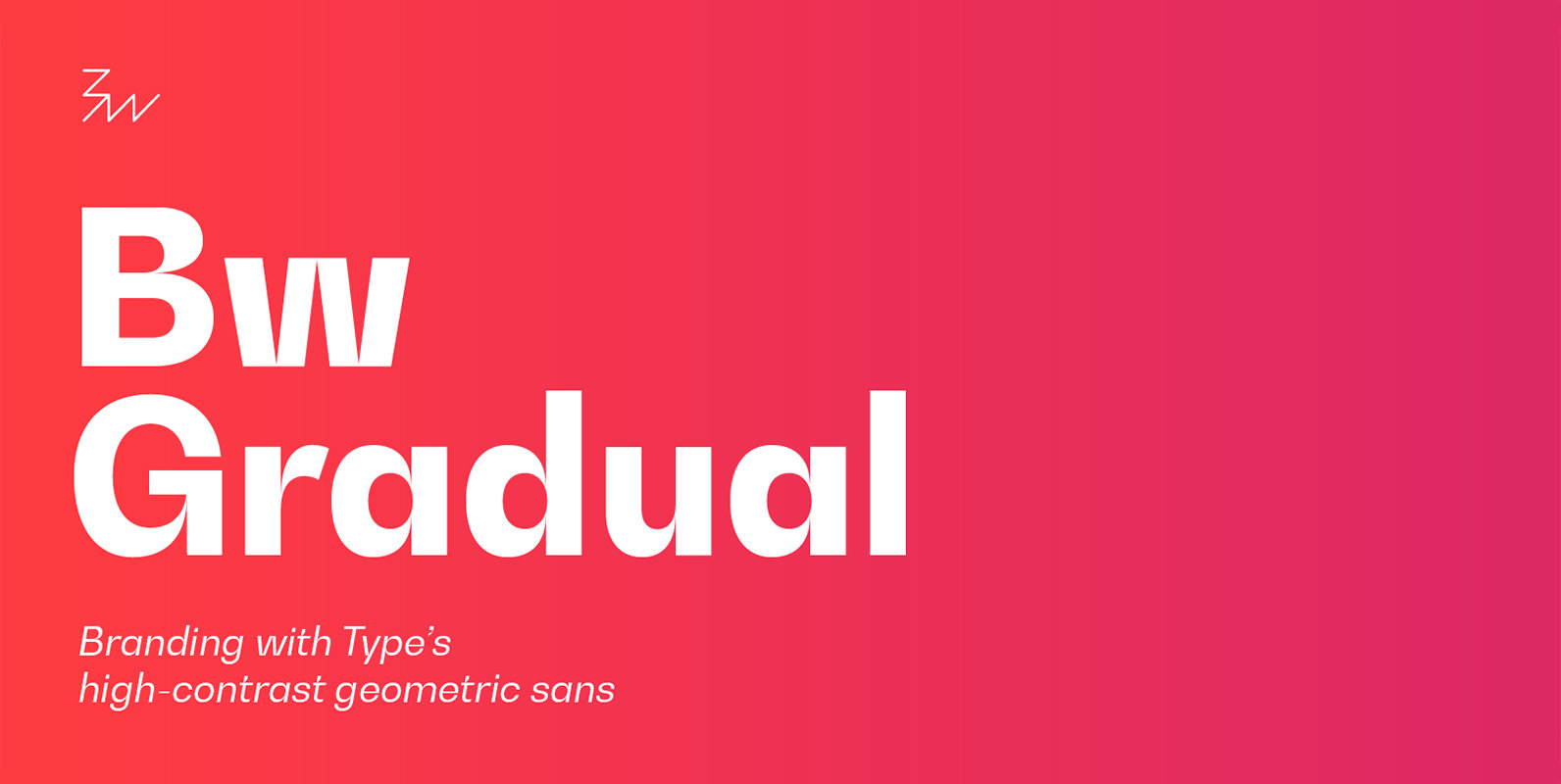
Bw Gradual Font
Bw Gradual brings together the pragmatic feel of the geometric grotesque genre with the visual appeal of its very deep joins. Pure shapes and fast curves coexist on this versatile font family that claims for attention when used large, but
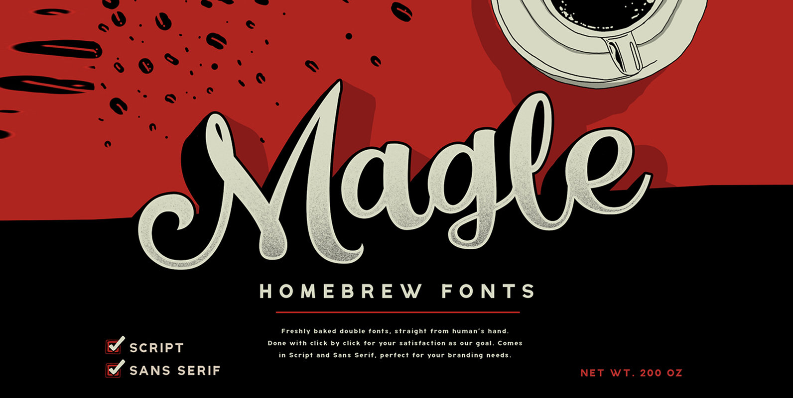
Magle Font
Magle Script is a script design with bold and bouncy style that works best casual and vintage branding needs. Also included is Magle Sans, a clean sans-serif font designed to be paired with Magle Script. Published by Konstantine StudioDownload Magle
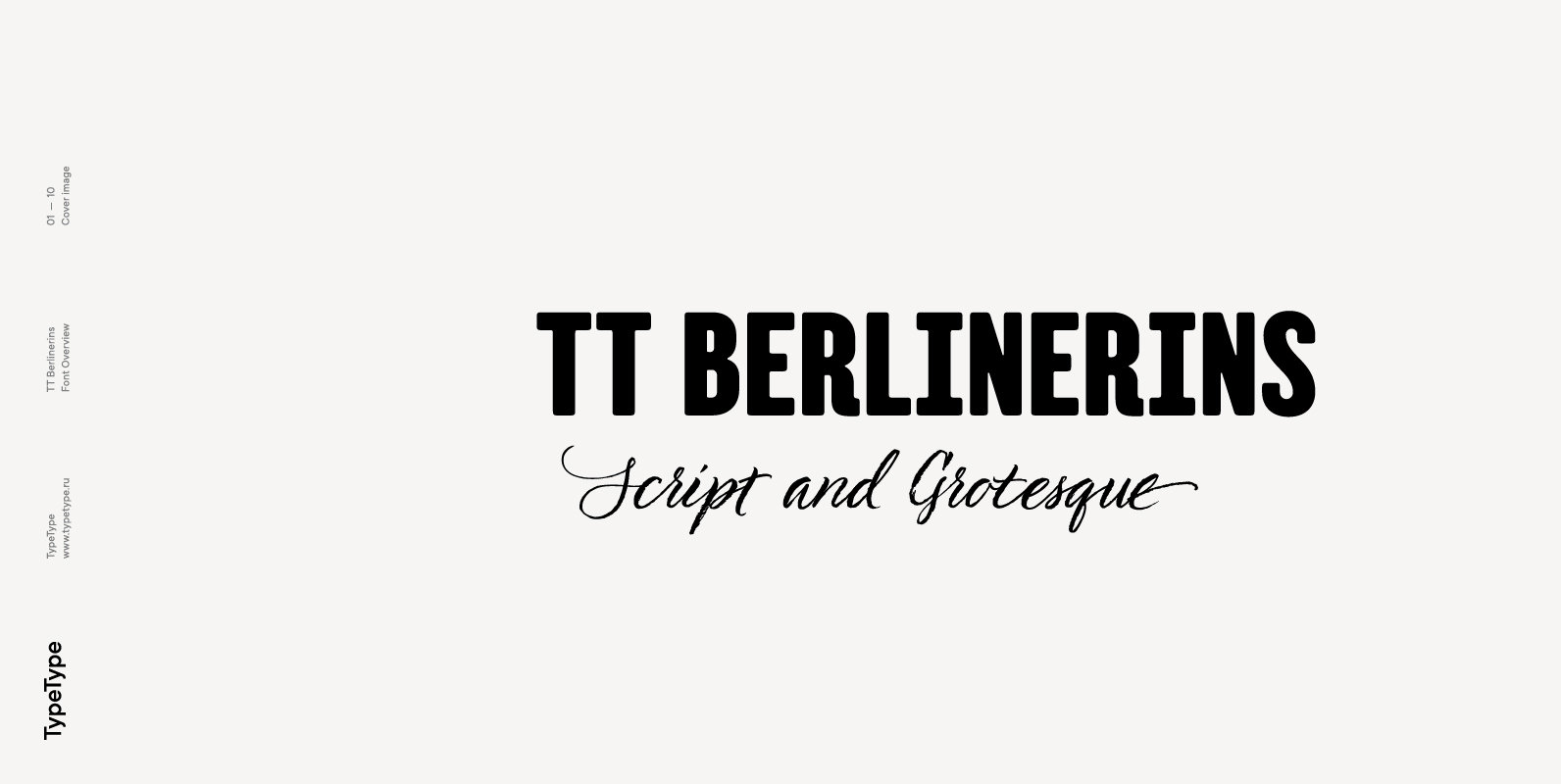
TT Berlinerins Font
TT Berlinerins is a contrast pair of typefaces which is basically our tribute to Berlin. Just like in the city itself where historicity and modernity are intertwined, the elegant script in our font family symbolizes the modern Berlin, and the
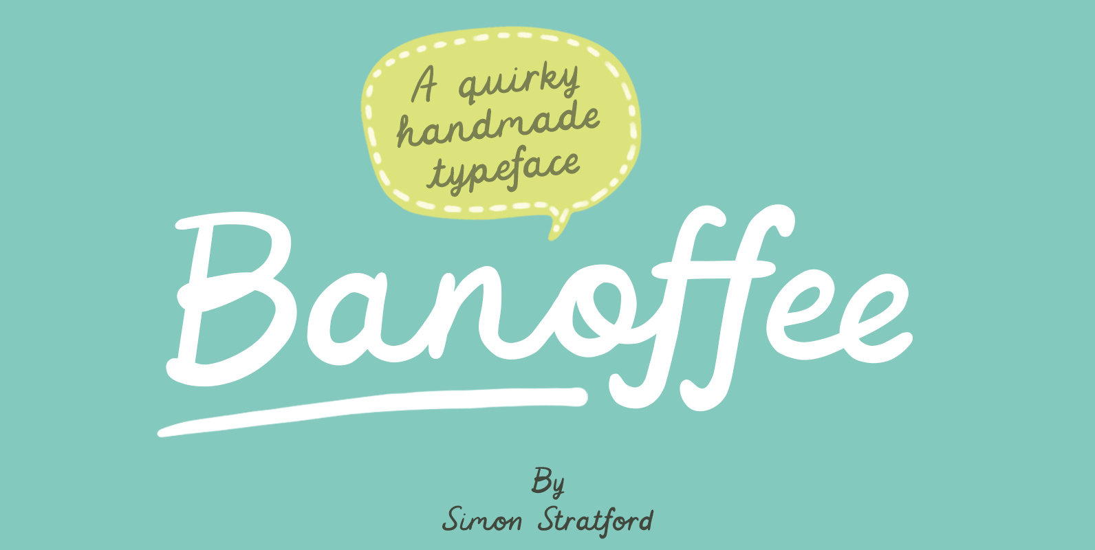
Banoffee Font
Banoffee is a playful, somewhat kooky typeface that tries its best to look like real handwriting. It uses OpenType features and has ligatures, terminals, and realistic looking connections. The character set includes western, central and south-eastern European glyphs. You will
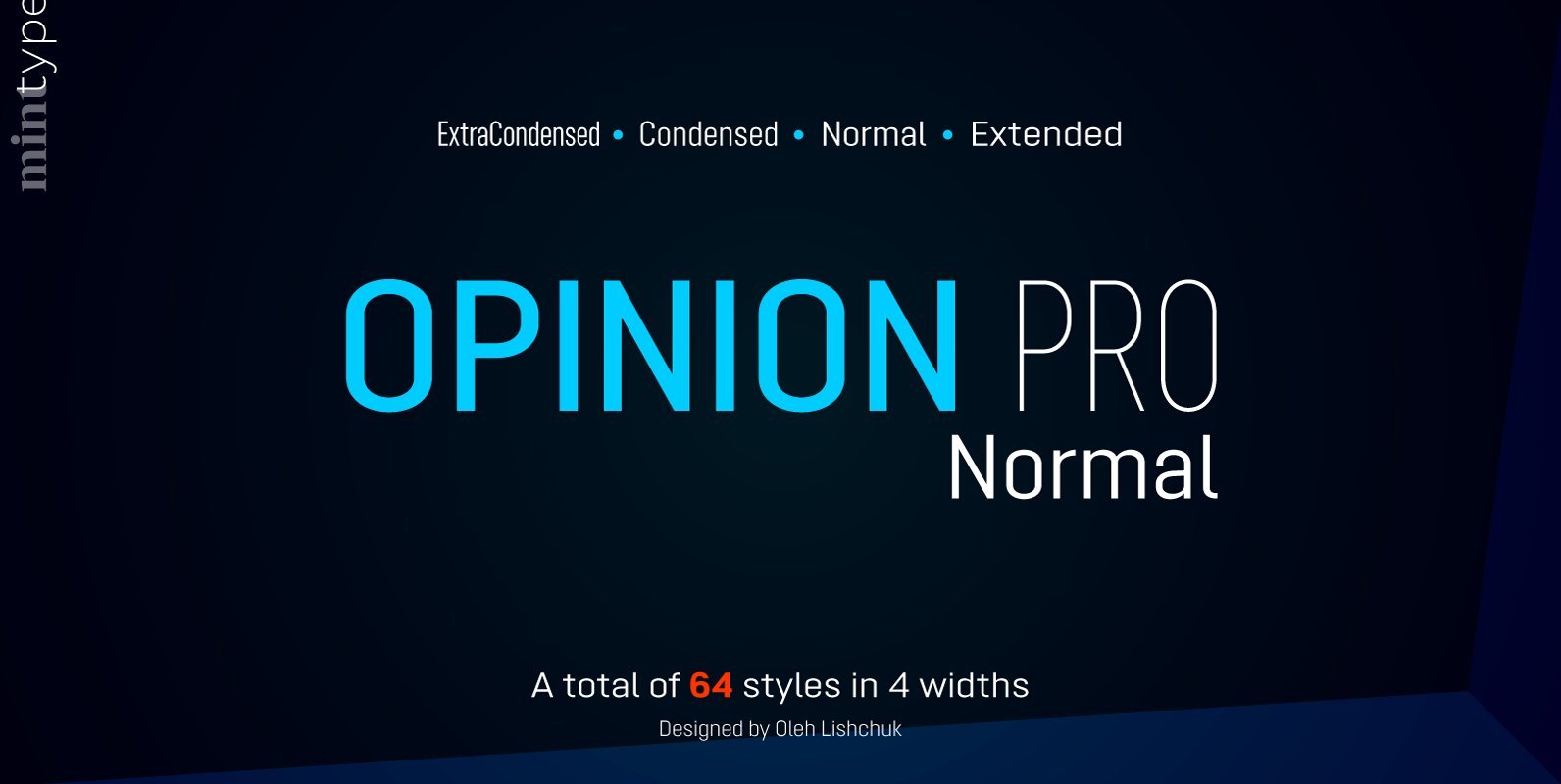
Opinion Pro Normal Font
Opinion Pro is a geometric sans-serif typeface with extra-large x-height that comes in 64 styles. It is composed of 4 width variations, each in 8 weights with respective italics. Its rigid curves with pronounced vertical stems makes it useful as
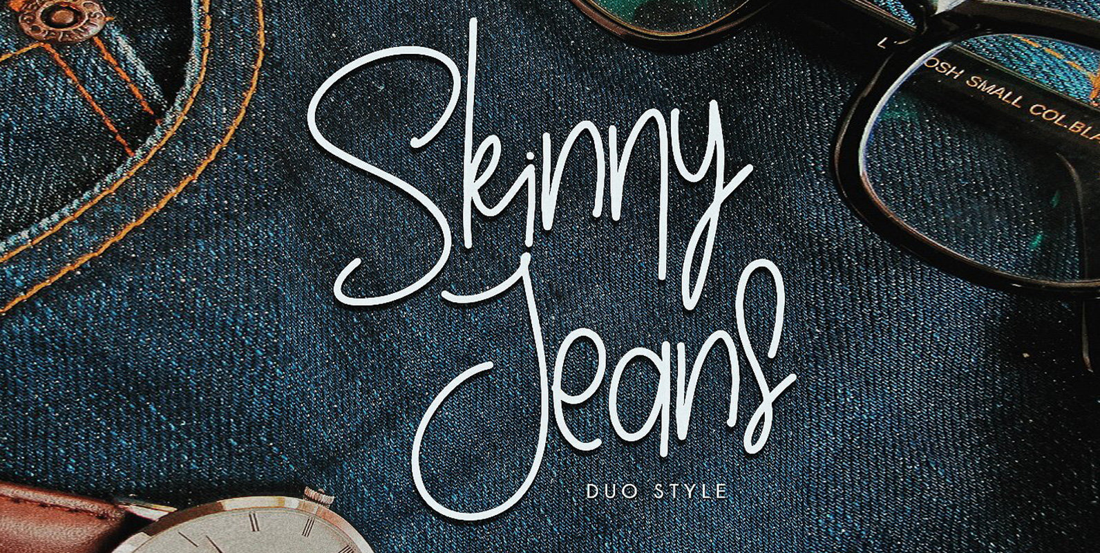
Skinny Jeans Font
Skinny Jeans is an informal and playful script design (contains 2 styles), published by Irwan Wismoyo. Published by Irwan WismoyoDownload Skinny Jeans

Kayto Font
Kayto Script is the second collaboration of Erwin Indrawan as the calligrapher and Dexsar Harry Anugrah of Majestype as the typeface designer. Today the resurgence of calligraphy has reached the summit, with social media as the vehicle, we are now
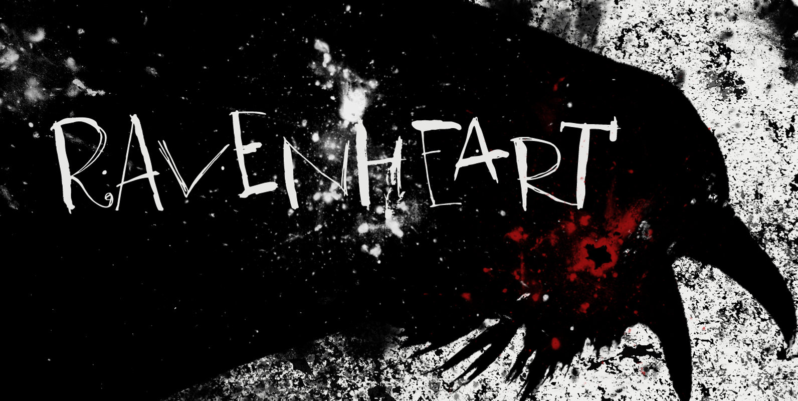
Ravenheart Font
I like Ravens. In fact, I like them so much that I have a tattoo of a Haida raven! Ravenheart was more or less modelled on my Qilin font, but it is completely different. It is scary and inky, but
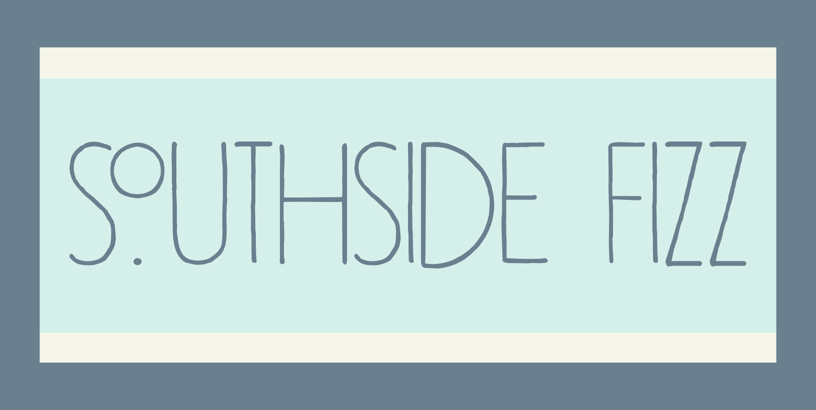
Southside Fizz Font
Southside Fizz is a cocktail (made with gin, lime, mint and soda). Southside Fizz font was based on a single word in a 1930’s advertisement and my Palembang font. I did not have that many glyphs to work with, so
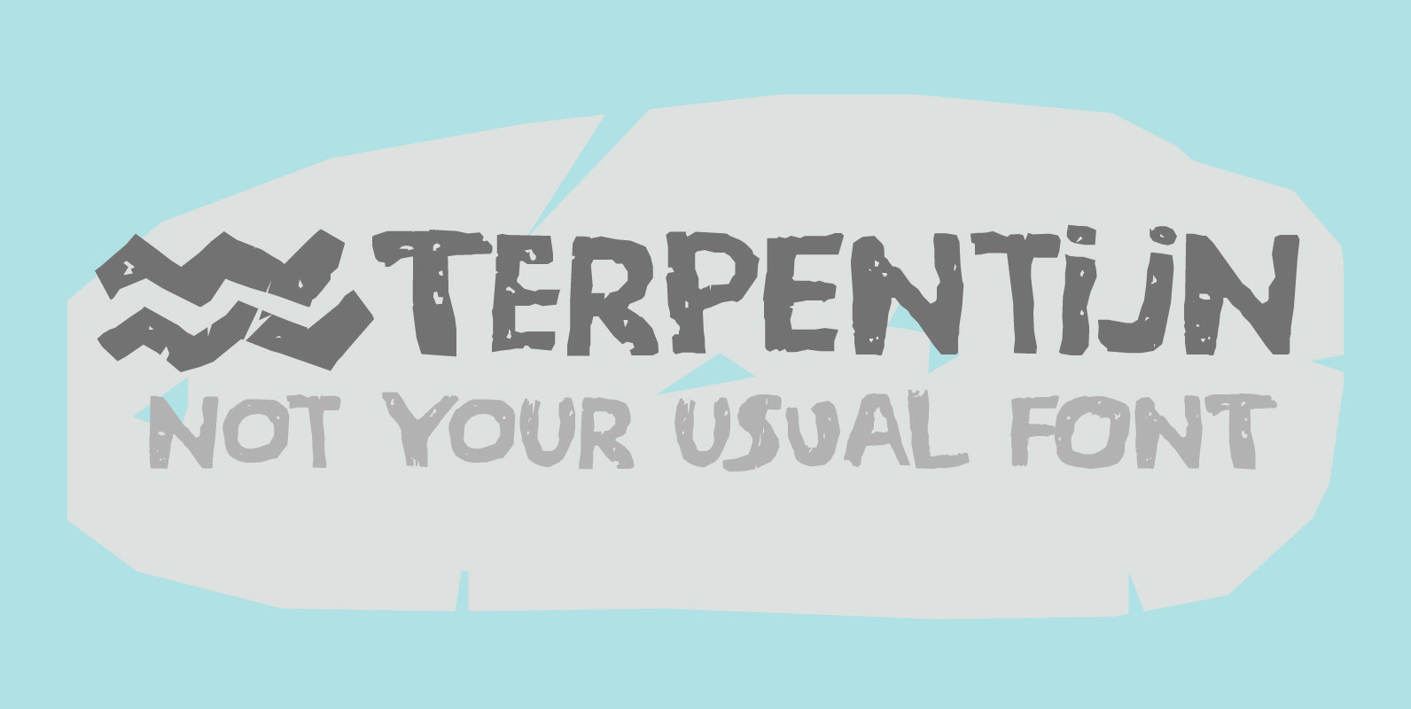
Terpentijn Font
Terpentijn is Dutch for Turpentine. If you say it out loud, it actually sounds quite similar!Here you thought you were just buying a font, but you get to learn some Dutch too! Terpentijn is a handmade typeface with a serious
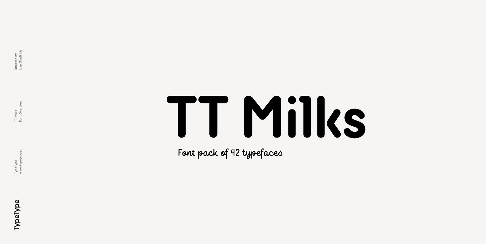
TT Milks Font
Initially the idea for TT Milks was to create a collection of typefaces to be used for packaging and branding of dairy products. We’ve started by creating a main sans-serif and a supporting script, worked on their compatibility, and created