Tag: packaging
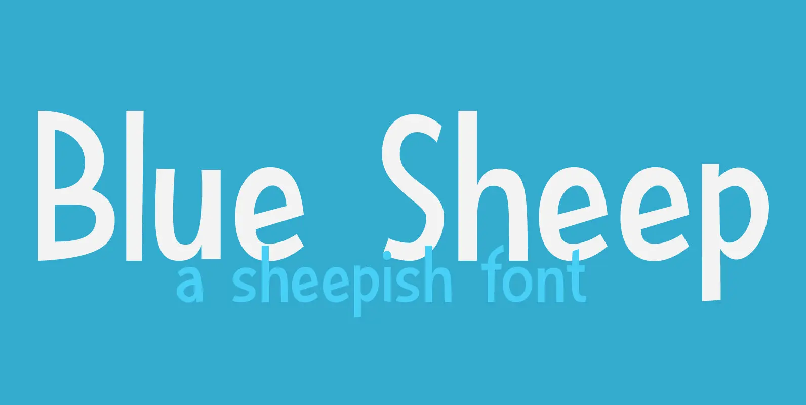
Blue Sheep Font
It’s been a while since I named a font after a sheep, so I figured it was about time. The Blue Sheep, or Naur (Pseudois nayaur), is actually an existing species of sheep. It is found in the Himalayas and
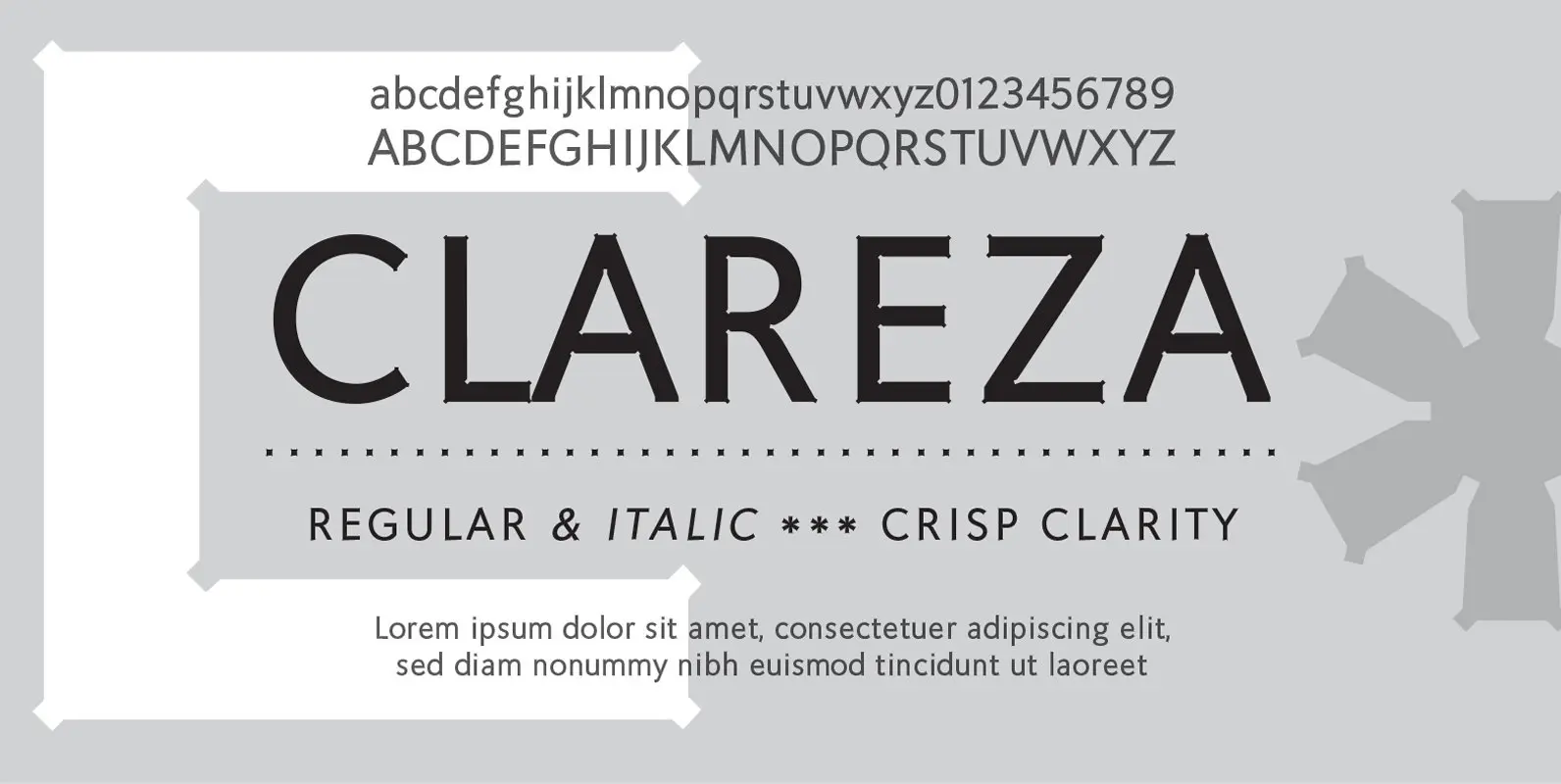
Clareza Font
Clareza means “Clarity” in Portugese. That was exactly the goal in creating this font. We managed to create a font that is crisp and extremely legible at all sizes but then comes to life in an interesting and unusual way
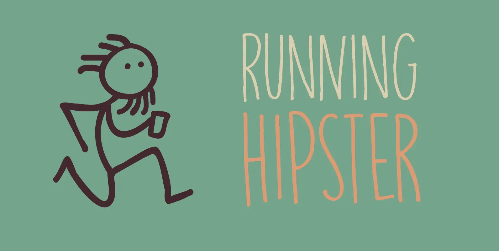
Running Hipster Font
Running Hipster is a tall, thin and all caps font with a funny name. The upper and lower case letters differ and can be mixed. You don’t necessarily have to use it to market your free range sheep woollen jumpers
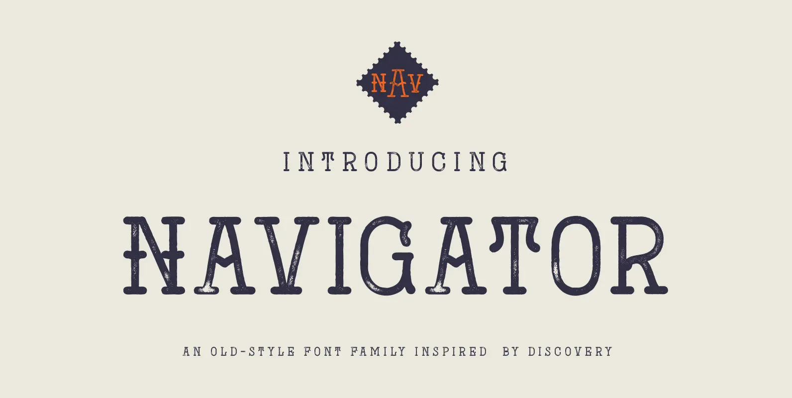
Navigator Font
The Navigator family is inspired by the early explorers, the early sailors with their old-style tattoos and the cowboys in the old west. I mashed up these to styles to create the Navigator display family. It has a vintage feel
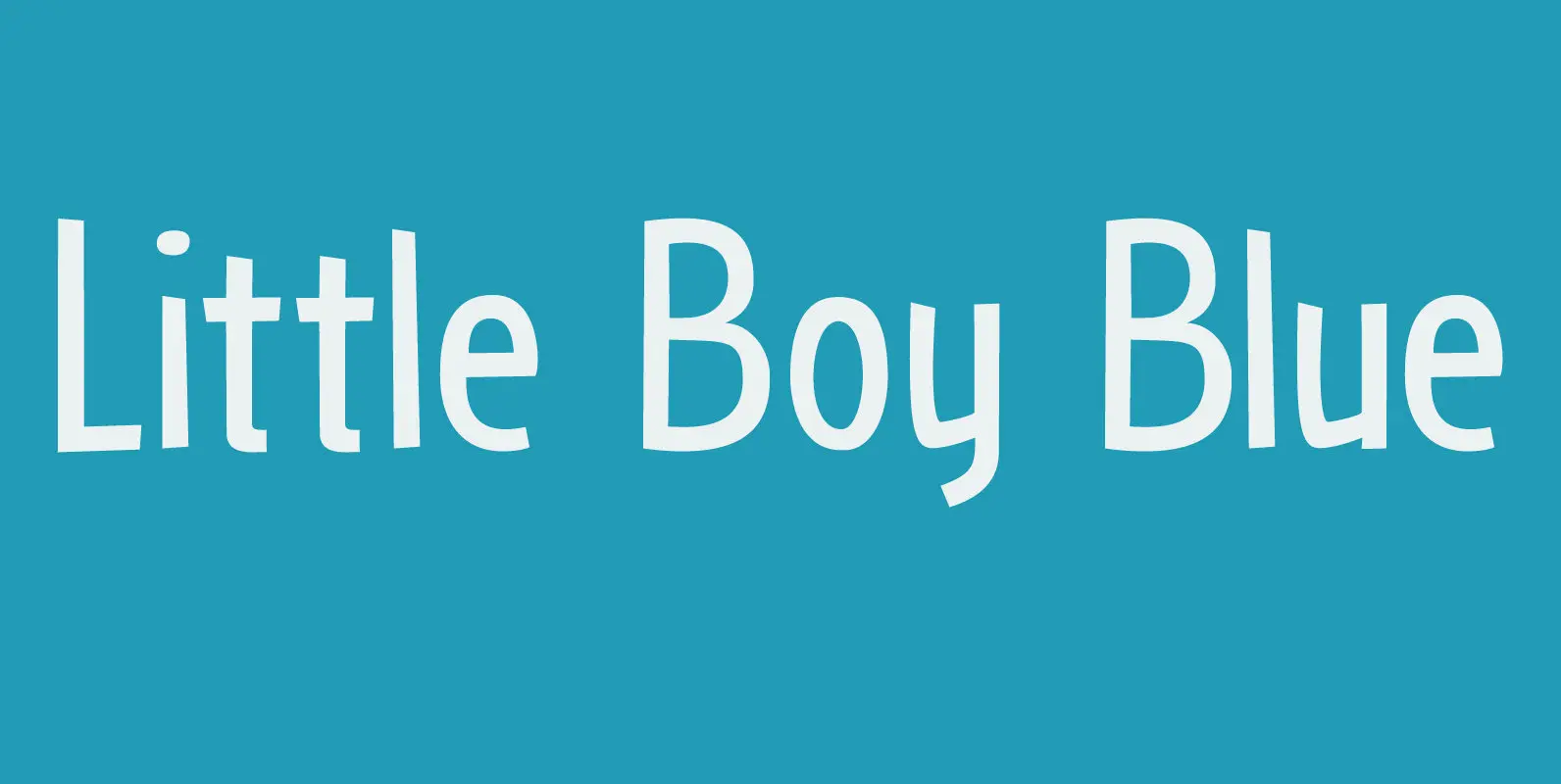
Little Boy Blue Font
I believe it was Picasso who had a Blue Period between 1901 and 1904. It seems that I have one myself – really not comparing myself to Picasso btw… Recently I created Blue Sheep font and now this one: Little
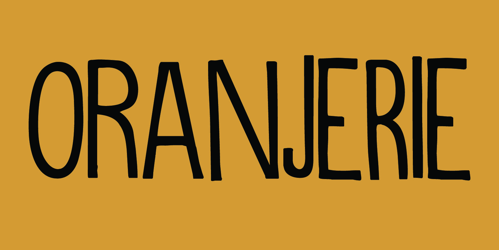
Oranjerie Font
Oranjerie is a very nice, handmade and legible font which will fit in just anywhere. The glyphs differ slightly in width and height, giving it a unique look. Upper and lower case letters can be freely interchanged. Published by Hanoded
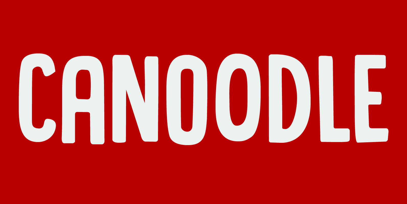
Canoodle Font
To canoodle means to hug and kiss passionately. I leave the rest to your imagination. Canoodle is also a very adorable font – some would even go as far as calling it kissable. It is an all caps typeface, but
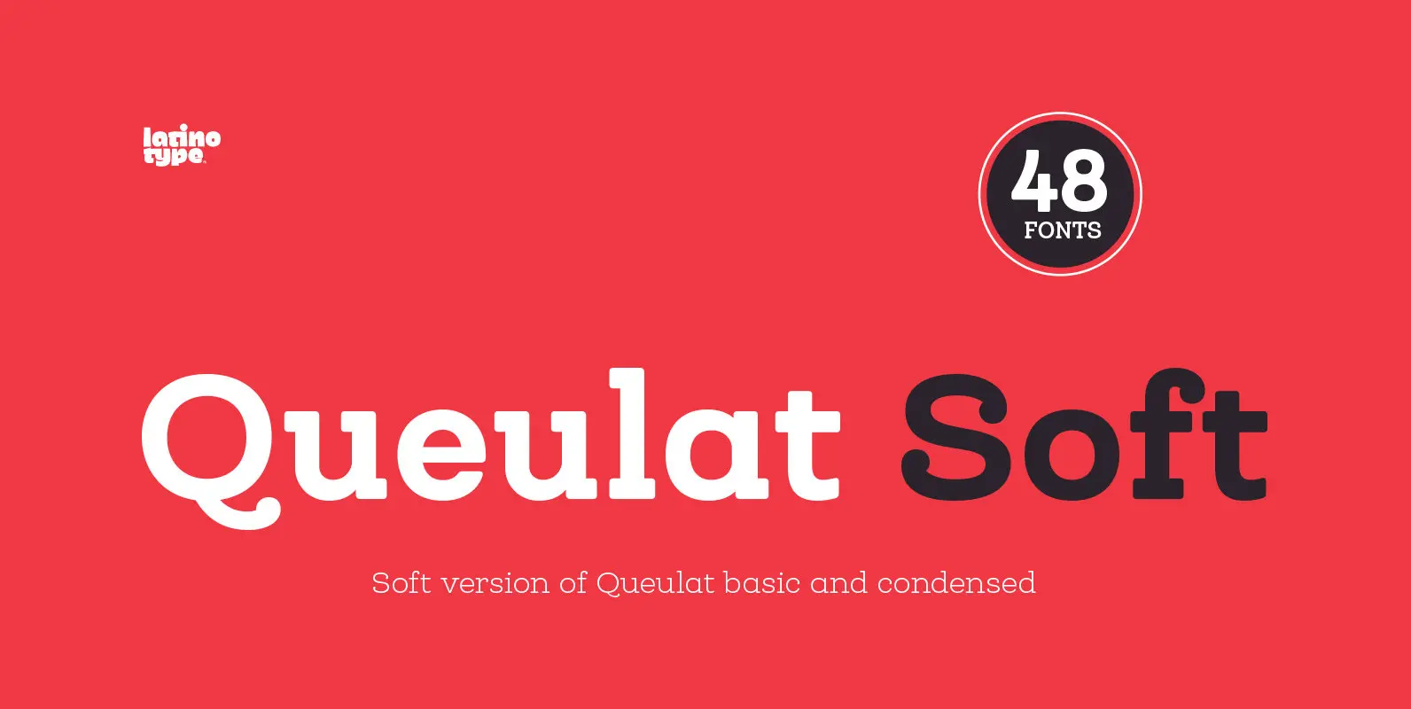
Queulat Soft Font
The font is the soft version of the Queulat basic and condensed families, but keeping the same features as the original typeface. Queulat Soft is a hybrid font that combines different styles, reflecting charm, freshness and, especially, a strong personality.
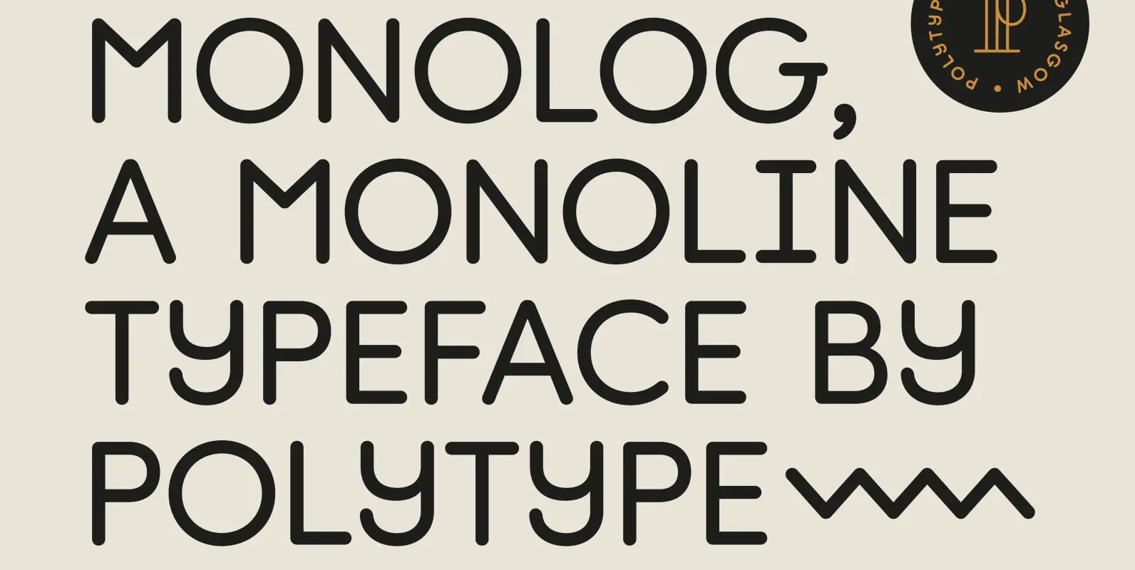
Monolog Font
Monolog is an especially monolinear rounded display typeface, designed to work great alongside monoline illustrations, logos and icons, while still performing well in some text settings. A number of contemporary quirks in its construction establish visual interest, while Monolog’s clean,
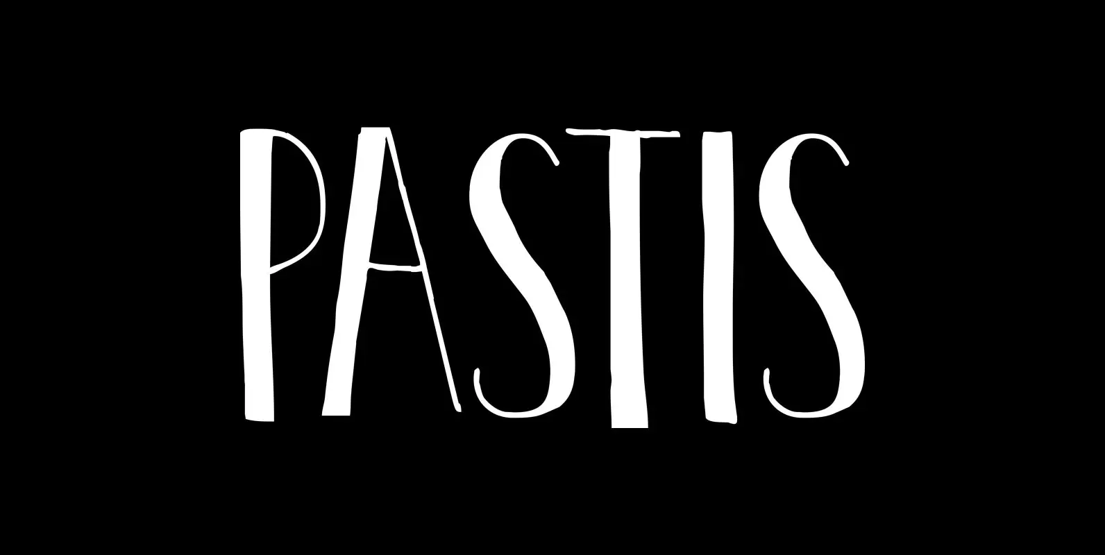
Pastis Font
Pastis is an anise-flavored drink from France – and a lovely font as well. Pastis is an all caps typeface with a different set of glyphs for upper and lower case. Use it for books, posters, ads and product packaging.
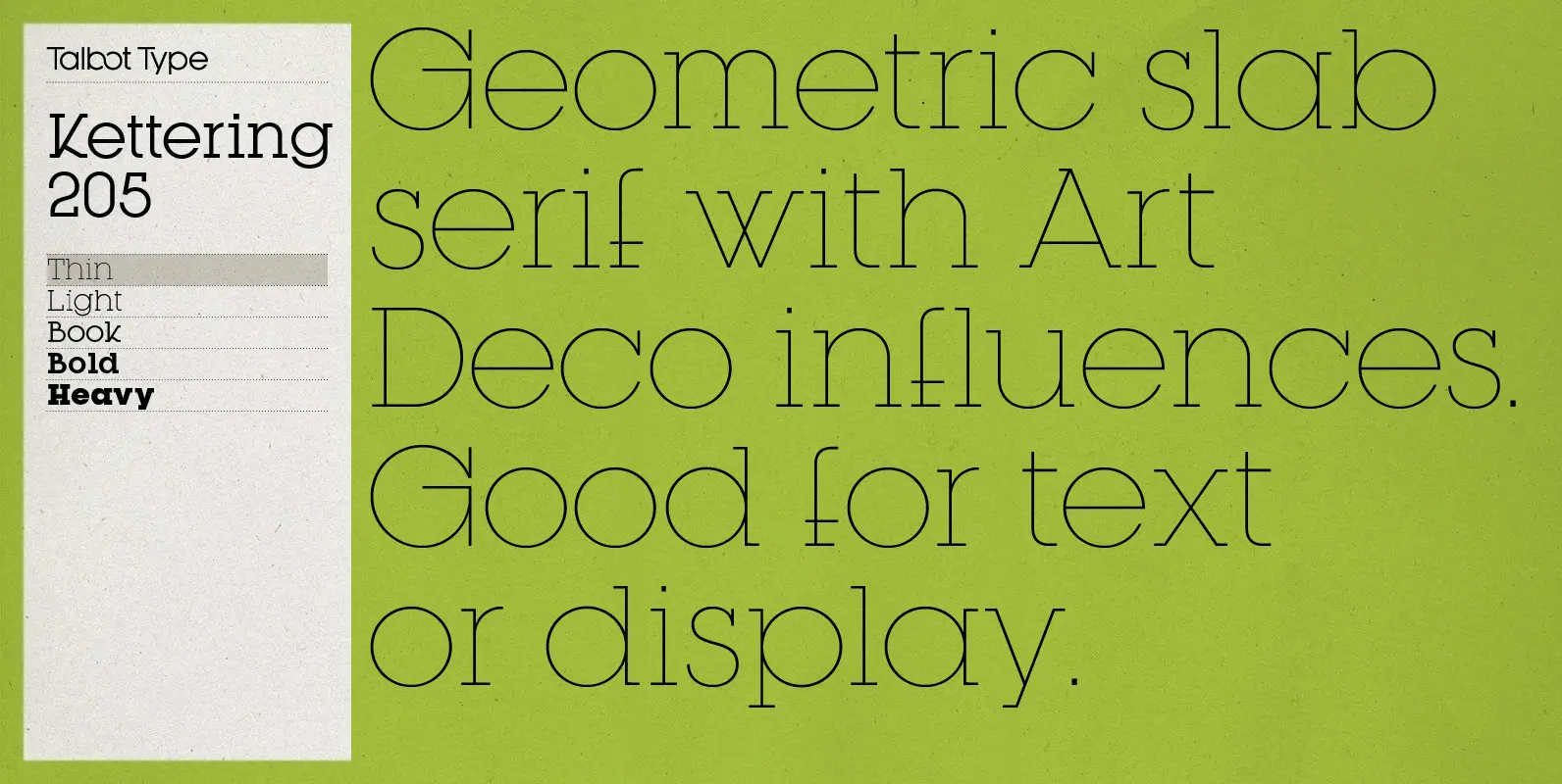
Kettering 205 Font
Kettering 205 is inspired by the classic, geometric slab-serifs such as Lubalin, but has shallower ascenders and descenders for a more compact look, and features art deco influenced, lowered crossbars and an oblique crossbar on the lower case e. It’s
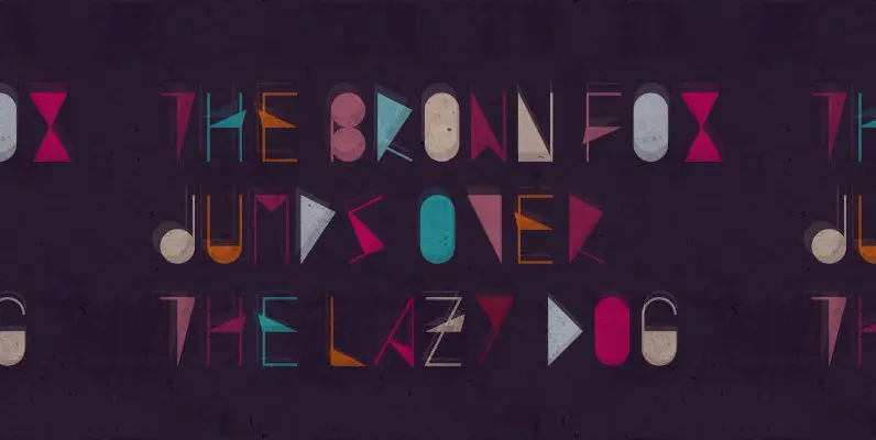
Arte Newest Font
Art Nouveau, Arte Nuevo or simply New Art – the movement and style of art, architecture and applied art of the 20th century is being redefined 100 years later, fancying the excess of the era and and at the same
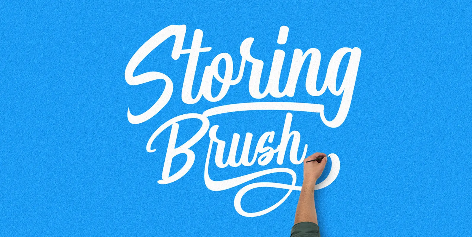
Storing Brush Font
Storing Brush is hand painted typeface, designed to help you create the look of stunning custom hand-lettering. Published by MaghribDownload Storing Brush
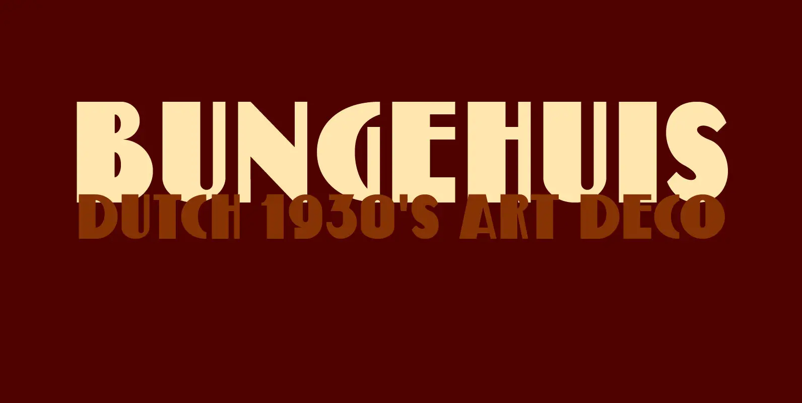
Bungehuis Font
Bungehuis font was modeled on the lettering found on an Amsterdam art deco building from 1931. This building on the Spuistraat, also called ‘Het Bungehuis’, used to house offices, but is now part of the University of Amsterdam. In 2015
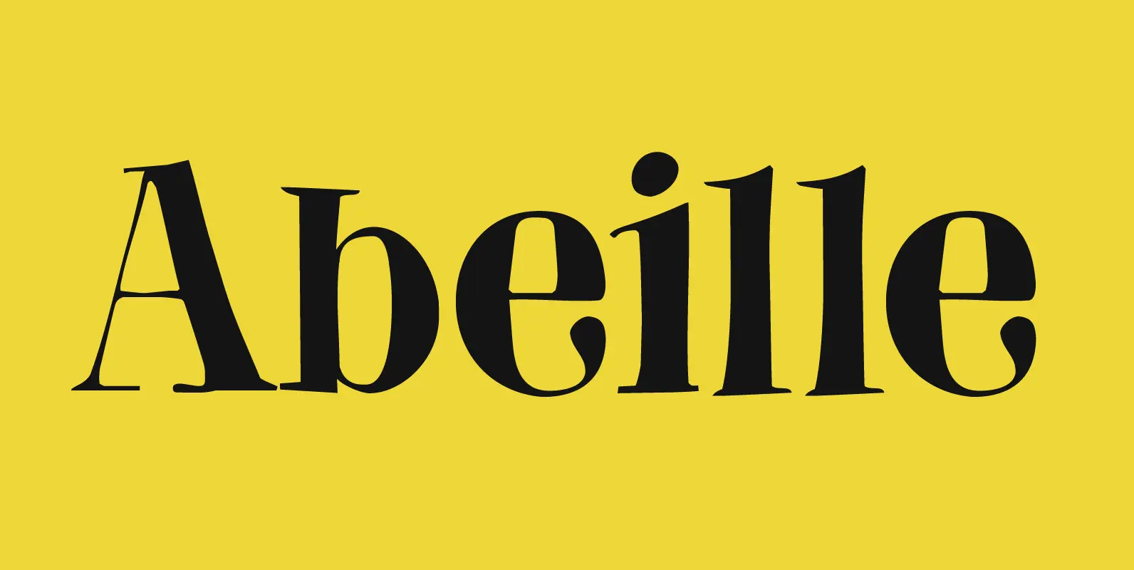
Abeille Font
Abeille means bee in French. I am a little worried about the world’s bee populations, as whole colonies collapse due to monoculture and pesticides. I have planted many bee-attracting plants in my garden and even put up a ‘bee hotel’

Moonlight Serenade Font
Moonlight Serenade is a 1939 song composed by Glenn Miller, with lyrics by Mitchell Parish. Moonlight Serenade font is an all caps affair – very legible, very recognizable and very useful. Upper and lower case differ slightly and are quite
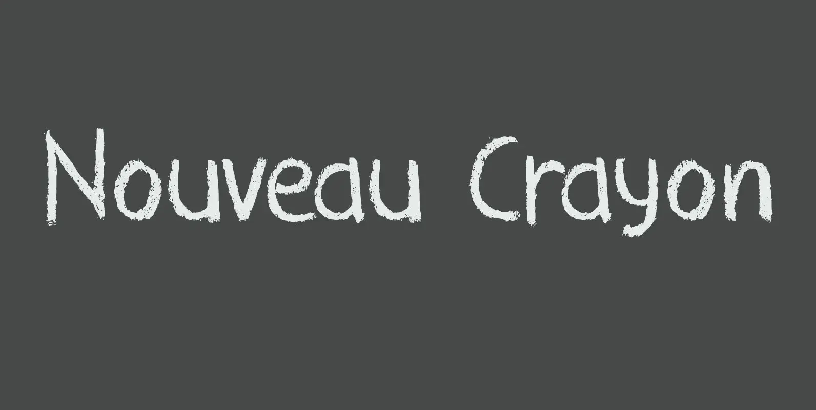
Nouveau Crayon Font
Nouveau Crayon is based on Crayon Crumble, a font I made a long time ago. I changed a lot of glyphs and added a whole bunch of new ones. It has become quite a good looking font to be honest:
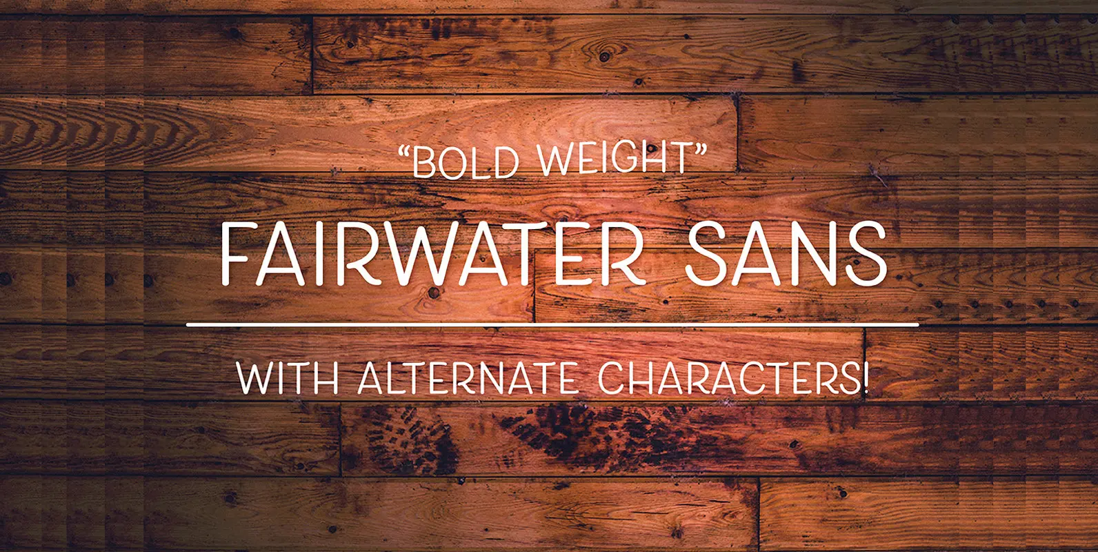
Fairwater Sans Font
bold weights. An all caps, slightly narrow style that has been designed to have a stylized appearance that works well on its own, or paired with the other fonts offered in the Fairwater collection. 506 Glyphs and 26 Stylistic Alternates