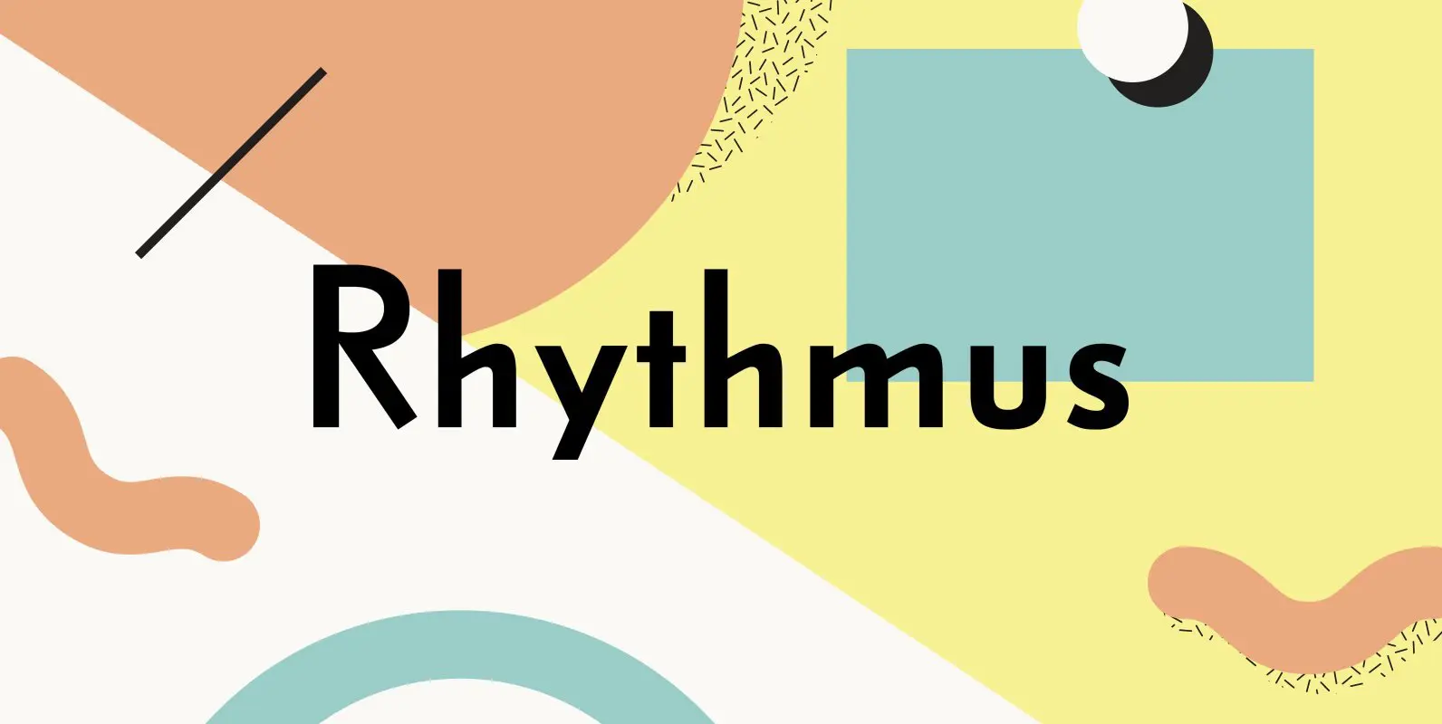
Rhythmus Pro Font
Schelter & Giesecke’s grotesk font family, widely used for their marketing and in-house prints, now revived and extended with a Cyrillic character set and old-style numerals. Published by RMU TypedesignDownload Rhythmus Pro

For the graphic and digital design virtuosi who find solace and inspiration in the artwork of the 1920s, or for those continually seeking to enhance their typographic arsenal with the most unique designs, illuminating the horizon is a digital product
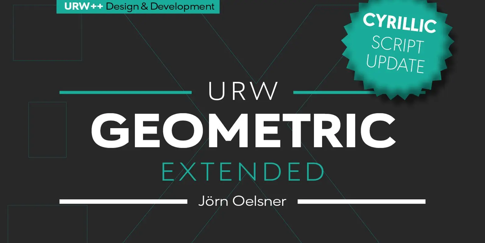
URW Geometric Extended is the matching complement for the URW Geometric, including 20 additional extended styles. URW Geometric is a sans serif typeface inspired by the German geometric typefaces of the 1920s but designed for modern usability. The character shapes have optimized
Schelter & Giesecke’s grotesk font family, widely used for their marketing and in-house prints, now revived and extended with a Cyrillic character set and old-style numerals. Published by RMU TypedesignDownload Rhythmus Pro
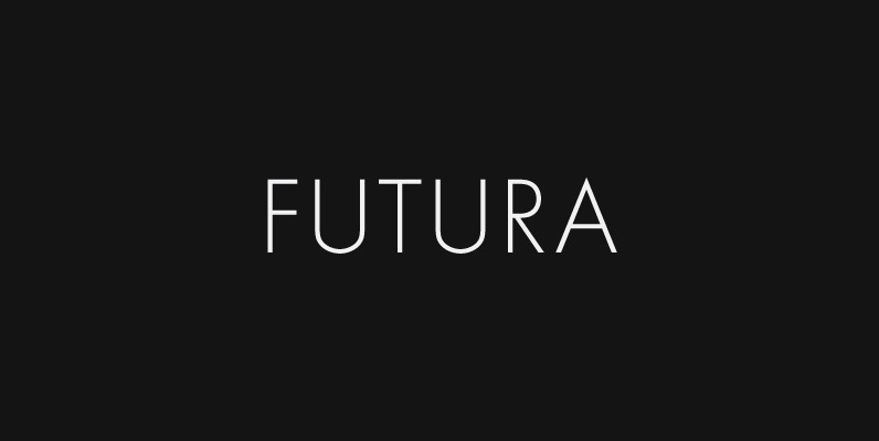
Futura. The very name brings to mind jet-age splendor of the highest order, and indeed the text on the commemorative plaque left behind on the Moon by the Apollo 11 astronauts in July, 1969 is set in Futura. There is
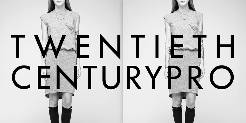
20th Century is a modern sans serif with apparent geometry yet it still has a certain warmth in its design. It is based on Paul Renner’s Futura and was redrawn by Sol Hess for Lanston Monotype. The new digital revival
Futura No. 2 is Letraset’s version of Futura from the 1980s, digitized by and at URW in opentype format. Futura. The very name brings to mind jet-age splendor of the highest order, and indeed the text on the commemorative plaque