Tag: plain
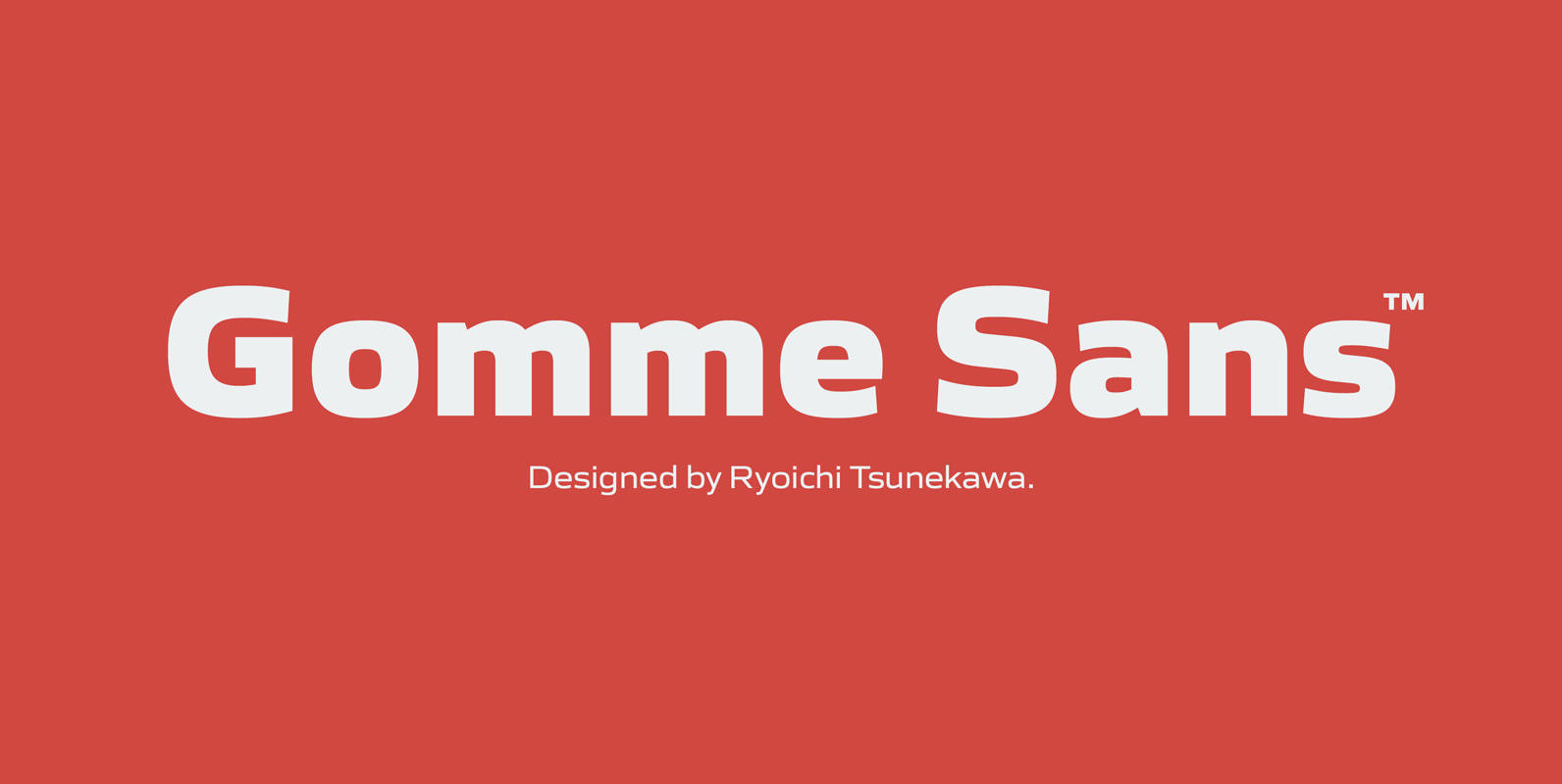
Gomme Sans Font
Gomme Sans is a wide and masculine sans-serif family for text designed by Ryoichi Tsunekawa and the whole family consists of 6 weights from ExtraLight to ExtraBold and their matching Italics. The basic concept of this family is not only
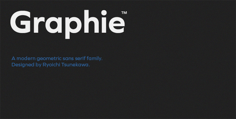
Graphie Font
Graphie is a modern geometric sans-serif family designed by Ryoichi Tsunekawa and the whole family consists of 16 style: eight weights from Thin to ExtraBold and their matching Italics. The range of styles provides flexibility for title, headline and body
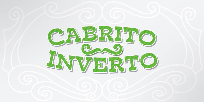
Cabrito Inverto Font
And so now, here it is. Cabrito Inverto, which features the reversed stress of the strokes from a font’s “normal” traits. Inverted stress fonts are most often associated with cowboys and the Old West. The inverted stress gives it a
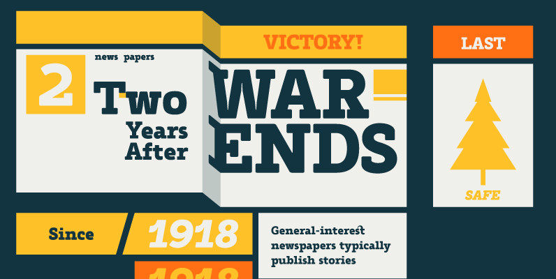
Tailor Font
Tailor was a study of slab serif style with round and comfortable feel. I wanted to merge round shapes with exaggerated ink traps for legibility. Published by Suomi Type FoundryDownload Tailor

Yummo Font
Yummo is a geometric and somewhat condensed sans serif type family that can be used in wide range of applications. The minimal glyphs that had been shaped superbly will give modern and contemporary impressions. At the same time the rounded
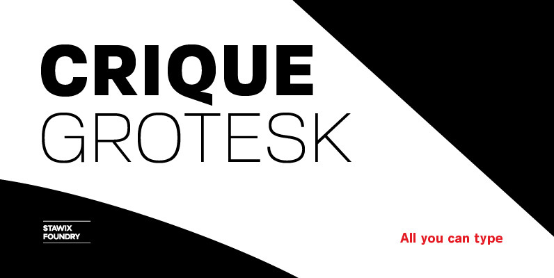
Crique Grotesk Font
The Crique Grotesk This contemporary typeface is inspired from Neo-humanist and Geomatric industrial tone presented the late 2000s typeface. The font family is also composed of the normal width and display width in order to support the different applications on the delicate
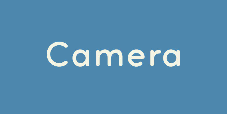
Camera Font
Legible, simple and very lovely sans serif is based on artdeco advertisment from 1800s to early 20th. The sweetest sans for your retro-style project. Published by Dharma TypeDownload Camera
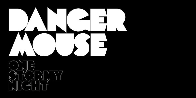
Mekon Font
A modern heavy weight typeface ideal for use on print, web, motion, t-shirts and apparel. Details include 4 styles with 3 alternatives, extended European character set, manually edited kerning and Euro symbol. Published by The Northern Block Download Mekon
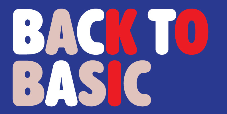
Alphabet Soup Pro Font
Designed by Steve Jackaman. In the early 1980’s, Steve worked at Typographic House in Boston, Massachusetts. At the time, ‘Typo’ House, as it was affectionately known, was the largest type house in New England. This font was designed and produced
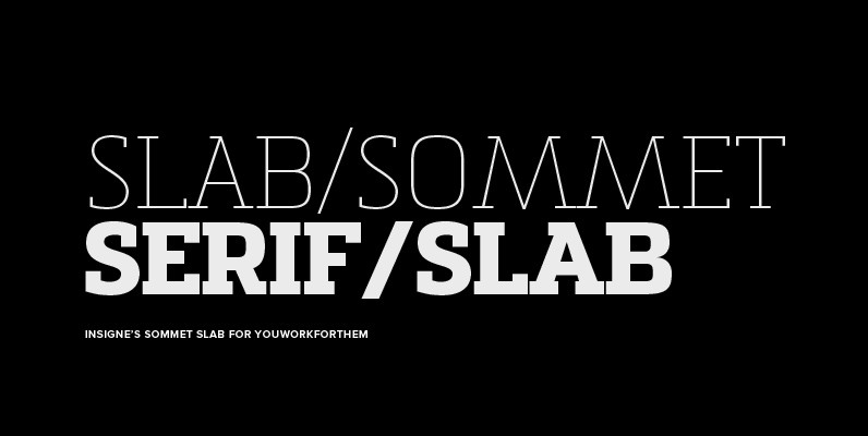
Sommet Slab Font
The Sommet family of typefaces has been updated with a new slab serif variant. Expanding on Sommet’s successful design principals, Sommet Slab is there when you need more impact and power. Sommet Slab is available with six weights and complementary
