Tag: playful

P22 Ainabee Pro Font
P22 Ainabee is an Art Deco inspired type design. The designer states: “The Art deco period has always fascinated me. The Architecture, The Furniture, The Car Industry, Letters etc, much of what I associate with 20s and 30s. This design
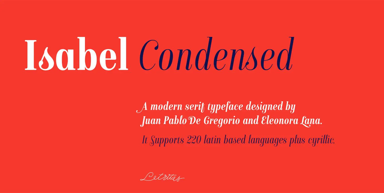
Isabel Condensed Font
Isabel condensed and Isabel were made out of necessity to create a new font for children and teenagers, that could be enough friendly and versatile for text in words or even easy-to- read long texts. The purpose of Isabel is
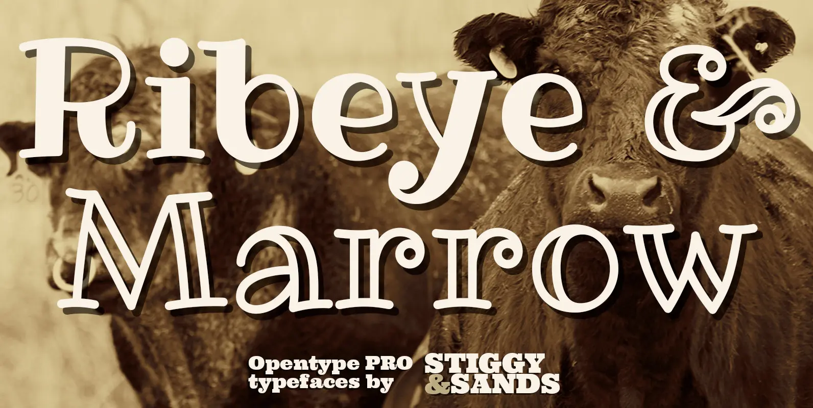
Ribeye Pro Family Font
The Ribeye Pro Family is reminiscent of a cartoon tattoo style of lettering, but exhibits a playfulness that breaks traditional weight distribution across its letterforms. An edgy attitude, friendly syncopation, and highly legible letterforms makes these fonts a real pair
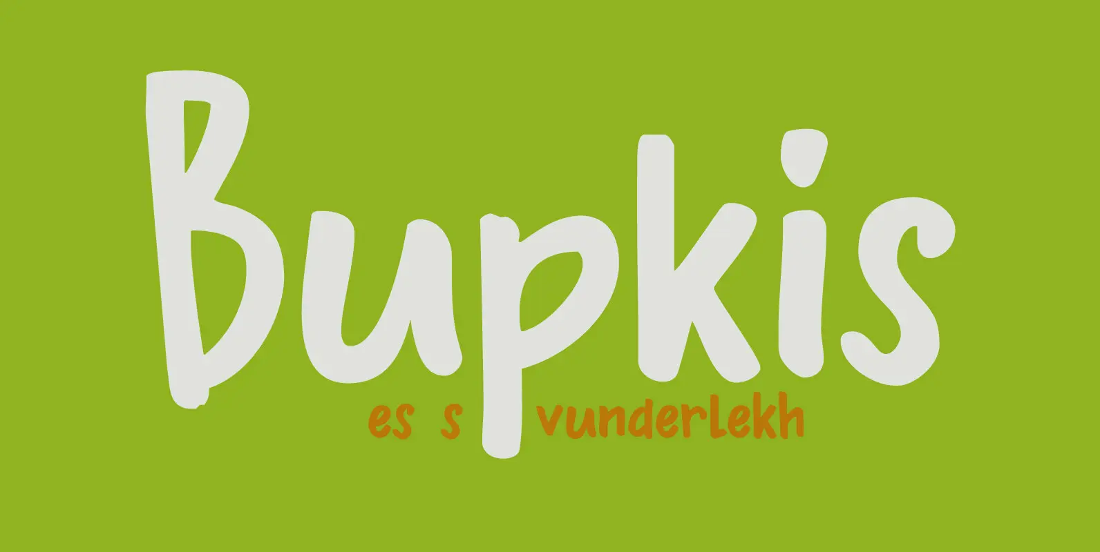
Bupkis Font
Bupkis literally means ‘goat’s dropping’ in Yiddish, but it is used to say ‘nothing, zero, zilch’. Bupkis is a very nice handmade font. A little formal, a little uneven, a little unusual. Use for it whatever you like, but product
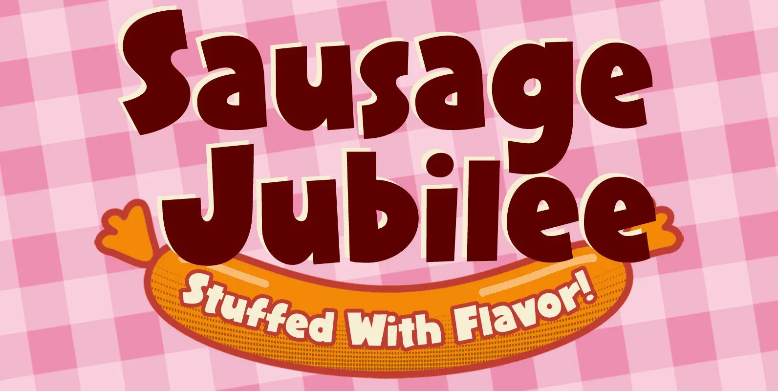
Sausage Jubilee Font
Plump, juicy and ready to serve in seconds; that’s Sausage Jubilee! We’ve cooked up a fully-packed set of savory glyphs to make a tempting typographic treat. And we know how you love your links, so we’ve included the webfont as
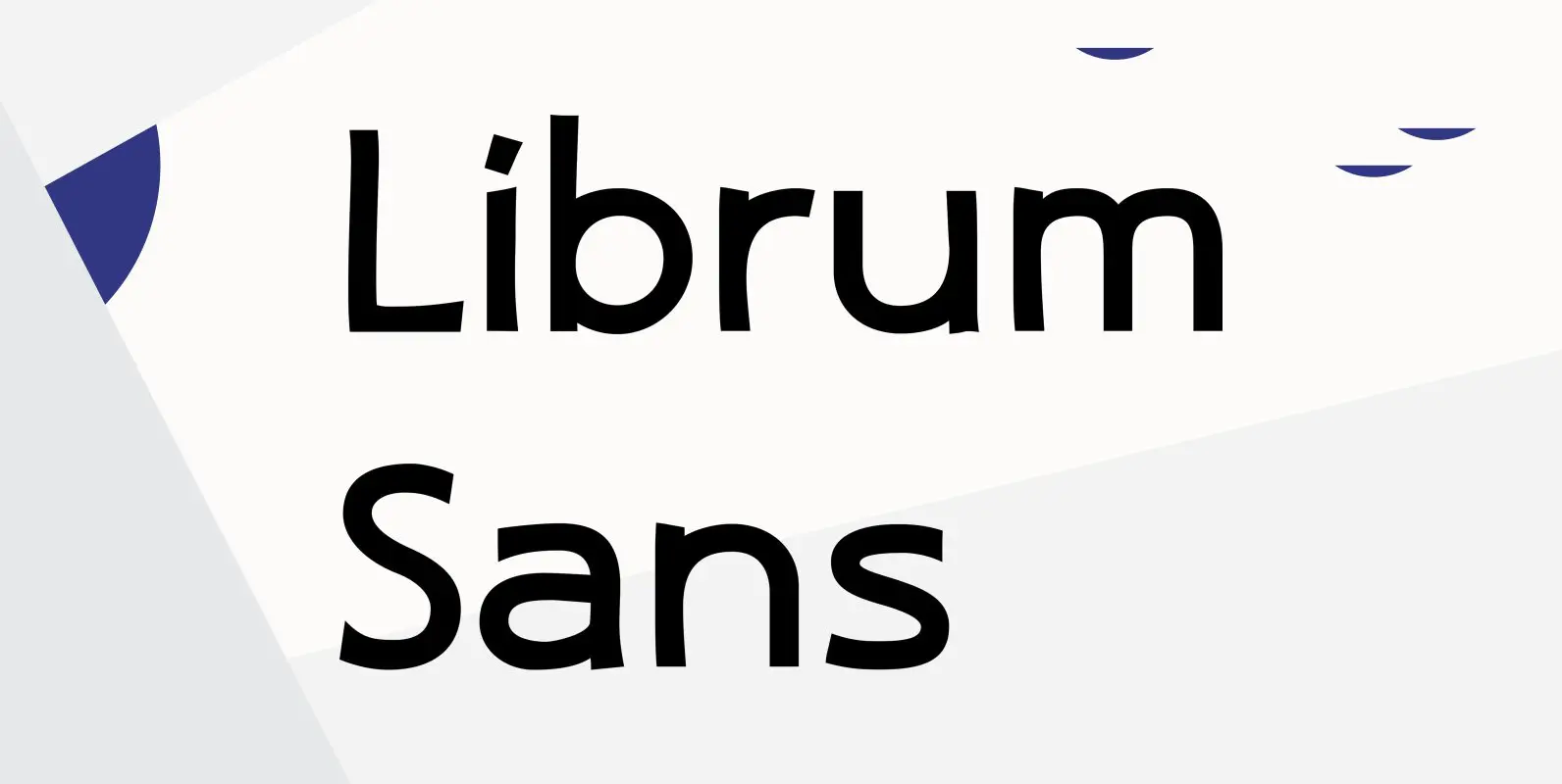
Librum Sans Font
This is the companion sans family to make the Librum serif families work as well as they do. By companion, I do mean stylistically compatible. But mainly, they have the same vertical metrics. So they work very well for run-in
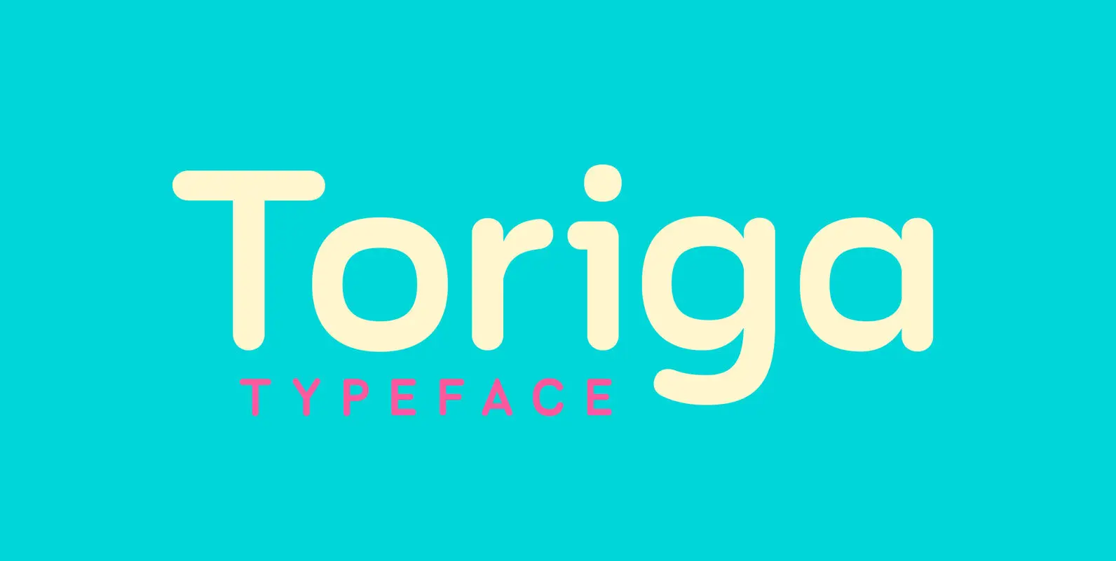
Toriga Font
The Toriga typeface was named after the Portuguese grape variant known as Touriga Nacional. This fun typeface boasts the features of a well-balanced, versatile, modern sans which is highly legible as a text font and with a clean, elegant look
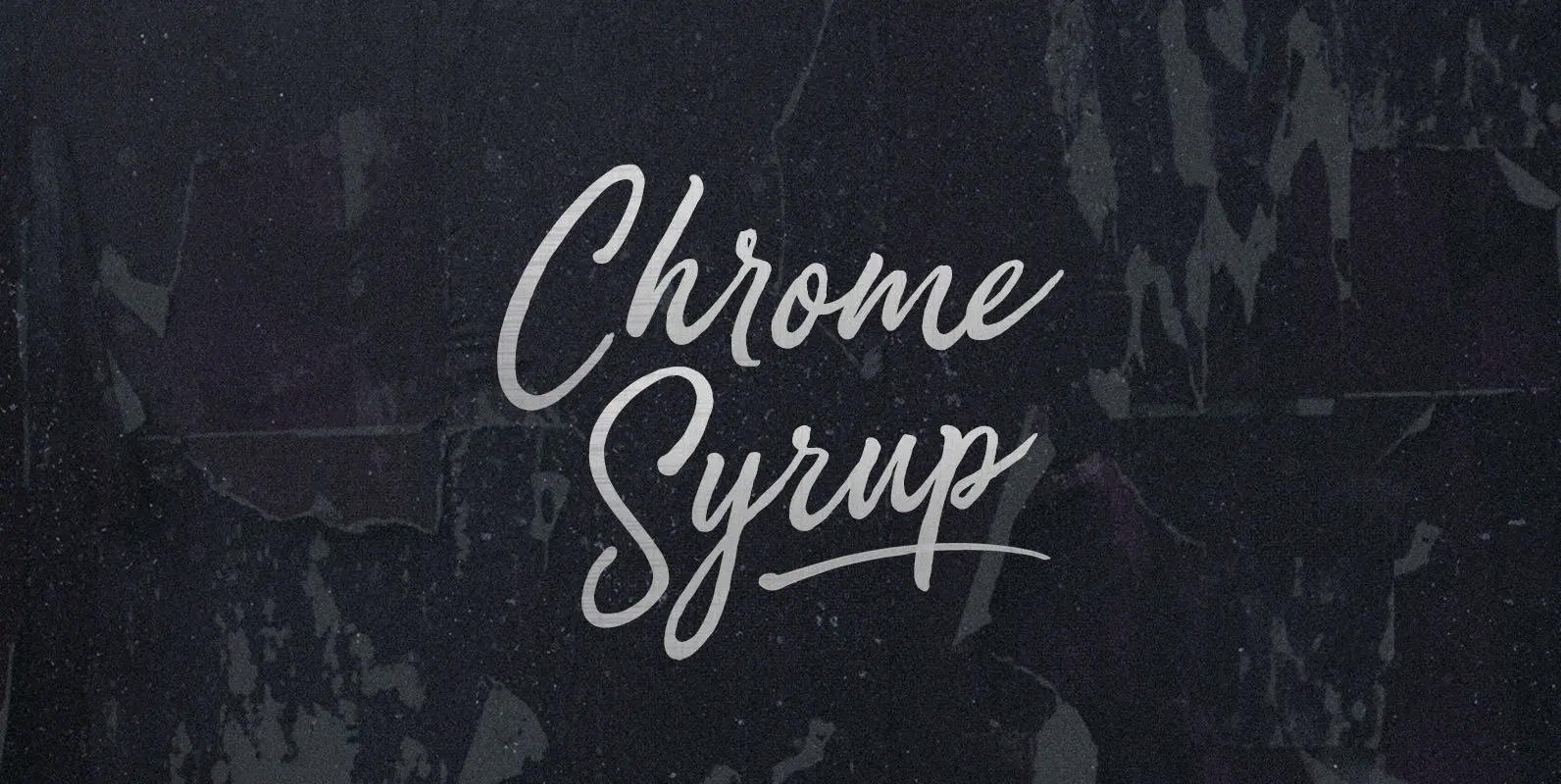
Chrome Syrup Font
Here we are, giving matter mad shine. Mad as bathing hot cakes in mercury, dripping off quick like silver with a sticky sparkle. Chrome Syrup in squeeze bottles, in the door of your fridge, to the door of your car,
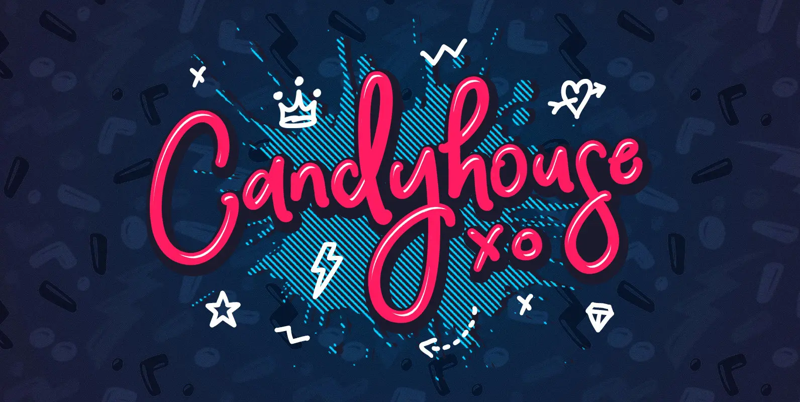
Candyhouse Font
Welcome to Candyhouse! It’s bold, playful, loopy & the party never stops! Have you ever received the not-so-helpful design feedback “make it pop”? Well, Candyhouse might just be your answer! This hand drawn font set is perfect for injecting some
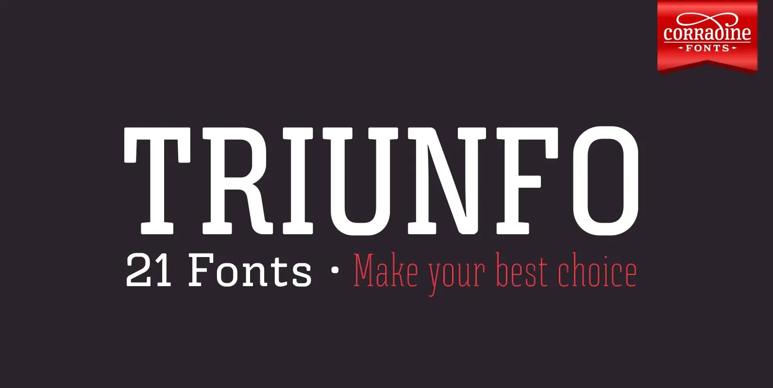
Triunfo Font
Triunfo is a modern slab serif font family with sports flavor. It comes in 21 variants of weight and wide that allows you to choose the best option to use in your work. Published by Corradine FontsDownload Triunfo
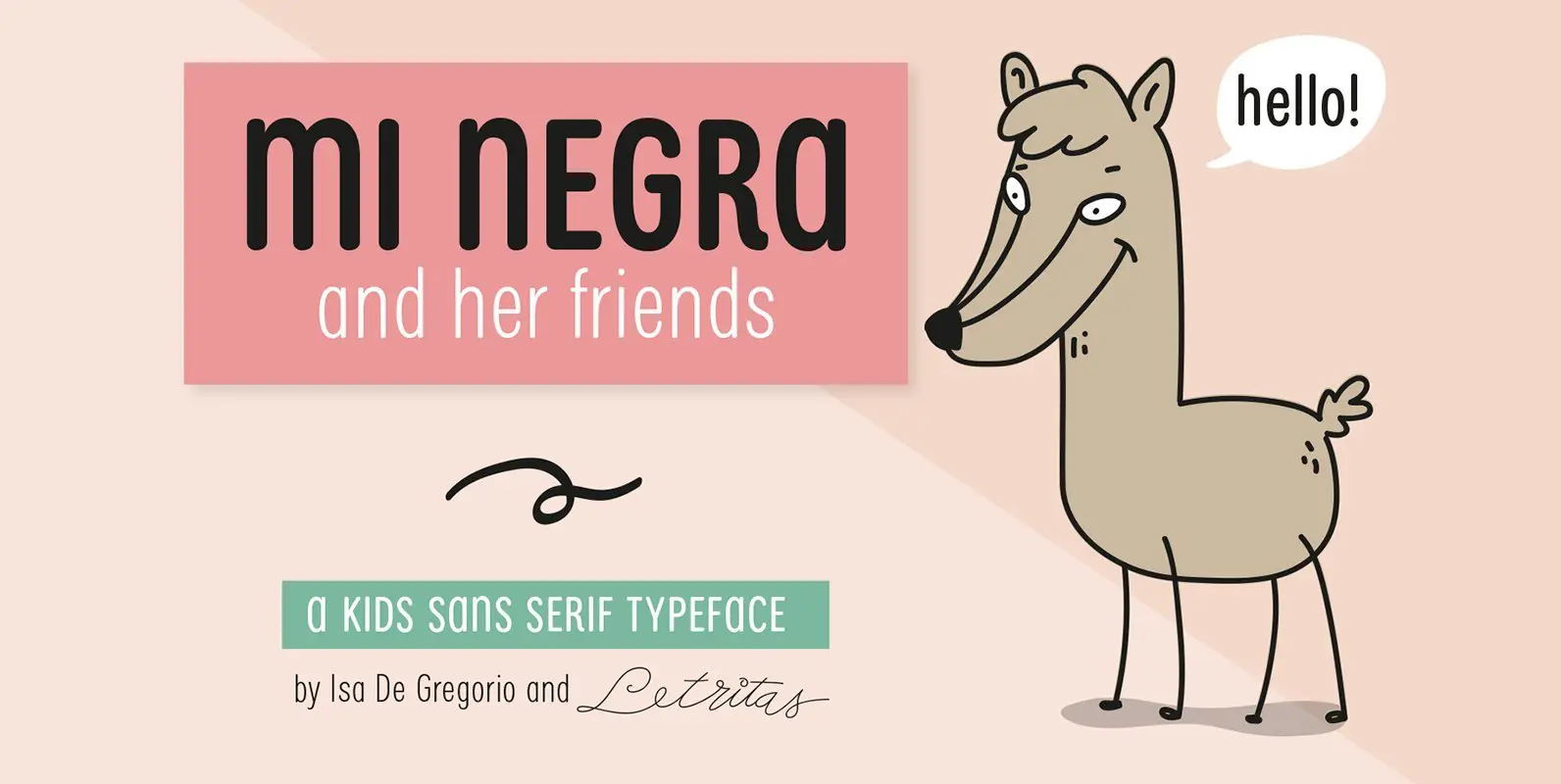
Mi Negra Font
Mi Negra is a funny and hilarious typography designed especially for children, thought and created by Isabel de Gregorio. It could be described as an original combination between a semi-handwright and semi sans-serif font. Thanks to its structure and nice

URW DIN Font
The digital outline fonts, DIN 1451 Fette Engschrift and Fette Mittelschrift were created by URW in 1984 and are the basis for all DIN font families. Both typefaces were designed for the URW SIGNUS system and were mainly used for
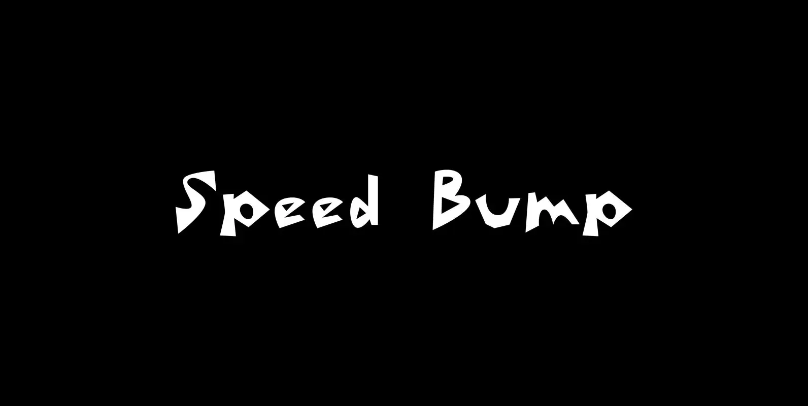
Speed Bump Font
Speed Bump gets its name in part from how quickly I designed it (a couple days) and in part from its conglomeration of arcs and corners that, in a weird way, reminded me of speed bumps on the road. Beyond

Beefcake Font
Beefcake treads the line of serious and playful. Just enough attitude to kick its legs over the baseline but not so much that it becomes annoying. If Beefcake had a chip on its shoulder they were knocked off as you
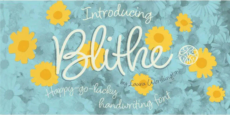
Blithe Font
Bouncy, effortless-looking handwriting can put us at ease or make us smile. Blithe captures the casual flair of a felt-tip pen with clean monoline strokes. Laura Worthington has retained the distinctive quirks of real handwriting – such as characters that
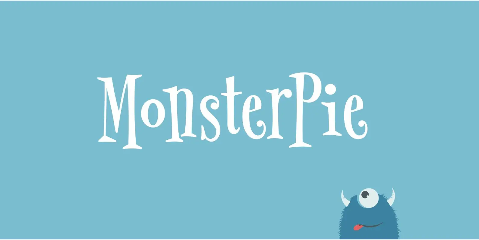
MonsterPie Font
Say hello to MonsterPie. This font brings the funny appearance of irregular designed characters together with the classic look of the Didone typefaces from the 18th century – that makes it a good choice for theme parks, movie posters, games,
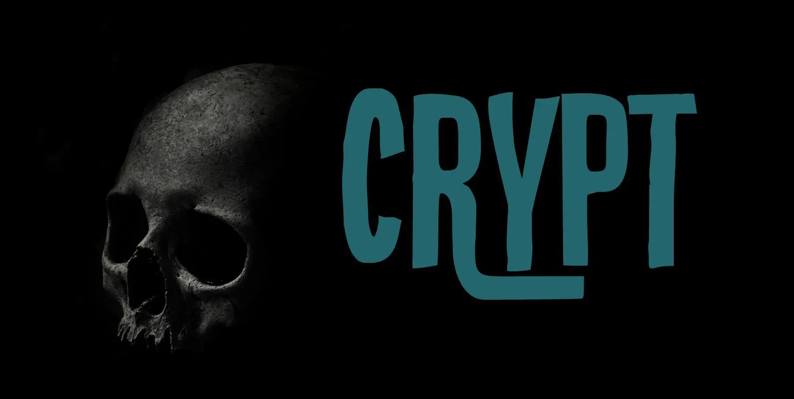
Crypt Font
Crypt is a seemingly lovely font that will look good in just about any design. But if you take a closer look, then Crypt is actually quite a scary font: it has jagged edges and a sinister undertone, making the