Tag: poster
Pen Swan Font
Pen Swan is the latest offering from Jen Maton & Great Lakes Lettering. A Pen Swan is the species of an adult female swan. It is a fitting name as it contains ‘pen’ in the name which is the tool

Smurrie Font
Smurrie means ‘sludge’ in Dutch. It is not an exact translation, but as good as I could find. The name refers to the rounded, blob-like shape of the glyphs. I think this font would look very good on posters, book
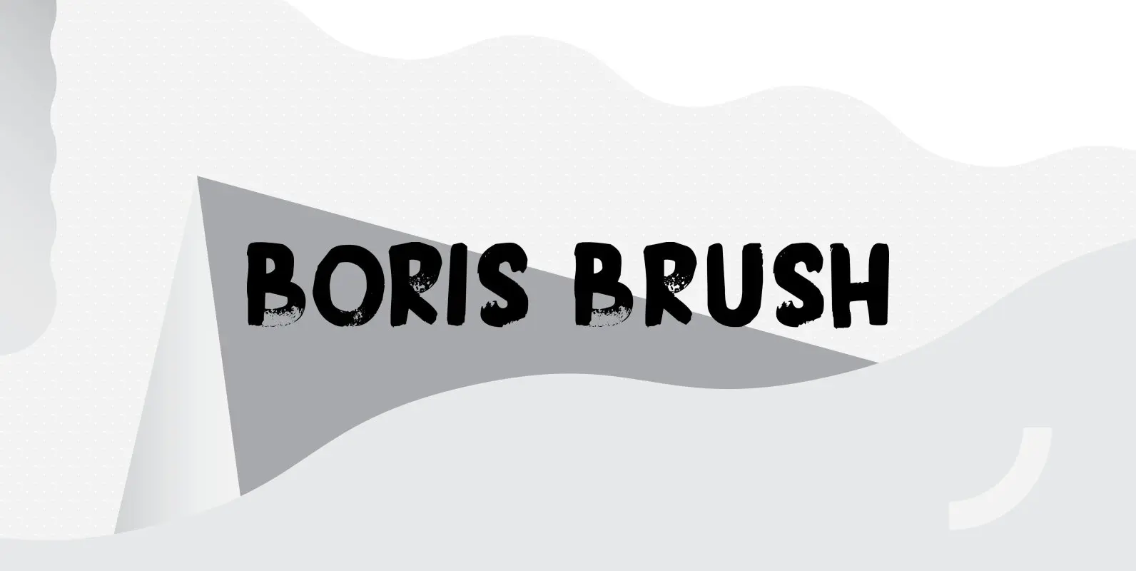
Boris Brush Font
Boris is my son: he was born on January 7th and he is as cute as can be. Boris Brush font is a very loud, very useful brush typeface, which I created using some fine-haired brushes and black paint. It
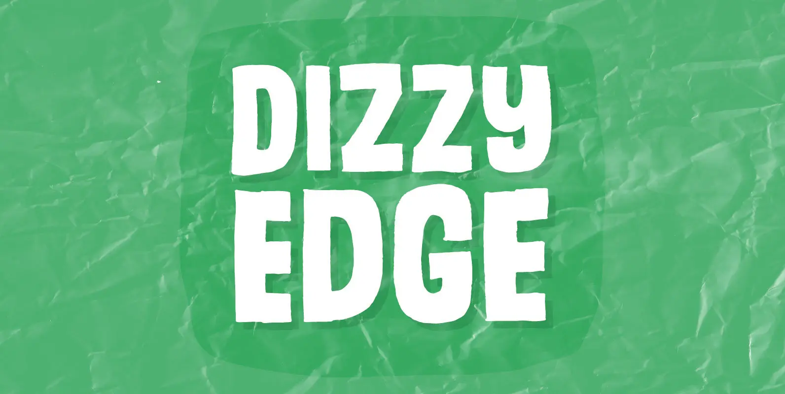
Dizzy Edge Font
My Dizzy Edge font is really not that dizzy! Actually it’s quite steady and legible – super good for packaging, greeting cards and perhaps even commercials for toys, candy, t-shirts, movie posters…yep, that list is long! What’s more interesting is
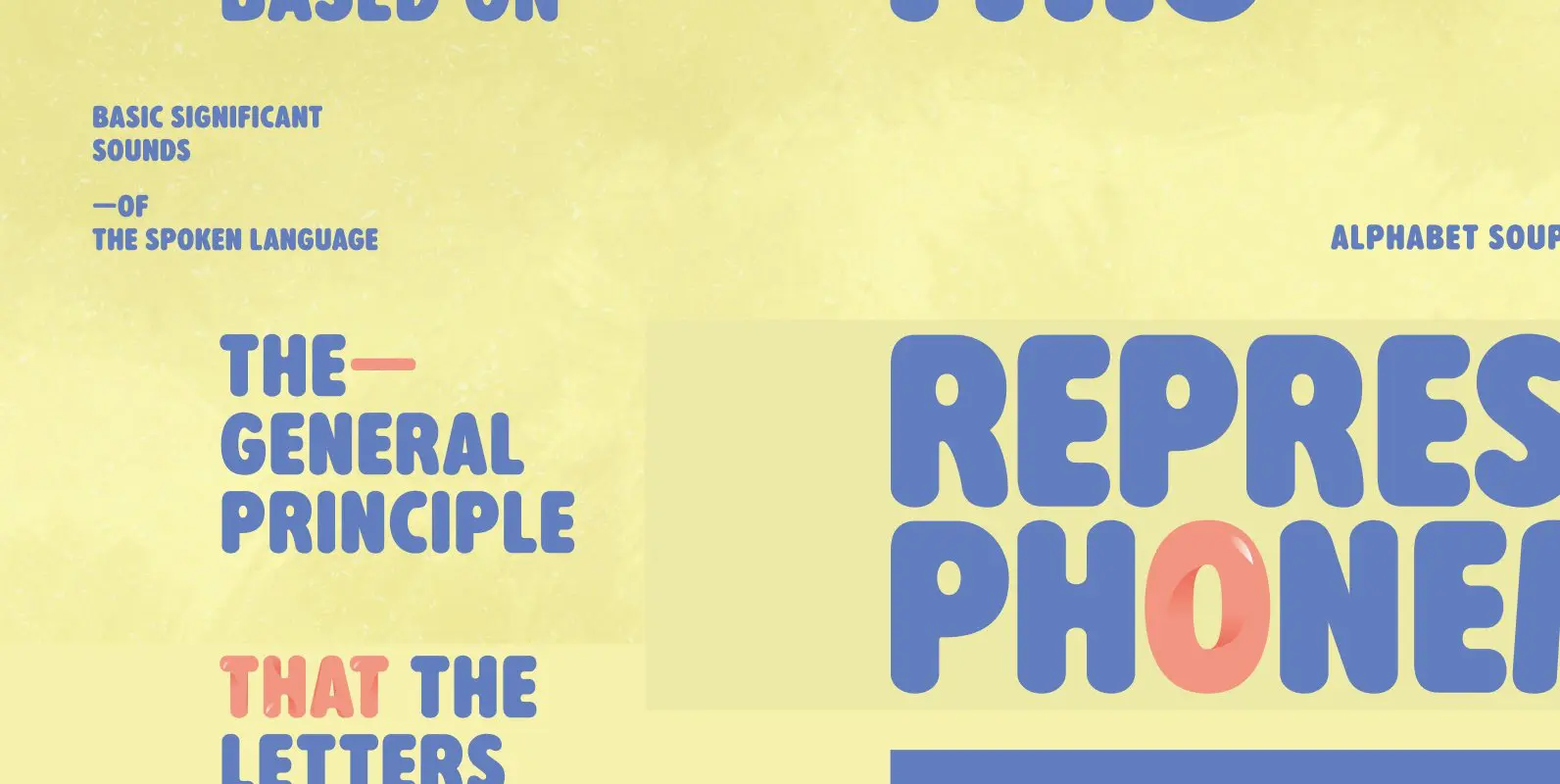
Alphabet Soup Font
Designed by Steve Jackaman. In the early 1980’s, Steve worked at Typographic House in Boston, Massachusetts. At the time, ‘Typo’ House, as it was affectionately known, was the largest type house in New England. This font was designed and produced
Vanderchalk Font
Vanderchalk is a distressed and chalk style font designed and published by Panji Nugraha. This release also contains a bonus vector elements design file (available as AI CS3 + EPS CS3). Published by Panji NugrahaDownload Vanderchalk
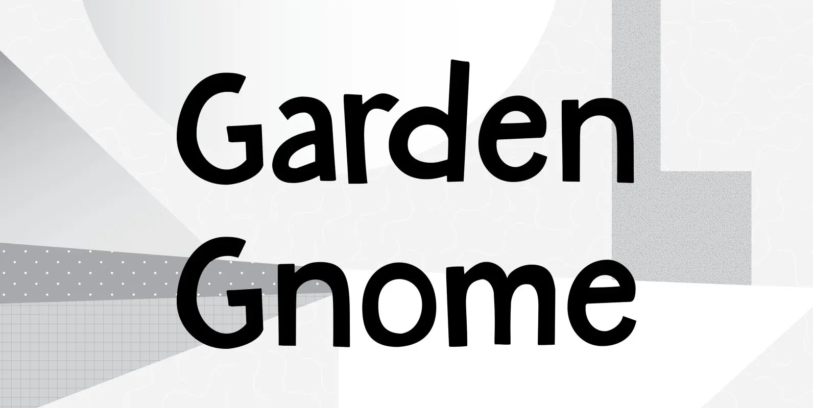
Garden Gnome Font
I am not really fond of Garden Gnomes, but this font is kinda cute and I figured it’d be a nice name. Garden Gnome is a very happy, easy to read Children’s Book font. It is bouncy, rounded and comes
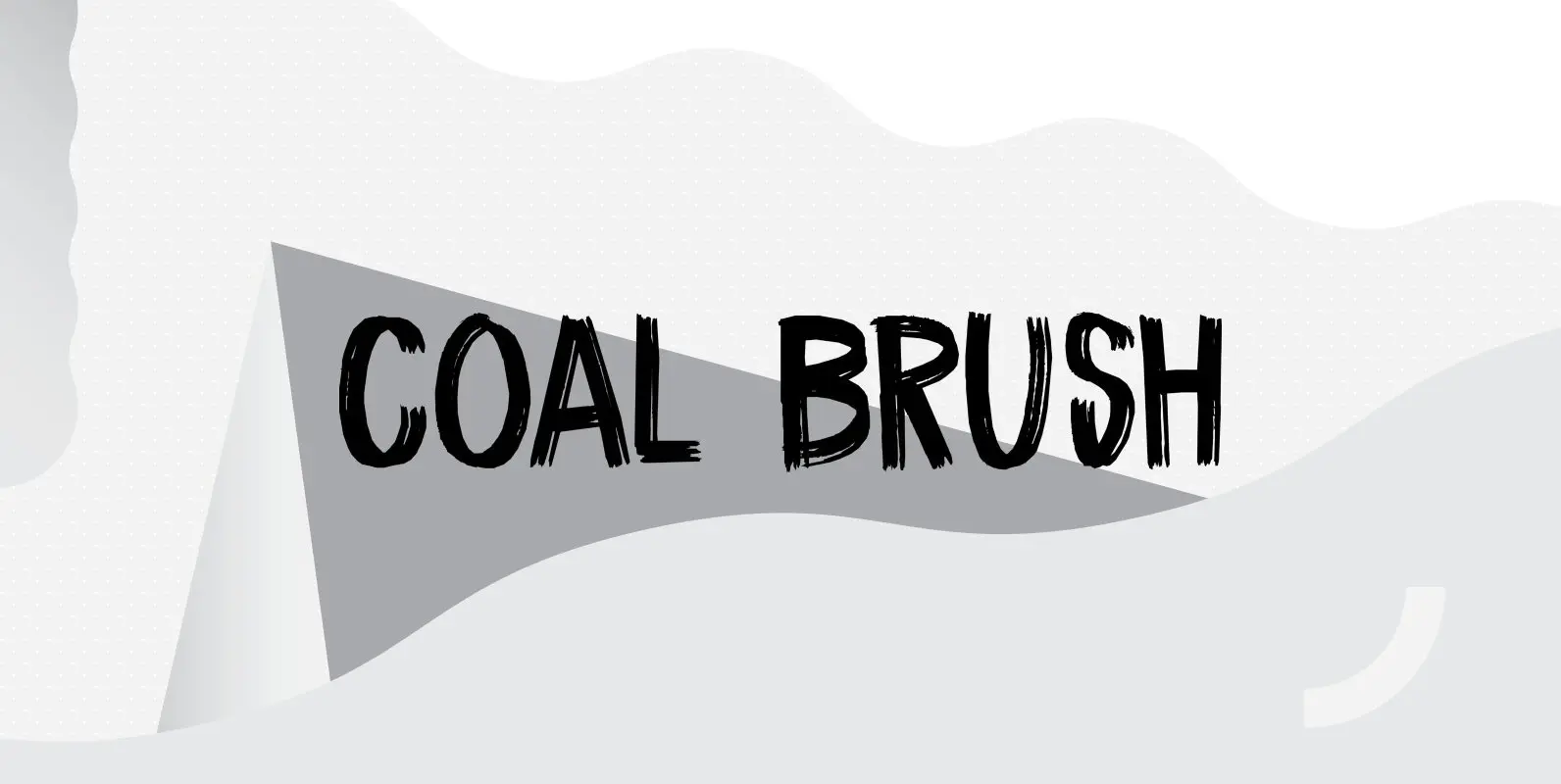
Coal Brush Font
Coal Brush is a bit of a misleading name. It looks as though it was made with a brush, but it was, in fact, made with a almost dried out old marker pen. But a font named ‘dried out old
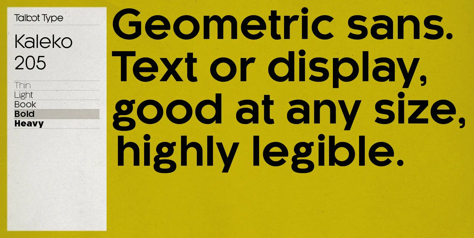
Kaleko 205 Font
Kaleko 205 is inspired by the classic, geometric sans-serifs such as Gill Sans, but has shallower ascenders and descenders for a more compact look. It’s a well-balanced, versatile, modern sans, highly legible as a text font and with a clean,
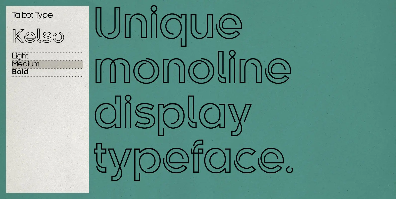
Kelso Font
Kelso is a highly original, outline display font. Each character is represented by a single continuous line to create a fluid and rhythmic look. This technique seems somehow to bring out the individual characteristics of each letter, resulting in a
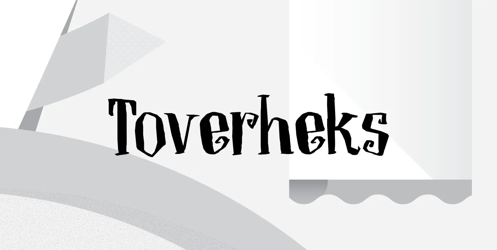
Toverheks Font
A Toverheks in Dutch means ‘witch’ – well, actually it means ‘magic witch’ (it doesn’t translate well). The reason for this kind of weird name is the nature of the font: it reminded me of a book of spells –
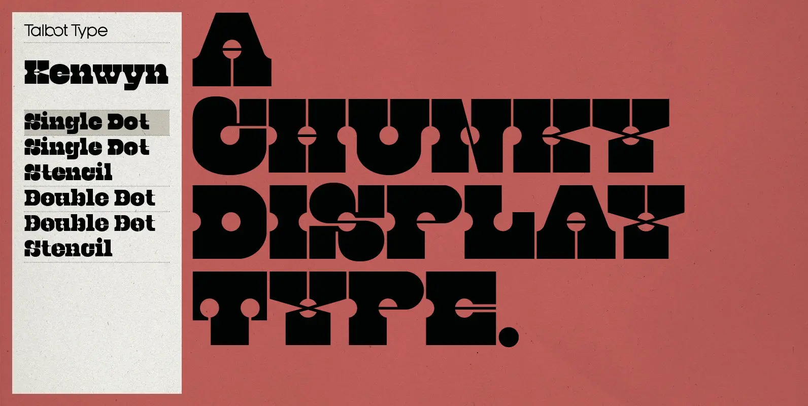
Kenwyn Font
Kenwyn is a bold, geometric, Egyptian style slab-serif display font. It comes in two variations — Single Dot and Double Dot — each with an accompanying Stencil variation. Essentially a blend of circles and squares, Single Dot features a circular
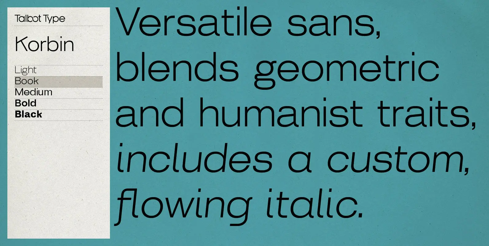
Korbin Font
Inspired by the sans-serifs of the late 19th and early 20th century, Korbin is a legible and versatile text and display face available in five weights. It mixes geometric and humanist traits to achieve a modern, clean, friendly appearance. The
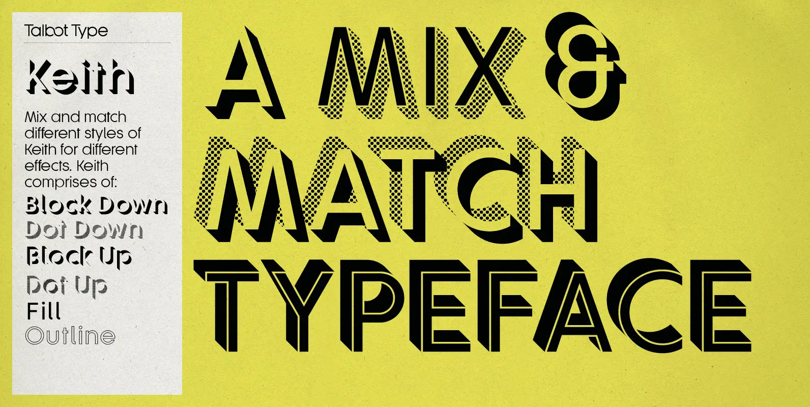
Keith Font
Keith is a striking and playful display font. Mix and match the different shadow styles, to create a variety of different looks and effects. There are four different shadow effects, along with a fill and an outline variation. Keith features
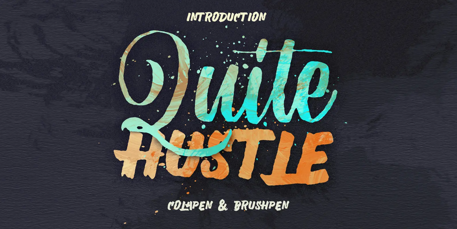
Quite Hustle Font
Quite Hustle type is hand painted typeface designed to help you create the look of stunning custom hand-lettering. Published by MaghribDownload Quite Hustle
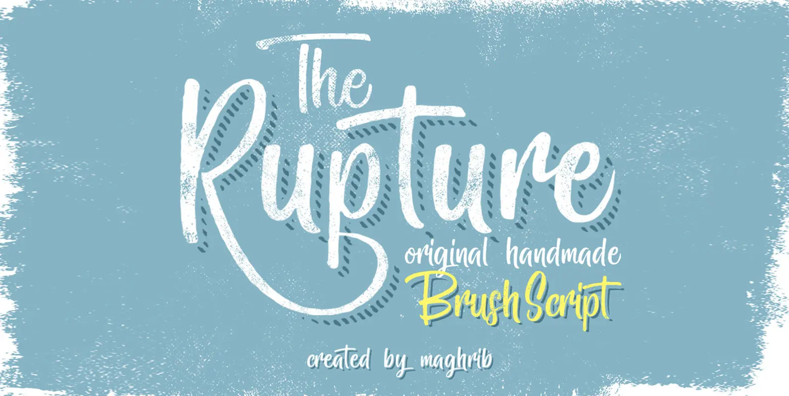
The Rupture Font
The Rupture is a hand painted typeface designed to help you create the look of stunning custom hand-lettering. Published by MaghribDownload The Rupture
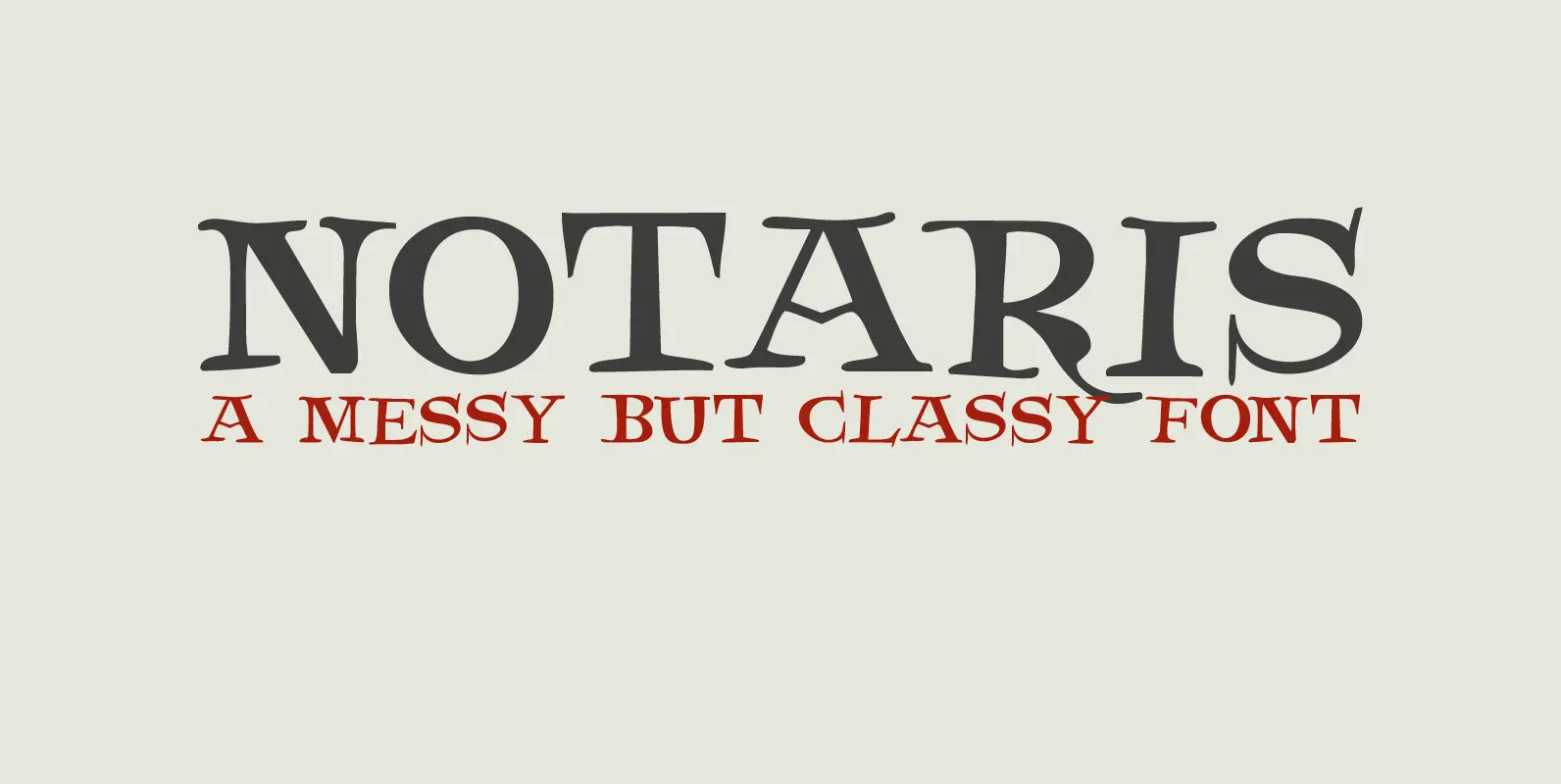
Notaris Font
Notaris (‘Notary’ in Dutch) is a hand-drawn, all caps didone-style typeface. It is a little rough, a little uneven, but lively and elegant as well. Comes with an abundance of diacritics and, lo and behold, some end-ligatures as well. Published
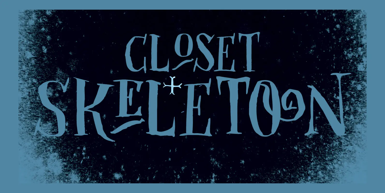
Closet Skeleton Font
Some time ago I stumbled upon a little book called ‘De Sprookjeshoorn’ (‘Horn of Fairy Tales’) by Anton Eijkens (1920 – 2012). It was published in 1946 and contains several authentic and unique fairy tales – unfortunately unreadable to modern