Tag: poster
Tremendous Font
Strong and somewhat rough but absolutely warm-hearted, this Tremendous family is quite versatile and will find the right tone to deliver your message in a nice way. It can be friendly, it can speak out loud, it can be almost
Copacabana Font
Copacabana is heavily based on one of my favourite typefaces Goudy Old Style Italic. It is sharper and more clearly defined than Goudy yet still retains it old style characteristics. The face is slightly angled so is basically upright whilst
Prelo Slab Font
Prelo Slab is the serif companion to Prelo, a neutral, highly readable typeface, for identity, editorial and information design. With nine weights and nine italics, from Hairline to Black, Prelo Slab is a workhorse typeface, full of OpenType features such
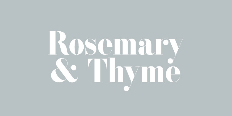
ATC Rosemary Font
ATC Rosemary is a didone print-font comprised of over 315 characters, producing extreme contrast between abrupt and thin serifs at large sizes. The luxurious feel of Rosemary utilizes not only hairlines and ball serifs, but expresses similarities to Romantic fonts
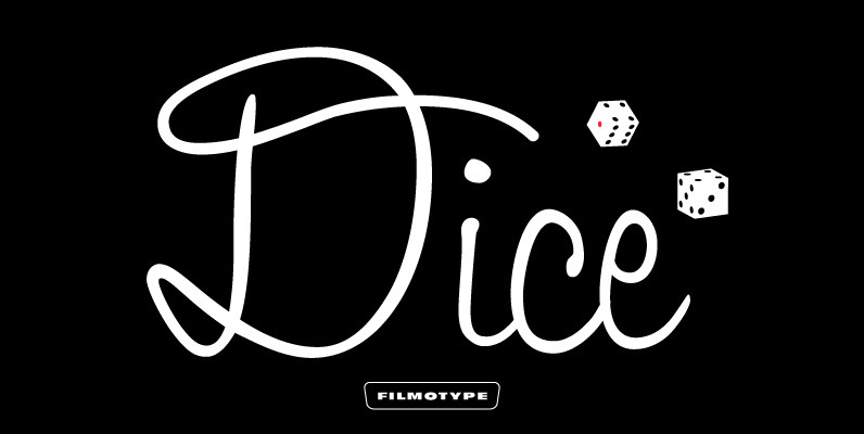
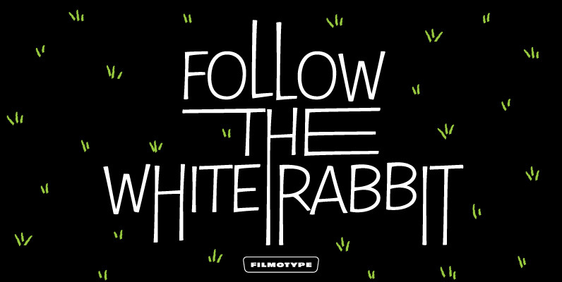
Filmotype Jamboree Font
Filmotype Jamboree was released by Filmotype in mid-1960s to expand its Scripts category with a smart looking fresh informal upright pen-script! Filmotype Jamboree was developed from the original font filmstrips and includes a full international character compliment, automatic fractionals, ordinals,
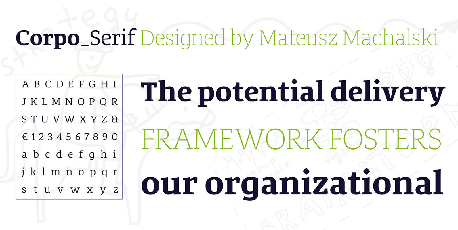
Corpo Serif Font
Corpo Serif is a refreshed version of my old font Korpo Serif. Corpo Serif, designed by Mateusz Machalski, is a serif type family with a friendly feel. This type comprises 12 variants with 6 weights.The high contrast and high x
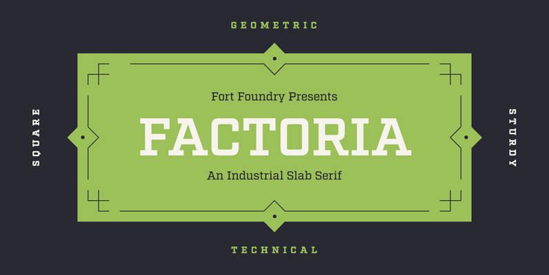
Factoria Font
Born out of the Industry typeface, Factoria is a geometric, square slab. The hard-working family can jump from the side of an industrial building and into a sports magazine in a jiffy. The lighter weights exhibit a clean, no-nonsense vibe
Filmotype Nemo Font
As one of earliest Free Style faces released in the early 1950s by Filmotype, Filmotype Nemo captures the more iconic playful type styles made popular in the early 1950s when a clear message needed to come across as fun to
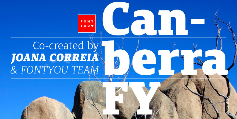
Canberra FY Font
Canberra FY is a contemporary and low-contrast serif typeface that shows legibility with personality. Its asymmetric and short serifs render a versatile look, always usable and friendly. As Canberra FY is very legible with its book style in small sizes,
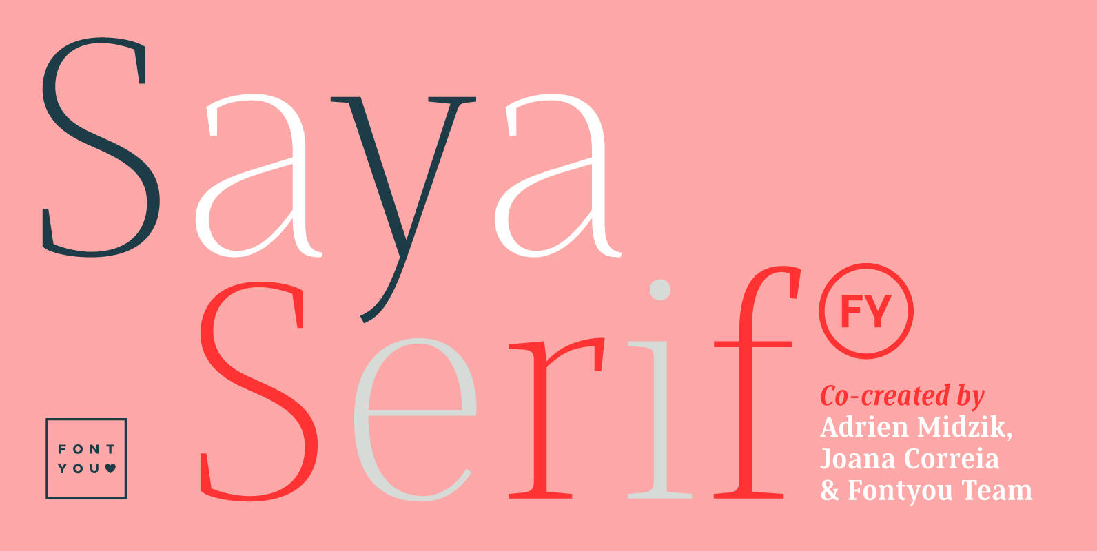
Saya Serif FY Font
Here comes the serif! After her big sisters version, Saya Sans and Saya Semi Sans, meet Saya Serif! With its lightly condensed letterforms and its elegant sharped serifs, this font family is both suitable for text and display use. It’s
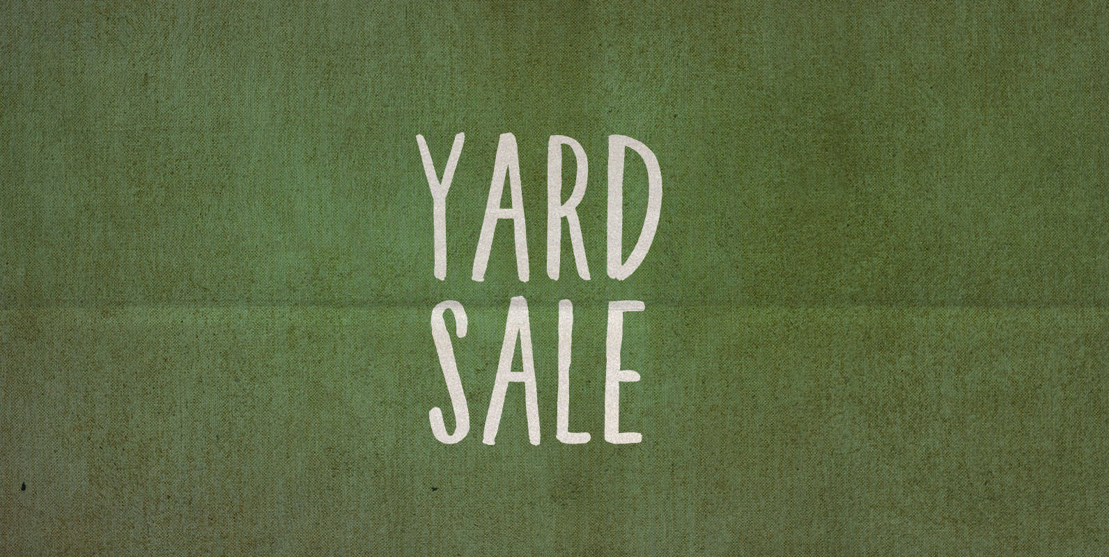
Yard Sale Font
Last year I put out my old yard sale sign and the city told me it was violating a bylaw for being too ugly of a sign in a public place. Not this year! This year I used BLKBK’s ‘Yard
Acta Poster Font
First designed for chilean newspaper La Tercera in 2010, Acta family is a clean and fresh type system, while enough conservative for newspaper setting. The complete Acta Type System contains Acta and Acta Display both with six weights with matching
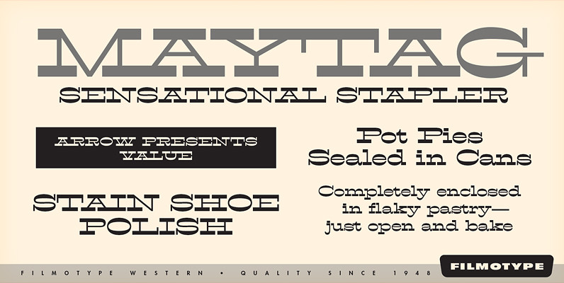
Filmotype Western Font
Inspired by French Antique reverse-stress types of the 1880s, Filmotype Western was released in 1955 to expand its Flat Serif category. Popular in broadsides, circus posters and advertisements at the turn of the 19th century, Filmotype Western will add old

Bobbin Cyrillic Font
To design a font Bobbin I was inspired by a You And Me Monthly published by National Magazines Publisher RSW Prasa that appeared from Mai 1960 till December 1973 in Poland. In the Bobbin family, every variety contains 3 alternative
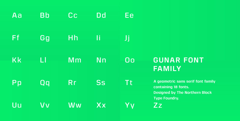
Gunar Font
A geometric sans serif with a square chiseled appearance. Precise curves are met with straight lines and tapered angles to produce a fresh, technical typeface. It’s large x-height and neutral width give it good legibility at small point sizes. These
Samantha Script Font
Based on pointed-pen lettering, Samantha features slightly condensed characters and a measured rhythm. It’s named after my niece who shares its optimistic style and discipline. Samantha is available in upright or italic variants, each with regular and bold weights. Samantha’s
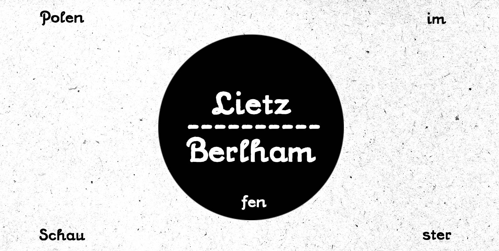
PiS Lietz Berlham Font
Need a perfect typeface for your post-apocalyptic shooting game? A documentary about suffragettes? Your vintage themed coffeeshop? PiS Lietz Berlham! Boom! Just as his straighter brother LIETZ Lindham, Lietz Berlham evokes the spirit of the 1920s and 30s. Hand-drawn and
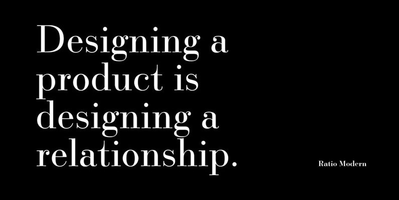
Ratio Modern Font
Designed in 1923 by Friedrich Kleukens for the Stempel foundry, Ratio was one of the first metal faces to bring the Didone genre to the forefront of industrial mass publishing as a headline and magazine face. Though essentially modern in