Tag: poster
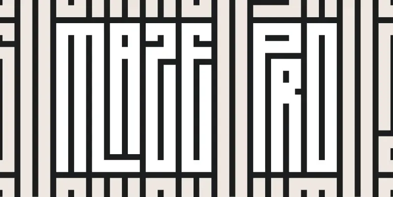
ZT Maze Pro Font
ZT Maze Pro” is a display typeface based on stem widths and regular spacings generating the visual sensation of being inside a maze, especially their capital letters. “ZT Maze Pro” has been thought for large sizes and experimental purposes. Published
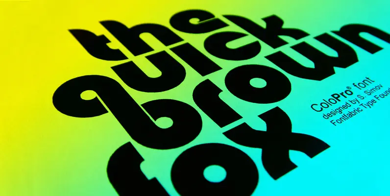
Colo Pro Font
Colo Pro is a display family with a lot of room for application, most obvious being the tightly fitted headlines. Inspired from some retro style fonts like Bauhaus , but with more weight and inner line implemented. Published by FontfabricDownload
Smooth Buggaloo Font
Just like my previous typefaces, my new one, Smooth Buggaloo, also finds its roots in music. The Boogaloo was a popular music style in the 60s, a mixture of Latin and Rock and Roll music. Later Salsa took over this

Liza Pro Complete Font
Liza, lettres d’amour Flirting, fashionable, provocative, emotional, casual, moderate, extremely sensible & beautiful – Liza Pro covers it all. Liza Pro, Underware’s latest creation, is a live-script typeface. Thanks to its extremely intelligent OpenType architecture, she approaches human hand lettering
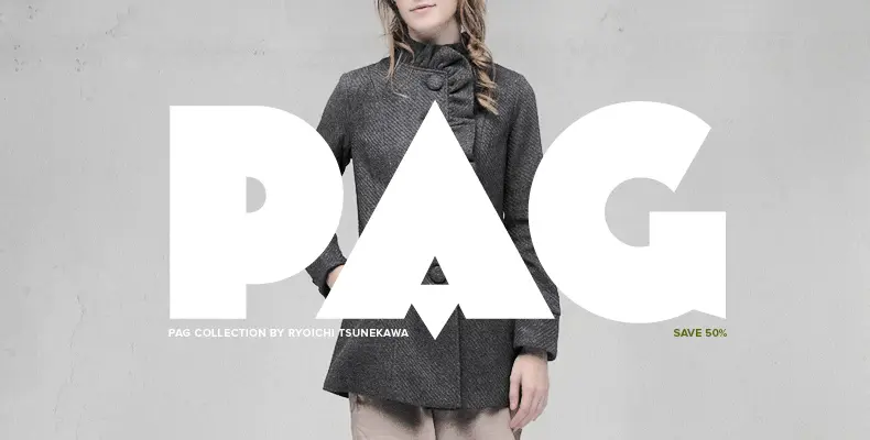
PAG Collection Font
The PAG Collection is the first of its kind, containing 25 beautiful and diverse retro styled fonts by the Japanese font designer, Ryoichi Tsunekawa. Discounted at an astonishing 50% off the retail price, this collection is a must have for
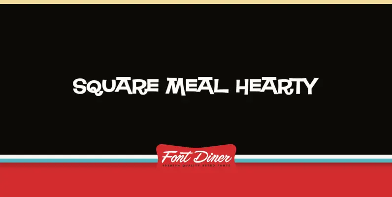
Square Meal Hearty Font
If Square Meal wasn’t enough to whet your appetite, then strap on that feedbag and dive into Square Meal Hearty! This casual interlocking sans-serif has all the trappings! Published by Font DinerDownload Square Meal Hearty
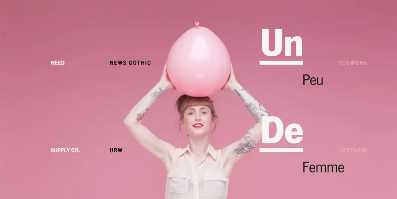
News Gothic Font
This is URW’s digitization of the famous font News Gothic, the realist sans-serif typeface designed by Morris Fuller Benton, and released by the American Type Founders (ATF) in 1908. (News Gothic is similar in proportion and structure to Benton’s famous
Weird Bill Family Font
Weird Bill is Squid’s tribute to his most prominent influence, Bill Campbell, model kit box illustrator extraordinaire and creator of the Weird-Ohs!. Bill’s series of goofy monster model kits in the early 1960s was such a hit that it has
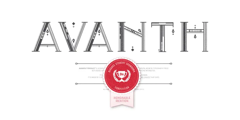
Avanth Font
Avanth Typeface was born from the search of a display typeface to use in titles with a real personality, but trying to keep it legible in big sizes. Its own personality is based on small details in each letter (unique
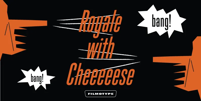
Filmotype Giant Family Font
Initially designed in the early-to-mid 1950s, Filmotype Giant is part of a larger group of condensed sans serifs offered by Filmotype at the demand of its customers based on their versatility, legibility, and timeless aesthetic. Remastered and expanded with exacting
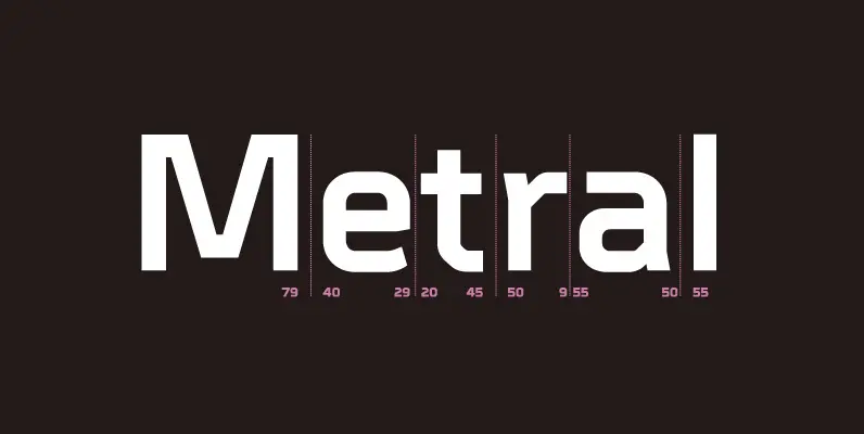
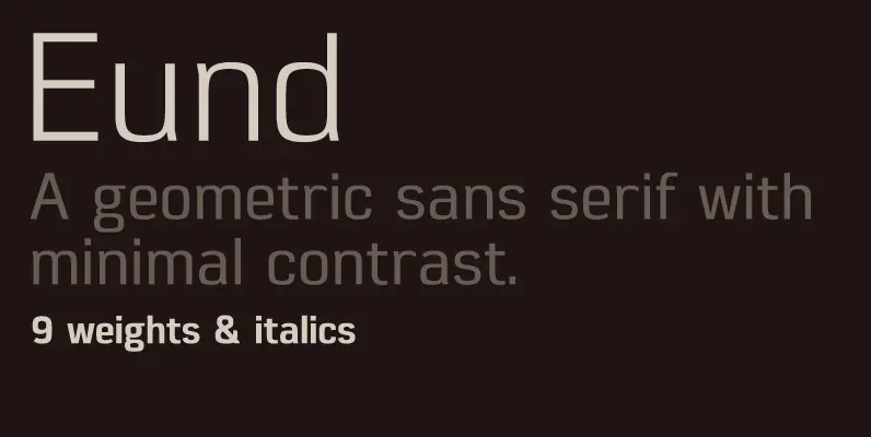
Metral Font
A geometric sans serif with a precise fabricated appearance. Smooth corners are mixed with subtle angles to form a strong, legible typeface ideally suited for a wide range of applications. Details include 6 weights with italics, an extended European character
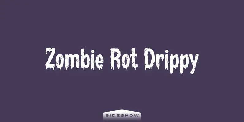
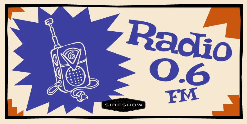
Zombie Rot Drippy Font
Your cries of “Extra rot, please!!!” have been answered. It’s Zombie Rot Drippy with all the festering goodness of the original Zombie Rot but with more, um, drippiness! Flesh-eating has never been so much fun. Published by SideshowDownload Zombie Rot
Directors Gothic 230 Font
Handcrafted by Lettering Inc as part of its core library of typefaces in the 1930s, Directors Gothic was dramatically expanded throughout the lifetime of the company and remains a timeless classic. Inspired by the Art Deco movement popular at the

Superba Font
Designed by Steve Jackaman, Superba is a heavy slab design based on the Haas 1928-30 design. Published by Red RoosterDownload Superba

Shearman STD Font
Shearman STD has a simple design, based on industrial fonts, in particular at the typewriters fonts. It’s a geometric font with curves elimination, noting in particular the O and Q letters. It has smooth angles and clean forms which combine
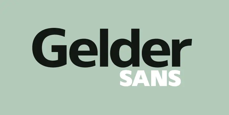
Gelder Sans Font
A clean modern sans serif typeface. The balanced proportions of each character demonstrate great legibility at both small and large scale. The distinctively open apertures further improves visibility when used across the web and hand held devices. Details include 9