Tag: poster
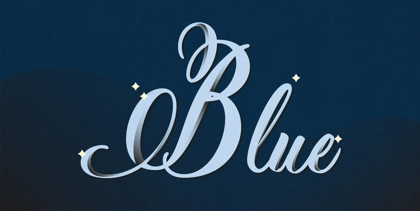
Pen Swan Font
Pen Swan is the latest offering from Jen Maton & Great Lakes Lettering. A Pen Swan is the species of an adult female swan. It is a fitting name as it contains ‘pen’ in the name which is the tool

Smurrie Font
Smurrie means ‘sludge’ in Dutch. It is not an exact translation, but as good as I could find. The name refers to the rounded, blob-like shape of the glyphs. I think this font would look very good on posters, book
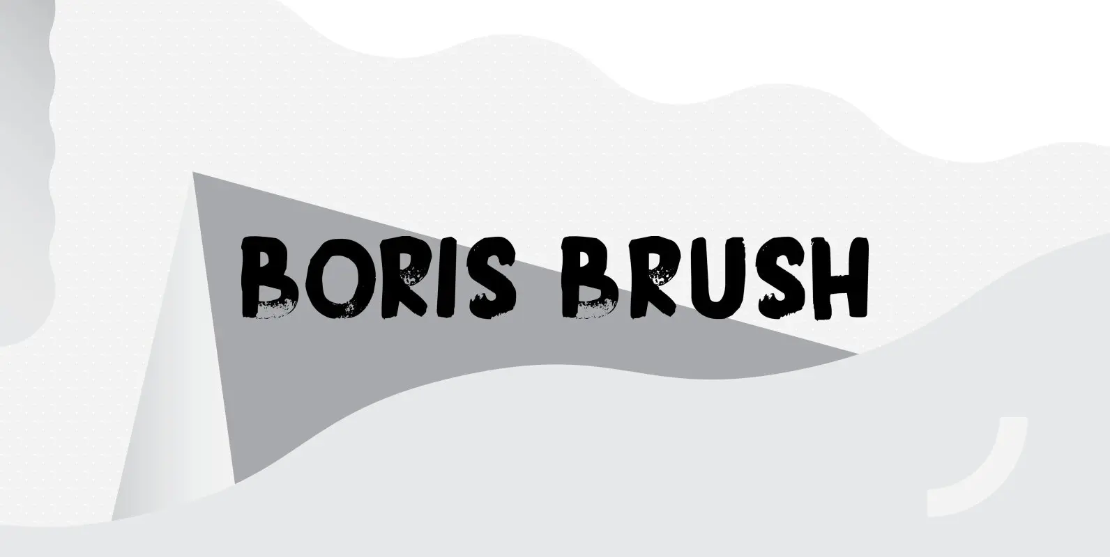
Boris Brush Font
Boris is my son: he was born on January 7th and he is as cute as can be. Boris Brush font is a very loud, very useful brush typeface, which I created using some fine-haired brushes and black paint. It
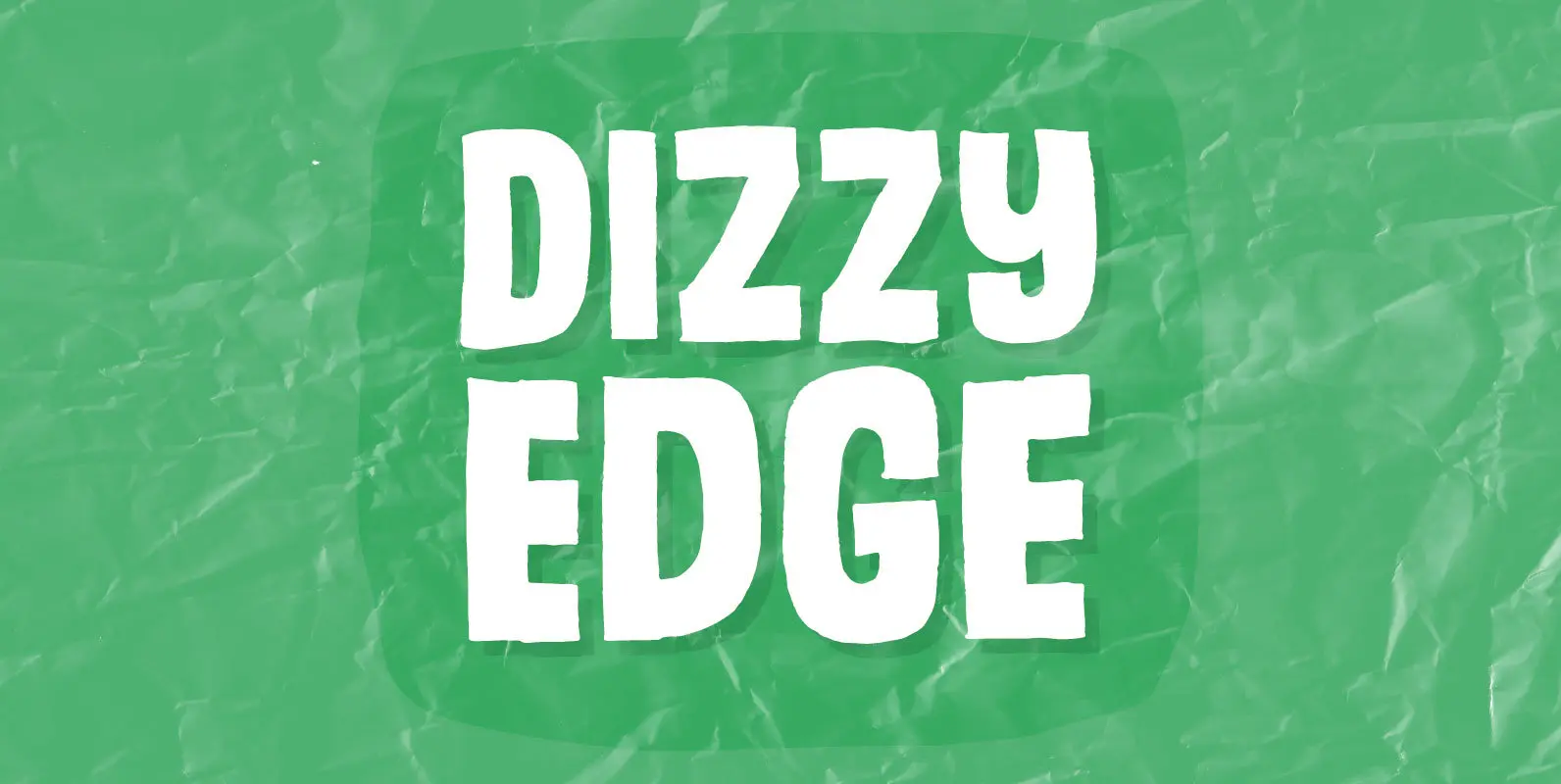
Dizzy Edge Font
My Dizzy Edge font is really not that dizzy! Actually it’s quite steady and legible – super good for packaging, greeting cards and perhaps even commercials for toys, candy, t-shirts, movie posters…yep, that list is long! What’s more interesting is
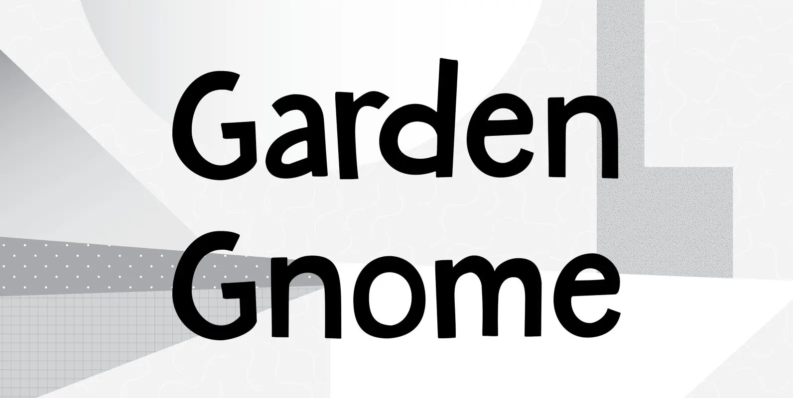
Garden Gnome Font
I am not really fond of Garden Gnomes, but this font is kinda cute and I figured it’d be a nice name. Garden Gnome is a very happy, easy to read Children’s Book font. It is bouncy, rounded and comes
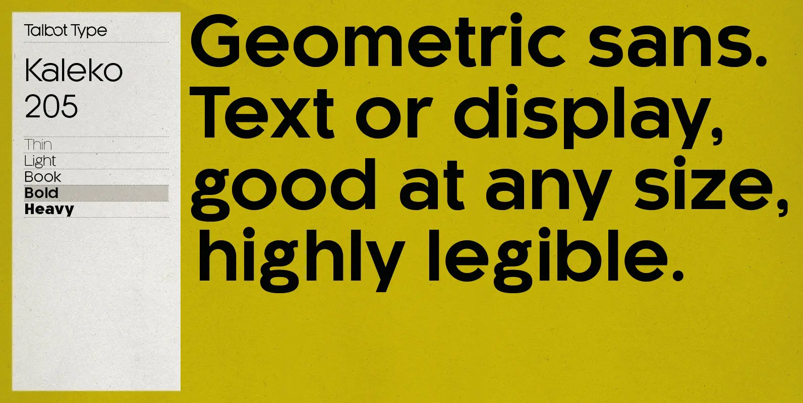
Kaleko 205 Font
Kaleko 205 is inspired by the classic, geometric sans-serifs such as Gill Sans, but has shallower ascenders and descenders for a more compact look. It’s a well-balanced, versatile, modern sans, highly legible as a text font and with a clean,
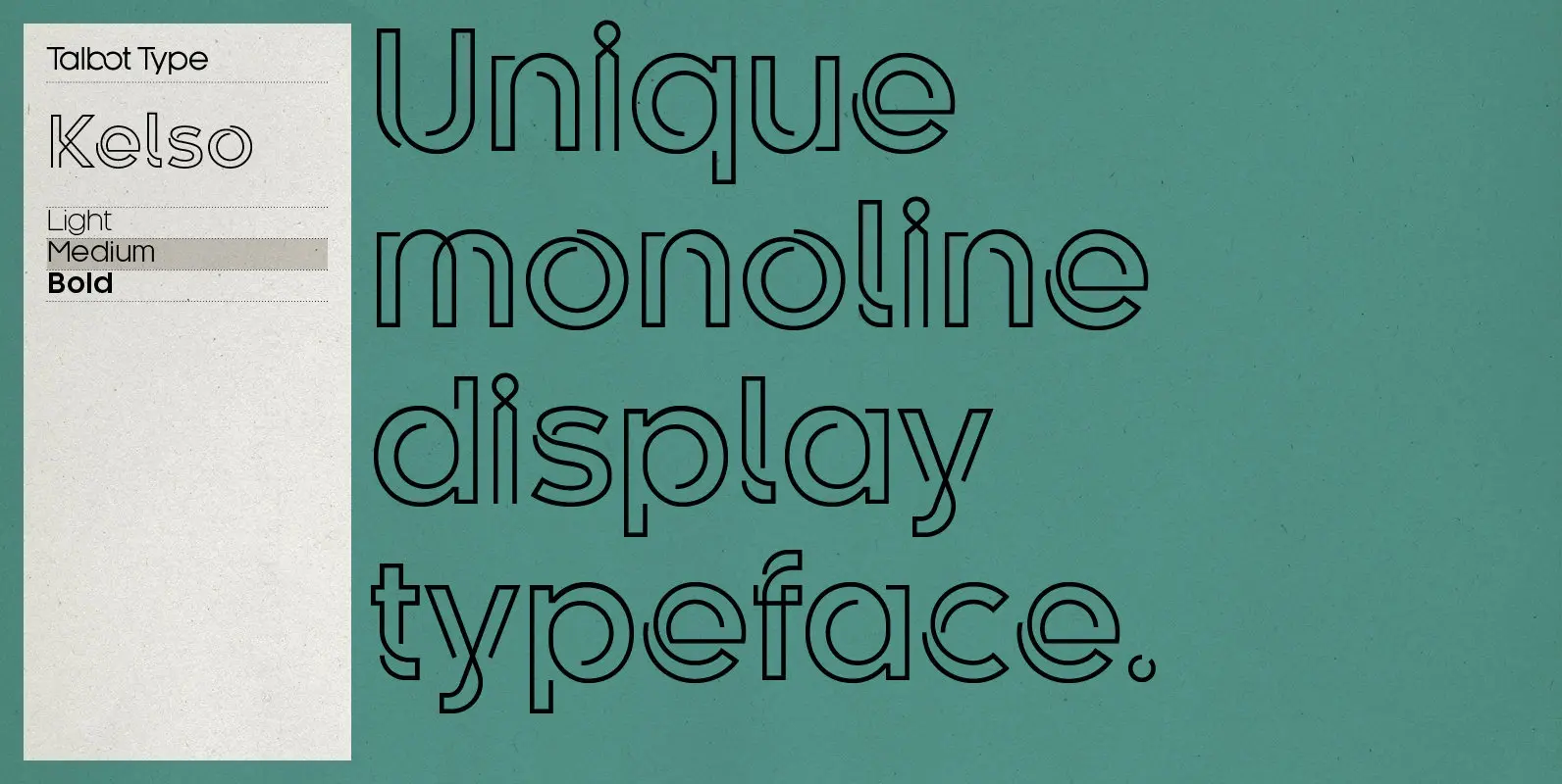
Kelso Font
Kelso is a highly original, outline display font. Each character is represented by a single continuous line to create a fluid and rhythmic look. This technique seems somehow to bring out the individual characteristics of each letter, resulting in a
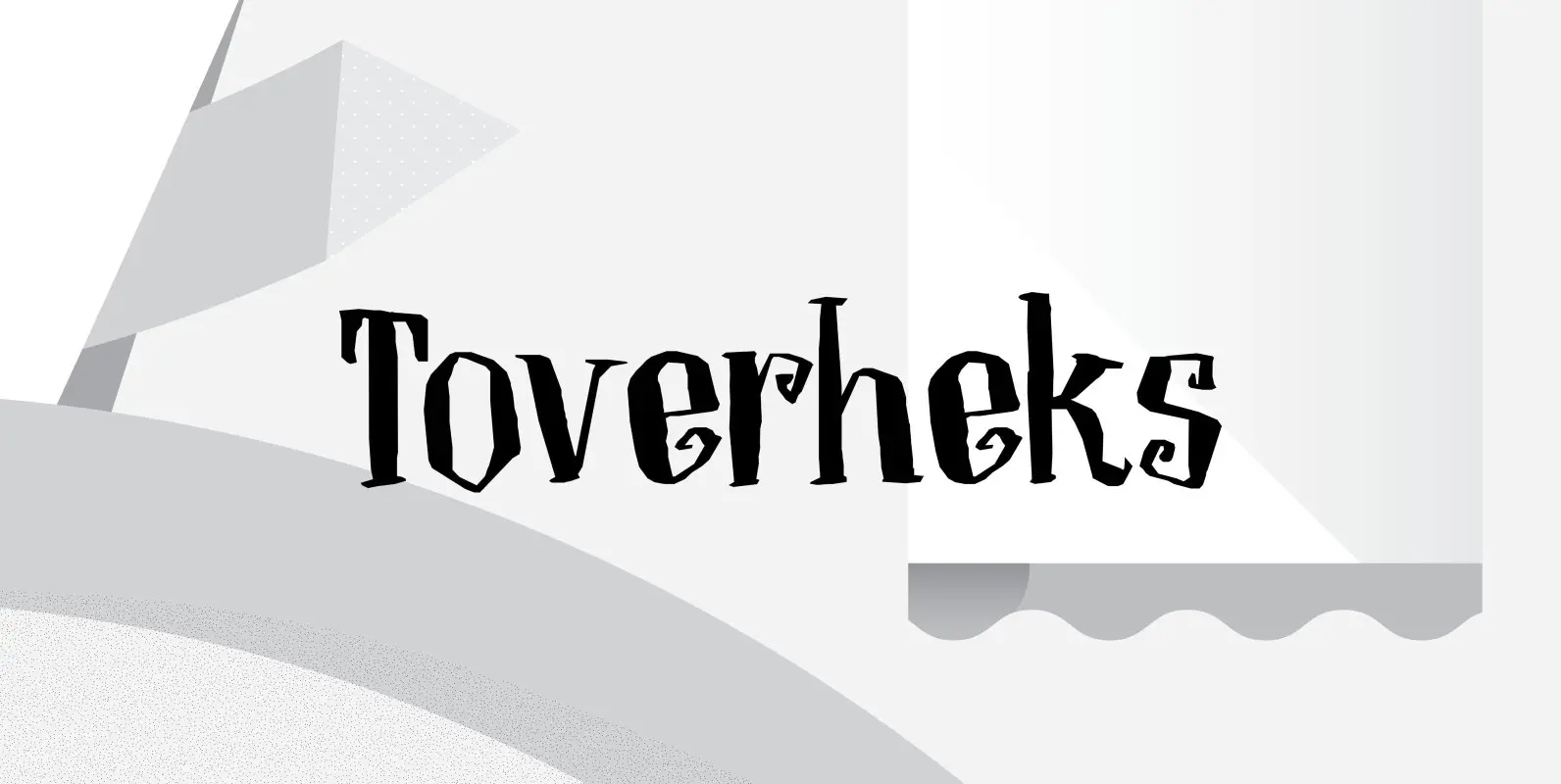
Toverheks Font
A Toverheks in Dutch means ‘witch’ – well, actually it means ‘magic witch’ (it doesn’t translate well). The reason for this kind of weird name is the nature of the font: it reminded me of a book of spells –
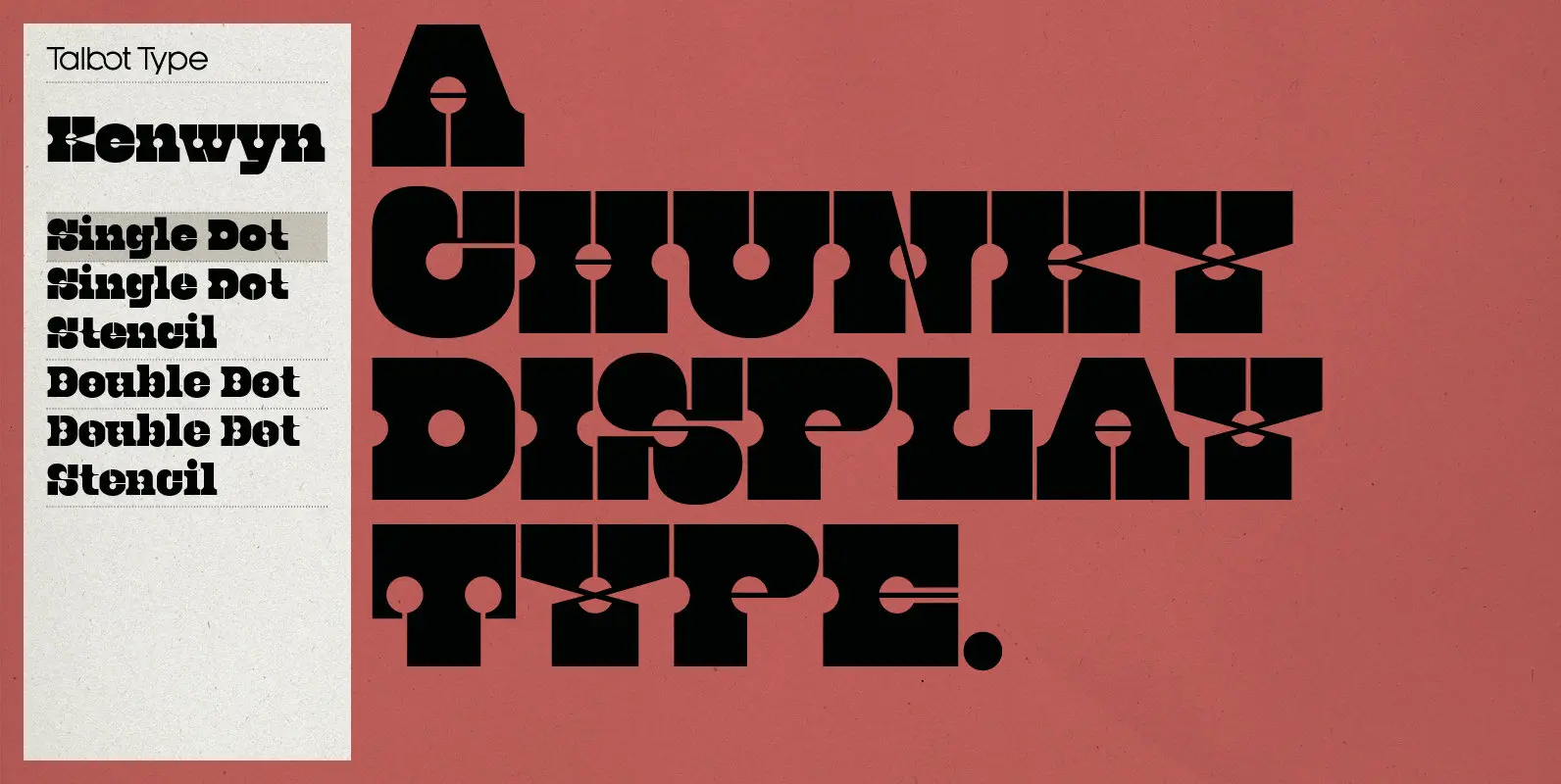
Kenwyn Font
Kenwyn is a bold, geometric, Egyptian style slab-serif display font. It comes in two variations — Single Dot and Double Dot — each with an accompanying Stencil variation. Essentially a blend of circles and squares, Single Dot features a circular
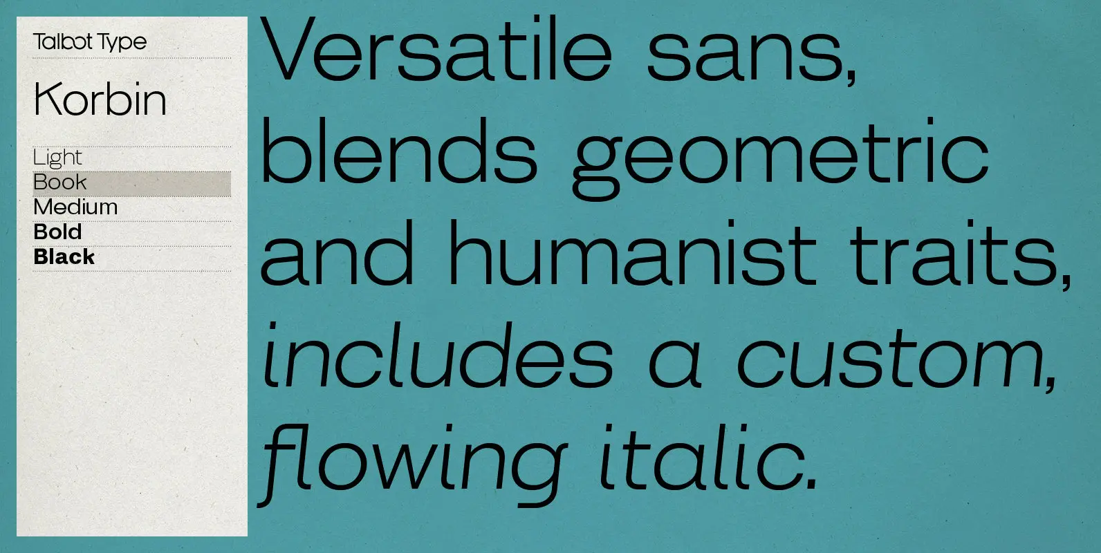
Korbin Font
Inspired by the sans-serifs of the late 19th and early 20th century, Korbin is a legible and versatile text and display face available in five weights. It mixes geometric and humanist traits to achieve a modern, clean, friendly appearance. The
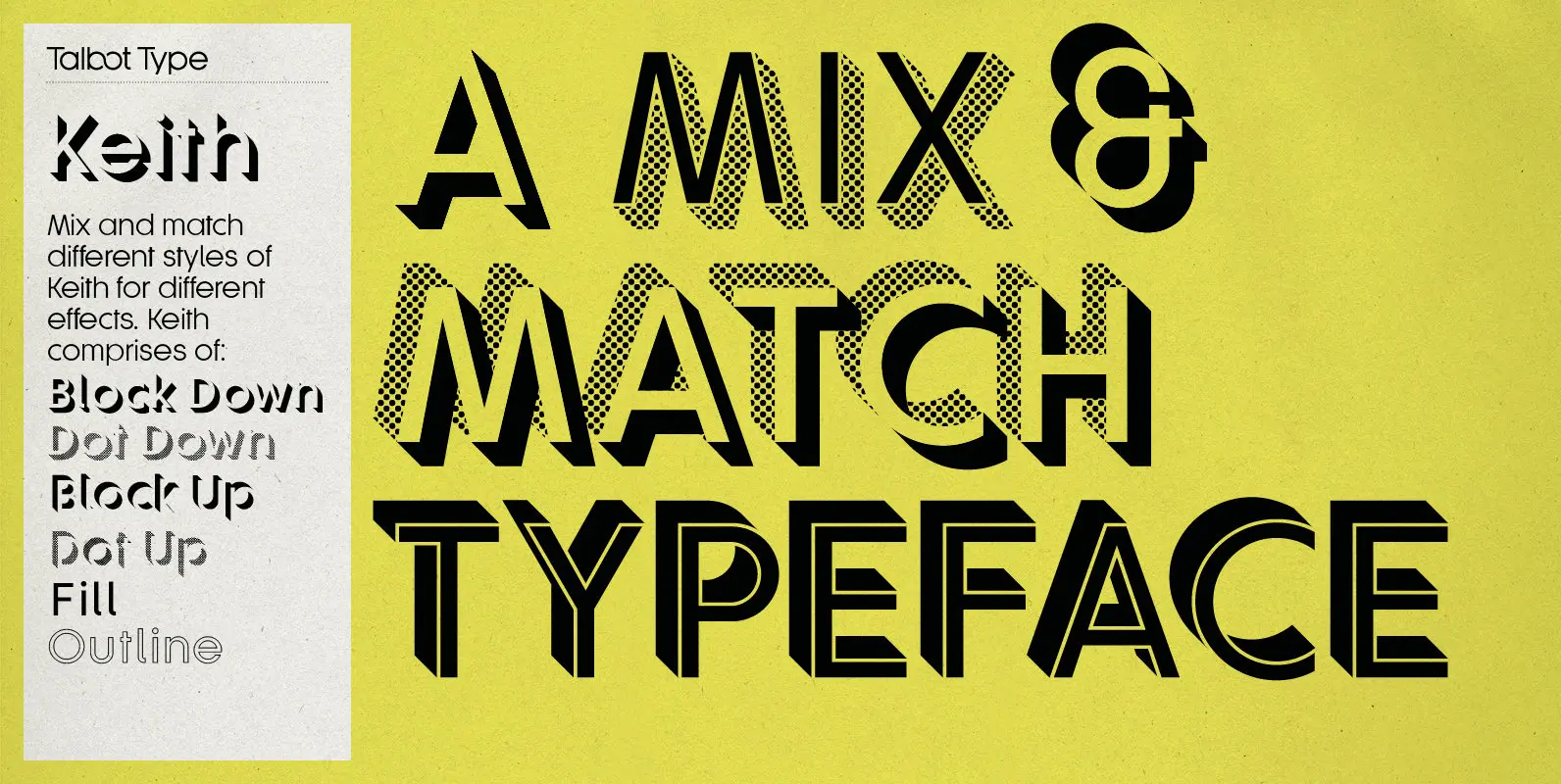
Keith Font
Keith is a striking and playful display font. Mix and match the different shadow styles, to create a variety of different looks and effects. There are four different shadow effects, along with a fill and an outline variation. Keith features
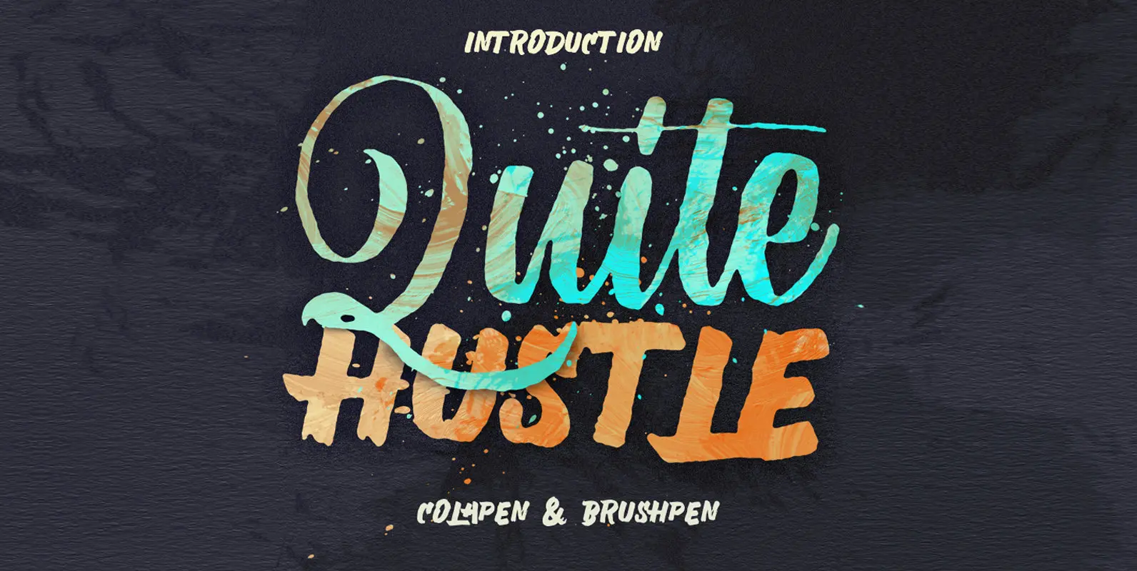
Quite Hustle Font
Quite Hustle type is hand painted typeface designed to help you create the look of stunning custom hand-lettering. Published by MaghribDownload Quite Hustle
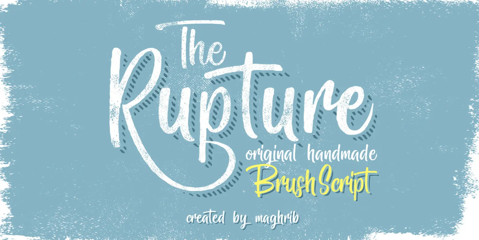
The Rupture Font
The Rupture is a hand painted typeface designed to help you create the look of stunning custom hand-lettering. Published by MaghribDownload The Rupture
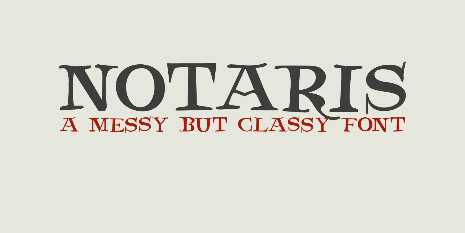
Notaris Font
Notaris (‘Notary’ in Dutch) is a hand-drawn, all caps didone-style typeface. It is a little rough, a little uneven, but lively and elegant as well. Comes with an abundance of diacritics and, lo and behold, some end-ligatures as well. Published
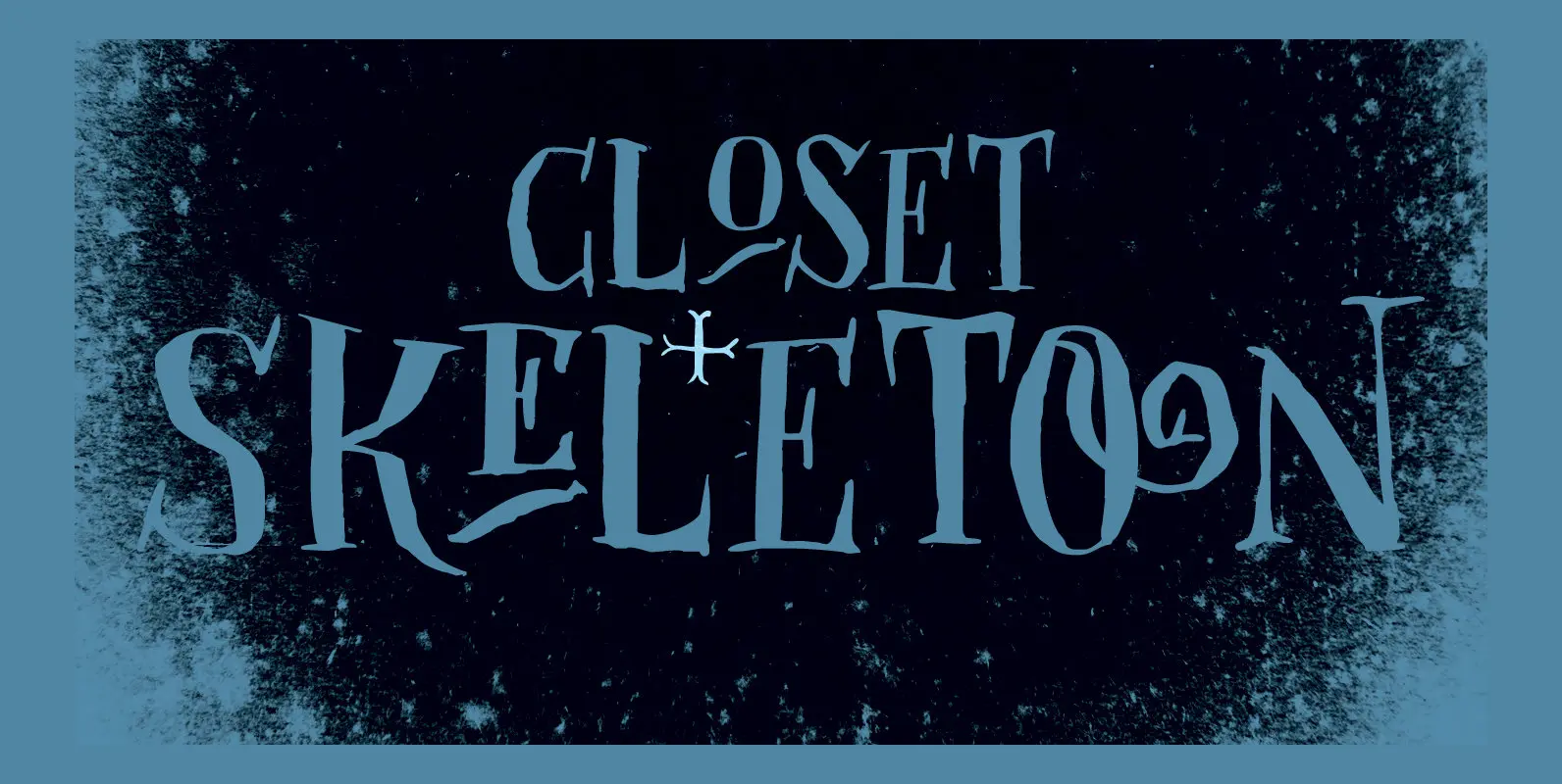
Closet Skeleton Font
Some time ago I stumbled upon a little book called ‘De Sprookjeshoorn’ (‘Horn of Fairy Tales’) by Anton Eijkens (1920 – 2012). It was published in 1946 and contains several authentic and unique fairy tales – unfortunately unreadable to modern
