Tag: poster
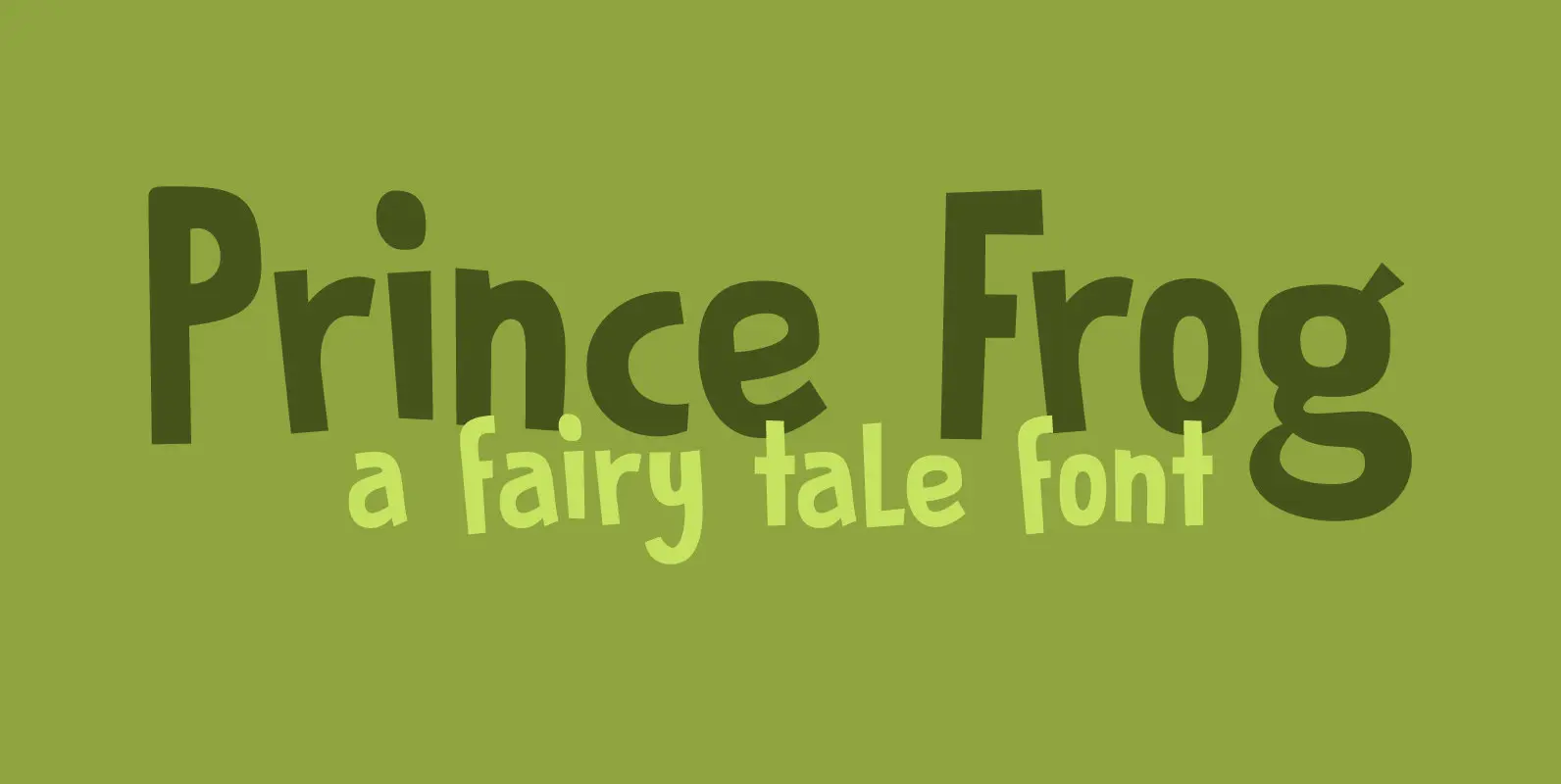
Prince Frog Font
Prince Frog started out as an attempt to ‘pimp’ Rabbit On The Moon font. It quickly evolved into an entirely different typeface with just a hint of ‘Rabbit’ in it. Prince Frog is a very happy, very legible font and
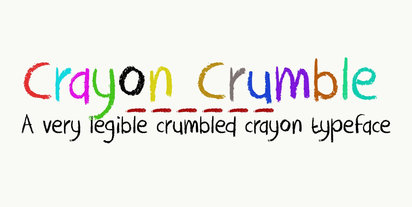
Crayon Crumble Font
Crayon Crumble is exactly what it reads on the package: it was made using cheap crayons, since the cheapies crumble a lot. It is a fun, kiddie font, with a grown-up look to it. It has been used for packaging,
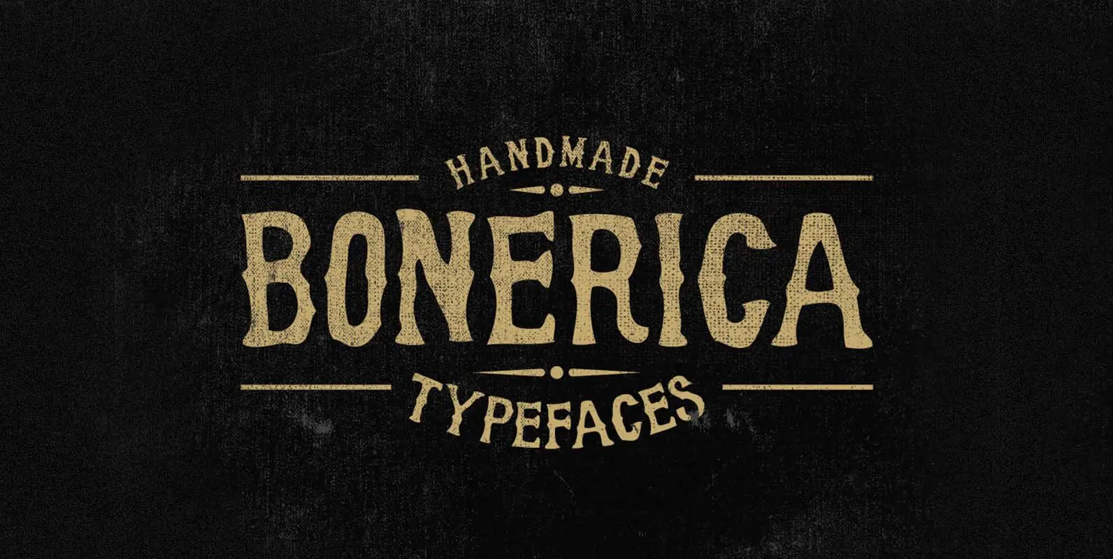
Bonerica Font
Bonerica is a wood type design released and designed by Panji Nugraha. Published by Panji NugrahaDownload Bonerica
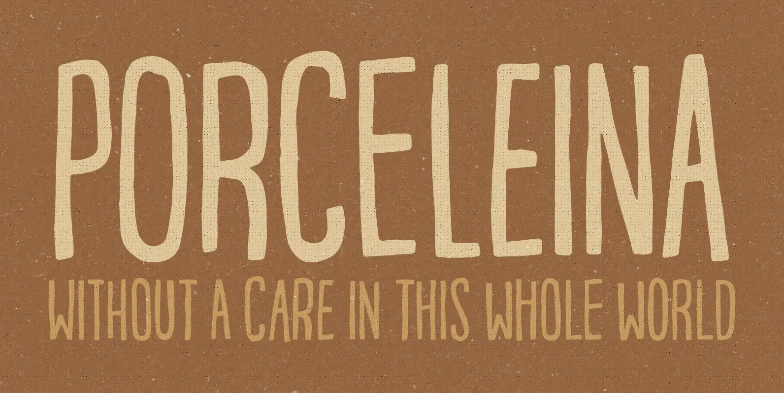
Porceleina Font
Porceleina is elegant, what more can I say? This handmade and hand drawn font comes with a heavy loadful of diacritics – and the Opentype contextual alternates makes sure that the font cycles between the six different…yes SIX different…versions of
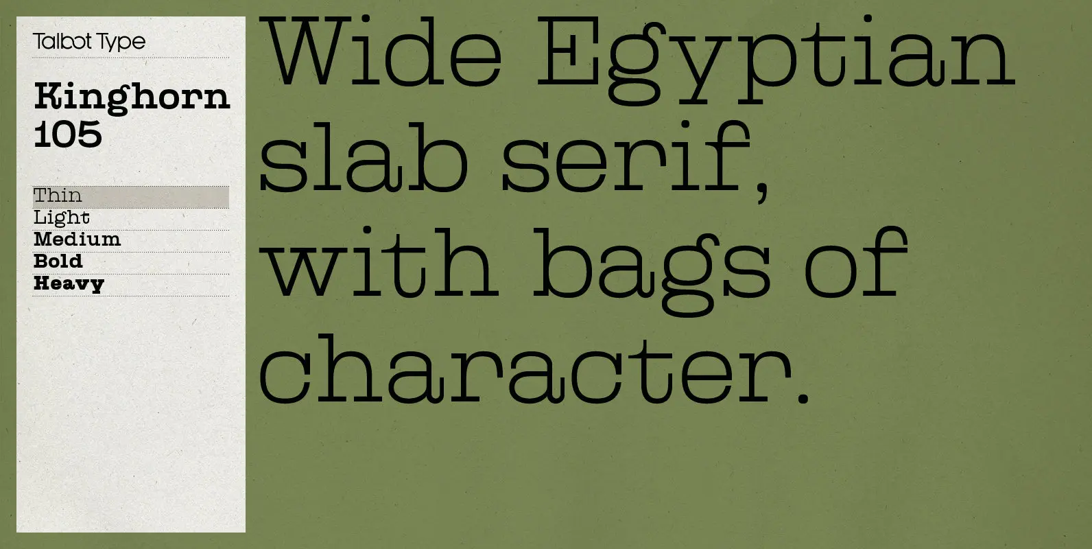
Kinghorn 105 Font
Kinghorn 105 is an Egyptian style slab-serif. The strokes are all of a roughly equal weight for an even, geometric look. Although original Egyptian slabs date from the early 19th century, the even look gives the font a balanced, contemporary
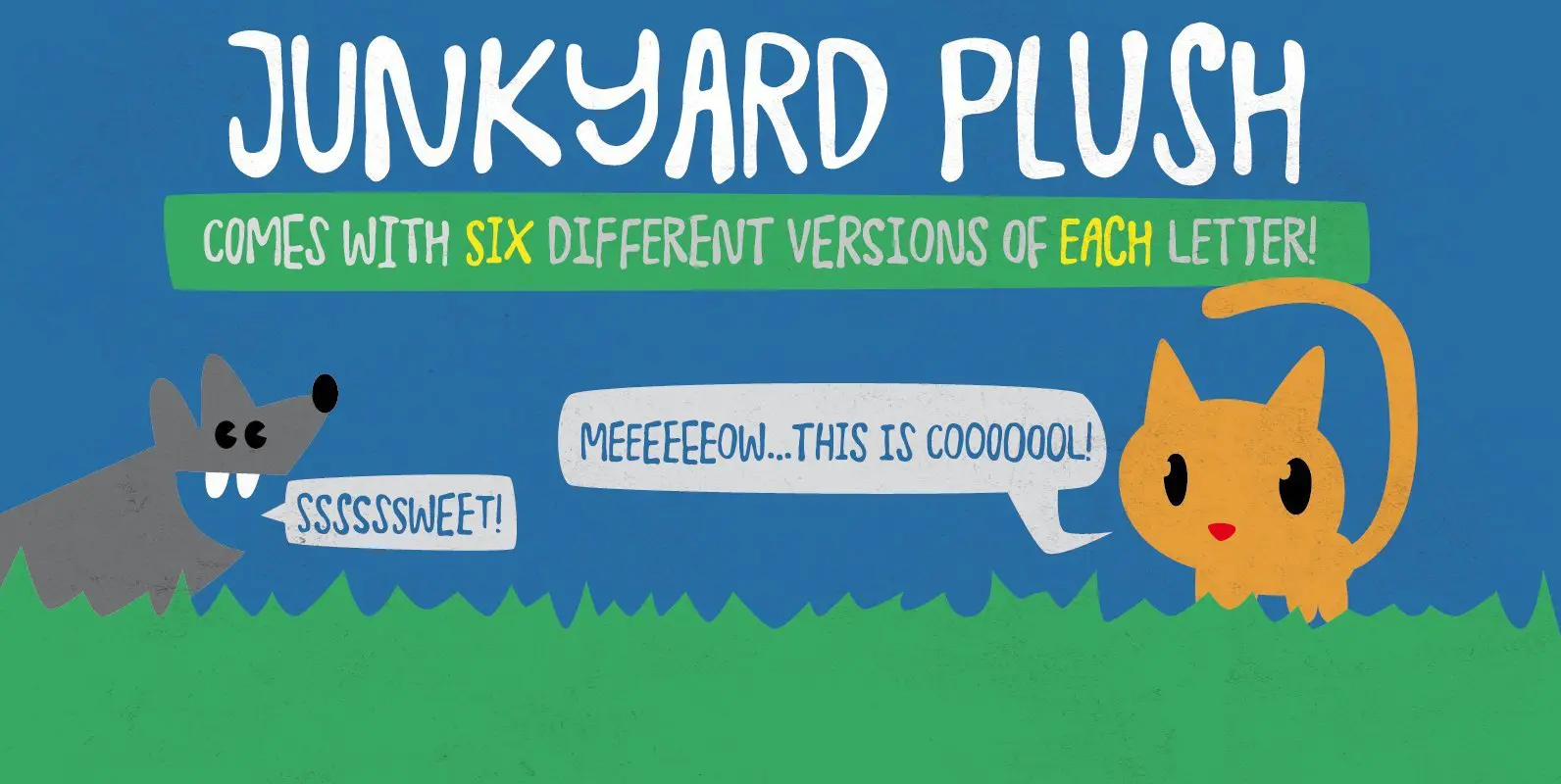
Junkyard Plush Font
Junkyard plush has six different versions of each letter! This is called “contextual alternates” which makes your text look random and like something authentic hand-made… which of course the font is! Included are ligatures for double-letters… if the contextual alternates
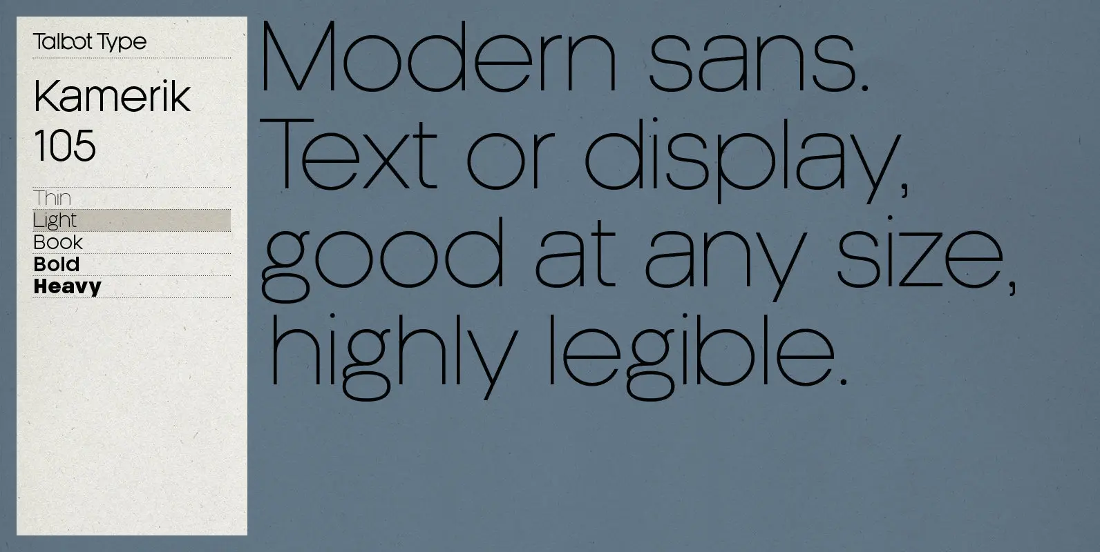
Kamerik 205 Font
Kamerik 205 is inspired by the classic, geometric sans-serifs such as Futura and Avant Garde, but has shallower ascenders and descenders for a more compact look, and features a traditional double-storey lower case a and g. It’s a versatile, modern
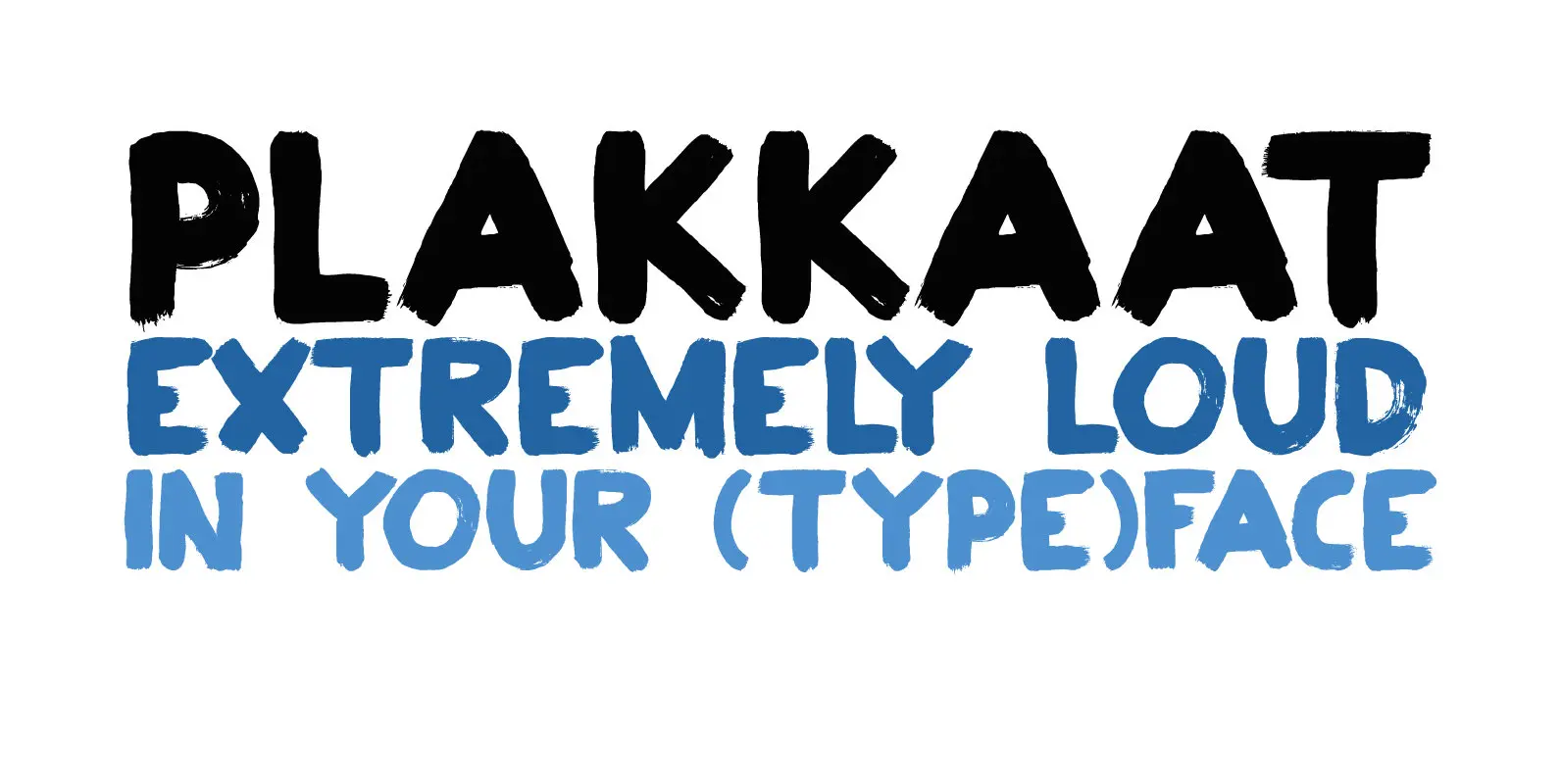
Plakkaat Font
Plakkaat is a fat brushed font, made with wide brushes and paint. Since it is a very easy to read font (and not to be missed), it is ideal for advertising campaigns, or demonstration signs.. This 2019 version comes with
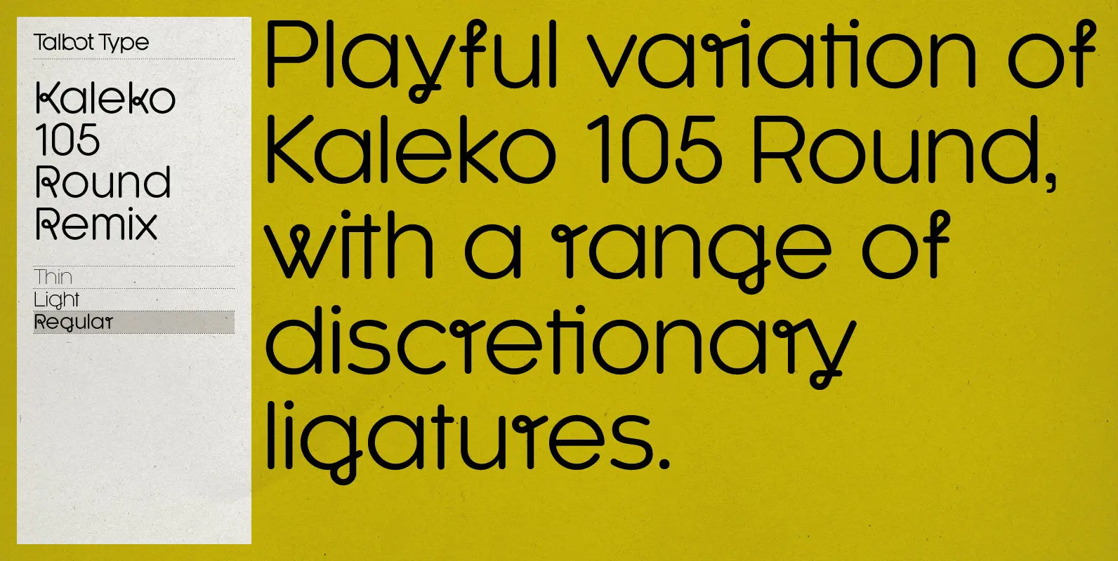
Kaleko 105 Round Remix Font
A remixed variation, available in three weights, of the popular Talbot Type geometric sans Kaleko 105 Round. The addition of occasional flourishes at the intersections of strokes, in both upper and lower case, adds character charm, making the font a
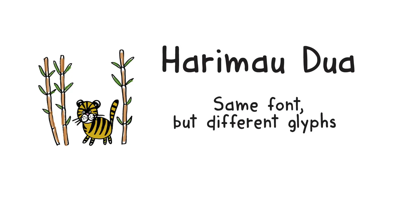
Harimau Dua Font
A while back I created a nice font called Harimau. It is a childish font, with a happy feel to it. Harimau had some unusual glyphs, most notably the ‘g’ and the ‘j’, which, for some designers, were a little
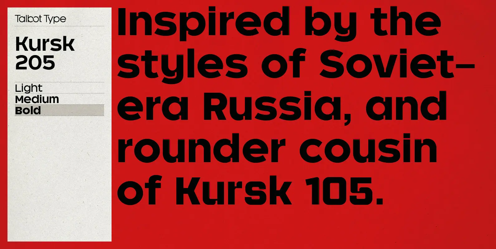
Kursk 205 Font
A text and display font with square proportions, inspired by the type styles of soviet-era Russia. Very shallow ascenders and descenders and a large relative x-height, exaggerate the compact and geometric look. Related to Kursk 105, its squarer-edged cousin. Published
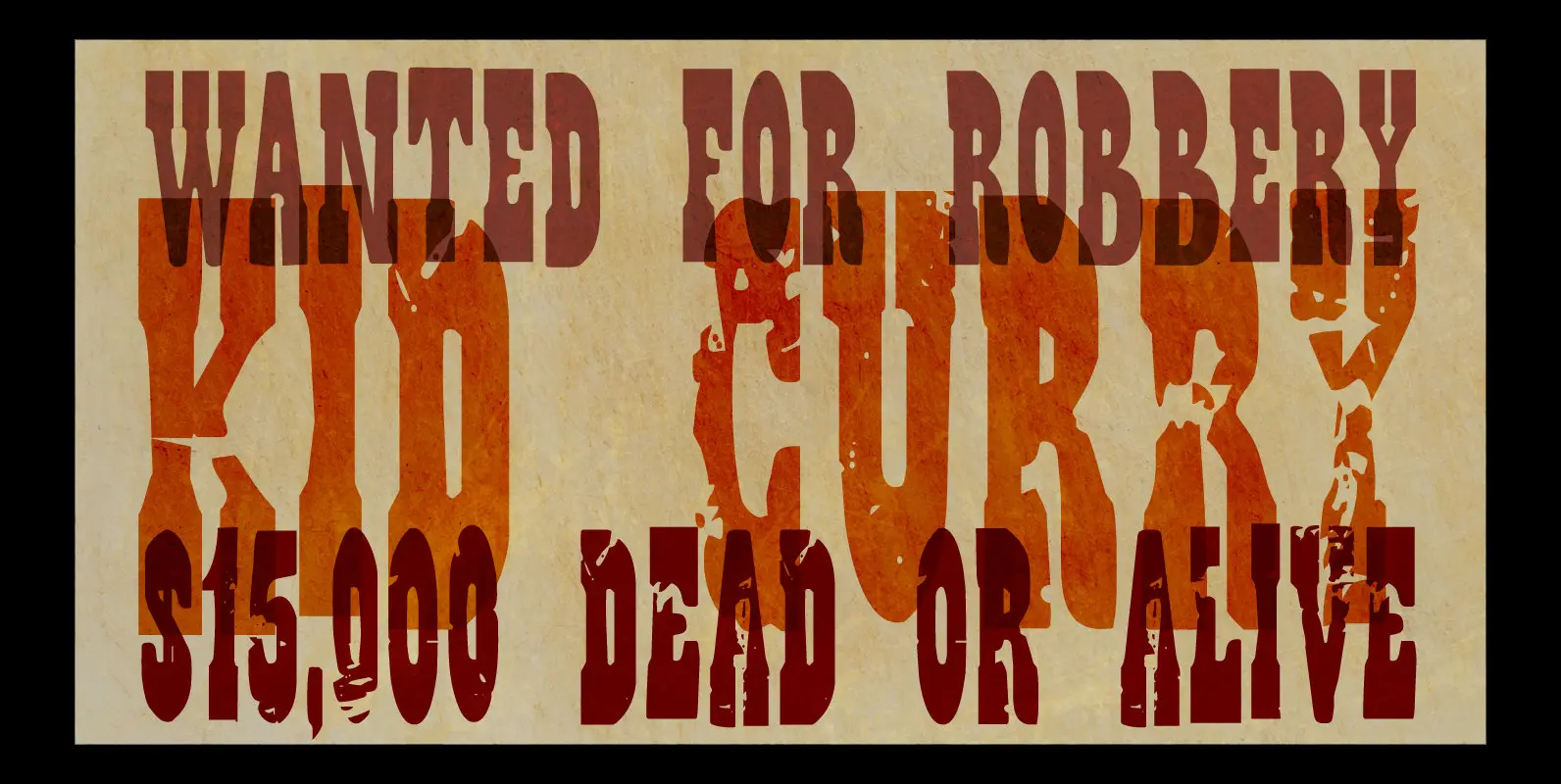
Wild Bunch Font
The Wild Bunch, also known as the Doolin–Dalton Gang, was a gang of outlaws that terrorized Kansas, Missouri, Arkansas, and Oklahoma Territory during the 1890s. They robbed banks, killed lawmen and held up trains. Of course its members were hunted
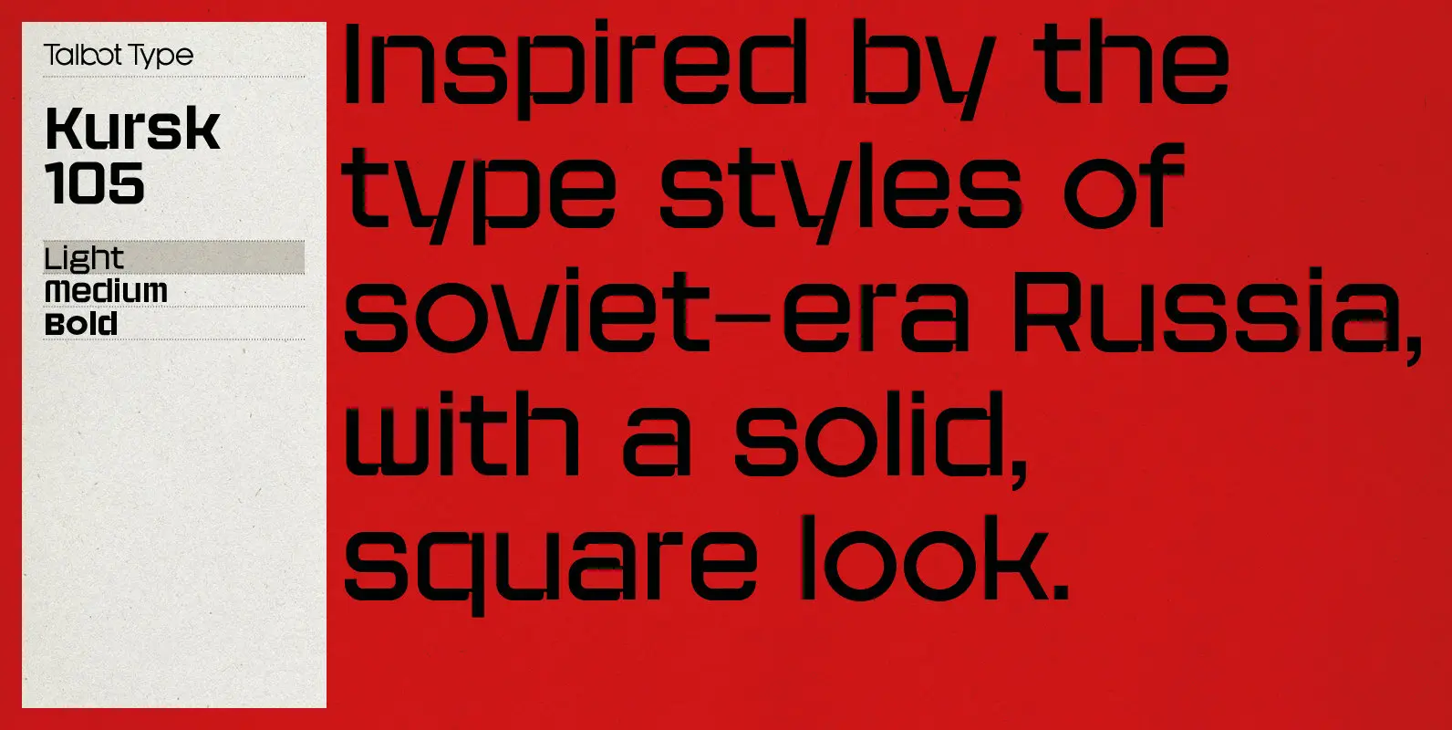
Kursk 105 Font
A text and display font with square proportions, inspired by the type styles of soviet-era Russia. Very shallow ascenders and descenders and a large relative x-height, exaggerate the square look. Related to Kursk 205, its slightly rounder cousin. Published by
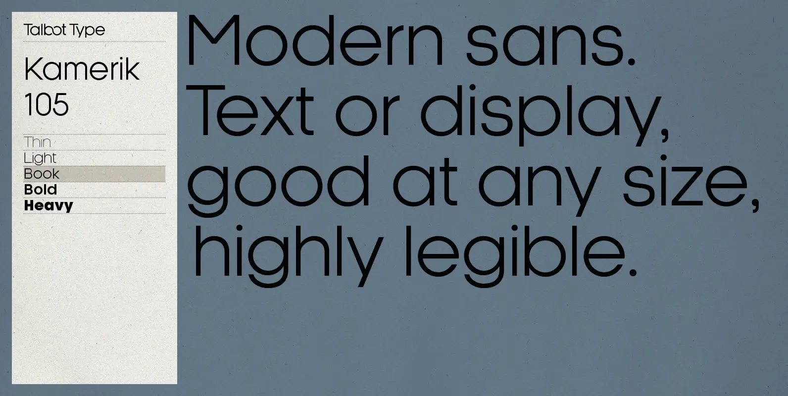
Kamerik 105 Font
Kamerik 105 is inspired by the classic, geometric sans-serifs such as Futura and Avant Garde, but has shallower ascenders and descenders for a more compact look. It’s a versatile, modern sans, highly legible as a text font and with a
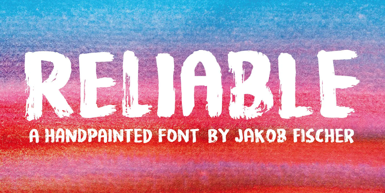
Reliable Font
Reliable was drawn with a somewhat dry brush, and then carefully made into a font. Reliable differs from other brush fonts, because it has got 8 different versions of each letter!!! 8 different letters that cycle while you type! Not
