BoRock Font
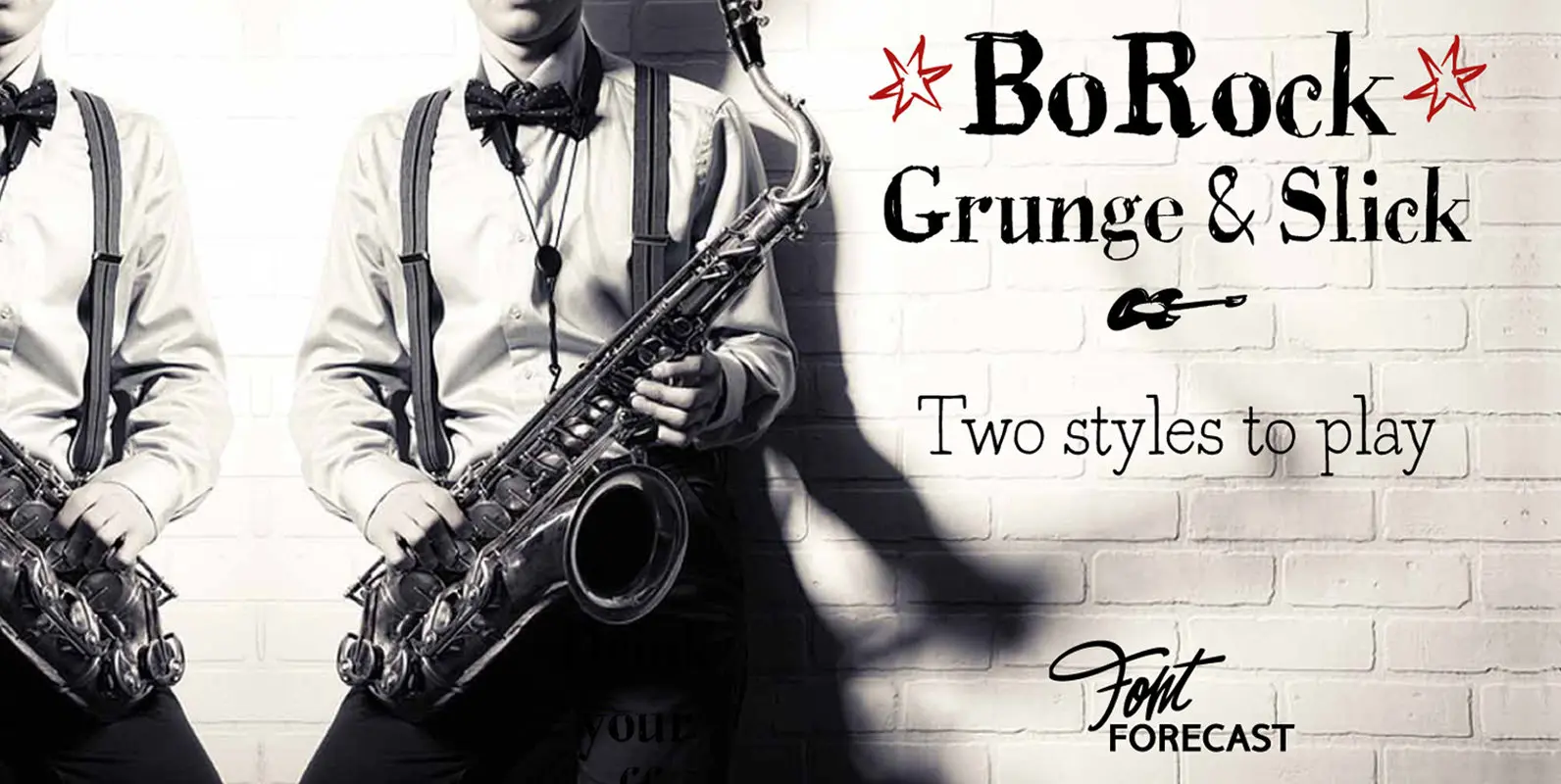
BoRock is a handcrafted font that comes in two pigheaded styles, inspired by the rock music scene. You can use BoRock instead of the usual neat serif fonts. BoRock Grunge is a rough crispy serif font, excellently suited for use

Apollonius is a high contrast, display typeface designed by Michael Parson. Packed with Opentype features, this single weight font offers a whole range of options that designers can explore and play with to create stunning layouts. Published by Michael ParsonDownload
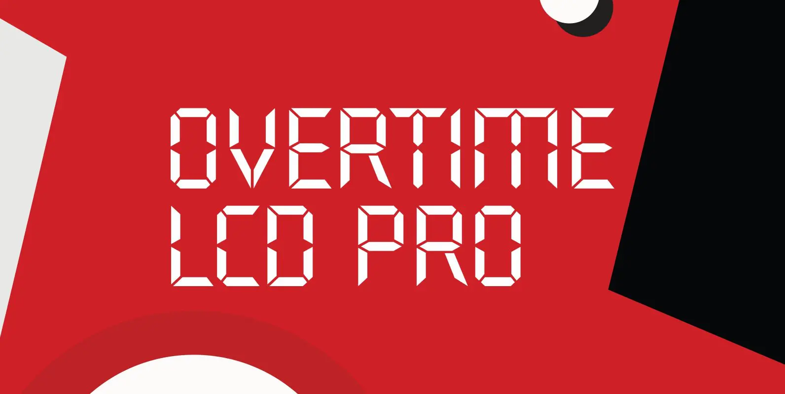
Designed by Steve Jackaman & Ashley Muir. Our collection was missing a small piece of the jigsaw puzzle until now; a quartz digital LCD font! Overtime LCD contains all the high-end features expected in a quality OpenType Pro font. Published
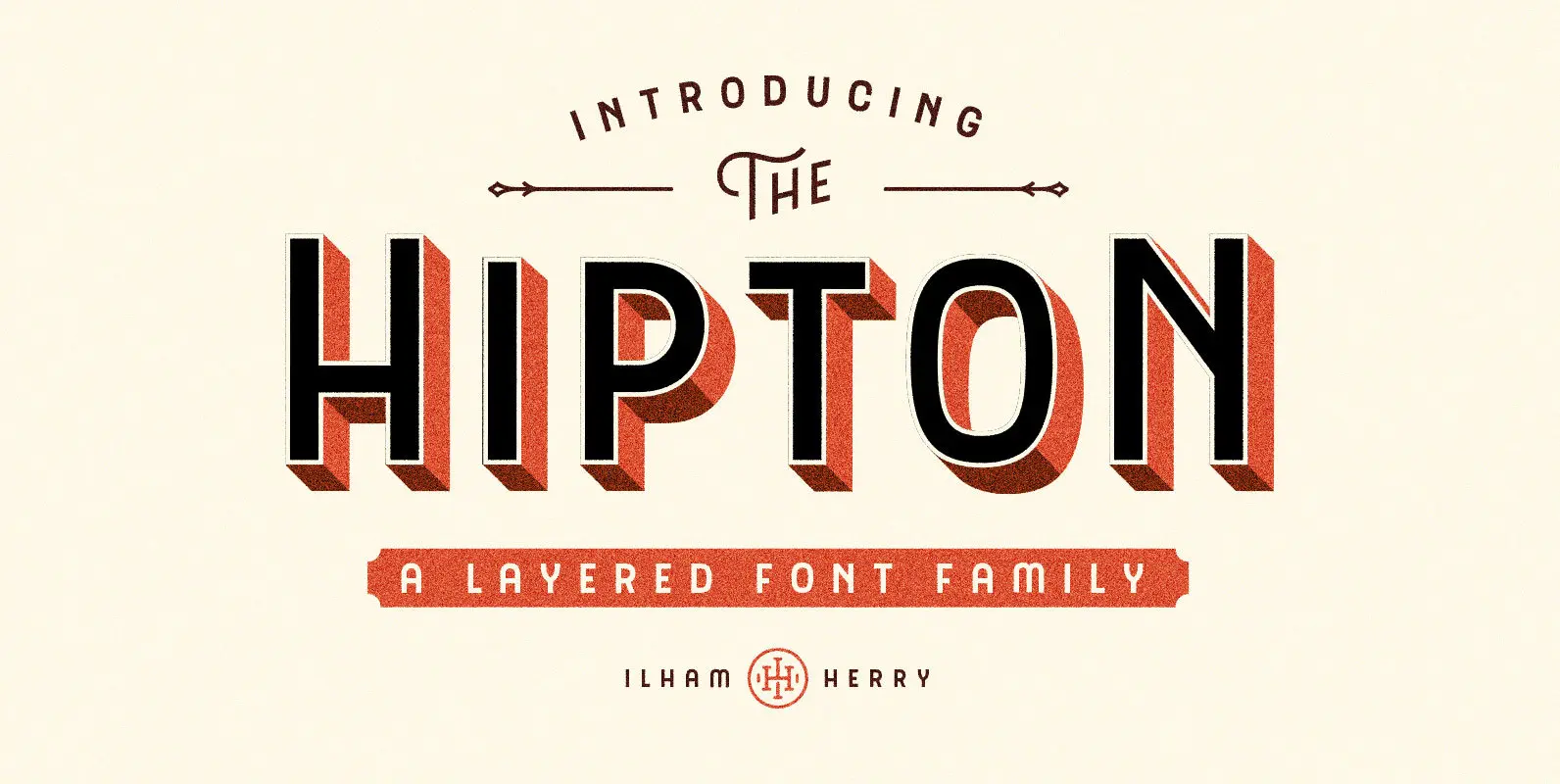
Introducing new layered font family it’s call the Hipton. Inspired from single stroke gothic letter of sign painting and make it layered. This is collection of type with a layered type system, many possibilities combination and options. As a display
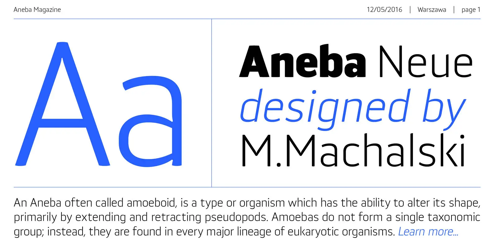
Aneba Neue is refreshed version of my old type family. It's a geometric sans serif typeface with a clean feel. The low contrast and high x height is perfect for headlines and display purposes. Aneba_Neue contains 5 weights in two
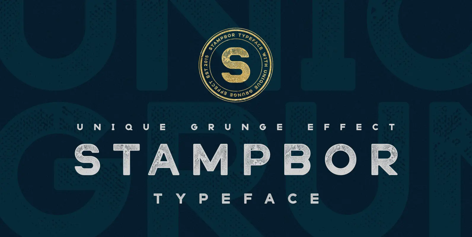
Stampbor is a vintage typeface with a touch of grunge. Published by Dmitry MashkinDownload Stampbor
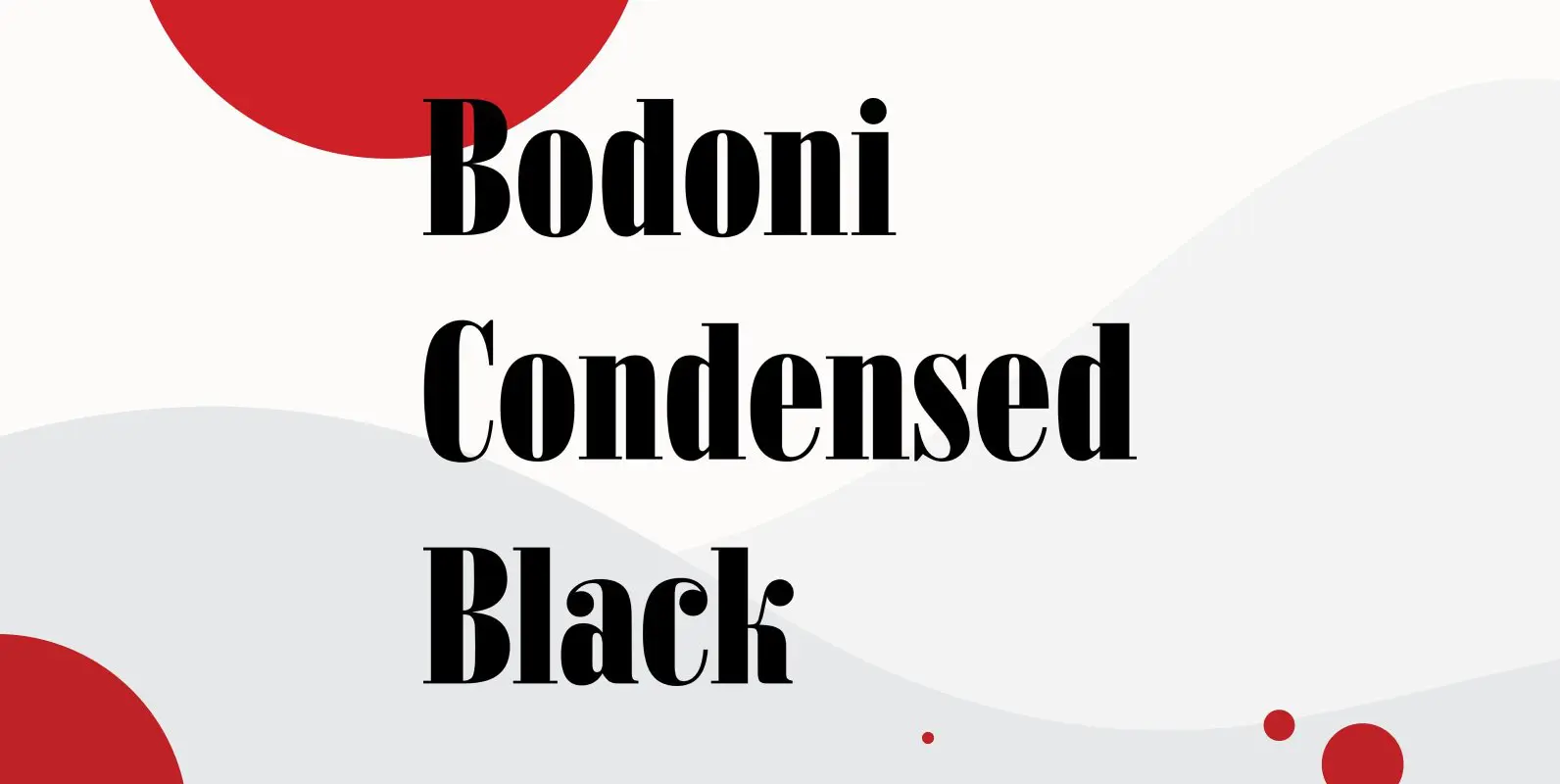
Bodoni Condensed Black was designed by R.H. Middleton for Ludlow, circa 1930. Digitally engineered by Steve Jackaman. Published by Red RoosterDownload Bodoni Condensed Black
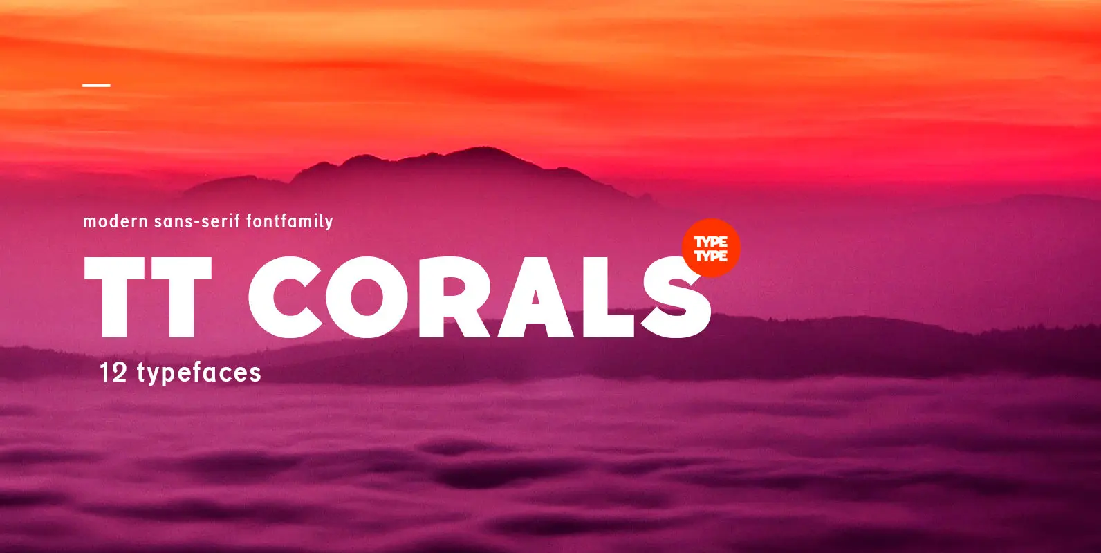
TT Corals is a modern humanistic sans-serif which has many typical traits of the beginning of the 20th century. For an increased functionality of the font family we’ve created 6 typefaces of various weights: Thin, Light, Regular, Bold, Extrabold, Black.
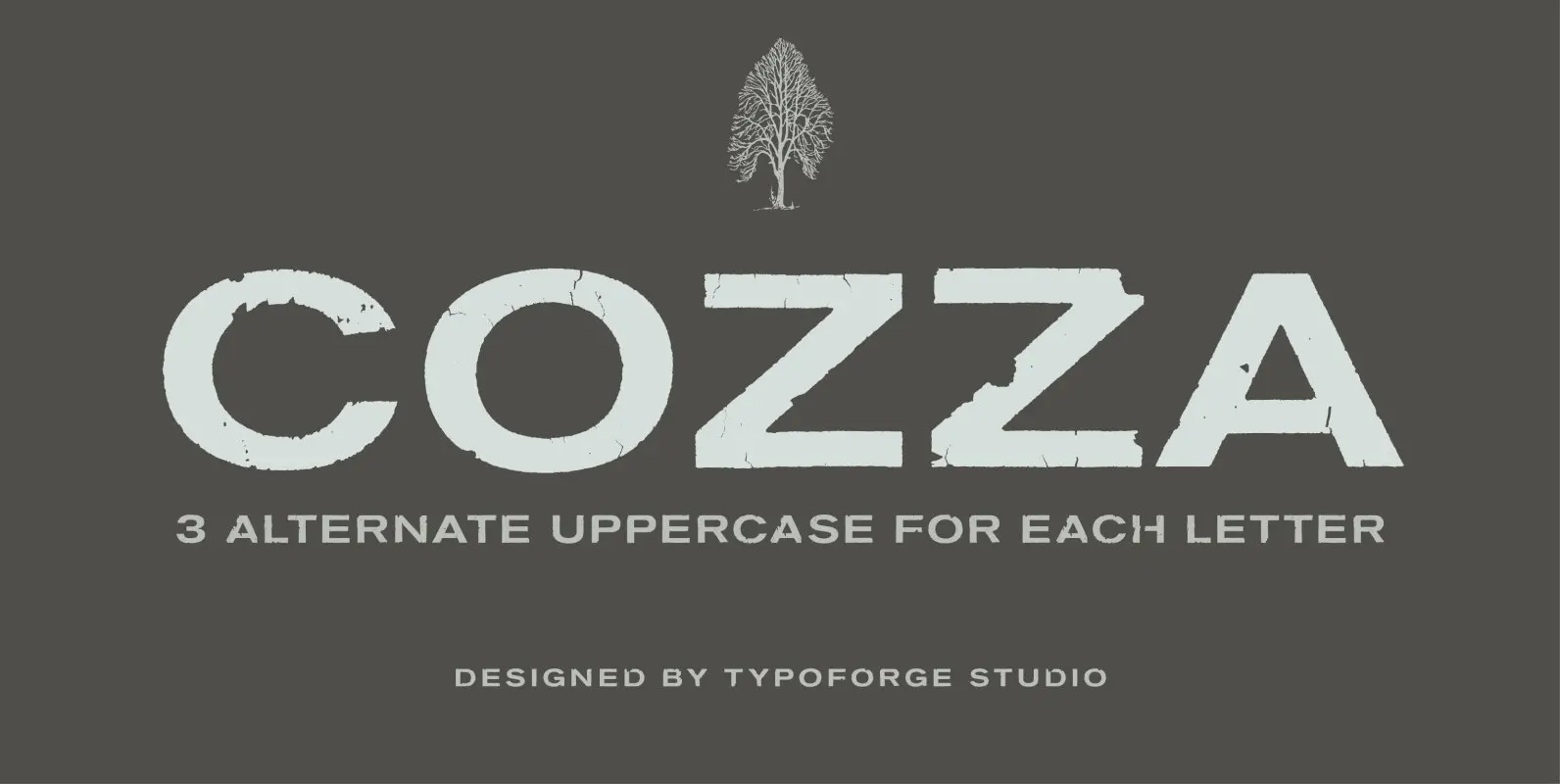
The inspiration for the design of the font Cozza was Unitra Letraset from the 80s. Dry transfer lettering was used by architects from Poland and Czech Republic. Font Cozza, for each character has three alternative characters with their automatic replacement.
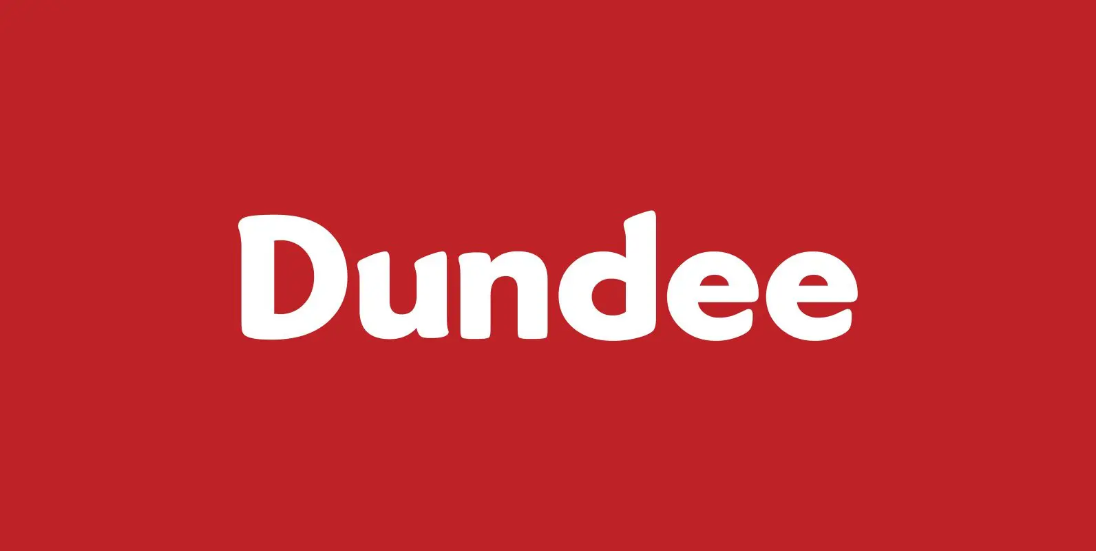
Designed by A. Pat Hickson, Dundee is a new design inspired by the various mastheads used in children’s comic books in England, published by D.C. Thompson of Dundee, Scotland. Published by Red RoosterDownload Dundee

TT Supermolot Condensed is the narrow version of the TT Supermolot font family. Thanks to its open forms, TT Supermolot Condensed fits perfectly into any contemporary technological design and navigation systems. We've already seen this fontfamily in the sports theme
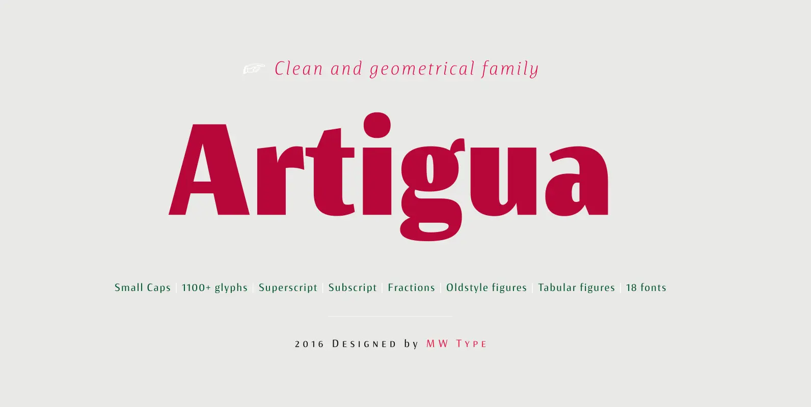
High contrast, sharp endings and geometrical shapes – these are the main features of Artigua. The relation of vertical and horizontal lines reduces with weight – this makes regular weight appropriate for longer texts and black ideal weight for headings.
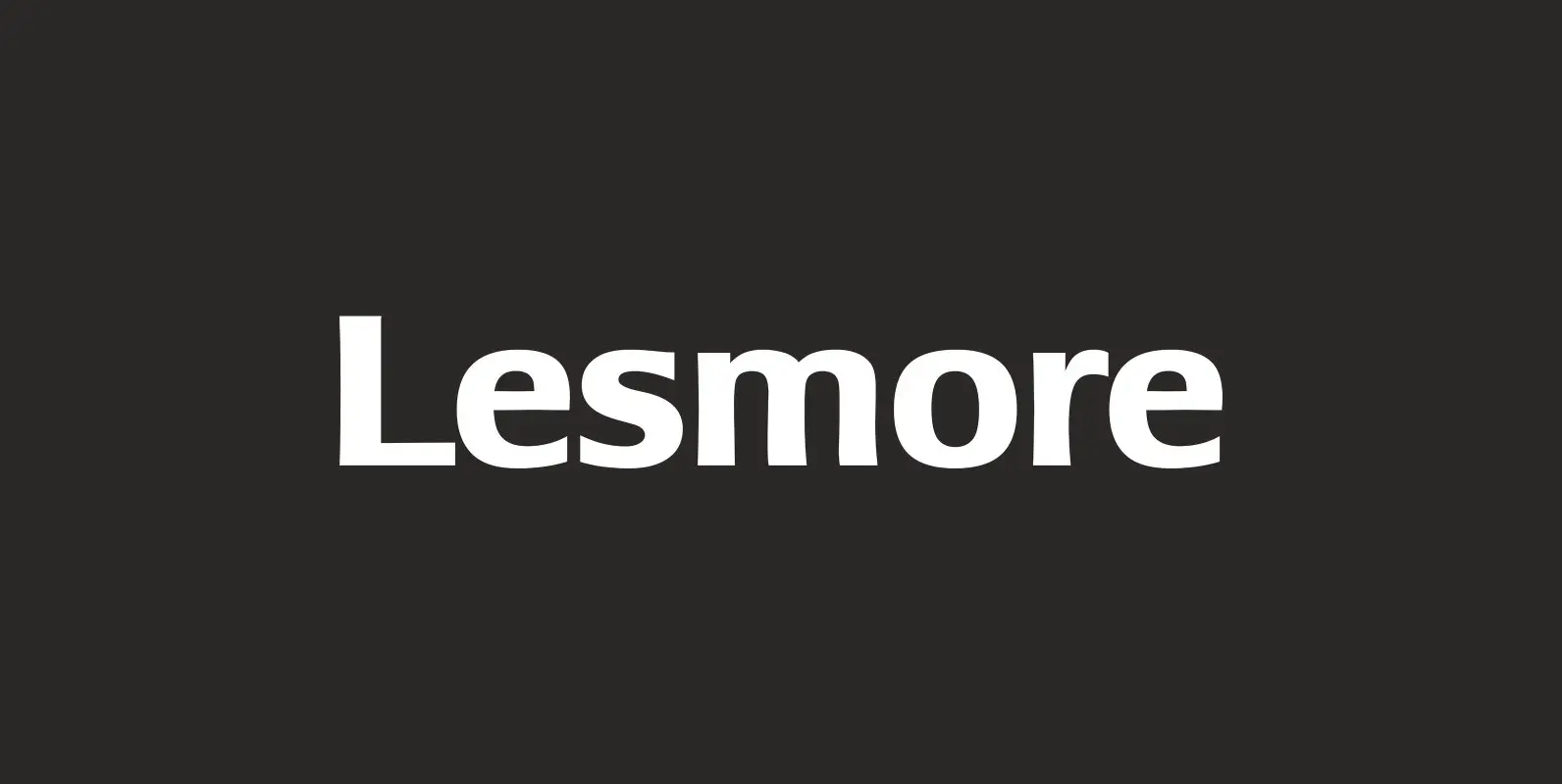
Designed by Les Usherwood. Digitally engineered by Paul Hickson. Another typeface from Les Usherwood that was released after his 1983 death. Published by Red RoosterDownload Lesmore
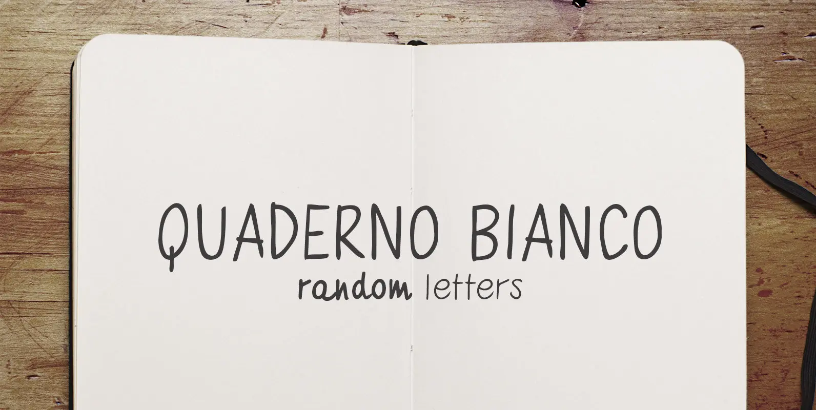
Quaderno Bianco is an Uppercase handwriting font with two weights – regular – bold. It has some Opentype features: Small Caps and Random (contextual alternate), this last one use four alternative style for alphabet letters and one alternative style for
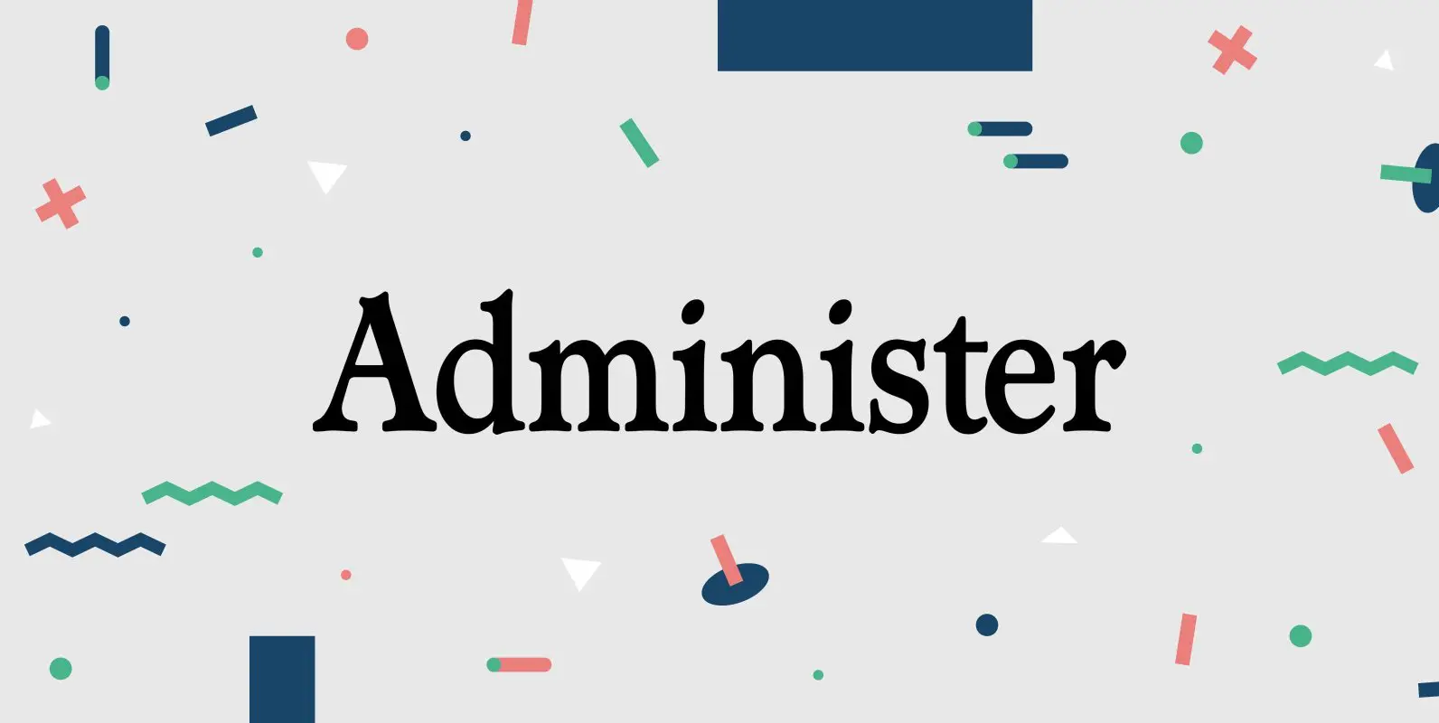
Designed by Les Usherwood. Digitally engineered by Steve Jackaman. A few weights were originally released by another foundry; but this complete version of the family is a better match to Les original drawings! Published by Red RoosterDownload Administer
BoRock is a handcrafted font that comes in two pigheaded styles, inspired by the rock music scene. You can use BoRock instead of the usual neat serif fonts. BoRock Grunge is a rough crispy serif font, excellently suited for use
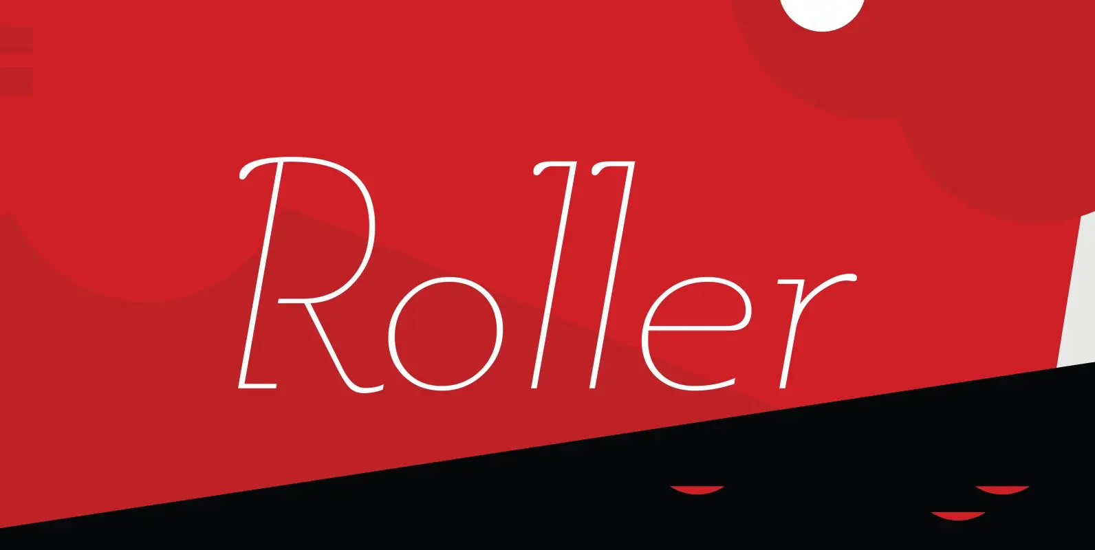
Designed by A. Pat Hickson, Roller is a retro font design based on Iberica by Carlos Winkow for the Spanish foundry, Nacional, circa 1942. Published by Red RoosterDownload Roller
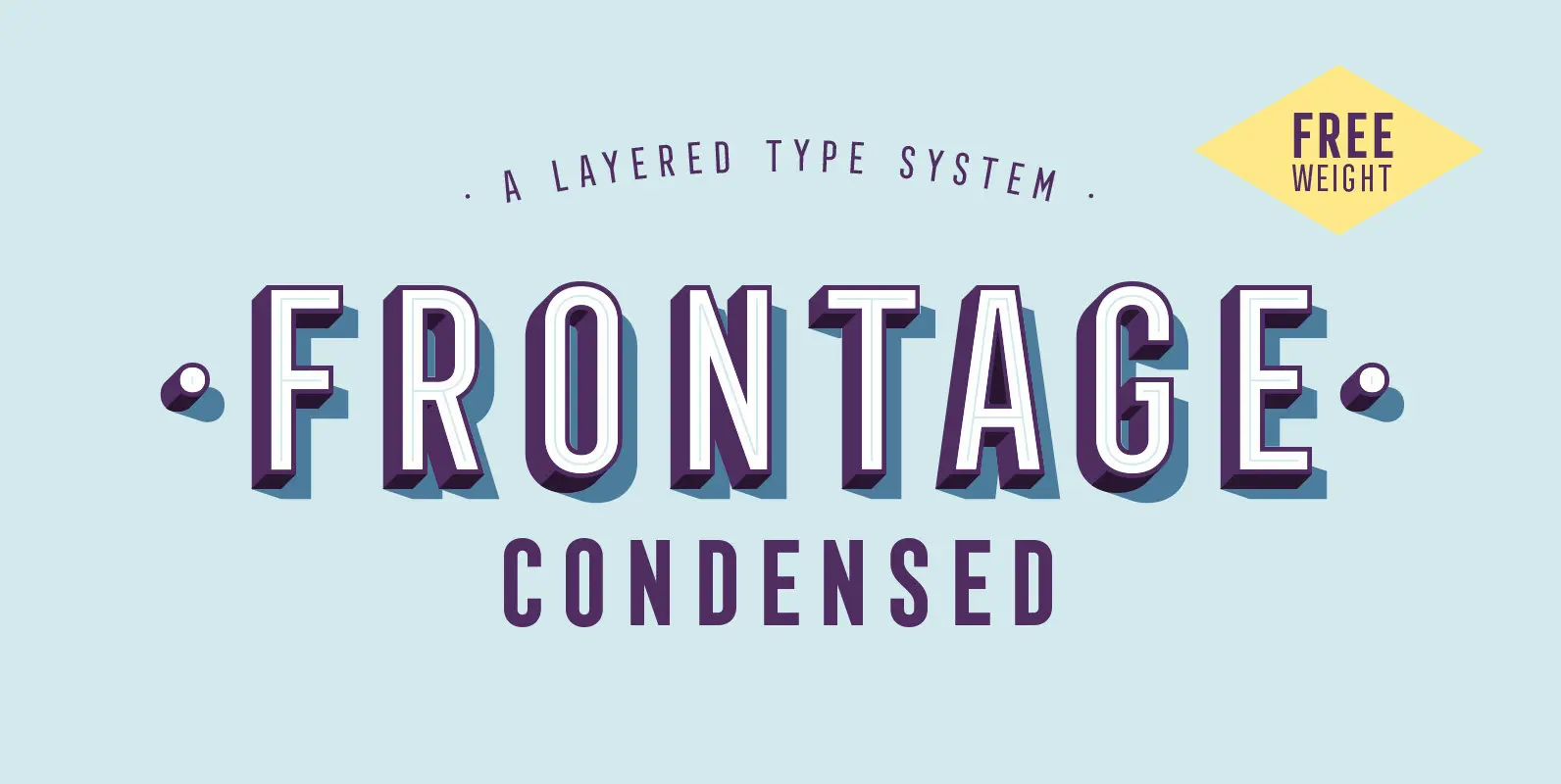
Frontage Condensed is a layered type system inspired by eye-catching and colorful facade signage. Its main aspect is — like many typographic installations on storefronts — three dimensional. The narrow, generously spaced letterforms lend the typeface a bold and eminent
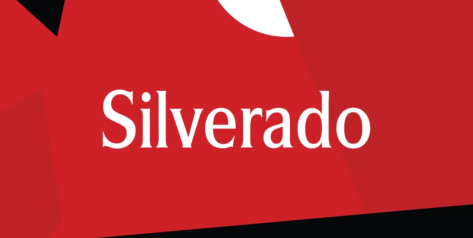
Designed by Steve Jackaman, Silverado is based on a classic serif type design called Eldorado. Published by Red RoosterDownload Silverado