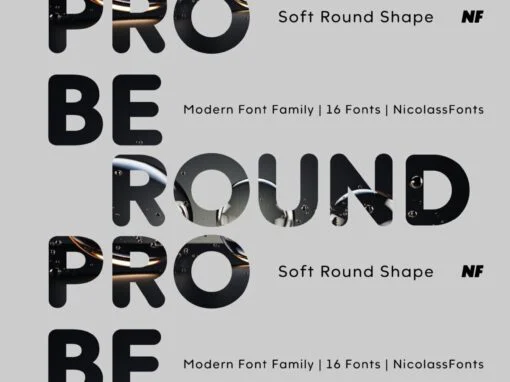
Tag: Pro  

Moucha Font - Image 2

Moucha  Font

Moucha is a geometric super family offering the proportions of all subgenres. Find a vintage and a modern variant and play with all the sea foam that happens in between. The variable font is your typographic toolbox with the perfect

Arbeit Pro Font - Image 3

Arbeit Pro  Font

Rediscover the acclaimed Neo Grotesk family with our remastered Arbeit – featuring perfect letterform balance and contrast, plus all-new alternates in each weight for an extra dose of style. Published by Samuel OakesDownload Arbeit  Pro

Artifex Hand CF Font - Image 4

Artifex Hand CF  Font

Artifex Hand is a humanist sans-serif cut of the original Artifex. Designed for flowing, easy-to-read text in Latin, Cyrillic, and Greek scripts. Soft details and moderate contrast let Artifex Hand excel in text and display settings. – Eight weights  and

Costanera Font - Image 5

Costanera  Font

Costanera is a neohumanist typeface with both soft strokes and endings, which is inspired by 90s typefaces. It has an organic aspect and curved finials associated to the early calligraphy, while its straight angles give Costanera a technological and futuristic

Hellen Font - Image 6

Hellen  Font

Hellen is an elegant classic serif font based on the Koch Antiqua typeface, created in 1922 by the German designer Rudolf Koch. It’s a delicate typeface with a low x-height, designed for decorative and display use. This version includes Regular,

Macella Font - Image 7

Macella  Font

The Macella font family is the proportional version of the monospaced Vivala Code. Both families are well matched and have a comprehensive character set. The Sans Serif contains five weights with matching italics. It is suitable for headlines of  all

Capital Font - Image 8

Capital  Font

Capital is a multifunctional super family with modernist roots. It is comprised of two distinct subfamilies: Gothic and Serif. Both share the same structure and proportions and come in seven weights – thin, light, regular, bold, extra bold and  black,

Neftalí Pro Font - Image 11

Neftalí Pro  Font

Designer: Franco Jonas Hernández 2015 First Prize TipoType award. Neftali is a type family designed for continuous reading in long texts & editorial design, created as an interpretation of Pablo Neruda’s “Poema 20”. This work delivers a subtle experimentation  of

Rama Gothic Font - Image 13

Rama Gothic  Font

Rama Gothic is an antiqued sans serif designed inspired by 1800s-style wood type. All glyphs had been designed carefully to be retro-looking of the old time and to fill all with nostalgia. This condensed font family with 18 styles  will

Centrale Sans Pro Font - Image 14

Centrale Sans Pro  Font

We have finally finished our work on Centrale Sans. A lot of mistakes have been made, and we hope a lot of them have been fixed. But finally we are ready to end this five-year journey and present you  the

Bw Quinta Pro Font - Image 15

Bw Quinta Pro  Font

Bw Quinta is a new face that instantly feels familiar. It’s a contemporary humanist sans that is approachable but well-grounded, getting any content delivered with efficiency while looking smart and professional. The Pro version comes with 590 glyphs per  style

Estilo Pro Font - Image 16

Estilo Pro  Font

Five years later, DSType proudly introduces Estilo Pro: the Ultimate version of Estilo. Now with sharp edges and five weights, from Hairline to Bold, Estilo Pro includes an extraordinary set of features like Alternate Characters, Initial Swashes, Ending Swashes, Ligatures,

Gibbs Font - Image 17

Gibbs  Font

Gibbs is a tough, sophisticated sans, named for prolific maritime architect William Francis Gibbs and inspired by his greatest design, the record-breaking mid-century luxury liner SS United States. Taking various cues from the unique cast aluminum signs found on  board,

Via Sans Font - Image 18

Via Sans  Font

Via sans is a font inspired by classics like Steile Futura and Din 1451, with neo-humanist characteristics. It was designed as a font for fast reading from a distance, which saves horizontal space in the text composition, making it  a