Tag: publishing
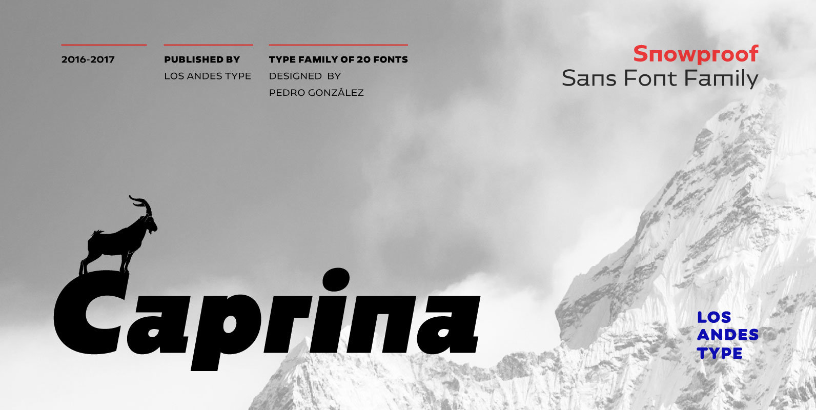
Caprina Font
Caprina (‘relating to or resembling goats’ in Spanish) is an audacious and rough geometric sans-serif font inspired by the wild and untamed personality of mountain goats—amazing animals which can skilfully climb up slopes and withstand very cold temperatures. Caprina comes
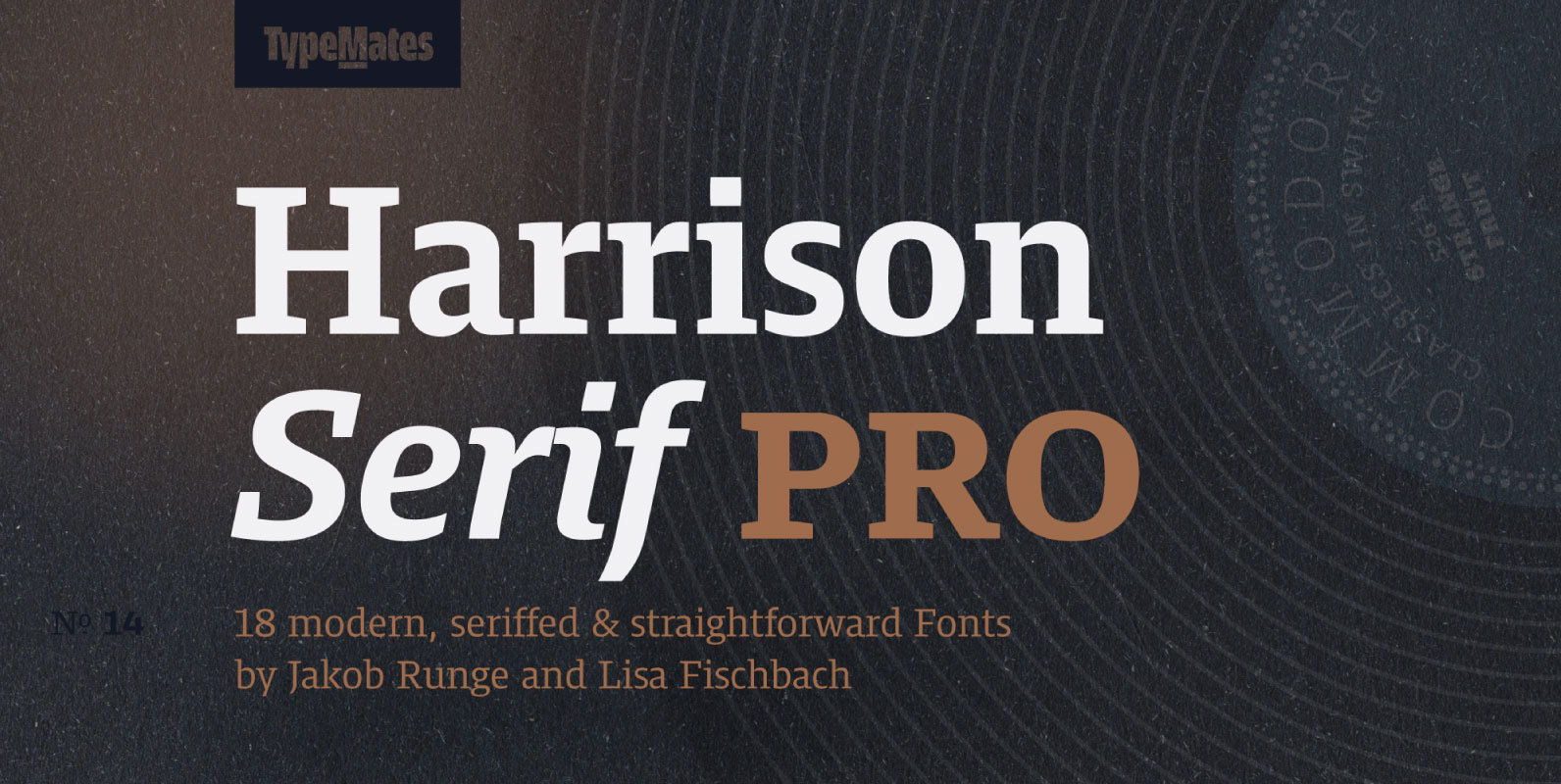
Harrison Serif Pro Font
Harrison Serif Pro is a sturdy yet contrasted slab serif that combines a rational and efficient approach with a warm voice. A typeface of nuances, the slightly carved and occasionally extended serifs evoke the friendly side of Harrison Serif and
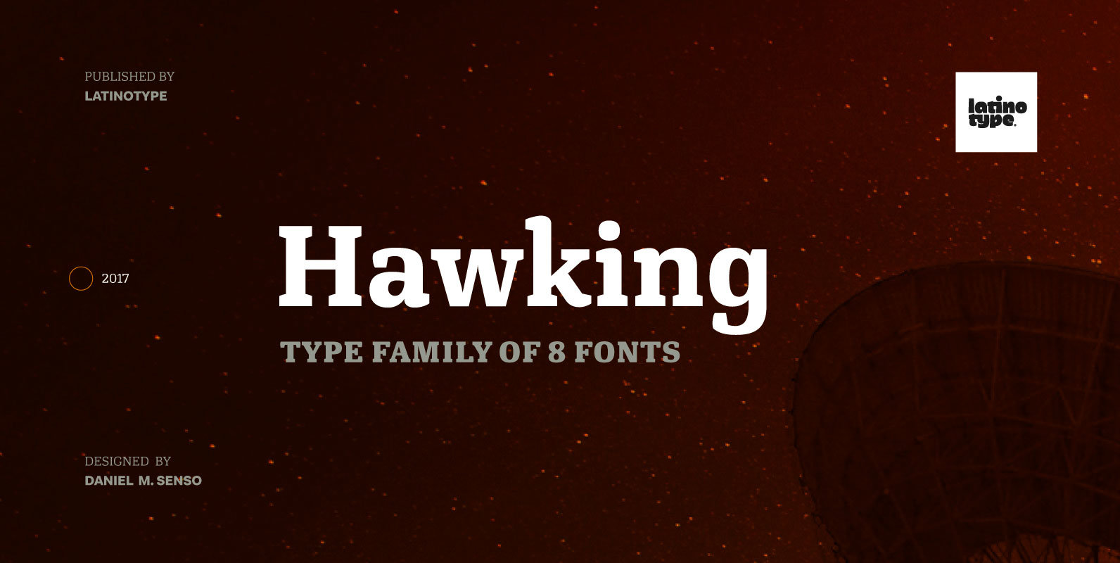
Hawking Font
Hawking is a slab typeface with slightly squarish shapes and a rational, modern look. The font has a minimal modulation, generous counter forms and relatively large x-height with lowercase ascenders extending above the cap-height for more legibility. Serifs are composed
TT Polls Font
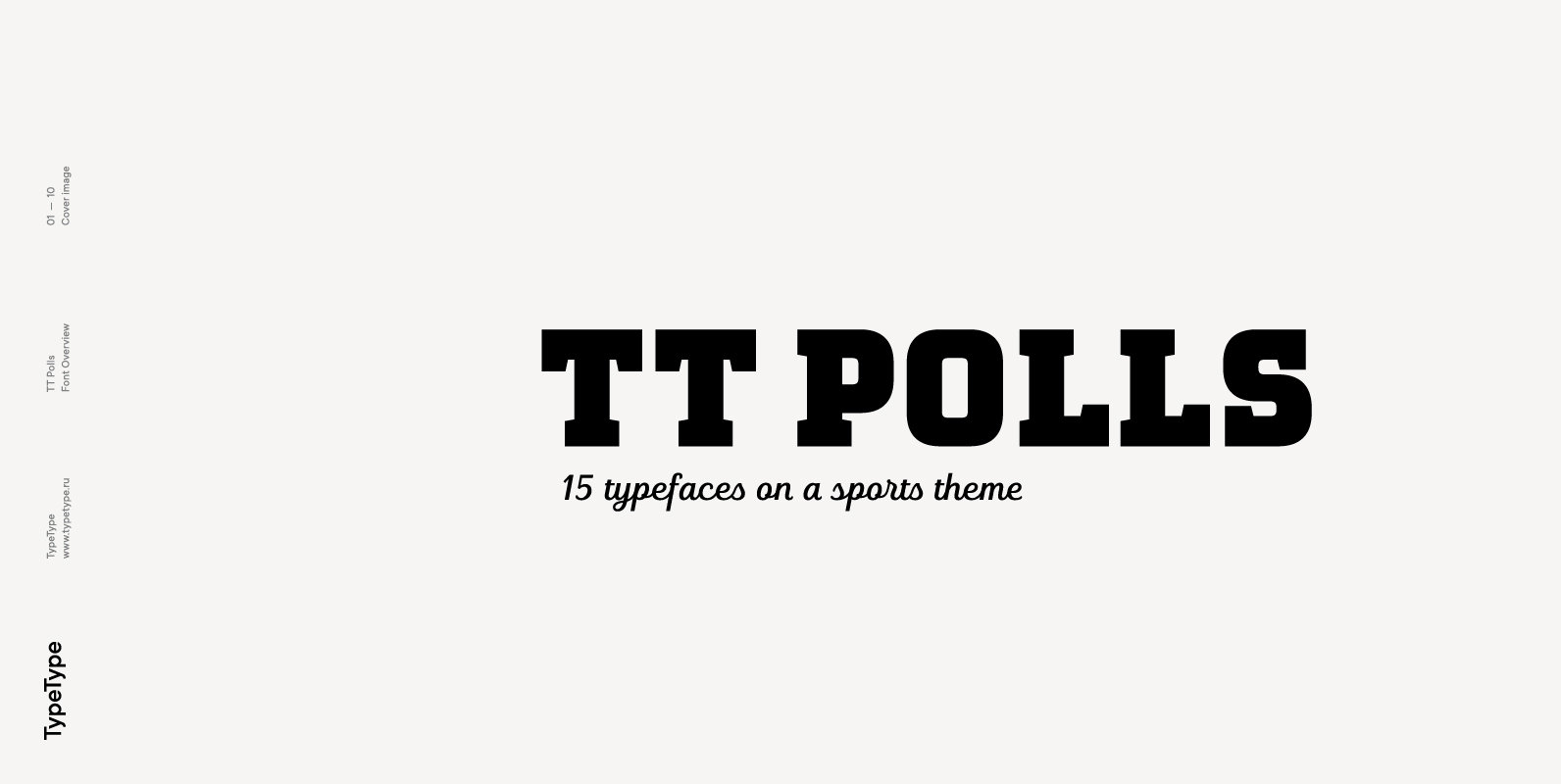
TT Polls emerges as a modern modular slab serif inspired by American sports graphics. As we wanted to create a really special and remarkable project, we’ve decided to broaden the character palette and implement the OT features support, and also
Bender Font
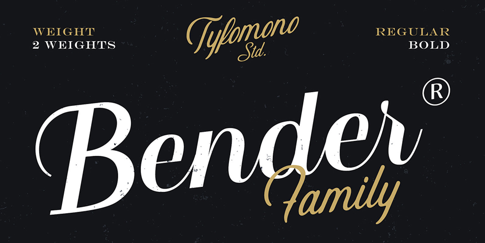
Bender Script is a 2-weight script typeface, designed by Tyfomono, with high contrast between thick and thin strokes typefaces. These elements are the main feature of the font and give it a very strong character. Bender Script is well-suited for
Niemeyer Font
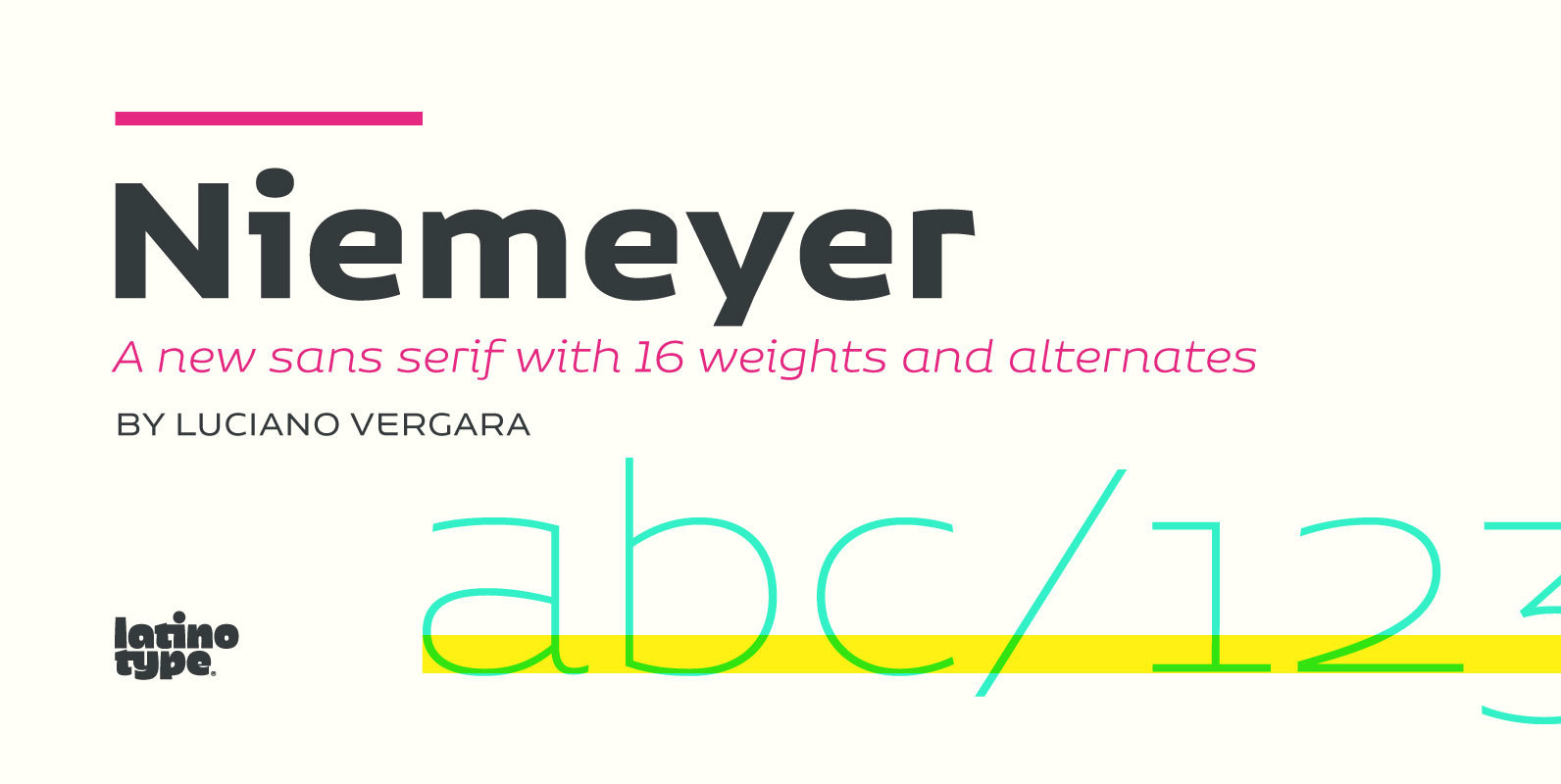
Oscar Niemeyer is one of the greatest architects of our time—his unique way of mixing straight lines and abstract curves gives rise to an unmistakable and characteristic style. This typeface is my own tribute to Brazilian architect Oscar Niemeyer. The
Davis Sans Font
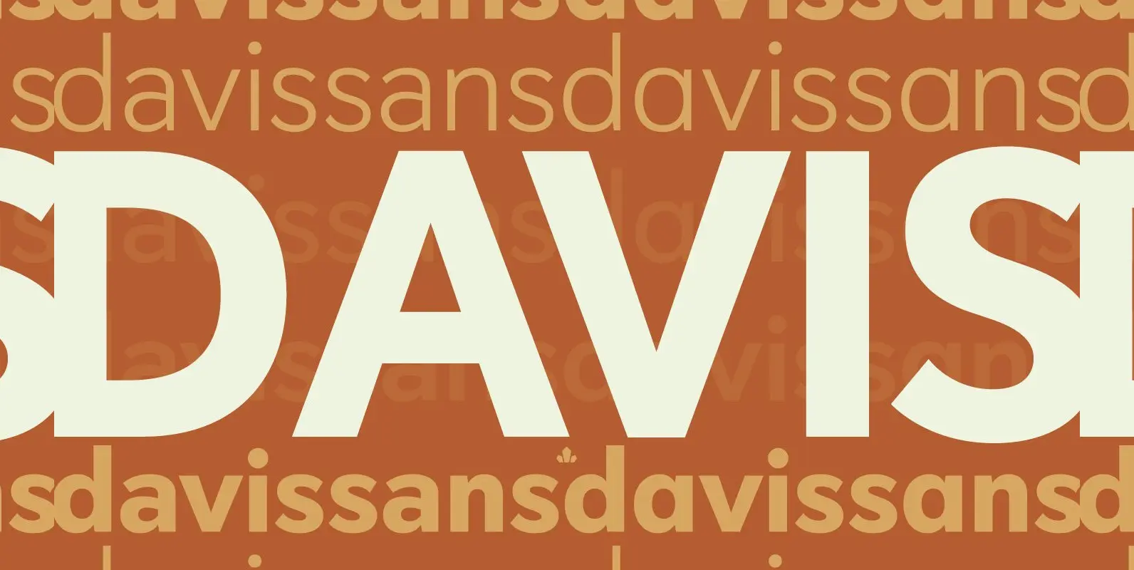
Over the past couple of decades, the many applications that joined print as media requiring design solutions have combined to necessitate a visual evolution that favours controlled optical geometry and careful counter-space consideration over ornamental features traditionally associated with print
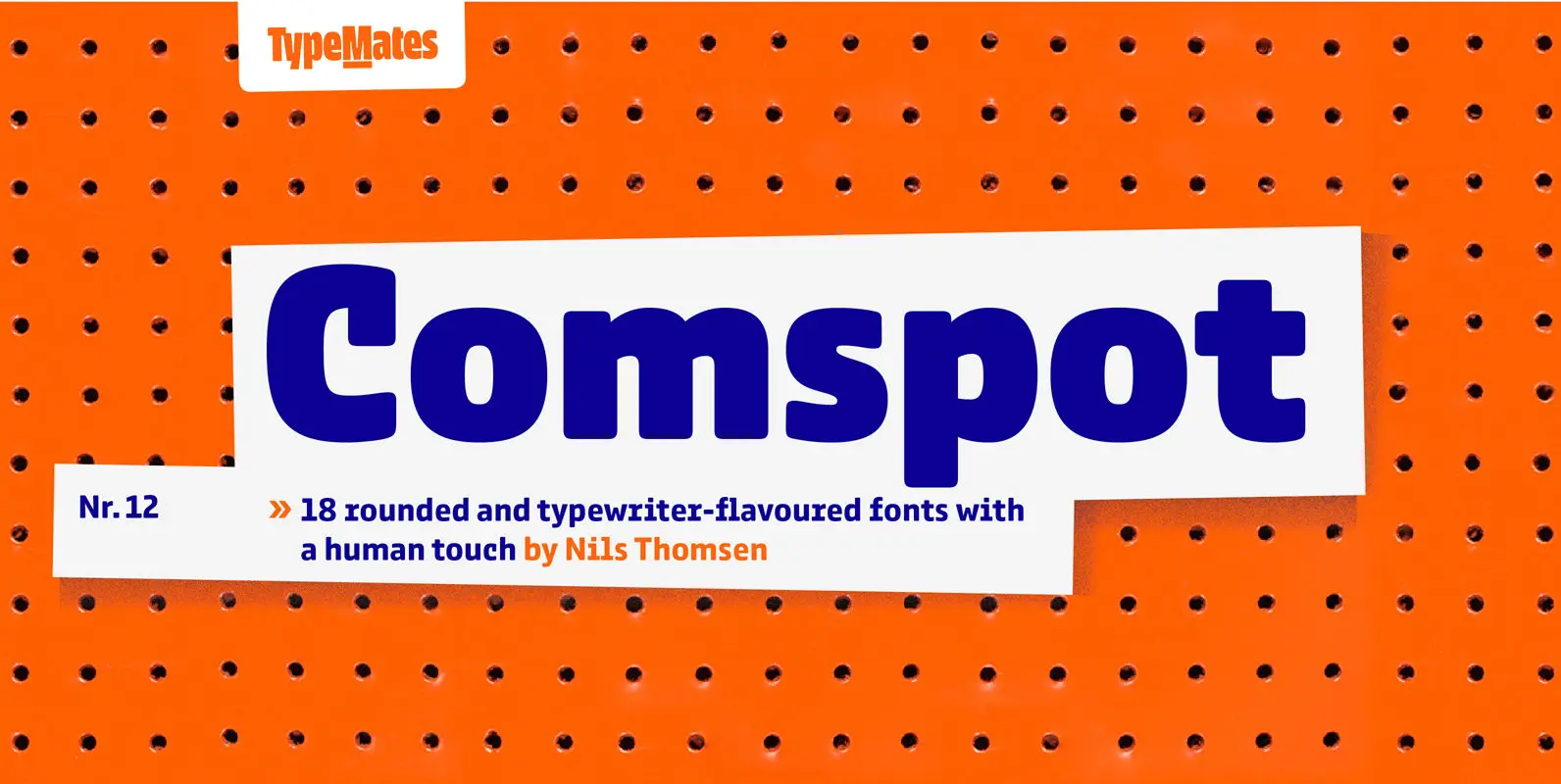
Comspot Font
Comspot is a rounded, typewriter-flavoured font family with a human touch. Originally designed as a custom typeface Comspot’s nine weights — razor-thin hairline to ultra black — and 14 stylistic alternates fulfil every need, from extended to display text. Comspot’s
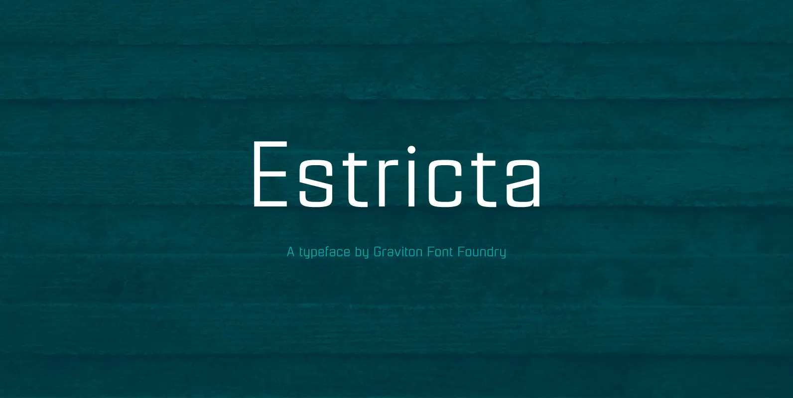
Estricta Font
Estricta font family has been designed for Graviton Font Foundry by Pablo Balcells in 2017. It is a sans serif typeface with a geometrical and mechanical appearance, its sharp, angular edges provide a strong and solid design. It has been
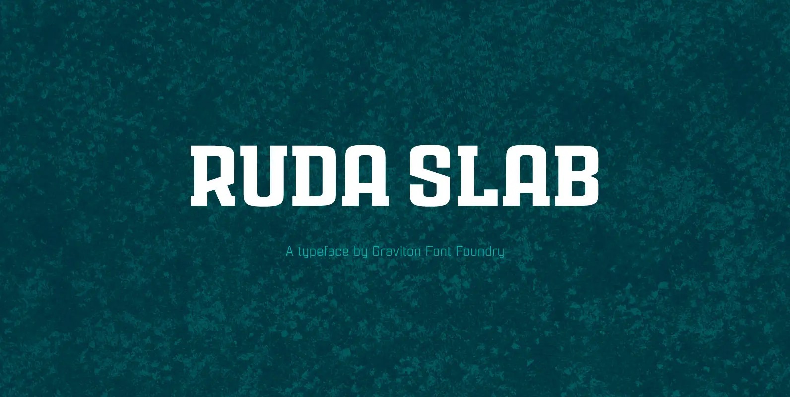
Ruda Slab Font
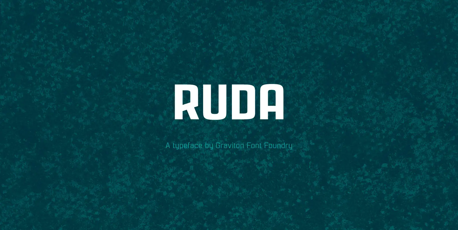
Rauda Slab font family has been designed for Graviton Font Foundry by Pablo Balcells in 2017. It is a display, slab serif, geometric typeface, with sharp angles that provides a strong and solid appearence. Rauda Slab consists of 8 styles.
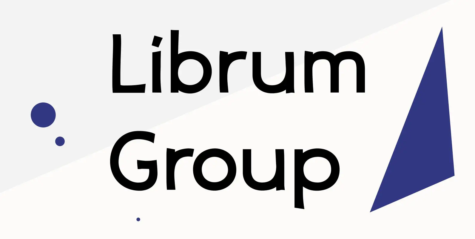
Librum Group Font
Librum is a 4-font text family specifically constructed for its use in book design. Its wider letter spacing works best in body copy sizes from 8-point to 15-point. It is slightly condensed and has several graphics in various rarely used
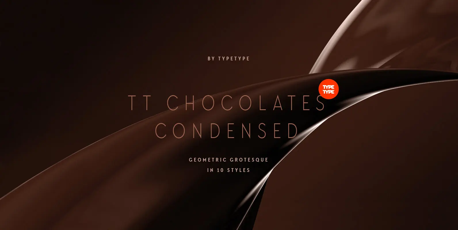
TT Chocolates Condensed Font
Have you heard the expression, 'you can never have too much chocolate'? We completely agree with this point of view and are gladly presenting you the TT Chocolates Condensed fontfamily, the narrow version of your favorite TT Chocolates. Keeping its

