Tag: rational
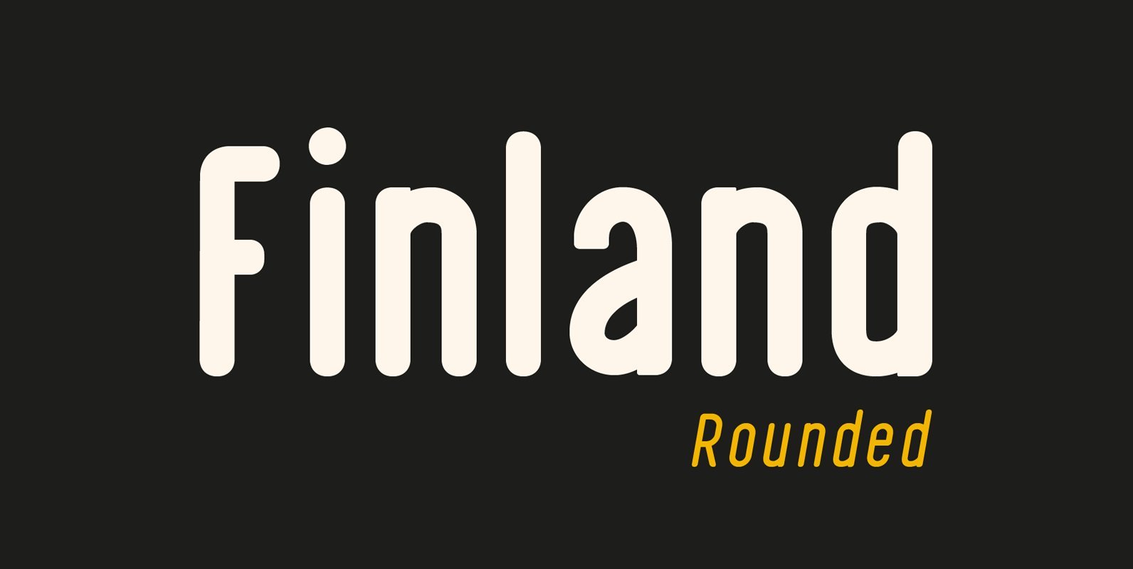
Finland Rounded Font
Finland Rounded Font Family has been crafted from scratch with a structural logic of its own: a fusion of pure geometry and optical balance. Finland Rounded font family comes with 6 Styles, Regular, Italic, Thin, Thin Italic, Bold, Bold Italic.
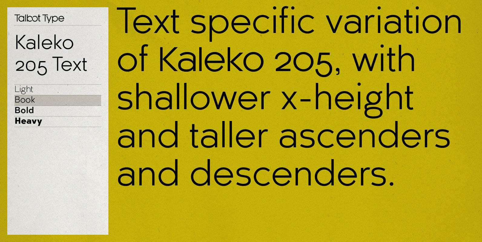
Kaleko 205 Text Font
Kaleko 205 Text is the text specific variation of stablemate, Kaleko 205. With a shallower x-height and longer ascenders and descenders, its more traditional proportions make it more economical with space and better suited to continuous text. It’s a well-balanced,
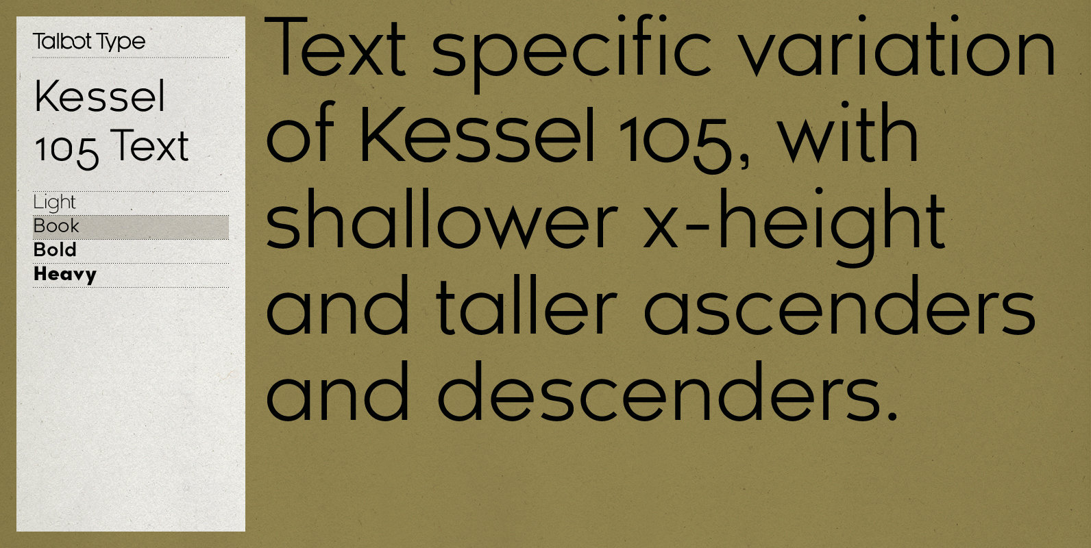
Kessel 105 Text Font
Kessel 105 Text is the text specific variation of stablemate, Kessel 105. With a narrower x-height and longer ascenders and descenders, its more traditional proportions make it more economical with space and better suited to continuous text. It’s a versatile,
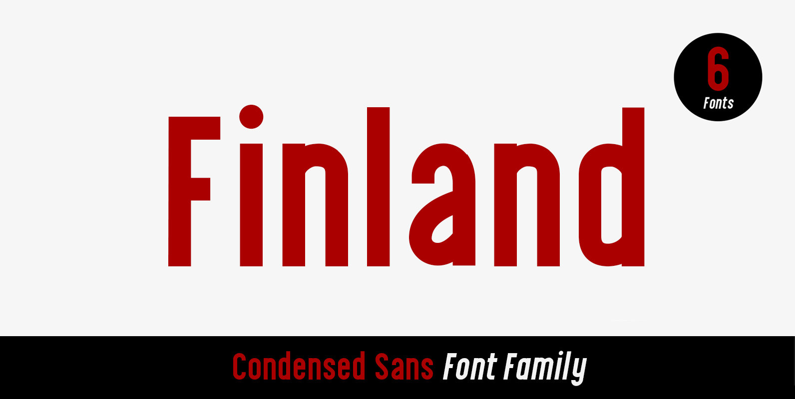
Finland Font
Finland was inspired by European type specimen books, especially Finland type standard. Delivering some glorious vibes of the solid values from the pioneers and keeping one eye on todays demands and technology, Finland is made for high professional use. Finland

Neuron Angled Font
Neuron Angled is based in the idea of Neuron, the original font designed in 2012 by Corradine Fonts’ team, keeping from its predecessor the proportions and slight narrowness. In this version the rounded edges are replaced by sharp contours and
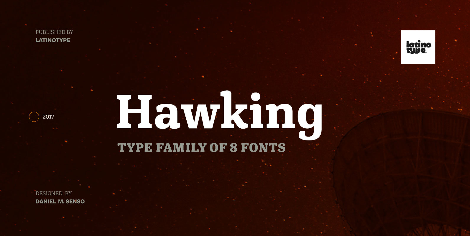
Hawking Font
Hawking is a slab typeface with slightly squarish shapes and a rational, modern look. The font has a minimal modulation, generous counter forms and relatively large x-height with lowercase ascenders extending above the cap-height for more legibility. Serifs are composed
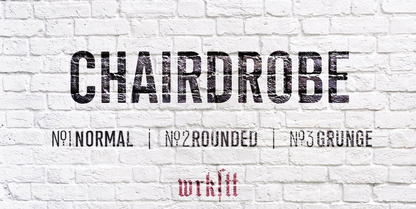
Chairdrobe Font
Chairdrobe is minimalistic typeface with a contemporary, urban style. It feels pure, raw and a bit dirty. You can use it as displaytype as well as in longer text. Try to space it up. It looks super tight with a
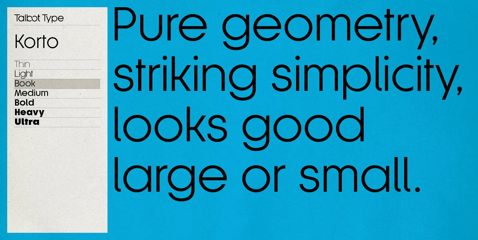
Korto Font
Korto is a clean, elegant and highly legible, geometric text and display font. Inspired by classic sans-serifs such as Futura and Avant Garde, this stylish, minimal typeface is available in a comprehensive family of seven weights and is suitable for
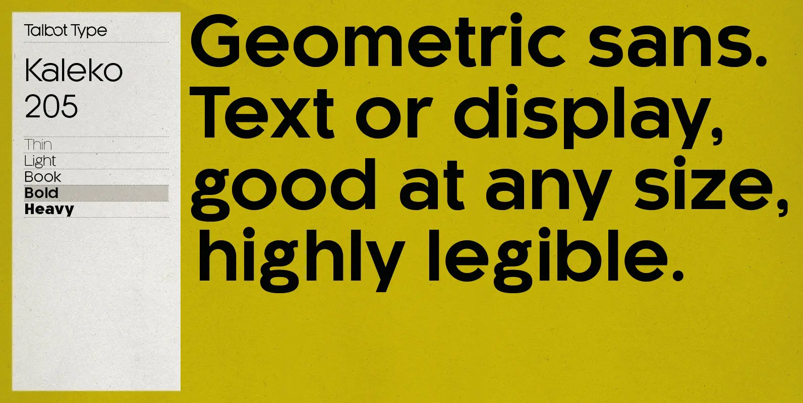
Kaleko 205 Font
Kaleko 205 is inspired by the classic, geometric sans-serifs such as Gill Sans, but has shallower ascenders and descenders for a more compact look. It’s a well-balanced, versatile, modern sans, highly legible as a text font and with a clean,
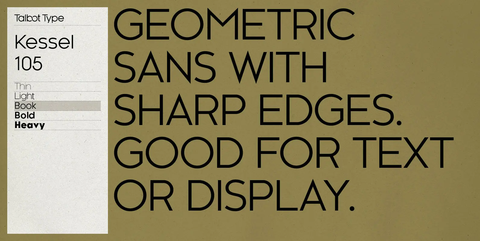
Kessel 105 Font
Kessel 105 is inspired by the classic, geometric sans-serifs such as Futura, but has shallower ascenders and descenders for a more compact look, and features an art deco influence with sharp points at the apex of many characters. It’s a
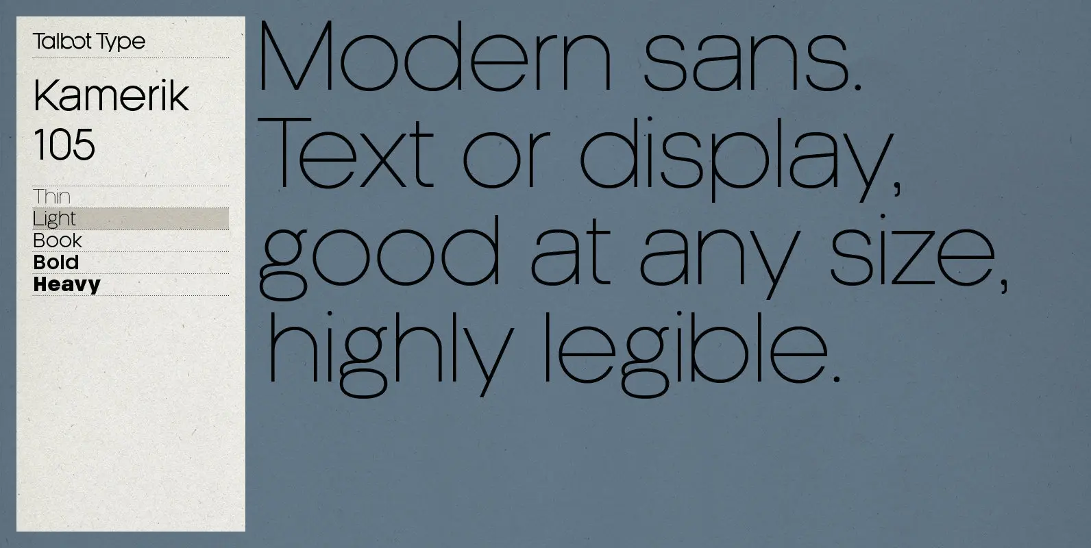
Kamerik 205 Font
Kamerik 205 is inspired by the classic, geometric sans-serifs such as Futura and Avant Garde, but has shallower ascenders and descenders for a more compact look, and features a traditional double-storey lower case a and g. It’s a versatile, modern
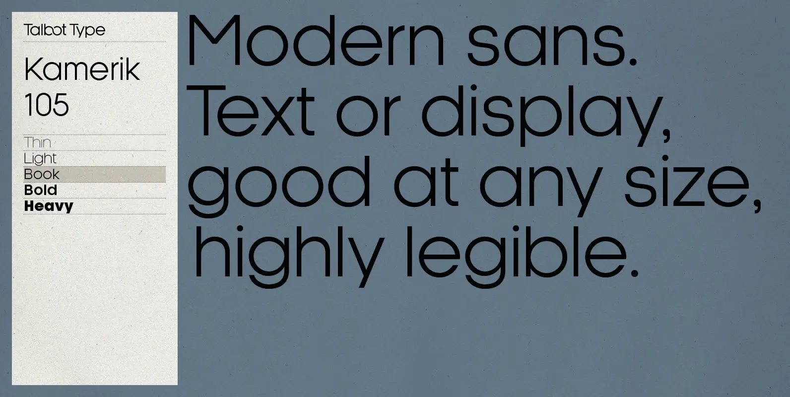
Kamerik 105 Font
Kamerik 105 is inspired by the classic, geometric sans-serifs such as Futura and Avant Garde, but has shallower ascenders and descenders for a more compact look. It’s a versatile, modern sans, highly legible as a text font and with a
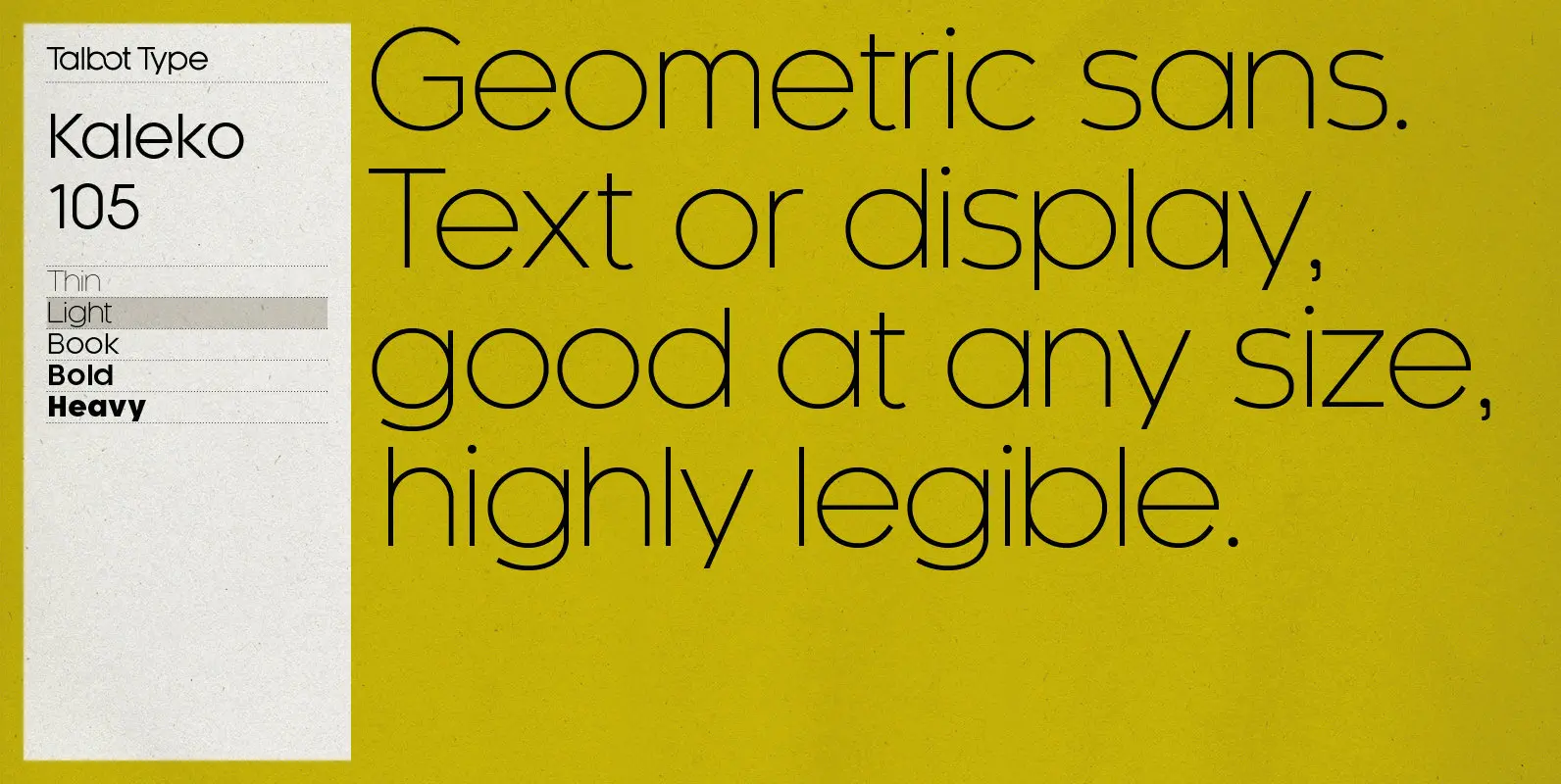
Kaleko 105 Font
Kaleko 105 is inspired by the classic, geometric sans-serifs such as Gill Sans, but has shallower ascenders and descenders for a more compact look. It’s a well-balanced, versatile, modern sans, highly legible as a text font and with a clean,
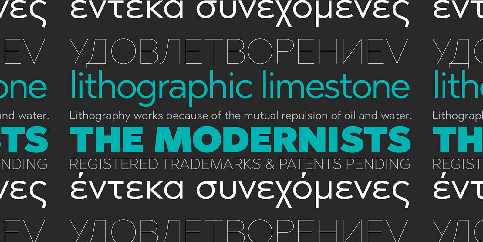
Abrade Font
Abrade is a geometric sans serif with rational design choices for contemporary functionality. The family is designed with a medium x-height to provided great legibility in both display and text sizes. The forms are refined to work well in print
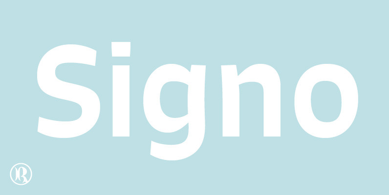
Signo Font
Signo is a dynamic sans serif with reverse contrast, designed for editorial and branding. Signo is a charismatic typeface for headlines, but its tall x-height and open counters also make it perform well in small sizes, resulting in a versatile
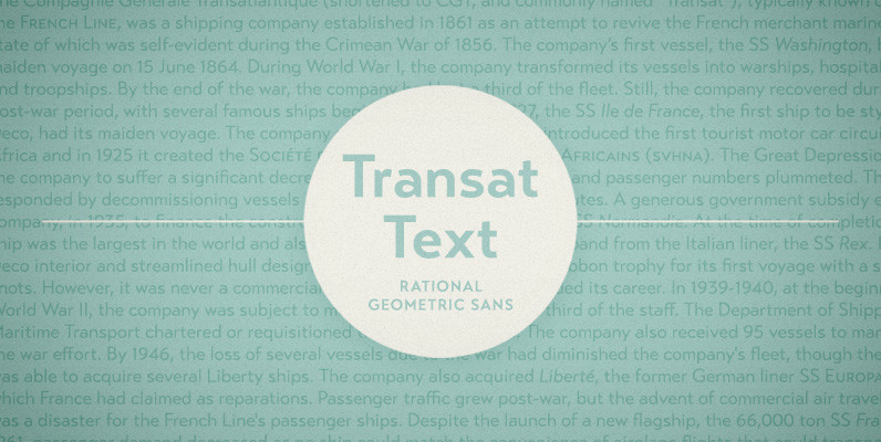
Transat Text Font
Transat Text is a geometric sans serif typeface, and is the more rational sibling to the unabashedly Art Deco “Transat”. Transat Text has a slightly taller x-height than its counterpart, making it easier to read at small sizes, but also
