Tag: readability
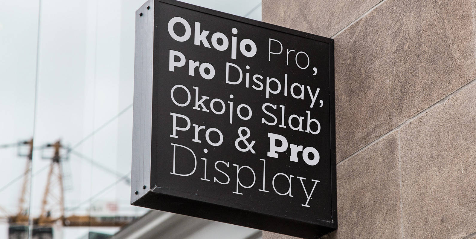
Okojo Pro Font
Okojo Pro Complete is the complete collection of the Okojo Pro family of typefaces: Okojo Pro, Okojo Slab Pro, Okojo Pro Display and Okojo Slab Pro Display. The Okojo Pro family is a reworking of Wordshape’s immensely popular Okojo family
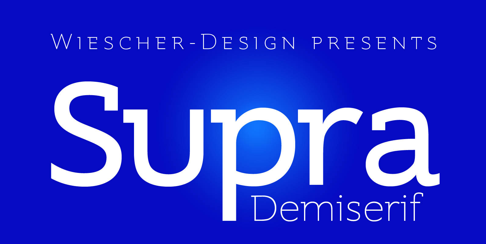
Supra Demiserif Font
“Supra Demiserif” is the demi serif addition to the Supra family. I am no fan of slab serif fonts, so I designed this one with half serifs, that makes the serifs less important. Then I found, that the italic does
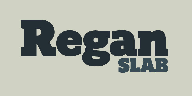
Regan Slab Font
A precision cut slab serif typeface. Simple curves are combined with sharp angles to provide a readable font with subtle characteristics. Regan Slab is ideally suited to a wide range of applications including magazines, newspapers and handheld devices. Details include

Neology Font
Variety is favored in many areas, particularly for activities which extend over time. Humanity balks at the prospect of the straight road, the assembly line, the prison cell – we are designed to respond to stimuli which vary; inertia generates
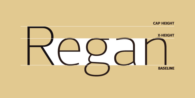
Regan Font
A finely crafted sans serif typeface with an uncomplicated appearance. Soft curves are mixed with minimal angles to create a readable font ideally suited for identity, editorial and online uses. Details include 10 weights with italics, 540 characters, 5 variations
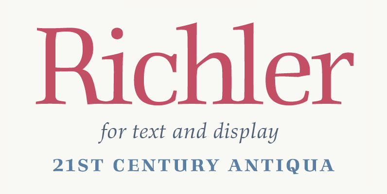
Richler Font
An open, evenly spaced book face designed for quality headlines and enhanced readability in text. Published by ShinntypeDownload Richler