Tag: readable
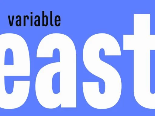
East Variable Font
East Variable is a condensed sans serif typeface. It is timeless, but with a subtle nostalgia of vintage jazz albums, film titles, newspapers, and signage. The light weight has excellent legibility at small sizes. The Extra Bold weight will
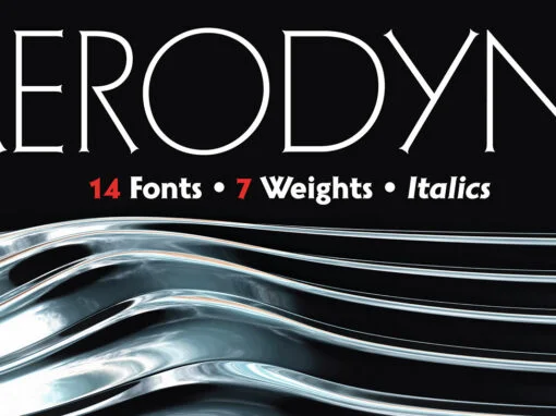
Aerodyne Font
Aerodyne is a highly versatile font family with seven weights and italics. While both modern and sleek in its line quality and flow, the fundamentals of this font set takes many of its design cues from more antiquated typestyles of
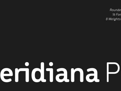
Meridiana Pro Font
The concept behind Meridiana Pro was to create an amalgamation between a rounded sans and a monospaced font in order to obtain an extensive and usable variable type-system. This typeface encapsulates a symmetrical and balanced rhythm due to the unique
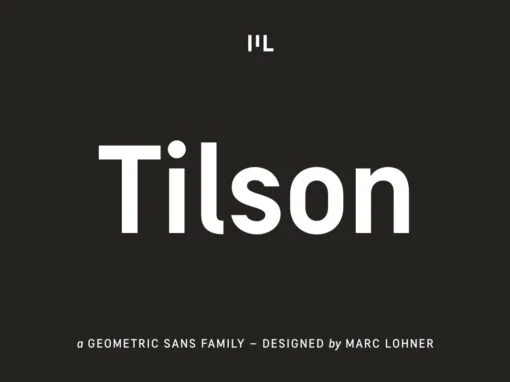
Tilson Font
Meet Tilson, a versatile workhorse family for both texts and headlines based on a geometric and straight-lined design. It will give your apps, websites, logos, posters and so much more a techy and masculine look and feel. However, some friendly
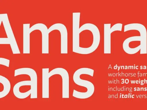
Ambra Sans Font
Designed by Cosimo Lorenzo Pancini with Francesco Canovaro as a development and reinvention of Tarif by Andrea Tartarelli, Ambra Sans is a humanist sans typeface family, drawn around a lively, expressive skeleton but developed with a contemporary, post-digital sensibility that
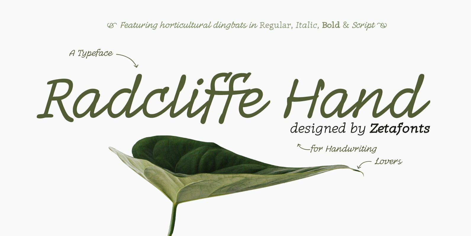
Radcliffe Hand Font
Radcliffe Hand is a typeface family designed by Cosimo Lorenzo Pancini with the help of Giulia Ursenna Dorati, re-inventing our Radcliffe family as a handwritten typeface. Each glyph of the original typeface has been lovingly traced by hand, interpreting every
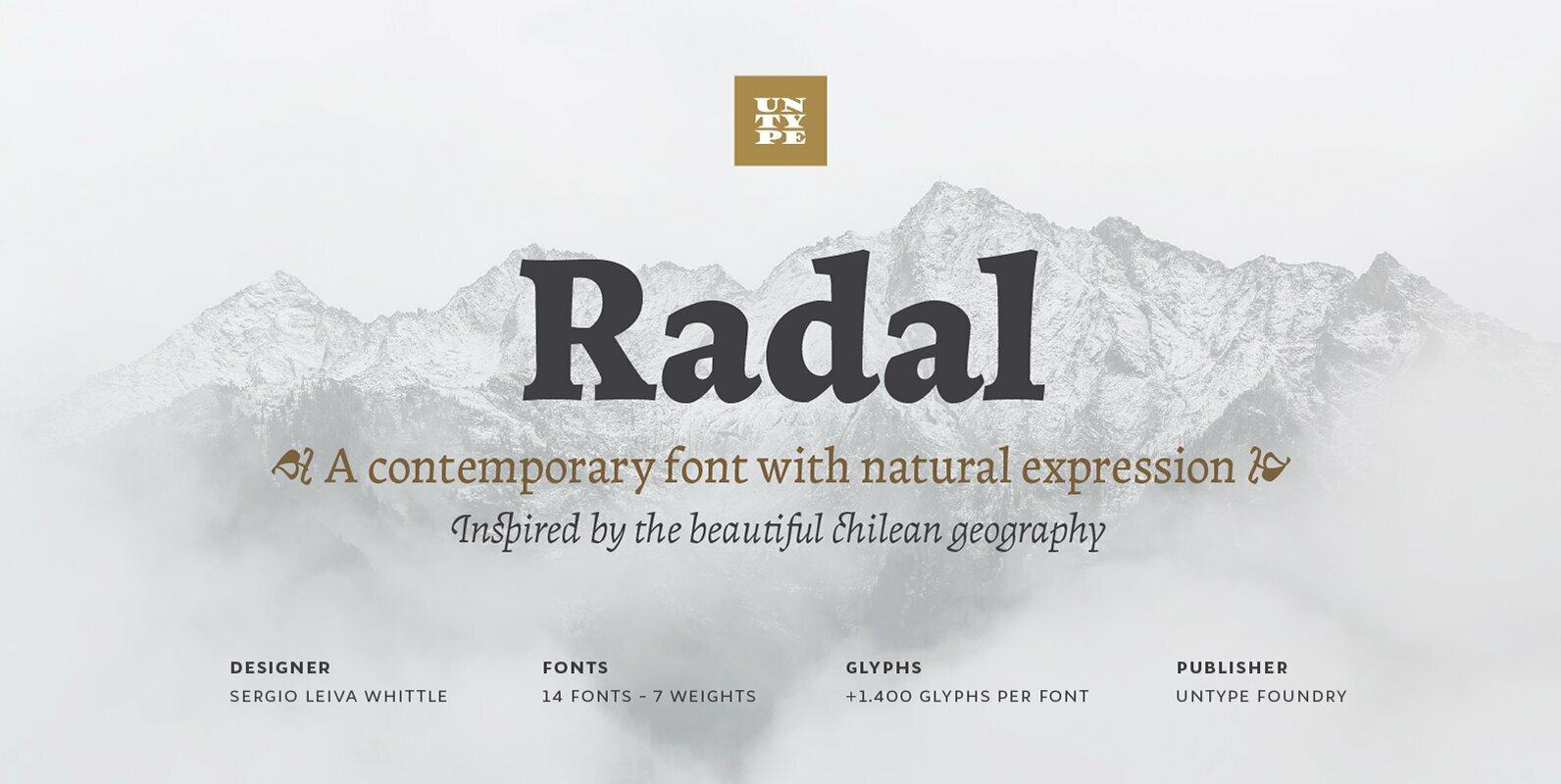
Radal Font
Two times awarded on Bienal Tipos Latinos 2012 and 2014, Radal is one of the most expected releases for all those who know well the Latin American type scene. Inspired by the capricious and temperamental southern Chile geography and the
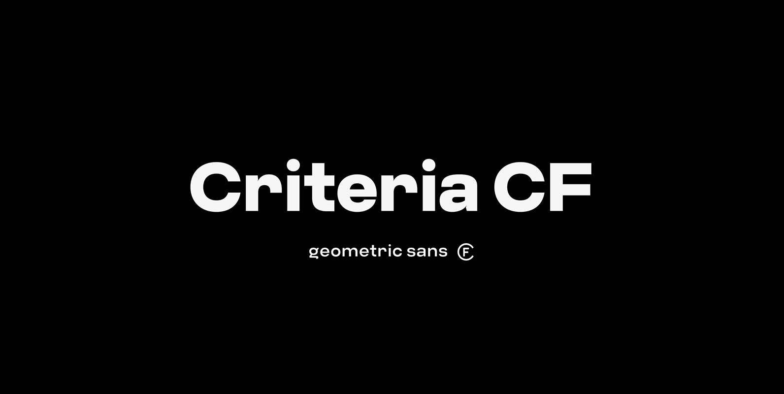
Criteria CF Font
Criteria CF is a geometric sans built with simple, efficient construction. Straight lines and clean circles combine with a tight vertical design that allows for cleanly-stacked lowercase text, striking headlines, and bold word marks. Hints of Swiss style and unconventional
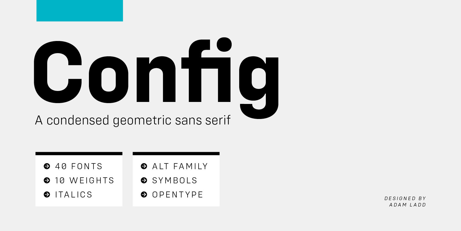
Config Font
Config is a condensed geometric sans serif family consisting of 40 fonts in 10 weights plus italics. The Config typeface was influenced by geometric sans serifs with circular forms on the tops and bottoms of characters, but the proportions have
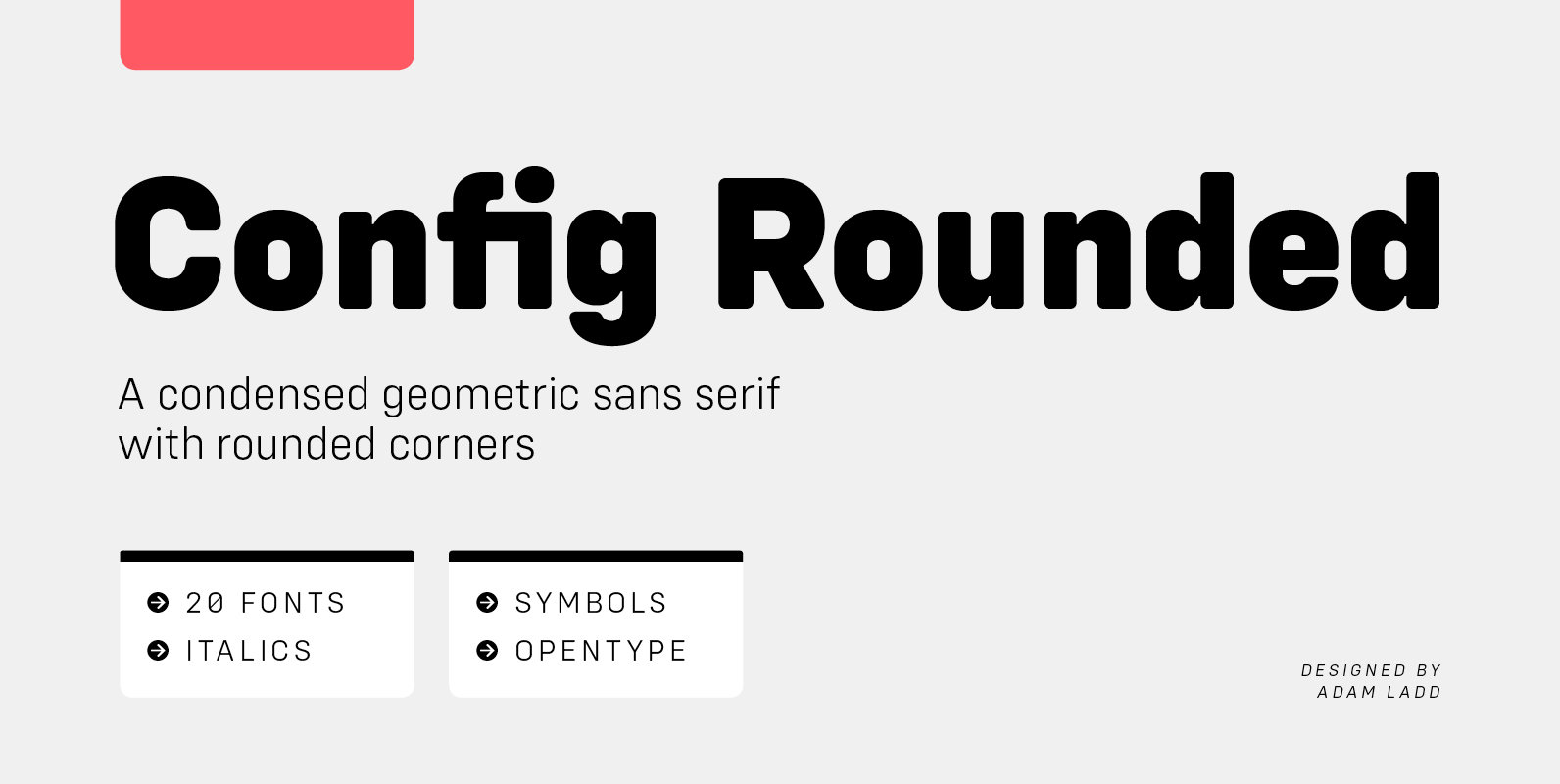
Config Rounded Font
Config Rounded is a condensed geometric sans serif with rounded corners. A sibling to Config, this typeface was influenced by geometric sans serifs with circular forms on the tops and bottoms of characters, but the proportions have been condensed by
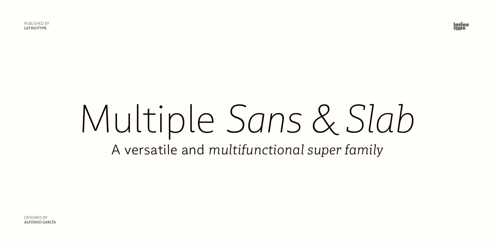
Multiple Font
As its name suggests, Multiple is a family with multiple font styles. The idea that sums up the concept behind the typeface is workhorse—the challenge was to develop a useful font fit for any scenario and suitable to any design
