Tag: readable
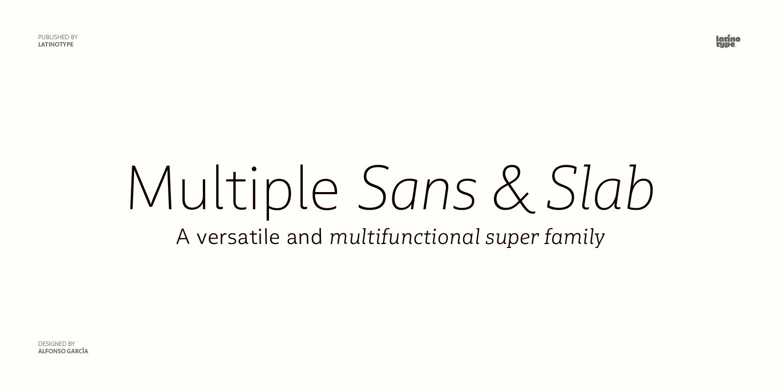
Multiple Font
As its name suggests, Multiple is a family with multiple font styles. The idea that sums up the concept behind the typeface is workhorse—the challenge was to develop a useful font fit for any scenario and suitable to any design
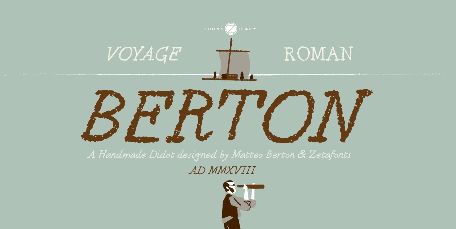
Berton Font
Berton – the third in the Zetafonts Signature artist-designed fonts – was hand drawn by italian illustrator Matteo Berton and lovingly digitized by Zetafonts to be used as main lettering font of the graphic novel “Voyage au Centre de la
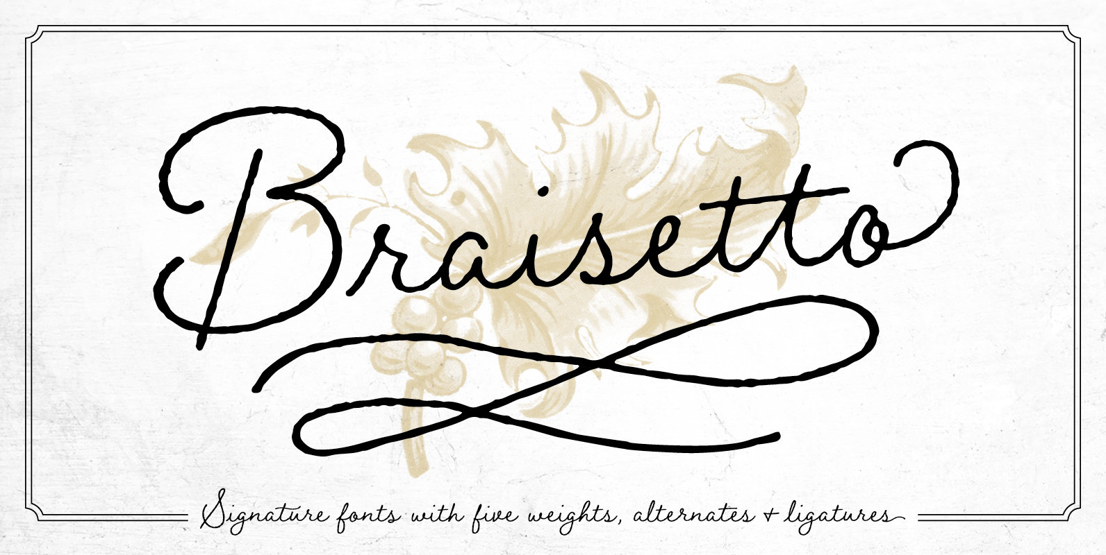
Braisetto Font
Braisetto is a handwritten, signature font family with five weights, multiple alternates, and natural ligatures. Inky and expressive yet readable and functional, this typeface is designed to look personal and be useful in a variety of applications. It can stand
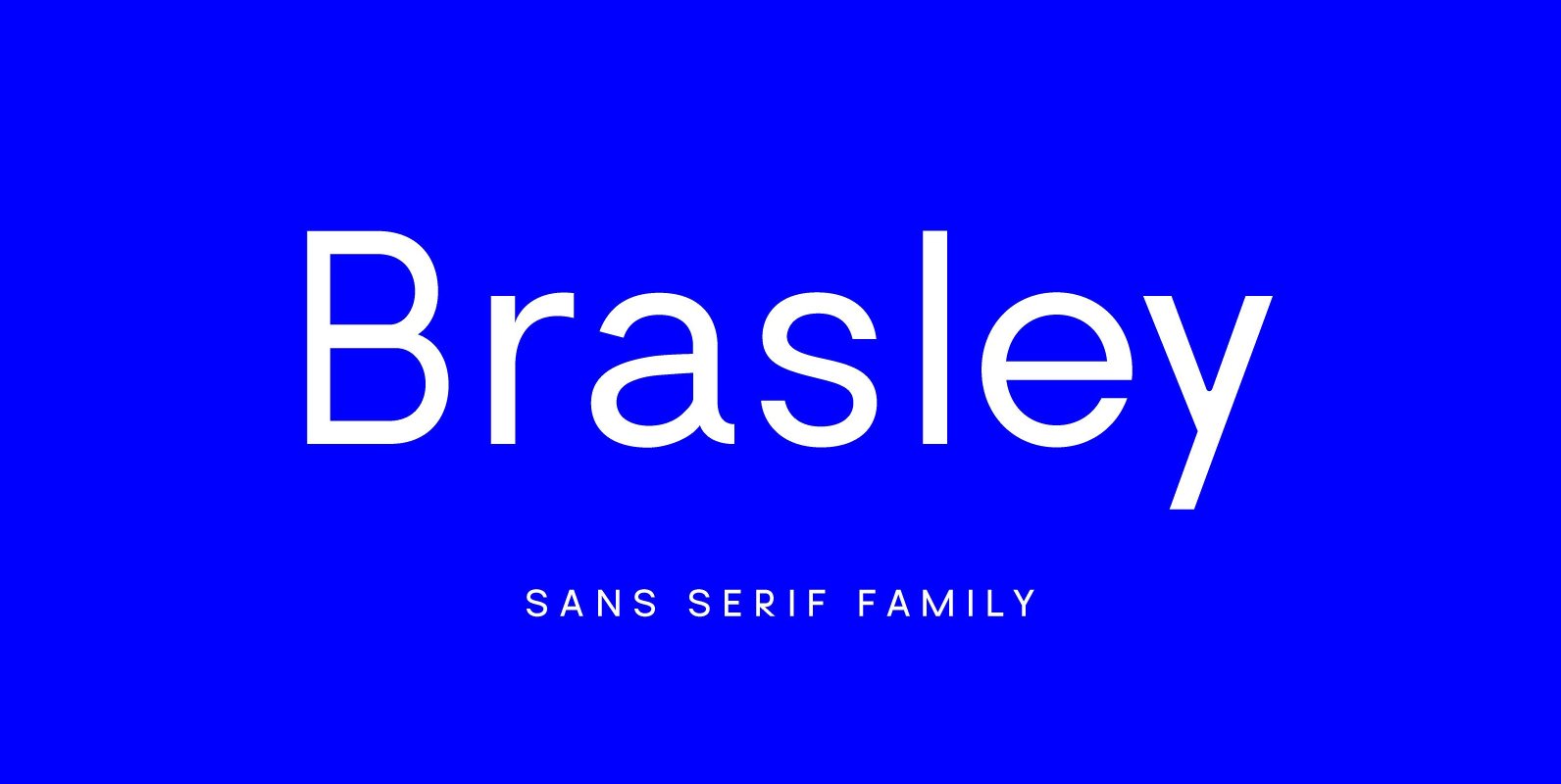
Brasley Font
Brasley is a geometric sans serif typeface created by Belgian designer Nicolas Desle. Spaced and mastered for optimal readability, Brasley plays well in a wide range of projects and applications. Brasley is available in six weights—bold, semibold, medium, regular, light
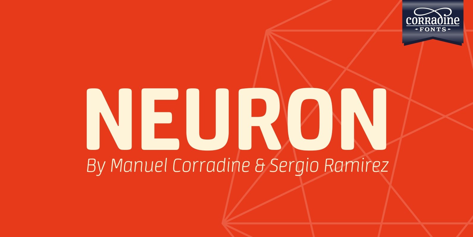
Neuron Font
Neuron puts a chemist’s twist on standard block-style print to create a fresher version of the elemental alphabet. Widely spaced letters and a slightly tall x-height have a clean effect for great readability. Squarish shapes are stylized to retain curved
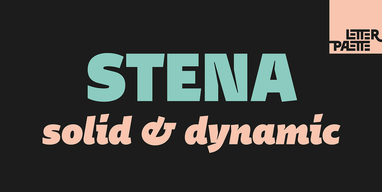
Stena Font
Stena is a very functional sans serif typeface with calligraphic feel, especially designed for contemporary typography. This family features deep and sharp ink-traps as part of its design. Thanks to its proportions, solid and balanced forms, combination of straight and
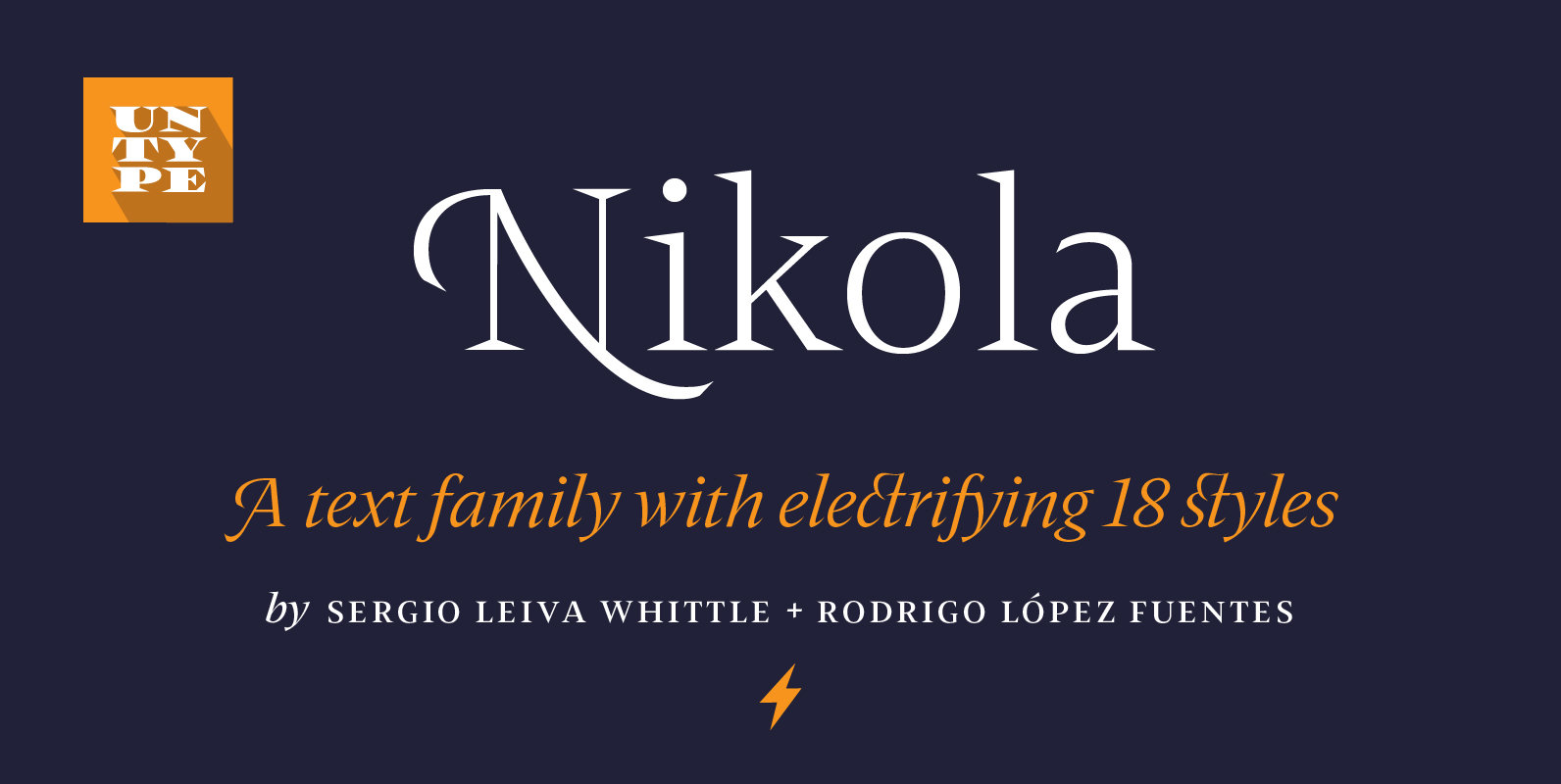
Nikola Font
Nikola is a text typeface that offers a wide range of possibilities. While its regular and medium weights were specially optimized for maximum performance, balanced for excellent legibility and carefully crafted to spread a scent of tradition on long text
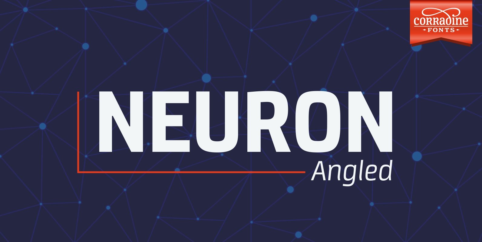
Neuron Angled Font
Neuron Angled is based in the idea of Neuron, the original font designed in 2012 by Corradine Fonts’ team, keeping from its predecessor the proportions and slight narrowness. In this version the rounded edges are replaced by sharp contours and
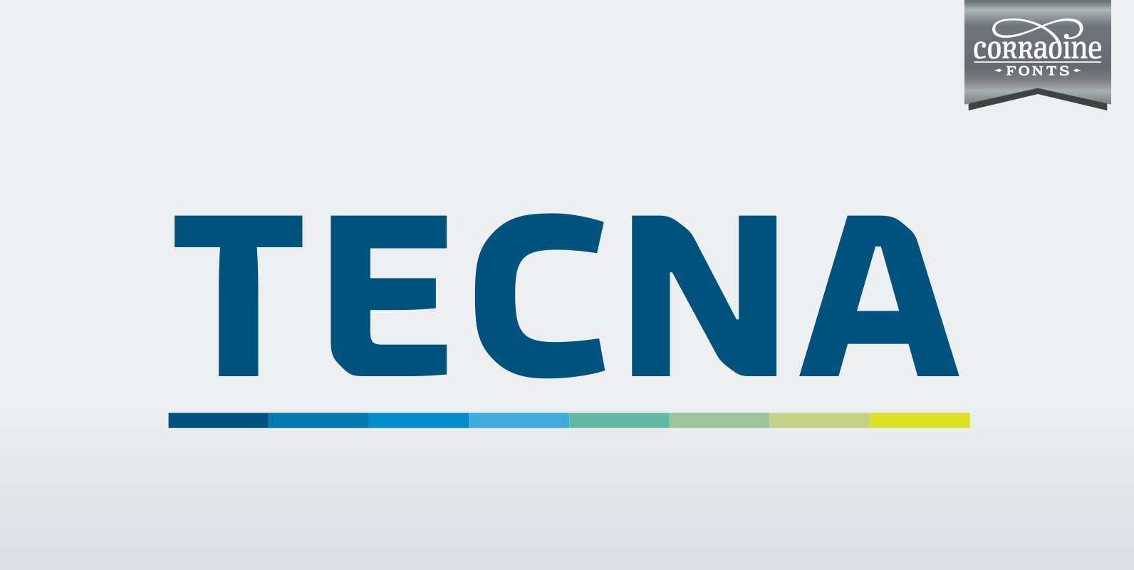
Tecna Font
Tecna is a modern sans typeface with straight cuts, rounded angles and curved thinnings at the endings that make the letter shapes fresher. The rounded characters are squarish giving to the layout a very structural appearance. Its wide proportions give
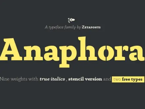
Anaphora Font
Anaphora is a contemporary serif typeface designed by Francesco Canovaro with Cosimo Lorenzo Pancini and Andrea Tartarelli. It features a wedge serif design with nine weights from thin to fat, each with true italics style, for a full range of
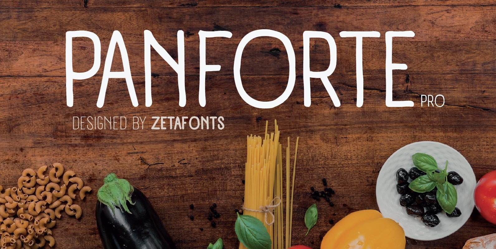
Panforte Pro Font
Panforte Pro is the basic ingredient for any tasty visual feast: a prime-cut font family, deliciously readable online and offline, space-saving and organic, appealing to hipster consumers and seasoned gluttons. Hand drawn in easy big strokes, its a very condensed
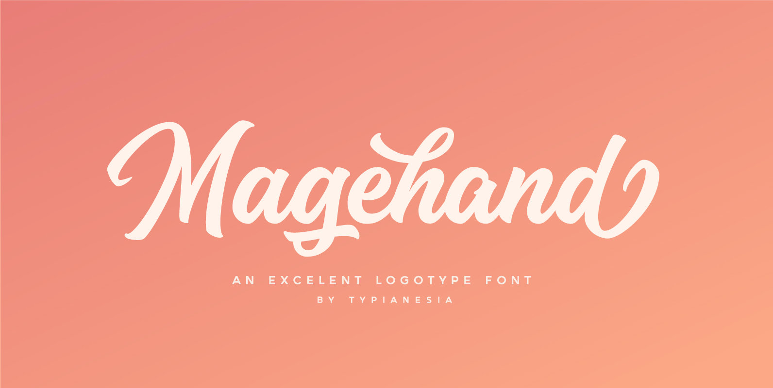
Magehand Font
Magehand is a script font design published by Arief Setyo Wahyudi Published by Arief Setyo WahyudiDownload Magehand
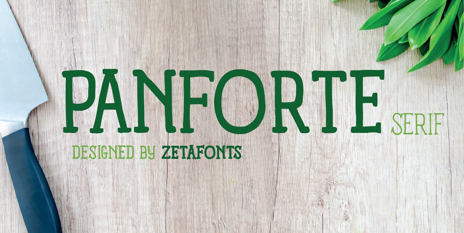
Panforte Serif Font
Panforte Serif is the serif companion of Panforte Pro: a prime-cut font family, deliciously readable online and offline, space-saving and organic, appealing to hipster consumers and seasoned gluttons. Published by ZetafontsDownload Panforte Serif
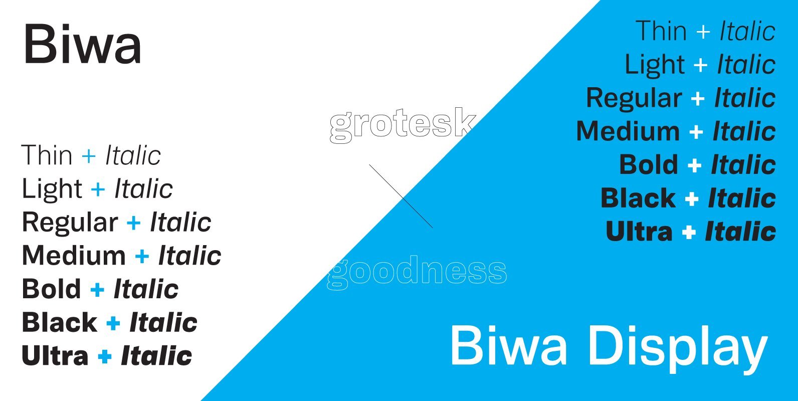
Biwa & Biwa Display Font
Biwa is a new straight-sided family of formally nuanced grotesk typefaces. Biwa’s lighter weights feel subdued, cool in tone, and neutral, while the heavier weights are more robust and full of personality. Biwa is, in essence, the son of the
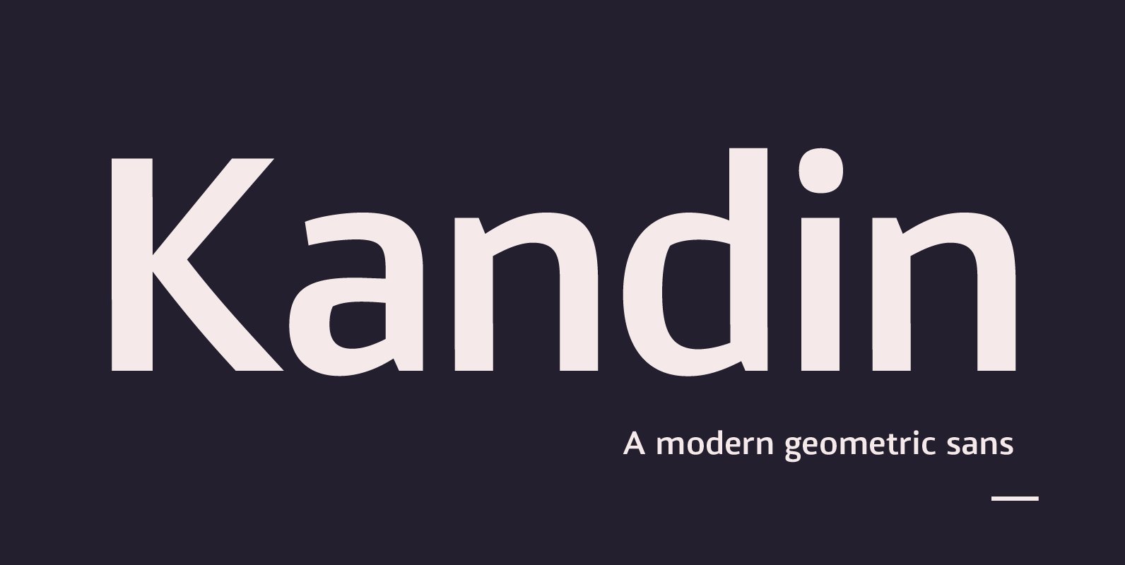
Kandin Font
Kandin is a modern geometric sans inspired by Scandinavian interiors. With a cool and collected feel and low-key luxury, Kandin has a crisp and uncluttered feel providing legibility with strong doses of aesthetic pleasure. Being one of the most static
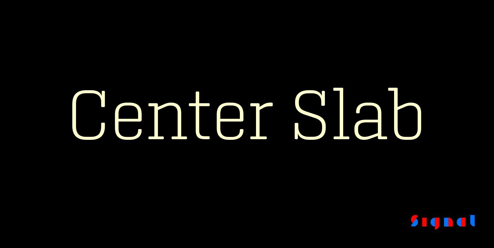
Center Slab Font
A funny thing happened when we added serifs to our best-selling Center family: its look went from digital to analog. Maybe it’s because slab serifs have their roots in 19th Century ‘Egyptians,’ or because monoline serif faces inevitably suggest typewriters.
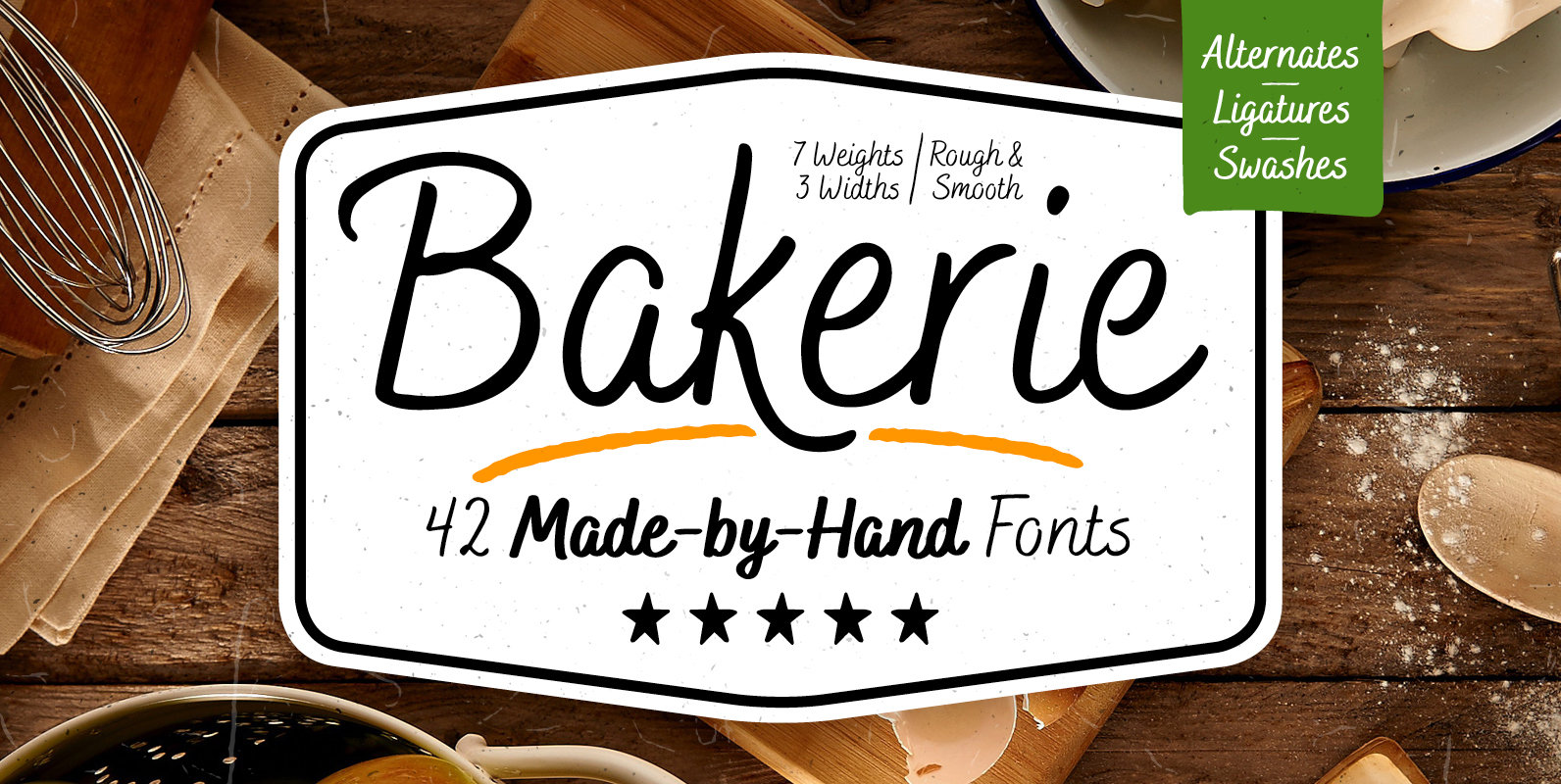
Bakerie Font
Bakerie is a handwritten script type family of 42 fonts, consisting of 7 weights, 3 widths, and 2 versions. Designed to be a hard-working, genuine handmade set of scripts that are useful in a variety of settings. The lighter weights