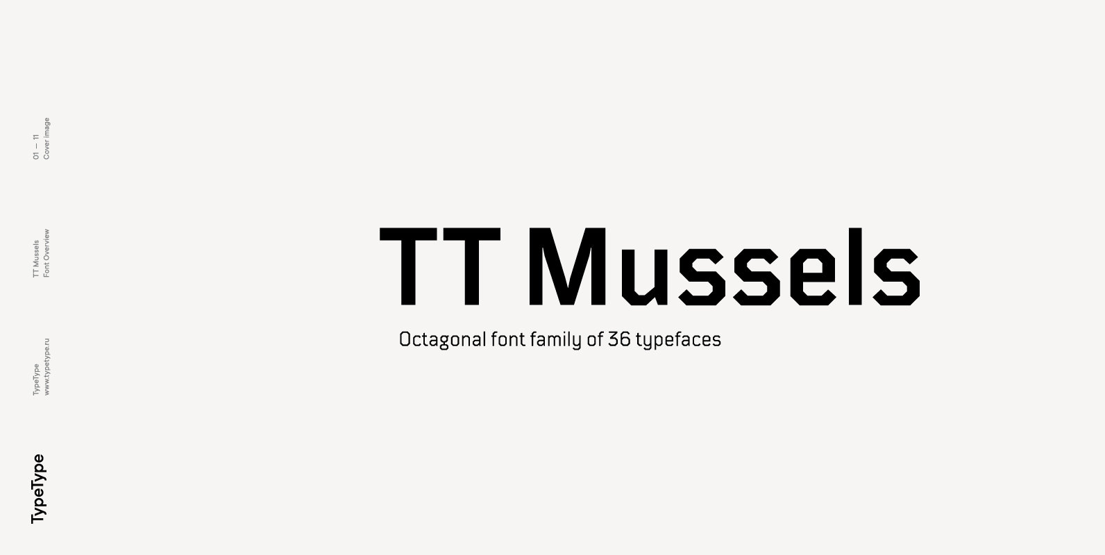
TT Mussels Font
The TT Mussels font family is the successor of such popular fonts as Bender and TT Squares. At the same time, TT Mussels has a number of fundamental differences that make it a unique font family that stands out from

The TT Mussels font family is the successor of such popular fonts as Bender and TT Squares. At the same time, TT Mussels has a number of fundamental differences that make it a unique font family that stands out from
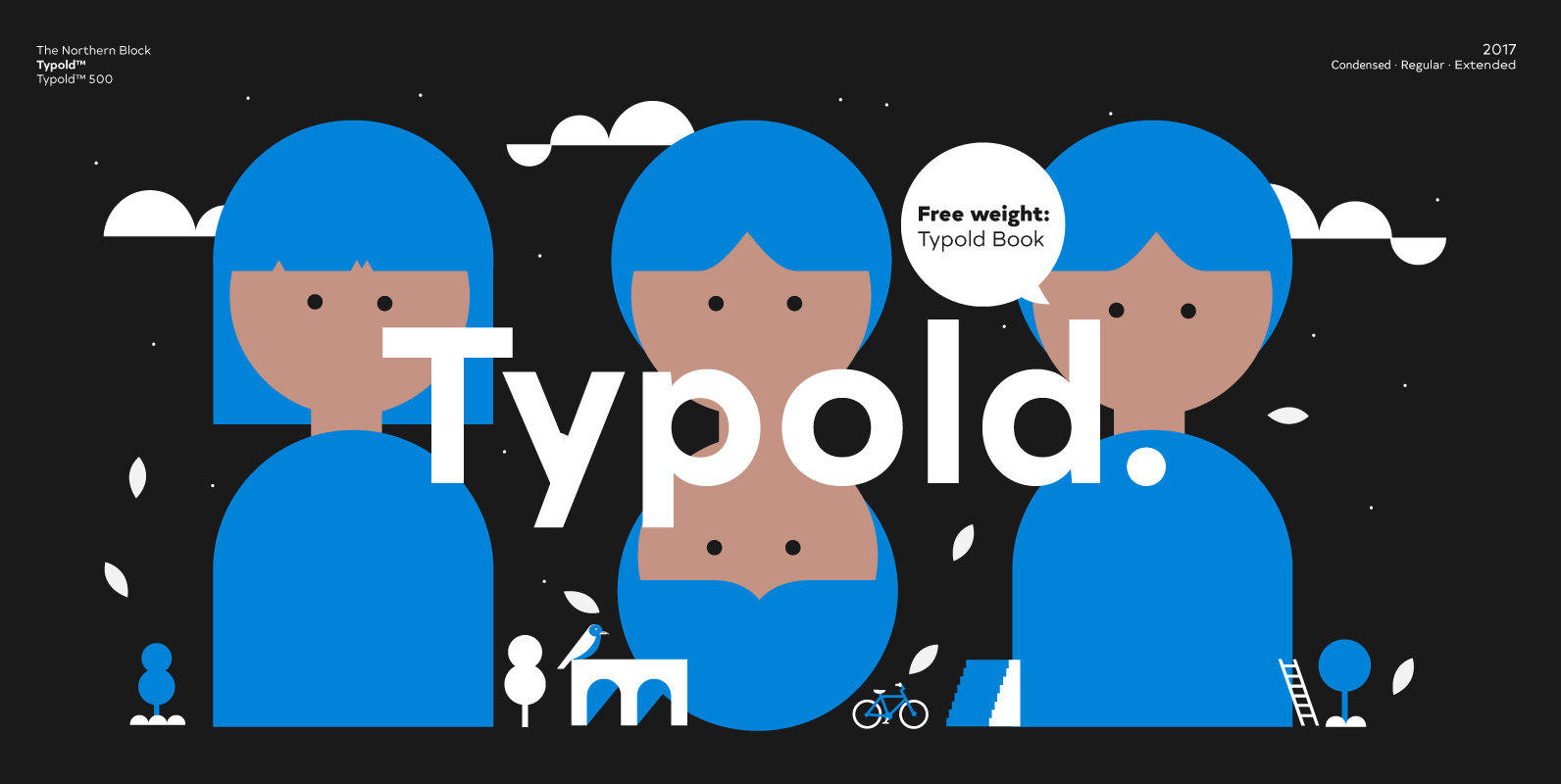
Typold originated out of the desire to improve, geometric forms and push beyond previous achievements through collaborative working methods and knowledge sharing. The result is a finely balanced modern sans serif constructed from mathematical inputs, typographers needs, and the natural
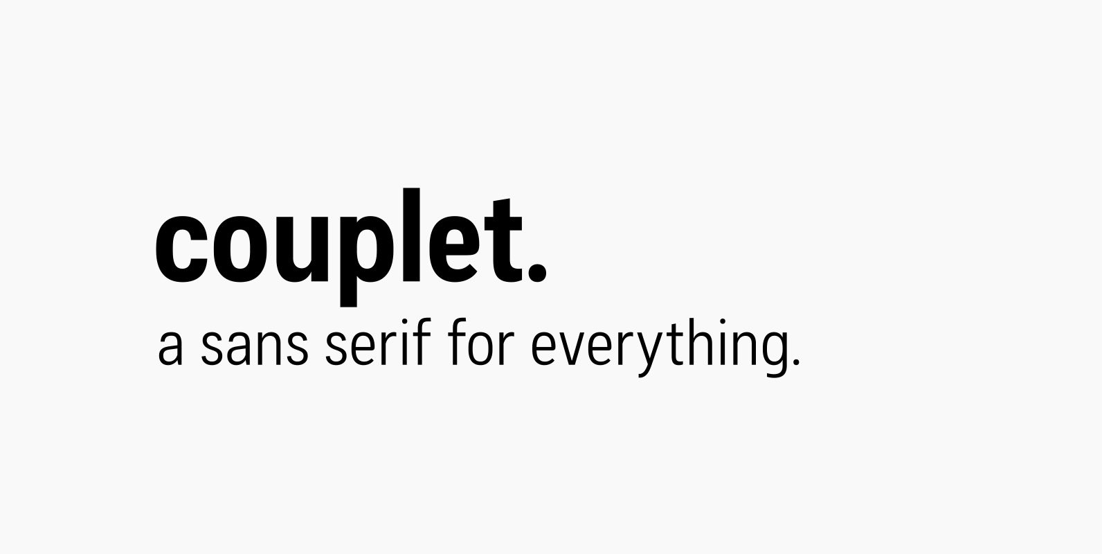
Couplet CF is expressive and practical, with a blend of precision and warmth. A strong rectangular underpinning and slightly condensed construction support bright, attractive letterforms across seven weights. Couplet’s simple shapes and clean construction are designed to be used anywhere
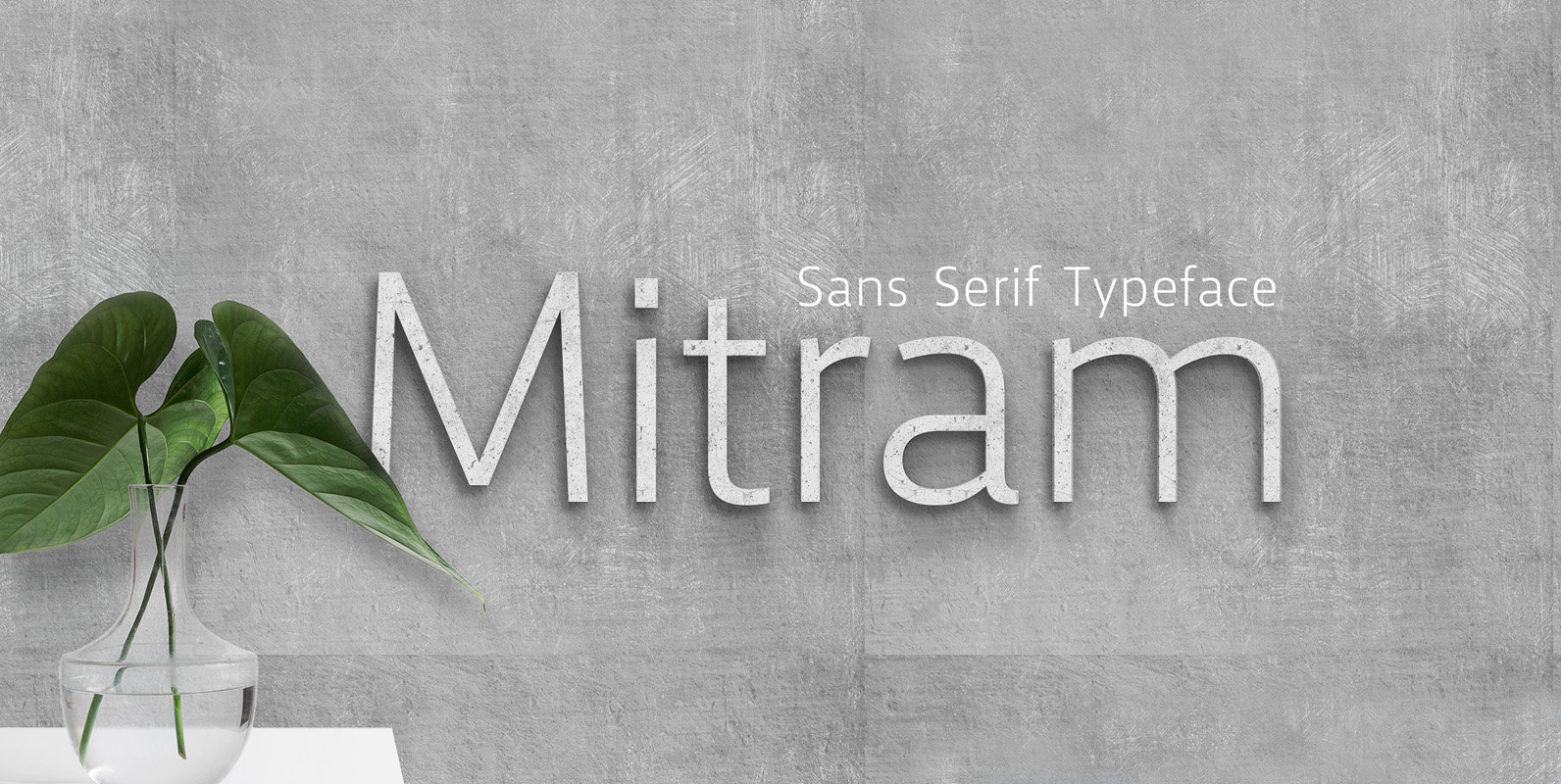
The Mitram family has 7 weights, ranging from Thin to ExtraBold (including italics) and is ideally suited for advertising and packaging, book text, logo, branding and creative industries, small text, wayfinding and signage as well as web and screen design.
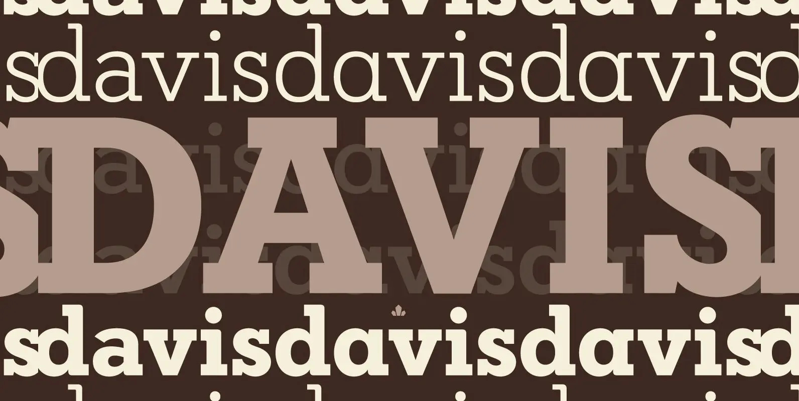
P22 Blox is a modular system of shapes that can build letterforms and abstract patterns. Created as a working prototype for the letterpress P22 Blox project from P22 Analog and Starshaped Press, this system of shapes presents a unique approach
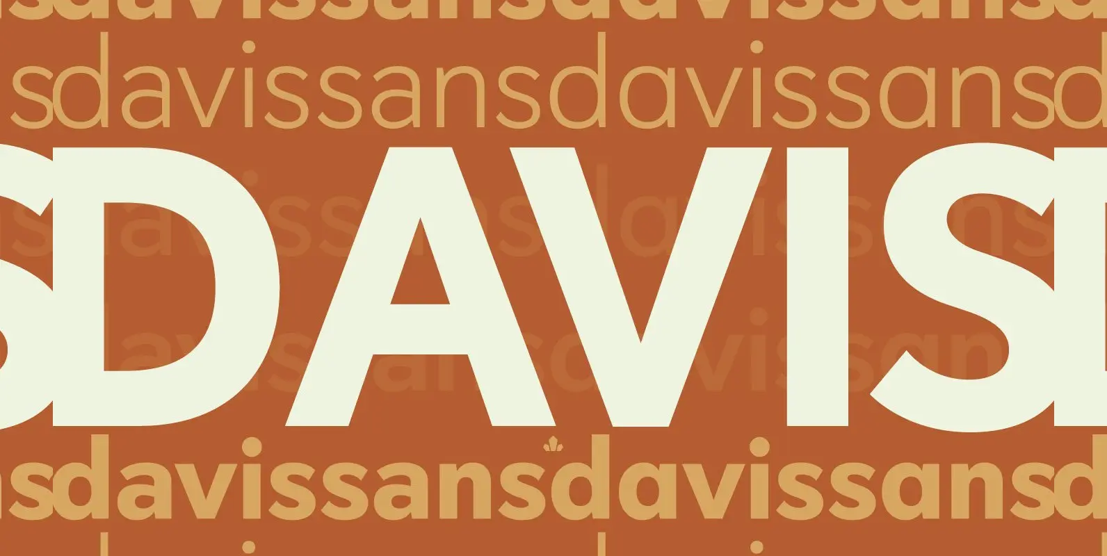
Over the past couple of decades, the many applications that joined print as media requiring design solutions have combined to necessitate a visual evolution that favours controlled optical geometry and careful counter-space consideration over ornamental features traditionally associated with print

It took me 12 years to bring this extensive font family to completion. A lot has been changed, transformed, peeled and developed in all those years. For many of my projects I used it as my quarry and so it
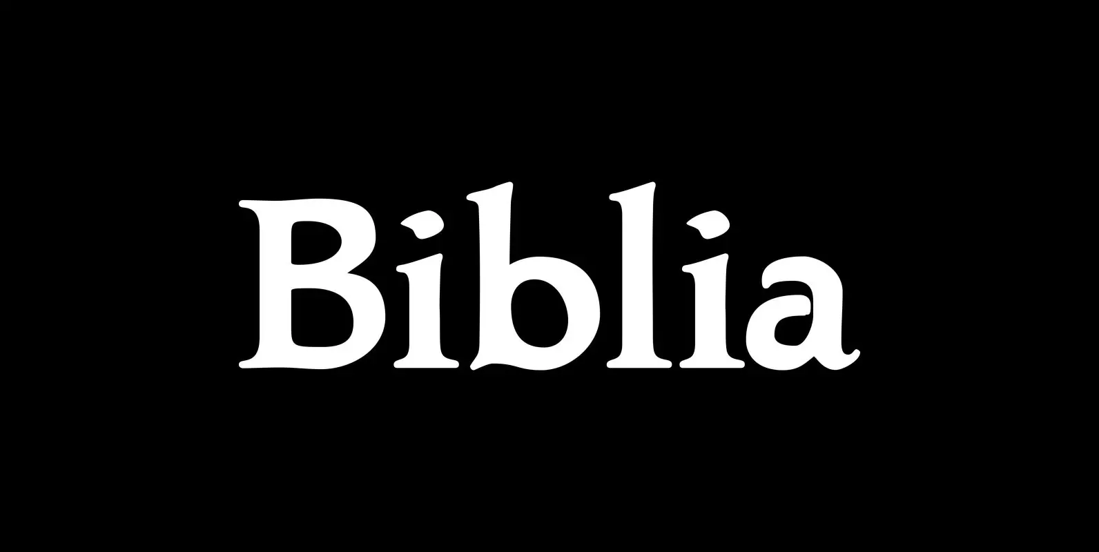
This all started with a love for Minister. This is a font designed by Carl Albert Fahrenwaldt in 1929. In the specimen booklet, there’s a scan from Linotype’s page many years ago. They no longer carry the font. I’ve gone
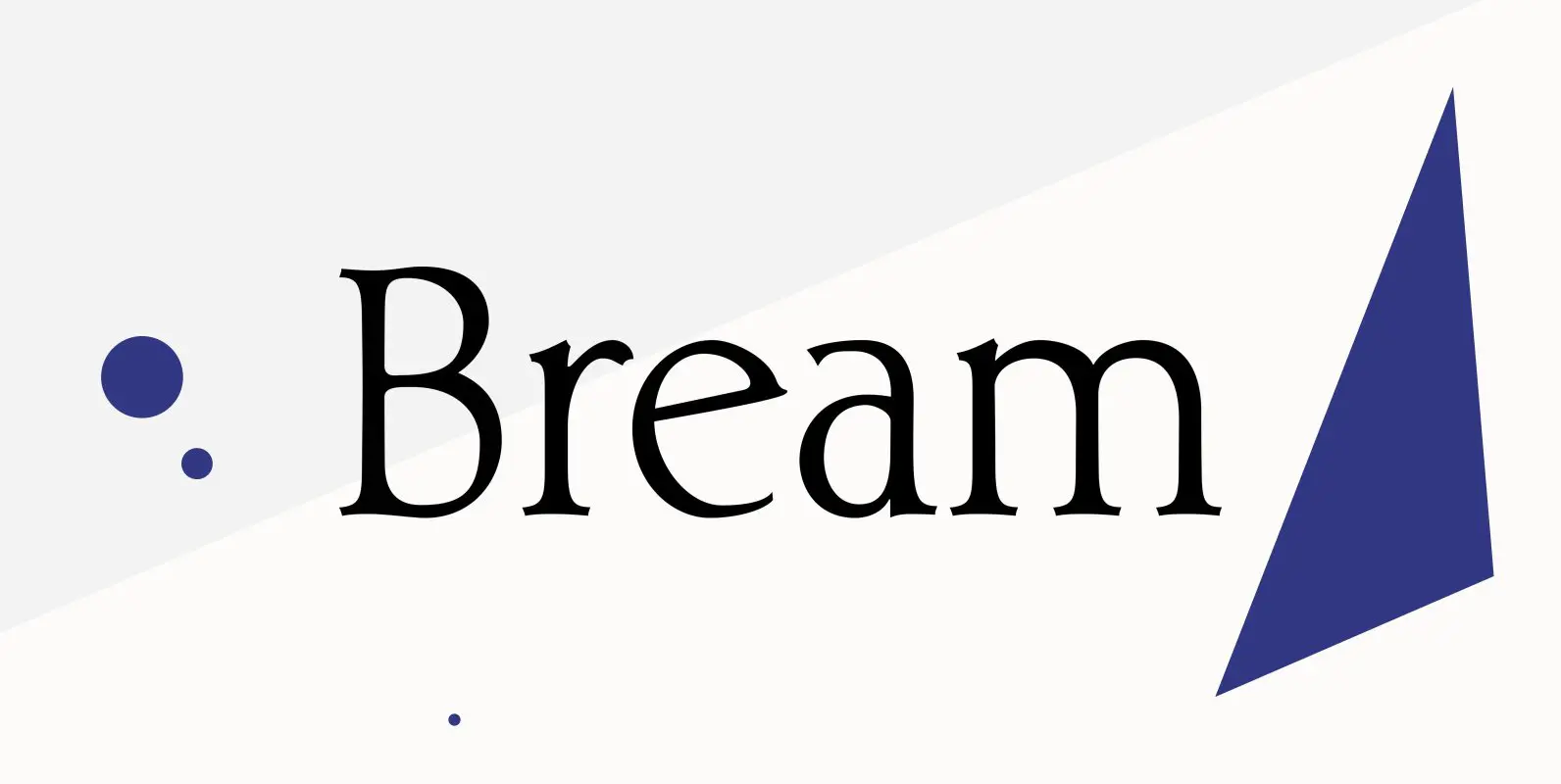
This is the display version of Librum. Librum means “book” in Latin, which I thought was appropriate. Bream is Latin for proclaim—appropriate for display work. The fonts are very close to Librum-Book and Librum-Italic, with the same OpenType features. The
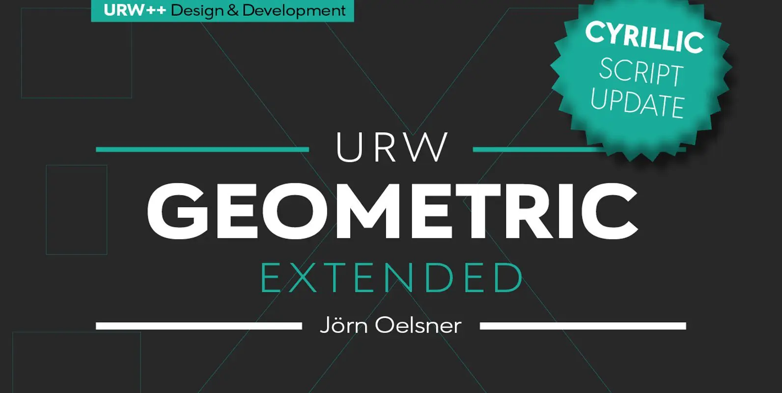
URW Geometric Extended is the matching complement for the URW Geometric, including 20 additional extended styles. URW Geometric is a sans serif typeface inspired by the German geometric typefaces of the 1920s but designed for modern usability. The character shapes have optimized

It took me 12 years to bring this extensive font family to completion. A lot has been changed, transformed, peeled and developed in all those years. For many of my projects I used it as my quarry and so it
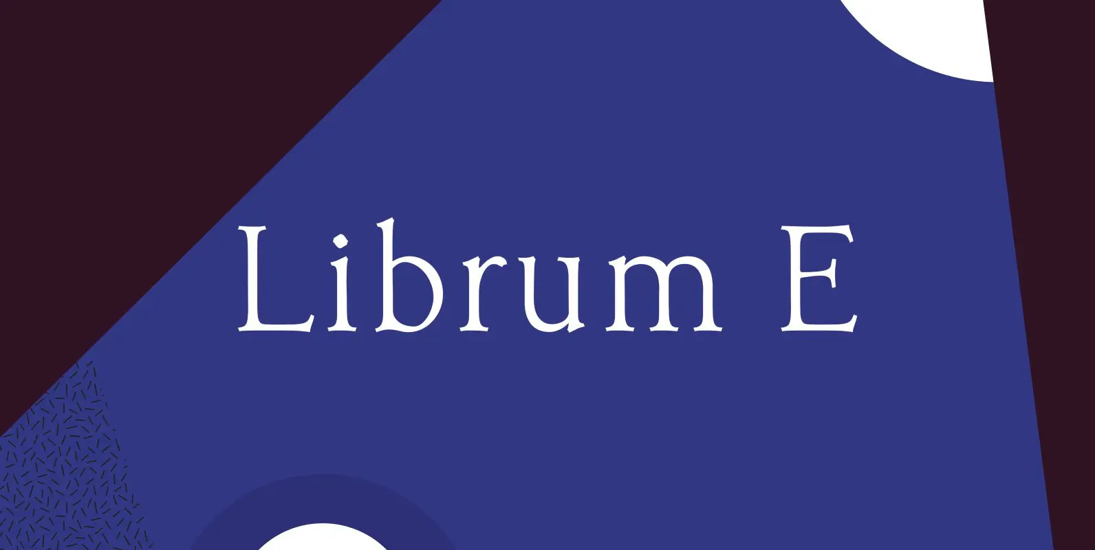
The major focus of my life and ministry at this point is book design. In the brave new world of 21st century self-publishing a new paradigm has arisen: the indie small shop. One of the problems is that all books
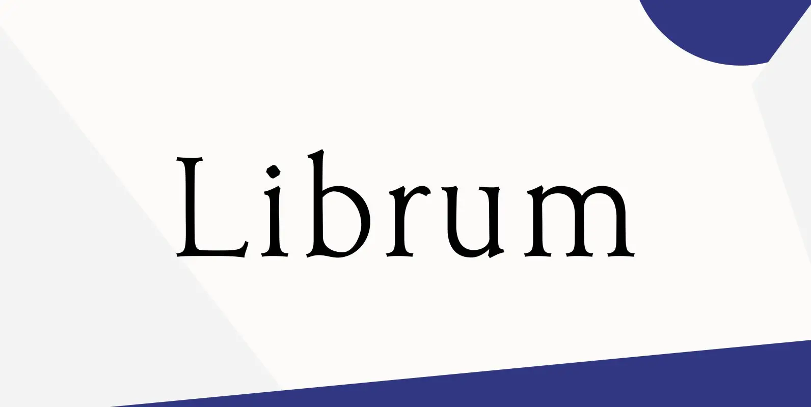
This is the serif text family for the book design group of font families which David designed in the process of writing “Practical Font Design With FontLab 5”. The letterspacing is set wide for body copy use. The main purpose

Like Phenix out of the ashes the former Schriftguss hot-metal font “Rautendelein” has come to live again. Carina Pro was carefully extended for multilingual use, and contains a few alternates which can be activated via the swash OpenType feature. Published
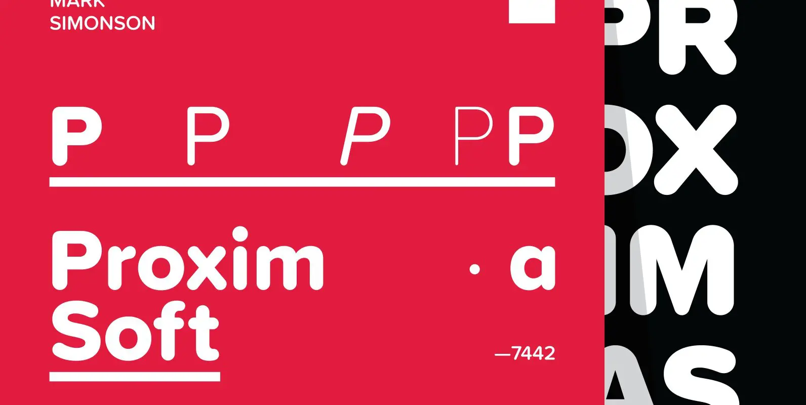
Proxima Soft (2017) is a rounded version of Proxima Nova. With the same forty-eight styles (eight weights in three widths, plus italics), Proxima Soft fits the bill when you want something a bit warmer and more playful than its older