Tag: readable
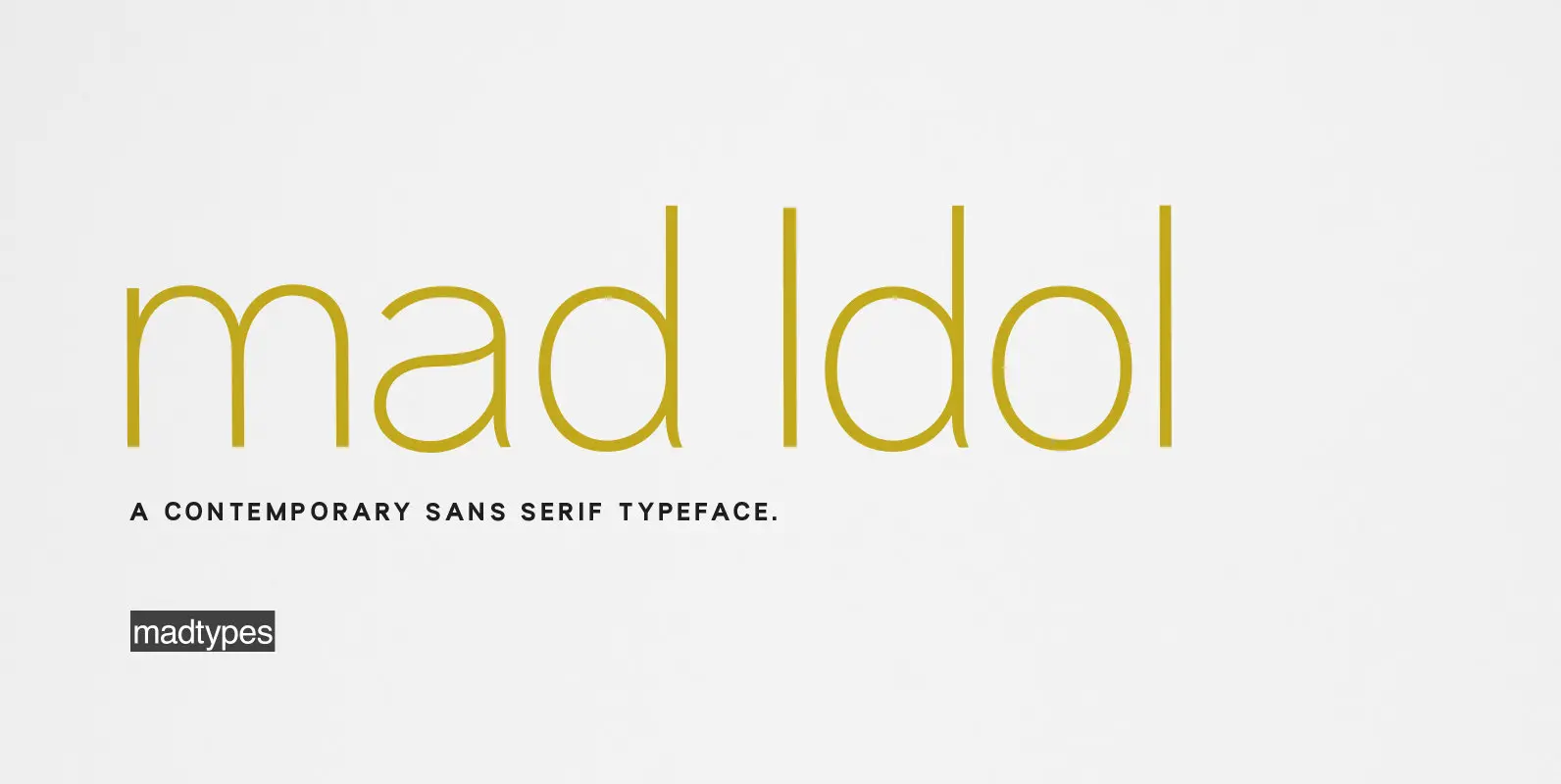
mad Idol Font
mad Idol is inspired by “Thai Handwriting Exercise Book”, with rounded head and circular as “Thai modern classic form” which is the key concept for this sans serif type family. It comes with 4 weights, each weight includes extended language
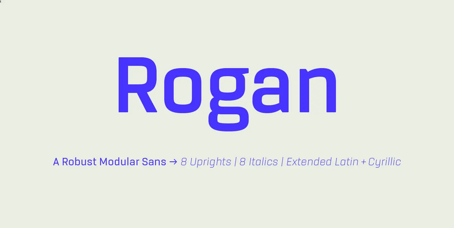
Rogan Font
Rogan: A Robust Modular Sans. Rogans clean lines started out as an exercise in modularity and geometric forms. This initial construction approach was then adapted to improve the functionality of the family; Breaking away from the strictly modular system in
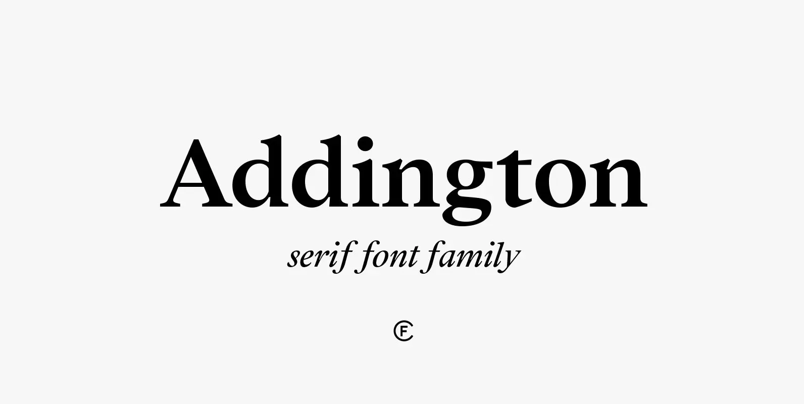
Addington CF Font
Addington is a graceful and reliable serif, useful in any situation. Beautiful yet practical, Addington is designed for excellence in text-heavy settings while doubling as a capable and strong display typeface. Complete with seven weights, true italics, and many OpenType
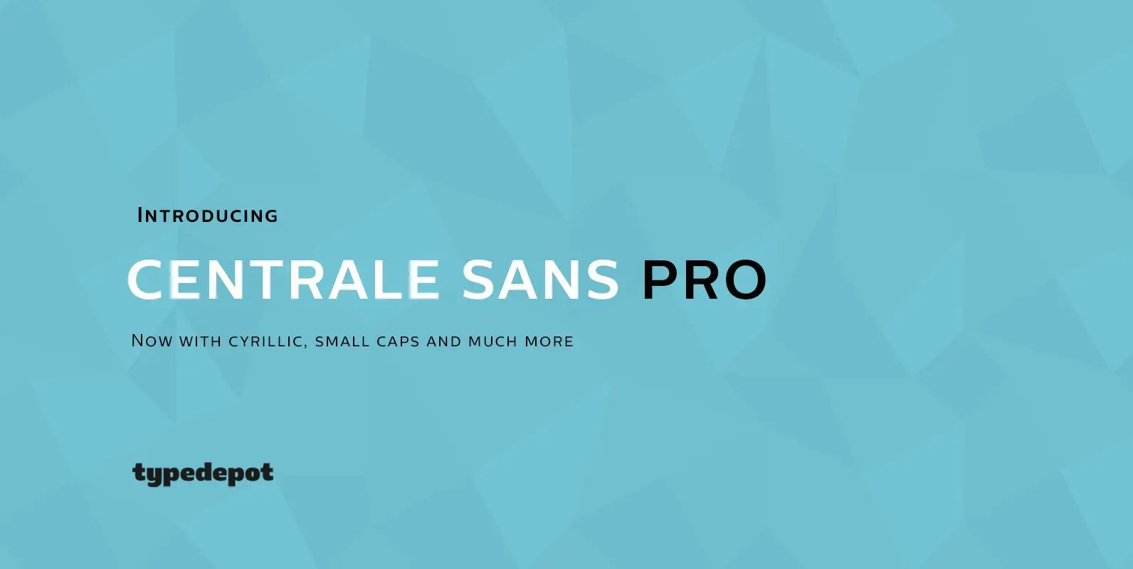
Centrale Sans Pro Font
We have finally finished our work on Centrale Sans. A lot of mistakes have been made, and we hope a lot of them have been fixed. But finally we are ready to end this five-year journey and present you the
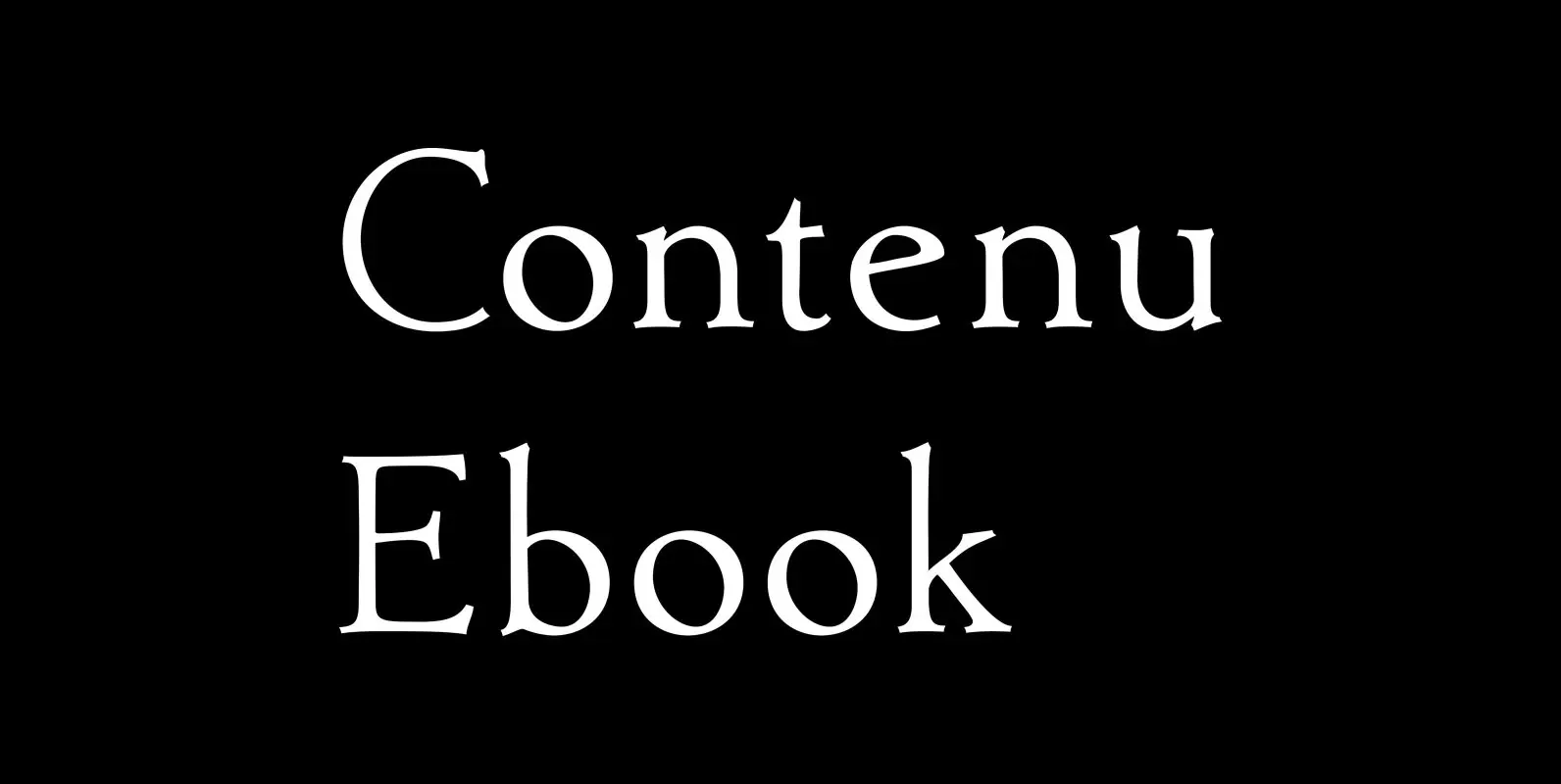
Contenu Ebook Font
This is the 4-font Contenu ebook family. It is a set of ASCII fonts which are designed to work within the limitations of ePUB Reflow and Kindle KF8 ebooks. It has oldstyle figures, plus several of the ASCII slots are

Bookish Font
This all started with a love for Jenson I know there’re hundreds of variations a on that theme. But, that is where I began, several years ago. How far it came, as usual, as I wandered through the vagaries of

Archaic Penpoint Font
This is a stylized blackletter font with many OpenType features and 403 characters — many of which are presently unknown for blackletter fonts: Caps, lowercase, small caps, old style figures, numerators, denominators, accents characters and so on. The idea is

Contenu Font
This is the 4-font Contenu Medium/Black family Contenu is the new book font family designed for an upcoming book on book family design. The name is French for content and this is what the family is designed for: text, body
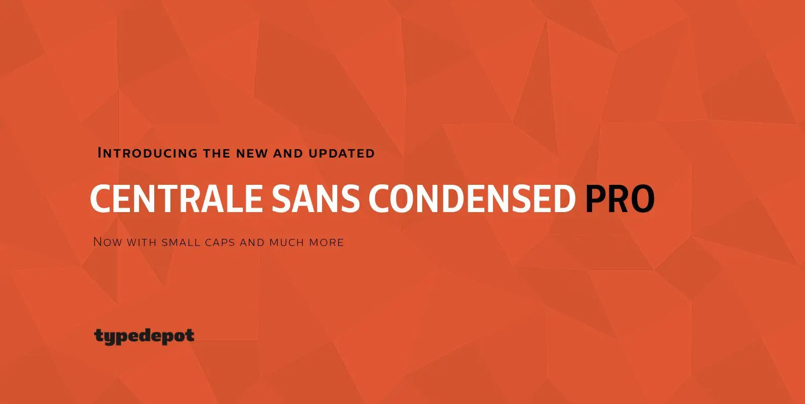
Centrale Sans Condensed Pro Font
Here comes the updated Pro version of Centrale Sans Condensed – not just a “squished” version of the normal Centrale Sans but designed from scratch with all the family characteristics in mind – combination of the grotesque and the humanist

Contenu Book Font
These are the five fonts of Contenu Book. Contenu is the new book font family designed for an upcoming book on book family design. The name is French for content and this is what the family is designed for: text,

Brinar Font
I’ve been working on a usable sans serif for body copy since the mid-1990s (though I certainly did not know it at the time). This one works well. It started life back in the mists of time as an old
Contenu Publishing Suite Font
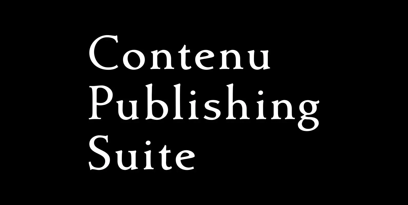
Contenu is the new book font family designed for an upcoming book on book family design. The name is French for content and this is what the family is designed for: text, body copy, and book layout. If it has
Artimas Font
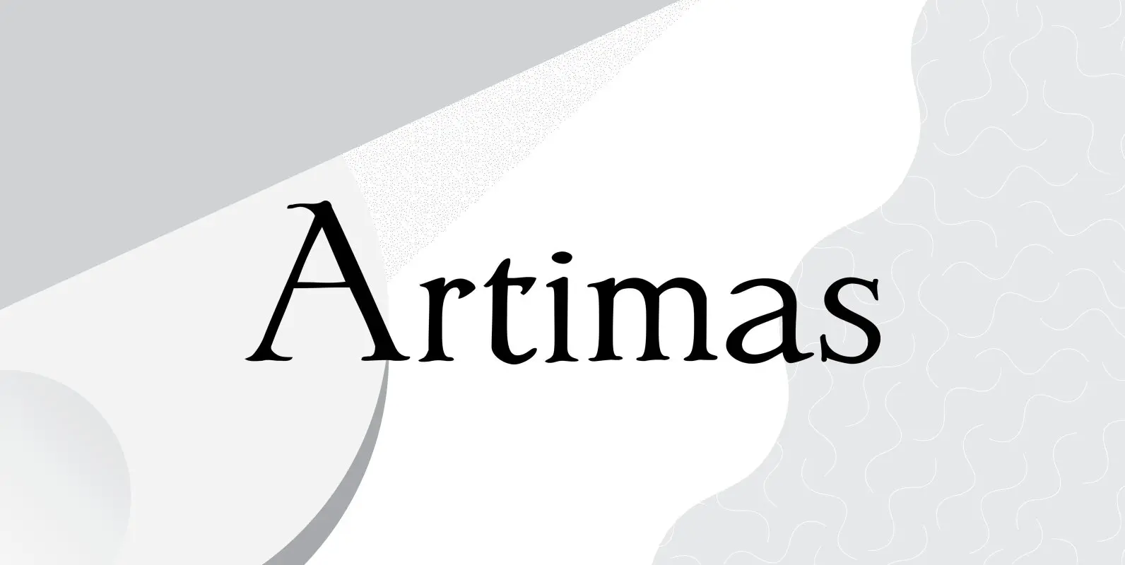
The Artimas family is the new book design font family developed out of Aramus. These new serif typefaces are readable and graceful — part of my development of a series of book families. Aramus was very popular for a single

Buddy Font
Buddy is the new companion sans for Contenu, the book font family designed for an upcoming book on book family design. It has the same vertical metrics as the Contenu families, so it fits perfectly in run-in heads, nested styles,
Dylan Condensed Font
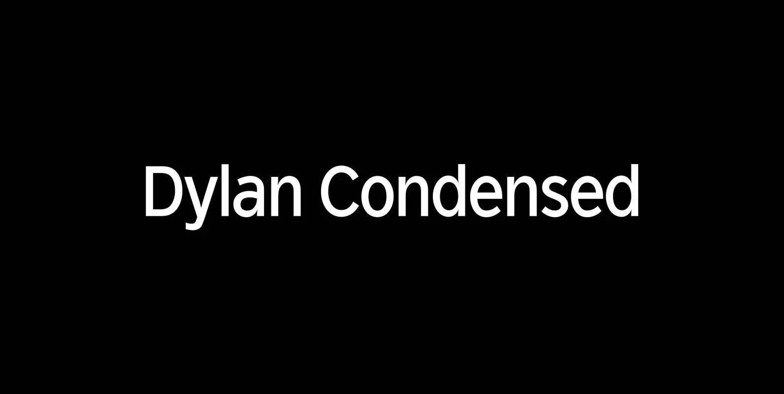
Dylan is a Sans typeface in the best American tradition. In order to keep corners open and to make the font more readable in small sizes it has deep cuts where curves join straights. I designed 8 finely tuned weights
