Tag: refined
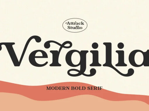
Vergilia Font
Vergilia is a serif font design published by Attract Studio Published by Attract StudioDownload Vergilia
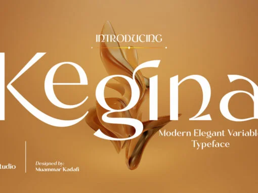
Kegina Font
Kegina is a decorative font design published by Attract Studio Published by Attract StudioDownload Kegina
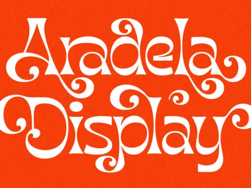
Aradela Display Font
Unleash a psychedelic vibe with Aradela Display: the ultimate font for stand-out projects. Combining unique ornamental features and opentype ligatures & alternates, this typeface brings harmonious style to any design. Let Aradela’s captivating brightness light up your creative work! Published
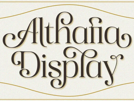
Althafia Display Font
Althafia Display is a decorative font design published by Attract Studio Published by Attract StudioDownload Althafia Display
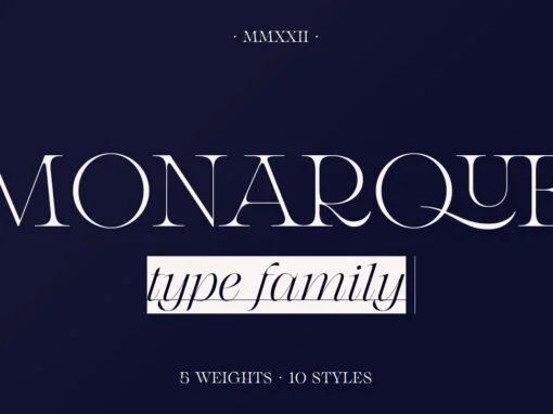
Monarque Font
Monarque is a serif font design published by The Paper Town Published by The Paper TownDownload Monarque
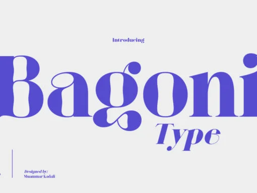
Bagoni Type Font
For a look that’s classic but still modern, choose Bagoni Type. Its serif-inspired design is perfect for editorial media style layouts from the 80s with its high contrast and simple shape making it effortless to read – whether your text
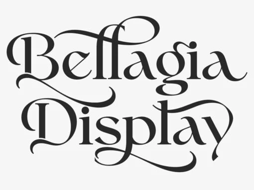
Bellagia Display Font
Bellagia Display is a serif font design published by Attract Studio Published by Attract StudioDownload Bellagia Display
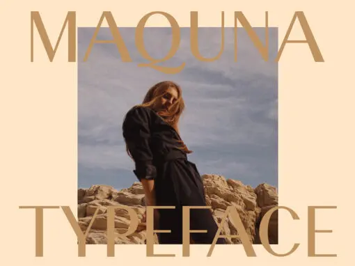
Maquna Font
Maquna is a sans serif font design published by Kurt Harahap Published by Kurt HarahapDownload Maquna
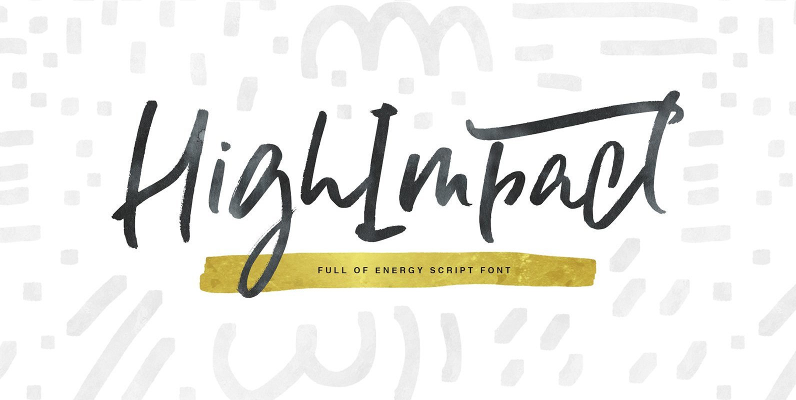
High Impact Font
High Impact is a hand drawn script font with organic feel. It was made for sports and fitness industry, as it’s highly energetic and active. Bouncing baseline makes this font both playful and unique. And tons of ligatures (that will
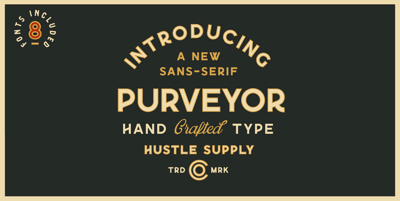
Purveyor Font
Purveyor is a bold modern sans serif with a lot of character. This will be your “Work Horse” for a lot of projects. It works nicely for projects that require a more refined yet vintage aesthetic. Purveyor is a simple
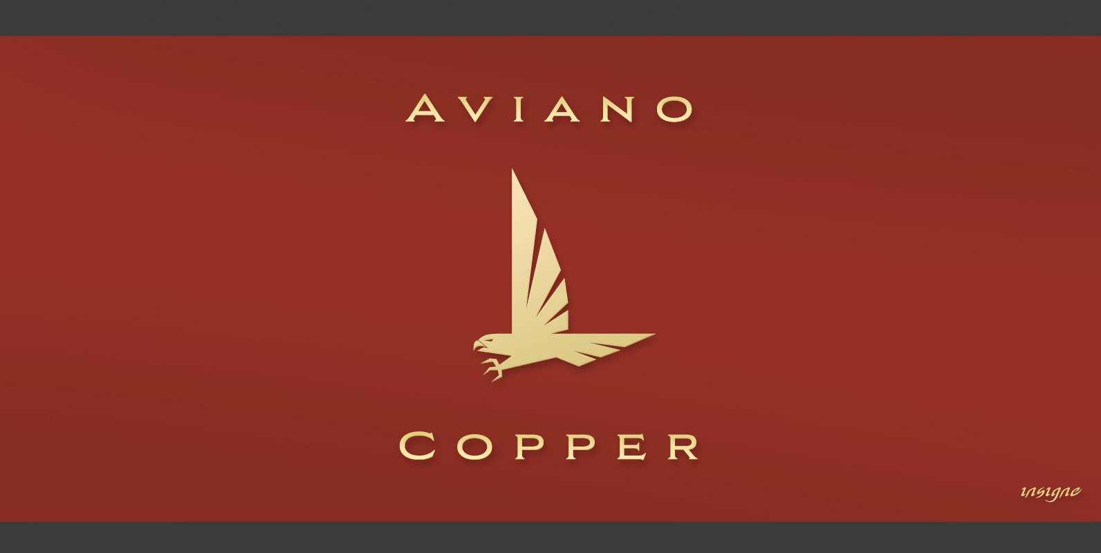
Aviano Copper Font
The retro-inspired design of Aviano Copper echos the bold style of America’s Gilded Age. Inspired by the copper-inscribed intaglio printing designs of the early 20th century, the powerful, wide character shape of this font walks softly across your page while
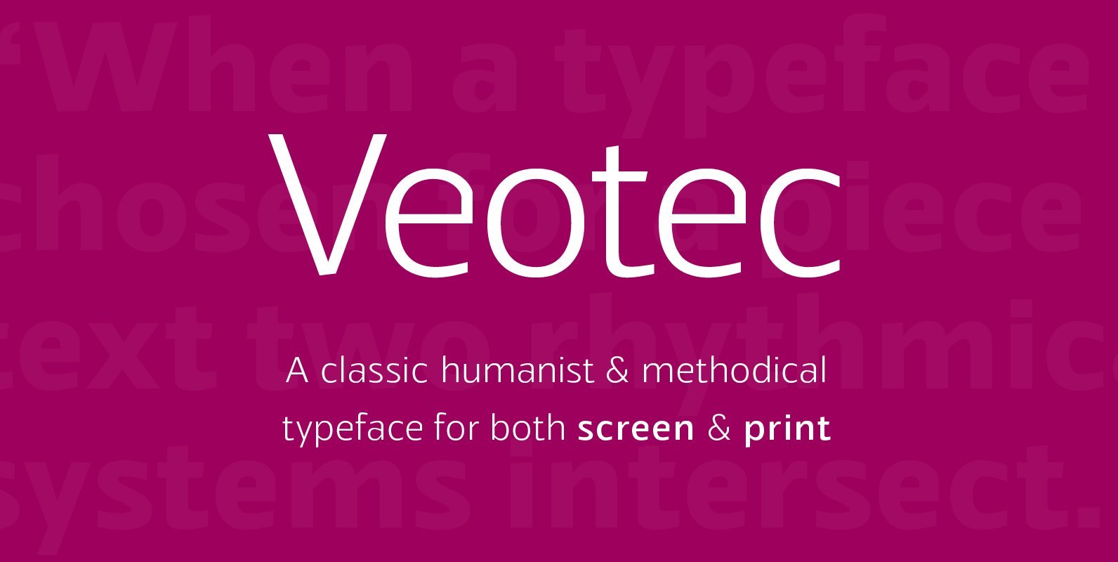
Veotec Font
Veotec is a classic humanist sans that skilfully works for both screen and print due to its steep and precise angles enabling more negative space. Not only does this methodical approach improve legibility and readability at small sizes, it allows
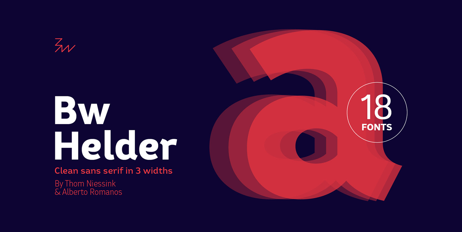
Bw Helder Font
Bw Helder is a clean and versatile sans serif combining gentle subtleties on its curves with remarkable spurs branching off its stems. It instills a friendly yet professional tone of voice, while maintaining the composure when used in longer paragraphs
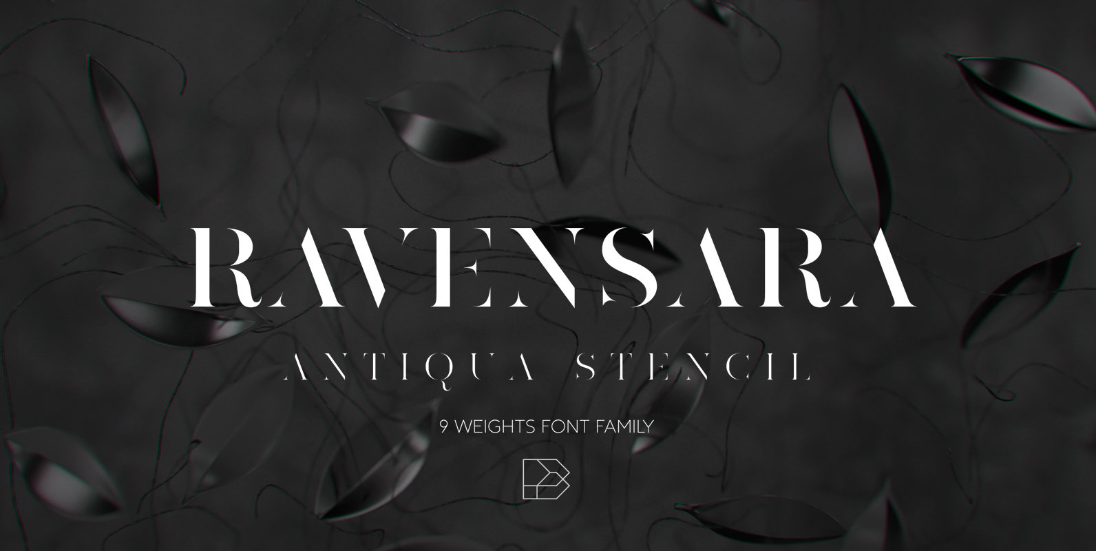
Ravensara Antiqua Stencil Font
Ravensara Antiqua Stencil is display font family with 9 weights, from Thin to Extrablack with hightest contrast. This font was inspired by old style classic typefaces, such as Didone and Baskerville, and got a modern feel by getting rid of
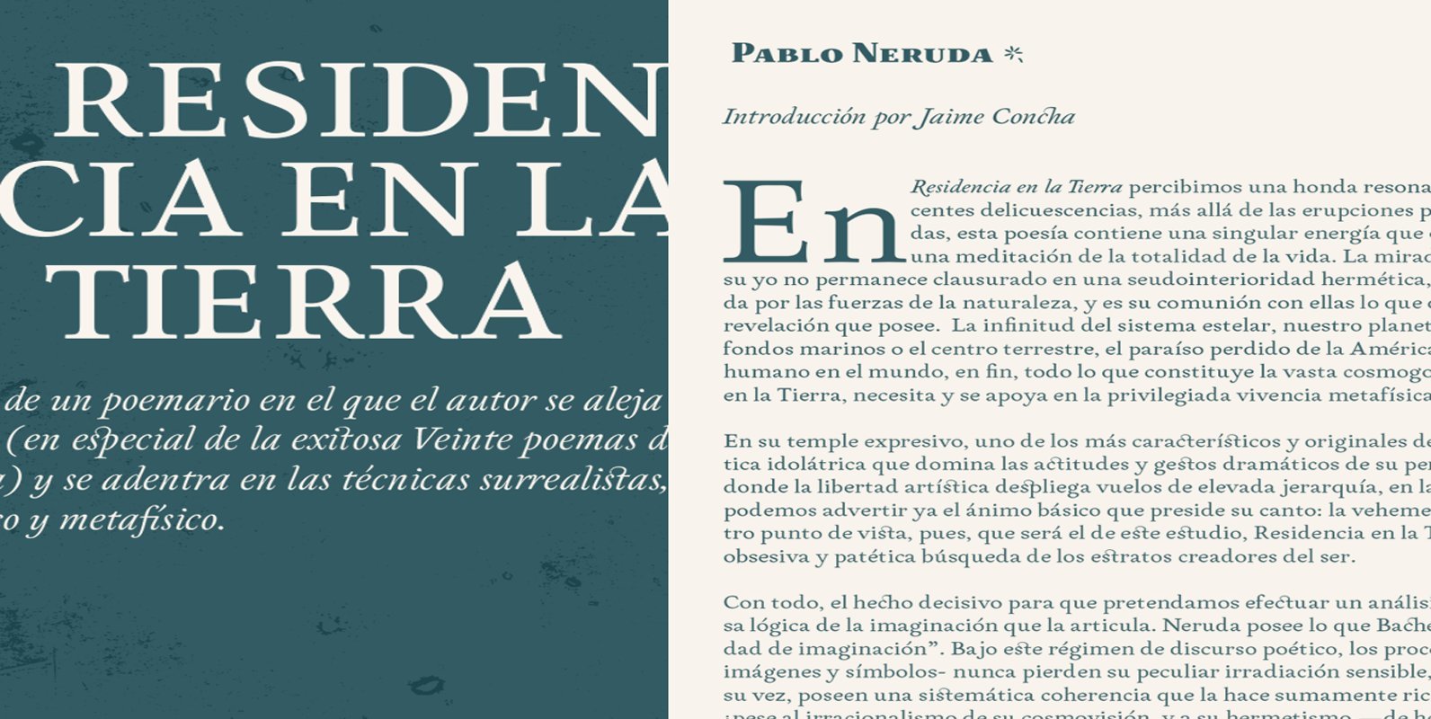
Neftalí Pro Font
Designer: Franco Jonas Hernández 2015 First Prize TipoType award. Neftali is a type family designed for continuous reading in long texts & editorial design, created as an interpretation of Pablo Neruda’s “Poema 20”. This work delivers a subtle experimentation of
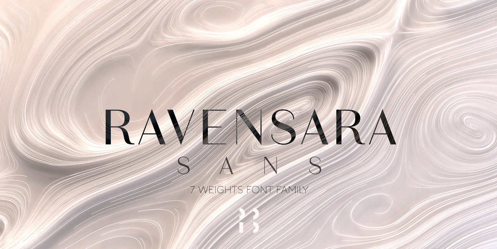
Ravensara Sans Font
Ravensara is a contemporary, high contrast, sans-serif font family that contains 7 weight options. Published by NaumTypeDownload Ravensara Sans
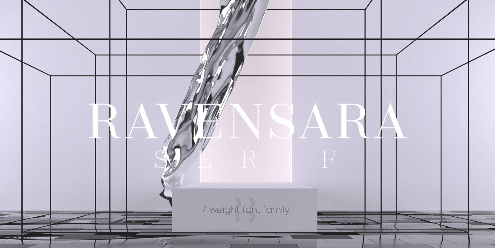
Ravensara Serif Font
Ravensara is an elegant, high contrast serif design that contains 7 weight options. Published by NaumTypeDownload Ravensara Serif