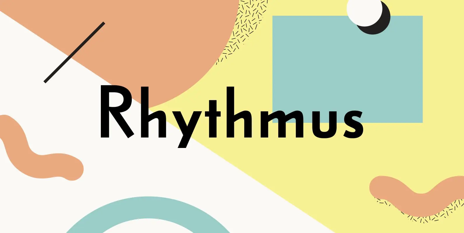
Rhythmus Pro Font
Schelter & Giesecke’s grotesk font family, widely used for their marketing and in-house prints, now revived and extended with a Cyrillic character set and old-style numerals. Published by RMU TypedesignDownload Rhythmus Pro
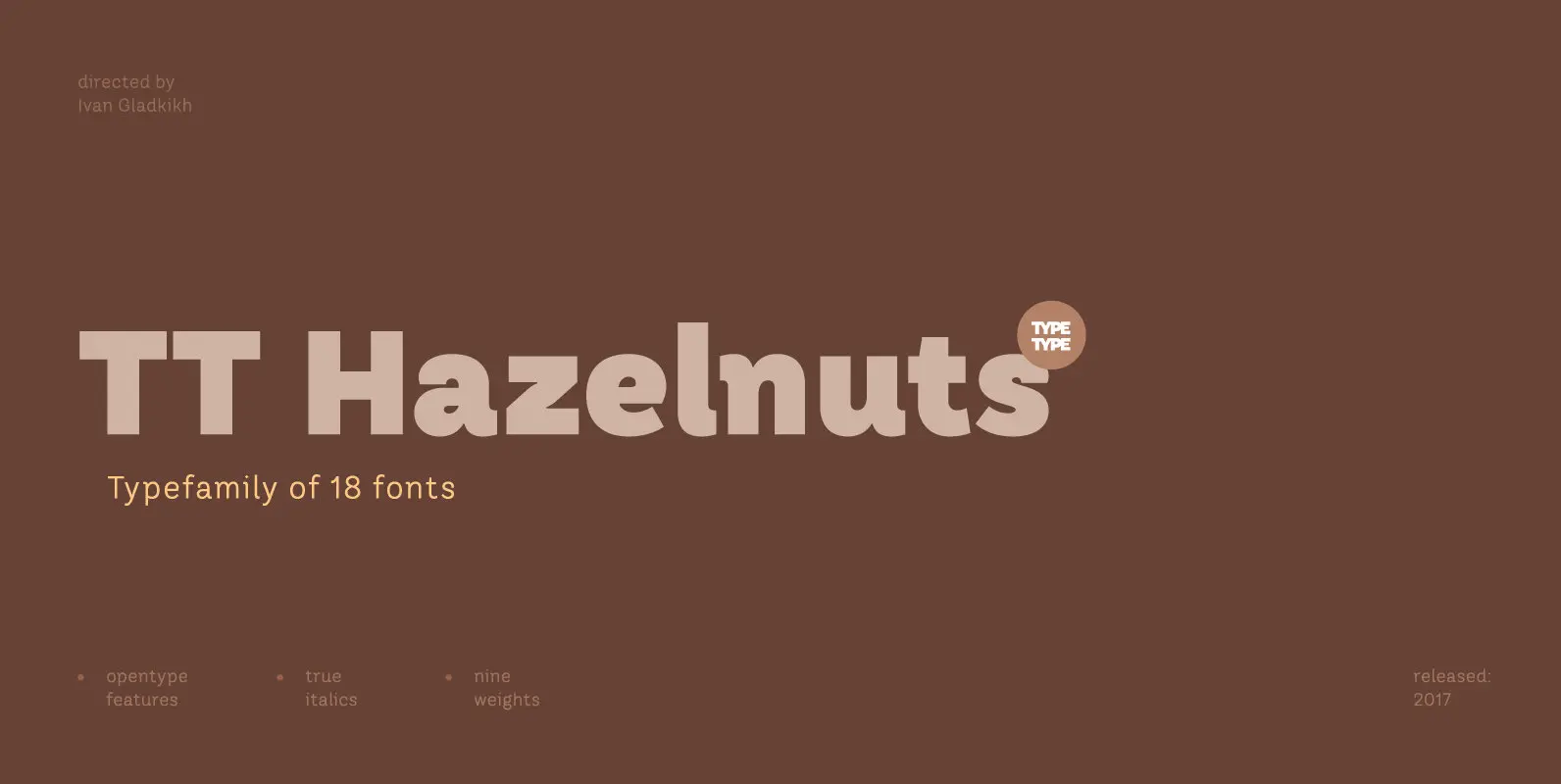
TT Hazelnuts is a display sans-serif font family containing a set of elegant and delicate decorative elements. Initially the family was designed for highly specialized areas, but we’ve decided to extend the number of typefaces and to make the family

Designed by Daniel Hernández and Paula Nazal. Corrections and review by Alfonso García and Rodrigo Fuenzalida. Trenda is a geometric sans-serif typeface based on the uppercase of Trend—a Latinotype font, released in 2013, that was very well received. This new
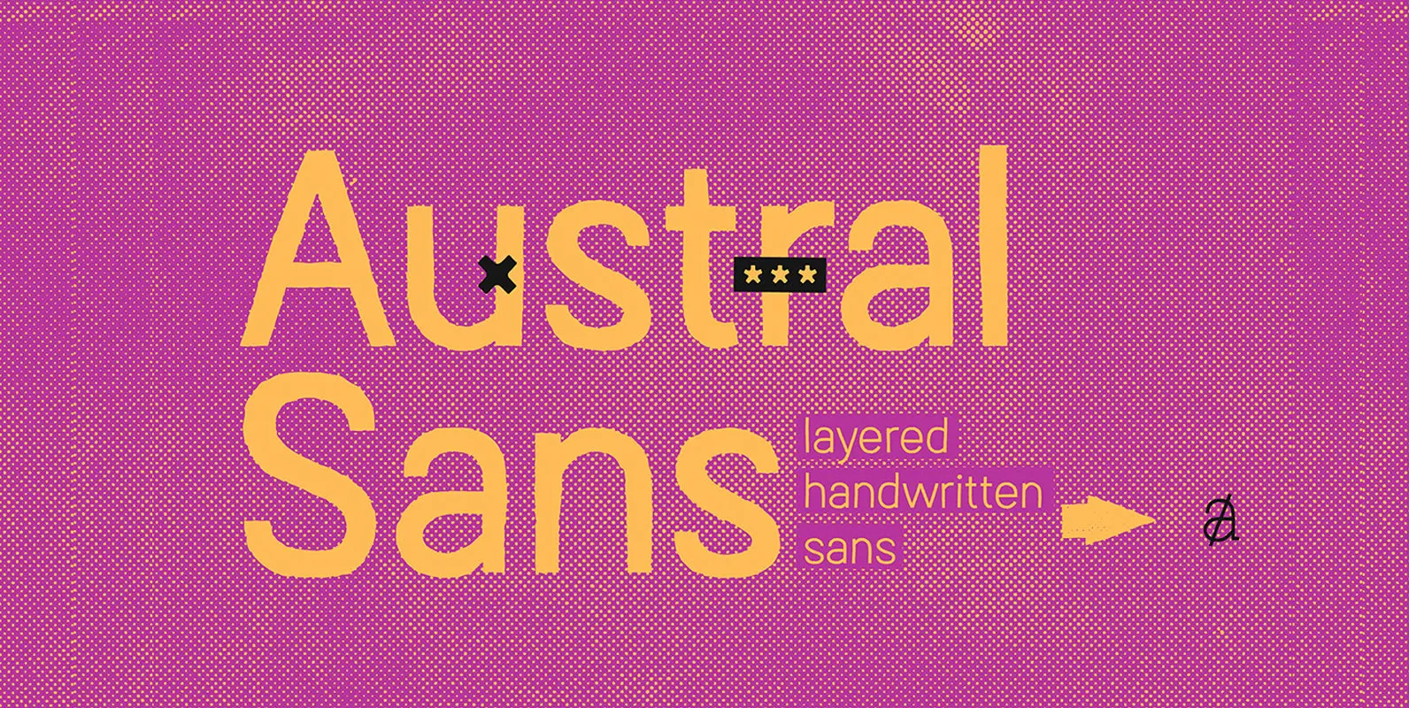
Austral Sans is a hand-drawn layered font designed by Antipixel. Based in the Slab version, it is part of the Austral type family. This sans makes your work unique & noteworthy, because the possibilities of combinations of textures & styles
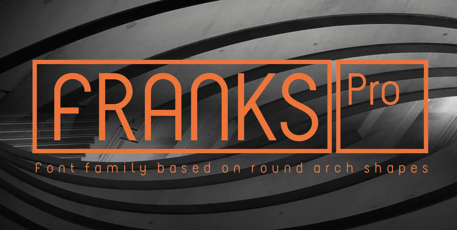
The design of Franks Pro is based on round arch shapes. The font supports all european languages and contains 3 styles. Published by Philippe MoeschDownload Franks Pro
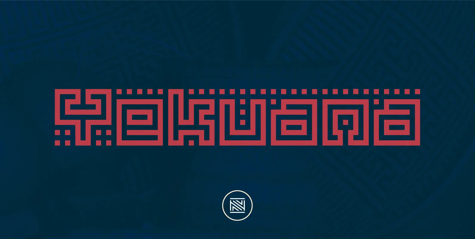
Yekuana is a typeface whose design is based primarily on the study of certain geometric ethnic ancestral Venezuelan signs, visually rich and originally used in the enrichment of various utilitarian objects with high symbolic and cultural content. Yekuana is a
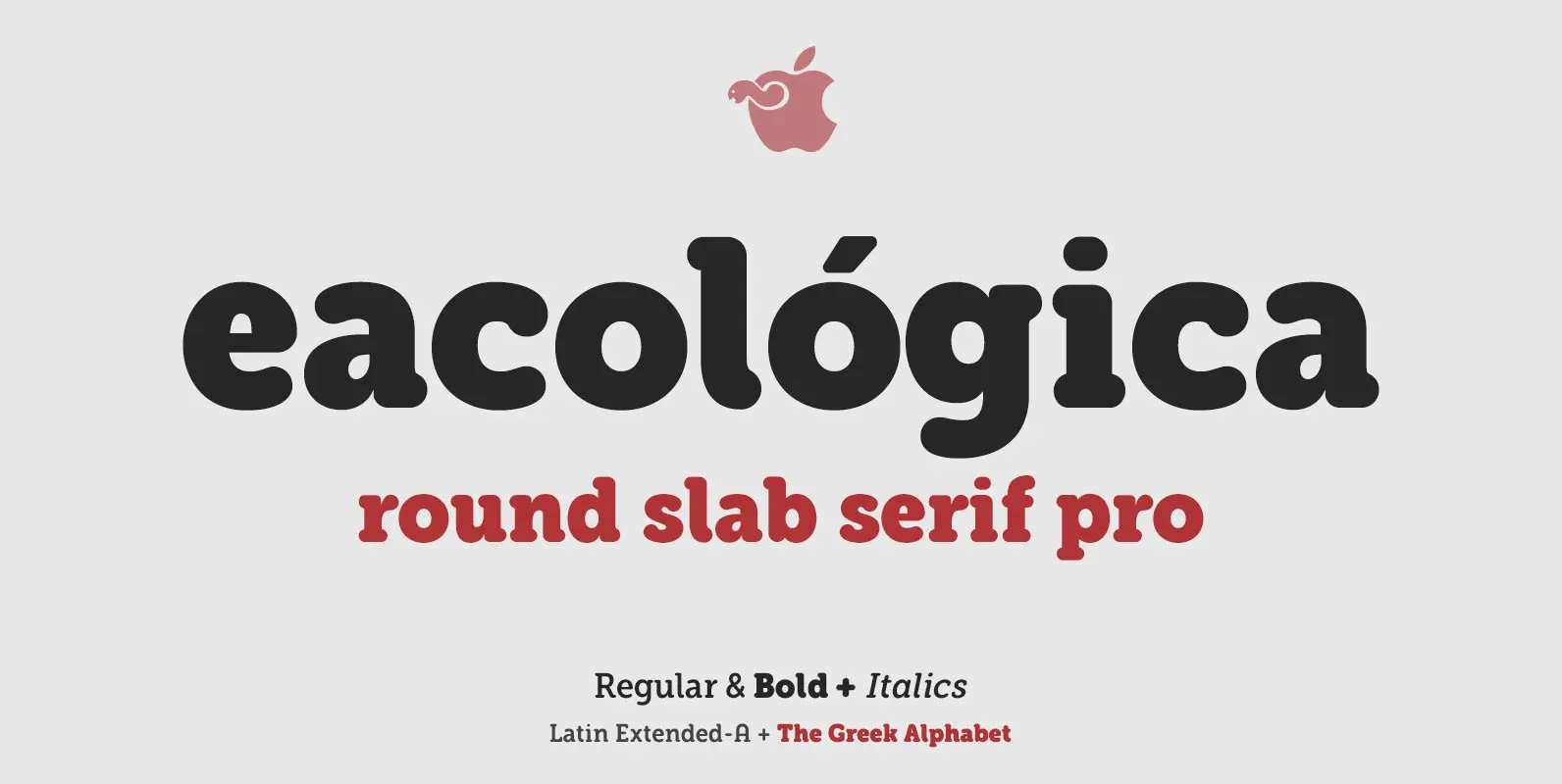
Eacológica round slab is a chunky slab serif typeface with thick rounded, ideal for very readable sturdy-looking titles. You can use this font for headlines in editorial design, advertising and also for designing posters, signs or posters in all cases
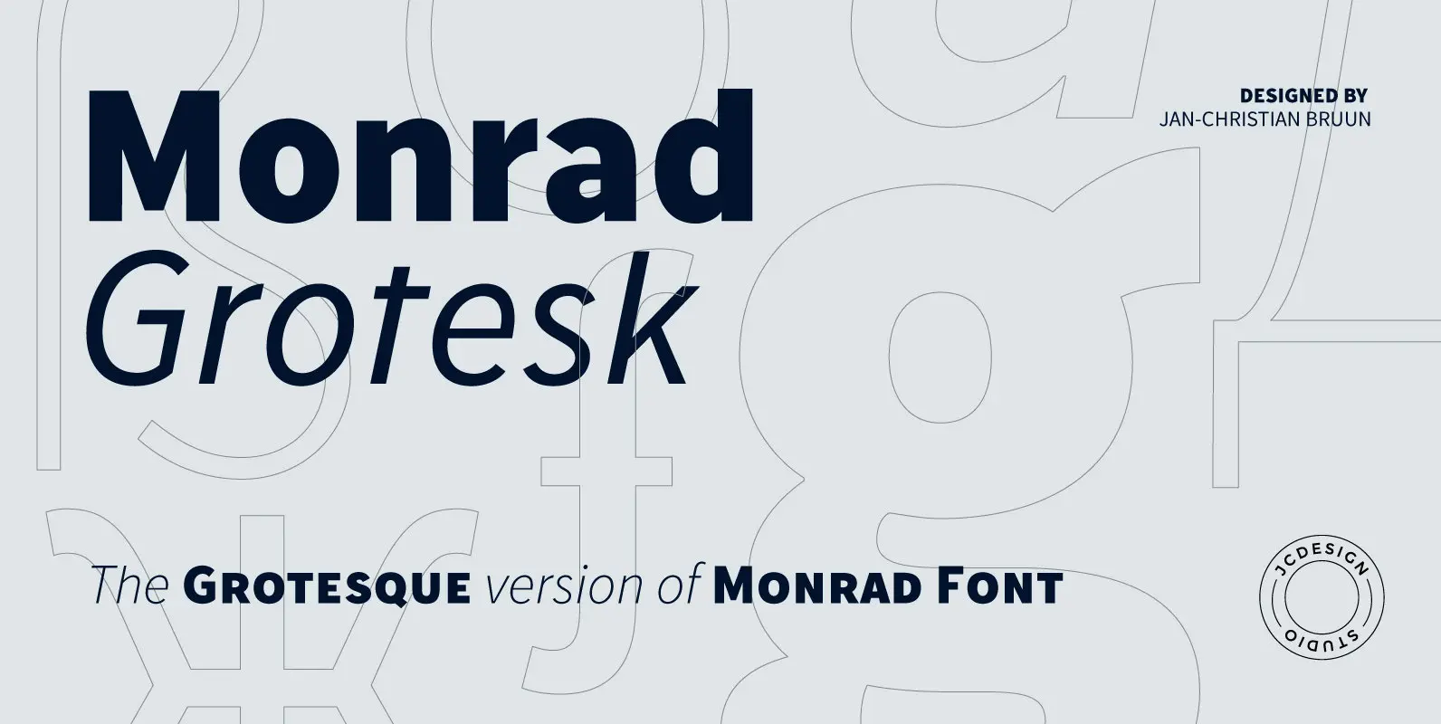
Monrad Grotesk is a modern grotesque font characterized as a sans serif. It is another version from Monrad Sans. The font consists 6 styles including italic version, manually edited kerning. The idea of the font is to create a blend
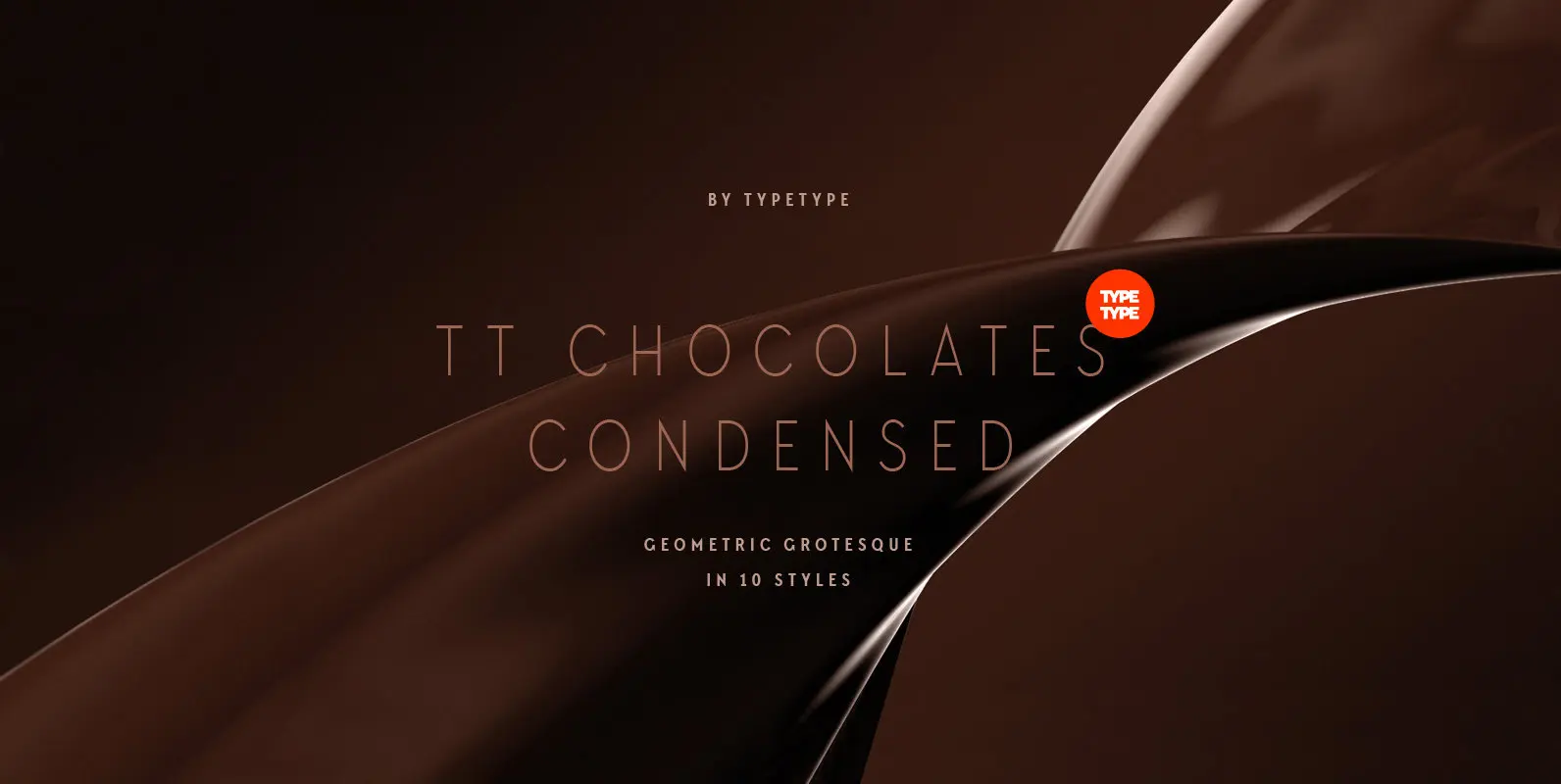
Have you heard the expression, 'you can never have too much chocolate'? We completely agree with this point of view and are gladly presenting you the TT Chocolates Condensed fontfamily, the narrow version of your favorite TT Chocolates. Keeping its
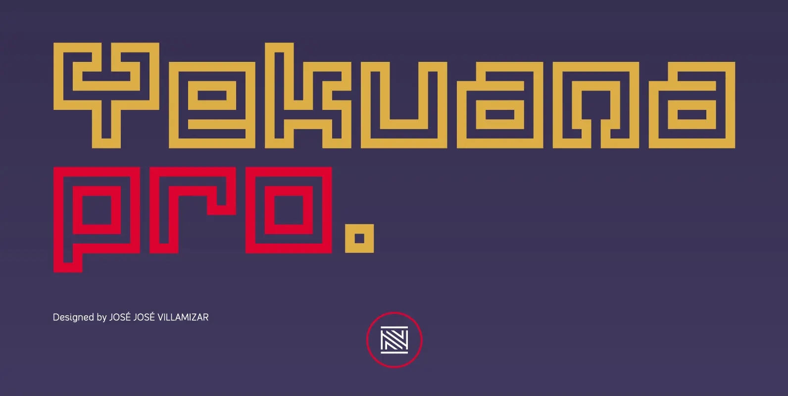
Yekuana Pro is a typeface whose design is based primarily on the study of certain geometric ethnic ancestral Venezuelan signs, visually rich and originally used in the enrichment of various utilitarian objects with high symbolic and cultural content. It’s a
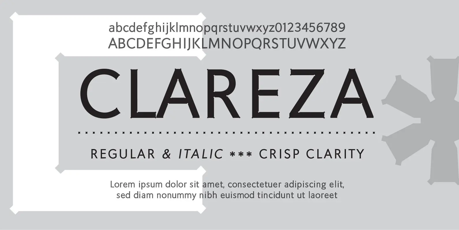
Clareza means “Clarity” in Portugese. That was exactly the goal in creating this font. We managed to create a font that is crisp and extremely legible at all sizes but then comes to life in an interesting and unusual way
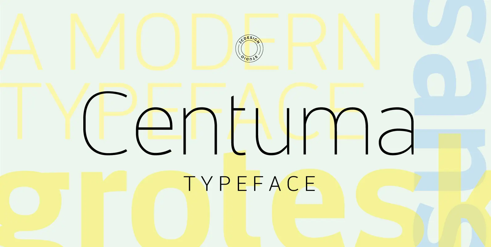
Centuma typeface is a modern grotesque sans font. It's mild contrast and multiple different styles – Black, Bold, Medium, Regular, Light and Thin. The organic shape is in focus, and especially in e, s and &. The starting point is
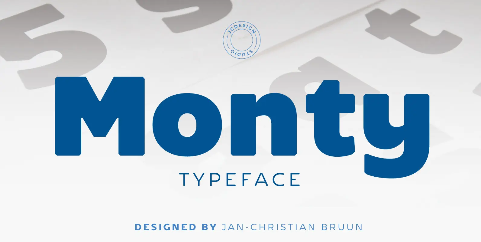
Monty is a new re-designed font family characterized as grotesque sans serif. The dynamics of the letters G, K and A adds an additional sharpening and a rounded softness to all of scripture and provide extra versatility, which makes Monty

Schelter & Giesecke’s grotesk font family, widely used for their marketing and in-house prints, now revived and extended with a Cyrillic character set and old-style numerals. Published by RMU TypedesignDownload Rhythmus Pro
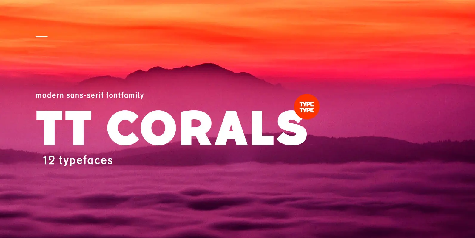
TT Corals is a modern humanistic sans-serif which has many typical traits of the beginning of the 20th century. For an increased functionality of the font family we’ve created 6 typefaces of various weights: Thin, Light, Regular, Bold, Extrabold, Black.