Tag: rockwell
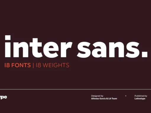
Inter Sans: An Aesthetic Dance of Geometry and Timeless Charm
In the ever-evolving sphere of digital and graphic design, finding a font that embodies both versatility and personality can be a veritable challenge. Enter Inter Sans, a stirring fusion of early 20th-century charm and contemporary geometrical precision. Designed to respond
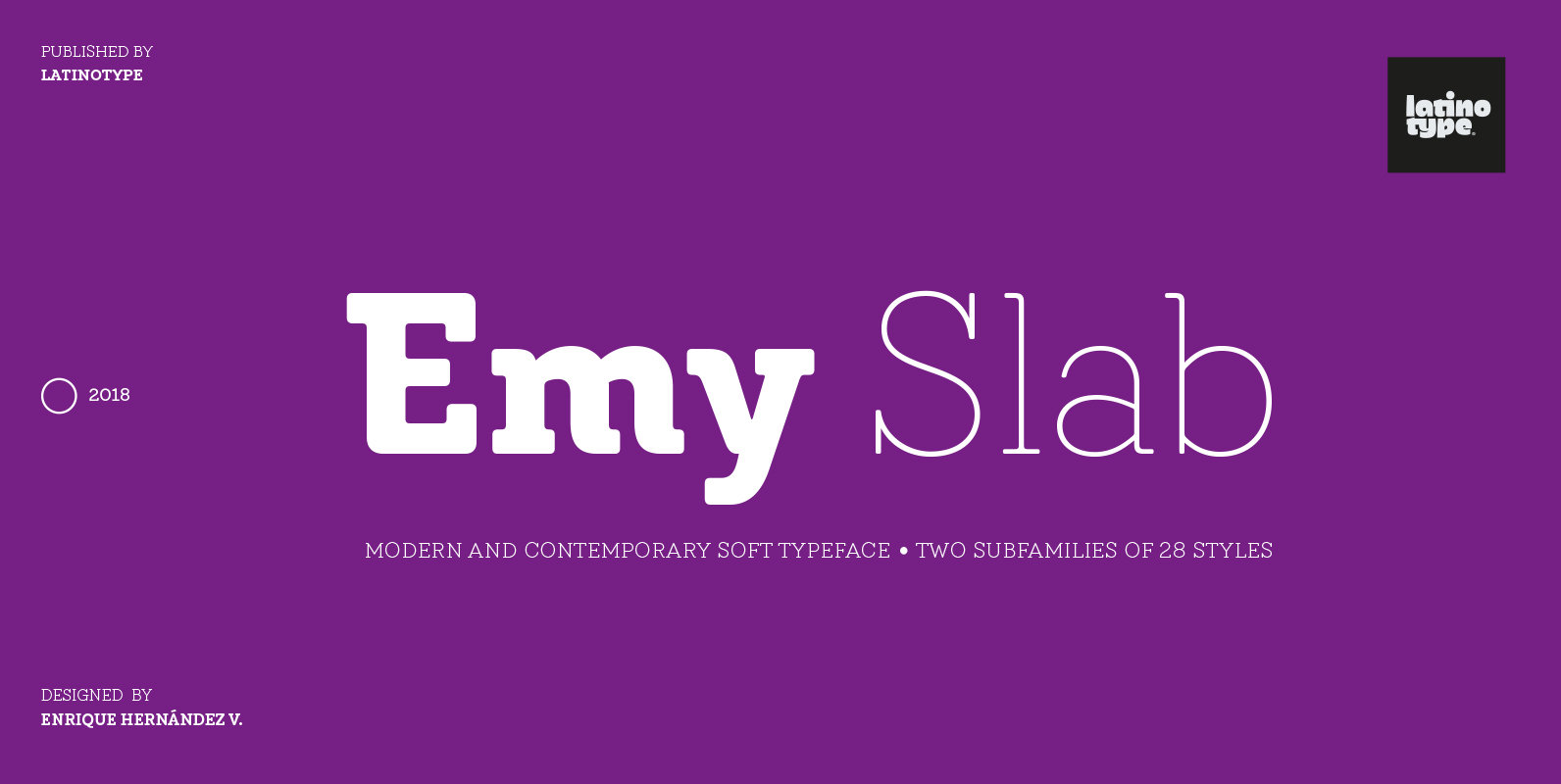
Emy Slab Font
Emy Slab is a slab serif based on the classical proportions of Egyptian typefaces but with soft terminals that give the font a more friendly and modern look. Emy Slab consists of two subfamilies of 7 weights, ranging from Thin
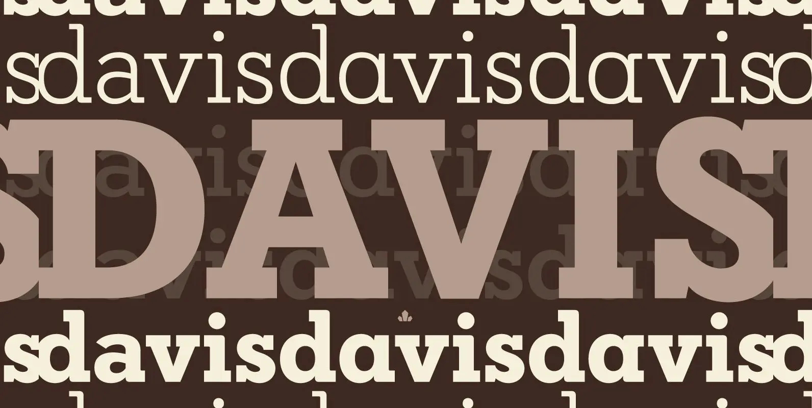
Davis Font
P22 Blox is a modular system of shapes that can build letterforms and abstract patterns. Created as a working prototype for the letterpress P22 Blox project from P22 Analog and Starshaped Press, this system of shapes presents a unique approach
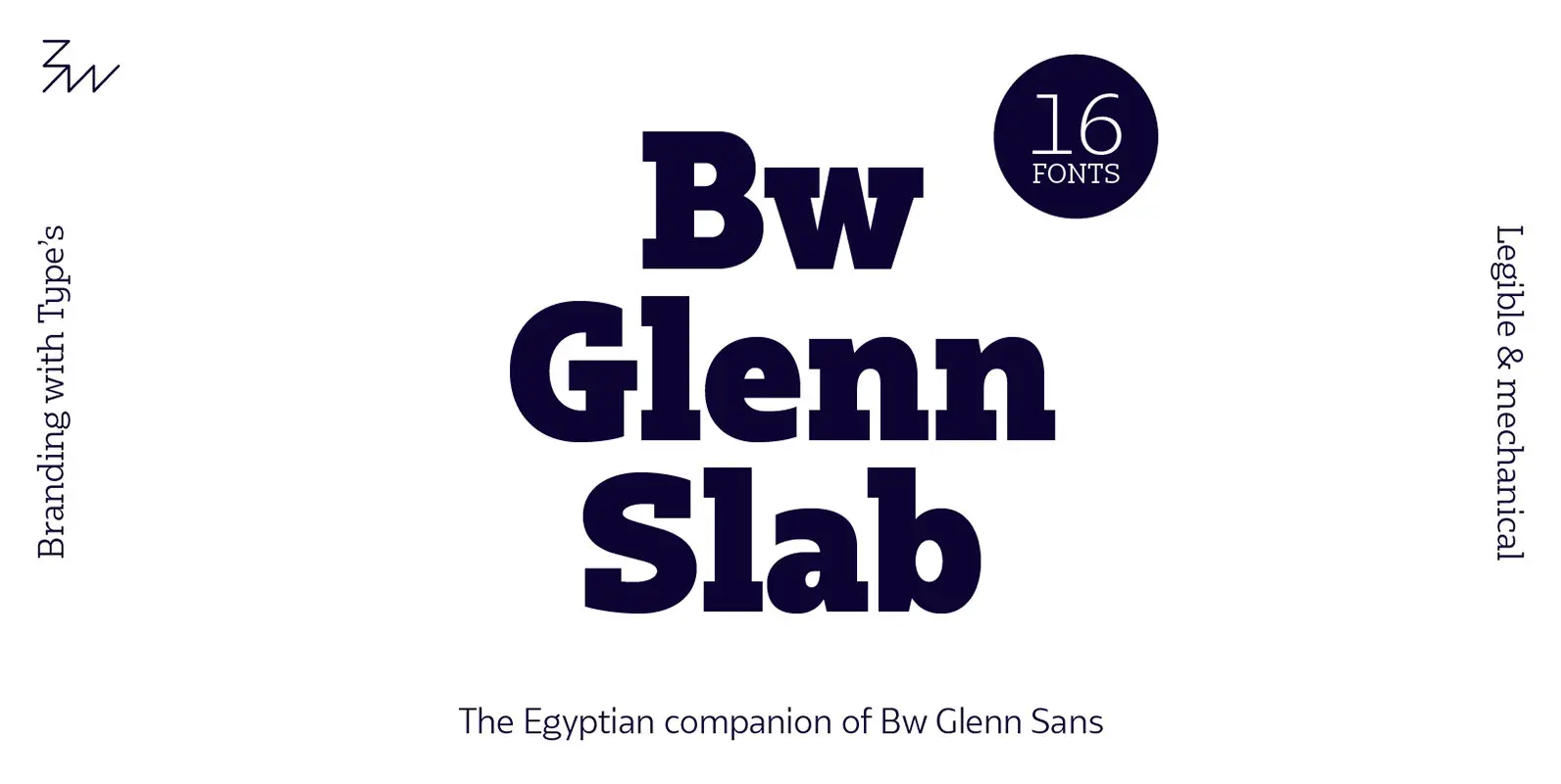
Bw Glenn Slab Font
Bw Glenn Slab is a confident and robust font family with a sturdy feel offering no concessions for ambiguity. Its strict geometry and open shapes provide a very legible and clean texture, performing well on print and screens alike. It’s
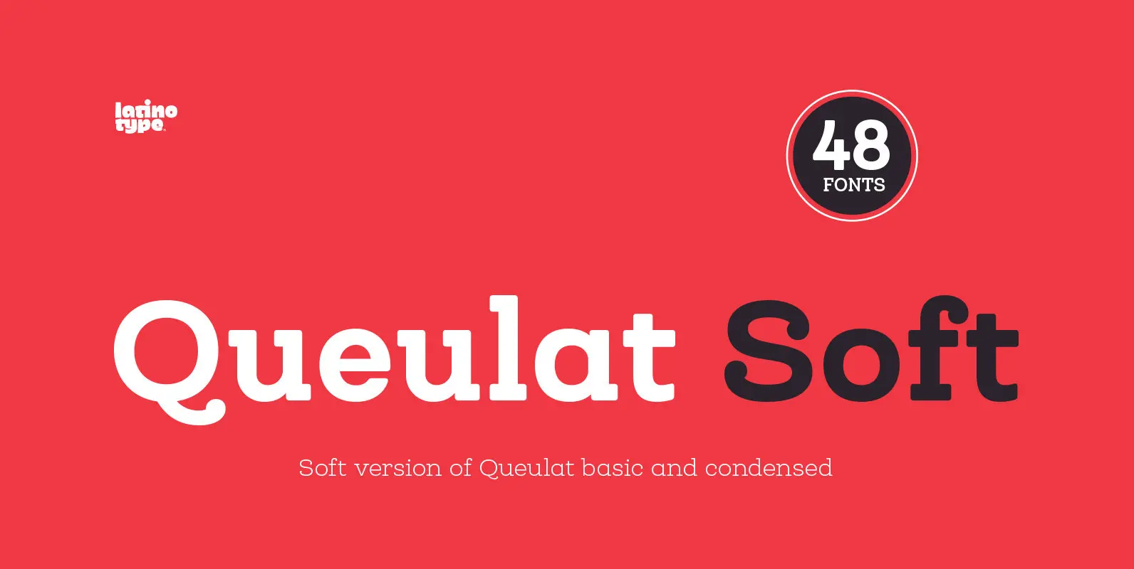
Queulat Soft Font
The font is the soft version of the Queulat basic and condensed families, but keeping the same features as the original typeface. Queulat Soft is a hybrid font that combines different styles, reflecting charm, freshness and, especially, a strong personality.
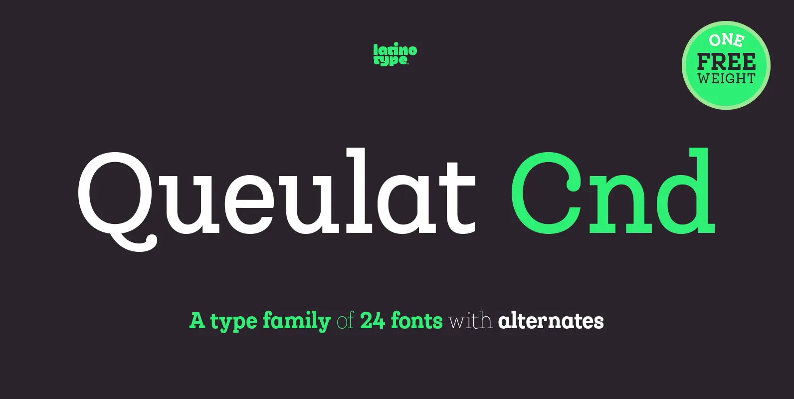
Queulat Cnd Font
This font is the condensed version of Queulat, but keeping the same features as the original typeface. Queulat Cnd is a hybrid typeface that combines different styles, reflecting charm, freshness and, especially, a strong personality. Since it is a condensed
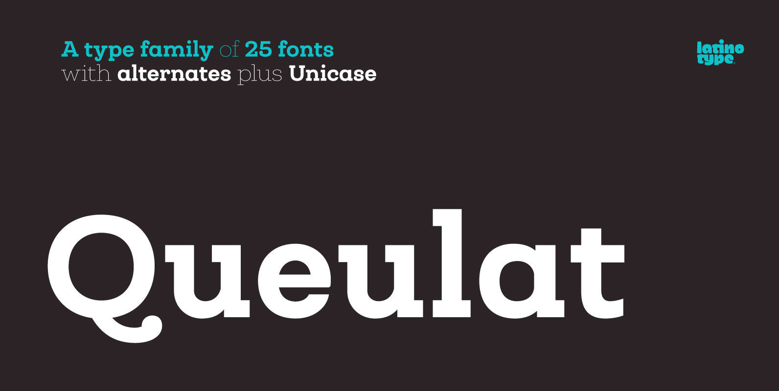
Queulat Font
Queulat is a hybrid typeface that combines two different styles, reflecting charm, freshness and, especially, a strong personality. The font is inspired by Modern and Grotesk styles. The former is shown in some characteristic features such as teardrop terminals, which
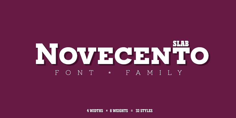
Novecento Slab Font
Novecento Slab is the “slab serif” companion of Novecento Sans, a font family inspired on european typographic tendencies between the second half of 19th century and first half of the 20th. This font face is designed to be used mostly
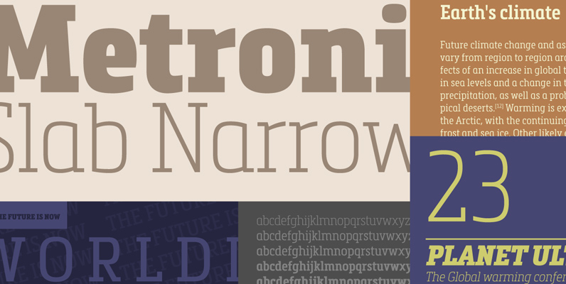
Metronic Slab Narrow Font
Metronic Slab Narrow is the condensed version of the Metronic Slab font family. This condensed style is designed for space-saving typography but with high legibility and versatility in mind. This Family also improved the needs of developers and graphic designers