Tag: roman
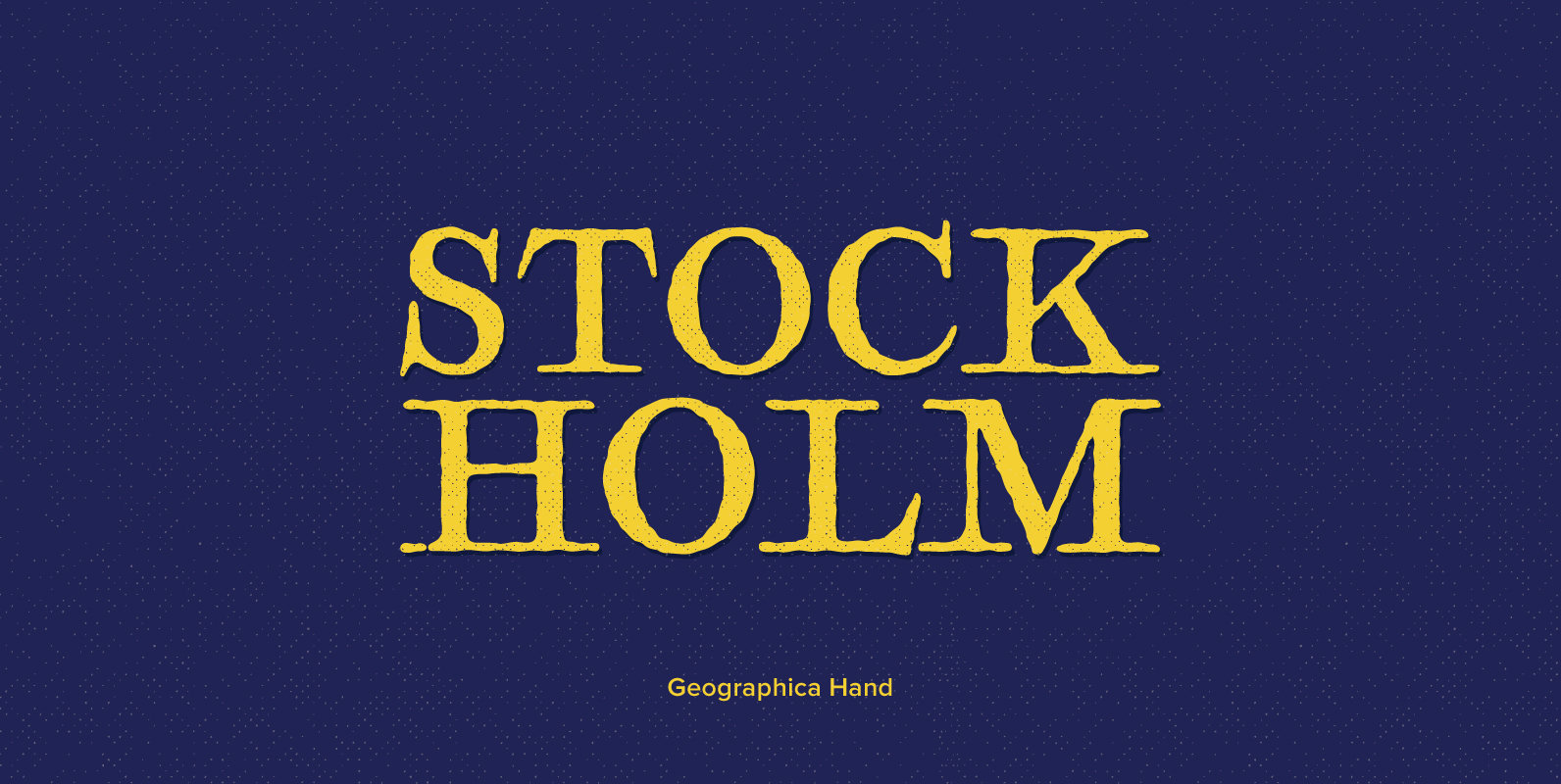
Geographica Hand Font
Geographica hand replicates the neat hand-lettering typical of engraved British maps of the 18th century, including the work of cartographers Emanuel Bowen (circa 1694–1767), geographer to king George ii, and Thomas Jefferys (circa 1719–1771) Geographica to King George iii. a
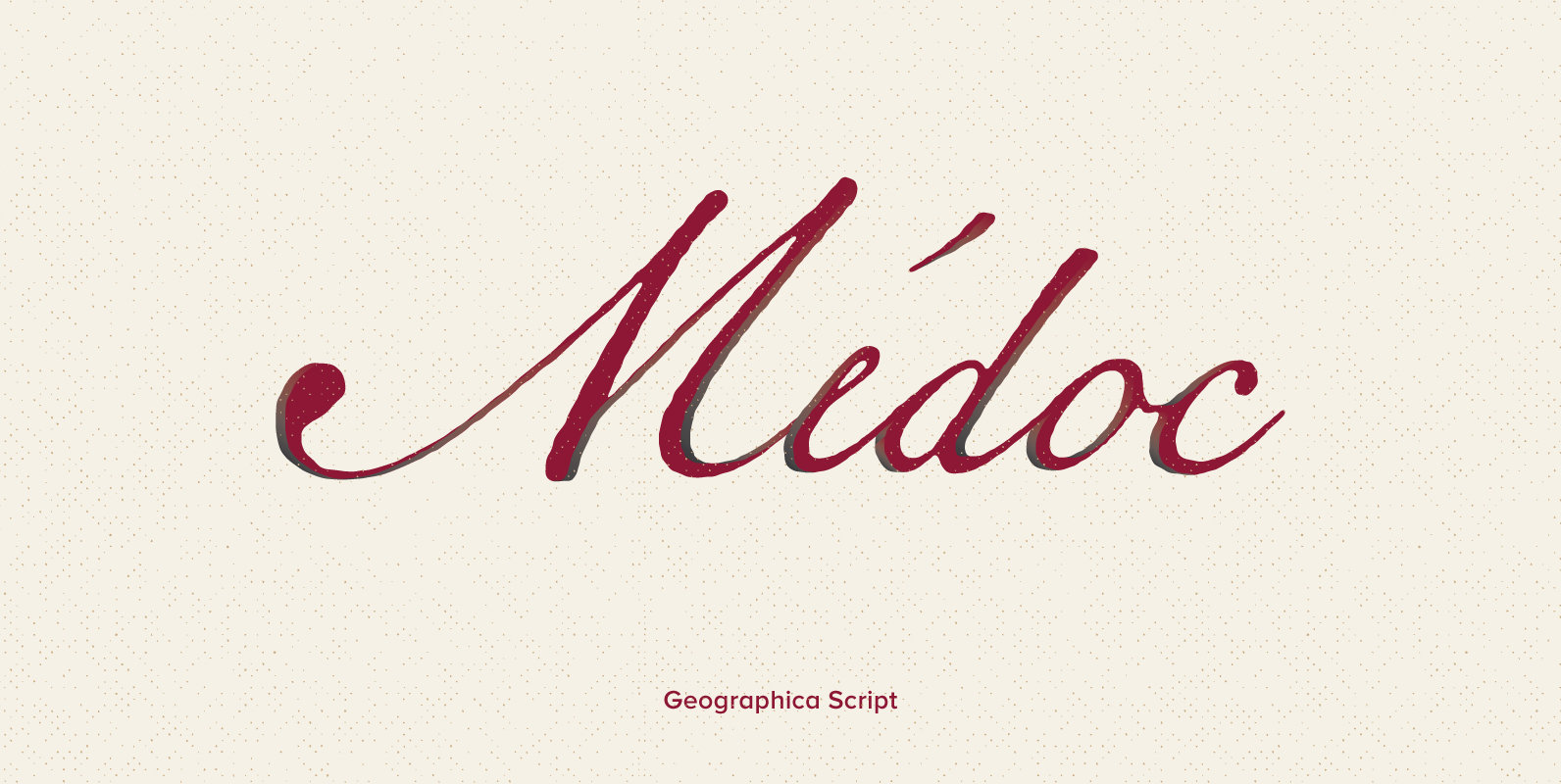
Geographica Script Font
Thank you for purchasing Geographica Script™, a member of the 3IP Type Library. We appreciate your business very much. Time-tested elegance is what you’ll get with Geographica Script, a handwritten typeface steeped in 18th century sophistication. Source materials include the
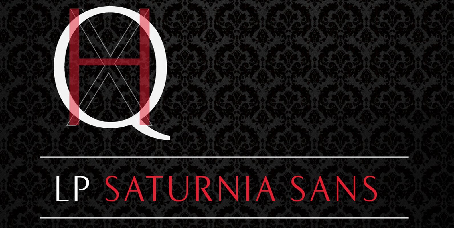
LP Saturnia Sans Font
Following up on the LP Saturnia, which is a modern interpretation of the classic Roman letterforms, comes the LP Saturnia Sans. While keeping the clear forms, this well-balanced Sans transports the original draft even further in the modern and at
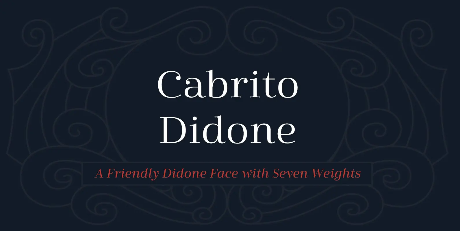
Cabrito Didone Font
A graceful kid if ever you’ve seen one, Cabrito Didone joins the Cabrito family of fonts–a family designed to provide young infants with clear recognition of letter forms. The original letters were released as part of the children’s book about
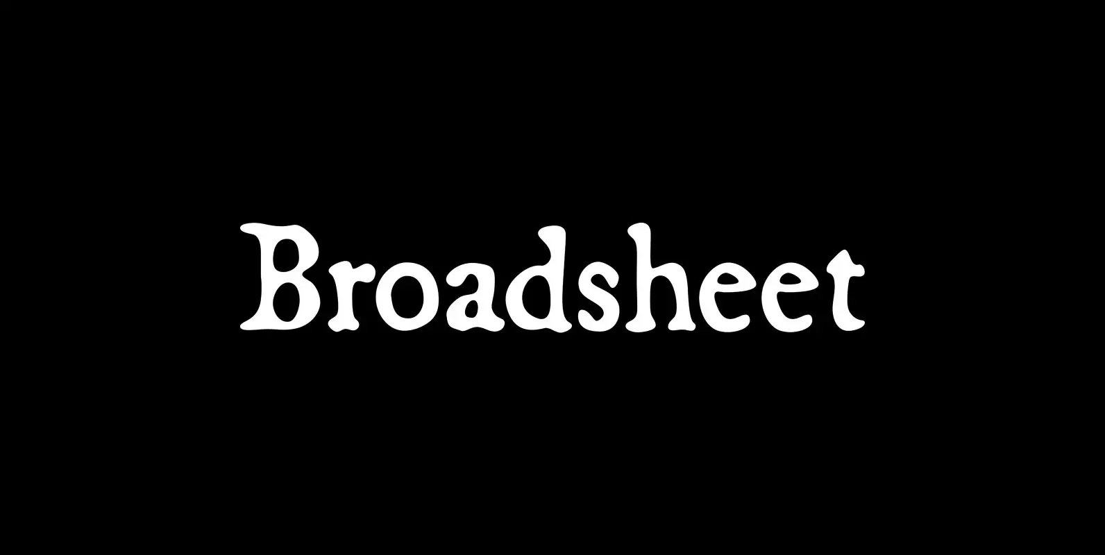
Broadsheet Font
Broadsheet simulates old newspaper text from the 1700s, chiefly from two specimens: an original copy of The New-England Weekly Journal, published in Boston on April 8, 1728, and a commemorative reprint of the Massachusetts Sun, published in Worcester, Mass., on
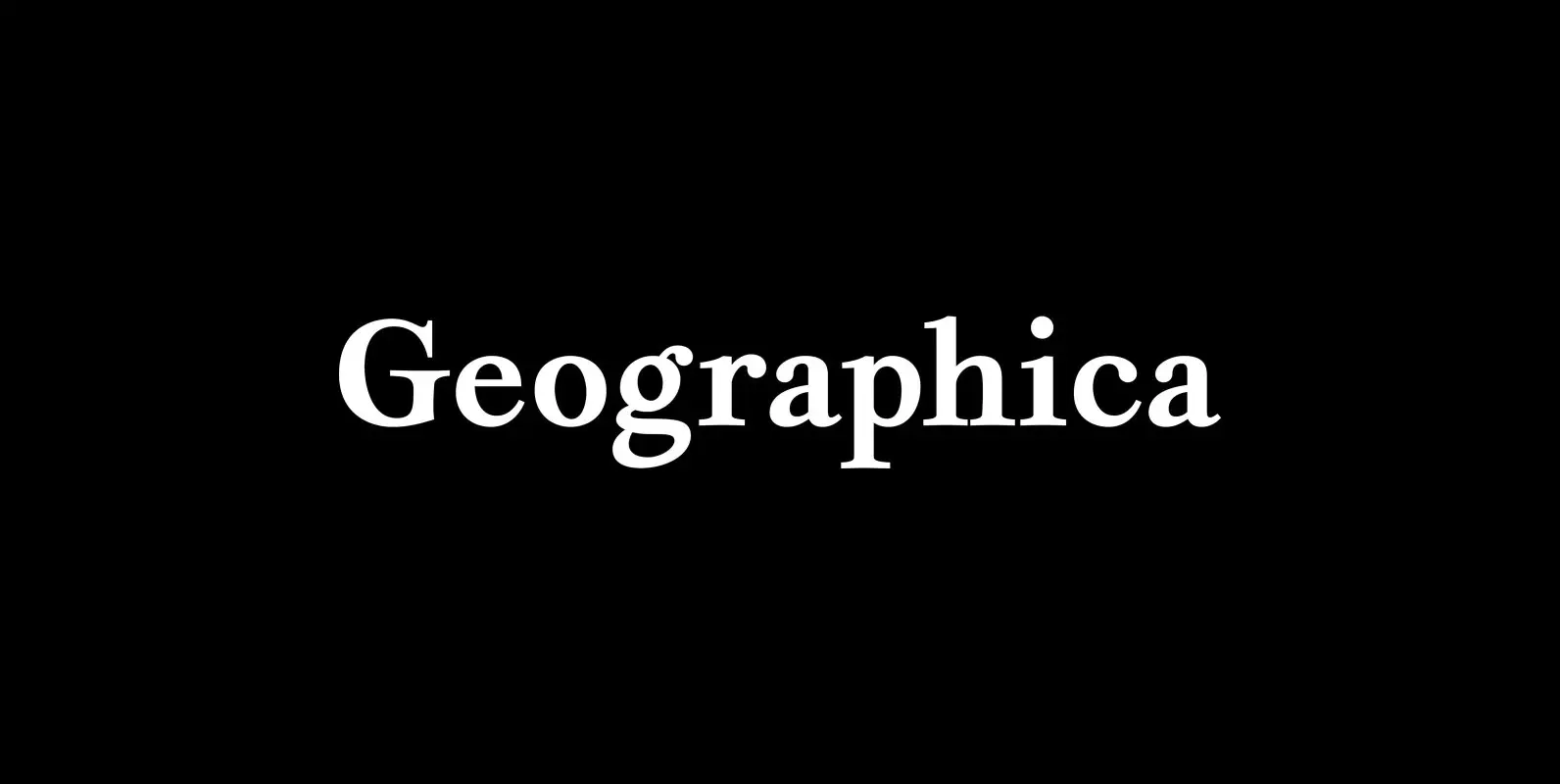
Geographica Font
Geographica is a four-style serif text-type family modeled after the neat hand-lettered place names and peripheral text on the maps of Thomas Jefferys (ca. 1710–1771), the best-known map engraver in 18th-century England. Although he won (and hyped) the title “Geographer
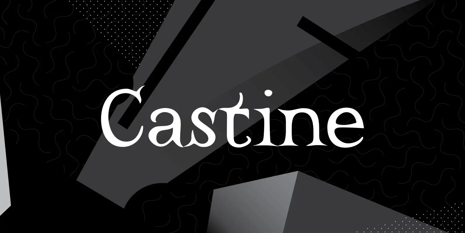
Castine Font
Castine gets its name from a small coastal Maine town with a seagoing heritage and long history. The town has an old cemetery with a few 200-plus-year-old headstones whose distinctive carved lettering inspired the typeface that shares its name. Castine’s
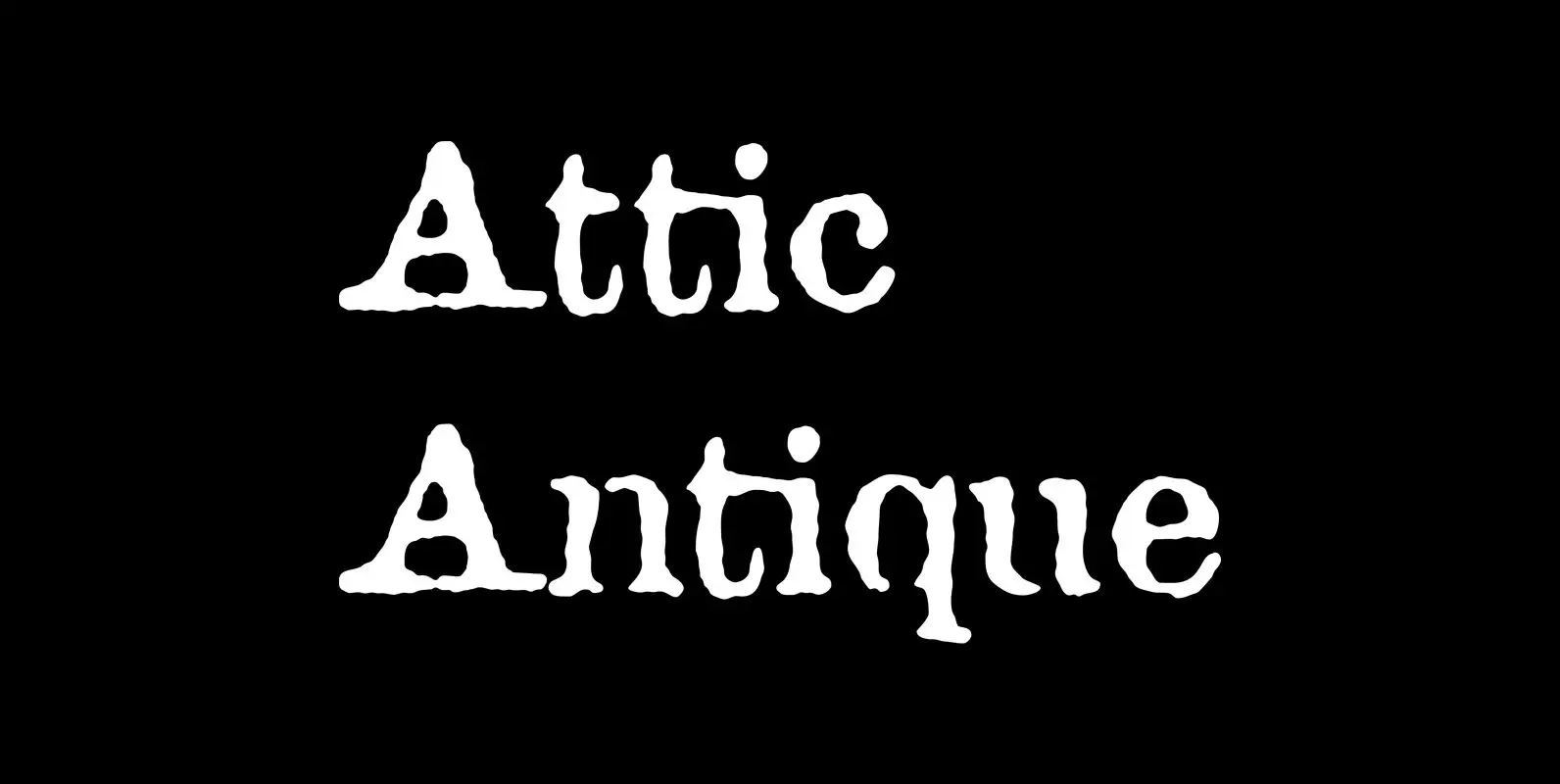
Attic Antique Font
Attic Antique replicates the warn, weathered text in a friend’s old copy of John Burroughs nature essays. It shares the wide spacing and ample serifs of the Century faces. Use it to represent age, to suggest photocopied archives, or to
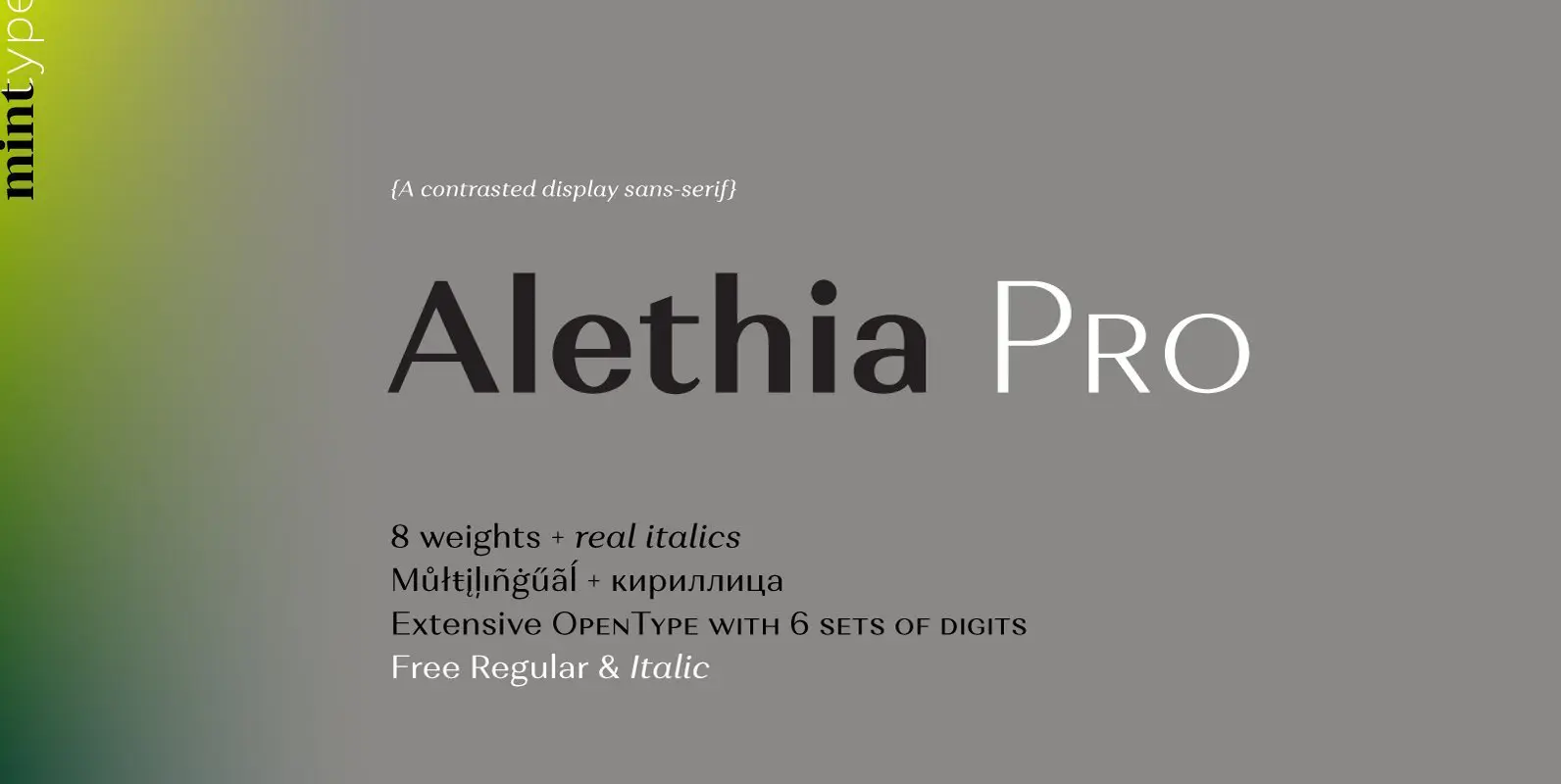
Alethia Pro Font
Alethia Pro is a grotesque sans-serif typeface with high contrast in all weights. It has been designed to serve as a display typeface in various editorial projects, such as magazines or corporate brochures, as a sans-serif pair to serif types
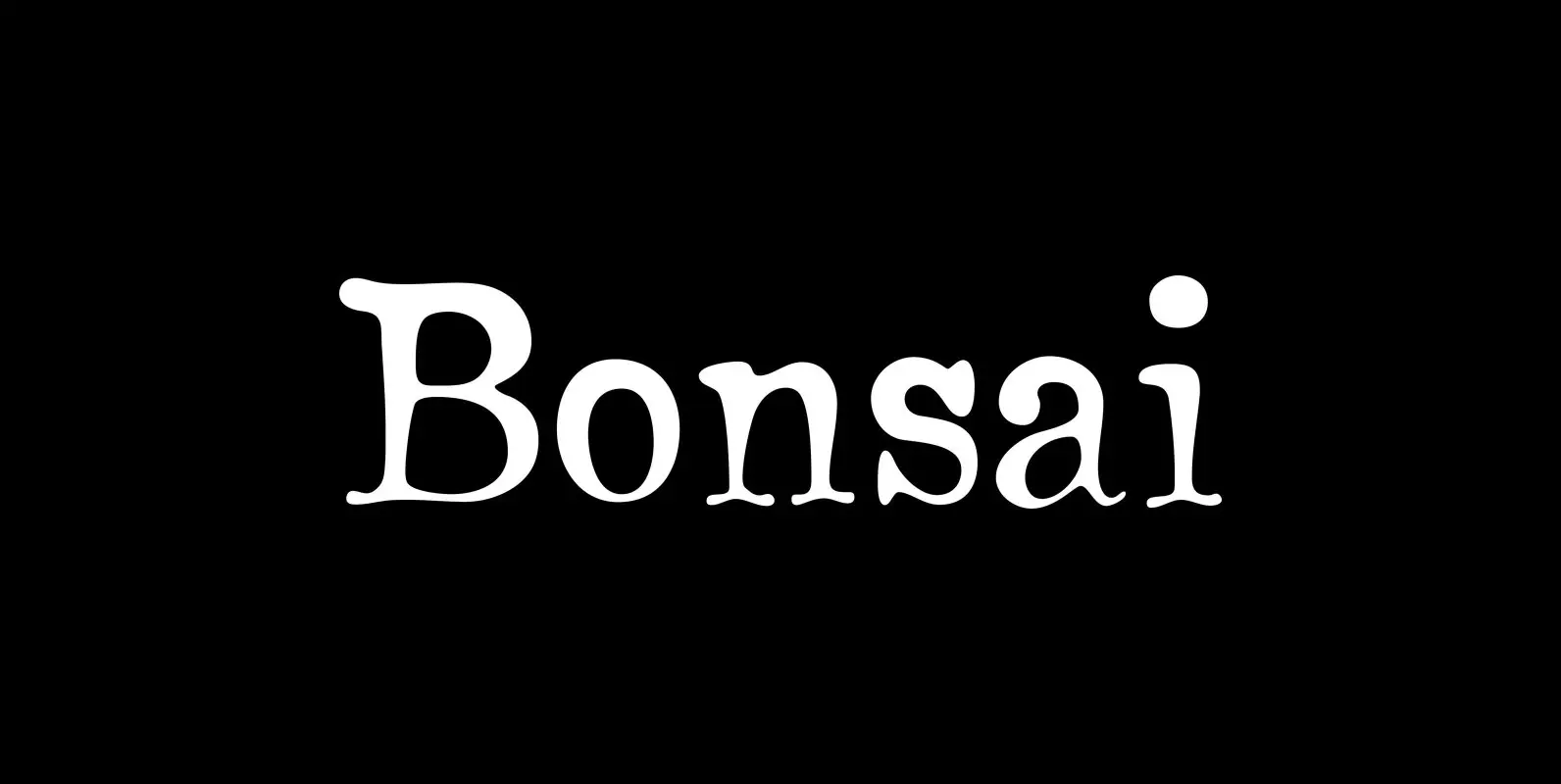
Bonsai Font
The name “Bonsai” seems appropriate for this font for two reasons: its source of inspiration—some top-heavy text type I found in an old handbook on bonsai from the Brooklyn Botanic Garden—and its glyphs’ resemblance, however vague, to the ancient miniature
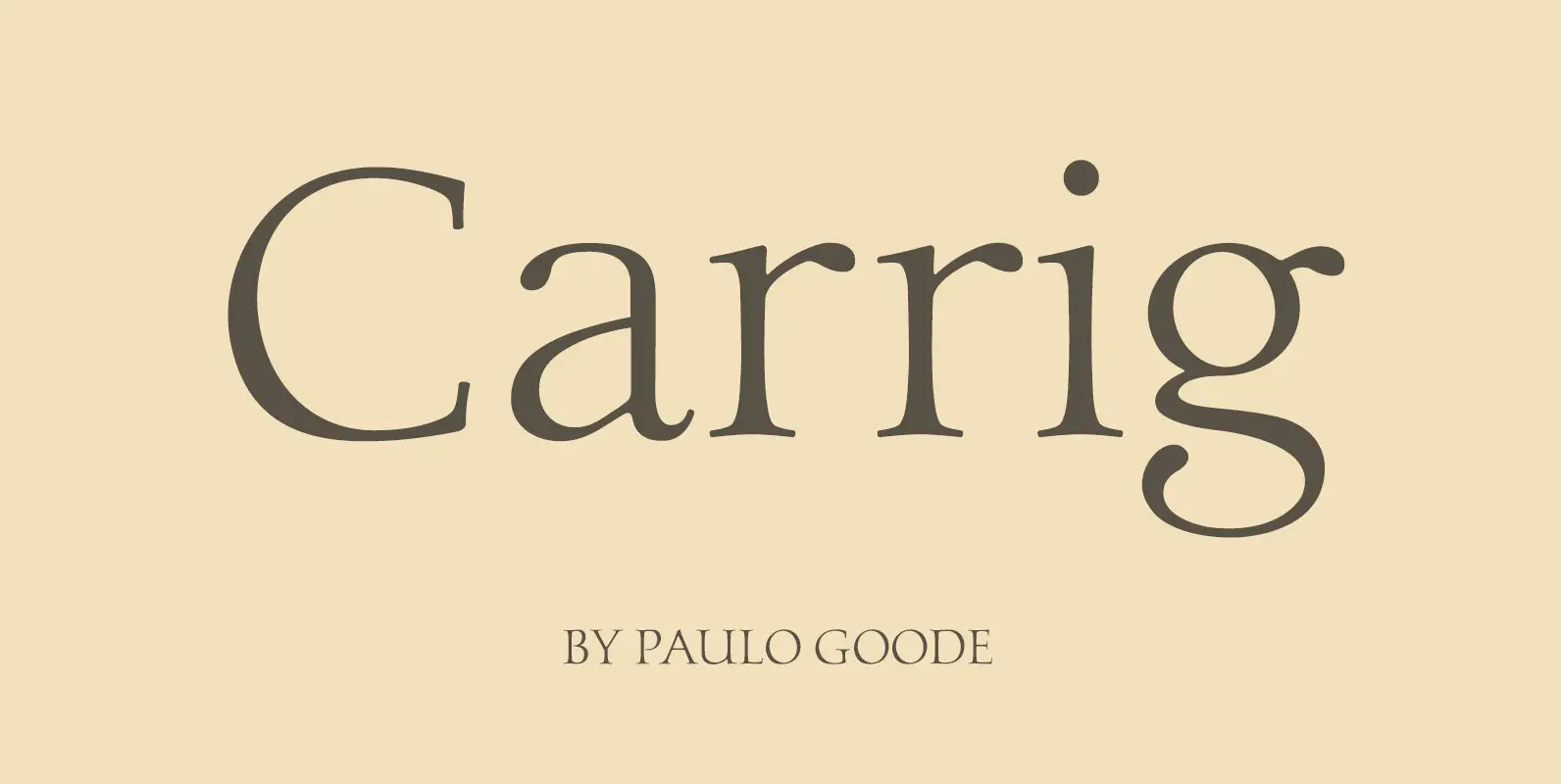
Carrig Font
Carrig is a Classic Antiqua typeface that was inspired by letterforms that have been carved into stone and weathered by time. Features: • Full European Character Set • 410 Glyphs • Alternate Letterforms for capitals O, Q, R and U.
