Tag: roman
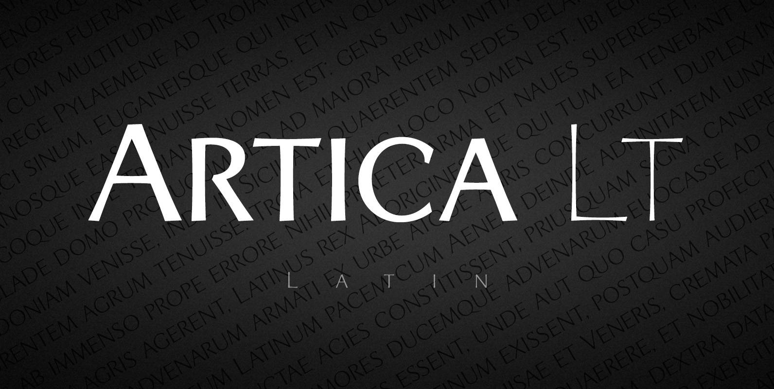
Artica Lt Font
Artica is an elegant sans serif typeface, offered in five weights. It was inspired by classic Roman letterforms. Artica Lt includes a Unicode Latin 1252 character set. Published by Green TypeDownload Artica Lt
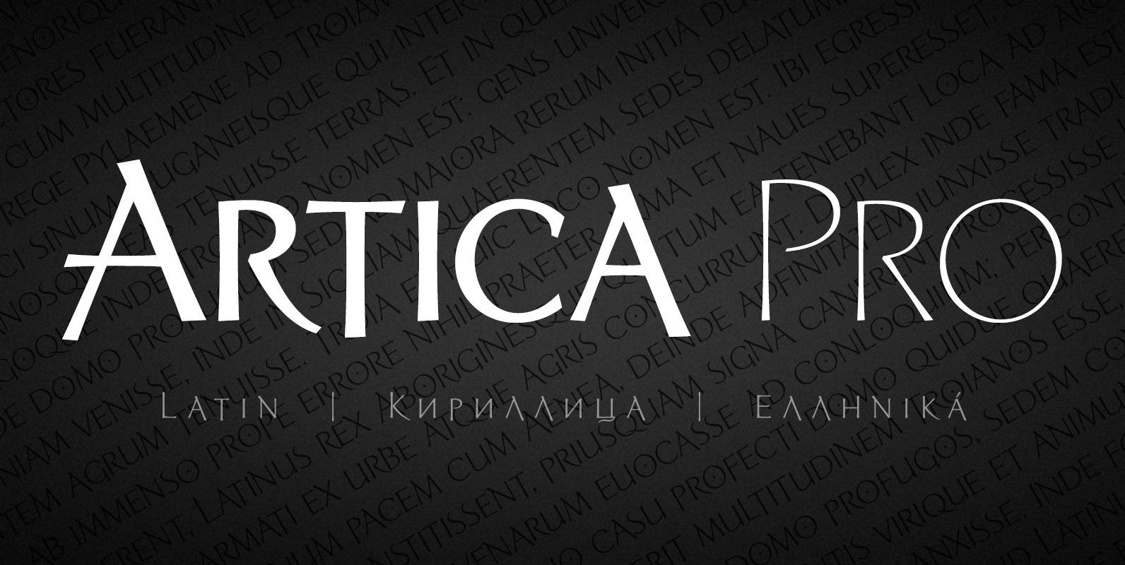
Artica Pro Font
Artica is an elegant sans serif typeface, offered in five weights. It was inspired by classic Roman letterforms. Artica Pro supports Latin, Cyrillic and modern Greek scripts, and includes swash initial & final forms, stylistic alternates and ligatures. Published by
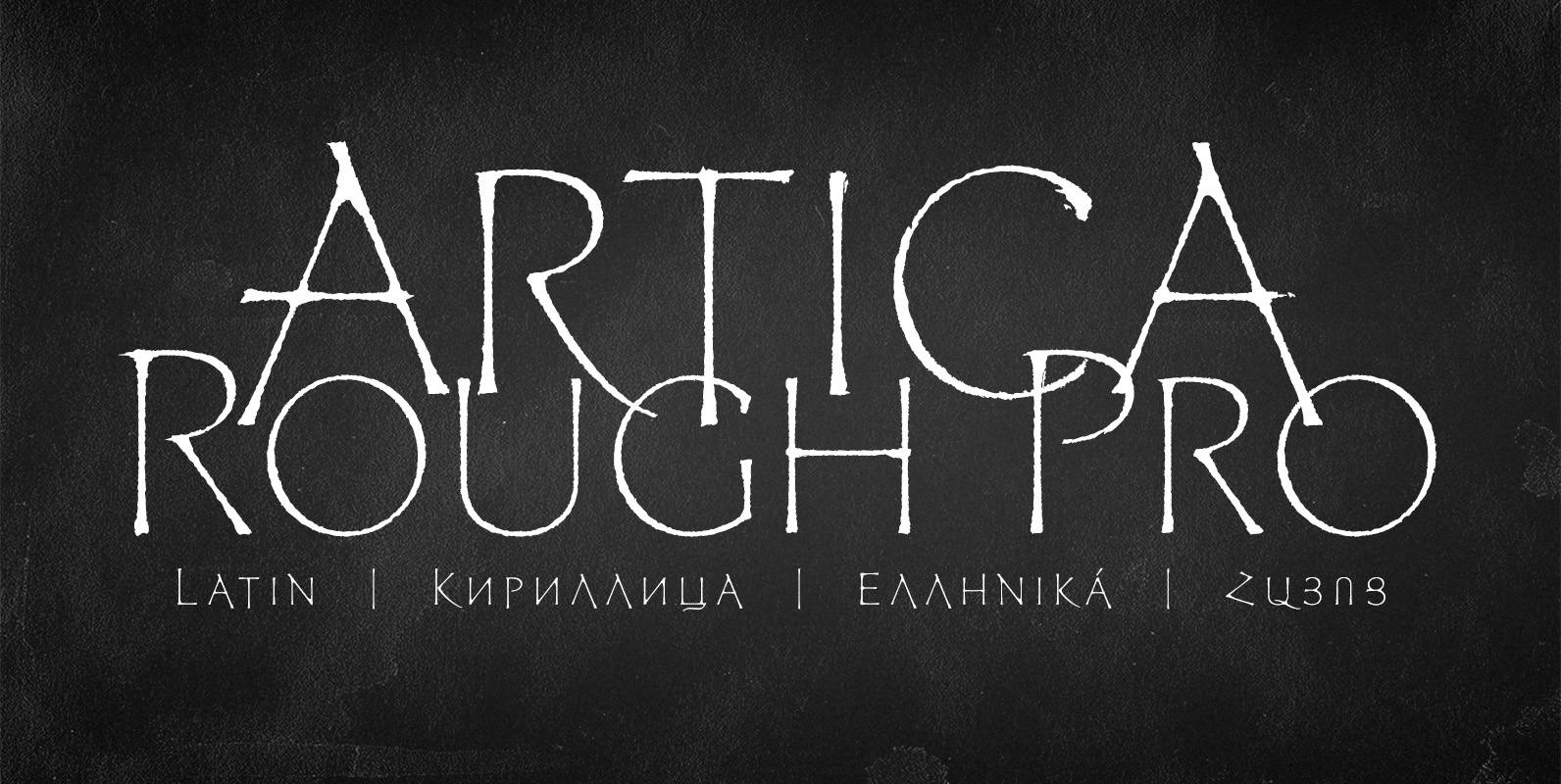
Artica Rough Pro Font
Artica Rough Pro is an elegant display typeface. It was inspired by classic Roman letterforms. Artica Rough Pro supports Latin, Cyrillic, modern Greek and Armenian scripts, and includes swash initial, final forms, stylistic alternates and ligatures. Published by Green TypeDownload
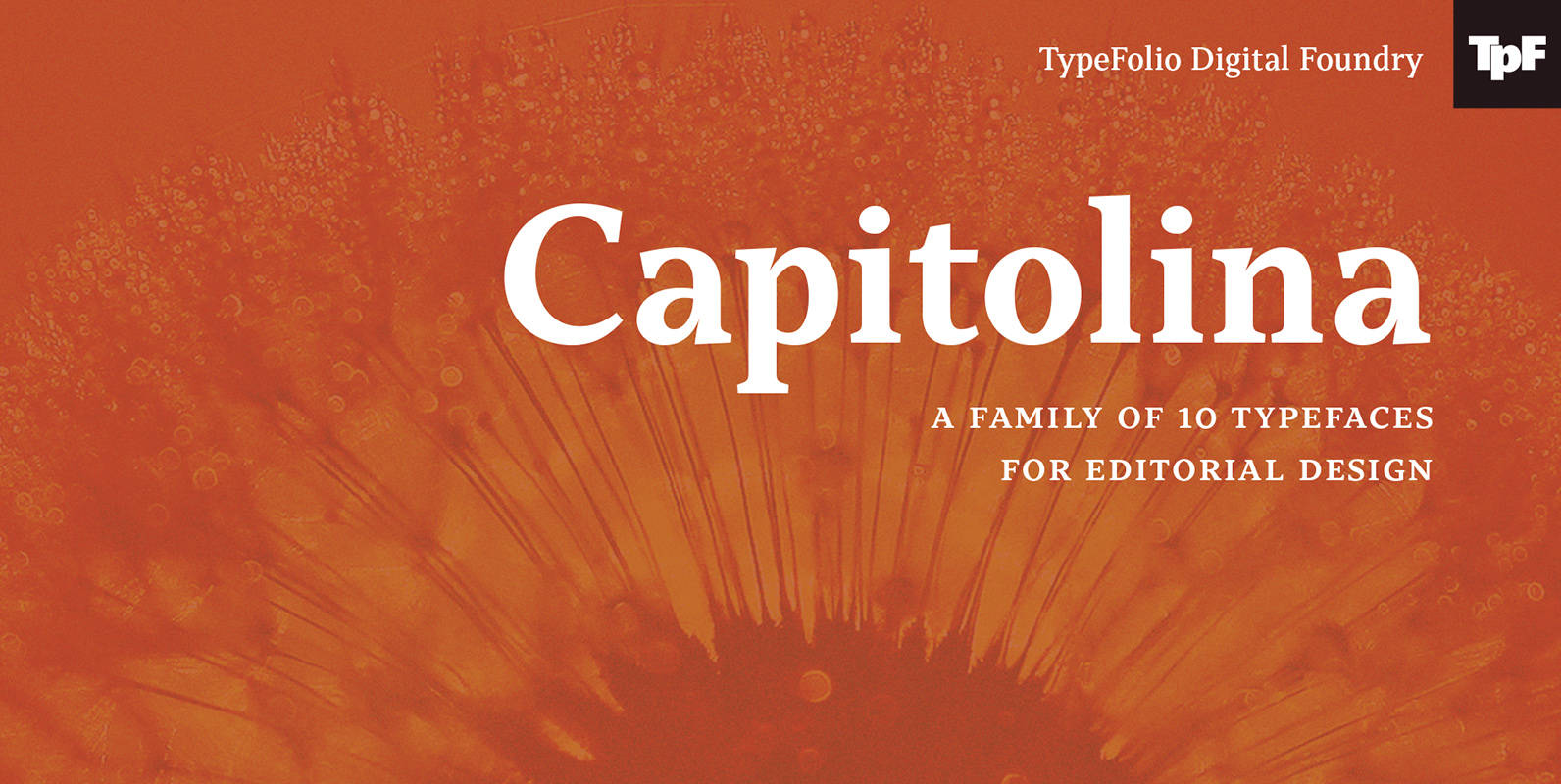
Capitolina Font
Capitolina is a family of 10 typefaces with a contemporary design style, based on different historical models. The original shape of serifs was a reference to 19th century’s Clarendon types though this inspiration remains as a subtle feature of the
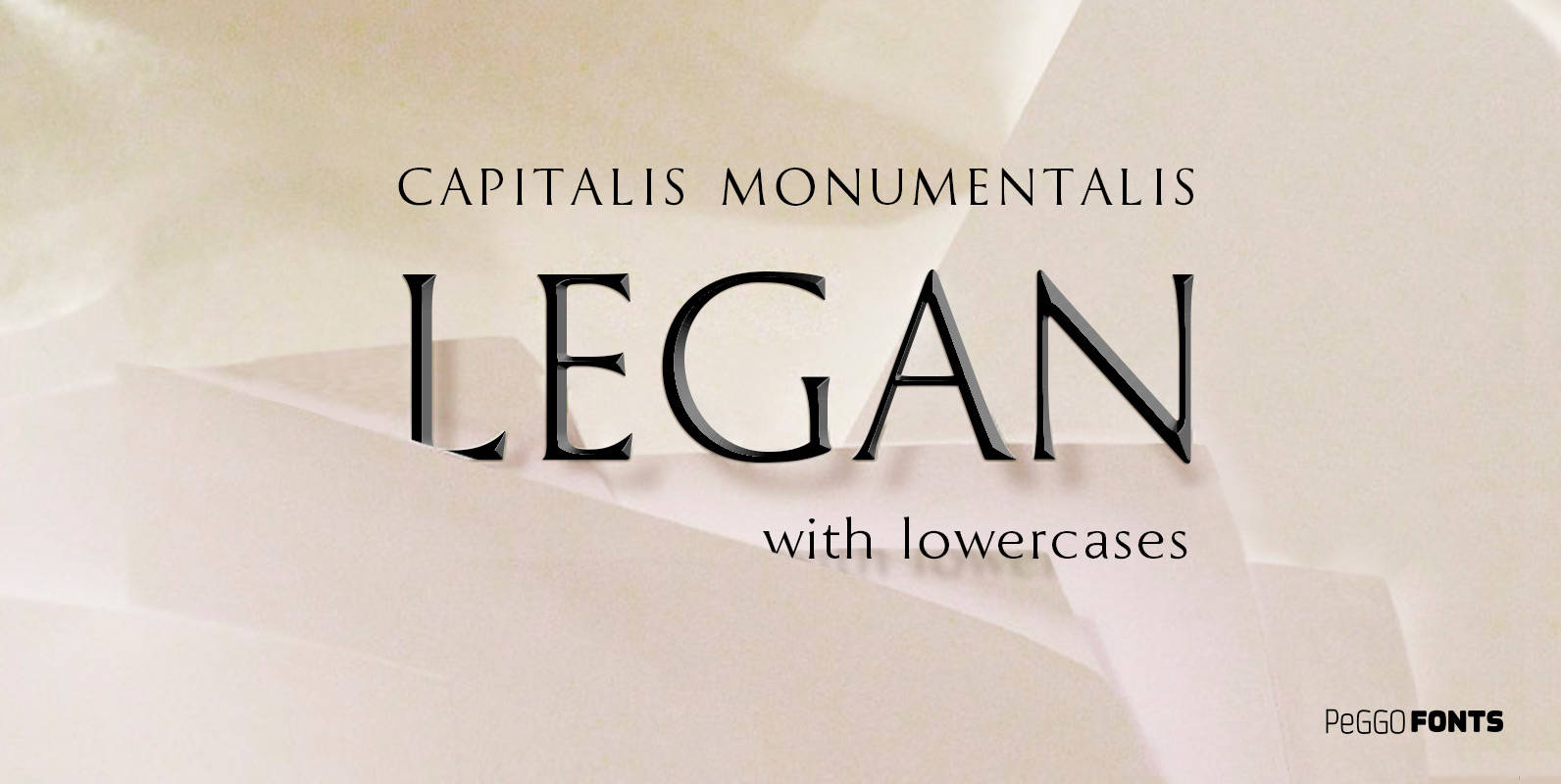
Legan Font
Legan is a font created by PeGGO Fonts, a very large typeface that follows the classical Trajan pattern, several geometrical proportions like root five, divine proportion (Golden Ratio), regular square, between other ones, same like Greek Trajan uppercase letters used
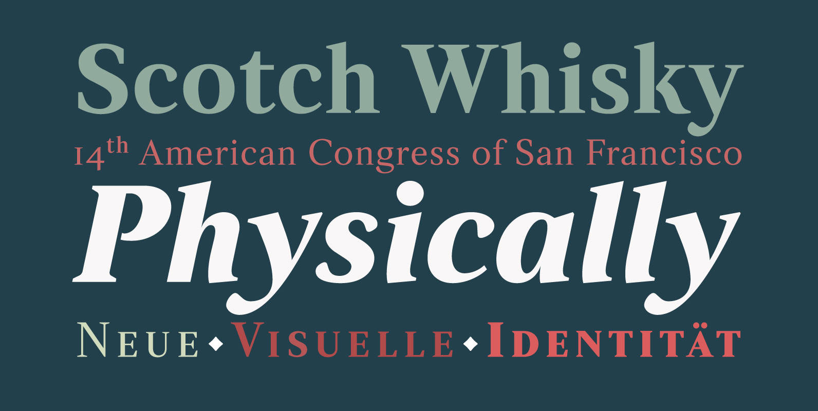
Strato Pro Font
Strato Pro font family is a modern serif typeface family with readability and legibility in mind. Inspired by Classic Roman typeface design, Strato Pro has 16 weights, ranging from book to black with small caps and an ornament set if

Turquoise Font
Many calligraphers agree that Roman Capitals is one of the most beautiful yet difficult hands to master. Its beauty lies in its simplicity of form and structure, yet understanding and applying these skillfully can take years of mindful practice. My
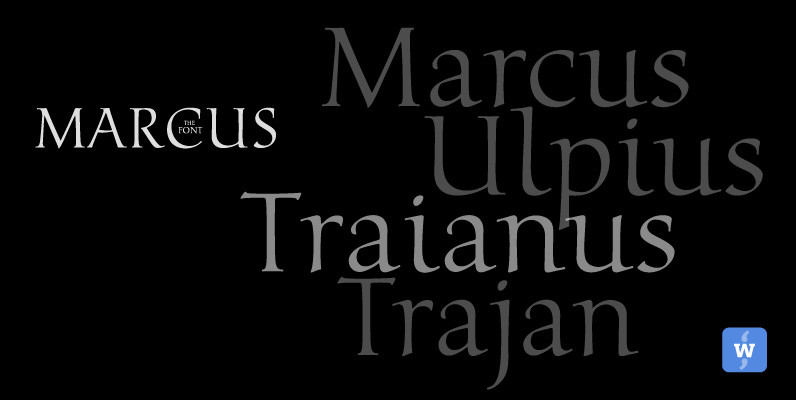
Marcus Font
Marcus, the font, was named after the Roman Emperor Marcus Ulpius Traianus (Trajan) born 18 September 53 in the Roman province of Hispania Baetica (in what is now Spain), a province that was thoroughly Romanized, in the city of Italica.
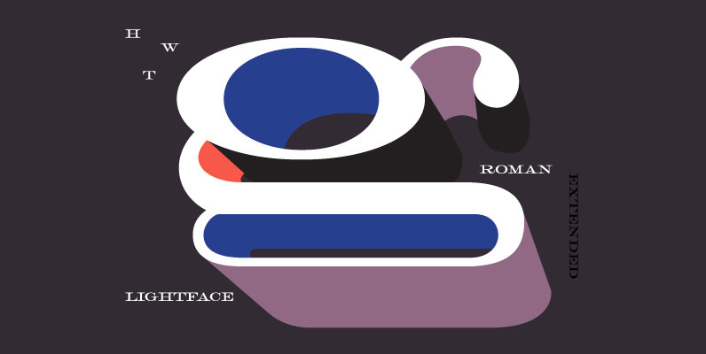
Roman Extended Lightface Font
The Roman alphabet has seen endless variations in interpretations of its classical form, and various wood type styles managed to explore everything from XXX condensed to hyper extended and expanded. This delicate and handsomely proportioned extended Roman was issued by
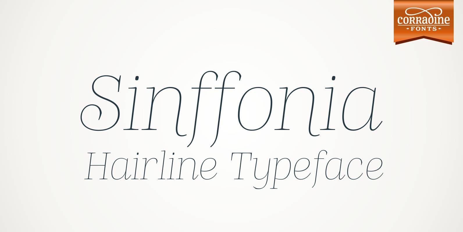
Sinffonia Font
Sinffonia is a beautiful ornamental font family. Its thin weight and roman style makes very elegant and ideal for any high quality project. Published by Corradine FontsDownload Sinffonia
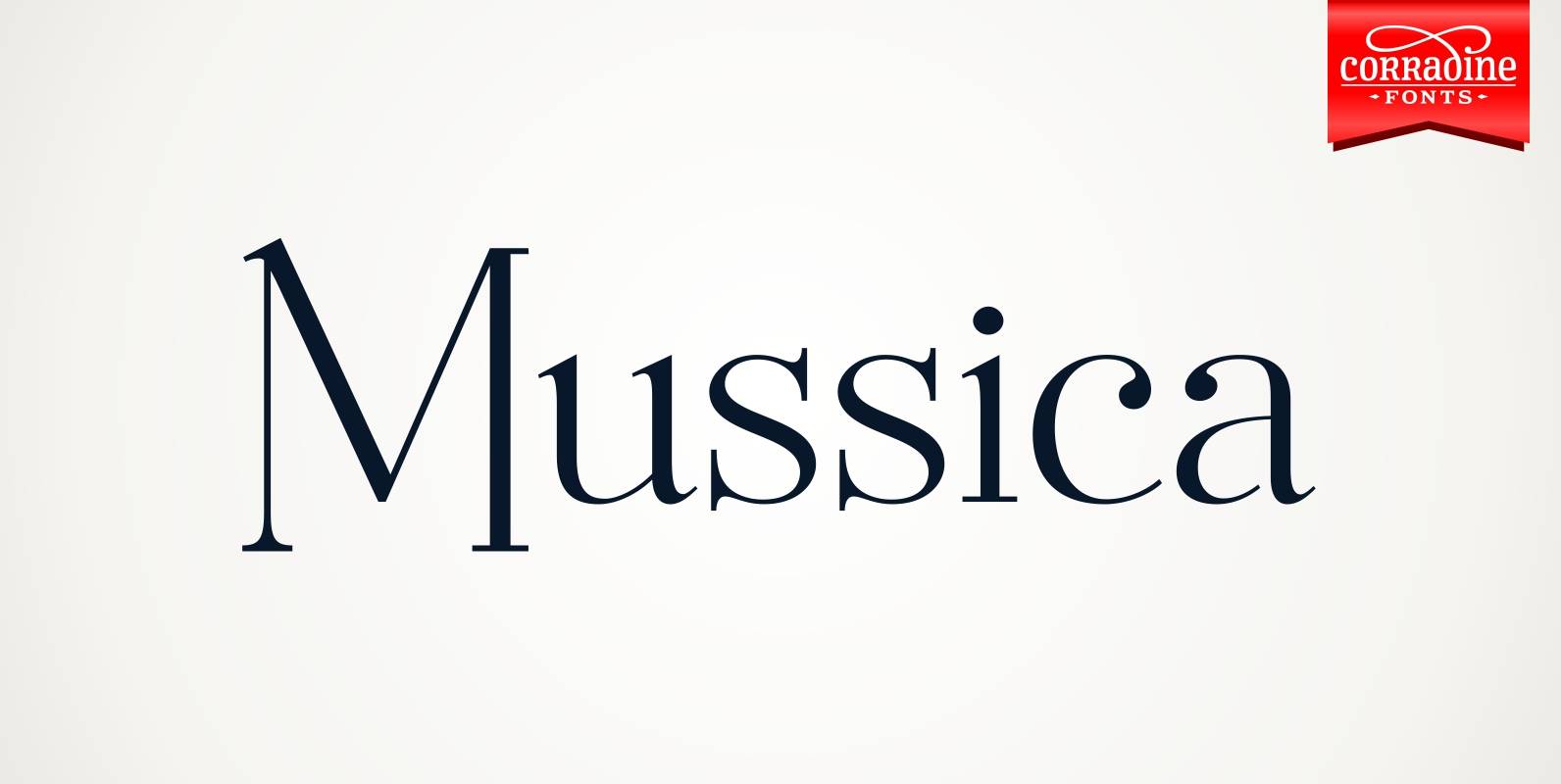
Mussica Font
Mussica is an ornamental hybrid font derived mainly of transitional and Didone styles but including some script and uncial quirks too. Its proportions and measurements aren’t conventional giving a very special look. The family consists of two fonts which could
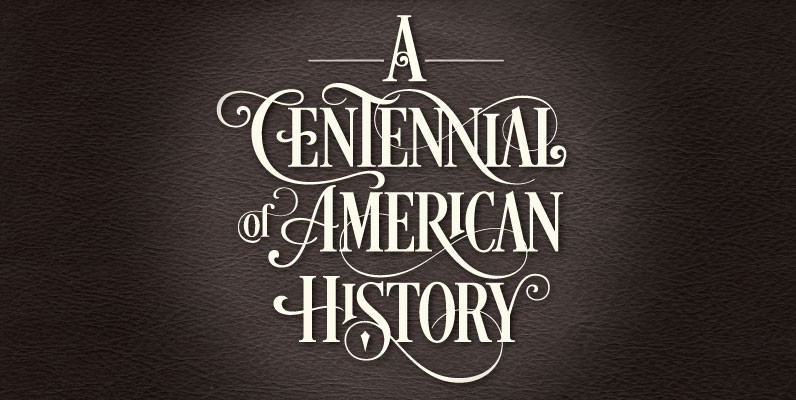
Desire Font
With over five years of design and development, Desire is a pursuit of epic proportions and ready to make a statement by adding elegance and unique flair to your next design project. Cultivated by his passion of letters, Charles Borges
