Tag: roman
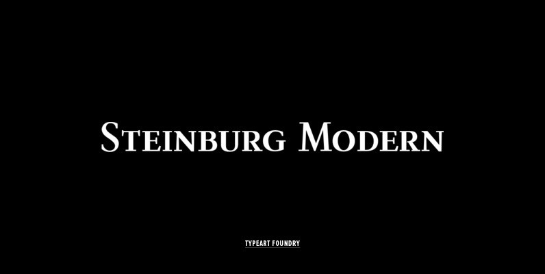
Steinburg Modern Font
Steinburg Modern™ is largely a variation on a Garamond-styled typeface with differences in some character designs and in the overall character proportions. In addition, the curved brackets that were a distinctive part of Garamond’s 16th century design are perhaps the
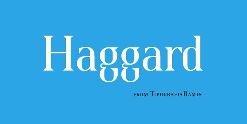
Haggard Font
Haggard is a wedge serifs typeface family of six styles. It stands out from the crowd with unique features like compact proportions of glyphs, sharp wedge serifs, small caps, and true italics. Haggard is a display font and can be
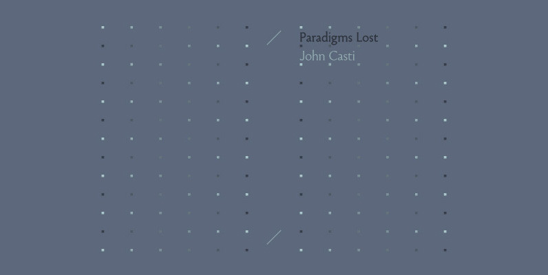
Paradigm Font
Originally released in 1995 as a three font family, Paradigm forcefully addressed the emaciating effect that digitization was then exerting upon traditional serifed typography. Investigating the new media of a much previous era, Nick Shinn deconstructed the first roman type,
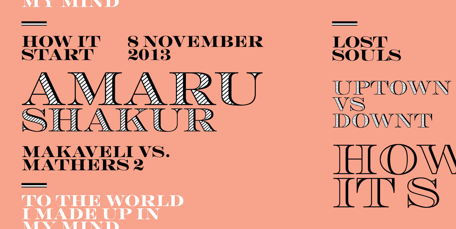
Engravers DT Font
Engravers DT is a decorative serif design, published by DTP Types Limited. Published by DTP Types LimitedDownload Engravers DT

P22 Wedge Font
‘Wedge’ is the outcome of a search for the essence of a formal alphabet for text — for 26 letters of the simplest form consistent with ease of reading. Noted New Zealand architect Bruce Rotherham (1926–2004) was inspired by Herbert

Ronaldson Font
The metal Ronaldson was the magnum opus of Alexander Kay, a first generation Scottish-American expert punchcutter whose résumé included clients no less historically prominent than Henry Caslon, Vincent Figgins and the Stephenson Blake company. His expertise at cutting roman faces
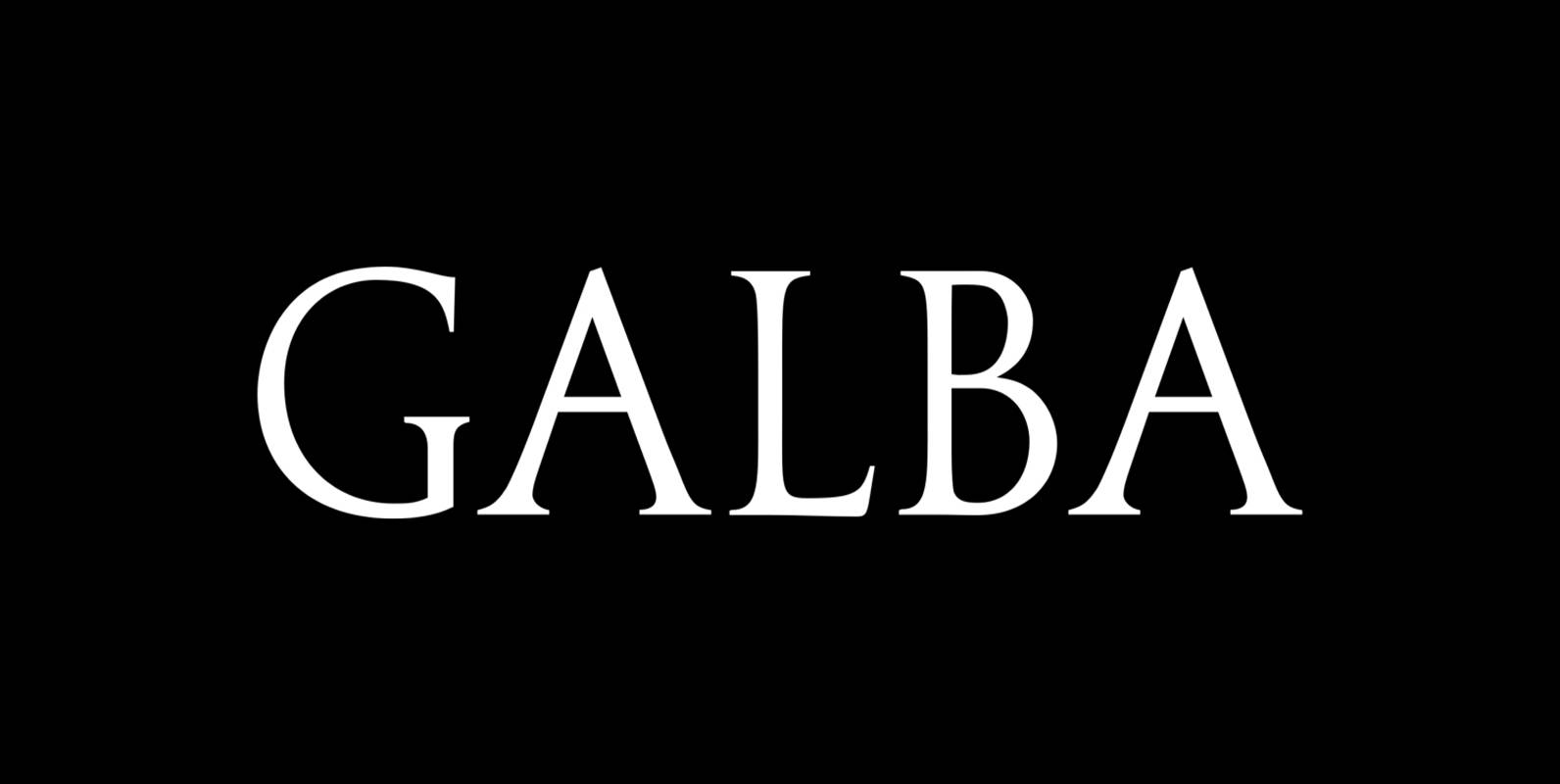
Galba Font
Galba is a font design released for the Mecanorma Type Collection. Copyright 2004 Trip Productions BV. Published by MecanormaDownload Galba
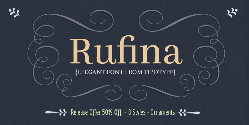
Rufina Font
Rufina was as tall and thin as a reed. Elegant, but with that distance which well defined forms seem to impose. Her voice, however, was sweeter, closer and when she spoke her name, like a slow whisper, one felt like
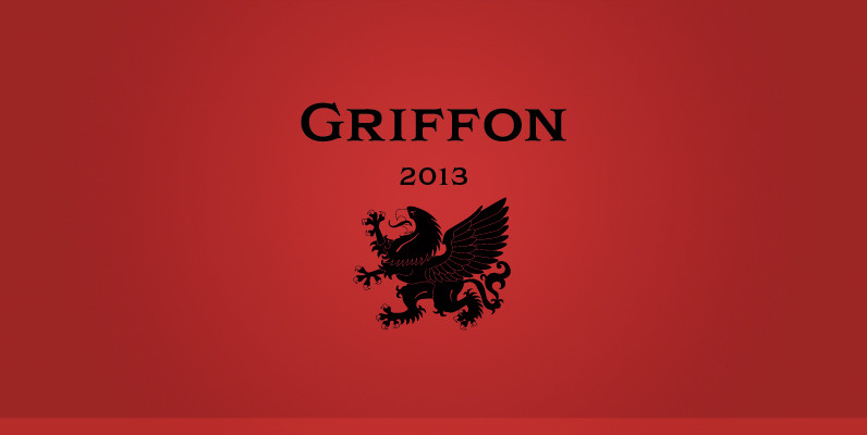
Griffon Font
Griffon, titling face with influence from classic letterforms, inspired by retro faces in the early 20th century. This font family was all redesigned from scratch and now released ranging in 5 weights with small caps from Light to Bold. The

