Tag: rough

Conifer Font
Conifer is a blocky geometric sans serif font that adheres to strict grid rules in order to define its corner angles. Its seemingly rigid form is tempered by the soft, rounded corners, and fine notched details present at acute angles
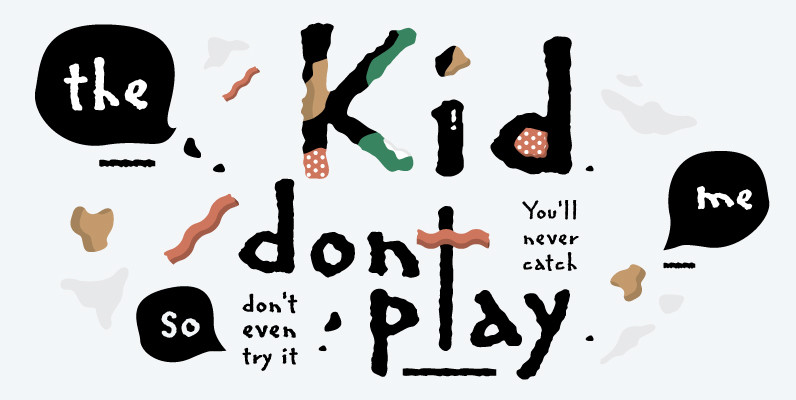
Regular Joe Font
From the creators of the famous and wacky Art Parts illustrations, Ron Romain and Joe Crabtree, A.K.A. Ron and Joe, Regular Joe was released in 1990 and is their only font. Originally created as an Art Parts corporate font, Regular
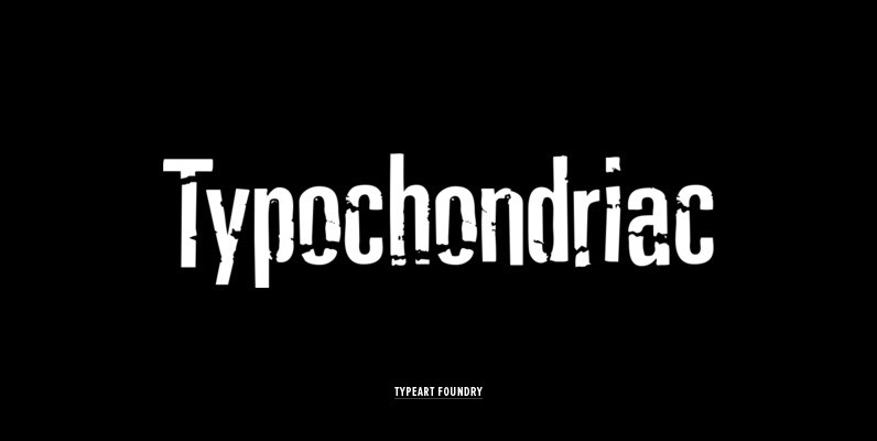
Typochondriac Font
The Typochondriac™ family is a variation on our Deviant Strain™ family. ALTERNATE VOWEL CHARACTERS All of the accented vowel characters in the Typochondriac™ fonts are slightly different from their unaccented root characters. To break up the visual monotony when you
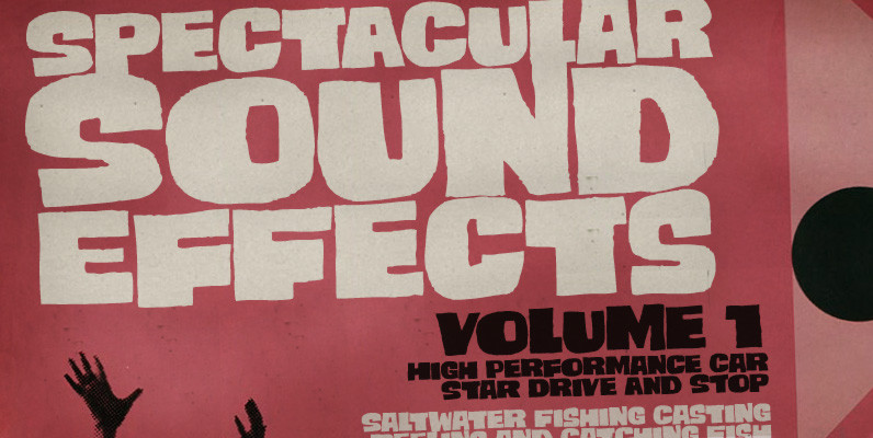
Smashing Font
Smashing is a stout typeface, with a twist. It’s a massive all-caps font with bouncing glyphs, positively bold yet quite good-humoured. Its upper and lower case slots stores different lettershapes, providing handy options to choose from. When working with OpenType
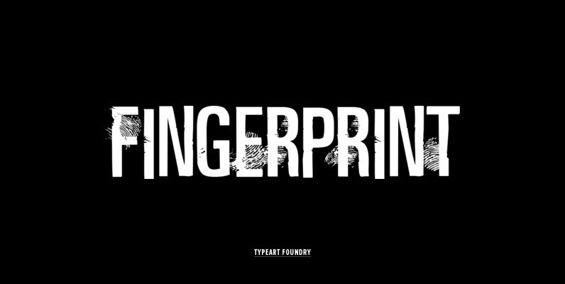
Fingerprint Font
The Fingerprint™ Regular font has fingerprint markings on only certain selected characters, in the hope of allowing most basic text to be set with a pleasing blend of marked and unmarked characters. Inevitably, you will set words with letter combinations
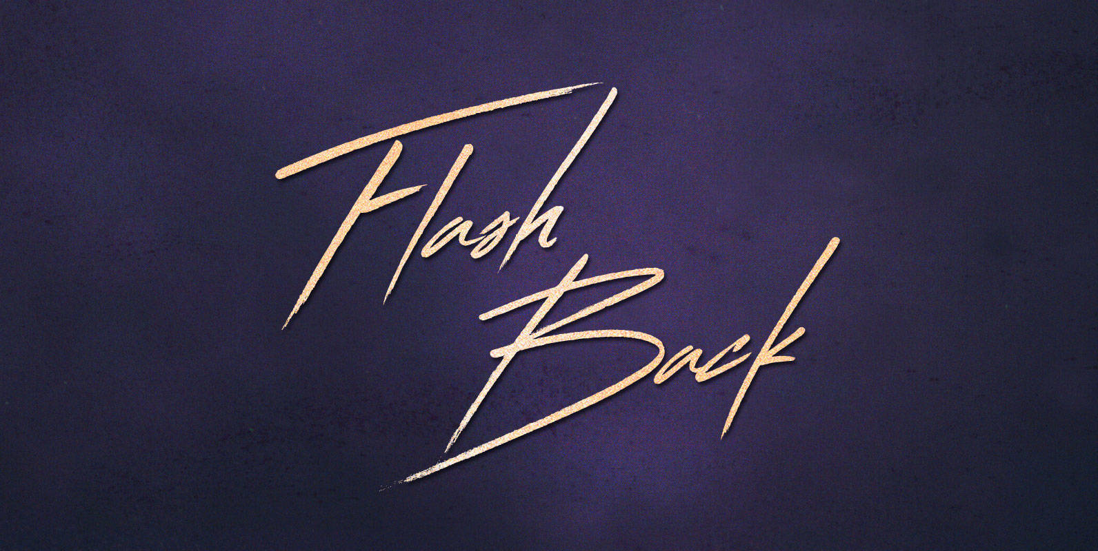
Flash Back Font
To place the beginning of the end, Corey had to think back 22 years, through yearning reminiscence, to his beginning. In learned memories of his birth to his 18 year old mother, the Flash Back is his starting point, and
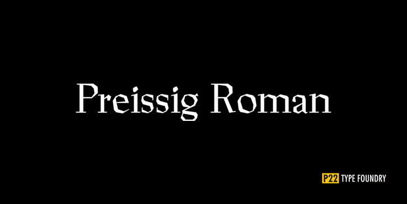
P22 Preissig Font
The type designs of Vojtech Preissig are rugged, bold and often technically flawed. The hand of the designer is clearly evident. In the true spirit of William Morris and the ideals of the Arts and Crafts movement, the tell-tale signs

Distillery Set Font
The Distillery Set is a collection of 5 fonts: Display, Strong, Script, Caps, and Icons. The fonts’ influences are in lettering from different eras and styles. They reflect forms from the Arts & Crafts movement, the Roman majuscules, artistic printing,
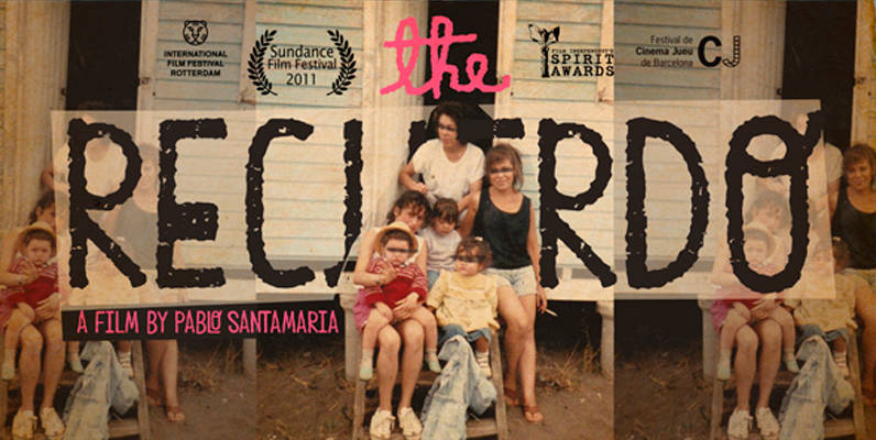
Peral Font
Peral was designed for use in for children’s related projects, designed by Rodrigo Araya Salas. Published by RodrigoTypoDownload Peral
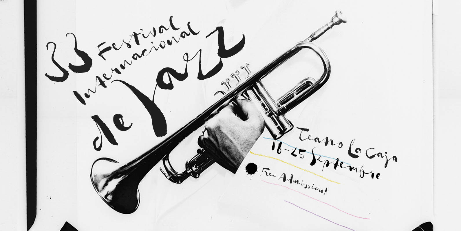
Gloss Drop Font
An enviable choice for magazine headers, book covers or record covers. Works also well as a companion to hand-drawn or painted illustrations. Like in real handwriting, some, but not all, letters connect within a word. Automatic Positional OpenType features handle
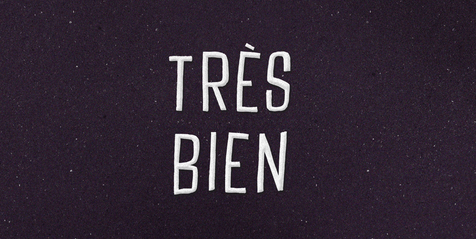
Tres Bien Font
We may say that a thing is good when on its own account it ought to exist, and bad when on its own account it ought not to exist. If it seems to be in our power to cause a
Stalker Font
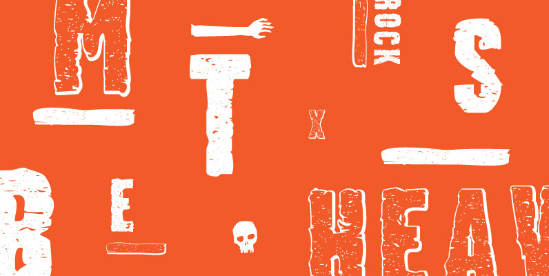
Stalker is one of those necessary fonts in a designer’s toolbox: Grungy sans serif caps that are most useful for entertainment project chores. Originally made in the summer of 2003 for set and prop design of an Alliance film, Stalker
Marker Aid Font
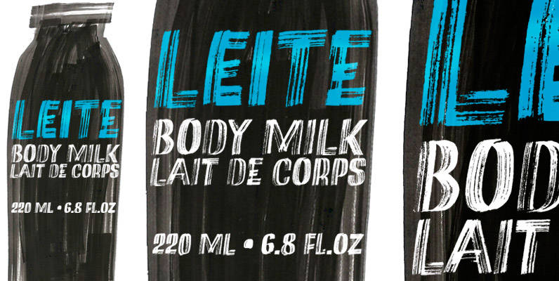
This expressive face was drawn with a dry chisel felt-tip marker, resulting in two striking, detail-rich fonts. Beyond its remarkable face, Marker Aid is a generous one, packed with 4 alternates for each letter, 2 for each number and yet
Joseph Font
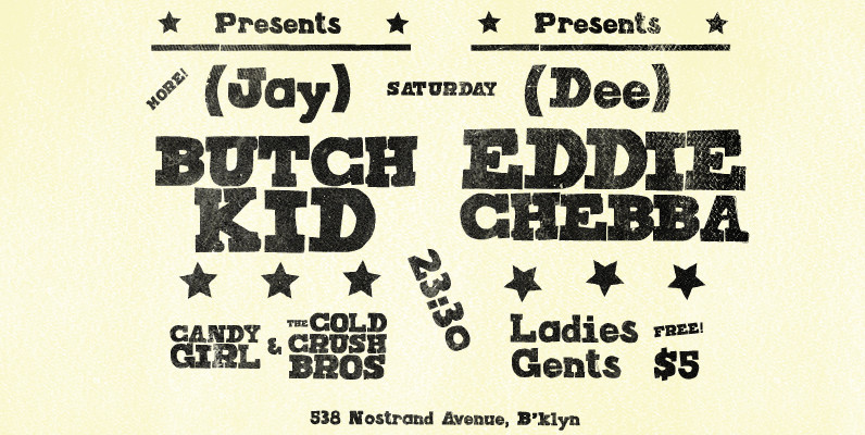
Joseph is a brand new slab-serif face designed by TOMO. With a wood type look – letterpress print technic, this fatty come in handy when is time to design an informal —yet strong—looking communication piece. Ideal for promotion-matter. Published by
P22 Preissig Scrape Font
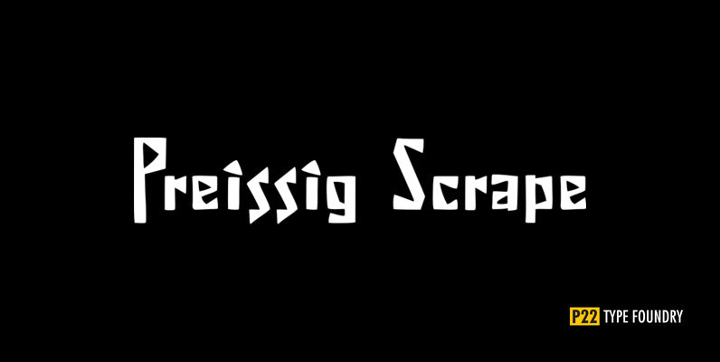
The type designs of Vojtech Preissig are rugged, bold and often technically flawed. The hand of the designer is clearly evident. In the true spirit of William Morris and the ideals of the Arts and Crafts movement, the tell-tale signs
