Tag: rough

Fortis Font
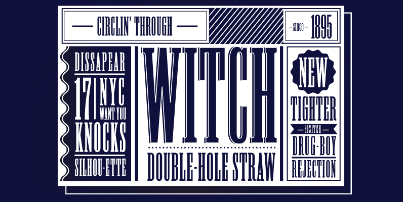
Fortis™ (originally named Atlas) was released in 1992 and is a 21st century contemporary Latin. Also categorized as a Glyphic, Latins were first introduced in the last half of the nineteenth century and are characterized by large, sharp, triangular serifs.
Machete Font
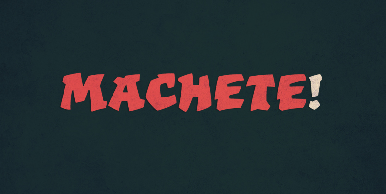
Machete is the hulky, overfed distant cousin of Bayoneta. Enthusiastically in your face and full of humour, Machete is exactly the kind of big alphabet that takes a skinny actress camping at the top of a really tall building downtown.
Linger On Font
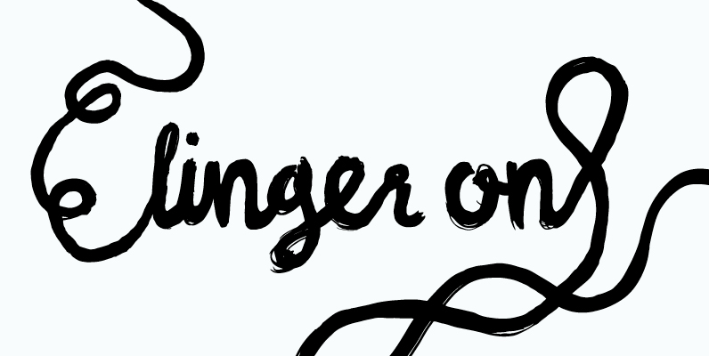
Linger On is a handwritten fairly rough brush script. It’s equipped with some OpenType features and an extra set of the most commonly used letters. It also includes lines and endings for you to have more fun with and make

Bootstrap Font
Broken in but none the worse for wear, Bootstrap and less distressed companion Bootstrap Alternate each have OpenType features that automatically substitute a unique pair of characters when any upper or lower case letter is keyed twice in a row,

Joe Family Font
From the creators of the famous and wacky Art Parts illustrations, Ron Romain and Joe Crabtree, A.K.A. Ron and Joe, Regular Joe was released in 1990 and is their only font. Originally created as an Art Parts corporate font, Regular
Macabro Family Font
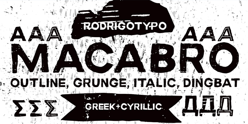
Macabro Family is a grunge typography, handmade whose concept, fear terror phobia among others, Cyrillic and Greek are also design also has several varieties, from italic, outline, rough, etc. .. dingbat Published by RodrigoTypoDownload Macabro Family

URW Urban Font
URW Urban follows the trend of pattern fonts. Each character has been provided with an individual pattern created with a special stamp technique. To create a vivid typeface, there is a stylistic alternate for nearly every character. In this way
Origins Font
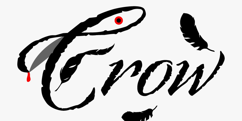
Based on letters hand-drawn with a crow quill on parchment paper, Origins combines calligraphic grace and antique ambiance. Its tight, energetic angularity can be complemented with swooping swash capitals, alternate ascending and descending letterforms, and graceful ending characters. Origins sings
Parcel Font
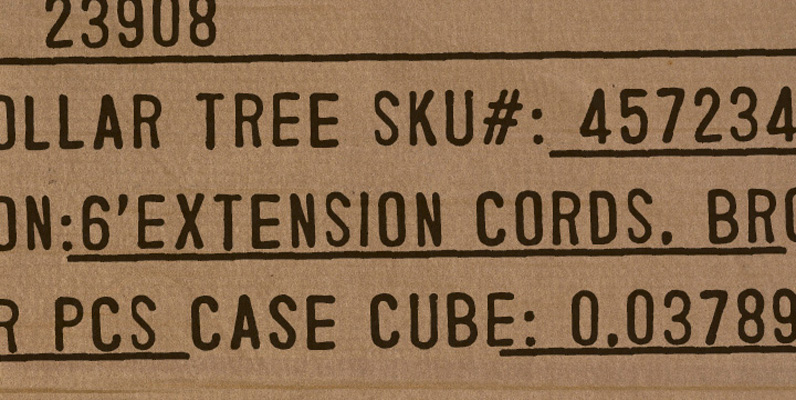
Parcel is based on information stamped on the side of some packaging. It was scanned in and converted, then expanded to include 1,282 glyphs in it’s extended character set. Published by MJWallner FontsDownload Parcel
Froh Family Font
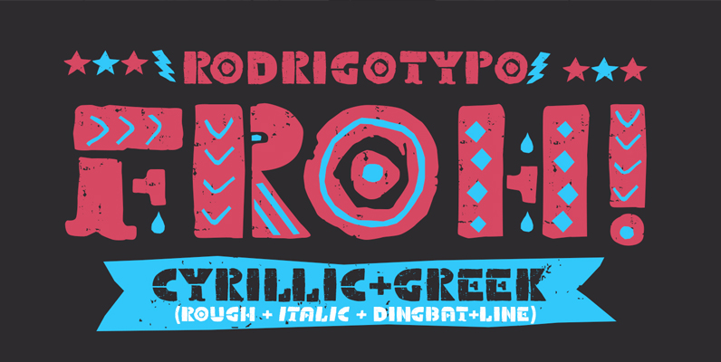
Froh Family is a typeface that has the concept to be a bit naughty playing with its various forms and contain Greek and Cyrillic. Published by RodrigoTypoDownload Froh Family
Chancellor Font
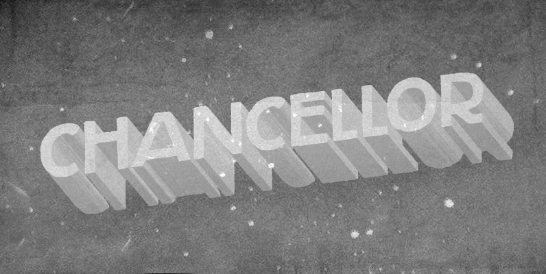
Chancellor is a robust hand-drawn sans serif display typeface. Its sturdy letterforms takes inspiration from Plakatstil era posters, while bringing up also cool adornments to flourish your lettering designs. This all caps typeface has two versions for each letter, amplifying
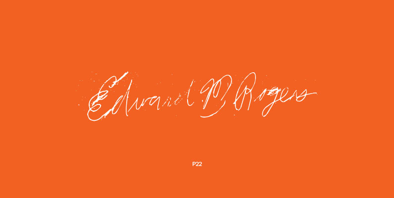
P22 Ed Rogers Set Font
Ed Rogers (1925-2002) was an unlikely and unintentional art figure. His art career began in 1981 when he met David Greenberger, the creator of The Duplex Planet, an ongoing project that introduces us to people who are old or in
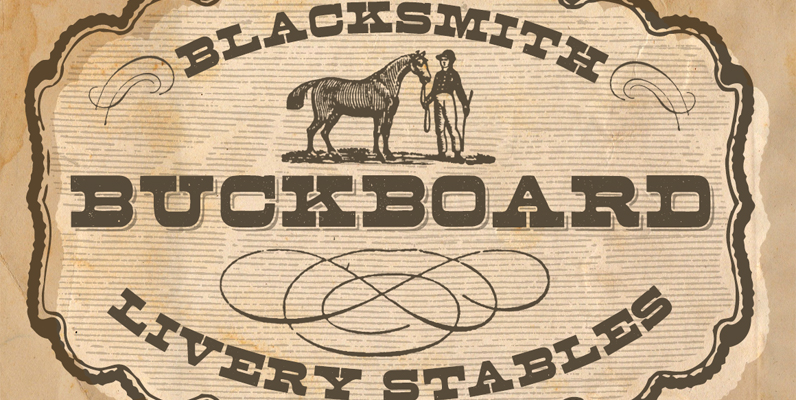
Buckboard Font
Nothing says Wild West like a good ole authentic wood type font with its original patina. The Buckboard fonts have OpenType ligature features that substitute a unique pairing of characters when any letter is keyed twice in a row, as

Bush!! Font
To begin with, I took a lot of care designing the letters. Then I used a digital effect add roughness. On first glance it looks cute, but this typeface’s character has a disturbing feel to it. Published by Shuji Kikuchi
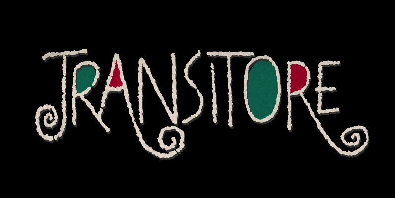
Transitore Font
Transitore is a lively hand-drawn font with loads of alternates and ligatures which, managed by advanced OpenType features, help create a convincing handcrafted look. The contextual alternates feature automagically substitute glyphs on the fly, providing a cool random effect, while
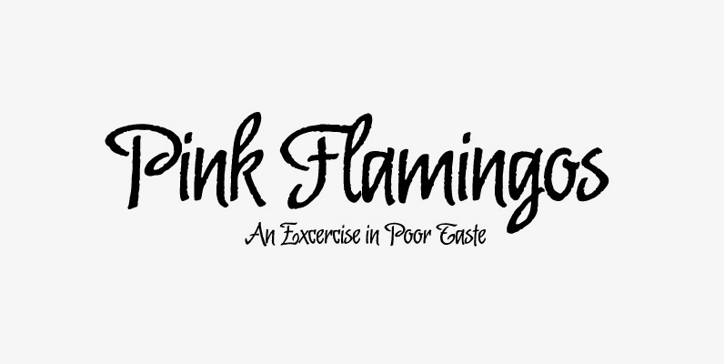
Malambo Font
The master of the dancing brush, Angel Koziupa, and the node-obsessed perfectionist, Alejandro Paul, offer up another bucket of fun with Malambo. This time Koziupa allows his brush to jitter one whole millimeter, and Paul digitizes with two eyes instead
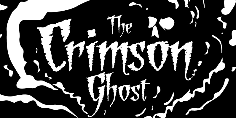
Grindel Grove Font
Several years ago, I was asked to design a brochure for a native plant habitat garden. I drew some scenic backgrounds with charcoal, used pen and ink to stipple detailed scientific drawings of the plants to be showcased in the
