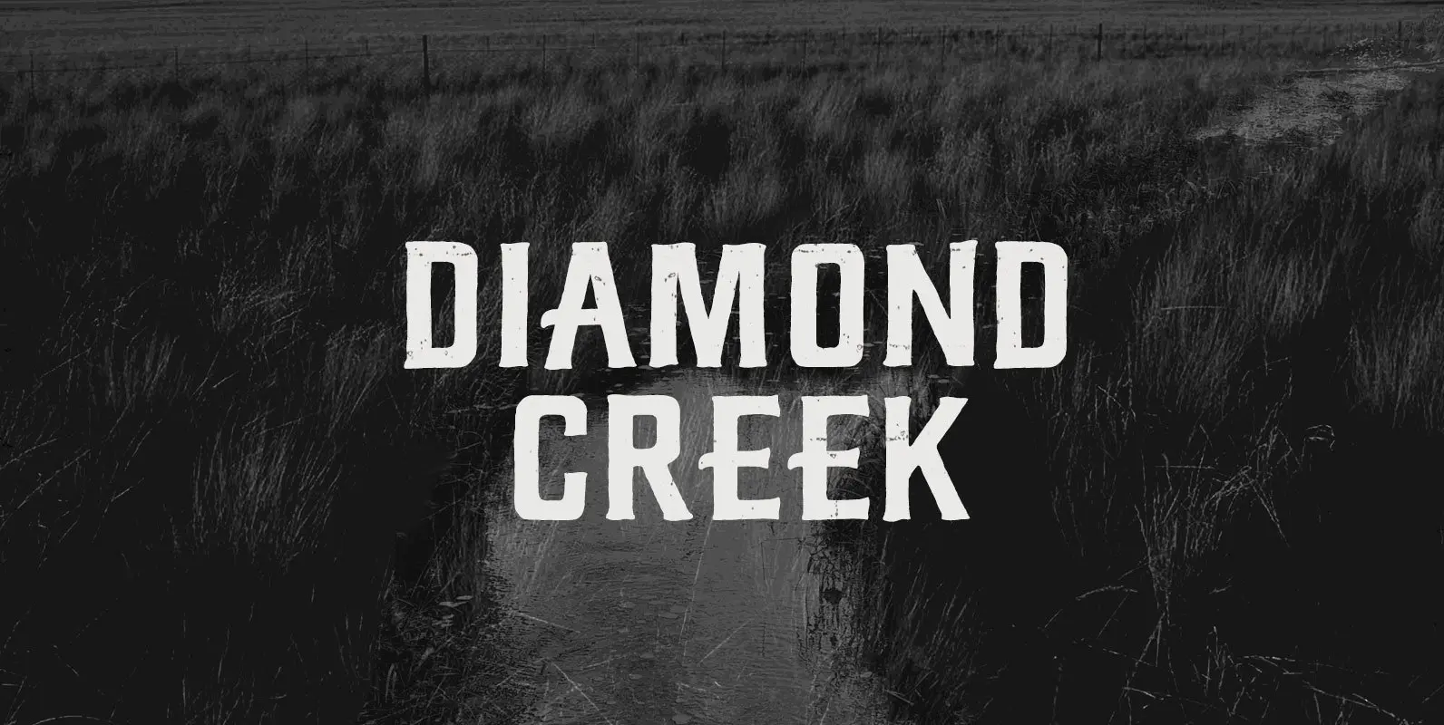
Tag: rounded
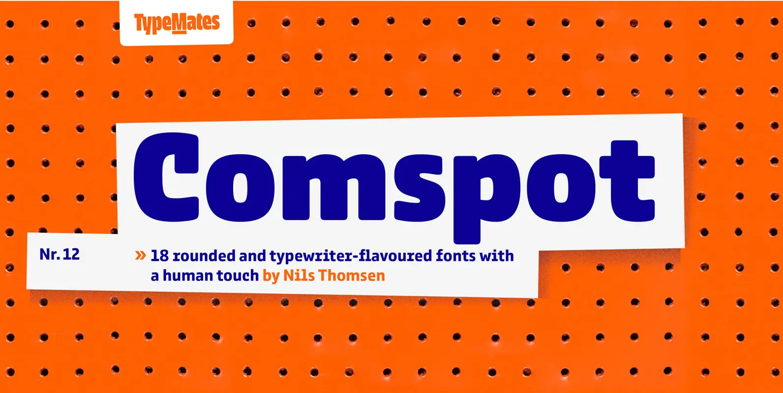
Comspot Font
Comspot is a rounded, typewriter-flavoured font family with a human touch. Originally designed as a custom typeface Comspot’s nine weights — razor-thin hairline to ultra black — and 14 stylistic alternates fulfil every need, from extended to display text. Comspot’s
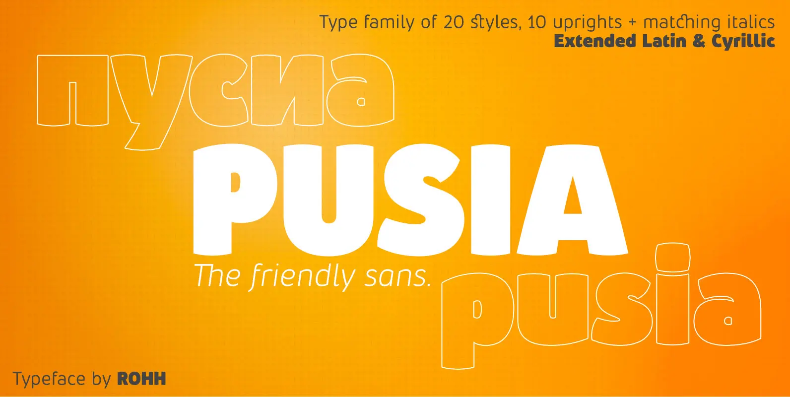
Pusia Font
Pusia is a versatile font family with a lot of character and warmth. It is a professional, contemporary sans serif with original letter forms, friendly and dynamic feel. Its subtle curved shapes and attention to details give Pusia a very
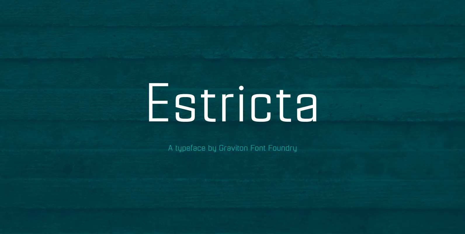
Estricta Font
Estricta font family has been designed for Graviton Font Foundry by Pablo Balcells in 2017. It is a sans serif typeface with a geometrical and mechanical appearance, its sharp, angular edges provide a strong and solid design. It has been
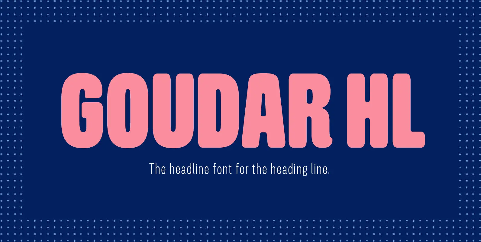
Goudar HL Font
From the old days technique to the present technology of type design, Gouda is the font that meets in the middle. With the design that has acquired the essence of wooden type letterpress but added with our own modern twist.
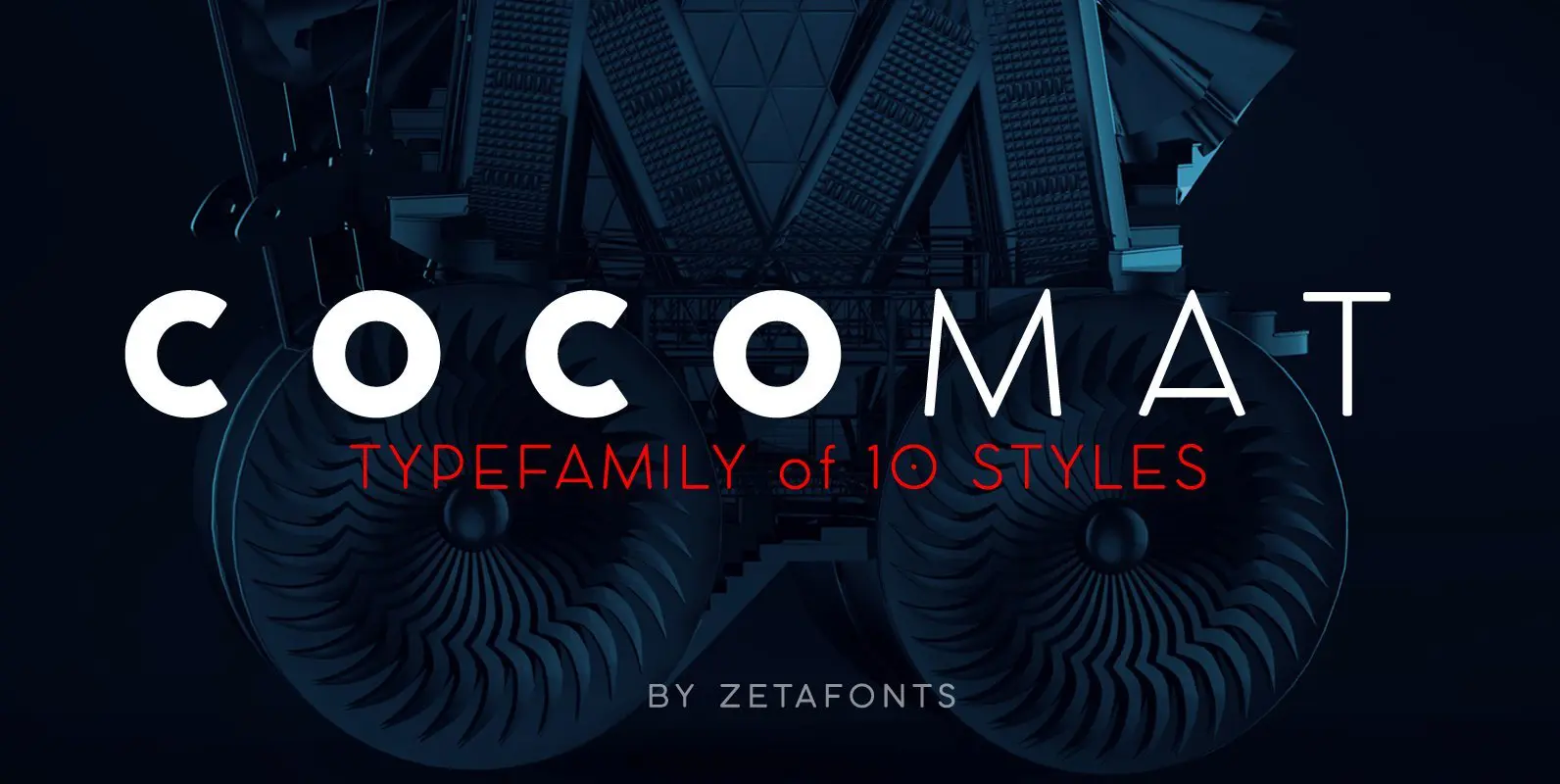
COCOMAT Font
COCOMAT is a typeface variant from the COCO GOTHIC family of sans serif geometric typefaces. It’s inspired by the style of the twenties and the visions of italian futurists like Fortunato Depero, Giacomo Balla and Antonio Sant’Elia. It’s a typeface
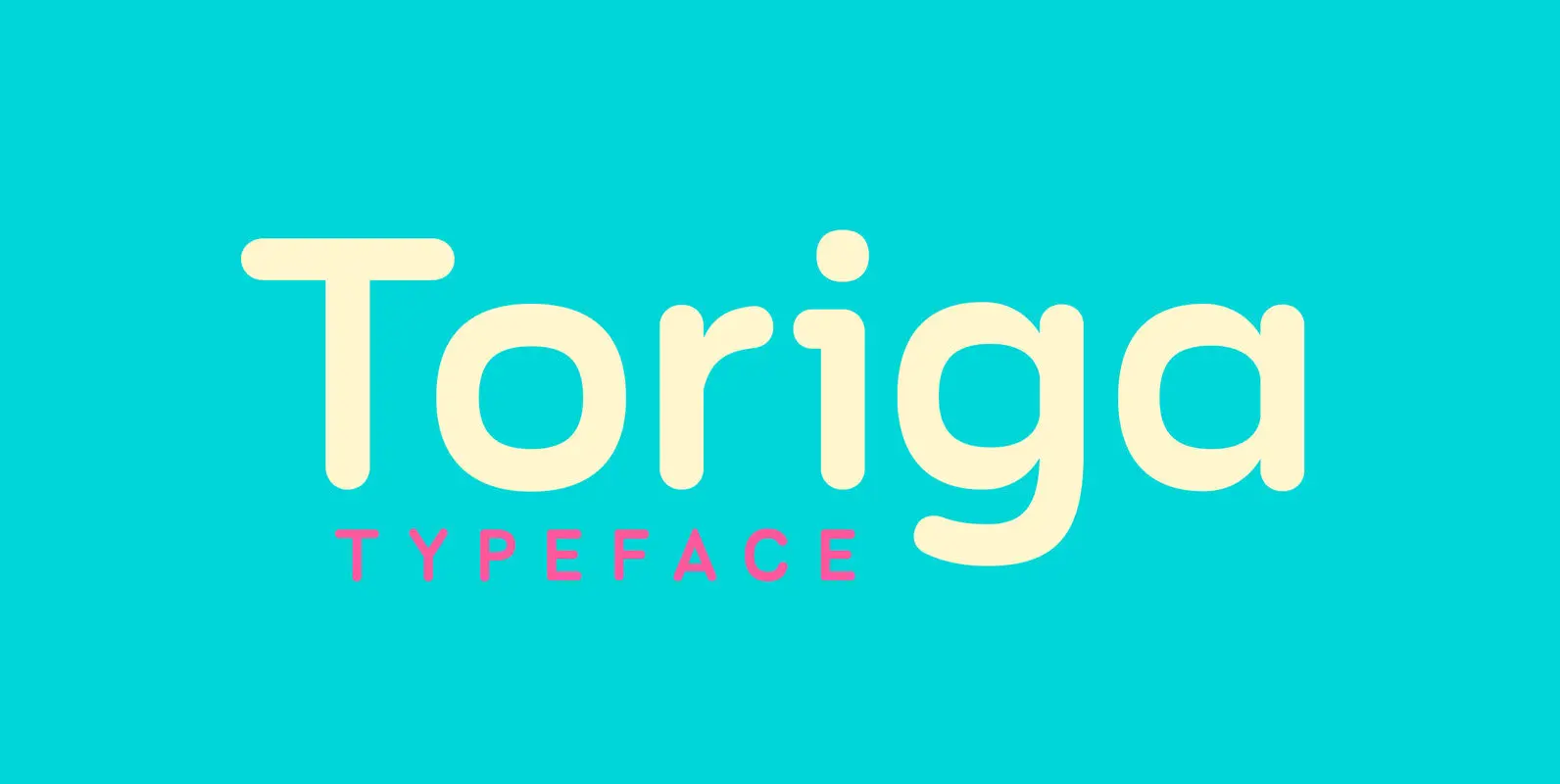
Toriga Font
The Toriga typeface was named after the Portuguese grape variant known as Touriga Nacional. This fun typeface boasts the features of a well-balanced, versatile, modern sans which is highly legible as a text font and with a clean, elegant look
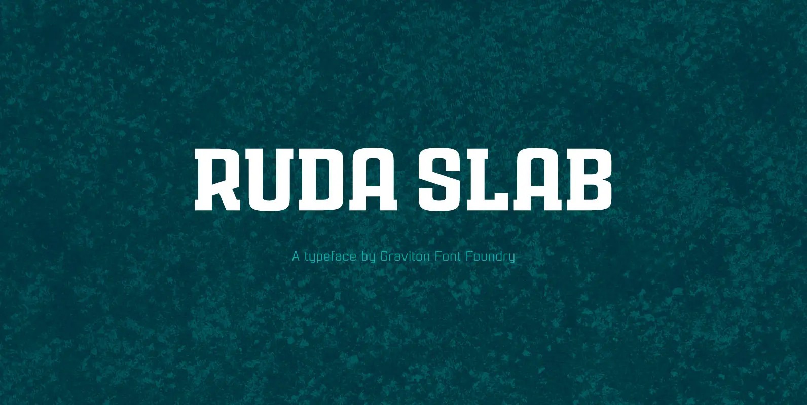
Ruda Slab Font
Rauda Slab font family has been designed for Graviton Font Foundry by Pablo Balcells in 2017. It is a display, slab serif, geometric typeface, with sharp angles that provides a strong and solid appearence. Rauda Slab consists of 8 styles.
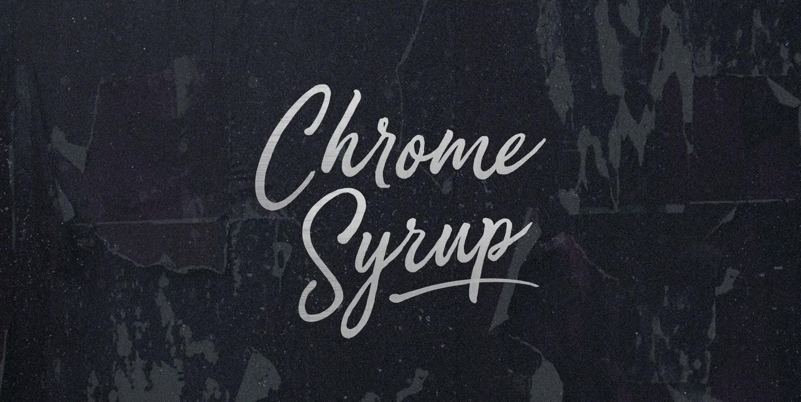
Chrome Syrup Font
Here we are, giving matter mad shine. Mad as bathing hot cakes in mercury, dripping off quick like silver with a sticky sparkle. Chrome Syrup in squeeze bottles, in the door of your fridge, to the door of your car,
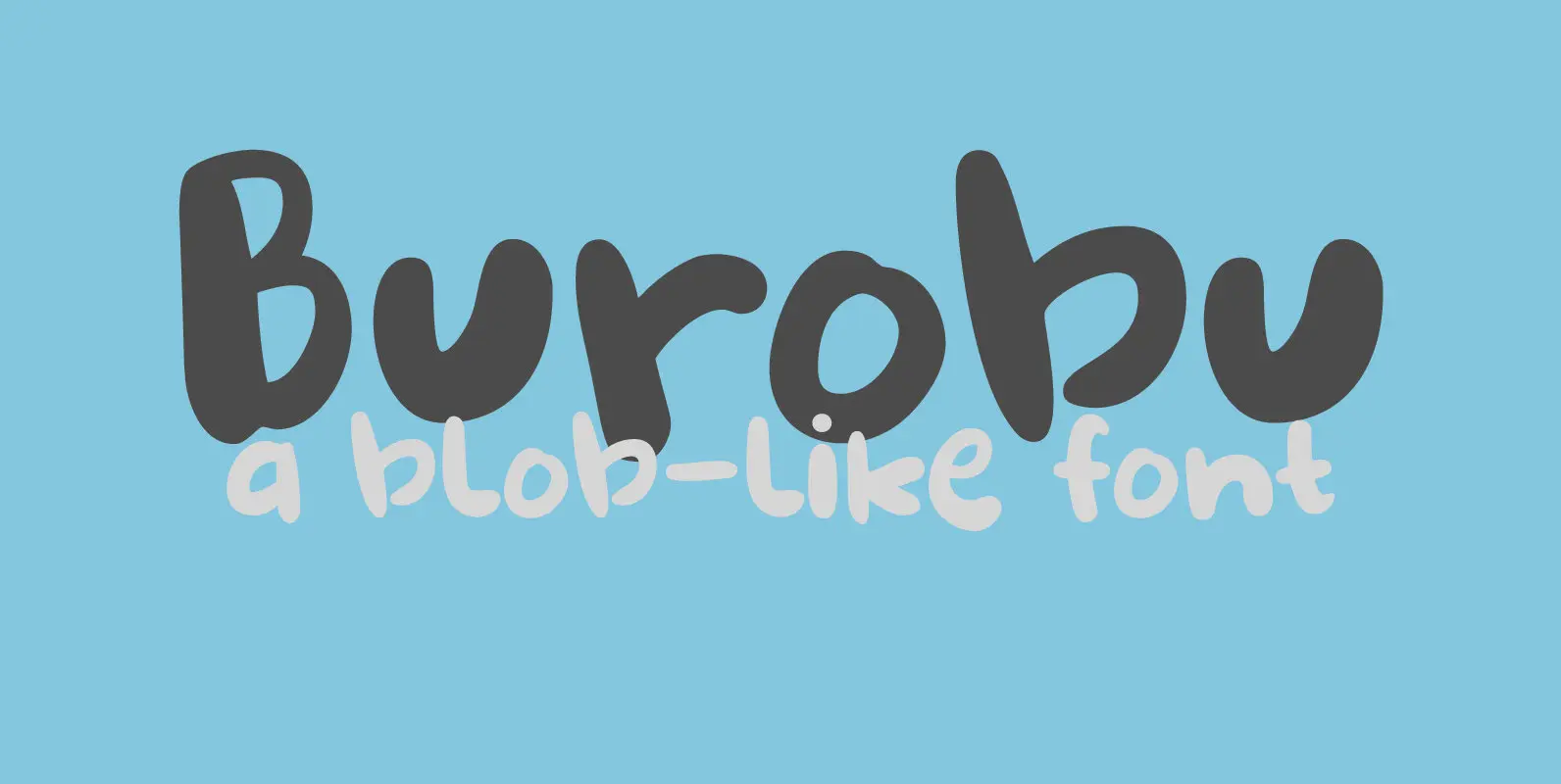
Burobu Font
Burobu, in case you’d like to know, means ‘blob’ in Japanese. I thought it was quite an appropriate name for this blob-like font! Burobu is a messy font and comes with a generous helping of jittery, jumping glyphs, exaggerated strokes
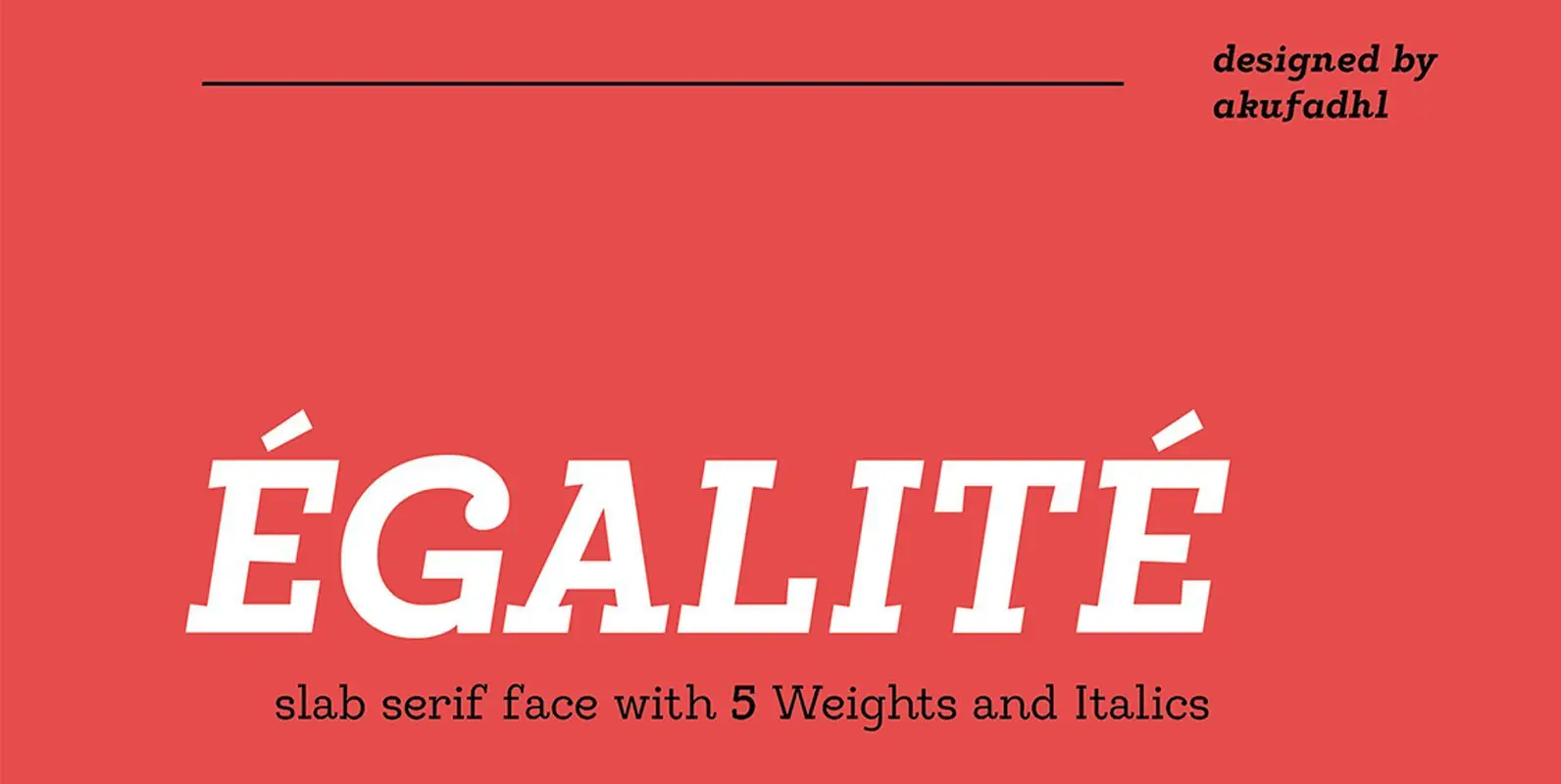
Egalite Font
Egalite iis a Slab-Serif face with a combination between sharp and Rounded shape, the sharp serif, and rounded terminals give a fun yet serious feel. It also have a low contrast shape to give more strong feel and personality. Come

Cool Daddy Font
It’s a brand new year, but I have been going back in time. To the seventies to be precise. A ‘bubblegum’ font was on the top of my to-do list, so when it was finally finished, it reminded me of
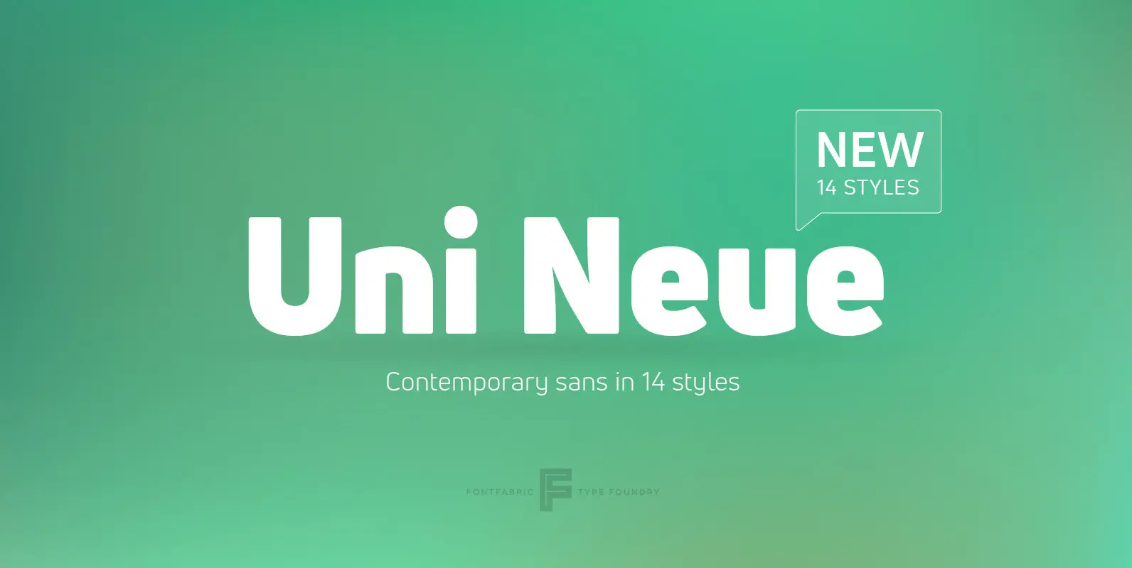
Uni Neue Font
Uni Neue is the whole new redesigned version (remake) of Uni Sans – one the most recognizable and signature font families of Fontfabric type foundry. From major changes like proportions, widths and thickness (weights) to the smaller details, this new
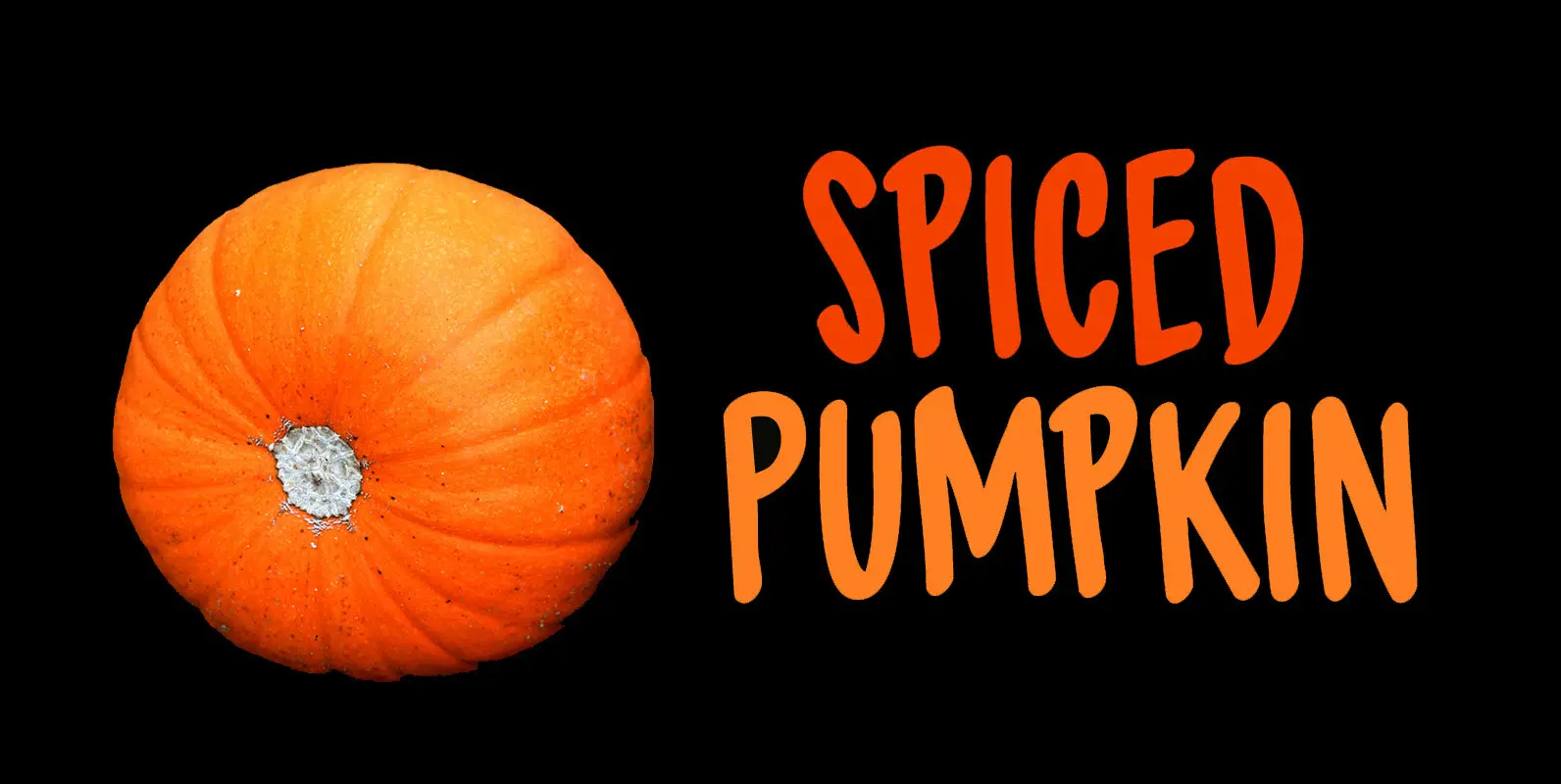
Spiced Pumpkin Font
I don’t know about the weather on your side of the globe, but here it is mighty cold! I was trying out a new technique of font-making AND I was craving a pumpkin spice latte, so I named this font
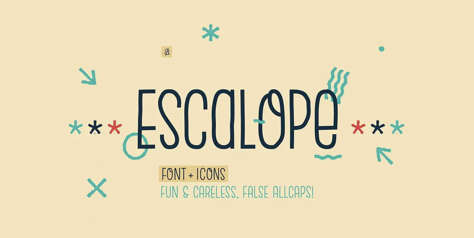
Escalope Font
Escalope is a hand-drawn layered font with a crazy & unique personality: the low midline, the false-All Caps style, all the fun & playful Stylistic Sets will give your projects a new and fresh look! There are many Open-Type features
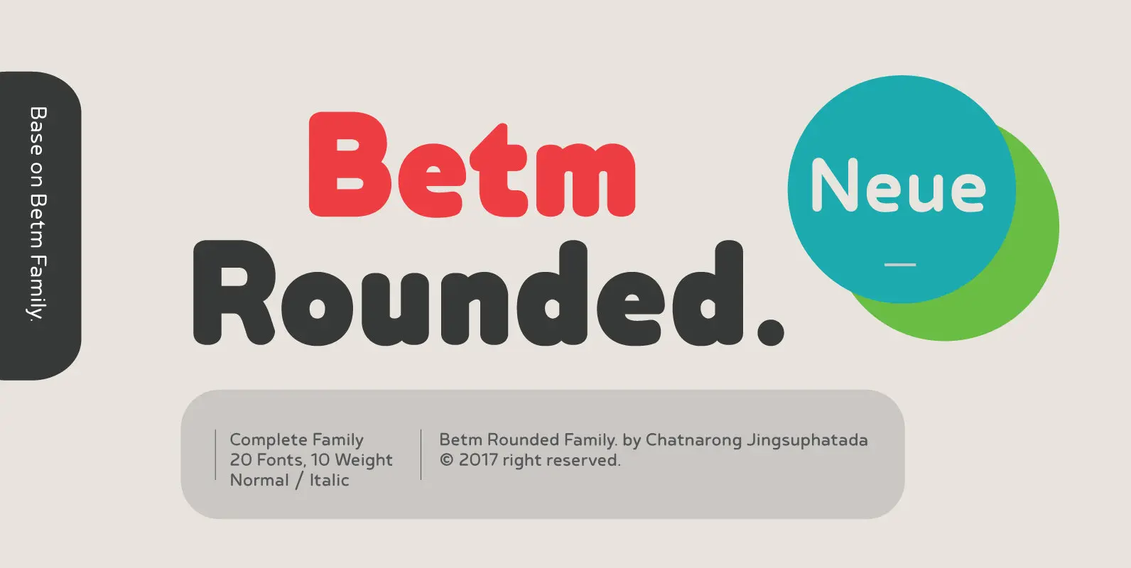
Betm Rounded Font
Betm Rounded is a warm, approachable sans serif with a high degree of legibility, even in small point. It displays a casual persona with an underlying sophistication that makes it appropriate for a wide variety of design projects. Betm Rounded
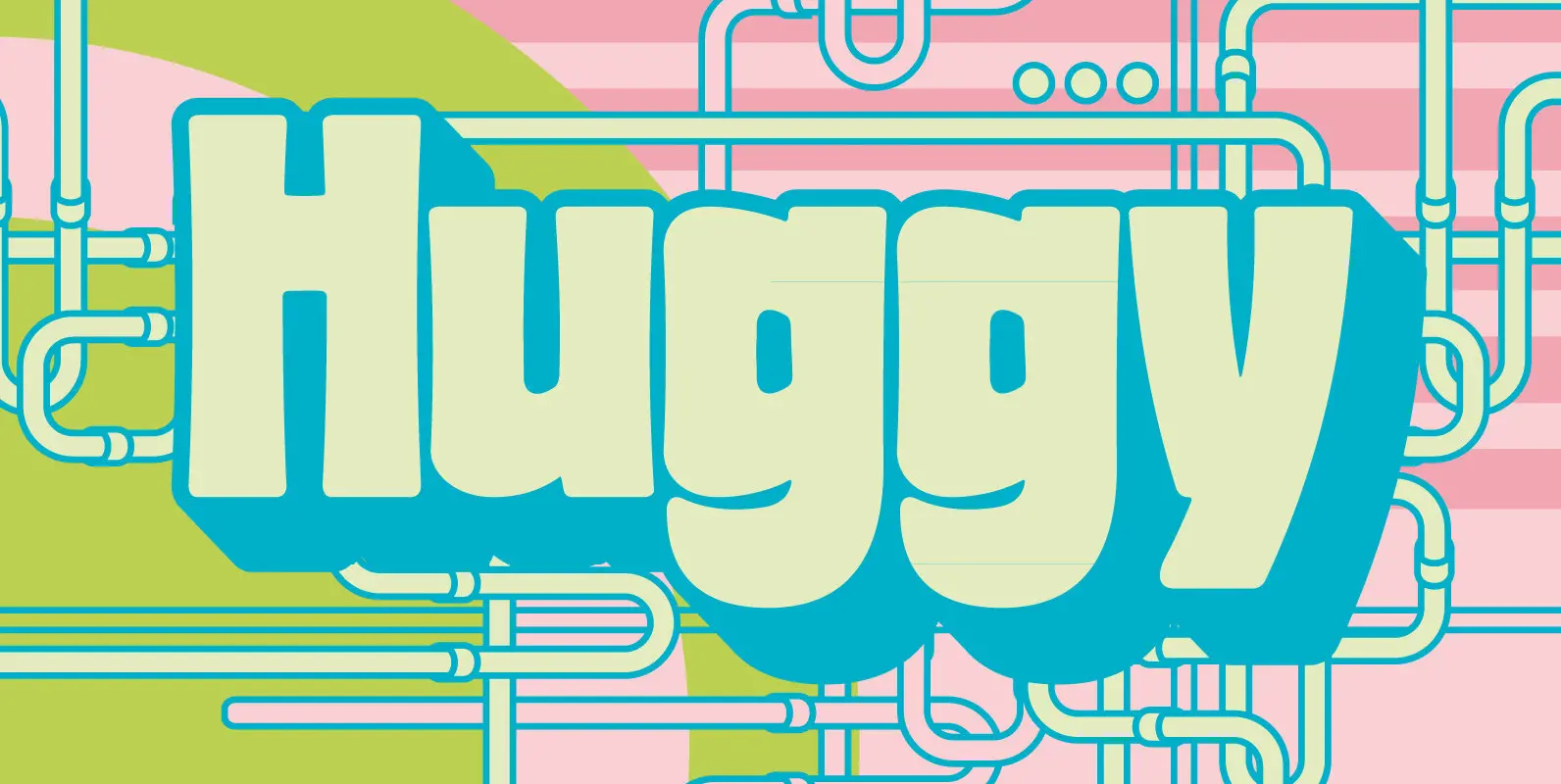
Huggy Font
Huggy is a display typeface designed by Michael Parson and inspired by the work of Heinrich Heinz. Full of Art Nouveau flair, this two weight typeface is bold forceful but full of subtle features that give the design a unique
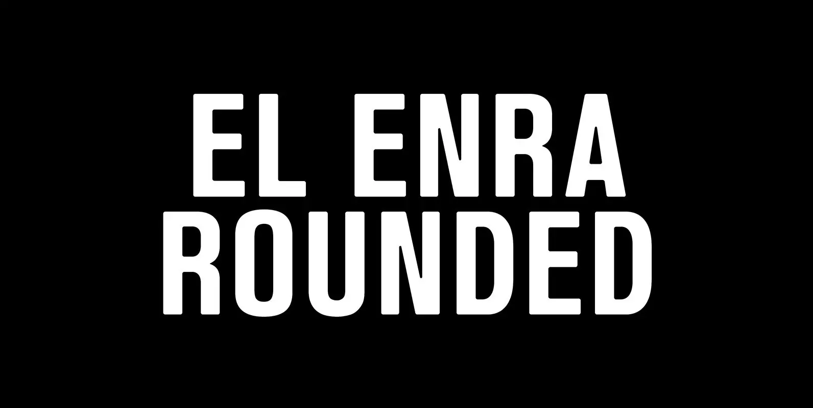
El Enra Rounded Font
El Enra is a bold and condensed typeface that is suitable for headlines, posters and titles. This is the rounded corners version — El Enra Rounded. Published by Hanken Design Co. Download El Enra Rounded
