Tag: rounded
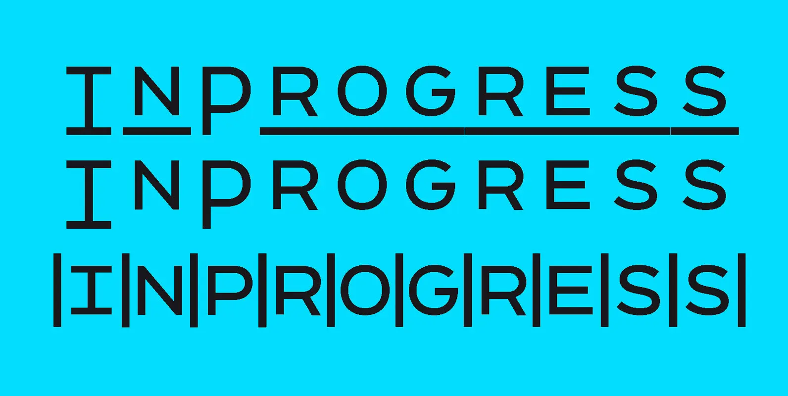
InProgress Font
InProgress is a playful multi-spaced sans-serif typeface that can turn typesetting into grid making. Stacked together, the lines of type create serendipitous alignments, with text blocks becoming dynamic checkerboards of geometric letterforms. The resulting patterns are best suited for posters,
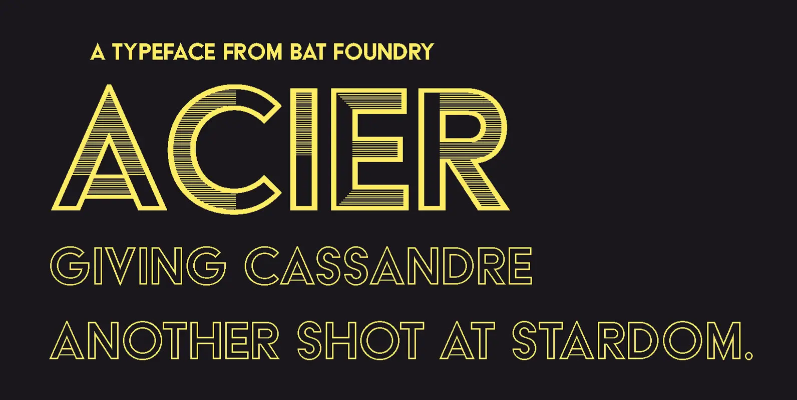
Acier Font
Giving Cassandre another shot at stardom Designed by Cassandre (born Adolphe-Jean Mouron, 1901-1968) in 1930, Acier was the second design by the legendary artist to be published by the Deberny & Peignot foundry. As a dual-color display typeface, designed in
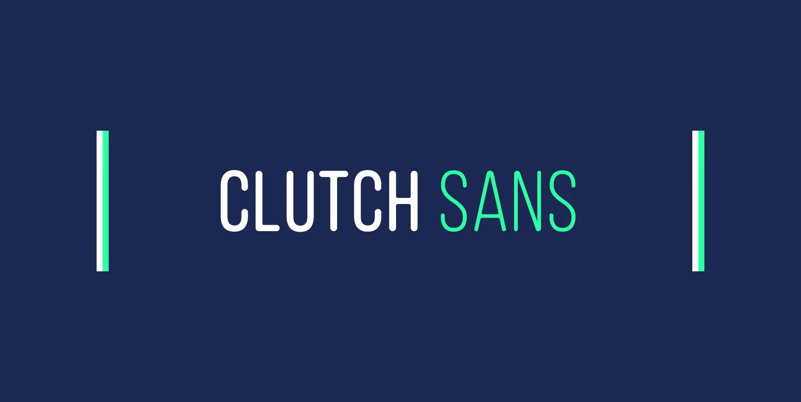
Clutch Sans Font
Clutch Sans is a condensed, sans serif with rounded terminals, set entirely in capitals. It’s a serious font with a little touch of positive energy and friendly warmth. It’s geometric structure makes it simple, clean and super functional. Clutch Sans
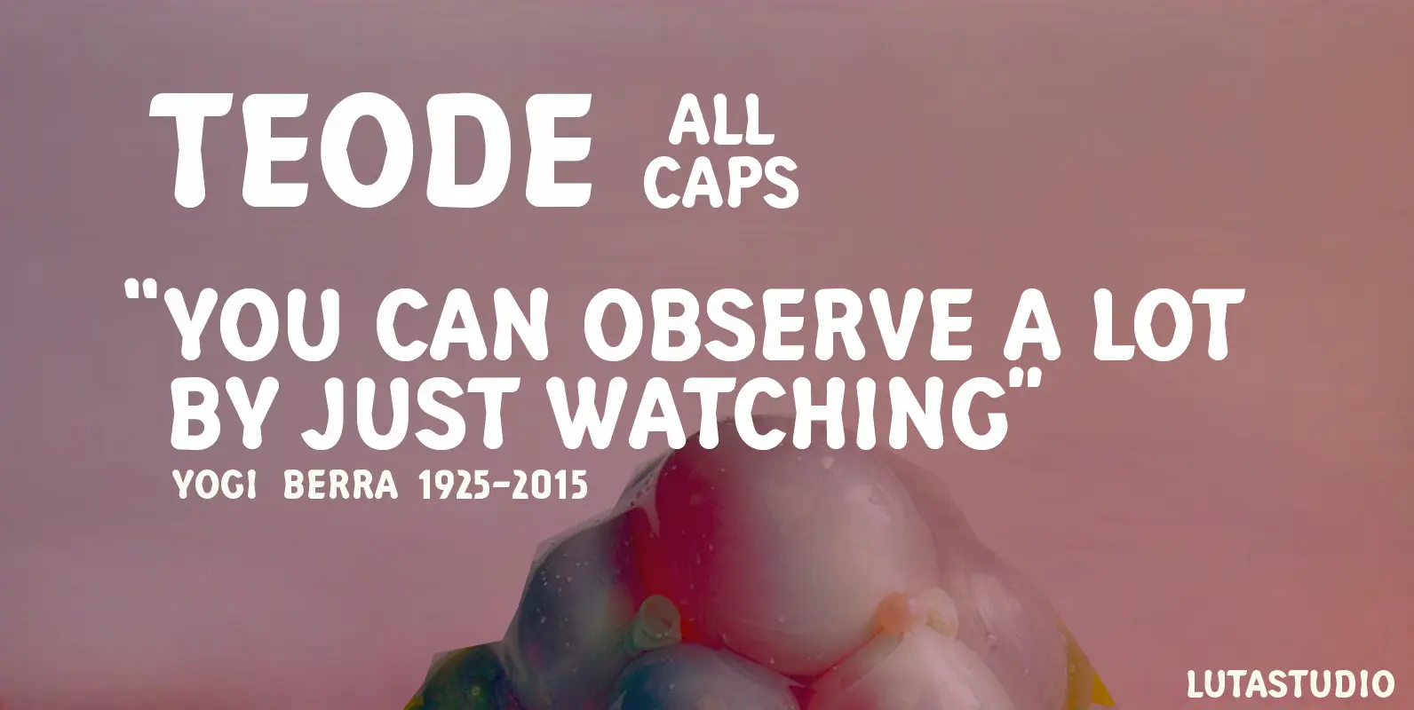
Teode Font
The Teode, designed by Lutastudio, is a display sans font with extensive Latin language support. Published by LutastudioDownload Teode
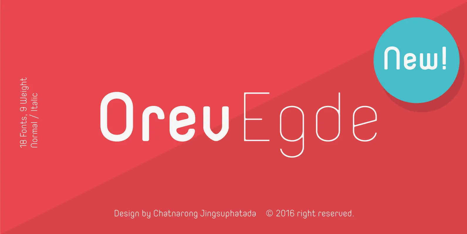
Orev Edge Font
Orev Edge is altered modified from the form of the original “Orev” typeface. We added curved line in both inner and outer edges, including the structure of typeface. Import to be more friendly, the font family has smoother terminals that
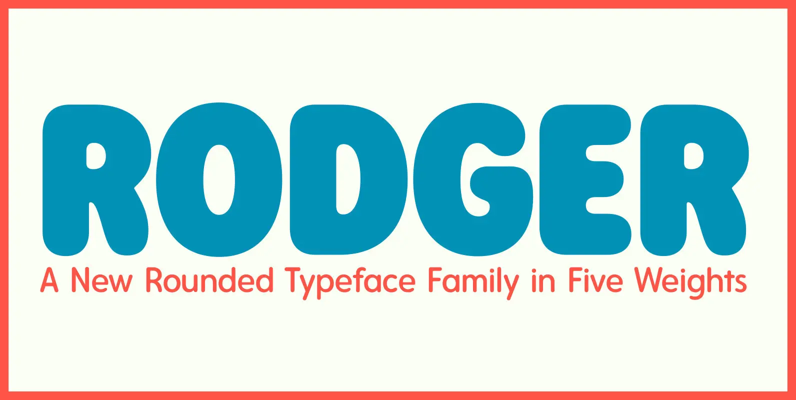
Rodger Font
The Rodger typeface family’s main source of inspiration came from rounded display faces of the 1960s and 70s, but it also references sans serif, rounded typefaces found in wood type collections of the 19th century. Despite its vintage roots, Rodger
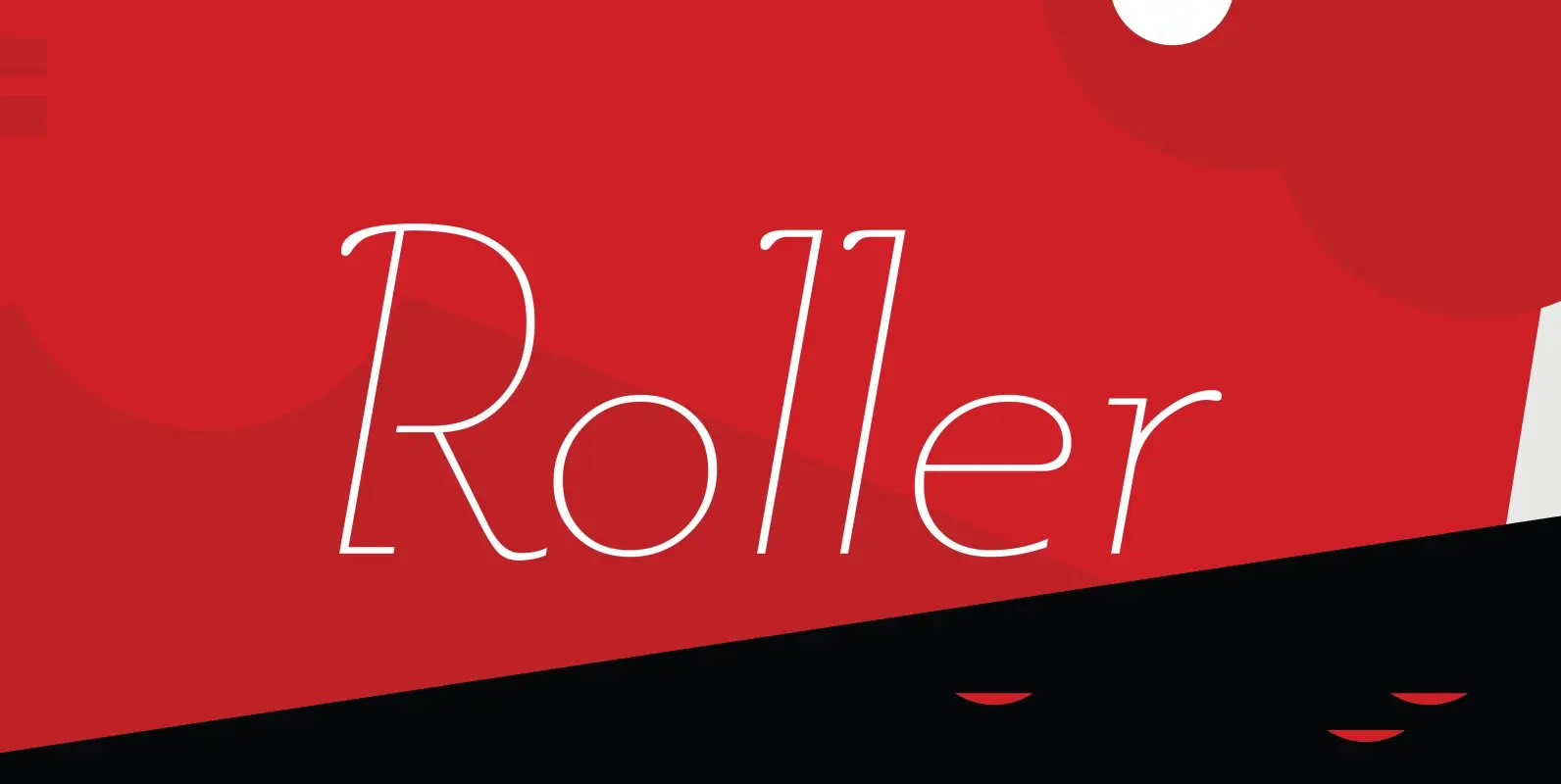
Roller Font
Designed by A. Pat Hickson, Roller is a retro font design based on Iberica by Carlos Winkow for the Spanish foundry, Nacional, circa 1942. Published by Red RoosterDownload Roller

Ovsyanka Font
Ovsyanka (oatmeal) is a typeface with rounded corners and a slight distressed effect. Ovsyanka is ideal for packaging designs, for example chocolate or coffee box designs. Published by Dmitry MashkinDownload Ovsyanka
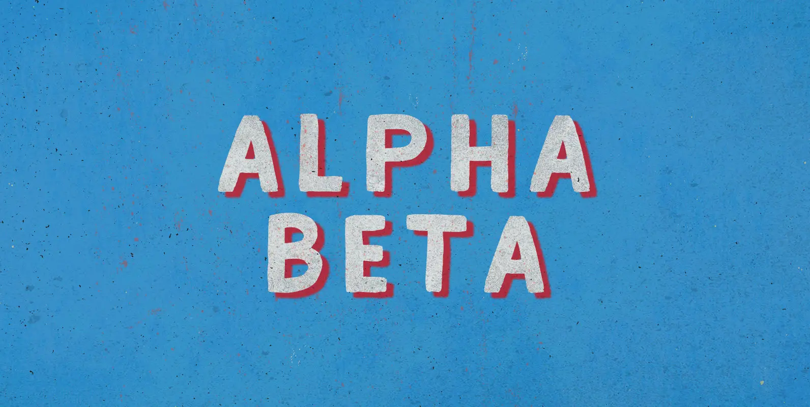
Alpha Beta Font
Steady in its place, ambitious in its outlook: Enter the journeyman of pack leaders. The Alpha Beta comes from behind to run ahead, before falling back; fighting and losing, fighting again, always to win. Published by BLKBKDownload Alpha Beta
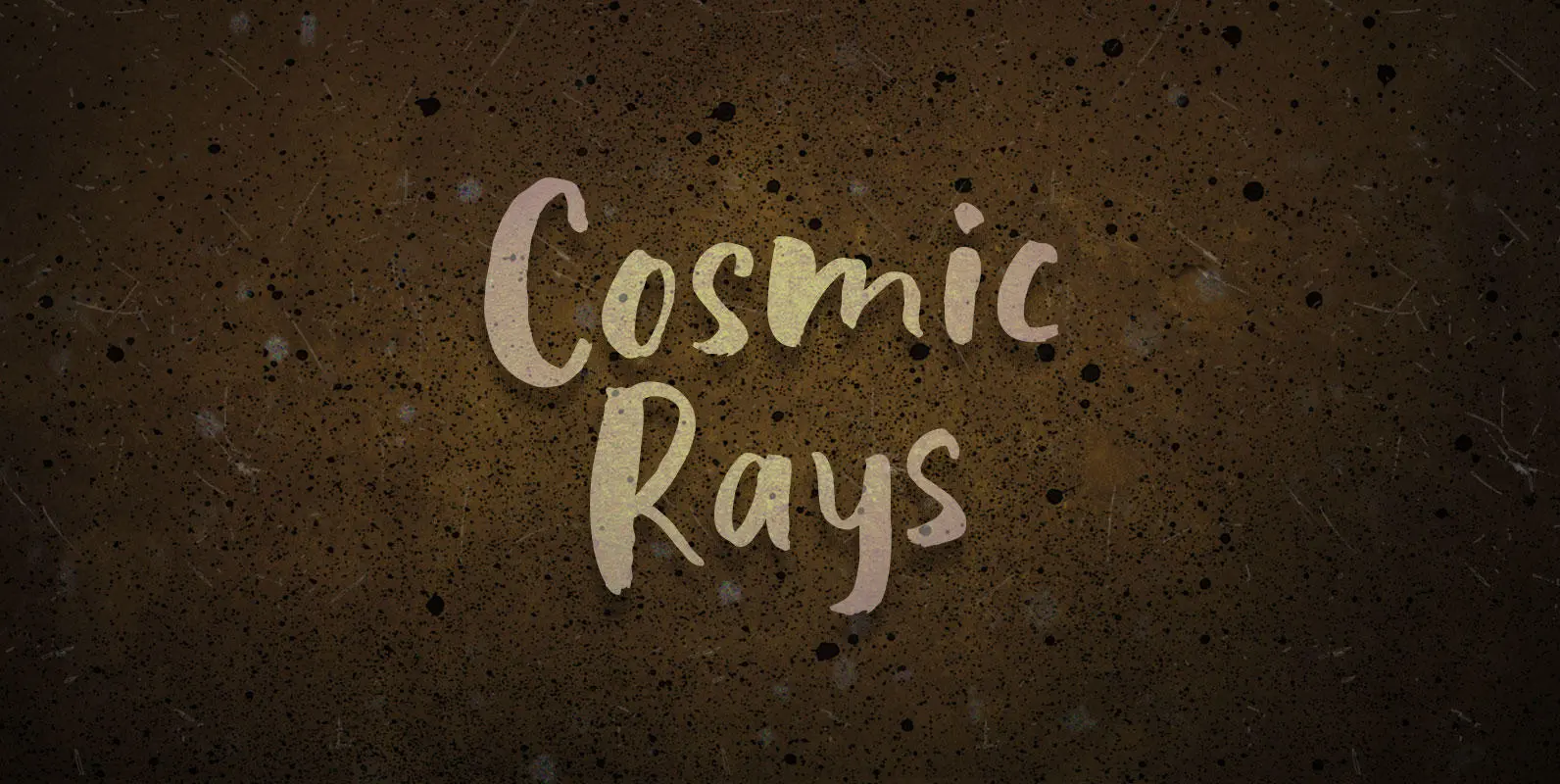
Cosmic Rays Font
Floating on photons, waving wings of pure energy, tail cocked to spear spacemen. The most alluring of all celestial fauna, Cosmic Rays navigate space by swimming through pure ether–familiar in their motion and form to their water-bound cousins. Published by
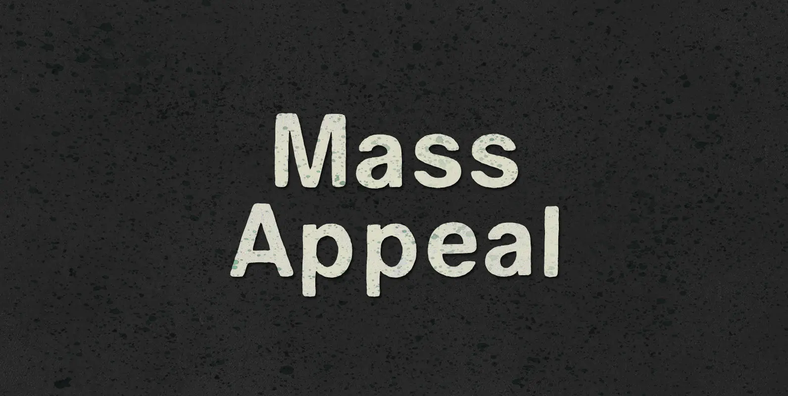
Mass Appeal Font
Down but standing tall under the weight of having it all. Above the clouds, or holding it down on the ground, the solution to and absolution of all problems with gravity: a pillar of planetary Mass Appeal. Published by BLKBKDownload
Migrena Grotesque Font
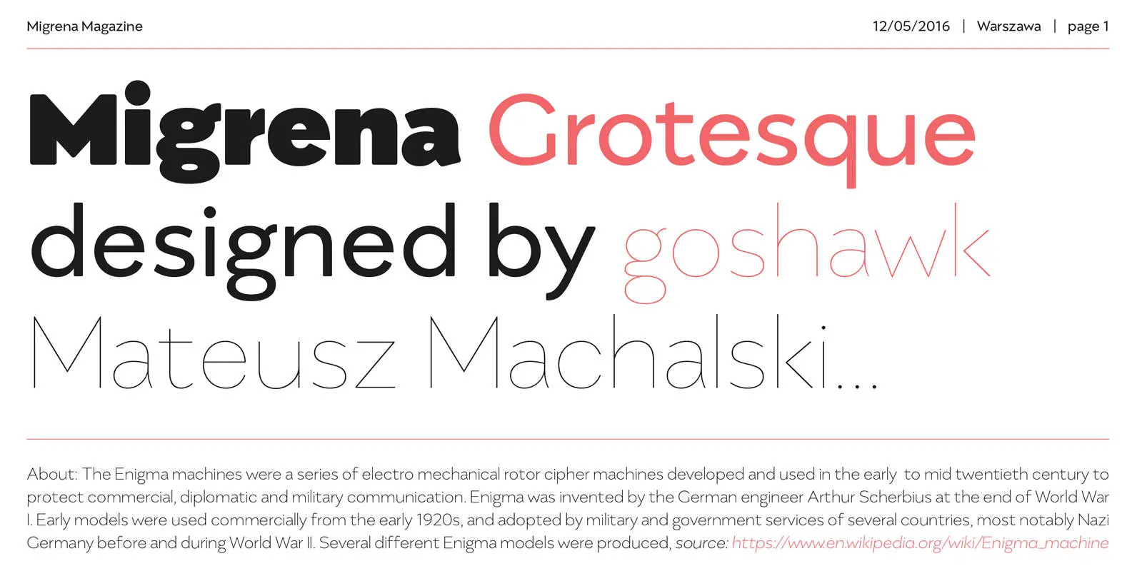
Migrena Grotesque designed by Mateusz Machalski is a classical sans geometric family. This typeface is characterised by a lot of details, which gives it a friendly character. Scalable x height, rounded corners makes Enigma good choice for many purposes. All
Ferrus Font
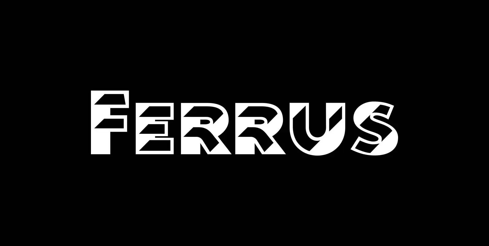
“Ferrus” is named after the location of famous French foundry Deberny & Peignot which was at “18 Rue Ferrus, XIV Paris”. “Ferrus” is inspired by a font named “Acier” of the Twenties of last century. But “Ferrus” is not a
CA Wolkenfluff Font
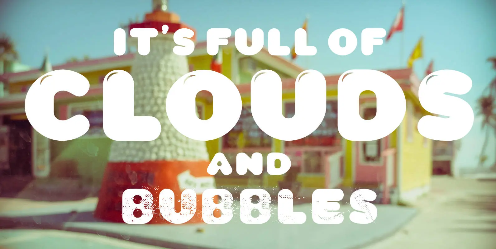
Yum, yum, a fat sausage font including plain and highlighted letters and a »Stencil« style if you need to spray something on walls. No, no! The form of the typeface was inspired by the pixelated in-game title font of the
Austral Slab Font
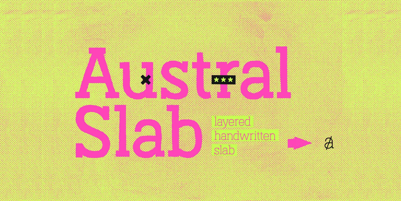
Austral Slab is a hand-drawn layered font designed by Antipixel, with unique textures & styles that combine giving your work a distinctive impression. This font comes in three weights, Regular, Light & Thin, with irregular outlines and uneven/crooked strokes, giving
